AURALIS: Organic skincare branding
Amina BJ
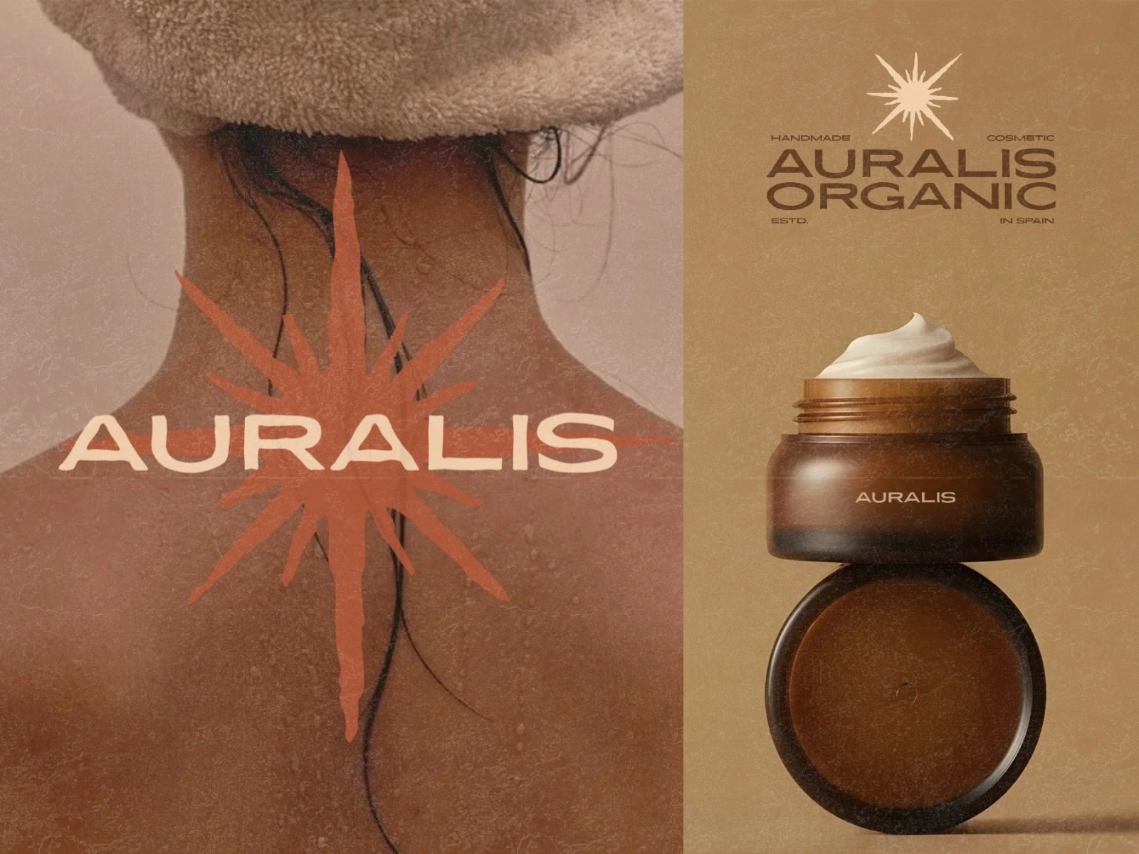
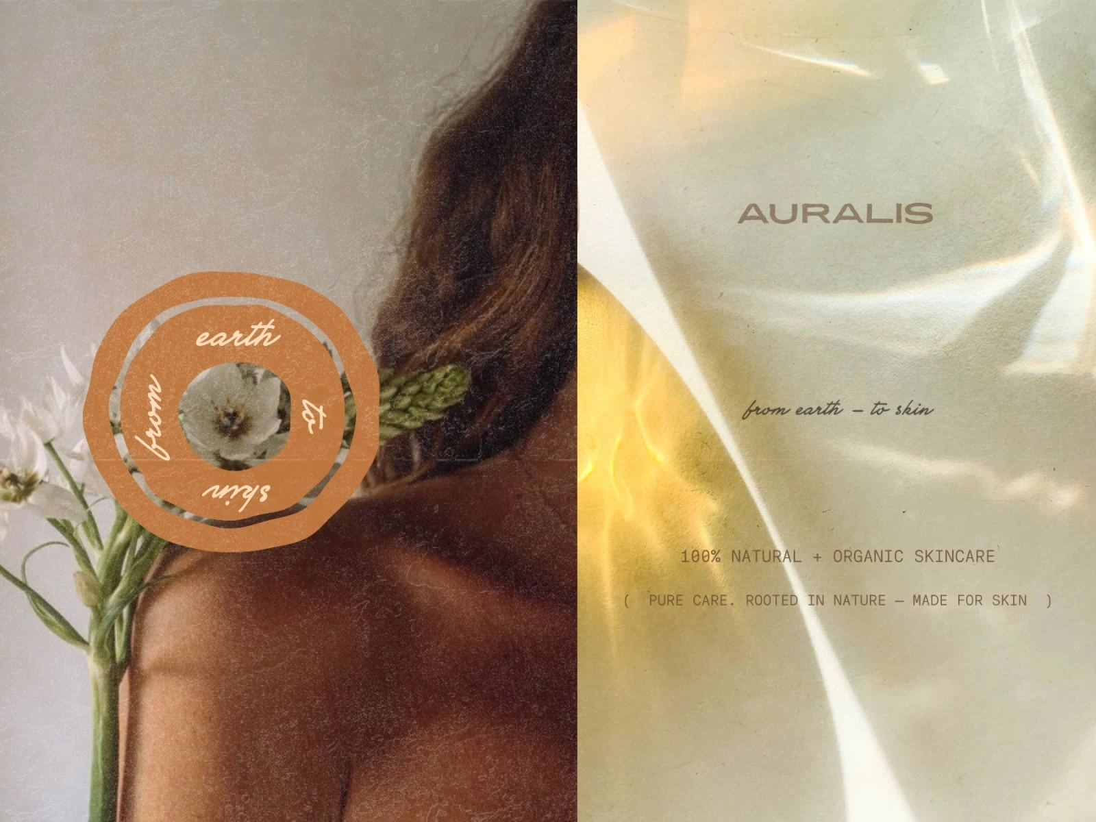
Visuals intentionally highlight texture to evoke the feeling of real skin. The identity centers around a custom, hand-drawn sun symbolizing purity and transparency, while simultaneously paying homage to the brand’s Spanish roots.
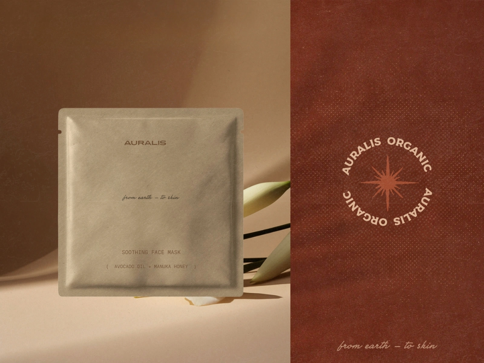
AURALIS: from earth - to skin
The logo mark (right) plays into the concept of orbiting around the sun, reinforcing the brand's narrative through subtle, intentional wordplay.
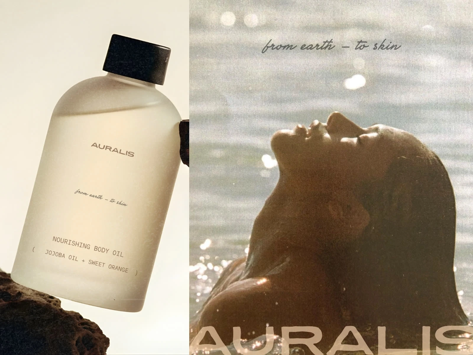
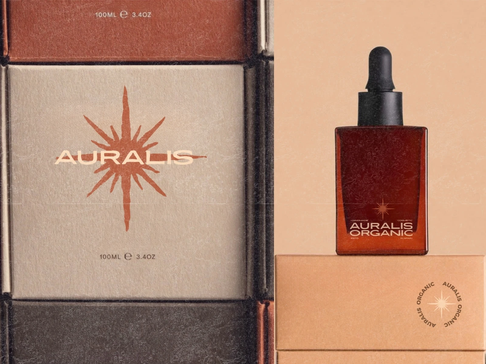
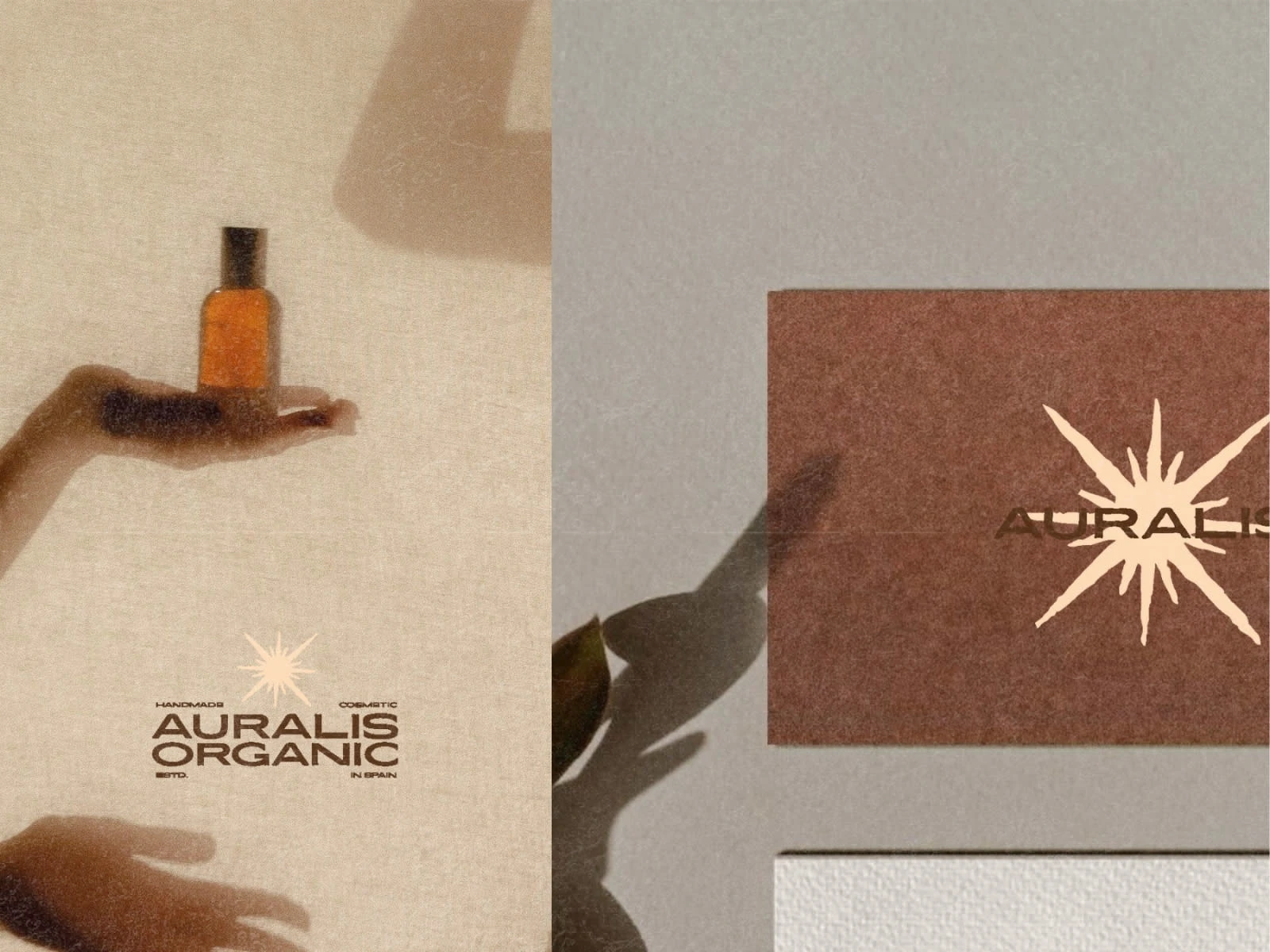
The color palette is kept in warm, golden-red tones, creating a sense of warmth, earthiness & a natural, sun-lit glow that feels both organic and premium.
Project Scope
The project focused on creating a logo + visual foundation that communicates AURALIS' core values: purity, craftsmanship and a premium organic feel, while staying minimal and timeless.
Concept & Approach
The concept draws from nature, light and authenticity.
Every element was designed with intention, blending softness and structure to feel grounded, honest and quietly elevated.
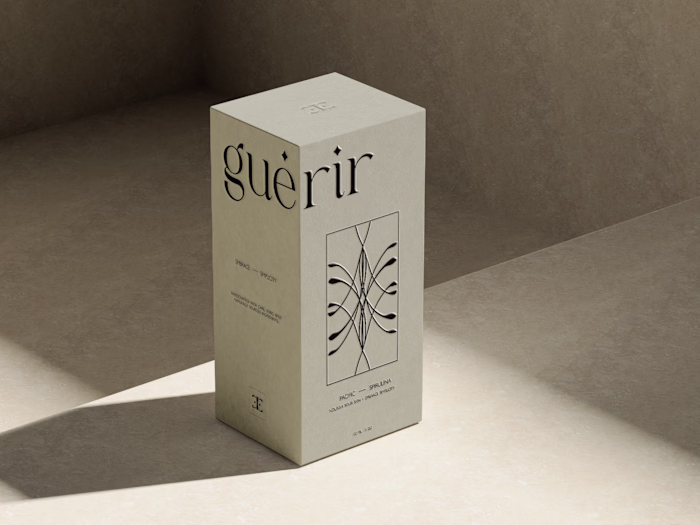
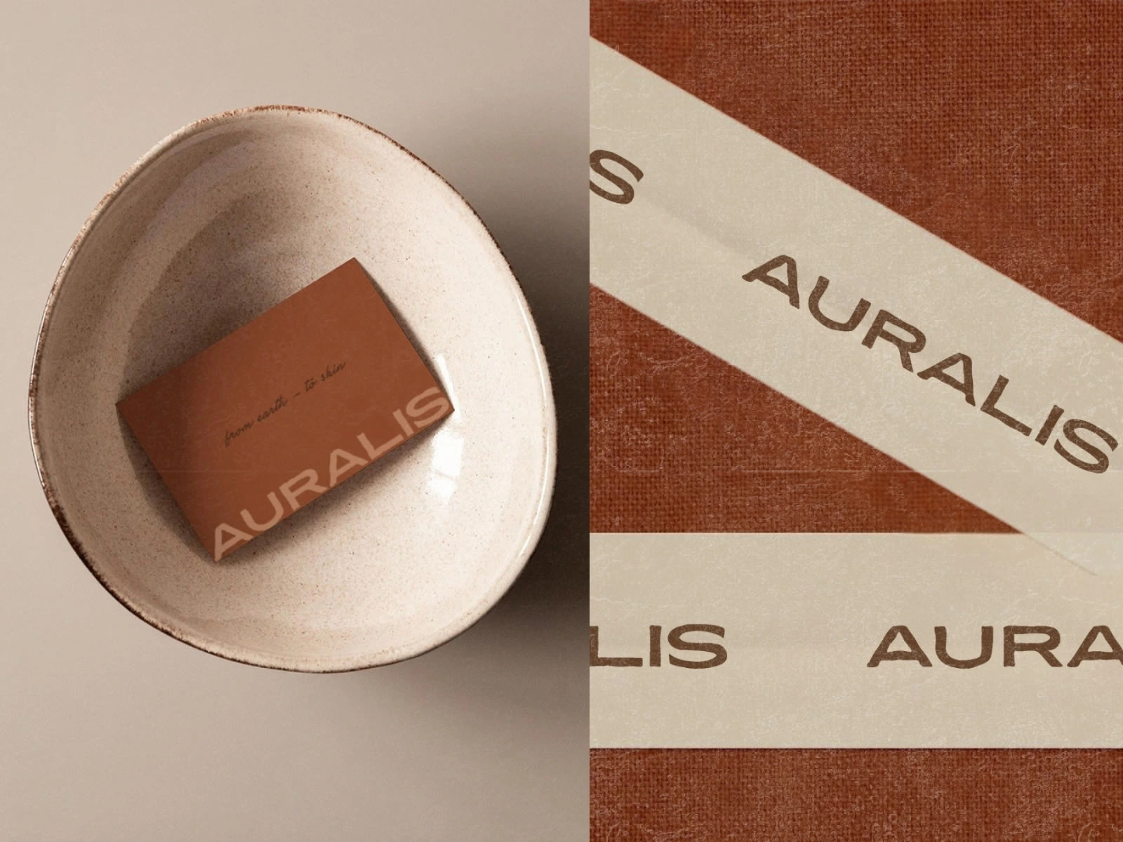
Packaging Details
Packaging was kept minimal yet premium, allowing space to breathe. Clean layouts and subtle details reinforce the idea that what you see on the outside mirrors the quality inside.
Visual Direction
The visual direction leans warm, organic and sun-inspired. Hand-drawn elements and a restrained palette create a cohesive identity that feels human, radiant and deeply connected to the brand's origins.
Like this project
Posted Jan 9, 2026
Logo design for a a fully organic + handmade Spanish brand. A refined, radiant identity that reflects purity, care + the brand's authenticity.