Guérir: Brand Design
Amina BJ
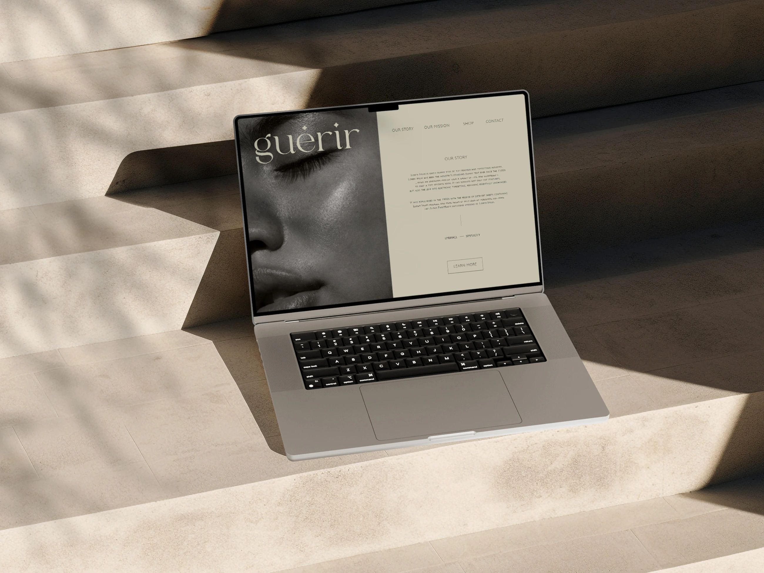
A website landing page designed to reflect the brand's essence: simple, clean and elegant.
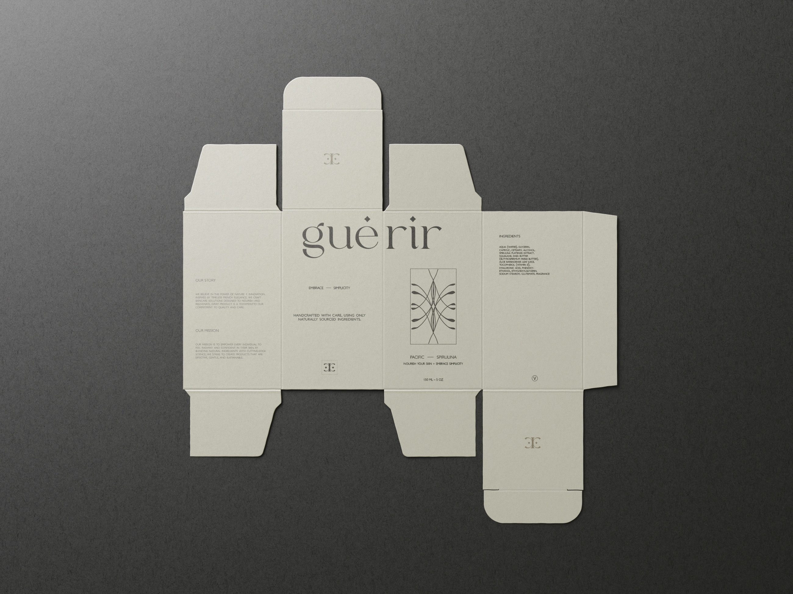
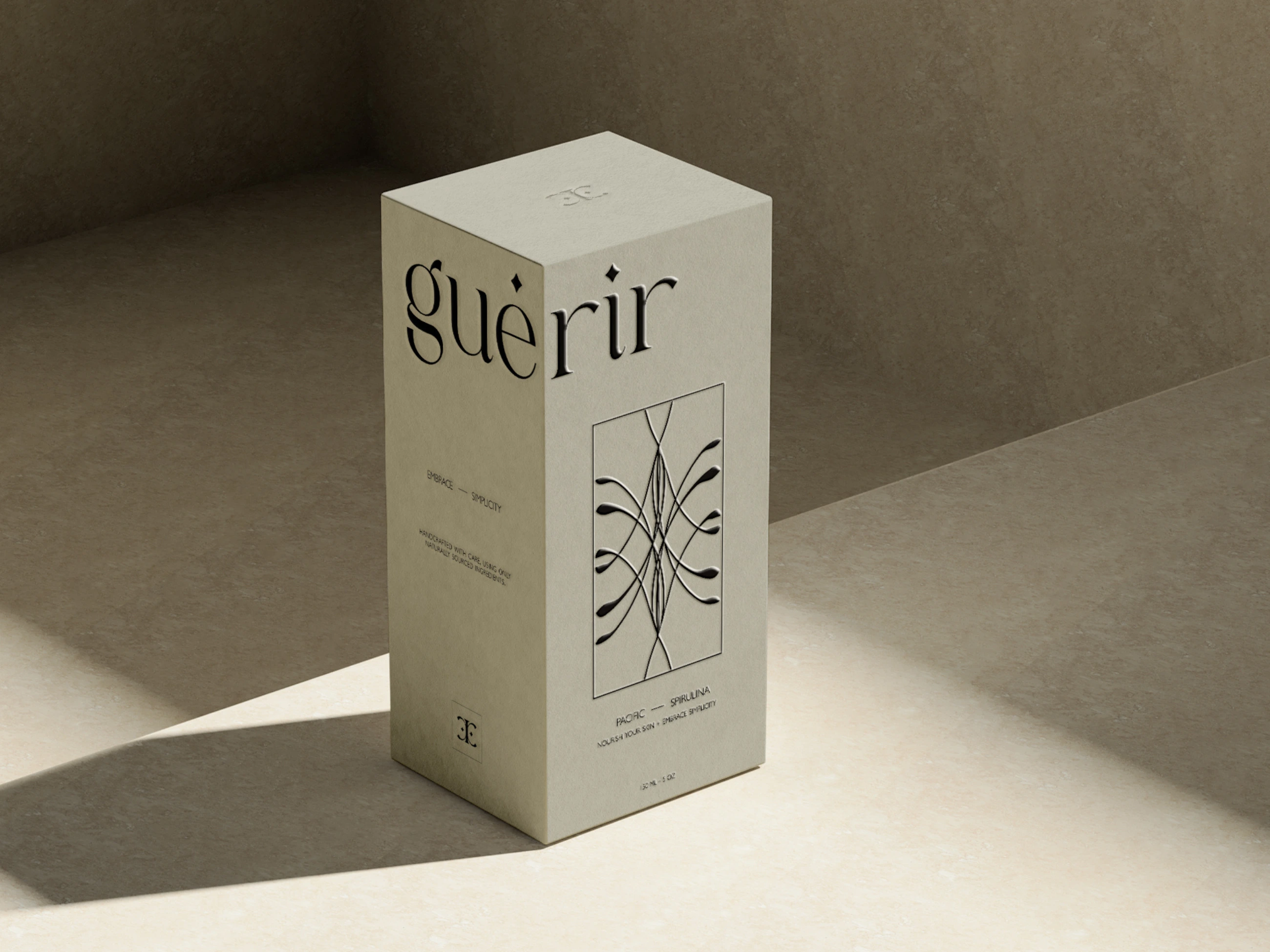
Vertical 150 mL / 5 oz cosmetic box — unfolded preview
This packaging concept showcases the full layout of a vertically oriented cosmetic box. All brand elements are thoughtfully placed: a submark appears on both the top and bottom flaps, while the front panel features a custom hand-drawn illustration. Beneath the illustration is a brief highlight of the product’s key ingredient (Pacific spirulina), followed by the brand’s messaging: “Nourish your skin + Embrace simplicity.”
The design intentionally splits the main logo, guérir, across two sides of the box, creating a bold visual effect when placed on shelves side by side: one box displaying “gué” and the next “rir”. This layout invites interaction and curiosity, while reinforcing brand recognition through repetition and modular storytelling.
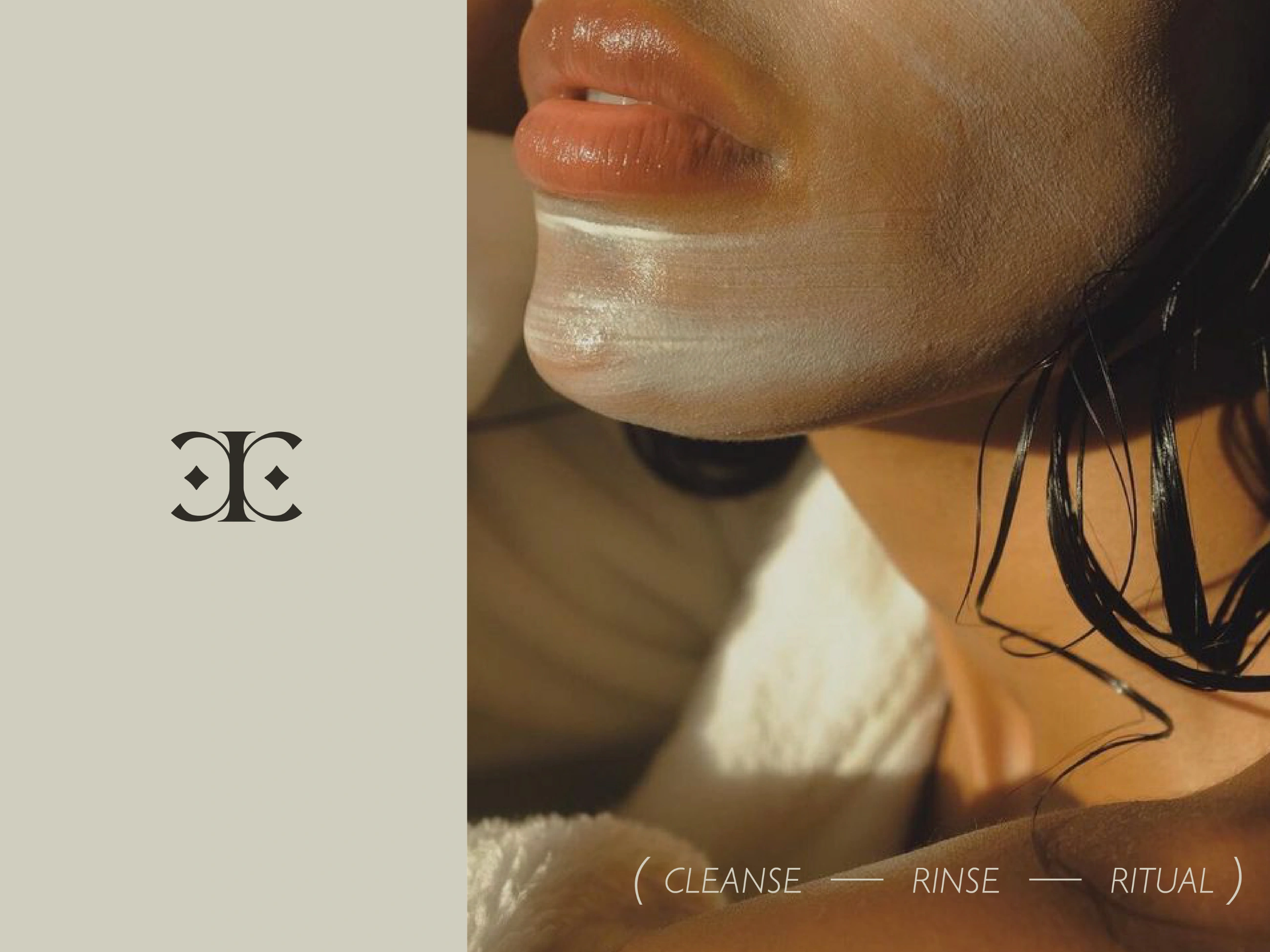
Left: The brand submark displayed on a light, minimal background. It’s derived from the stylized “r” in the brand name, paired with the signature sparkle dot (the same detail that appears above the “e” and “i” in the main logo). This tiny spark, playful yet intentional, subtly reinforces the brand’s focus on cleanliness and lightness.
Right: Carefully selected close-up imagery evokes calm and intimacy, visually echoing the brand’s voice: “Cleanse – Rinse – Ritual”.
The composition feels personal and inviting, subtly linking the everyday ritual of care to intention and ease.
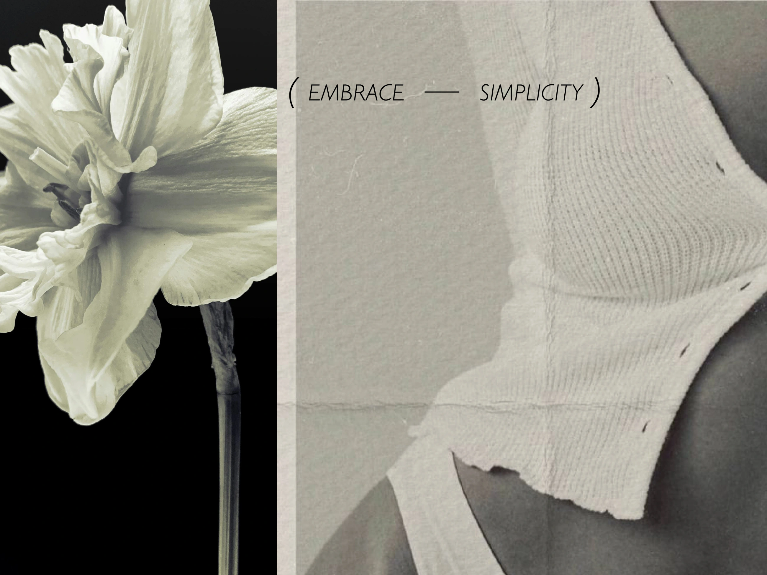
More visual cues are introduced to reflect the brand’s essence: delicate lighting, skin-close framing + a sense of quiet softness throughout.
Guérir – Skincare Branding
Where healing meets elegance.
Guérir is a natural skincare brand wrapped in softness, femininity and slow, intentional beauty. The brand invites a return to simplicity and gentle care in both ritual and design.
Project Scope
Logo Design | Visual Identity | Packaging Design | Custom Illustration
The goal was to craft a refined yet personal visual identity that captures the spirit of Guérir: clean, calm and rooted in healing. The brand speaks in a soft voice — one that prioritizes well-being, trust and elegance without excess.
Concept & Approach
The logo features minimalist typography with airy spacing and subtle curves to reflect softness and clarity. A custom submark was created by combining the stylized letter “r” from the logotype with a sparkle dot, which also appears above the “e” and “i” in the main logo. This detail acts as a visual metaphor for cleanliness and intentional radiance.
The color palette is muted and natural, supporting the feeling of lightness and serenity, while a hand-drawn illustration on the packaging adds an organic, human touch.
Packaging Details
The 150 mL / 5 oz cosmetic tube and matching vertical box were designed to feel light, clean and intimate. The front features a custom illustration, followed by a short highlight of the key ingredient — Pacific spirulina — and the brand’s guiding words: “Nourish your skin + embrace simplicity”.
An intentional typographic play appears across the box — the word Guérir is split into “gué” and “rir” on opposite sides, encouraging shelf display in pairs and adding intrigue through subtle repetition.
Visual Direction
Supporting imagery is soft, close-up and personal emphasizing the sensory quality of skincare as a ritual. Elements like gentle textures, natural light + calm composition all reinforce the brand’s voice:
Cleanse – Rinse – Ritual
It’s skincare that feels like a whisper — personal, purposeful and beautiful in its restraint.
Like this project
Posted Aug 1, 2025
Where healing meets elegance. Guérir is a skincare brand wrapped in softness, femininity and slow, intentional beauty. Embrace — Simplicity.