PACE+ Brand Design
Amina BJ
Custom animation derived from the brand’s stylized “+” element. It reflects the movement, energy and dynamism at the core of this running / sports brand. Designed with versatility in mind, this animation is especially effective as a loading animation, subtly reinforcing brand identity while keeping the user engaged.
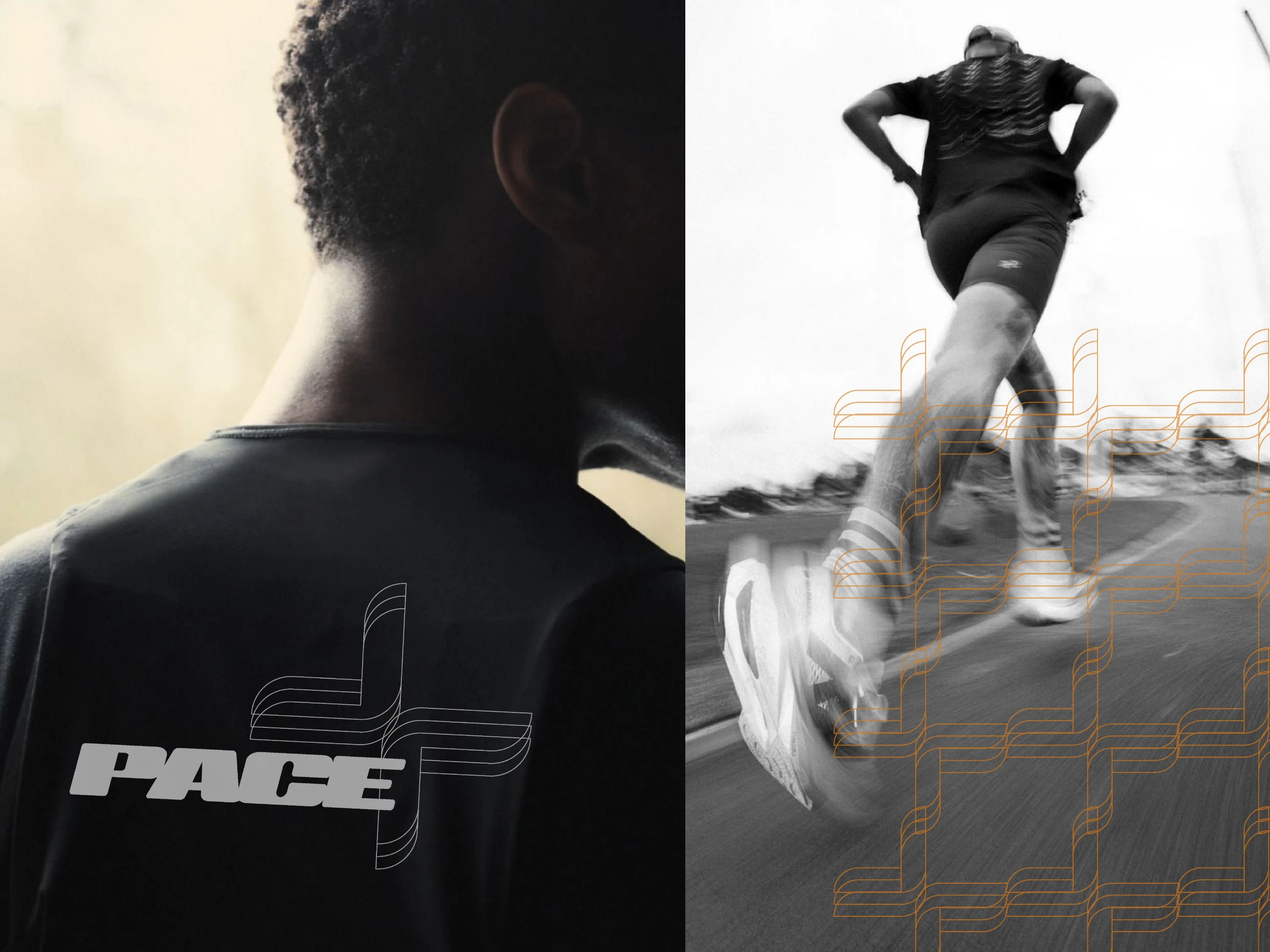
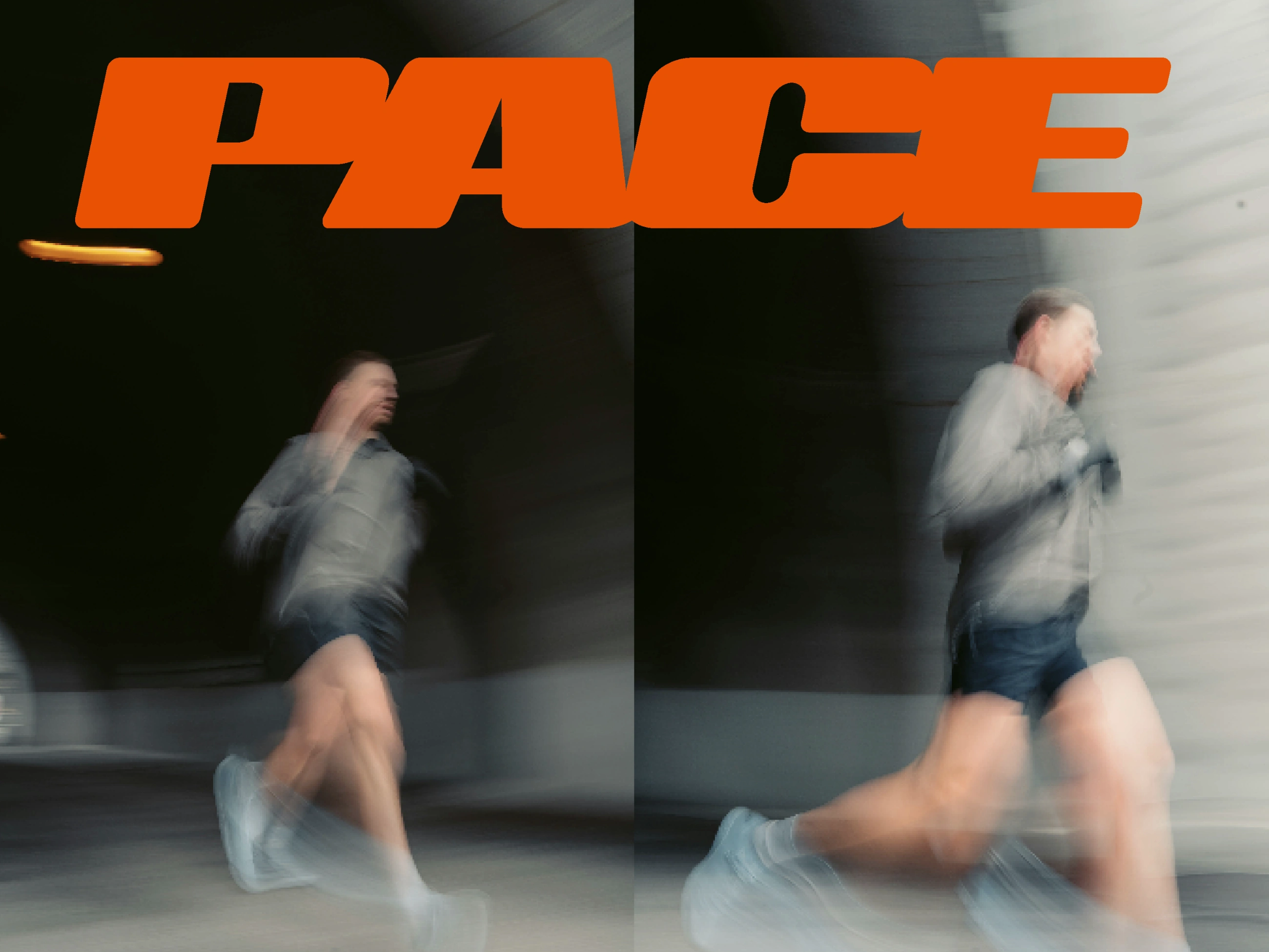
On the left is a merch design printed on a quick-dry running t-shirt. Both images together capture the urban spirit of the city runner.
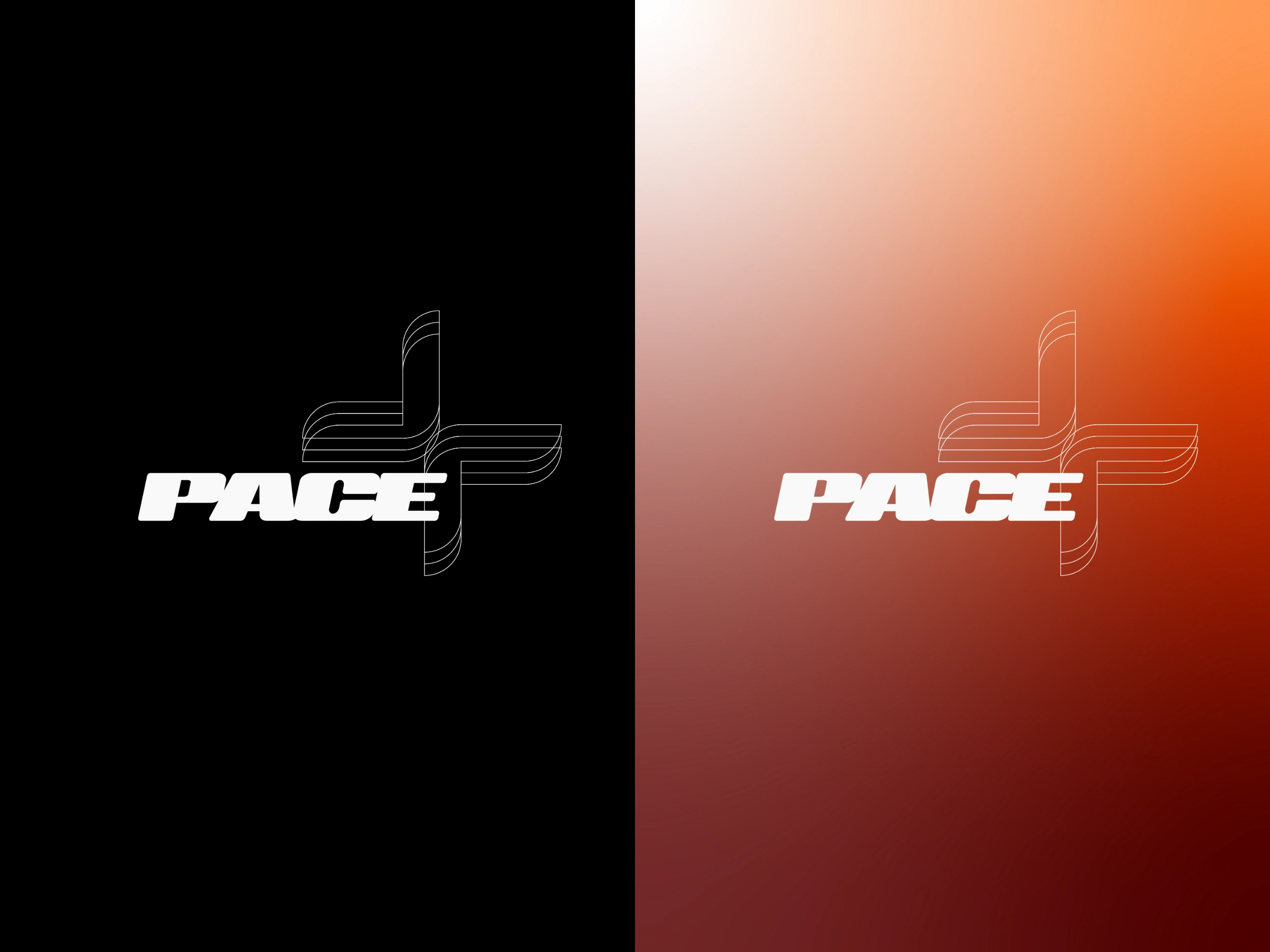
Logo variations displayed across different brand color treatments: dark and the signature color gradient. This showcases the logo’s adaptability and consistency in various visual contexts.
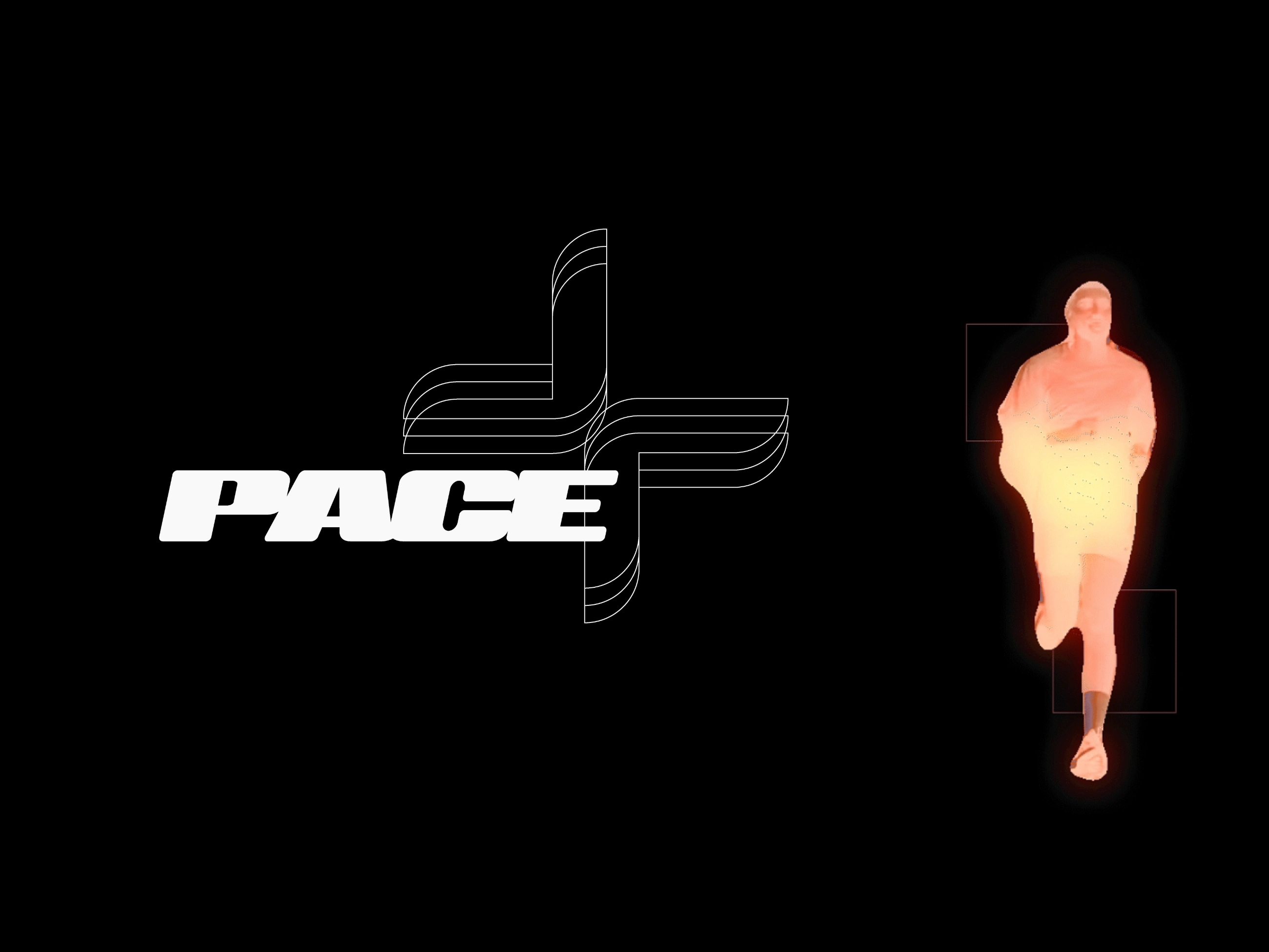
The image on the right illustrates the inspiration behind the brand’s color gradient. It mimics the view through a heat camera, where active bodies glow in bright orange and red tones, symbolizing energy and movement — key elements of the brand’s identity.
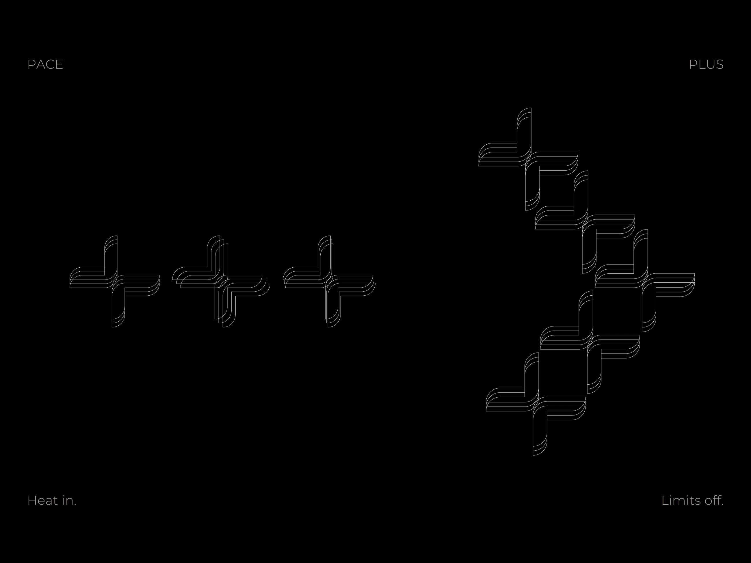
These are the same “+” elements used in the animation above. Some have been further stylized here to emphasize the idea of movement, resembling a running body. This sense of progression is also reinforced by the composition on the right, which resembles an arrow symbolizing “keep moving forward.”
Project Scope
PACE+ is an urban and modern sportswear brand aimed at active individuals living fast-paced city lives. The brand focuses on supporting those who value dedicating intentional time for physical activity as a way to reset, recalibrate and relieve daily stress.
Concept & Approach
The concept centers around movement, energy, and urban resilience. PACE+ combines boldness with simplicity, reflecting the dynamic rhythm of city runners who balance hectic routines with purposeful self-care. The design approach uses strong, clean visuals that communicate strength and forward momentum.
Product Details
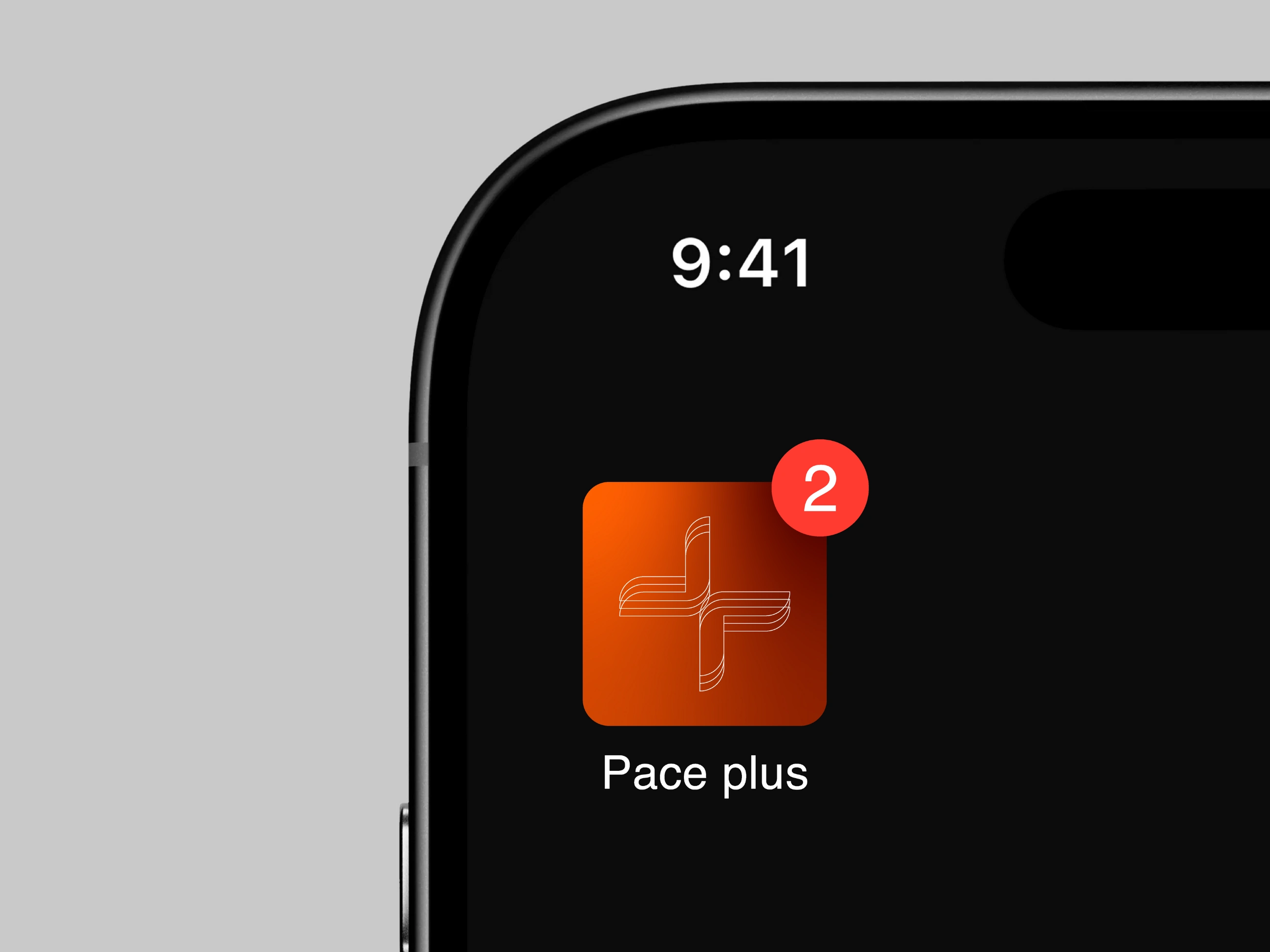
PACE+ offers both performance-focused quick-dry apparel designed for city runners and a companion mobile app. The merch, the quick-dry running shirts, features bold graphics, blending style with functionality for active urban lifestyles. The app’s icon incorporates the brand’s distinct color gradient from deep red to white along with the signature “+” element, reinforcing the brand’s dynamic and energetic identity in the digital space.
Visual Direction
The visual identity features a bold logo that embodies power and motion. The palette stays cool and minimal, using black and white as the base, rounded off with a warm gradient that evokes heat and activity. This direction supports the brand slogan: “Heat in. Limits off.”, expressing energy, endurance and breaking through limits.
Like this project
Posted Aug 1, 2025
Urban, bold, and built for movement. PACE+ is a modern sports brand with a sleek+dynamic identity made to stand out on streets and in gyms. Heat in. Limits off.