Sipps: Brand Design
Amina BJ
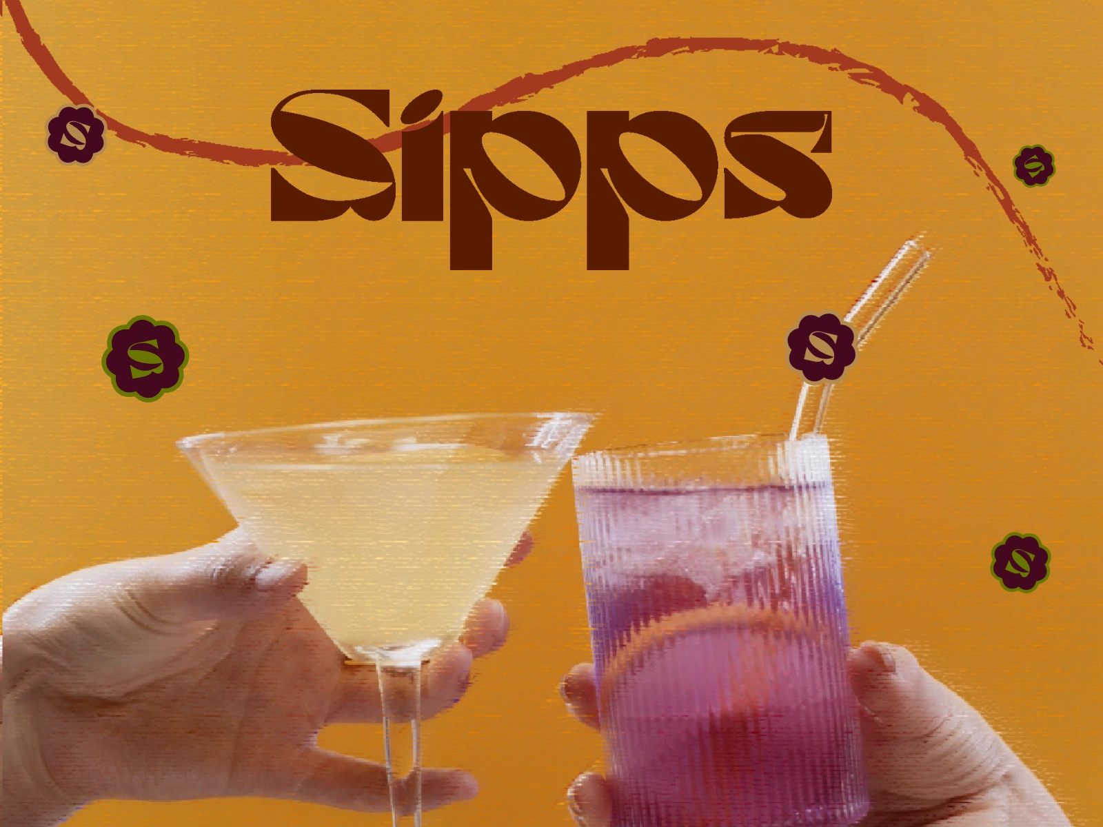
A vibrant and energetic visual designed to highlight the bold, fun and outspoken nature of this low-calorie soda brand. The scene captures a celebratory moment — a toast mid-motion — emphasizing the spontaneity and joy of shared experiences. Bold and intense colors dominate the composition, instantly drawing the eye and evoking excitement. The highly stylized logo and submarks act as the life of the party, standing out like signature accessories at a loud, unforgettable gathering. A playful soda spill stretches across the logo, subtly referencing the kind of happy mess that happens when glasses clink with enthusiasm and joy.
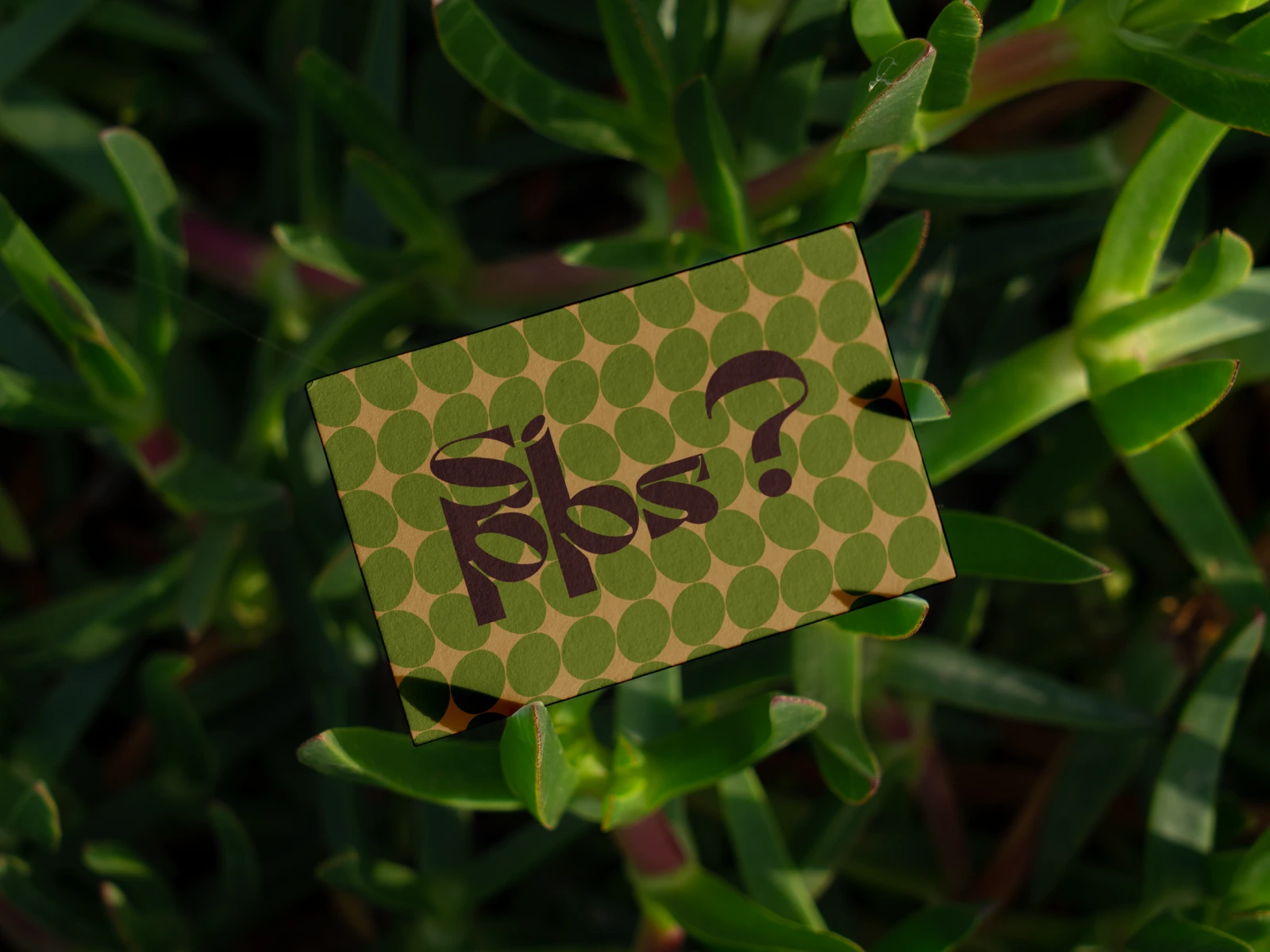
A business card lies among bold green plants, featuring the logo with a playful question mark — tying into the cheeky slogan “Want a Sipps? / Take a Sipps”. The scene feels spontaneous as if the card fell during a cheerful, carefree moment, echoing the brand’s fun and lively spirit.
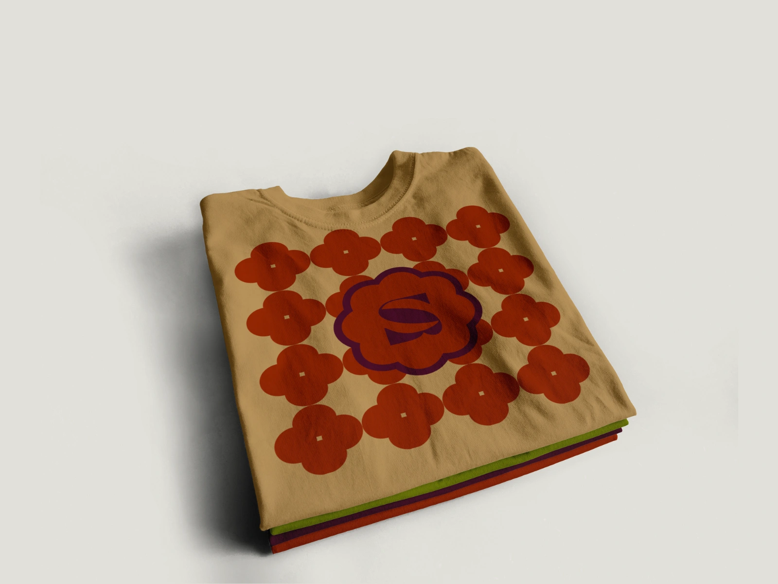
A colorful merch lineup of t-shirts showcases the brand’s submark on the front, each in a different color. Behind each submark, a unique pattern reflects the soda variant it represents: an abstract floral mix of bold red and deep purple for Blood Orange + Blackberry; a rounded green, yellow, and beige pattern evoking small citrus shapes for Lemon + Lime; and a spiky green and yellow design for Rosemary + Thyme — all adding playful, flavorful energy to the wearable branding.
Project Scope
The goal of this project was to develop a vibrant and unforgettable visual identity for Sipps, a bold, low-calorie soda brand with a loud, fun-loving personality. The deliverables included logo design, submarks, packaging design + mockups, merchandise design, brand collateral (business cards) and an overall visual direction that captures the essence of a soda made for parties, spontaneity and joyful messes. The brand needed to stand out in a saturated market by visually reflecting its playful tone and cheeky slogan: “Want a sipps? / Take a Sipps”.
Concept & Approach
Our approach focused on bringing Sipps to life as “the life of the party.” We built the identity around moments of celebration — clinking glasses, vibrant spills and carefree energy. The brand’s tone is cheeky and inviting with a question-mark integrated into the logo to tie back to its central catchphrase. Each soda flavor inspired a visual world of its own, reflected in custom patterns and a color-driven design system. The brand is made to feel like a good time — bold, quirky + unafraid to make a (stylish) splash.
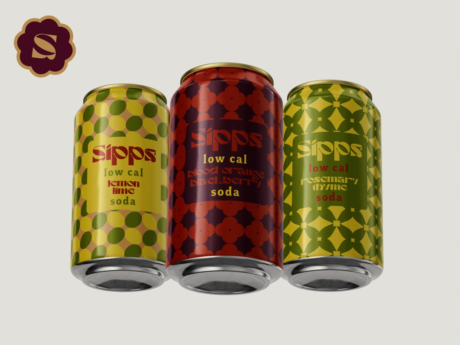
Product and Packaging Details
Each Sipps drink variant comes with its own distinct visual pattern, subtly hinting at the flavor profile.
Blood Orange + Blackberry features an abstract floral pattern in rich red and purple hues.
Lemon + Lime is paired with a rounded, citrus-inspired design in green, yellow and beige.
Rosemary + Thyme has a spiky green and yellow pattern to reflect its herbaceous twist.
Packaging is colorful, punchy, and energetic — designed to stand out on shelves and scream “fun.” Merchandise includes t-shirts with submarks and patterns and business cards that visually extend the brand’s playful moments, sometimes even appearing as if they’ve fallen mid-party.
Visual Direction
The visual language of Sipps is unapologetically bold. It embraces saturated colors, expressive typography and stylized illustrations. The logo and submarks are playful, with movement, spills and dynamic layouts used to convey energy and spontaneity. Lush greenery and lifestyle imagery surround brand elements to enhance the fresh, vibrant vibe. Every visual decision was made to reflect celebration, curiosity and the fizzy, feel-good nature of a soda that doesn’t take itself too seriously — but looks seriously good.
Like this project
Posted Aug 2, 2025
Sipps is bold, bubbly and guilt-free. It's a low-cal soda made for fun, fizz and flavor without the sugar crash. Want a Sipps?