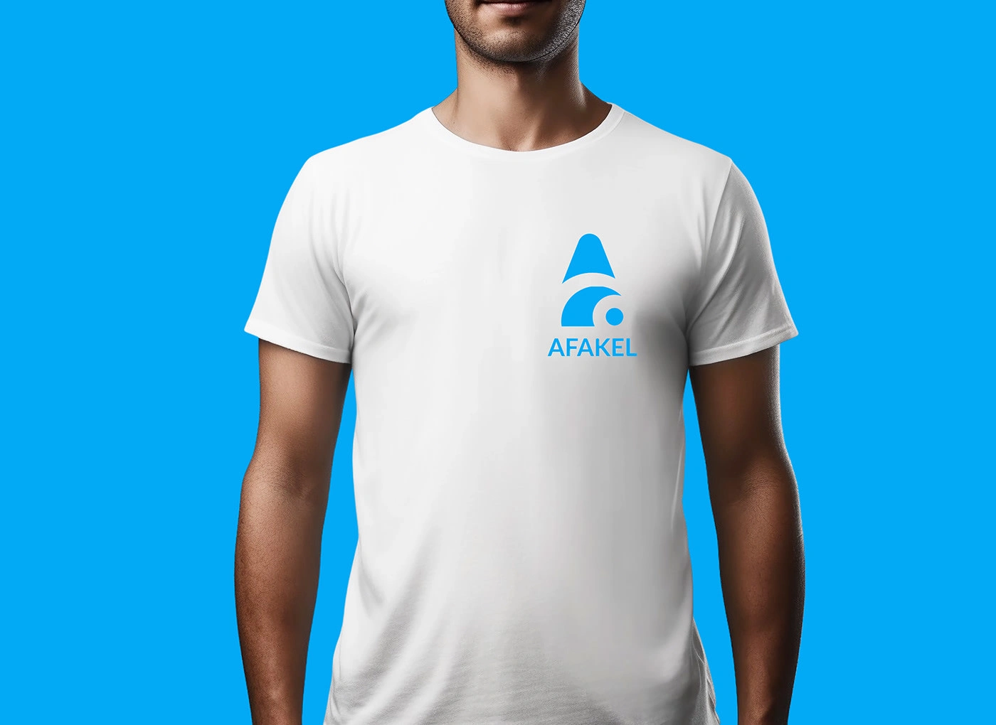
Afakel Brand Identity Development

Victor Eyo


Like this project
Posted Dec 8, 2025
Developed Afakel’s brand identity to enhance trust and clarity, resulting in a 30% rise in brand engagement and stronger user confidence across early audiences.
Likes
1
Views
0


Overview
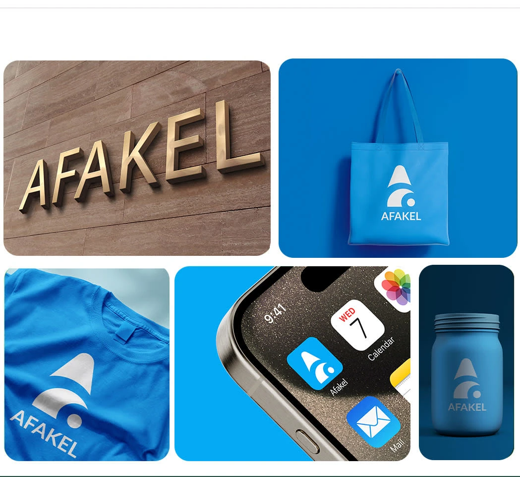
Afakel is a rising health-tech startup committed to making healthcare simple and accessible. I was brought in to develop a brand identity that clearly expressed their mission and built trust with users from the first interaction.
What the Brand Is About
Afakel helps individuals understand their health through easy-to-use digital tools, symptom guidance, and wellness insights. They stand for clarity, support, and dependable health information.
Goal
Build a brand identity that looks trustworthy, human, and modern—something that reflects Afakel’s mission while standing out in the health-tech space.
What I Wanted to Achieve
I wanted to design a brand system that felt calm and reassuring, communicated professionalism, and created instant recognition across all touchpoints.
Challenges
Building a health-tech identity required balancing medical credibility with emotional warmth so the brand didn’t look too clinical or too casual.
Four Problems I Faced
Crafting a logo that communicated health, clarity, and technology in one unified mark.
Developing a color palette that felt calm but still strong enough for a tech brand.
Choosing typography that worked for quick reading and maintained trust.
Ensuring the visual identity scaled well across digital, print, and product communication.
Solutions / Outcome
I designed a clean, meaningful logo supported by a calm yet confident color palette and a modern type system. The full identity was structured to be flexible and consistent across all brand materials. The final result gave Afakel a clear and trustworthy visual presence that strengthened their message and positioned them as a reliable player in the health-tech industry.