Rialto Vacations B2C Marketplace Redesign
Bobby Papson
Rialto Vacations — B2C Experience Redesign
Overview
Rialto Vacations is a marketplace for timeshare resale and rental properties. They needed a modern, intuitive B2C experience that made searching, comparing, and booking resorts feel effortless. I redesigned the end-to-end user journey—from search results to resort details to checkout—focusing on clarity, visual hierarchy, trust cues, and ease of decision-making.
The new UI elevates the brand’s credibility while making complex property data simple and enjoyable to explore.
The Challenge
The original user journey suffered from:
Dense property information with no hierarchy
Confusing pricing structures for rentals vs. purchases
A lack of trust elements during booking
Poor mobile responsiveness
No consistent system for image galleries, amenities, or property attributes
Users struggled to find the right property quickly and confidently, leading to friction during both discovery and checkout.
Rialto needed a clean, modern design that felt closer to Airbnb-level usability and polish while still supporting unique marketplace requirements.
My Approach
I redesigned the full consumer flow using clear information hierarchy, modern card systems, consistent photography treatment, and conversion-focused layout patterns.
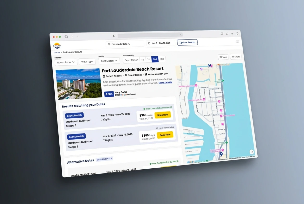
1. Search & Discovery
I introduced a more structured search results layout with:
Larger, high-quality resort imagery
Clean pricing presentation for both rental and resale
Clear labels for unit types and stay durations
Quick-scan badges for amenities & features
Saved properties and comparison indicators
This helps users browse confidently and quickly identify properties that fit their needs.
2. Resort Details Page
The details page received a complete upgrade:
Full-width hero imagery for emotional appeal
Sticky summary card with price, unit details, and dates
Organized sections for amenities, policies, room layouts, and activities
Simplified rate comparison module
Scroll-friendly spacing for long content
The redesign balances inspiration (photos, highlights) with transactional clarity (pricing, unit fits, availability).
3. Property Modal (Quick View)
To support browsing behavior, I designed a quick-view modal allowing users to:
Preview photos
Review key unit details
See pricing & availability
Navigate without breaking flow
This significantly reduces friction by letting shoppers evaluate properties without losing their place.
4. Checkout & Payment Flow
The final booking step needed trust, clarity, and simplicity.
Improvements included:
Streamlined checkout layout
Clear cost breakdown (taxes, fees, security deposits)
Trust elements for payment and secure booking
Mobile-first form improvements
Shortened visual path to completion
The new flow reduces cognitive load and improves overall conversion confidence.
Visual System
For the B2C experience, I built a UI language centered around:
Neutral, calming color palette
Strong typographic hierarchy
Clean photo-driven layouts
Scalable card components
Modern spacing & natural grouping
Subtle shadows and depth for a premium feel
This created a unified, trustworthy shopping experience across all screens.
Impact
The redesigned interface:
Improves property discoverability
Clarifies pricing and availability
Reduces friction in the checkout process
Strengthens trust and brand credibility
Provides a scalable UI system for future resort categories and features
The result is a polished, welcoming marketplace that helps users explore and book resort stays with confidence.
Like this project
Posted Dec 11, 2025
Redesigned Rialto’s B2C marketplace with clearer search, modern resort pages, and a streamlined checkout to improve booking confidence and usability.