RouteMe.ai Wayfinding Tool — Mobile AR Navigation
Bobby Papson
Perfect — here is a polished, high-end case study narrative to follow your hero image on Contra.
This version is structured for clarity, skim-ability, and strong UX storytelling, and matches the tone of your other elevated portfolio pieces.
You can copy/paste sections directly into Contra’s content blocks.
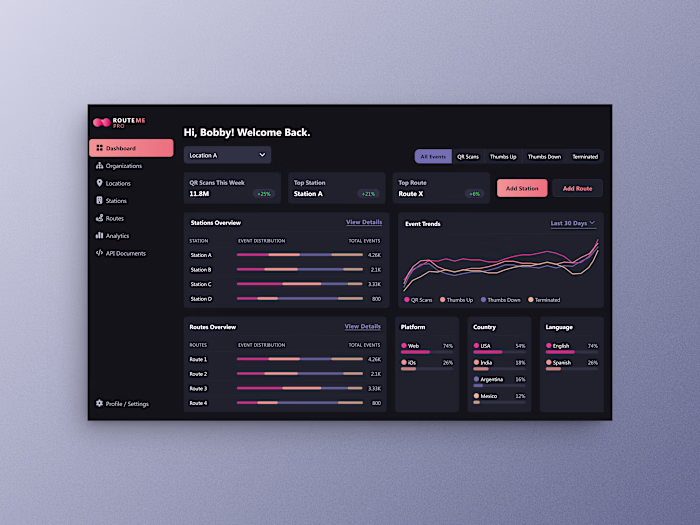
RouteMe.AI Wayfinding Tool
Overview
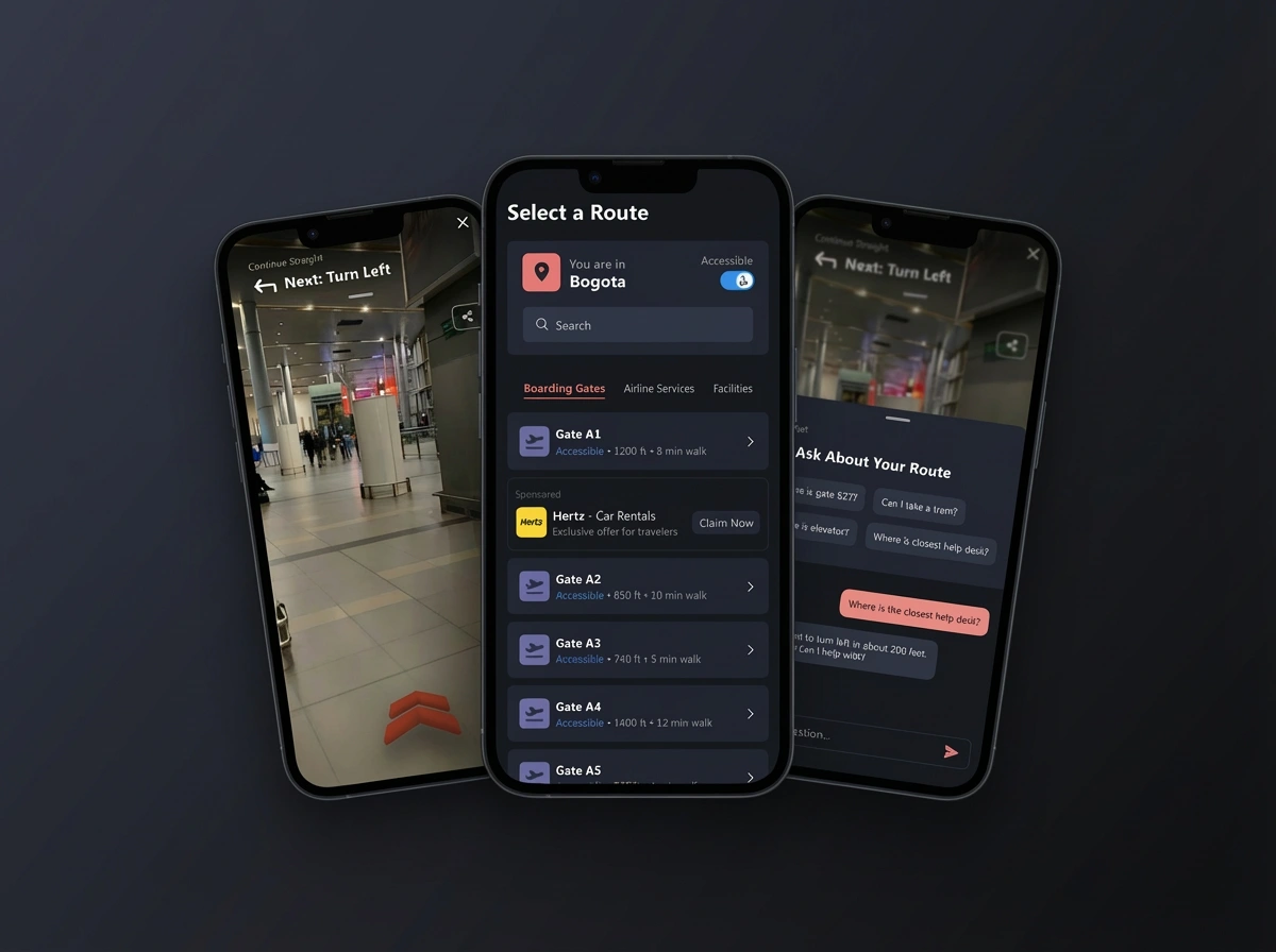
RouteMe.AI partnered with me to redesign their mobile wayfinding experience—an indoor navigation tool that helps travelers move confidently through busy airports. The product needed clearer guidance, smoother route recording, and a more accessible interface for users with diverse mobility needs.
The goal was simple:
Make indoor navigation feel as intuitive as following directions outdoors.
The Challenge
Airports are chaotic environments. Travelers rush, signage varies, and outdated maps don’t reflect real-world obstacles like construction or closed pathways. RouteMe.AI wanted to solve this by allowing staff to record accurate routes, overlay AR guidance, and provide step-by-step assistance.
But the original experience had several gaps:
Route recording was unclear and difficult to follow
AR navigation lacked visual hierarchy and stability
Accessibility cues weren’t consistent across screens
Key actions—recording, reviewing, and submitting routes—felt disconnected
The product needed a modern, scalable design language and a more intentional flow.
My Approach
I redesigned the experience from the ground up, focusing on clarity, control, and guided support across three core functions:
1. Route Recording Setup
Users begin by selecting their organization, airport location, and origin gate.
I simplified this workflow with:
A streamlined card-based hierarchy
Strong visual anchors for primary actions
Clear separation between setup inputs and next steps
This helped reduce mistakes before field recording begins.
2. AR Orientation & Navigation
During recording, the app uses the camera to capture the travel path.
I improved this flow through:
Cleaner overlays with subtle, stabilized directional indicators
Instructional onboarding (“Hold your phone upright”, “Let’s get set up”)
A calm visual system that avoids clutter while standing out against busy environments
The goal was to keep staff focused, steady, and confident during the process.
3. Route Review & Submission
Once recording is complete, users review the route details:
Annotated wayfinding notes
Timestamped error flags
A preview of the captured video
Clear actions for re-recording or submitting to RouteMe AI
I designed this screen to feel more like a professional QA workflow, reducing friction and ensuring accurate data before models process the route.
Visual System
The final design introduced:
A dark UI optimized for indoor/low-light environments
Clean, minimal AR overlays
A softer, modern color palette for wayfinding cues
Scalable components that adapt across mobile variants
Each element reinforces clarity and trust—critical for high-stakes environments like airports.
Impact
The redesigned experience created measurable improvements:
Faster route recording due to reduced cognitive load
Clearer AR cues that remain readable in varied environments
More consistent submissions, improving the quality of AI-generated navigation
A scalable foundation for future features like indoor maps, real-time alerts, and accessibility presets
This project reflects my ability to transform complex mobility flows into intuitive, human-centered experiences.
Closing
RouteMe.AI's updated design elevates wayfinding from a technical tool to a guided experience—giving staff the confidence to create accurate routes and helping travelers navigate airports with ease.
Like this project
Posted Dec 11, 2025
Redesigned RouteMe.ai’s mobile wayfinding tool with clearer AR navigation, smoother route recording, and accessible flows for staff in complex environments.