RouteMe Pro Dashboard Redesign
Bobby Papson
Project Overview
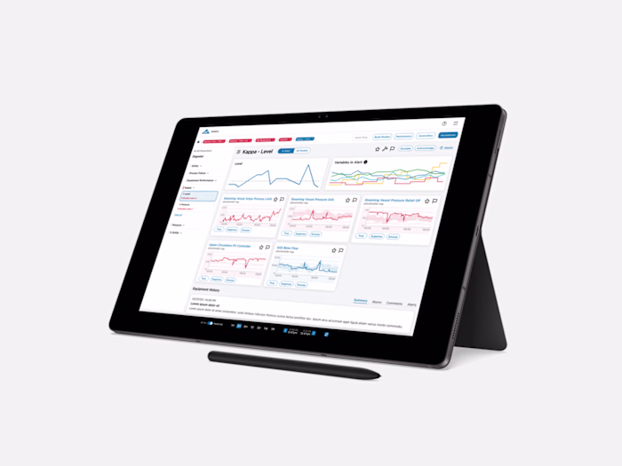
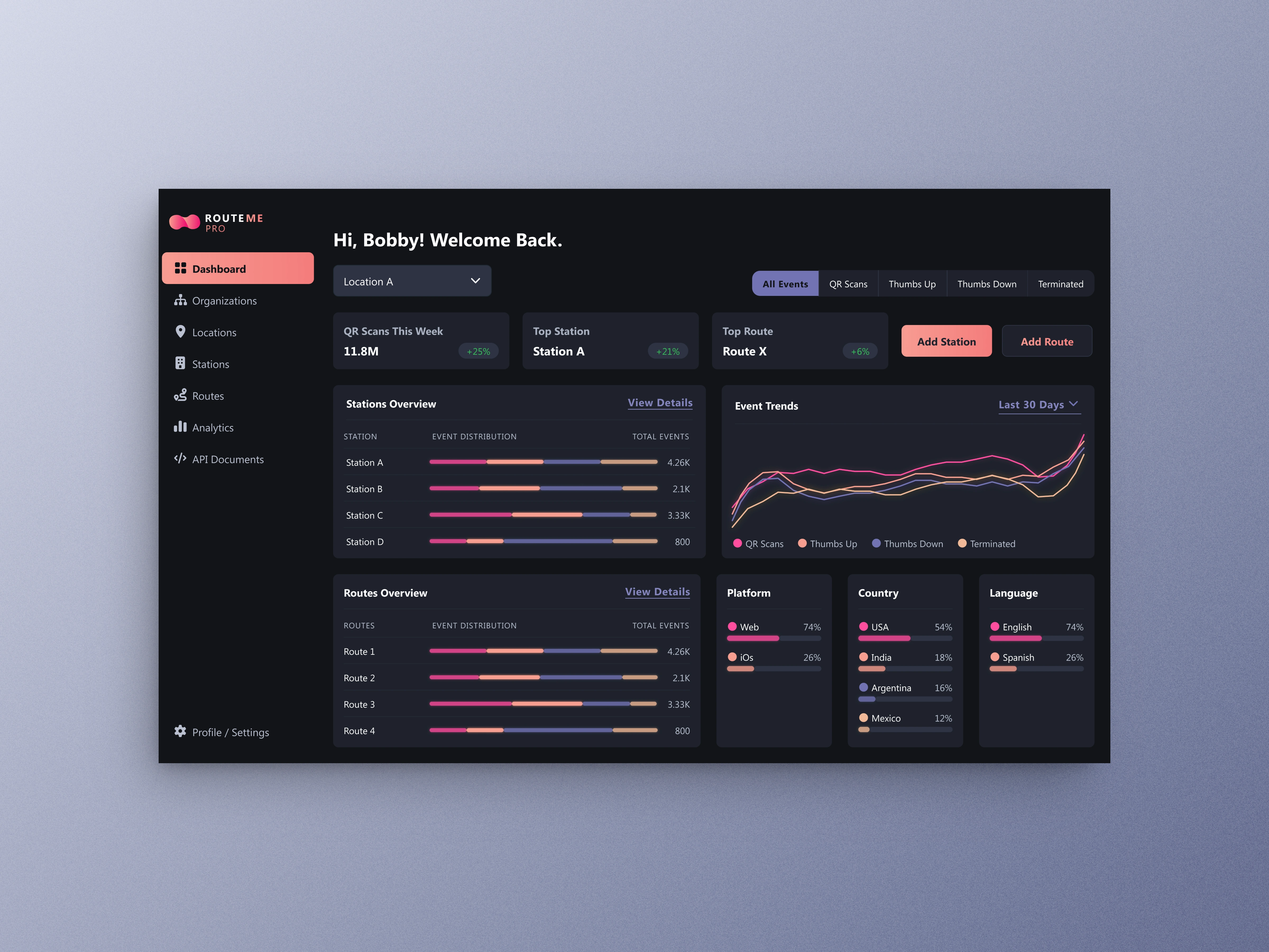
RouteMe Pro is a dashboard designed for organizations to track real-time navigation events across stations, locations, and routes. The goal was to redesign the experience into a modern, intuitive analytics tool — improving clarity, usability, metric visibility, and navigation hierarchy. I delivered a polished, production-ready UI with improved workflows, updated data visualization, and a scalable design system.
My Role
Lead Product Designer (UX + UI + Design System)
Responsibilities included:
UX audit & information hierarchy redesign
Full UI design & component system
Data visualization enhancements
Interaction flows
Responsive layouts
Developer-ready handoff
The Challenge
RouteMe Pro needed a cleaner, more modern way to display large volumes of navigation and event data. The original layout lacked:
Clear visual hierarchy
Scalable card and module patterns
Easy access to multi-location metrics
Readable charts for trend analysis
A cohesive design system for future features
The challenge was to create an interface that felt fast, clear, and enterprise-grade, while still being visually approachable.
The Solution
I redesigned the dashboard using:
Modular card components so organizations can scan data instantly
Color-coded statuses and metrics for quick insight
A flexible filter + top-level action bar for faster workflows
Accessible typography + spacing system for readability
Modernized charts to reveal trends at a glance
A dark-mode-ready visual foundation for future scaling
The result is a streamlined professional dashboard that scales effortlessly across organizations and devices.
Like this project
Posted Dec 11, 2025
Improved RouteMe Pro’s dashboard with clearer hierarchy, refined workflows, and a scalable UI system built for enterprise growth.