Aetna Rewards Center
Chris Fredricks
Aetna’s reward center was created to encourage users to complete health-related activities in exchange for gift cards or fitness products.
After running user testing on the initial MVP, the product team identified potential improvements.
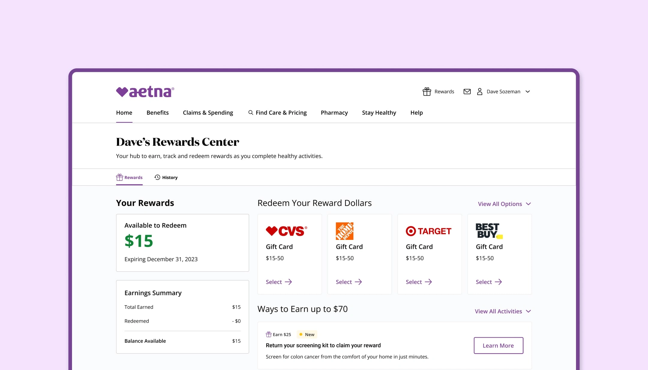
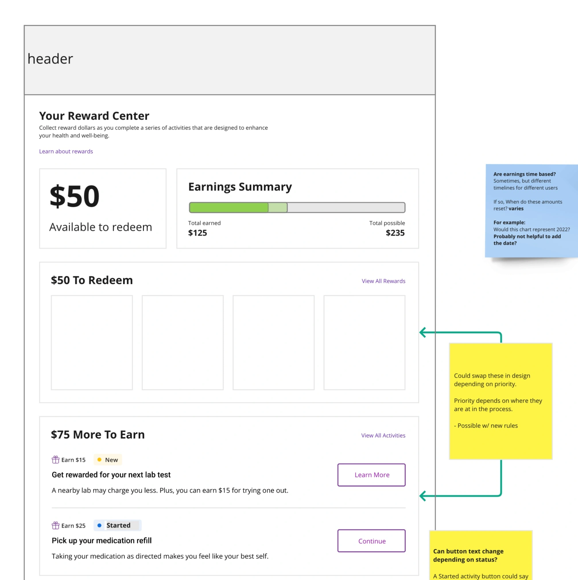
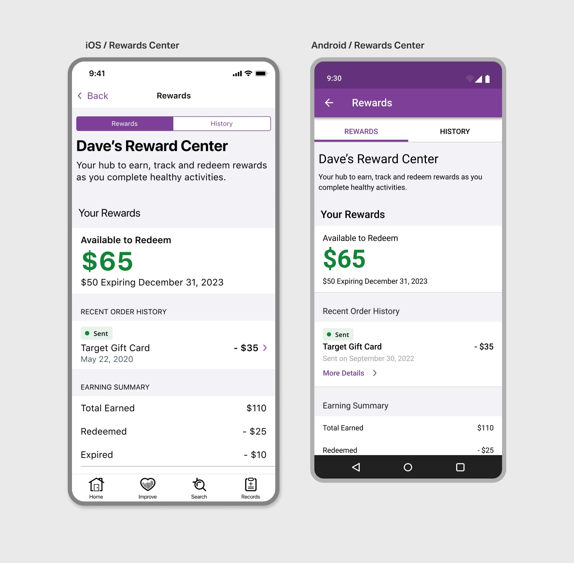
The revised Rewards center displays content dynamically depending on the user's previous activity.
I worked alongside UXR, content strategists, accessibility experts, and engineers as I iterated on concepts for the Reward Center.
The Problem
The Rewards Center was initially rolled out to Medicare patients (65 years and older). The users had difficulty understanding many aspects of the rewards center including:
How much they could earn by completing health activities
The status of rewards earned and orders placed
The Research
The existing design used a donut chart to display important information to the users related to their activity in the Rewards Center. A visualization like this remained a requirement of the feature. However, it had performed poorly in testing, so I started by researching best practices for communicating financial information like this and patterns that are familiar to users.
Early explorations on how to visualize earnings
Familiar Patterns
Through my research into other rewards programs, I discovered an overuse of visuals that didn't help make the activity easier to understand.
The pattern that did work though comes from banking or credit card statements. Up top you can always see the money you have, what you've earned, and what you've spent.
In addition to following a bank statement pattern, I proposed dynamically displaying the redemption and activity options to ensure users could easily discover the content they were there to find.
Like this project
Posted Aug 29, 2023
Diving into user's needs, recognizable design patterns, and best practices I created an easy-to-use platform that sends out $50+ million in rewards per year.