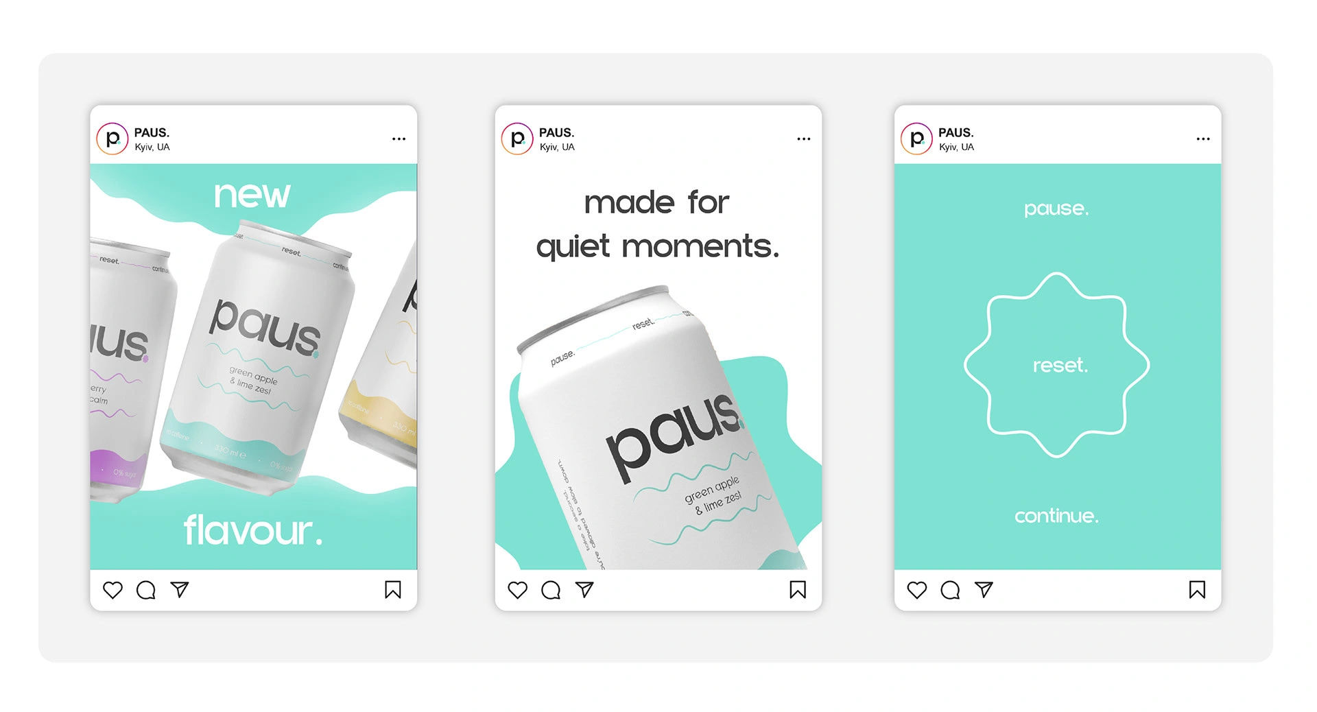
PAUS Soda - Branding
Devowise Studios
PAUS — Building a Mindful Beverage Brand Through Identity & Digital Storytelling
Overview
At Devowise Studios, we conceptualized and designed PAUS, a modern soda brand inspired by the idea of slowing down and embracing moments of balance in everyday life. The project combined brand strategy, visual identity, packaging design, and an immersive digital experience to demonstrate how thoughtful branding can communicate emotion beyond the product itself.
From the identity system to the responsive landing page, every touchpoint was crafted to reinforce PAUS as more than a beverage—it represents a lifestyle centered around mindfulness, simplicity, and intentional living.
The project emphasizes emotional branding, visual consistency, and digital storytelling, creating a launch-ready brand experience that connects with modern consumers through both design and narrative.
The Challenge
Consumer beverage brands operate in highly competitive markets where differentiation extends beyond packaging and flavor. The challenge was to create a brand that immediately communicates a sense of calm and authenticity while maintaining a premium, contemporary appearance.
We set out to create a brand experience that would:
Establish a distinctive visual identity rooted in mindful living.
Translate brand values consistently across packaging and digital experiences.
Communicate the product through storytelling rather than traditional advertising.
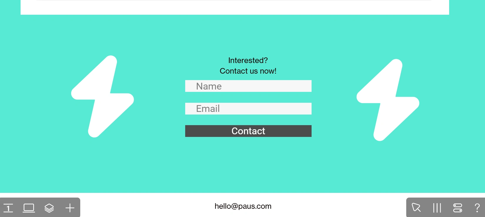
Deliver an immersive, responsive website that complements the physical brand.
Build a scalable identity system capable of supporting future product variations and campaigns.
Project Objectives
To achieve these goals, we focused on:
Developing a memorable and emotionally driven brand identity.
Designing cohesive packaging that reflects the brand philosophy.
Creating a storytelling-first digital experience.
Building responsive layouts optimized for every device.
Maintaining consistency across all visual touchpoints.
Establishing a flexible design system for future product expansion.
Our Role
Our team led the project from concept through digital execution, including:
Brand Strategy
Creative Direction
Visual Identity Design
Logo Design
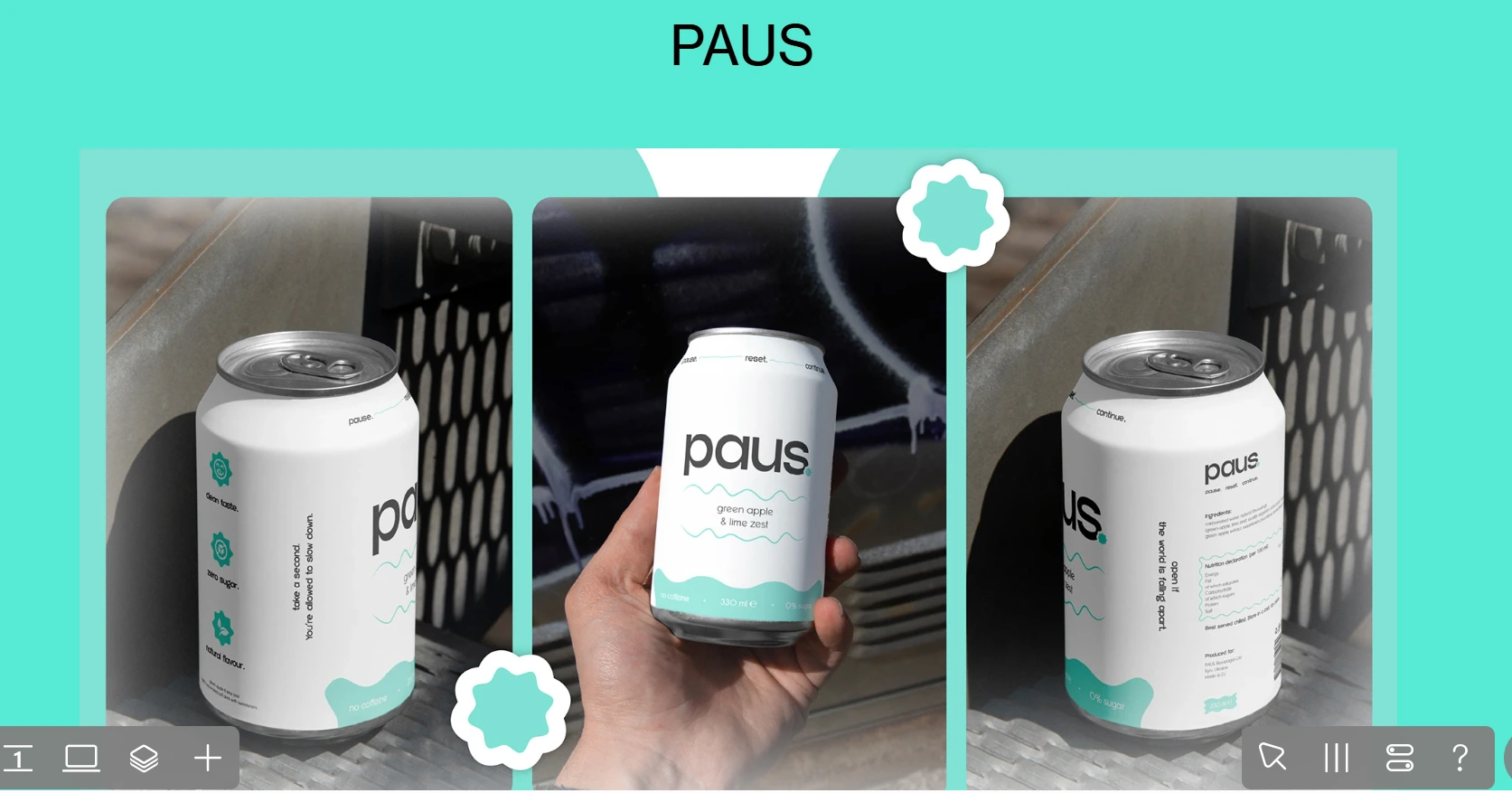
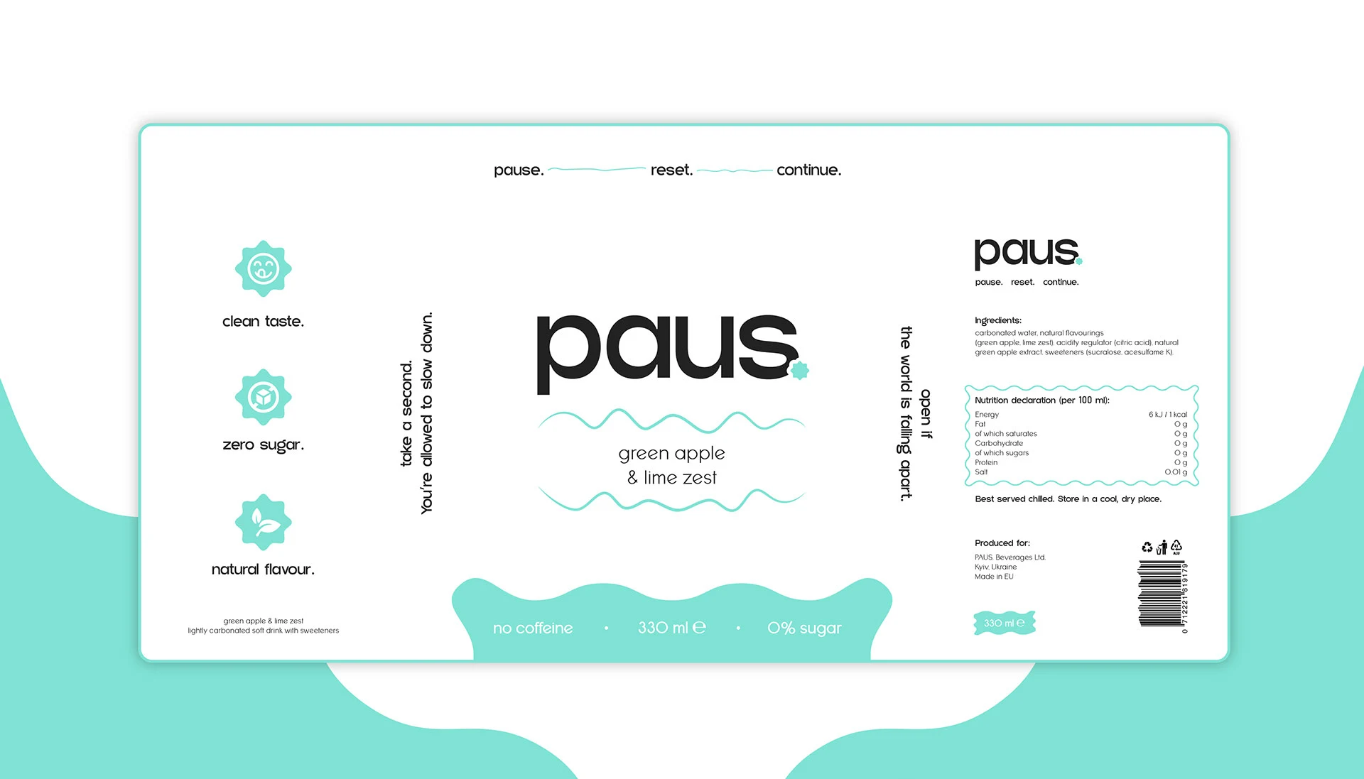
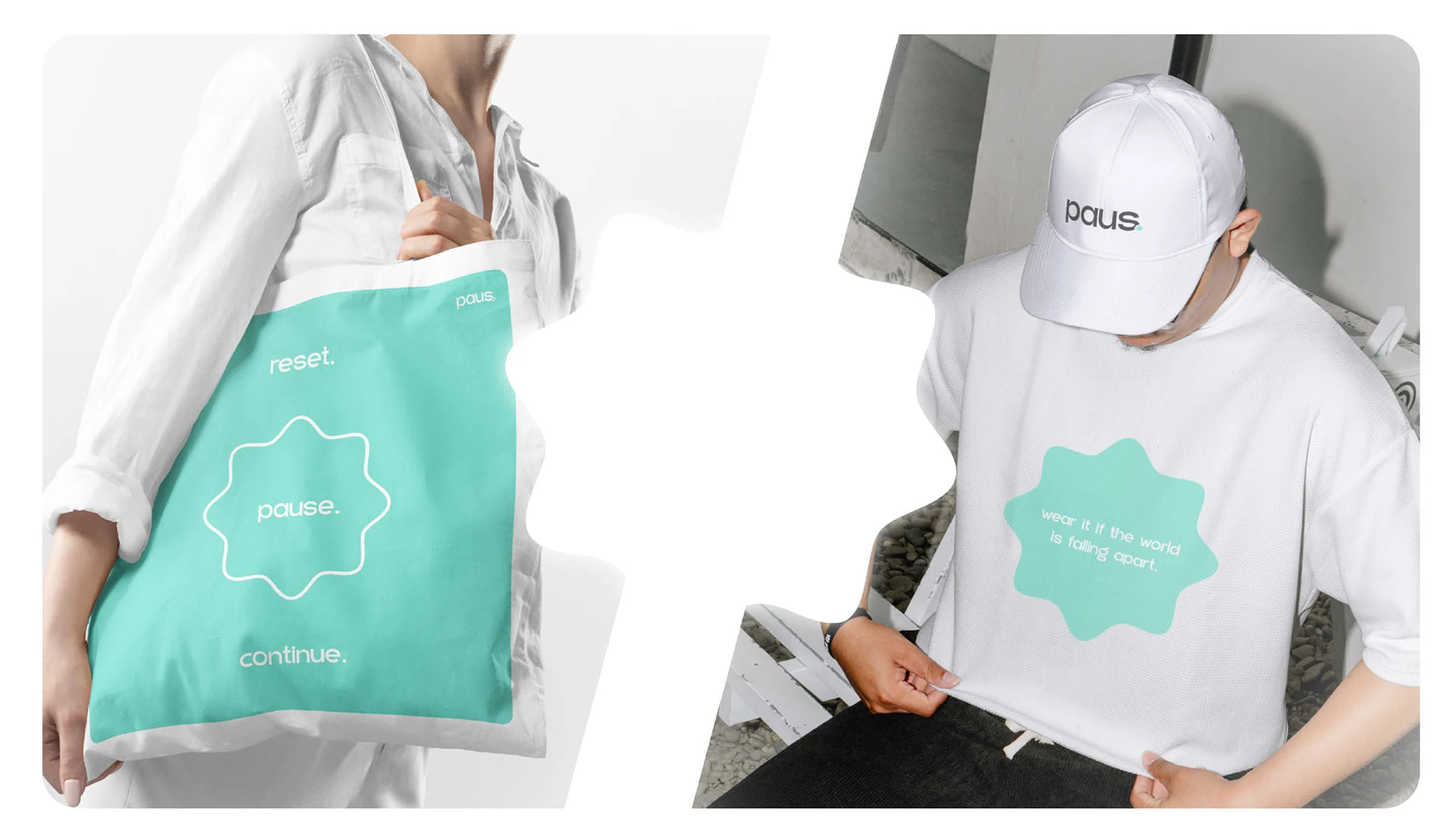
Packaging Design
UX Strategy
Information Architecture
Landing Page Design
Responsive Development
Design System Creation
Our Process
1. Brand Discovery & Creative Strategy
The project began by exploring the concept of "pause" as a lifestyle rather than simply a product message.
Research into wellness, modern consumer behavior, and minimalist design informed a creative direction focused on calm, clarity, and intentional living. These insights shaped every aspect of the visual identity and digital experience.
The brand journey follows a natural progression:
Discover → Connect → Experience → Enjoy
2. Brand Identity Development
A complete visual identity system was created to communicate the brand's personality across every touchpoint.
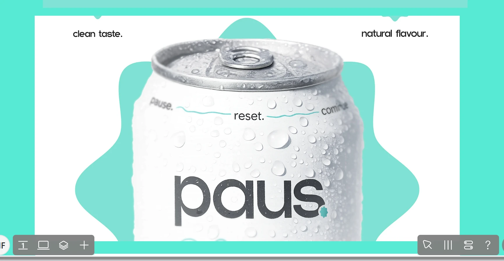
The identity combines soft color palettes, refined typography, and minimalist compositions to establish a calm and approachable aesthetic while maintaining a premium visual presence.
Packaging, logo design, typography, and supporting brand assets were developed as part of a unified system that ensures consistency across future product releases.
3. Digital Experience Design
The landing page was designed to extend the physical brand into an immersive digital experience.
Key design decisions included:
Spacious layouts supported by generous whitespace.
Soft, calming color palettes that reinforce the brand personality.
Minimal typography with a strong visual hierarchy.
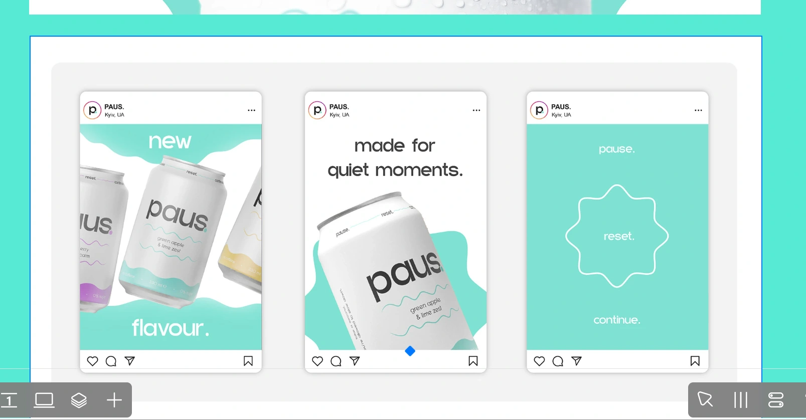
Editorial-style storytelling that introduces the brand before the product.
High-quality product imagery and packaging showcases.
Smooth scrolling interactions that encourage exploration.
Responsive layouts optimized across desktop, tablet, and mobile devices.
Every section was designed to create an emotional connection while naturally guiding visitors through the brand story.
4. Responsive Development
The website was developed in Readymag using immersive layouts and smooth scrolling interactions that enhance storytelling without distracting from the brand.
Careful attention was given to responsiveness, visual consistency, and interaction quality, ensuring the experience remains polished across a wide range of devices and screen sizes.
Key Features
The completed brand experience includes:
Complete visual identity system.
Custom logo and typography.
Premium packaging design.
Storytelling-focused landing page.
Responsive layouts for desktop, tablet, and mobile.
Editorial-inspired product presentation.
Smooth scrolling interactions.
Consistent design system for future product expansion.
Flexible digital foundation for campaigns and new product launches.
Technology Stack
Brand Design
Adobe Illustrator
Adobe Photoshop
Experience Design
Readymag
Design System
Responsive Layout System
Component-Based Visual Framework
Outcome
The final concept delivers a cohesive brand experience that successfully combines visual identity, packaging, and digital storytelling into a unified consumer experience.
Key outcomes include:
A distinctive brand identity that communicates calm, balance, and modern living.
Consistent visual language across physical and digital touchpoints.
An immersive landing page that strengthens emotional engagement through storytelling.
A responsive experience optimized across multiple devices.
A scalable brand system prepared for future product collections, campaigns, and retail expansion.
Key Takeaways
PAUS demonstrates how strategic branding, thoughtful visual design, and immersive digital experiences can transform a conceptual beverage into a compelling lifestyle brand.
By combining a cohesive identity system, premium packaging, editorial-inspired storytelling, and responsive web design, we created a launch-ready concept that showcases how modern consumer brands can build meaningful emotional connections while maintaining long-term scalability.
Like this project
Posted Mar 28, 2026
Minimal soda brand identity and landing page built in Readymag, focused on calm aesthetics and modern storytelling.
Likes
1
Views
18