Built with Framer
PrismPay - Designing a Seamless Payment Interface

Devowise Studios


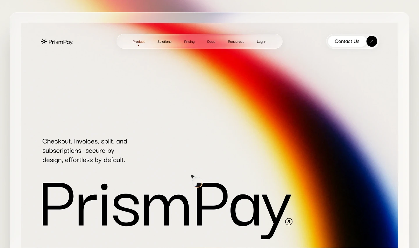
PrismPay — Designing a Clear & Trust-Centered Digital Payment Experience
Overview
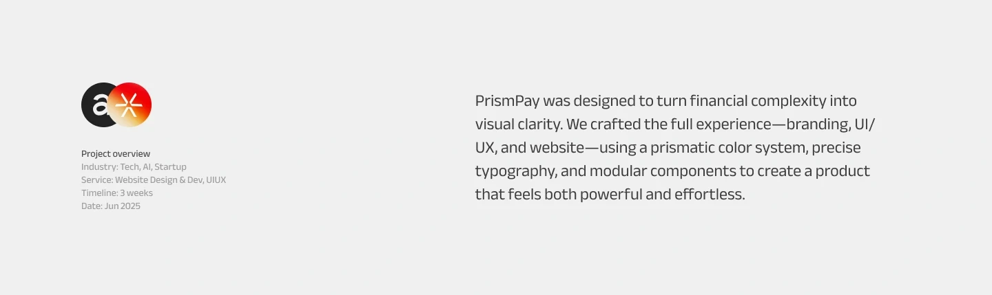
At Devowise Studios, we designed PrismPay, a modern fintech payment platform concept focused on making digital transactions simple, transparent, and effortless.
Financial applications often overwhelm users with complex interfaces and unclear workflows. PrismPay reimagines the payment experience by combining intuitive UX, thoughtful information architecture, and a clean visual language that helps users complete transactions with confidence.
The project emphasizes clarity, trust, and usability—creating a scalable fintech experience that simplifies everyday financial interactions while maintaining a modern and professional aesthetic.
The Challenge
Digital payment platforms frequently present users with crowded interfaces, complicated navigation, and limited transaction transparency. These issues increase cognitive load and reduce confidence during critical financial actions.
We set out to design a platform that would:
Simplify complex payment workflows.
Build trust through transparent transaction feedback.
Reduce friction throughout the payment journey.
Improve visibility into payment history and account activity.
Create a scalable interface capable of supporting future financial services.
Project Objectives
To achieve these goals, we focused on:
Designing an intuitive payment experience.
Improving transaction clarity through thoughtful information architecture.
Building a consistent and reusable design system.
Creating responsive layouts for every device.
Reducing cognitive load through clean interface design.
Supporting business goals with strategically placed calls-to-action.
Our Role
Our team led the project from concept through high-fidelity interface design, including:
UX Strategy
User Research
Information Architecture
User Journey Mapping
Wireframing
UI Design
Design System Creation
Interactive Prototyping
Responsive Experience Design
Developer Handoff
Our Process
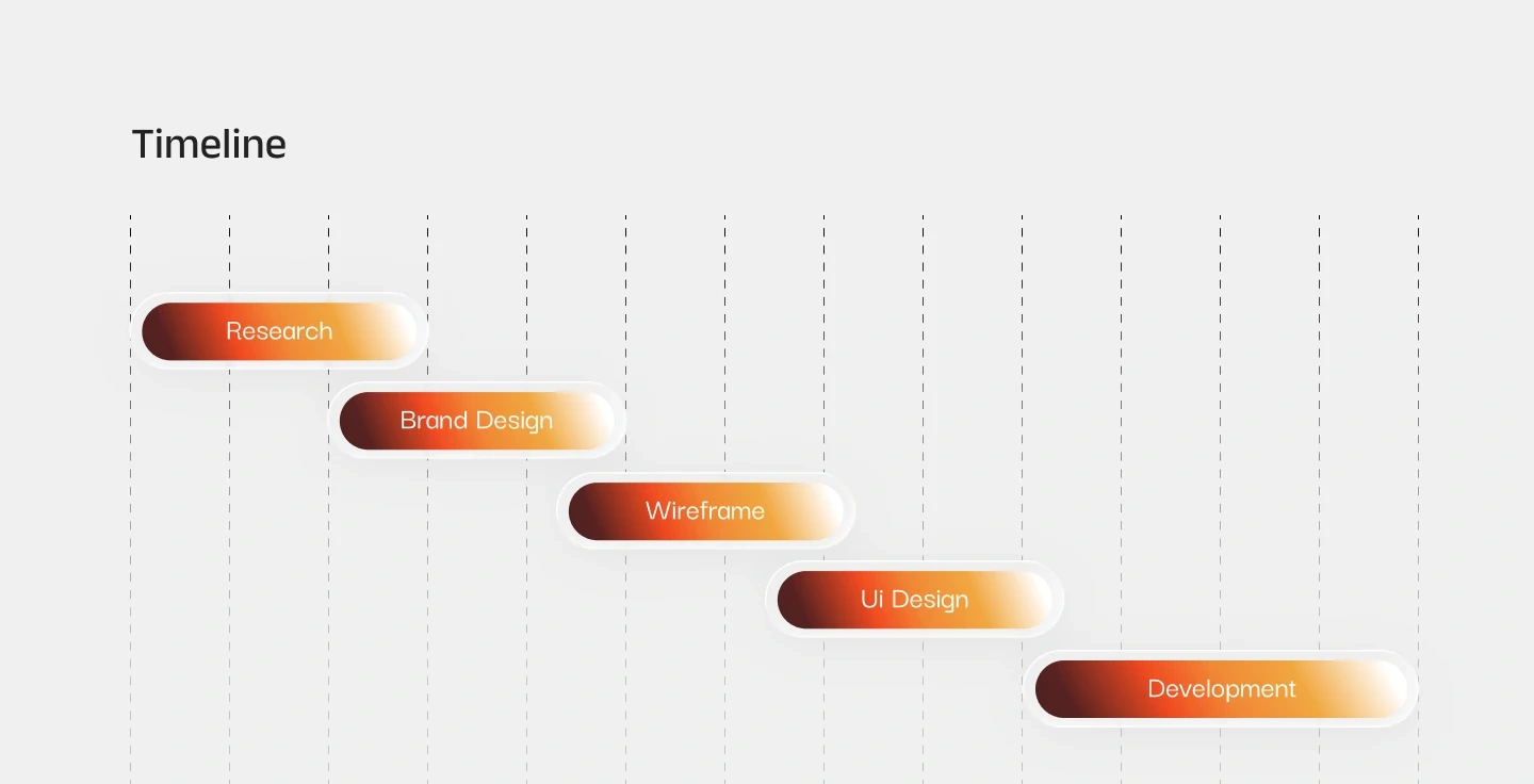
1. Discovery & UX Strategy
We began by researching leading fintech products to identify common usability challenges and user expectations surrounding digital payments.
The research highlighted the importance of transaction transparency, simplified navigation, and trust-building interactions. These insights shaped a user journey focused on minimizing friction while helping users confidently complete financial tasks.
The experience follows a simple progression:
Send → Confirm → Track → Complete
2. Information Architecture
A clear content hierarchy was established to simplify financial interactions and make important information immediately accessible.
Payment actions, transaction history, account balances, and status updates were organized into intuitive sections that reduce decision fatigue while improving overall usability.
3. UI Design
The visual design combines modern fintech aesthetics with practical usability principles to create a clean, approachable interface.
Key design decisions included:
Minimal layouts with generous whitespace.
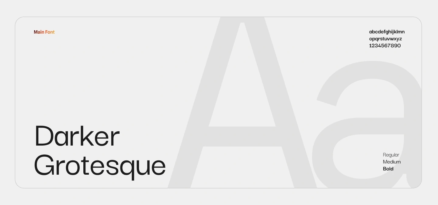
Strong typography hierarchy for effortless scanning.
Card-based interface patterns for transaction summaries.
Clear visual feedback throughout payment workflows.
Consistent spacing and reusable UI components.
Strategic use of color to reinforce payment status and user actions.
Balanced visual hierarchy that prioritizes important financial information.
Every screen was designed to reduce cognitive load while reinforcing confidence during every transaction.
4. Interactive Prototyping
Interactive prototypes were created to validate payment flows, navigation patterns, and user interactions before finalizing the design.
Multiple iterations refined transaction feedback, navigation behavior, and interface consistency, resulting in a polished experience optimized across desktop, tablet, and mobile devices.
Key Features
The completed platform includes:
Modern payment dashboard with intuitive navigation.
Streamlined money transfer workflows.
Real-time transaction status tracking.
Clear payment confirmations and feedback.
Organized transaction history.
Responsive layouts for desktop, tablet, and mobile.
Component-based design system.
Interactive prototypes for usability validation.
Scalable interface prepared for future fintech features.
Technology Stack
Design
Figma
Design System
Auto Layout
Component-Based Design System
Prototyping
Interactive Prototypes
Layout
Responsive Grid System
Outcome
The final design delivers a clean and intuitive payment experience that simplifies digital transactions while strengthening user trust through transparency and thoughtful interface design.
Key outcomes include:
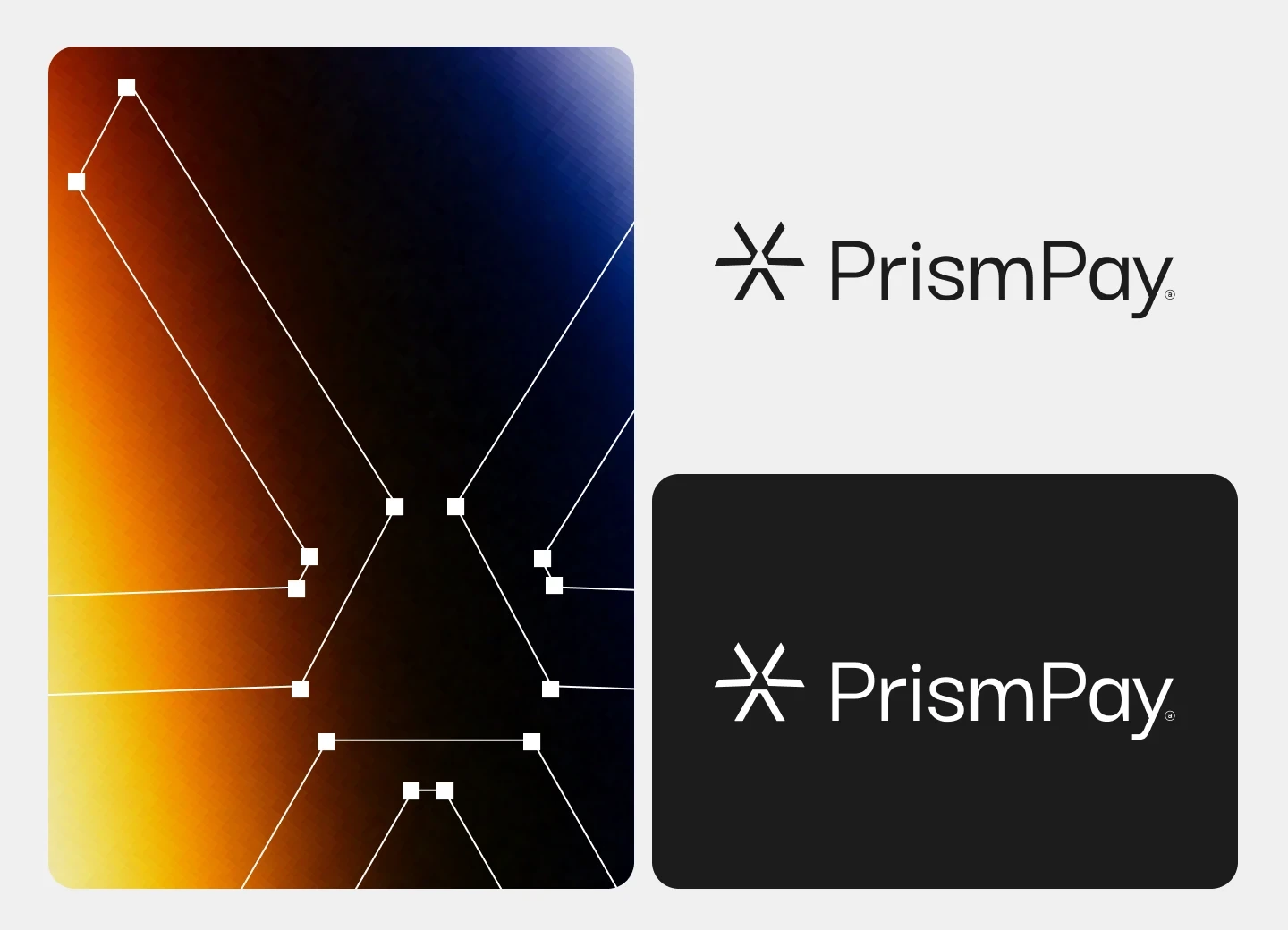
A modern visual identity that reinforces credibility and professionalism.
Simplified payment workflows that reduce friction throughout the user journey.
Improved transaction visibility through clear status updates and confirmations.
Consistent user experience across desktop, tablet, and mobile devices.
A scalable design foundation prepared to support future payment features and platform growth.
Key Takeaways
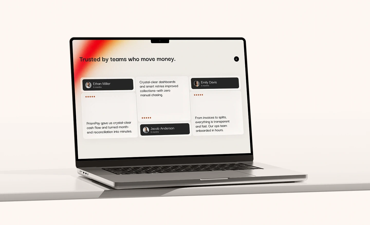
PrismPay demonstrates how thoughtful UX strategy and modern interface design can transform complex financial interactions into experiences that feel simple, secure, and approachable.
By combining structured information architecture, a scalable design system, responsive layouts, and intuitive payment workflows, we created a fintech concept that balances business objectives with user needs—resulting in a digital experience that builds confidence with every transaction.
Like this project
Posted Jun 17, 2026
PrismPay is a modern fintech UI/UX project built in Figma and Framer, designed for seamless payments, clear transactions, and a clean, secure experience.