Janus Brand Identity Design
Muhammad Ibrahim
Case Study: Janus - A Modern Identity Rooted in Mythology & Dual Vision
Client Overview
Janus is a brand inspired by the Roman god of duality symbolizing past & future, transitions, gateways, and strategic foresight. The company needed a visual identity that captures this philosophical depth while remaining contemporary, scalable, and globally recognizable.
Design Objectives
The Janus brand required a logo system that communicates:
Duality and vision
Forward-looking innovation
Classical elegance with modern minimalism
Strength, reliability, and intelligence
A premium, iconic identity
The challenge was balancing the rich symbolism of Janus with a clean, modern style suitable for digital and large-format applications.
Concept Development
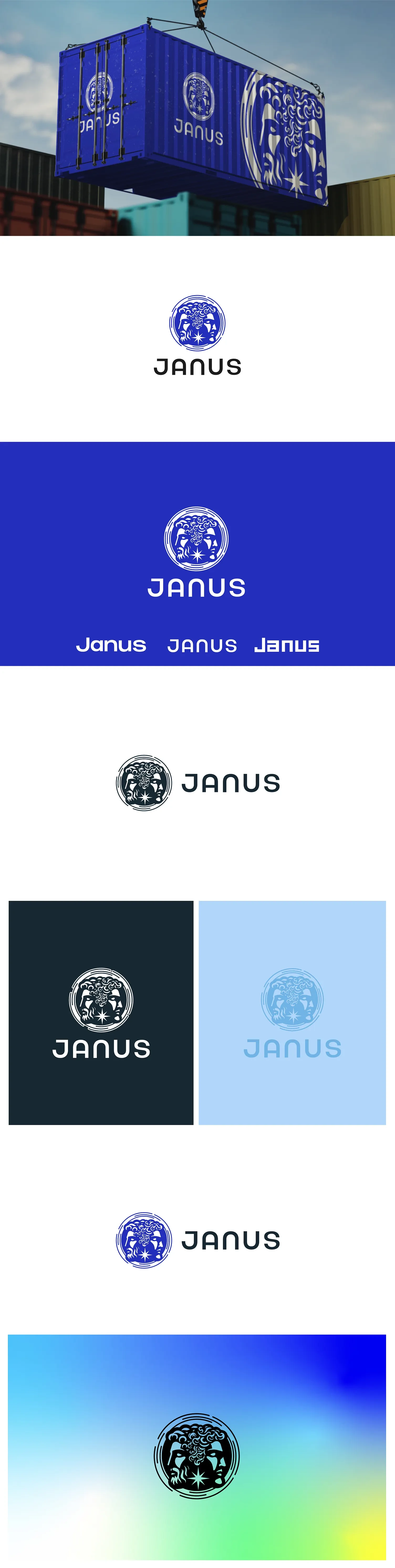
1. The Brandmark
The central emblem features:
Dual Faces of Janus
Two faces looking in opposite directions - representing:
Past + Future
Wisdom + Strategy
Protection + Progress
The faces are stylized with modern linework, creating a refined, artistic identity that feels both mythological and futuristic.
Cosmic Elements
Stars and celestial lines symbolize:
Guidance
Navigation
Enlightenment
A sense of expanded perspective
This reinforces Janus as a brand of insight and clarity.
Circular Form
The circle provides:
Wholeness
Protection
Unity
Timeless symmetry
It also ensures the mark works flawlessly as:
✔ App icon
✔ Seal / stamp
✔ Product emblem
✔ Large-scale signage (like the container mockup)
2. Typography
The wordmark features a custom-metric geometric typeface with smooth curvature and modern precision.
Typography communicates:
Futuristic clarity
Approachability
Strong brand recall
Letters like J – A – N – U – S are spaced with balanced rhythm to mirror the circular harmony of the icon.
3. Color System
The palette is built around a strong visual atmosphere:
Royal Blue
Symbolizes depth, authority, and intelligence.
Black
Communicates luxury, strength, and timelessness.
Ice Blue + Gradient Spectrum
Adds freshness, innovation, and adaptability across digital applications.
This palette allows Janus to feel:
✨ Premium
✨ Modern
✨ Mythologically grounded
✨ Digitally ready
Application Testing
The logo was tested across multiple real-world touchpoints:
• Shipping Containers
Large-format application demonstrates boldness and scalability.
• Corporate Identity
Clean contrast ensures strong readability on white, blue, and black.
• Marketing Collateral
Works effortlessly across minimal and gradient-rich backgrounds.
• App & Digital Interface
Runs cleanly at small sizes with minimal detail loss.
Every test confirms the brandmark’s high versatility and strong visual impact.
Final Outcome
The Janus identity delivers:
✅ A modern interpretation of classical mythology
✅ A symbol of duality, strategy, and vision
✅ A premium and scalable visual identity
✅ A distinctive mark suitable for global branding
✅ A balance of artistic detail + digital simplicity
Janus now stands as a brand that feels:
Authoritative, visionary, and timeless.
Like this project
Posted Dec 24, 2025
Developed a modern visual identity for Janus integrating mythology and modern design.