Saray Identity Design Project
Muhammad Ibrahim
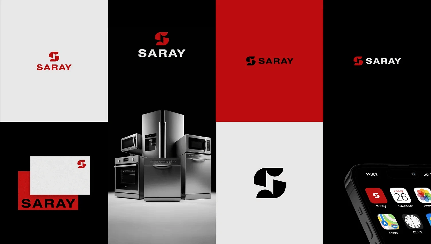
Case Study: Saray - Modern Appliances, Modern Identity
Client Overview
Saray is a home appliances brand offering high-quality, reliable, and modern household electronics. They needed a strong, iconic identity that could stand confidently across product surfaces, packaging, digital interfaces, and retail environments.
Their visual goal:
A bold, industrial-modern brand that communicates strength, precision, and trust.
Design Objectives
The Saray identity needed to reflect:
Premium quality & durability
Clean engineering & modern craftsmanship
A bold, memorable presence
Versatility across digital and physical applications
Instant recognition, even at small sizes
The challenge was to create a mark powerful enough to stand beside large appliance competitors, while feeling fresh and timeless.
Concept Development
1. The Brandmark
The Saray “S” symbol is built from abstract geometric shapes, creating:
A dynamic flow representing innovation
A strong, industrial form reflecting product strength
A balanced, symmetrical structure symbolizing precision
This flexible symbol is easily readable, iconic, and works perfectly as:
✔ Product badge
✔ App icon
✔ Packaging monogram
✔ Digital avatar
2. The Typography
The wordmark uses a block-strong, confident typeface chosen to communicate:
Power
Stability
Durability
It aligns with the brand’s values and complements the geometric symbol.
3. Color Direction
The palette is built around Saray Red + Industrial Black, representing:
Red → Energy, strength, reliability
Black → Luxury, precision, high-end engineering
Neutral Grey → Clean, modern contrast
This color system creates a premium, high-impact visual experience across all touchpoints.
4. Practical Applications
The identity was tested across:
Product branding (refrigerators, ovens, microwaves, dishwashers)
Corporate materials
Retail signage
Mobile UI / App icon
Packaging concepts
The logo maintains clarity, elegance, and power in every environment.
Final Result
The Saray logo system delivers:
✨ A distinctive, modern brand identity
✨ Strong visibility in physical and digital markets
✨ A professional, industrial aesthetic
✨ A timeless symbol ready for long-term growth
Saray now has a bold and unified brand presence, matching the quality of its appliances and elevating its market image.
Like this project
Posted Dec 23, 2025
Designed a bold, modern identity for Saray, reflecting strength and precision.
Likes
0
Views
7
Clients
Saray