Friyay Brand Identity Design
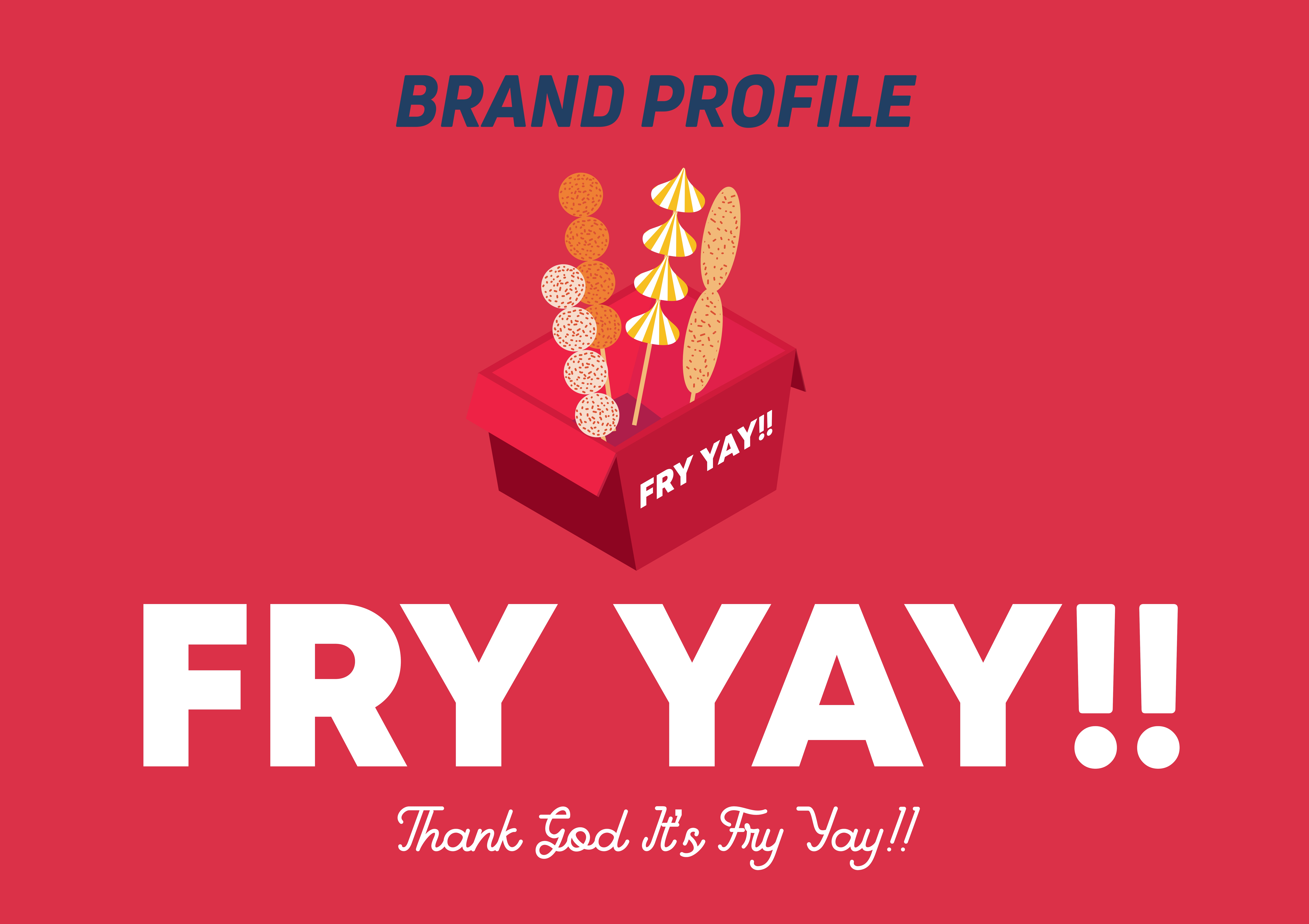
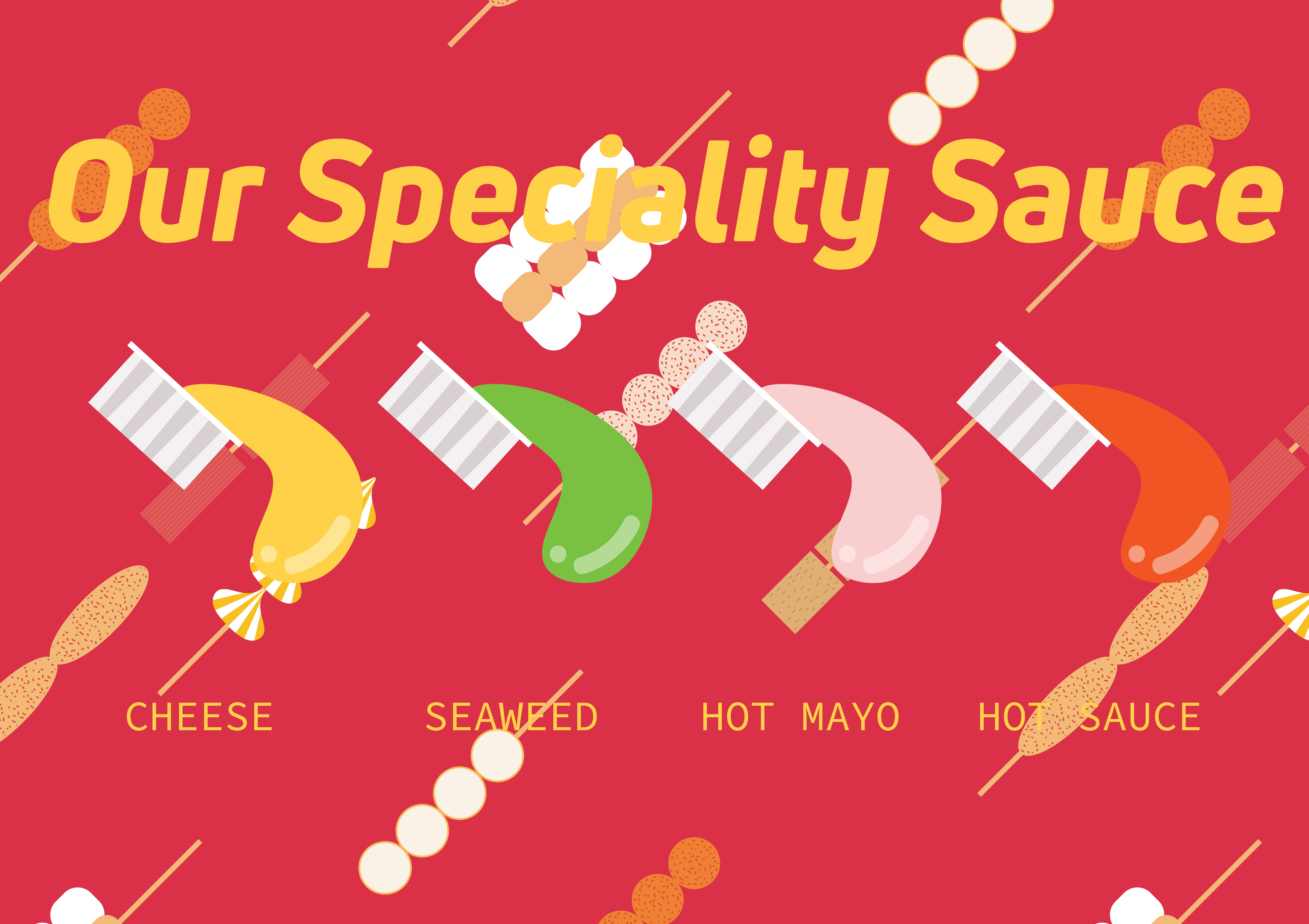
Friyay is a contemporary suki booth that offers an innovative dining experience, where patrons can indulge in the grilled delights of their suki dishes, accompanied by a signature special sauce that adds a unique twist to the traditional suki flavors. The modern aesthetic of the suki booth is designed to provide a refreshing and inviting atmosphere, making it an ideal destination for those seeking a unique culinary experience.
Design Process
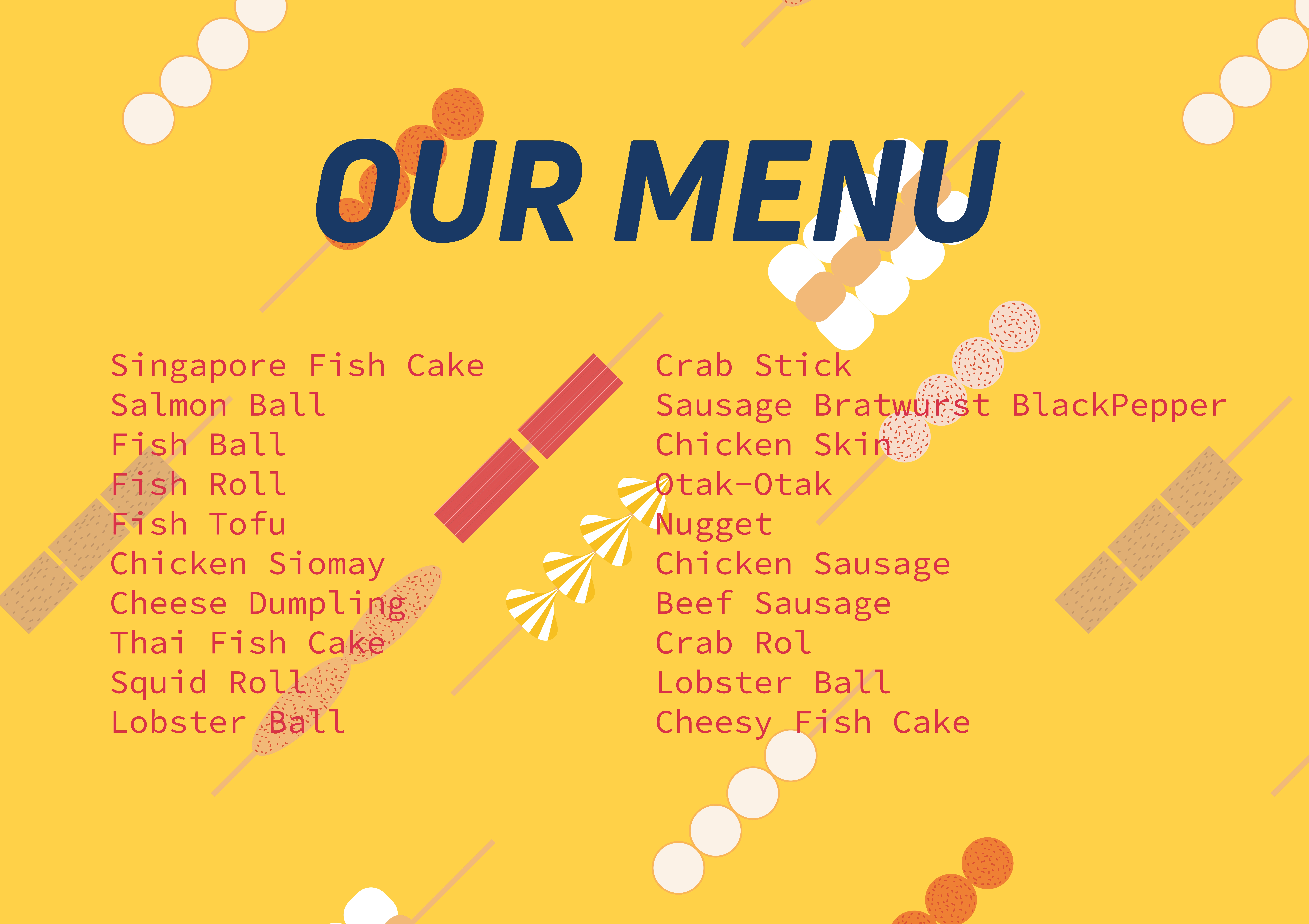
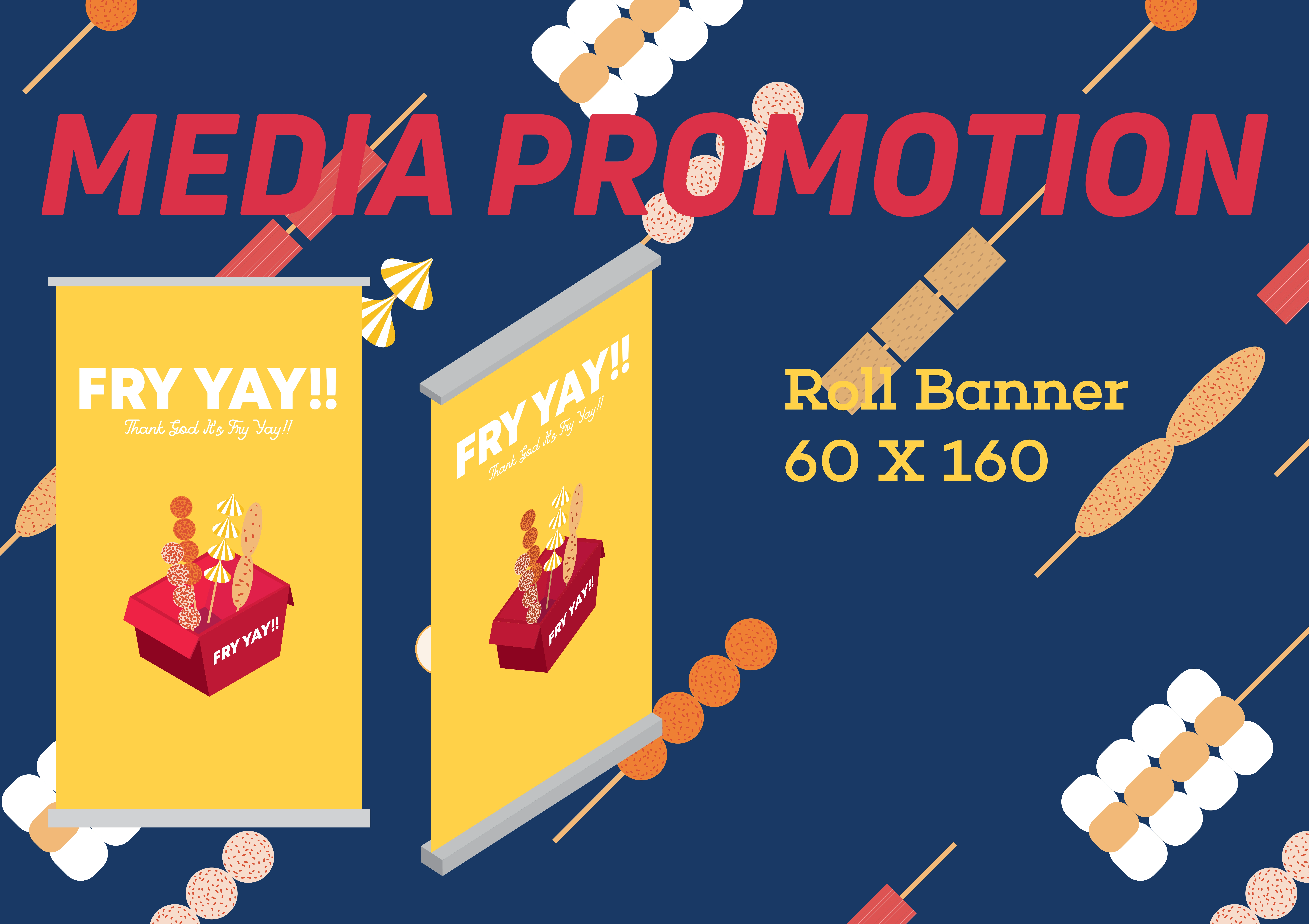
In designing the menu for Friyay, I employed an isometric style to creatively showcase their delectable dishes on the food paper. The solid red color, which is integral to their branding, was strategically integrated into the design to reinforce their visual identity. Additionally, I developed a distinctive pattern inspired by suki, which serves as the iconic element of the design. This pattern effectively functions as a background, allowing for the incorporation of other colors and creating a visually appealing and dynamic design that effectively communicates the essence of Friyay's culinary offerings.
Results
In designing the visual identity for Friyay, I incorporated a fun and playful pattern that is deeply rooted in their iconic food signature. To enhance the overall aesthetic, I employed diagonal lines within the pattern to create a clean and organized visual structure. Furthermore, the use of the italian font style effectively complements the diagonal form, adding an additional layer of visual interest and harmony to the design. This deliberate integration of design elements results in a visually appealing and cohesive visual identity that effectively communicates the playful and approachable nature of Friyay's brand.

Like this project
Posted May 16, 2024
Friyay, a modern suki booth. My design combines an isometric style with adistinctive suki pattern, incorporating their solid red branding.
Likes
0
Views
18


