FOGO & GRELHA — AUTHENTIC CHURRASCO DELIVERY BRAND
Rodrigo Rodrigues
FOGO & GRELHA — BRANDING FOR A BRAZILIAN BARBECUE DELIVERY EXPERIENCE
Fogo & Grelha is a Brazilian barbecue delivery brand created to bring the feeling of a real churrasco into a takeaway experience.
The brand was built around fire, appetite, bold typography, rustic textures, and practical delivery touchpoints — transforming a simple meal into a visual experience with presence, warmth, and attitude.
THE CONTEXT
Fogo & Grelha is not a traditional restaurant with a dining room, tables, or a physical environment designed for customers to stay. It is a delivery-first barbecue operation.
That changed the entire branding challenge.
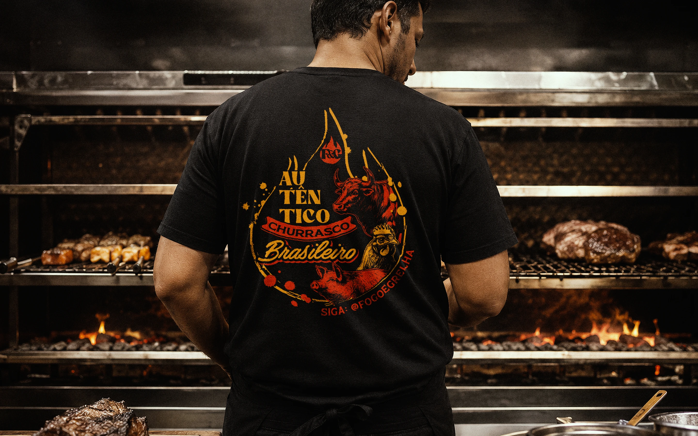
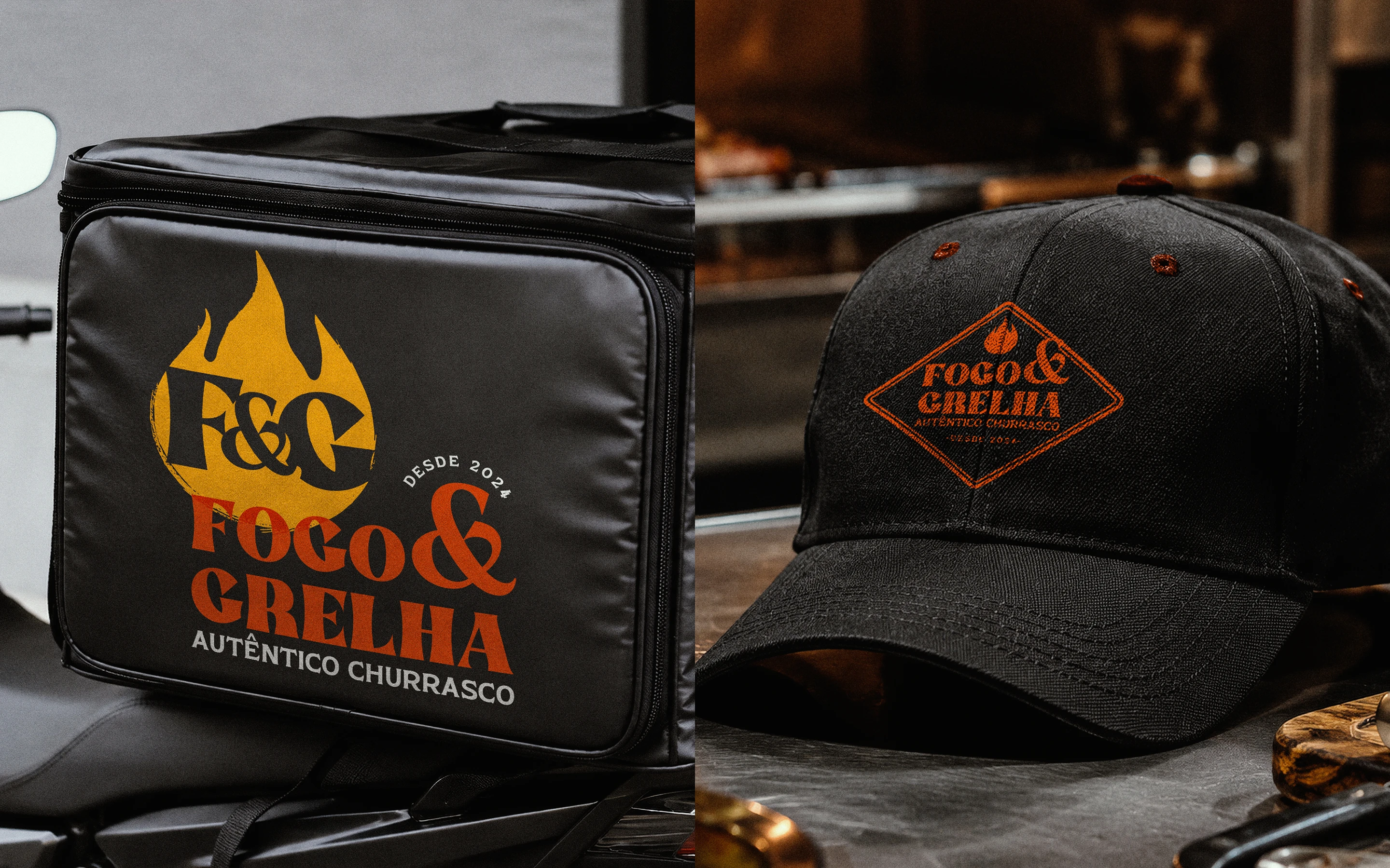
The experience would not happen through architecture, signage, or interior design. It would happen through the things people actually receive and interact with: the meal tray, the kraft bag, the sealed packaging, the staff uniform, the social posts, the delivery bag, and the food itself.
The goal was to make the brand feel hot, generous, authentic, and memorable — even before the first bite.
THE CHALLENGE
The challenge was to create a strong identity for a Brazilian churrasco brand without relying on the usual steakhouse clichés.
Fogo & Grelha needed to feel rustic, but not outdated. Popular, but not generic. Bold, but still practical enough to work across delivery packaging and digital communication.
The brand had to communicate:
• Real Brazilian barbecue culture
• Appetite and abundance
• Trust in the food preparation
• A strong delivery experience
• Visual impact on social media
• Consistency across packaging, uniforms, and service materials
The main question was:
How can a delivery-only barbecue brand feel as warm and desirable as a real churrasco?
THE CONCEPT
The identity was developed around the idea that barbecue does not need a dining room to feel real.
Fire became the central symbol of the brand: not only as a visual element, but as an expression of flavor, heat, craft, and presence. The grill, the smoke, the black packaging, the kraft textures, and the bold typographic voice all work together to create a brand that feels direct, hungry, and unmistakably Brazilian.
The result is a delivery brand that does not try to imitate a restaurant. It embraces its format and turns every delivery touchpoint into part of the experience.
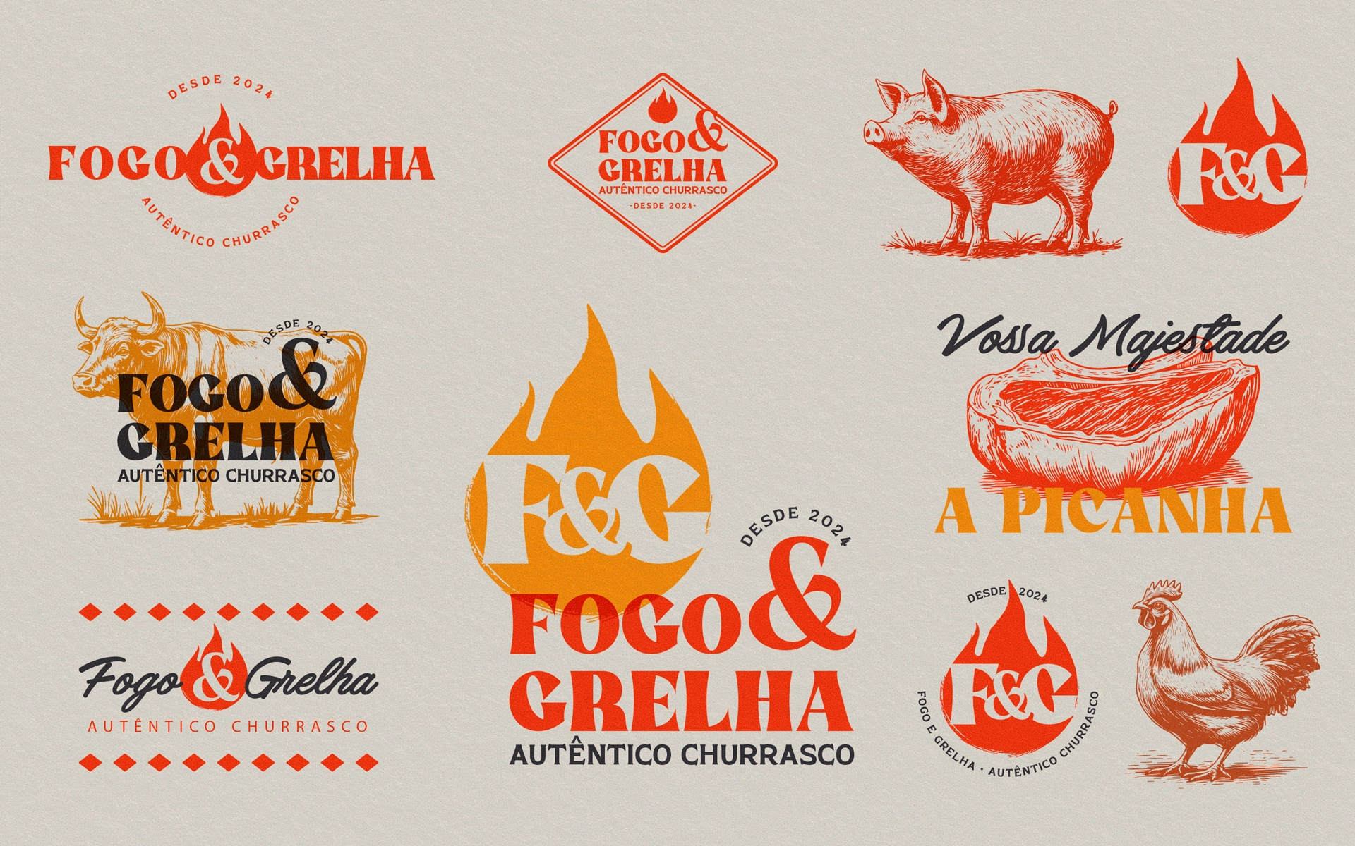
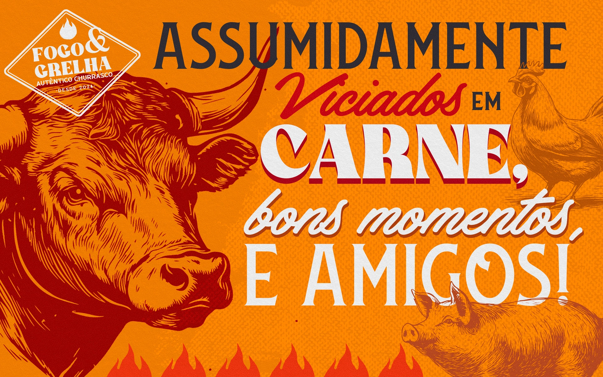
VISUAL IDENTITY
The visual system combines a bold logo, strong typography, warm fire-inspired colors, rustic textures, and food-driven compositions.
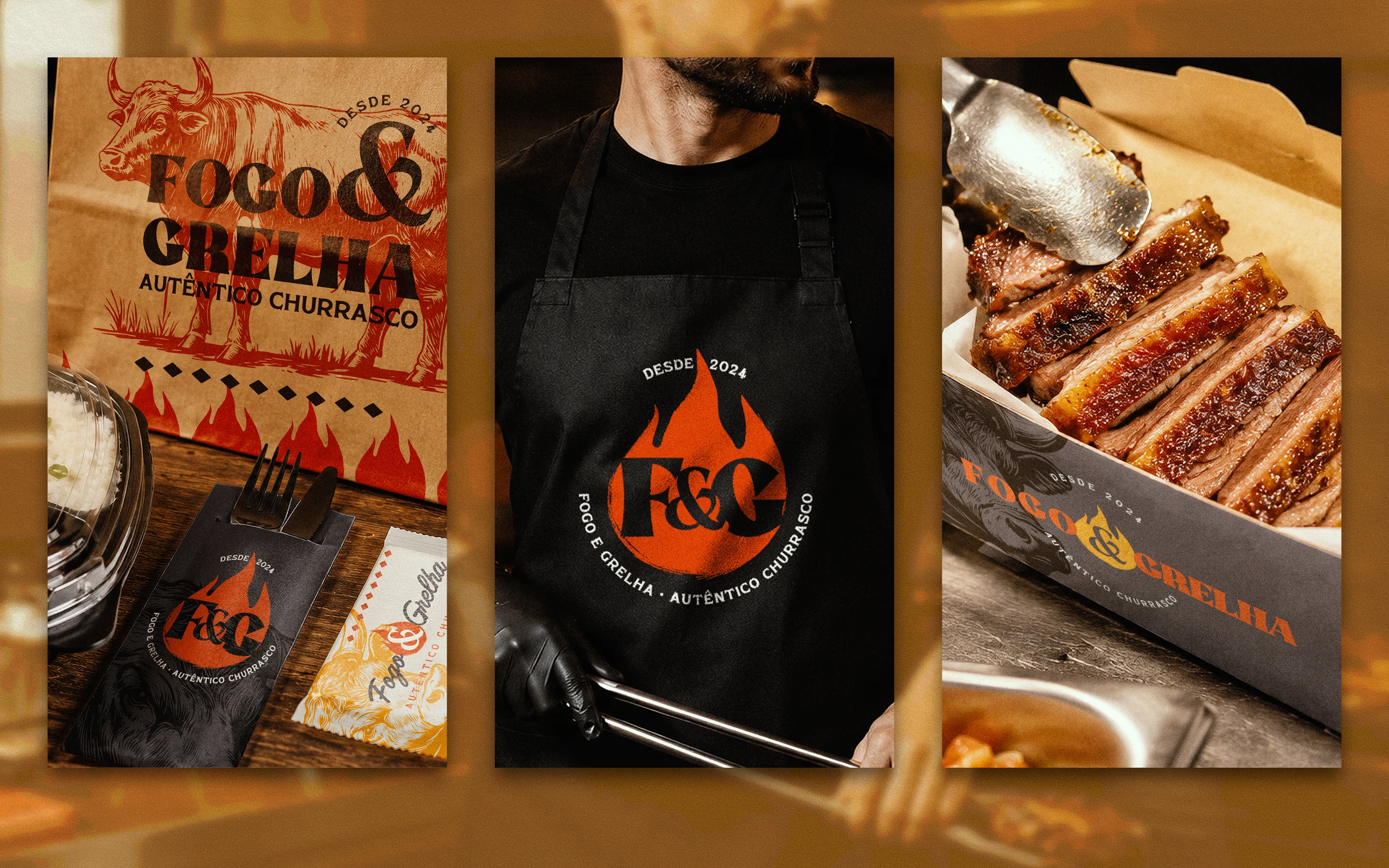
The palette is built around black, orange, red, and kraft tones — colors that immediately connect to fire, charcoal, grilled meat, and delivery packaging.
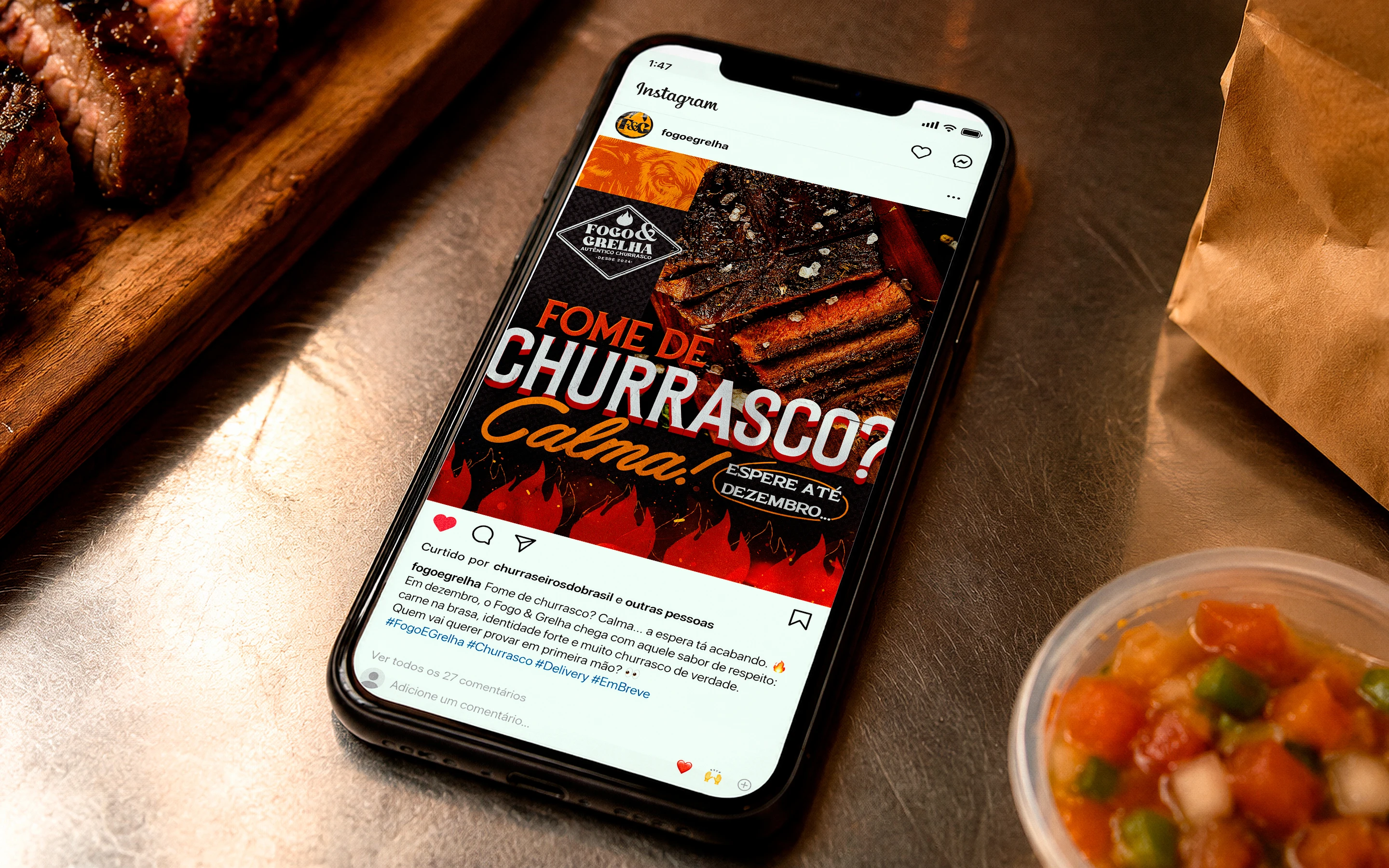
The typography brings a strong, expressive personality, balancing impact and appetite. It creates a voice that feels popular, confident, and energetic, especially across posters and social media posts.
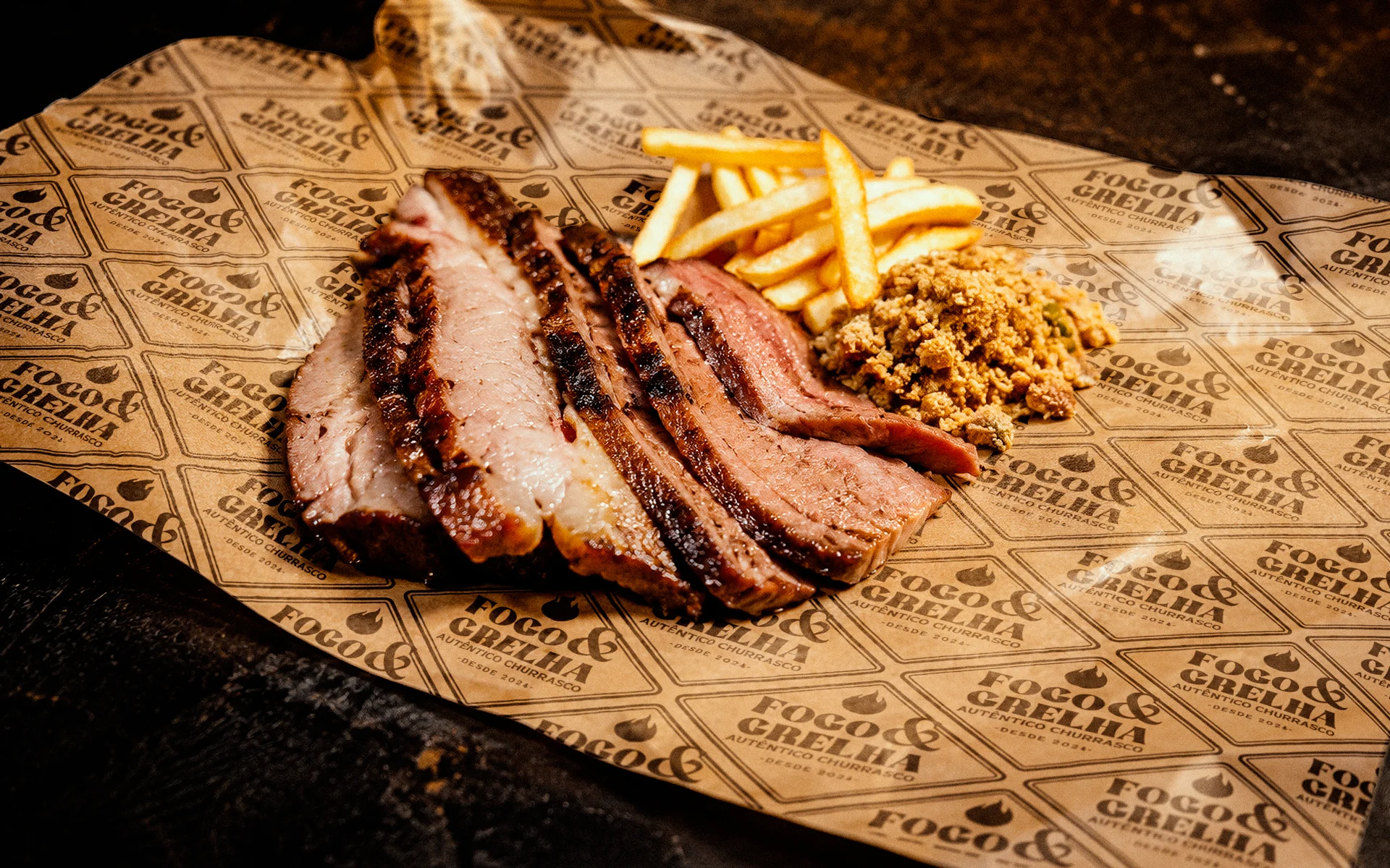
Textures play an important role in the system. Burned surfaces, paper folds, meat close-ups, grill marks, smoke, and rough materials help the brand feel more tactile and real.
The identity was designed to work across:
• delivery meal trays
• kraft bags
• stickers and seals
• disposable cutlery packaging
• staff shirts and aprons
• thermal delivery bags
• social media posts
• digital ordering interfaces
• food photography and promotional materials
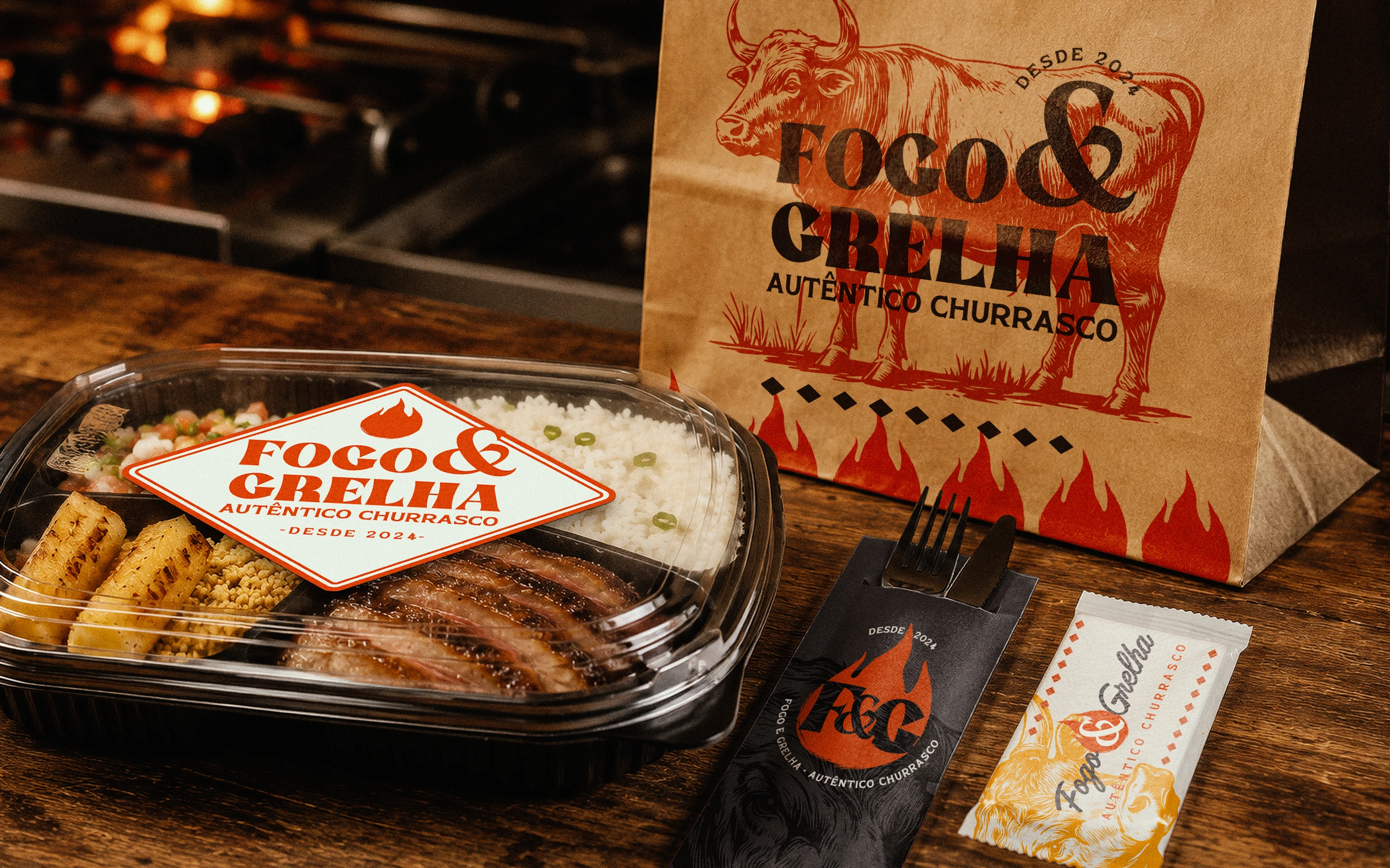
PACKAGING AND DELIVERY SYSTEM
Since delivery is the main point of contact with the customer, packaging became one of the most important parts of the project.
The visual direction was applied to black meal trays, kraft bags, sealed labels, wrapped cutlery, napkin packs, and complete delivery kits. These elements were designed to make the brand feel consistent from the moment the order arrives.
The goal was not just to make the packaging look good, but to make the delivery experience feel intentional — as if the customer were receiving a branded churrasco ritual, not just another takeout meal.
OUTCOME
Fogo & Grelha became a complete visual identity system for a delivery-first barbecue brand.
The project expanded beyond the logo and created a full brand world around fire, food, packaging, and service.
The final result is:
• a stronger and more memorable brand presence
• a visual system built specifically for delivery
• realistic applications across packaging and uniforms
• a social media language with appetite and personality
• a brand experience that feels warm, bold, and authentic
• a delivery concept with the visual strength of a real churrasco operation
Fogo & Grelha is not just a barbecue logo.
It is a fire-driven delivery identity built to make churrasco feel real, even inside a takeaway box.
Like this project
Posted Jun 11, 2026
Brazilian barbecue delivery brand identity built around fire, bold packaging, rustic textures, and a real churrasco experience.