MK Educação - Public Sector Brand
Rodrigo Rodrigues
MK Educação — Brand Identity & Website for a Public Sector Education Institution
A visual system and digital presence designed to position MK Educação with more clarity, professionalism, and institutional trust.
MK Educação needed a stronger brand presence to communicate professionalism, credibility, and long-term value in a competitive education market. The project combined visual identity and website design to create a more modern, trustworthy, and cohesive experience — one that could speak clearly to both prospective students and professional partners. The final system extended naturally across digital, editorial, and promotional materials, helping the brand feel consistent, capable, and ready to grow.
Context
MK Educação is an educational institution focused on professional training and lifelong learning. Its positioning needed to reflect seriousness, competence, and practical value — especially for audiences looking for reliable educational partners and career-oriented opportunities.
The existing challenge was not a lack of substance, but a lack of alignment. The brand needed a clearer visual and digital system capable of expressing experience, dedication, and trust in a more immediate way.
The real challenge
MK Educação is an educational institution focused on professional training and lifelong learning. Its positioning needed to reflect seriousness, competence, and practical value — especially for audiences looking for reliable educational partners and career-oriented opportunities.
The existing challenge was not a lack of substance, but a lack of alignment. The brand needed a clearer visual and digital system capable of expressing experience, dedication, and trust in a more immediate way.
Building a trustworthy visual system
The visual identity was built around precision, contrast, and clarity. Color played a central role in this balance: strong blues reinforced authority and professionalism, while black and white created a cleaner, more controlled visual rhythm.
Rather than overcomplicating the system, the design focused on consistency — using a restrained palette, structured composition, and a bold graphic logic that could support both institutional materials and promotional communication.
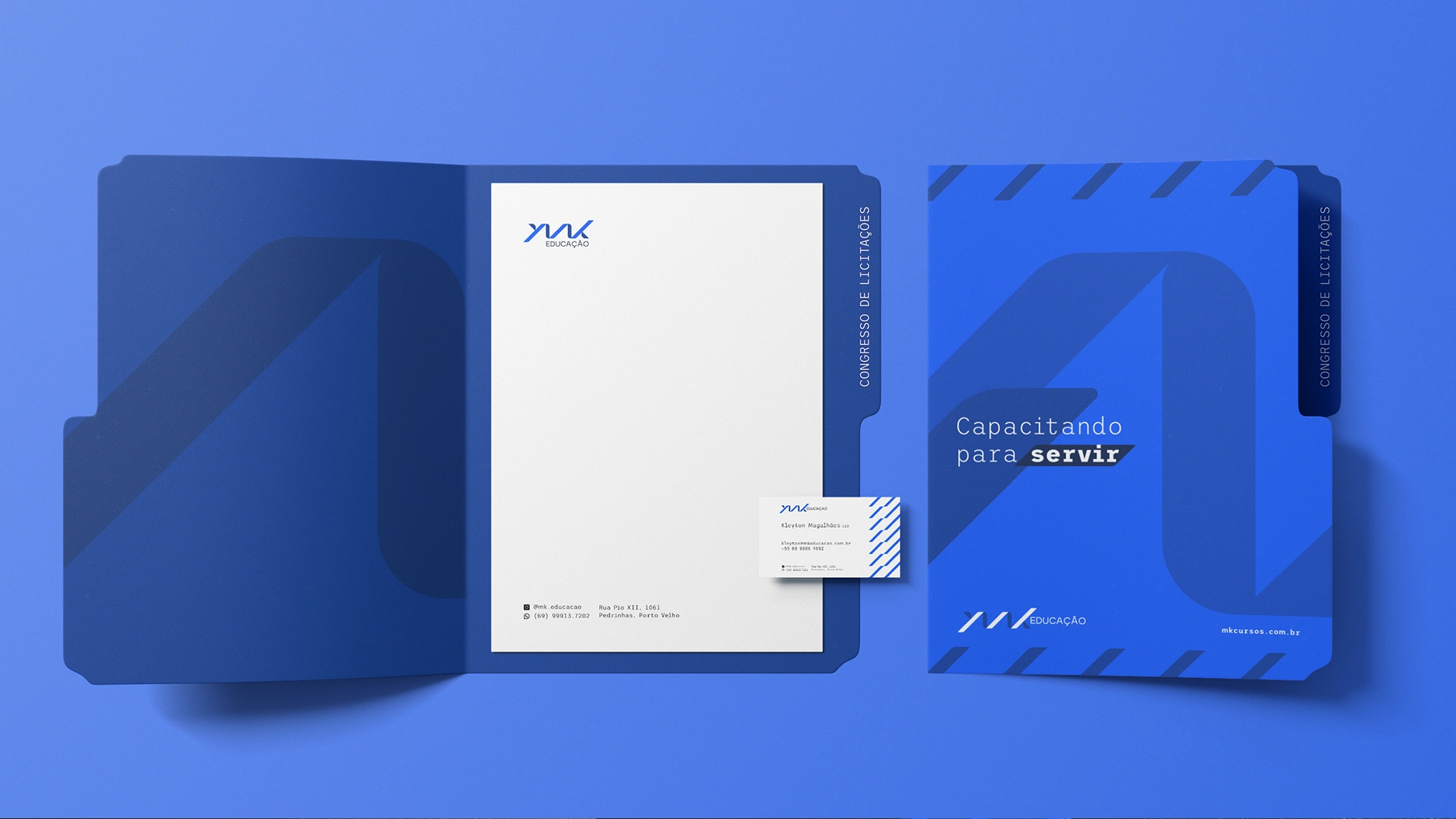
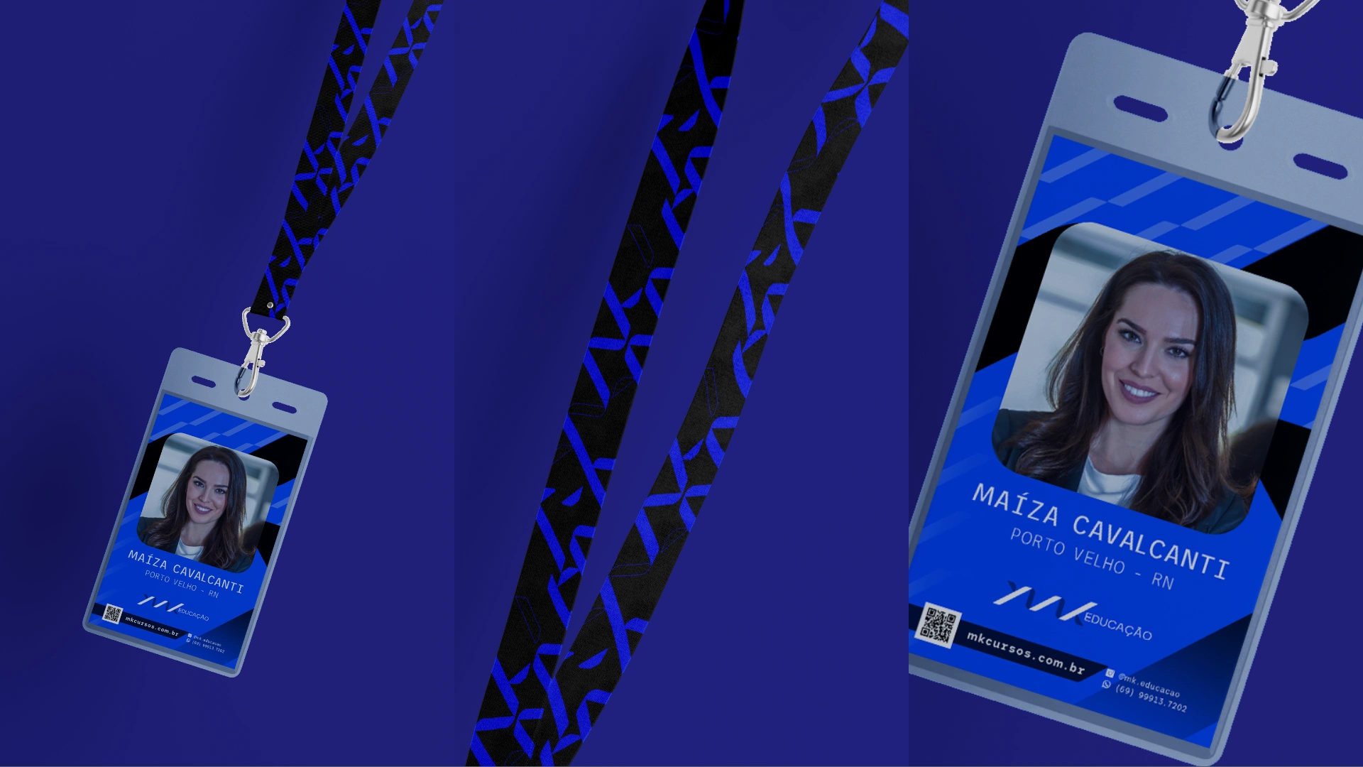
Core brand applications
A brand gains credibility when it behaves consistently across its most practical touchpoints. Business cards, folders, and supporting stationery were designed to translate the identity into everyday use — reinforcing professionalism in presentations, meetings, and direct communication.
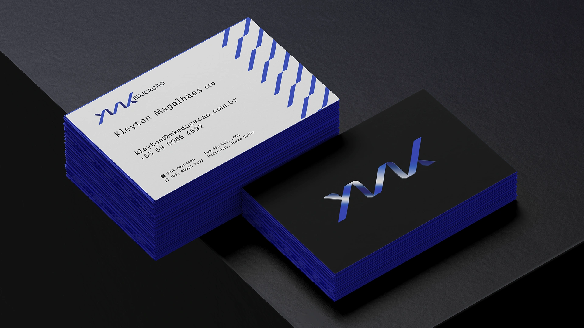
These applications helped establish MK Educação as a more cohesive and recognizable institution, giving the brand a stronger foundation beyond the screen.
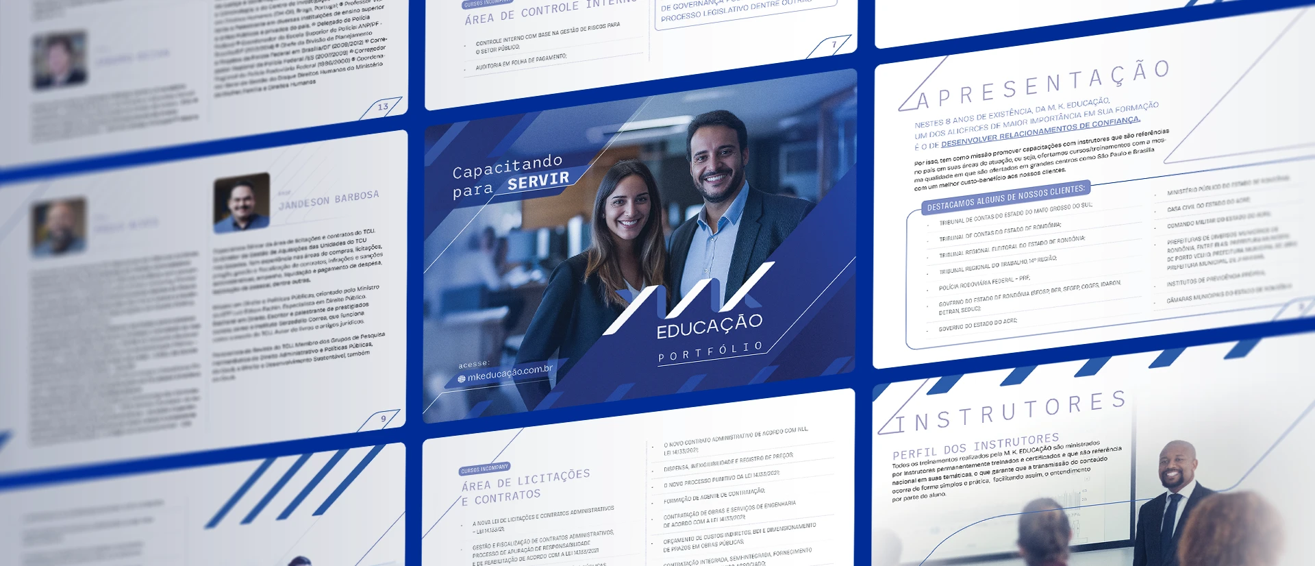
Editorial and information design
Because MK Educação communicates complex information — courses, instructors, institutional strengths, and training programs — editorial clarity was essential. Printed and presentation-based materials needed to organize content with structure, legibility, and visual consistency.
These applications helped establish MK Educação as a more cohesive and recognizable institution, giving the brand a stronger foundation beyond the screen.
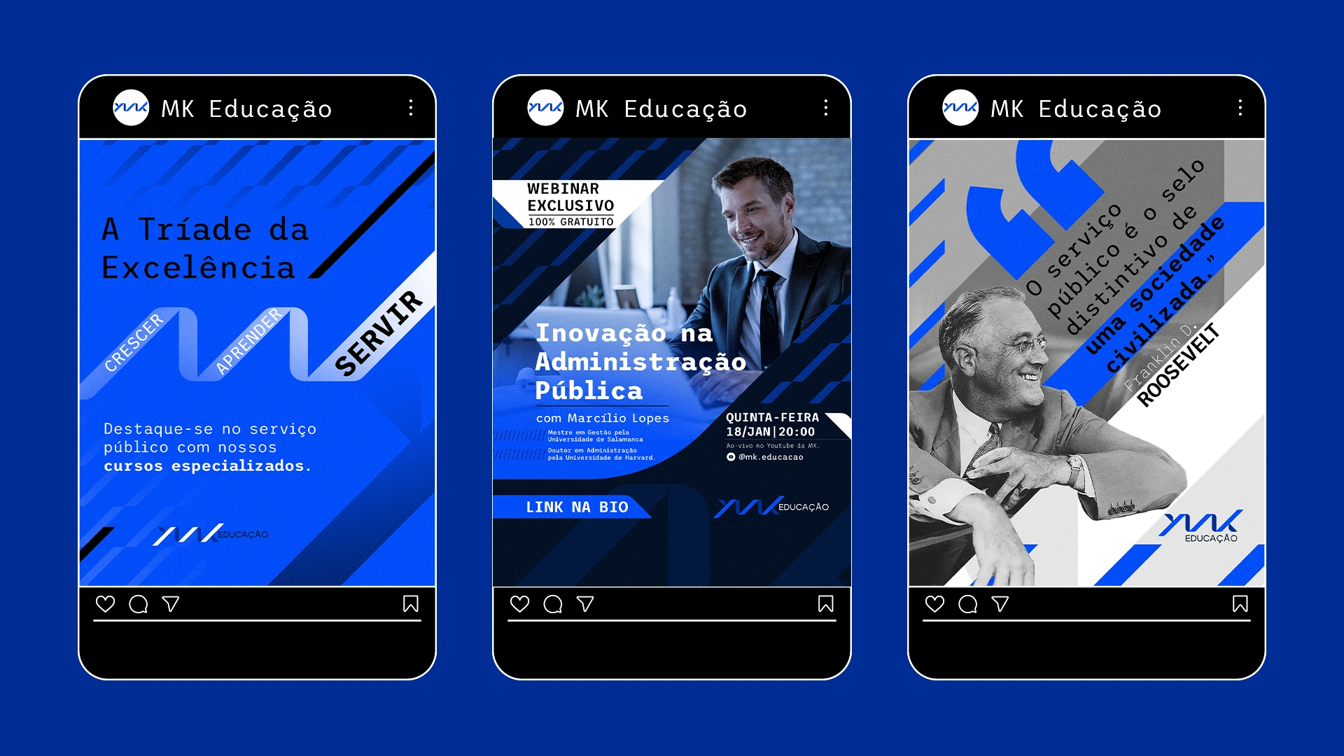
Public-facing communication
The identity also needed to perform in larger, more visible formats — where first impressions matter most. Posters, event visuals, and stage applications were designed to maintain the brand’s authority while increasing impact and recognizability.
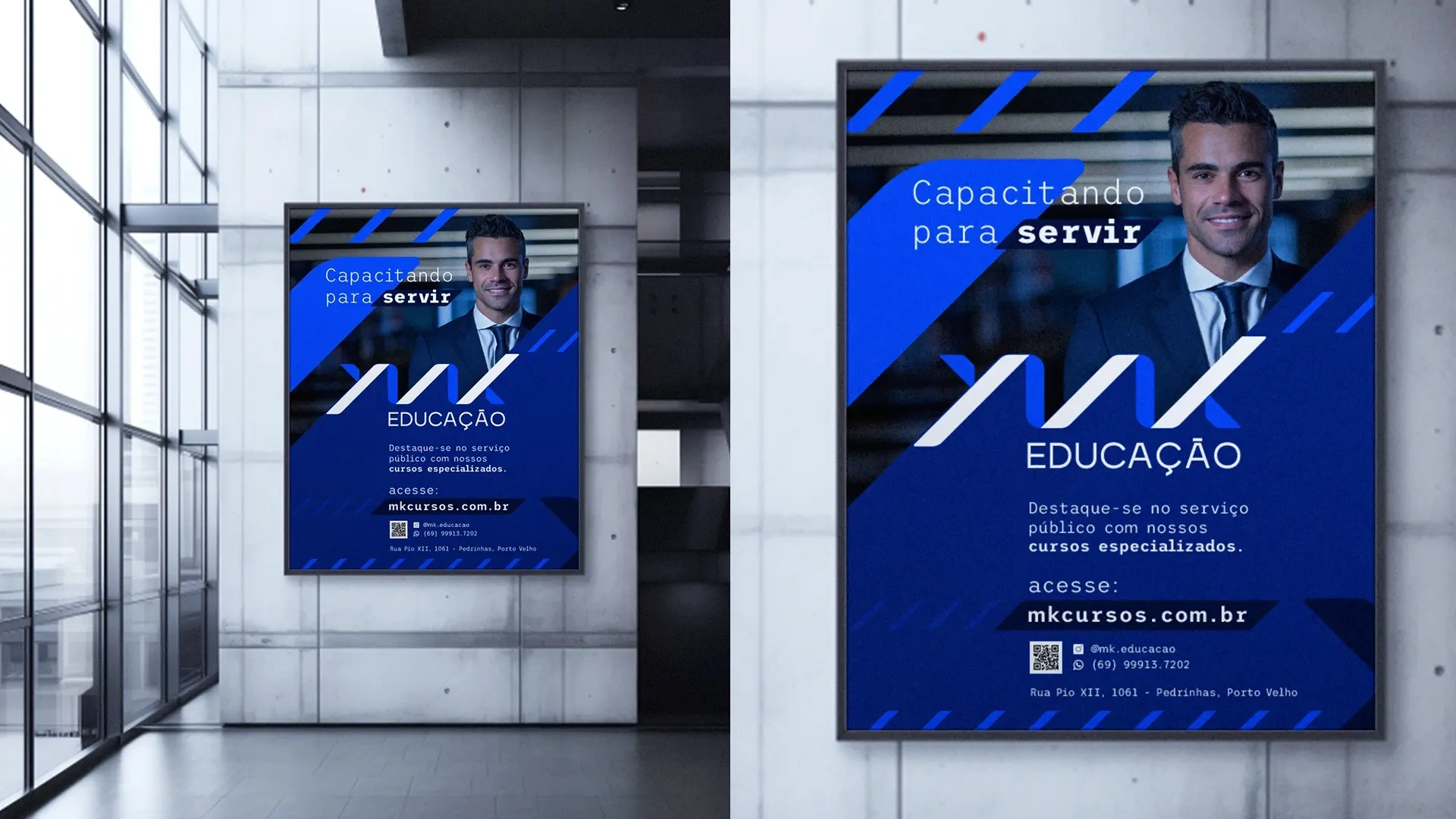
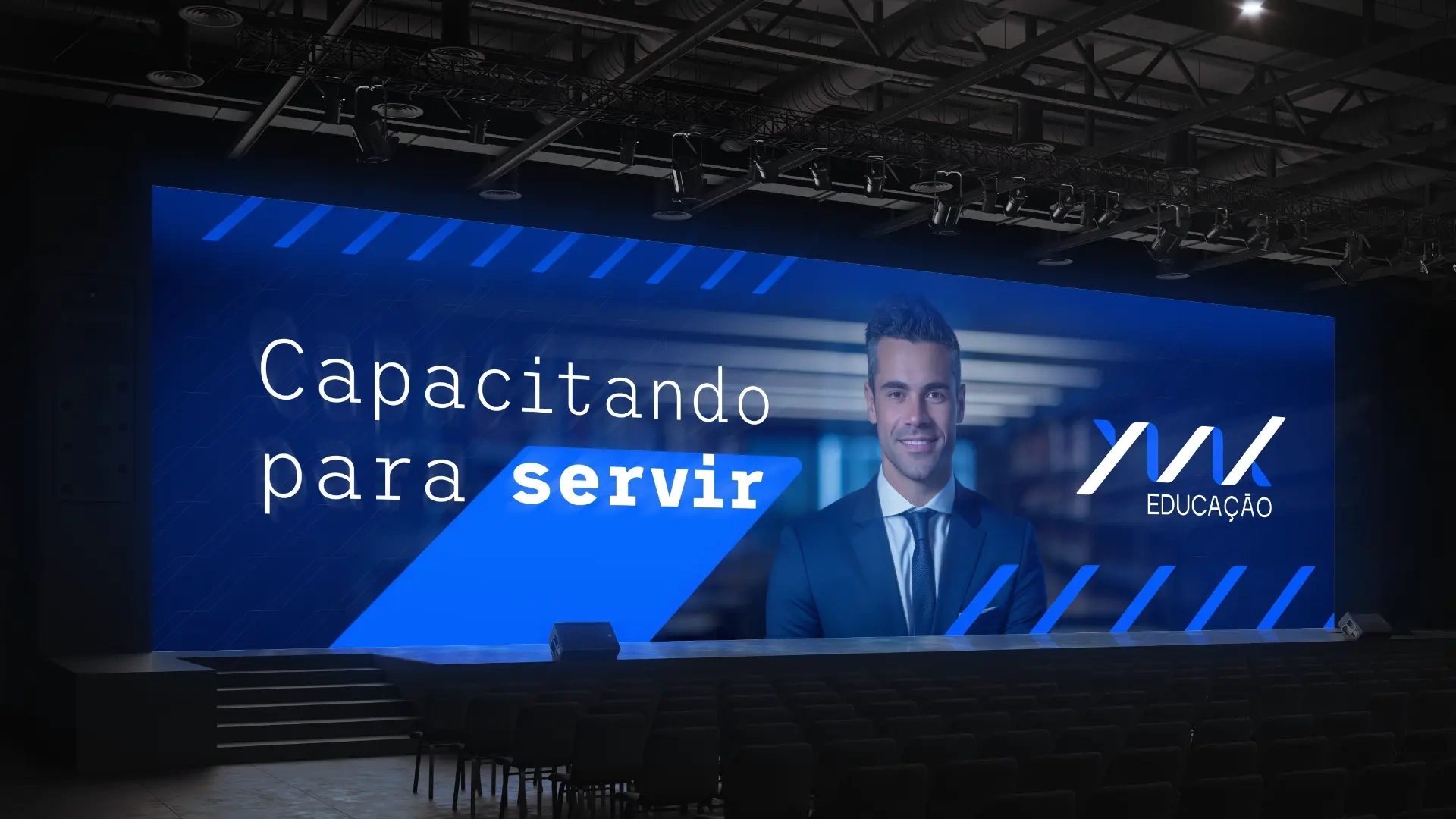
Here, the system proves its flexibility: the same visual language works across institutional communication, event promotion, and larger brand moments without losing coherence.
Brand extensions
To support a broader and more memorable presence, the visual identity was also extended into branded materials. These pieces help the brand move beyond formal communication and into more tangible, everyday touchpoints.
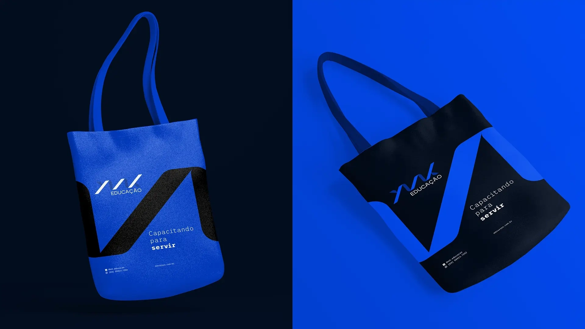
Even in lighter applications, the system remains recognizable — a sign that the identity was built with consistency, not just decoration, in mind.
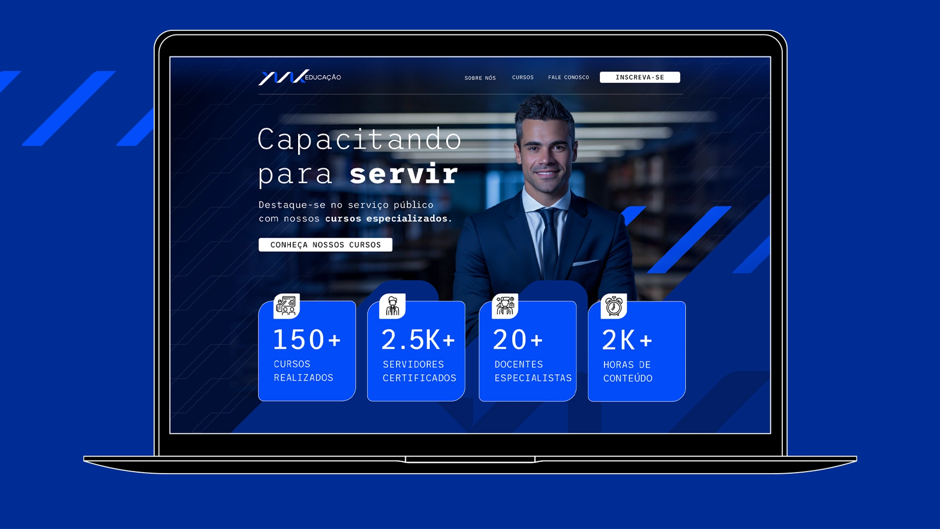
Website as trust-building tool
The website was designed as a key trust-building asset. More than a digital brochure, it needed to communicate competence, make information easier to access, and create a smoother journey for users exploring MK Educação’s programs and partnerships.
The result was a cleaner and more intuitive experience, aligned with the institution’s values and capable of translating credibility into a stronger online presence.
Outcome
The final project gave MK Educação a more coherent and professional brand presence across both identity and digital experience. By aligning visual language, communication structure, and website design, the project helped the institution present itself with greater clarity, confidence, and consistency.
Instead of relying on generic institutional aesthetics, the new system positioned MK Educação with a stronger sense of trust, modernity, and readiness for growth.
Like this project
Posted Mar 16, 2026
Created a visual identity and website for MK Educação, strengthening its credibility through a clear, modern, and professional brand system.