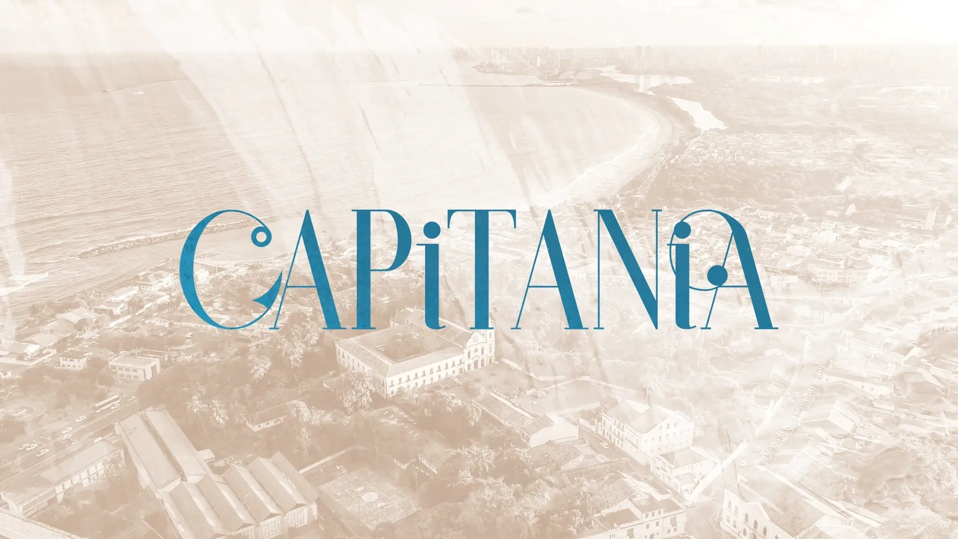
Capitania – Seafood Restaurant Branding
Rodrigo Rodrigues
Capitania — Seafood Restaurant Brand Identity Inspired by Coastal Culture
A restaurant identity inspired by Pernambuco’s maritime history, local culture, and the warm, immersive atmosphere of Olinda.
Capitania needed a visual identity that could evoke Pernambuco’s coastal history without falling into cliché. The challenge was to balance heritage and atmosphere — making the restaurant feel rooted, warm, and culturally specific, while still contemporary enough to support a memorable dining experience. The final system combined refined typography, nautical illustration, and a flexible visual language that extended naturally into signage, menus, environmental graphics, and branded materials.
CONTEXT
Capitania is a restaurant project shaped by the cultural and historical imagination of Pernambuco. The name references the hereditary captaincies, while the concept draws from the region’s close relationship with the sea, port life, and the layered identity of Olinda.
From the beginning, the brand needed to do more than look “regional.” It had to feel intentional and atmospheric — capable of translating local memory into a dining experience that felt both welcoming and distinctive.
The real challenge
The challenge wasn’t simply to create a nautical brand. It was to build a visual identity that felt anchored in place without becoming generic, decorative, or folkloric.
Historical references could easily become literal. Coastal imagery could quickly drift into cliché. The work needed to find a more balanced tone: something elegant, expressive, and culturally grounded — a system that could support the restaurant’s personality across print, space, and experience.
Typography as atmosphere
Typography became one of the key tools in shaping Capitania’s tone. Rather than relying on obvious visual tropes, the identity uses type to create tension between sophistication and personality — combining elegance, rhythm, and a sense of historic echo.
The chosen letterforms helped establish a brand voice that feels refined, distinctive, and slightly theatrical, without losing readability or presence in real applications such as menus, signage, and environmental graphics.
Building the visual language
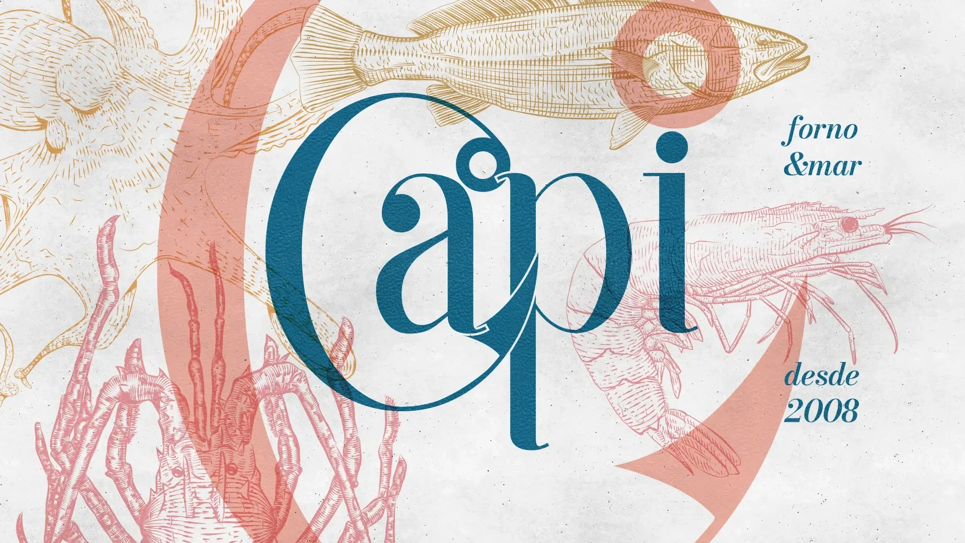
The visual system was built around a dialogue between typography, illustration, and composition. Nautical engravings, marine species, and flowing graphic gestures became part of a broader language designed to feel immersive rather than ornamental.
Instead of treating these elements as isolated assets, the identity was structured as a system: one that could flex between bold hero moments and quieter supporting applications, always reinforcing the same atmosphere of coastal memory and cultural richness.
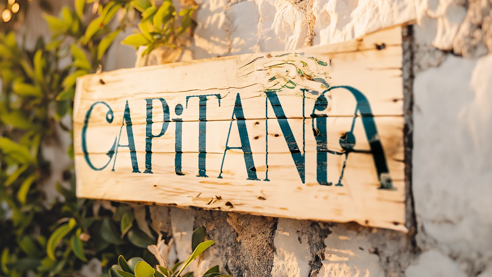
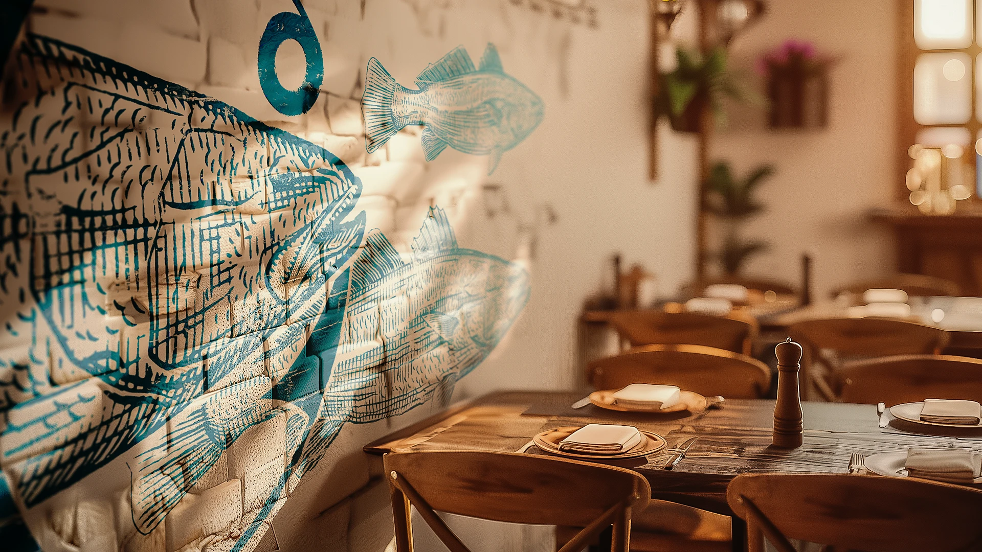
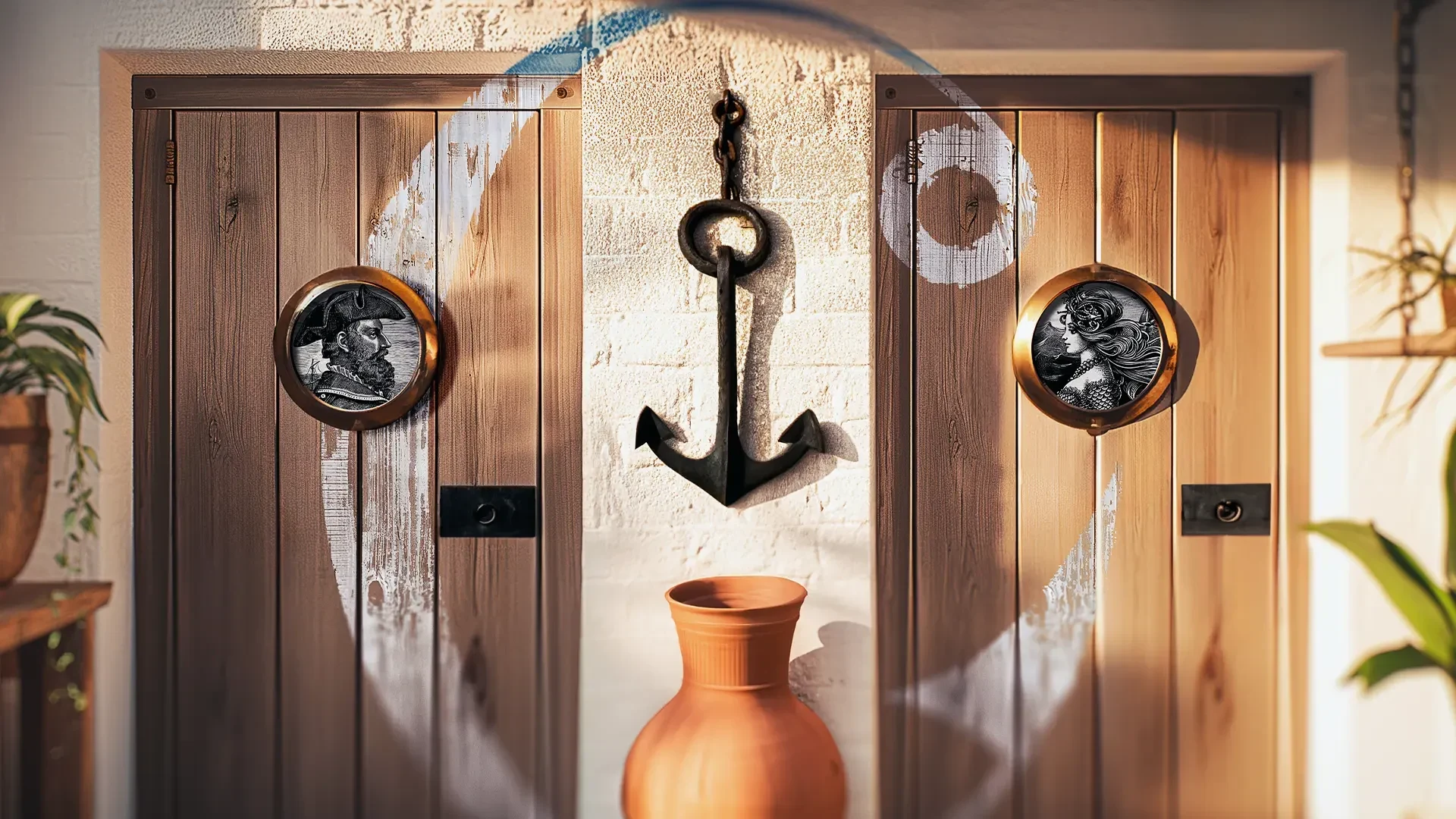
Design where it lives
Capitania’s identity was designed to live beyond the logo. It needed to hold together across the restaurant’s physical environment — from the entrance to interior surfaces and smaller spatial touchpoints.
Applied to signage, walls, and architectural details, the system helps create a cohesive and immersive atmosphere. The goal was not just recognition, but presence: a brand that feels embedded in the space itself, shaping the customer experience from the moment they arrive.
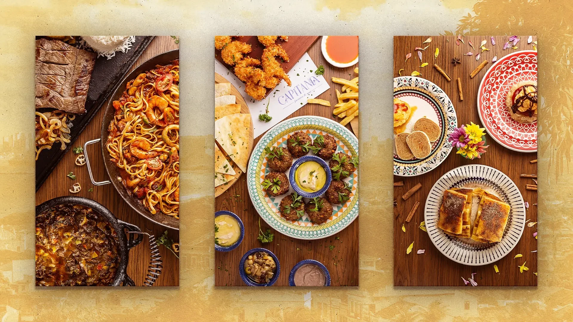
On the table
Menus and food presentation materials were essential to the project. These pieces had to carry the identity clearly while staying functional, legible, and aligned with the restaurant’s sensory experience.
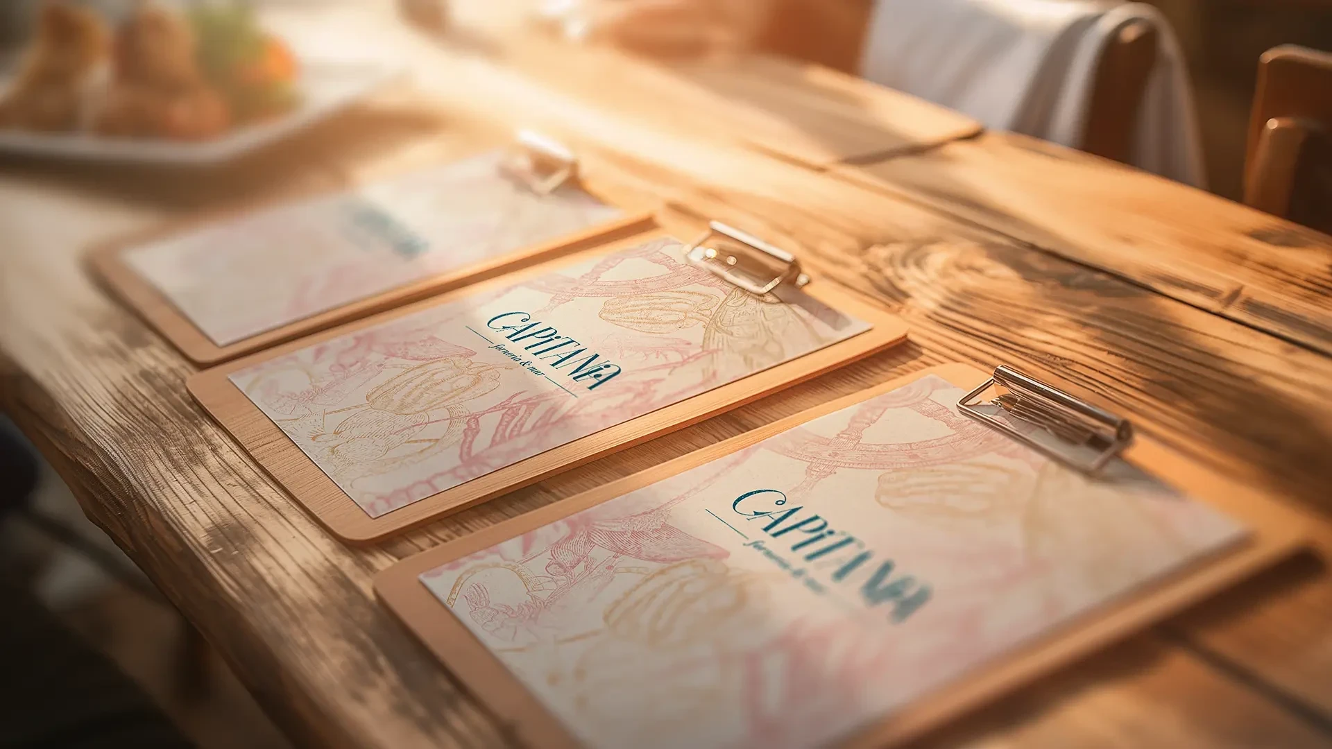
The system was designed to support both structure and atmosphere: giving printed materials a strong visual signature while allowing the food, photography, and textures of the dining experience to remain central.
Brand extensions
A strong identity should travel well. Beyond the restaurant space, Capitania’s visual language was designed to extend into secondary materials and branded objects without losing character.
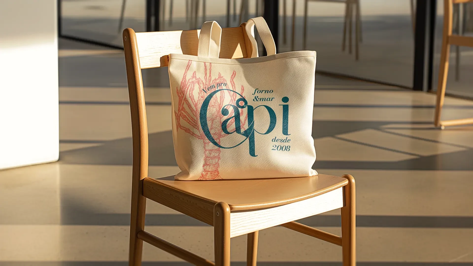
Applied to items such as tote bags and supporting pieces, the identity continues to feel coherent, expressive, and recognizable — proving that the system could scale beyond the immediate dining environment.
Outcome
The final identity gave Capitania a distinctive visual presence — one that connects historical reference, local atmosphere, and contemporary brand craft in a cohesive way.
Rather than relying on a single symbol or a literal nautical approach, the project created a broader system capable of shaping how the restaurant looks, feels, and is remembered. From signage to menus to environmental graphics, the result is a brand that feels rooted, immersive, and built to live in the real world.
Like this project
Posted Mar 16, 2026
A restaurant identity inspired by Pernambuco’s maritime history, blending typography, nautical illustration, and atmosphere into a memorable brand system.