High-Performance Branding for a Weight Loss Specialist
Rodrigo Rodrigues
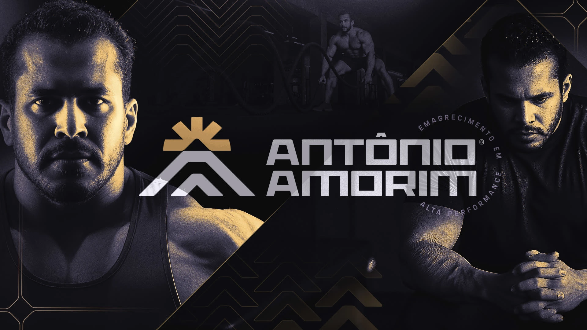
Dr. Antônio Amorim
High-performance personal brand for transformation and weight loss
A strategic brand identity built to position a weight loss specialist as a symbol of discipline, transformation, and high performance — turning a medical service into a movement.
Dr. Antônio Amorim needed more than a visual identity.
He needed positioning.
In a market saturated with generic “before and after” narratives, the challenge was to create a brand that would feel strong, disciplined, and aspirational — without losing credibility.
The goal was clear:
Transform his image from “another professional” into a reference in high-performance weight loss.
The Challenge
Most professionals in this space communicate the same way:
Generic promises
Weak visual identity
No emotional connection
No clear positioning
We needed to break that pattern.
The brand had to:
Build authority and trust
Create emotional resonance
Represent discipline, transformation, and identity shift
Stand out in digital environments (especially social media)
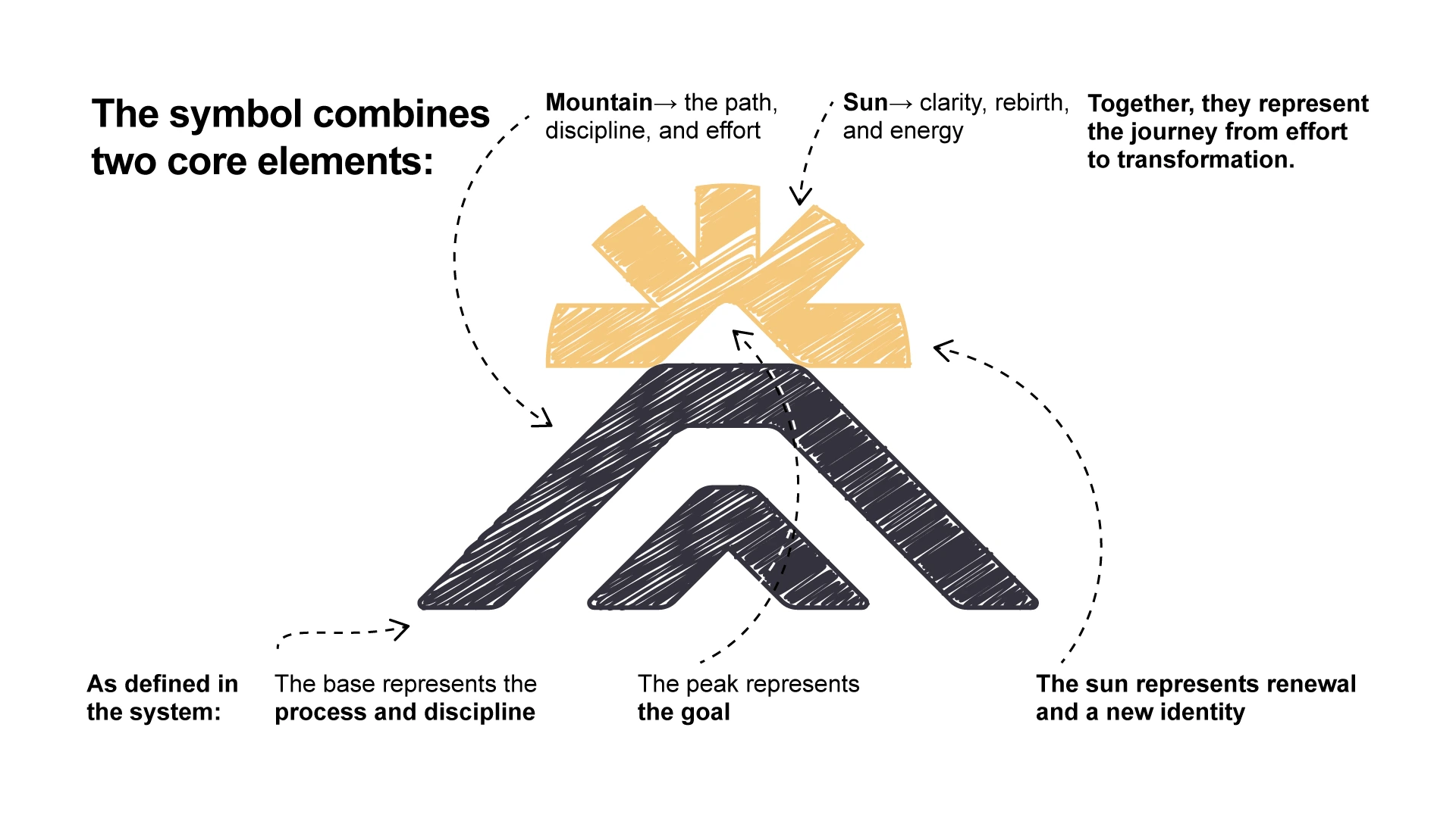
Visually and conceptually, the brand became a metaphor for climbing a mountain — a powerful symbol of personal transformation.
As presented in the concept development, the entire narrative reinforces that transformation requires decision, consistency, and resilience
Concept
The brand is built on a simple but powerful idea:

“Transformation is a climb.”
Every element reinforces that:
The struggle
The process
The achievement
This moves the communication away from superficial results and into something deeper:
👉 Identity change.
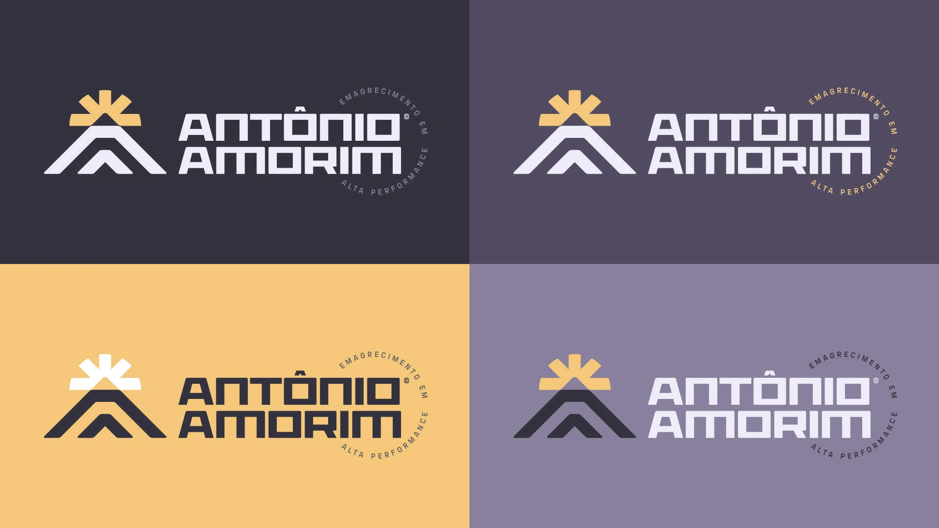
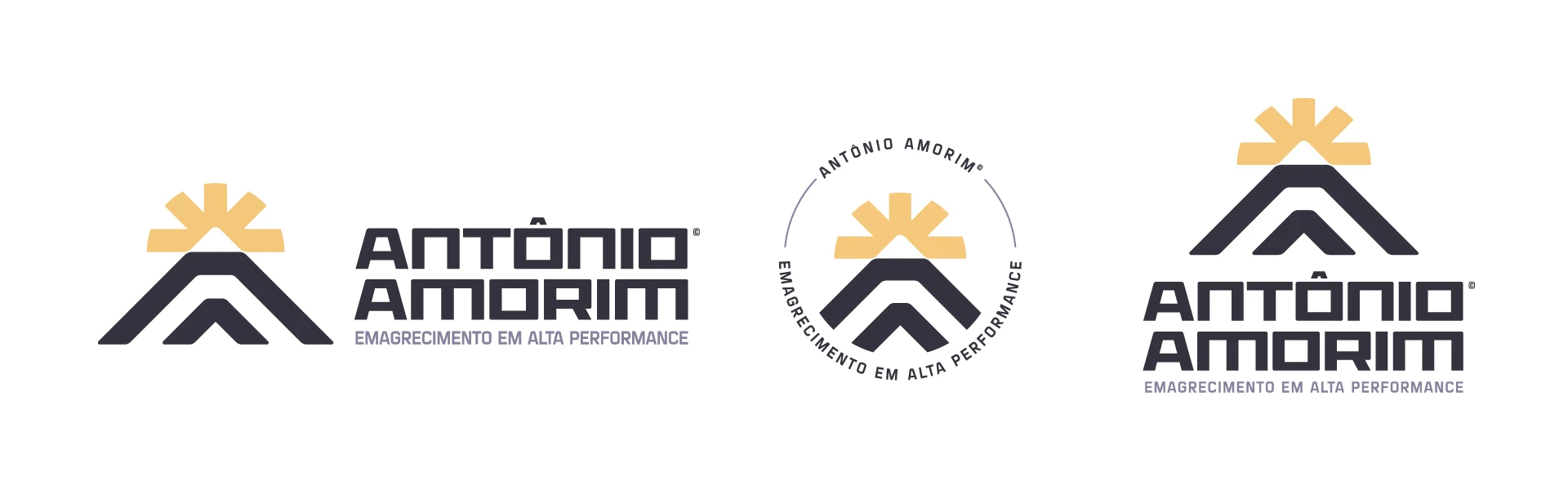
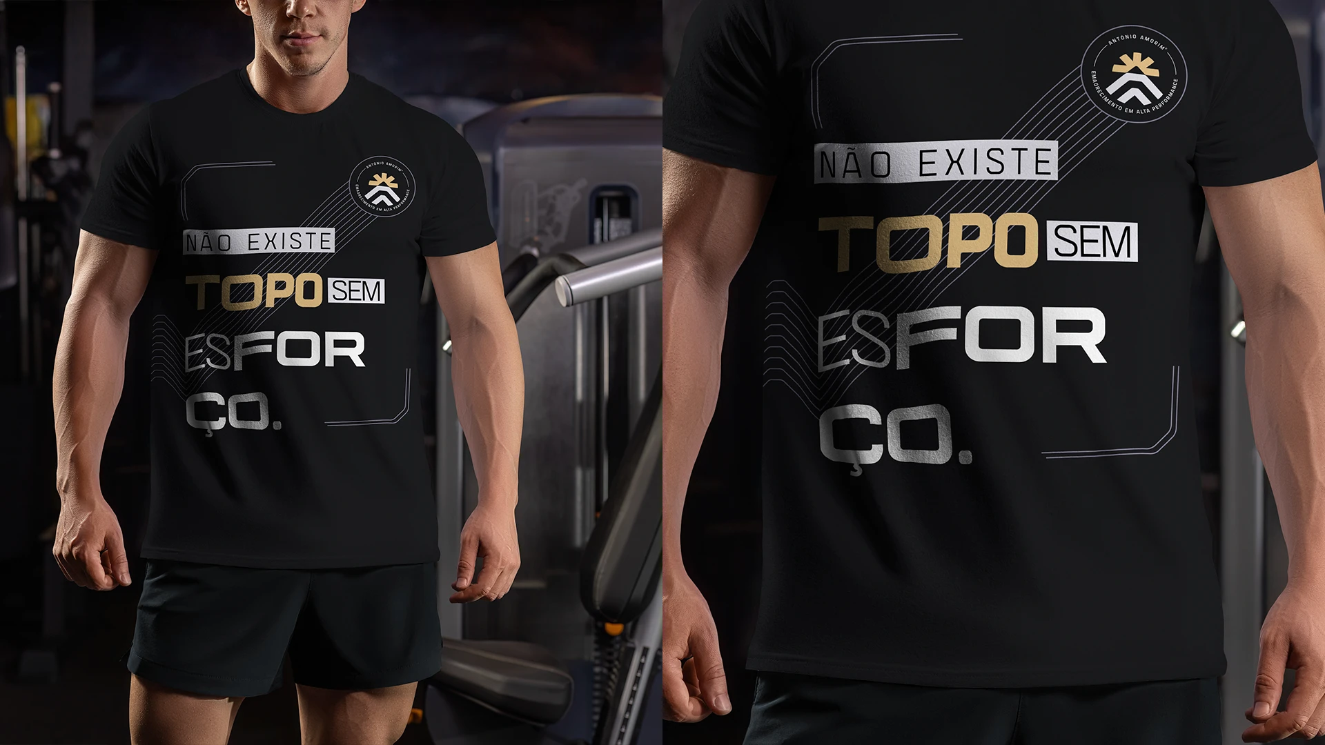
Visual Identity
Design System
The identity was built as a structured system, not just a logo.
Typography
Strong, geometric display type → authority and performance
Clean supporting type → clarity and readability
Color Palette
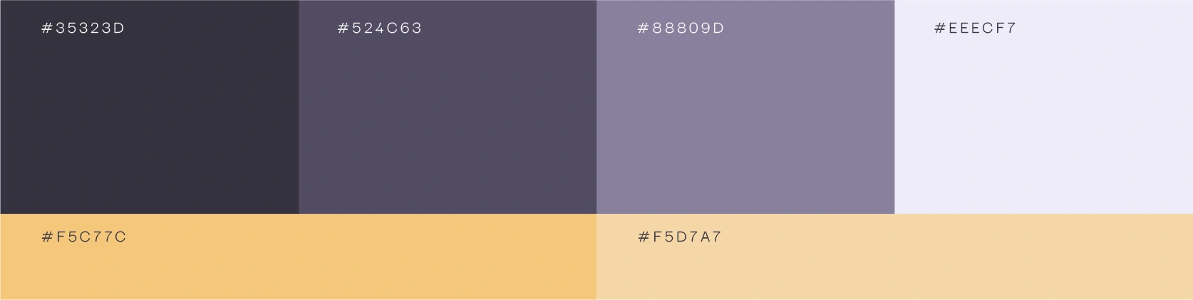
Built around contrast:
Dark tones → seriousness, professionalism, high performance
Warm tones → energy, vitality, transformation
The palette reinforces key brand values:
strength, trust, clarity, and energy
Graphics

Support elements derived from the symbol:
Modular patterns
Directional shapes
Consistent visual rhythm
Applications
The brand was designed to scale across:
Social media
Digital campaigns
Personal branding content
Apparel and physical presence
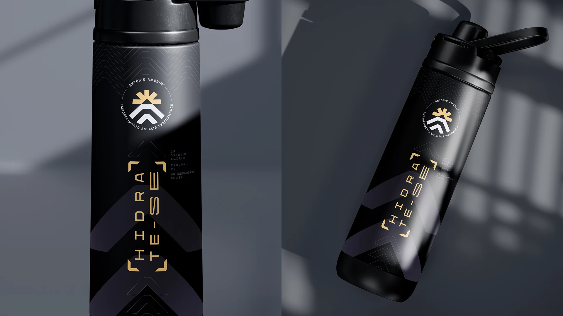
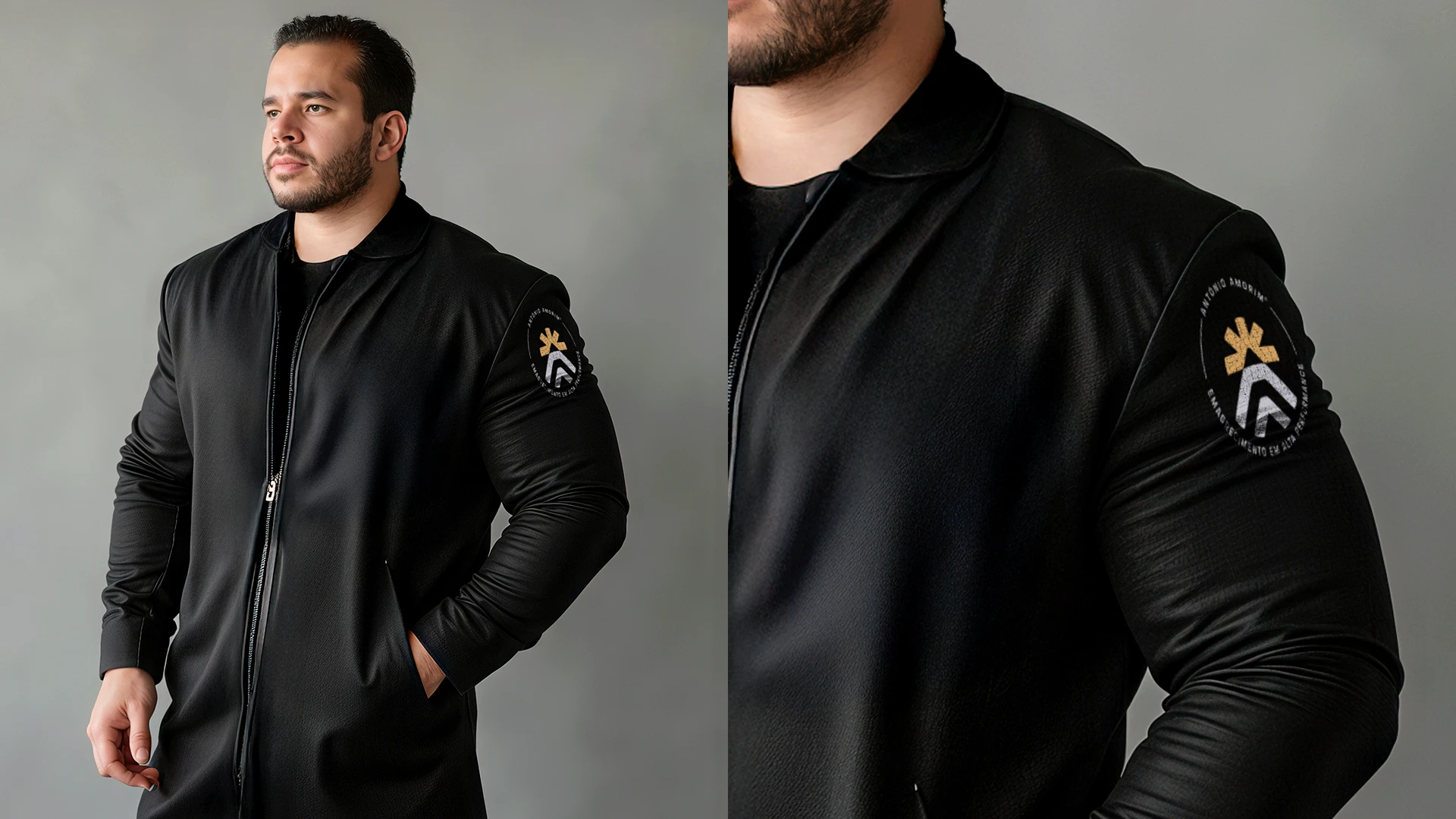
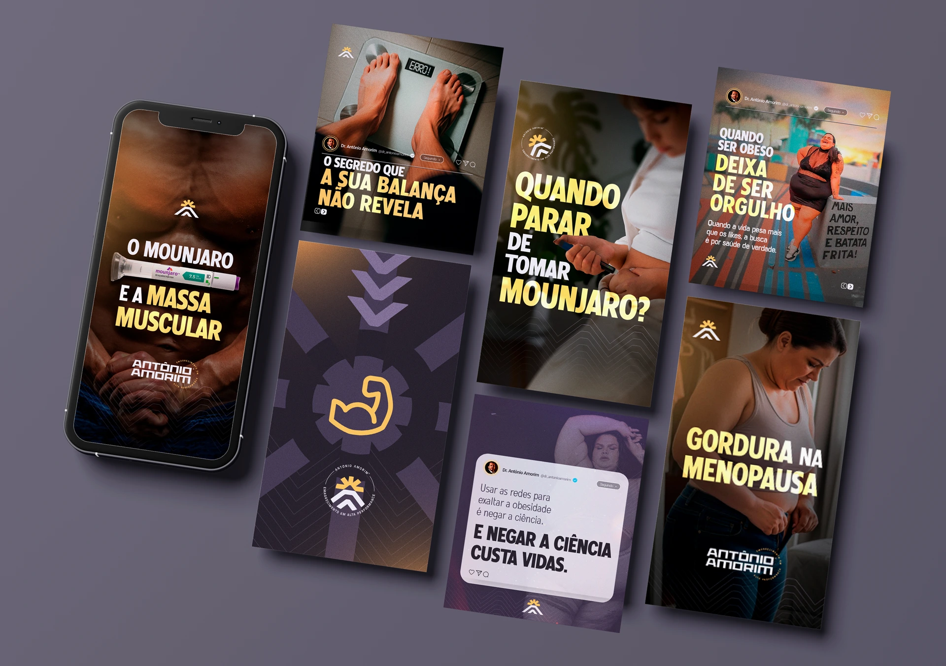
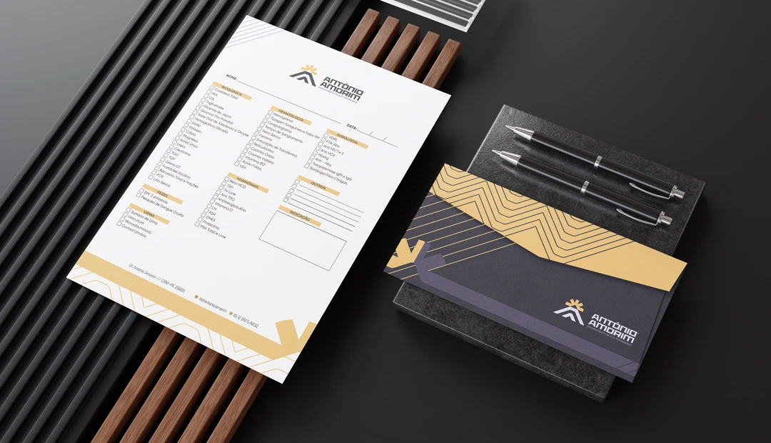
The system ensures consistency while allowing flexibility.
Outcome
The result is a brand that:
Positions Dr. Antônio as a high-performance authority
Moves beyond generic health communication
Creates a strong emotional connection with patients
Builds a recognizable and scalable identity
This is not just a logo.
It’s a positioning system.
Design is not about making things look better.
It’s about making them mean something.
Like this project
Posted Mar 26, 2026
A strategic identity system designed to build authority, trust, and transformation-driven positioning.