Reimagining Welya: A High-Conversion Webinar Platform

Mustofa Al-Ameen Mustafa


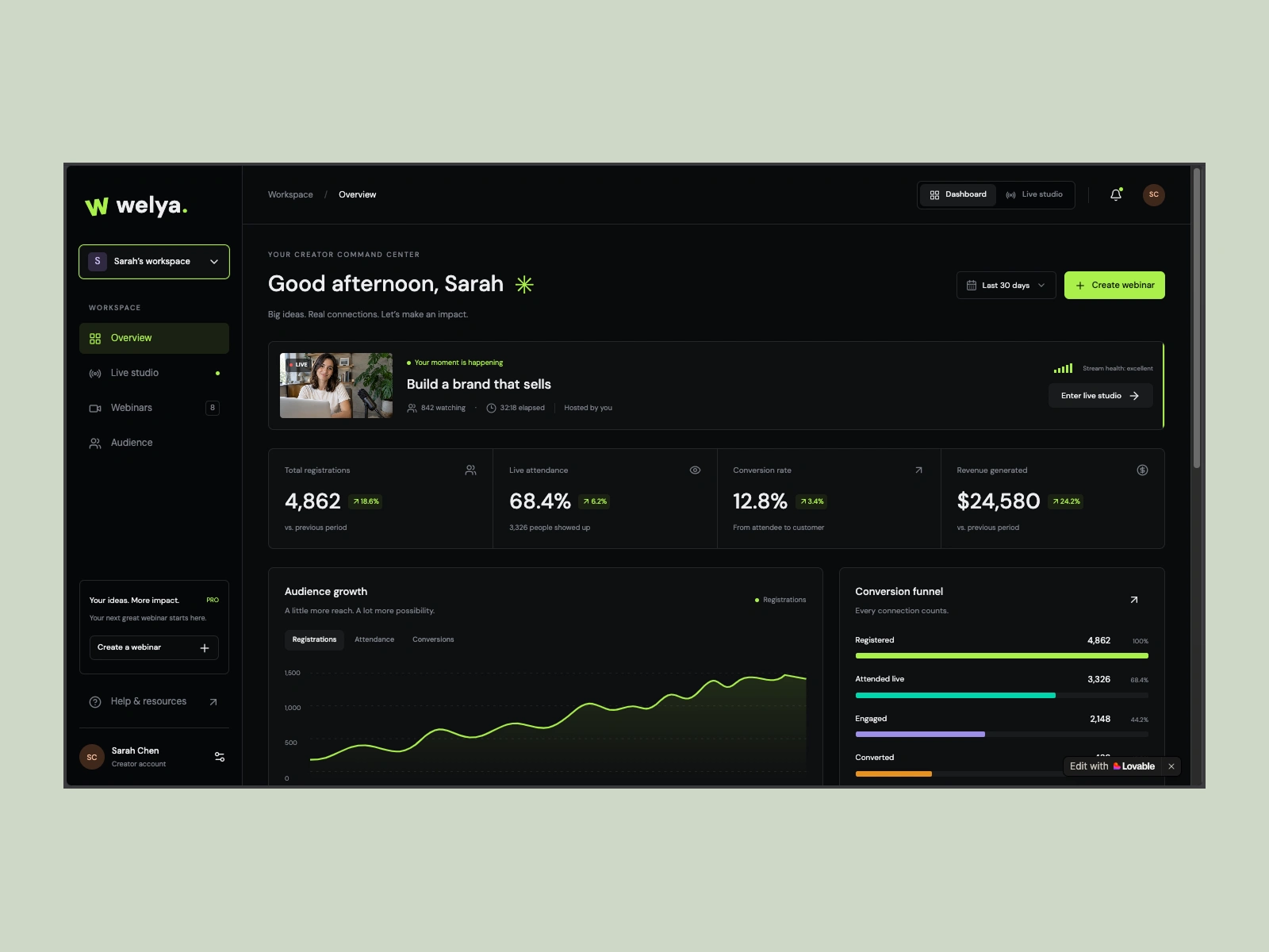
Case Study: Reimagining Welya — The High-Conversion Webinar Platform for Modern Creators
Role: Lead Product Designer (UI/UX, Design Systems, Code Prototyping)
Deliverable: End-to-end Product Strategy, Design System, Responsive UX, and Interactive Code Prototype
Interactive Prototype: https://webinar-duality.lovable.app
Target Market: US Creators, Coaches, and Course Operators
Most legacy webinar tools (WebinarJam, GoToWebinar, Zoom) were engineered a decade ago for corporate conference rooms. For modern digital creators and coaches selling high-ticket masterminds ($1,000–$5,000+), these legacy tools present critical failure points:
High cognitive load during live events: Creators must juggle multiple detached windows, moderation panels, and third-party checkout links while speaking live.
Low perceived brand value: Outdated attendee rooms erode authority and trust before the pitch even happens.
Disconnected conversion mechanics: Analytics are buried in post-event CSVs rather than informing live selling decisions.
This project delivers a complete UI/UX rebuild of @welya, transforming it into a high-density, conversion-focused platform inspired by the craft and precision of Linear, Vercel, and Framer.
The Problem
During a live sales webinar, a creator's attention is divided between delivering content, reading attendee sentiment, and orchestrating the pitch. Clunky navigation and fragmented tools lead to lost sales, delayed offer drops, and high drop-off rates.
The Hypothesis
By splitting the platform into two purpose-built surfaces—a Pre/Post-Event Command Center and a Unified Live Studio Cockpit—we can eliminate cognitive friction, surface high-intent buyers in real time, and maximize sales conversions.
Instead of forcing all functionality into a generic dashboard, Welya’s information architecture separates creator workflows into two dedicated modes:
Surface 1: The Creator Command Center (Pre & Post Event)
Designed for planning, audience intelligence, and revenue analysis:
Executive Metrics Grid: Immediate visibility into Show-up Rate, Engagement Index, Offer Conversion %, and Net Revenue with period-over-period delta indicators.
Retention & Drop-off Funnel: Visual drop-off curves mapping attendee retention from minute 0 to the pitch milestone (minute 45+), diagnosing exactly where audiences lose focus.
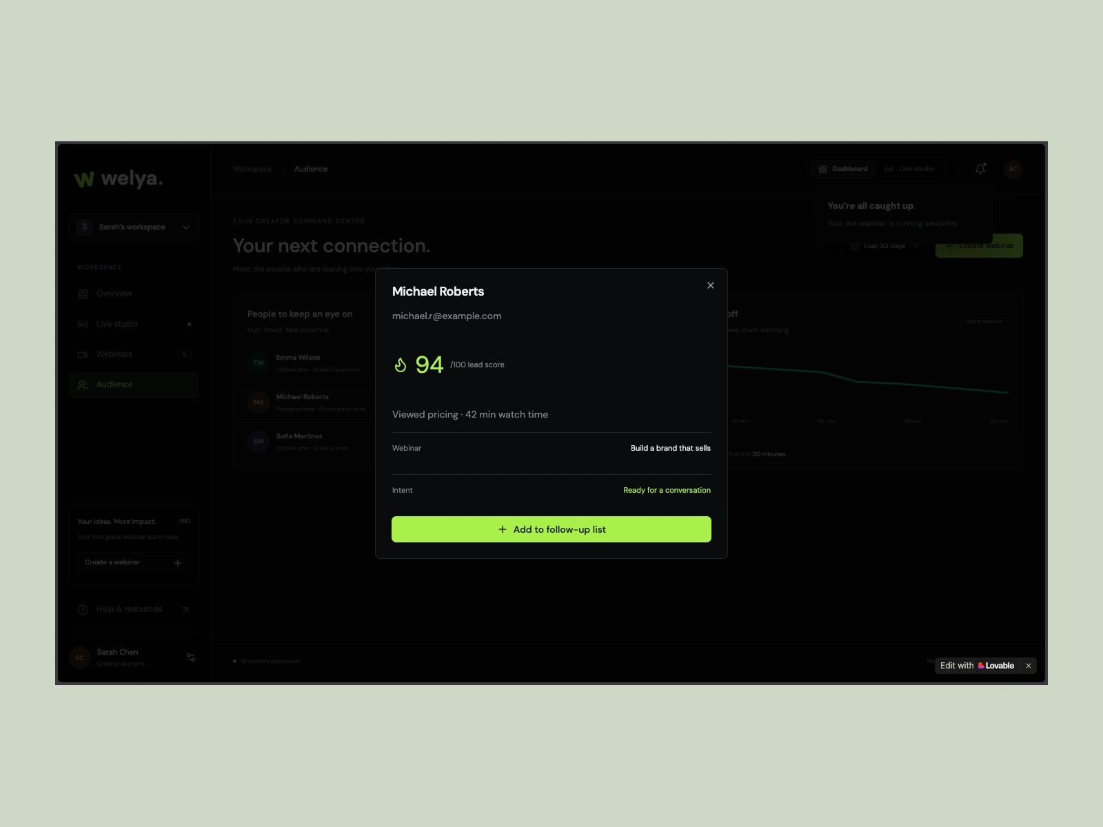
Behavioral Lead Board: Instead of raw attendee lists, leads are scored (0–100) based on engagement signals (watch duration, chat frequency, poll participation, offer clicks).
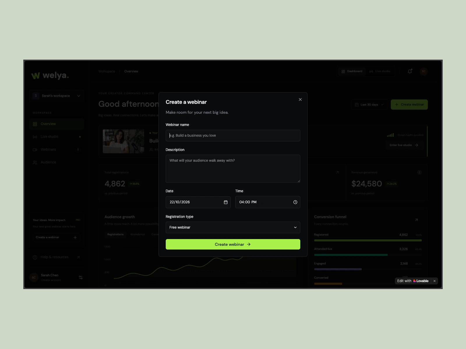
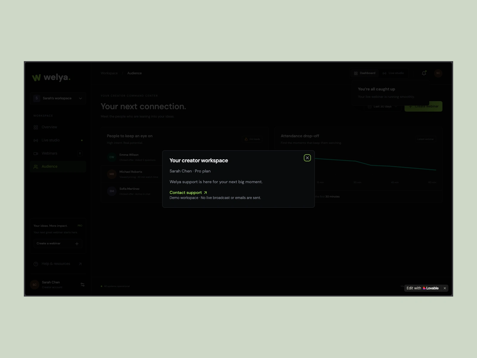
Streamlined Setup Modal: A frictionless 3-step creation flow that unifies scheduling, registration page branding, and offer configuration.
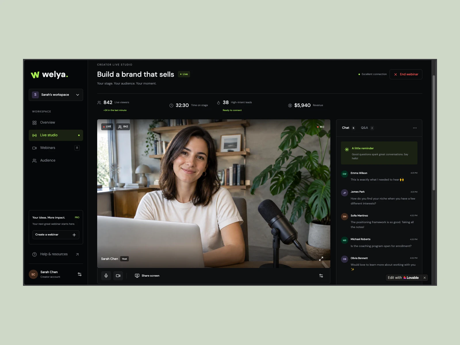
Surface 2: The Live Studio Cockpit (In-Event Broadcast Hub)
A high-density 3-column control cockpit built for zero-distraction operation during live broadcasts:
Left Column — Stage Monitor & AV: 16:9 low-latency stream preview, stream health status (1080p 60fps), audio level indicators, camera/screen-share toggles, and instant layout switching (Grid, Focus, Picture-in-Picture).
Center Column — Real-Time Lead Scoring & Interaction: Dynamic intent-ranked attendee feed displaying hot leads, alongside a categorized chat panel with dedicated filters for Q&A questions and purchase intents.
Right Column — Conversion & Offer Engine: One-click conversion triggers. The coach can pin an offer card, push animated countdown urgency timers, launch real-time audience polls, and view live checkout tickers as sales happen.
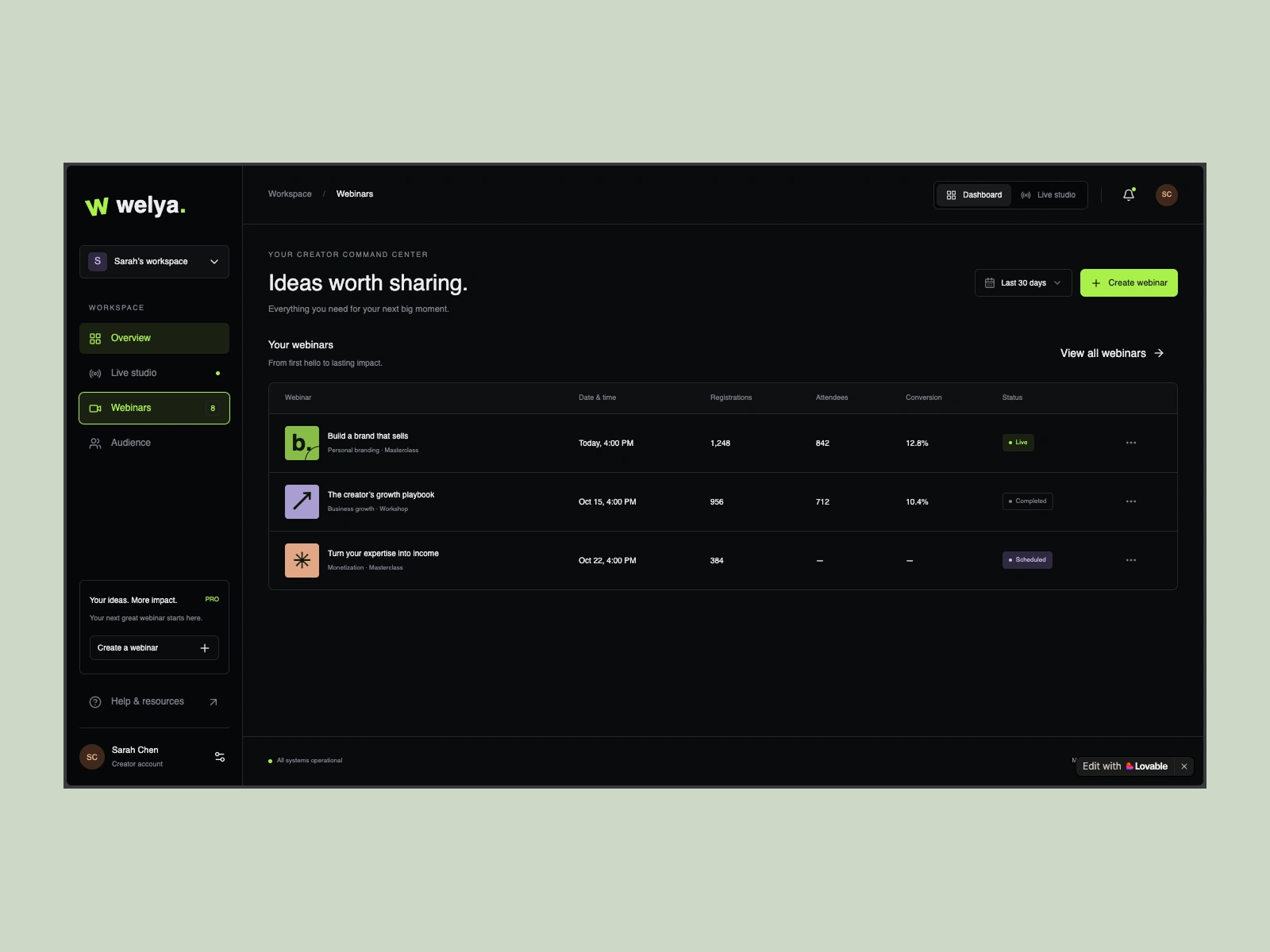
The visual design system establishes a premium, authoritative dark-mode environment tailored to modern tech-savvy creators:
Dark-Mode Palette: Deep neutral backgrounds (
zinc-950 / zinc-900) paired with subtle zinc-800 structural borders, creating crisp contrast without visual fatigue.Information Density: High-density 1px borders, compact padding, and monospace numeric chips for timestamps, bitrates, and metrics.
Accessible Contrast: Bright white iconography and typography for critical operational controls (calendar pickers, stage toggles, and live status tags) verified across light and dark viewports.
Responsive Touch Targets: Mobile layouts re-architected with persistent bottom navigation bars, full-width touch-friendly cards, and stacked broadcast controls for mobile attendees and hosts.
Rather than delivering static Figma frames that leave edge cases and state changes to guesswork, this concept was prototyped directly in code using React, TypeScript, Tailwind CSS, and TanStack Start:
Tested Interaction States: Modals, popovers, filters, tab switches, and live offer triggers were verified with real component behaviors.
Zero Translation Loss: UI tokens and layout grids correspond 1:1 with production frontend standards, drastically cutting engineering implementation time.
Like this project
Posted Oct 9, 2026
Redesigned Welya for modern creators using UI/UX innovation and code prototypes.
Likes
0
Views
2