Vively — Own your health
Ville Oké
Vively — Own Your Health
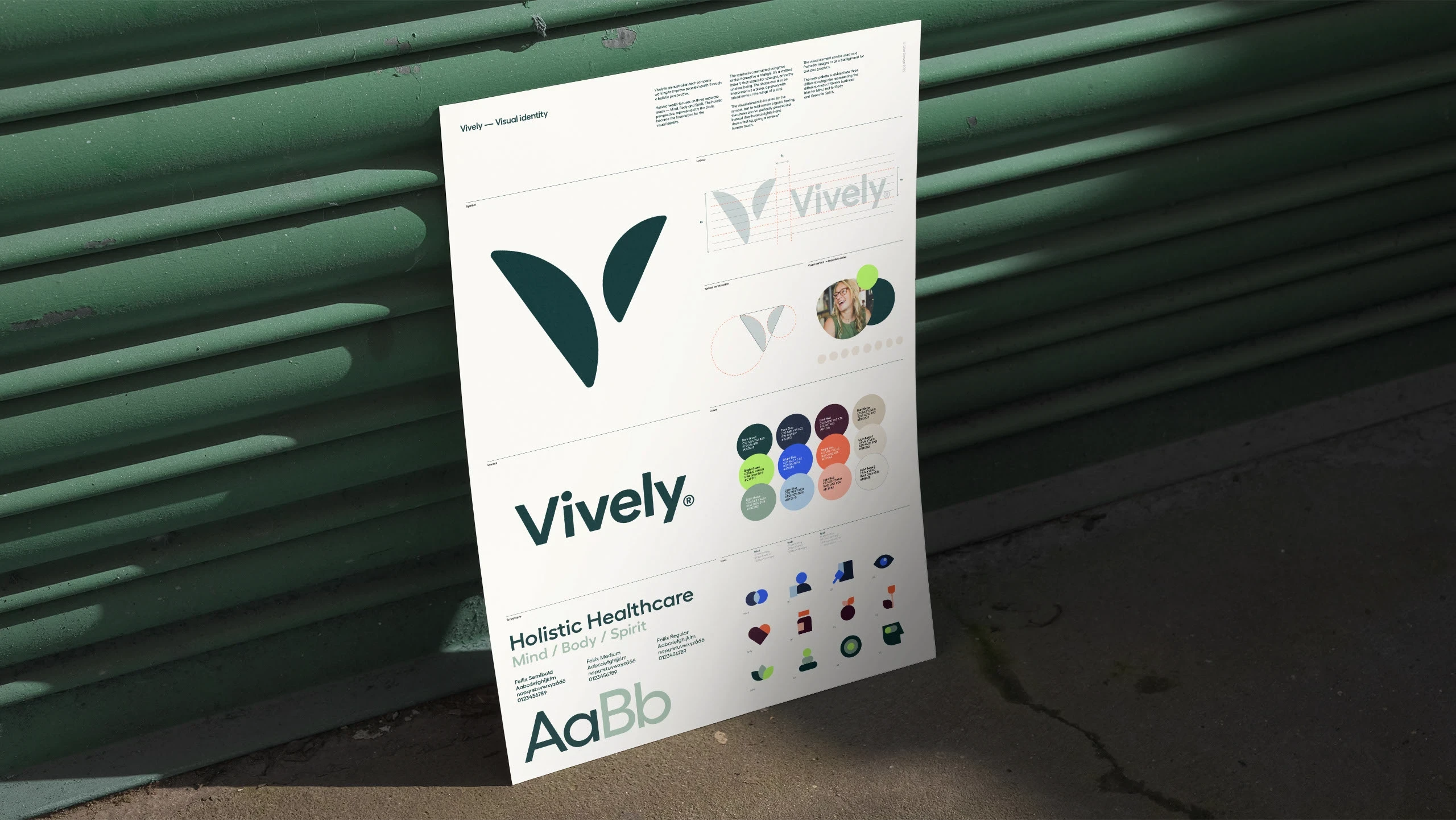
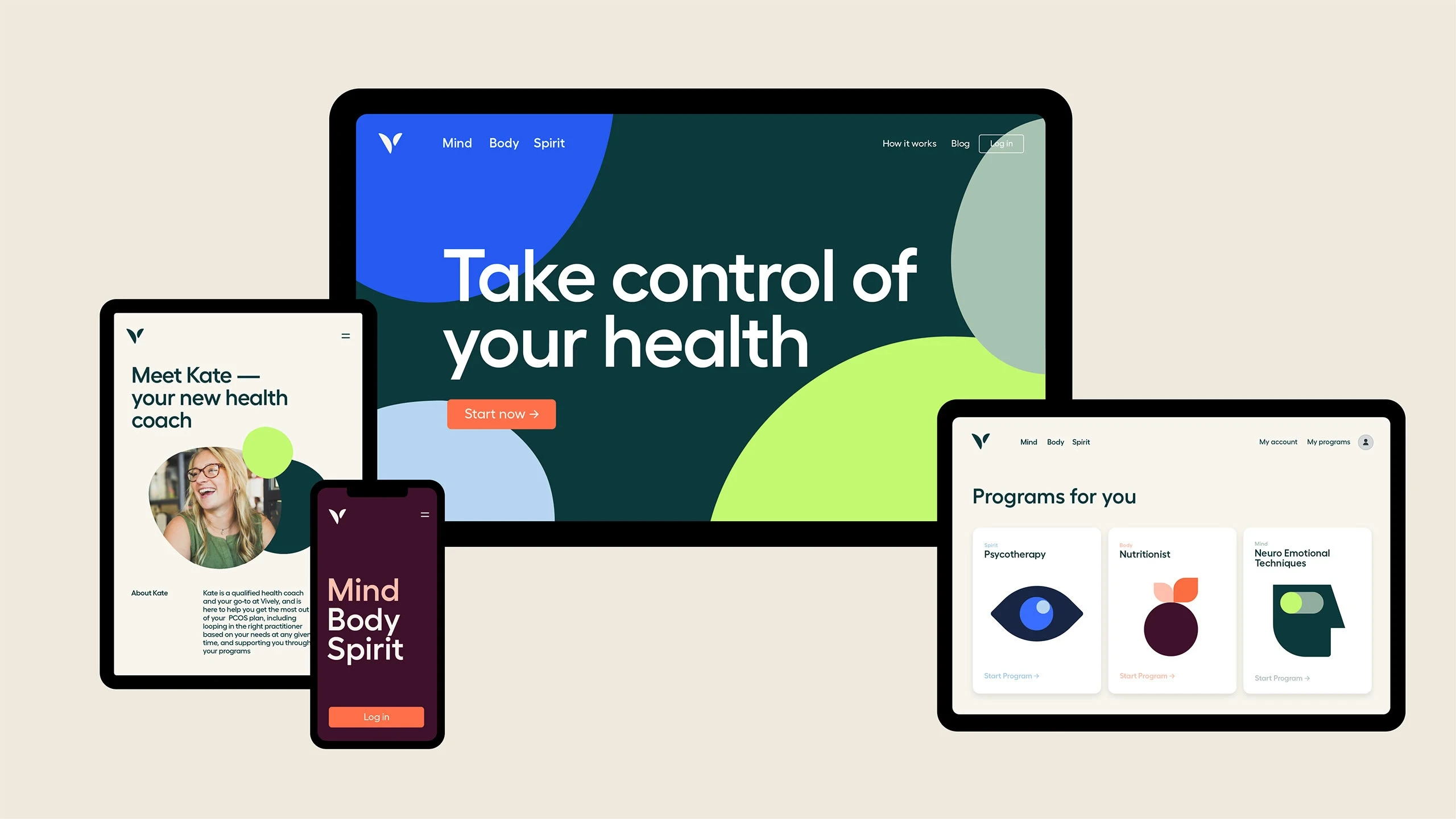
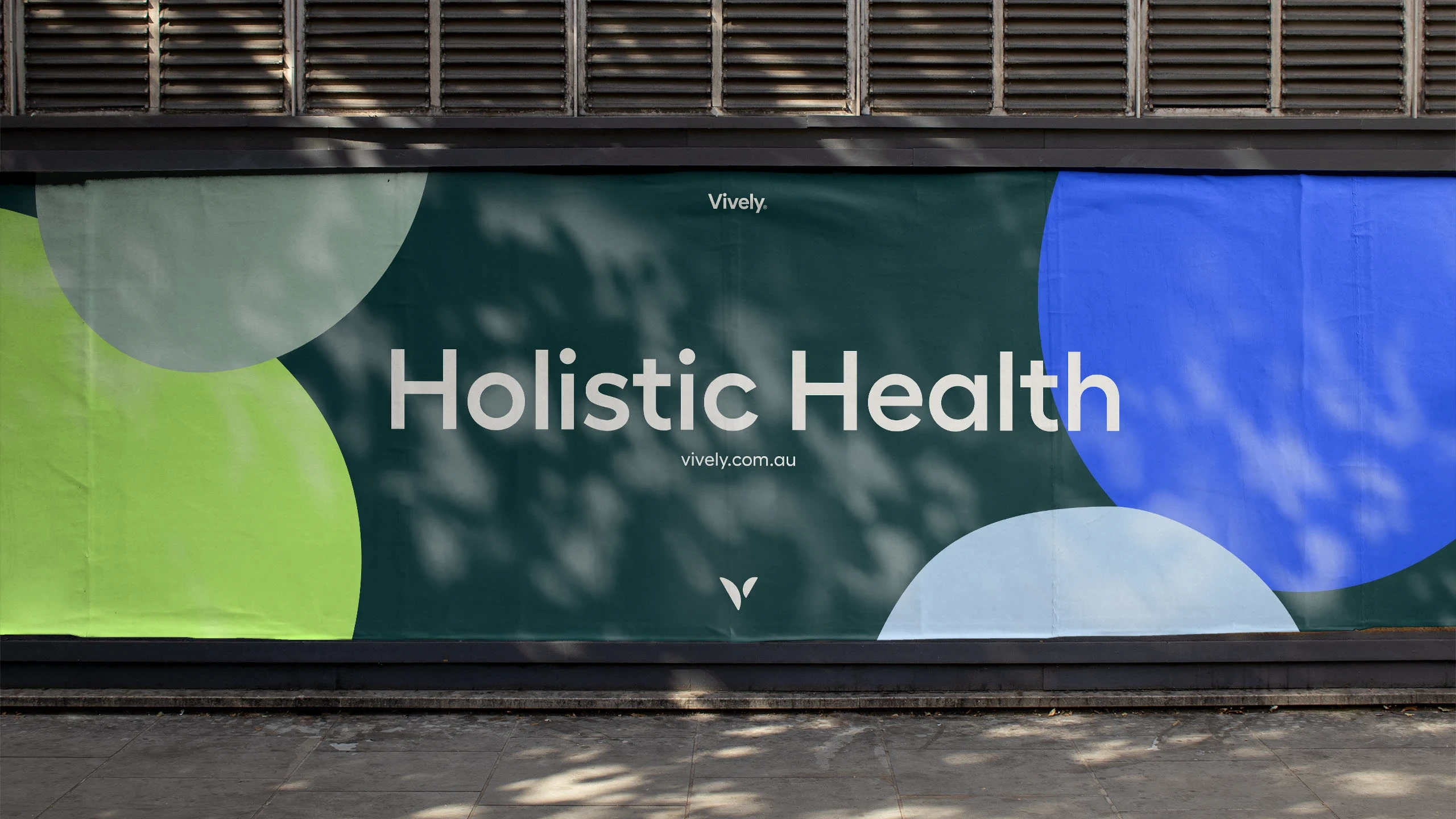
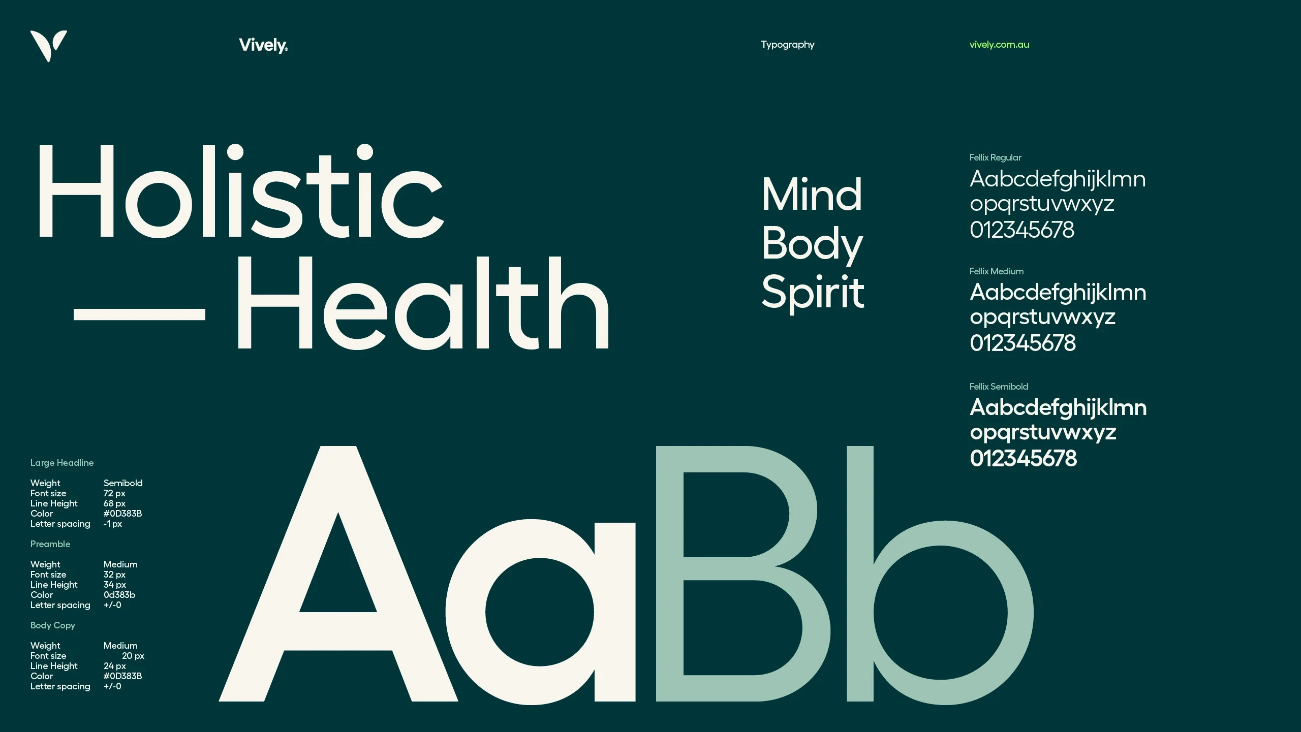
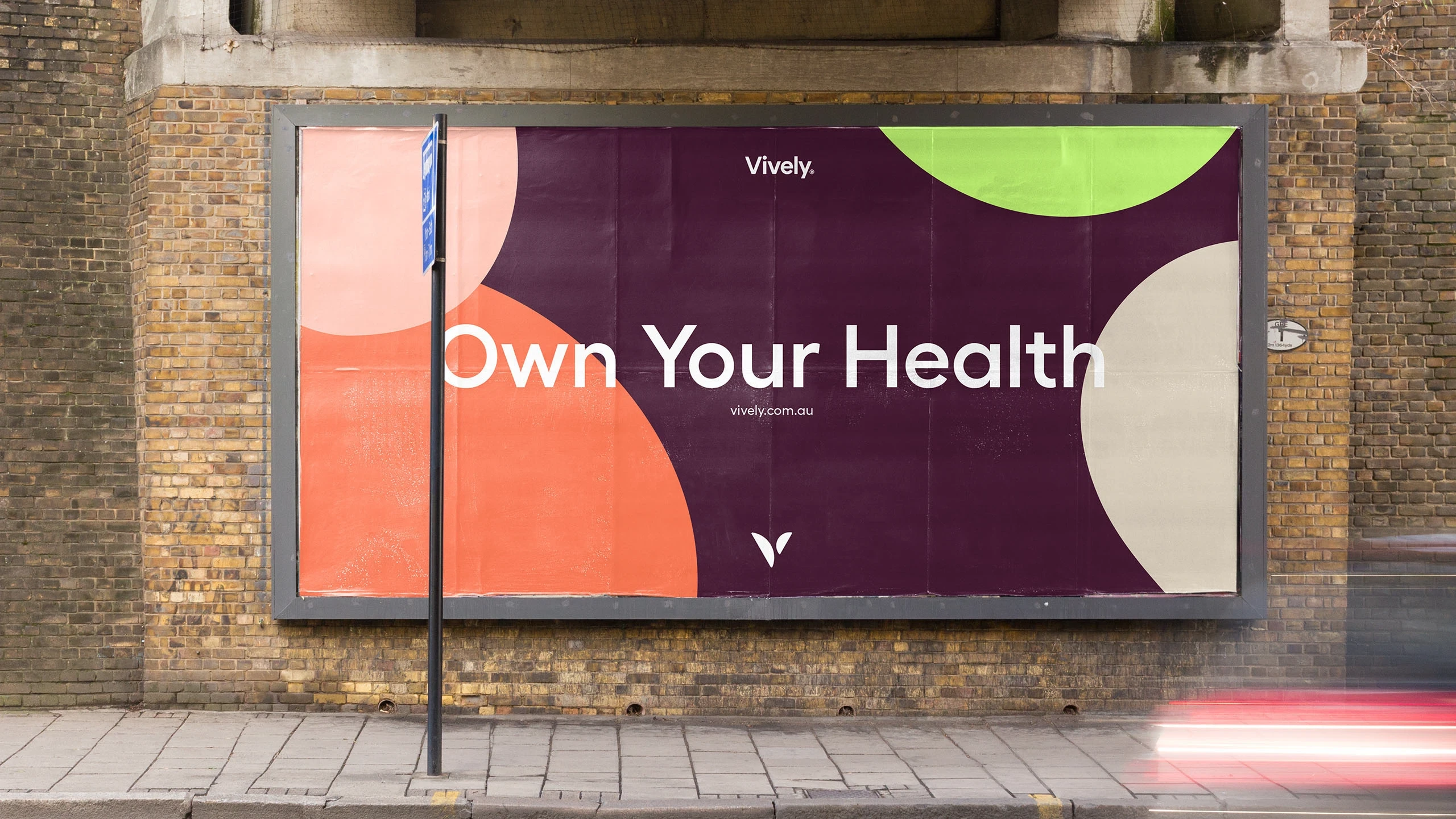
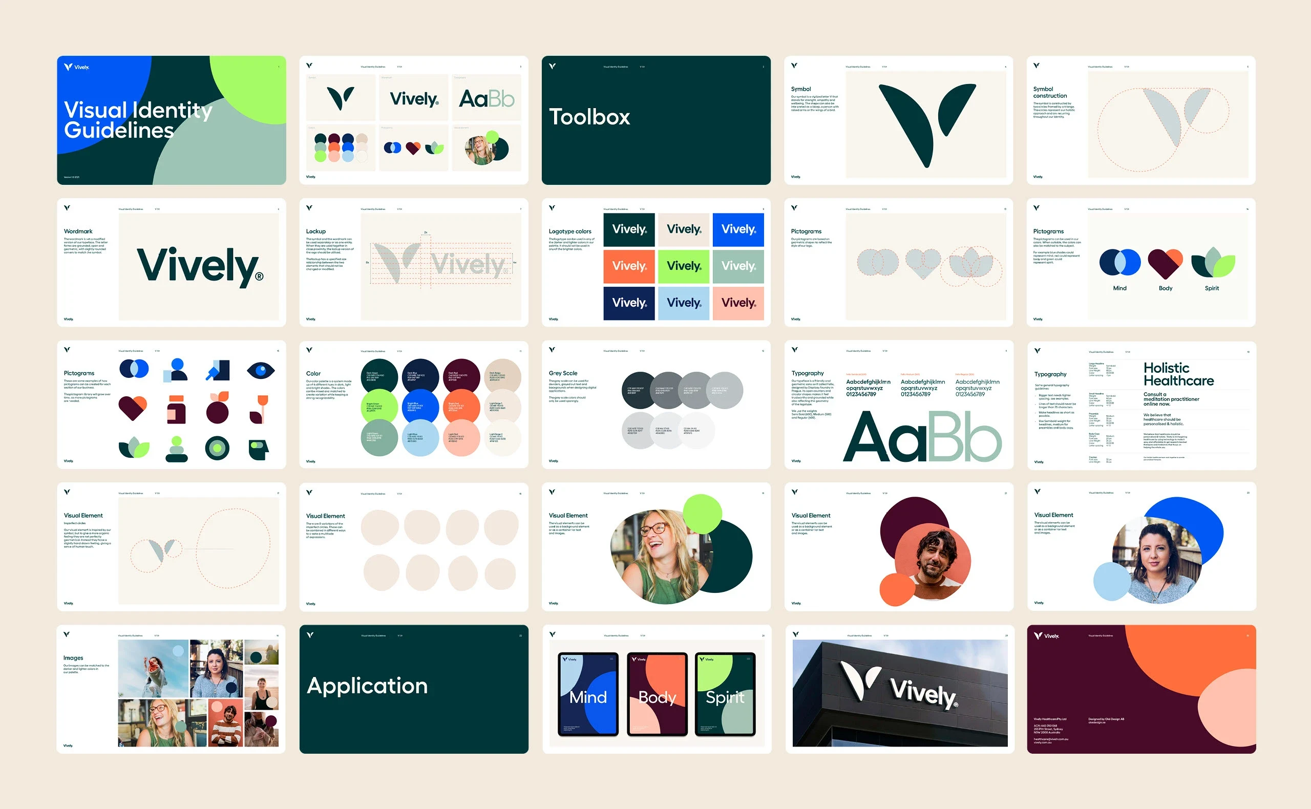
Vively is an Australian health tech company with a holistic perspective, meaning they focus on three different areas; mind body and spirit. The holistic perspective, represented by the circle, became the foundation for the visual identity.
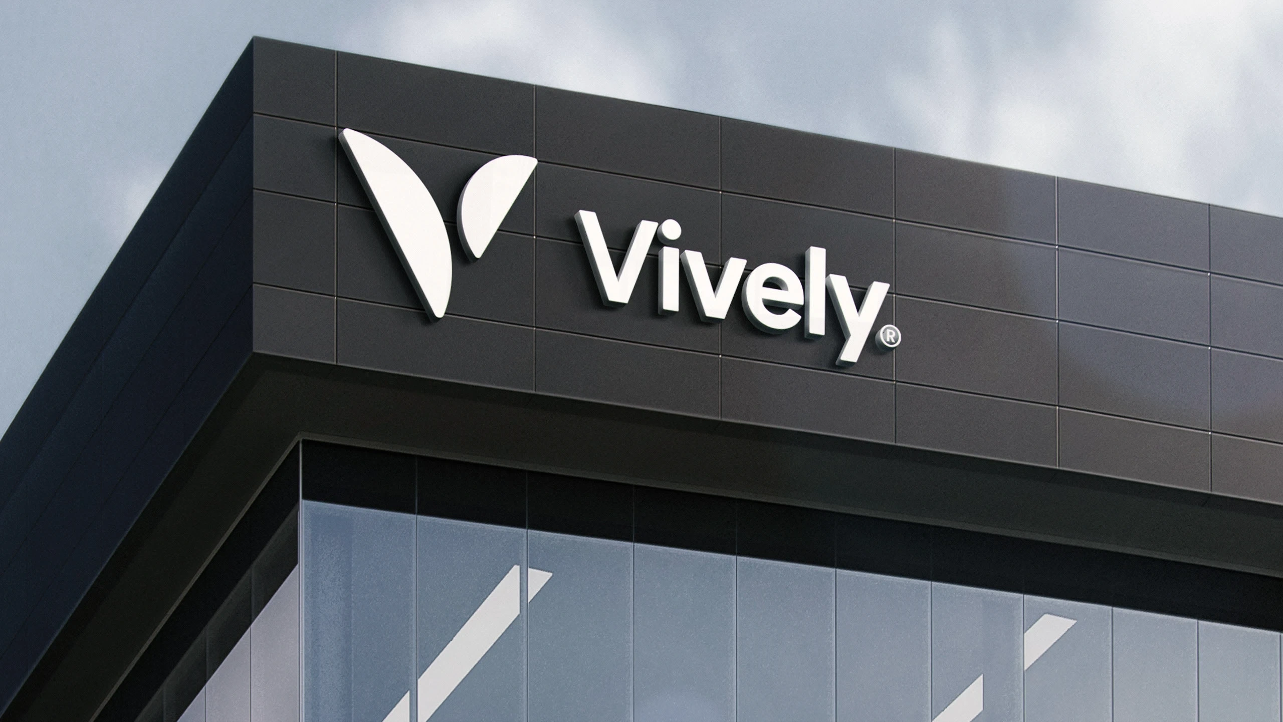
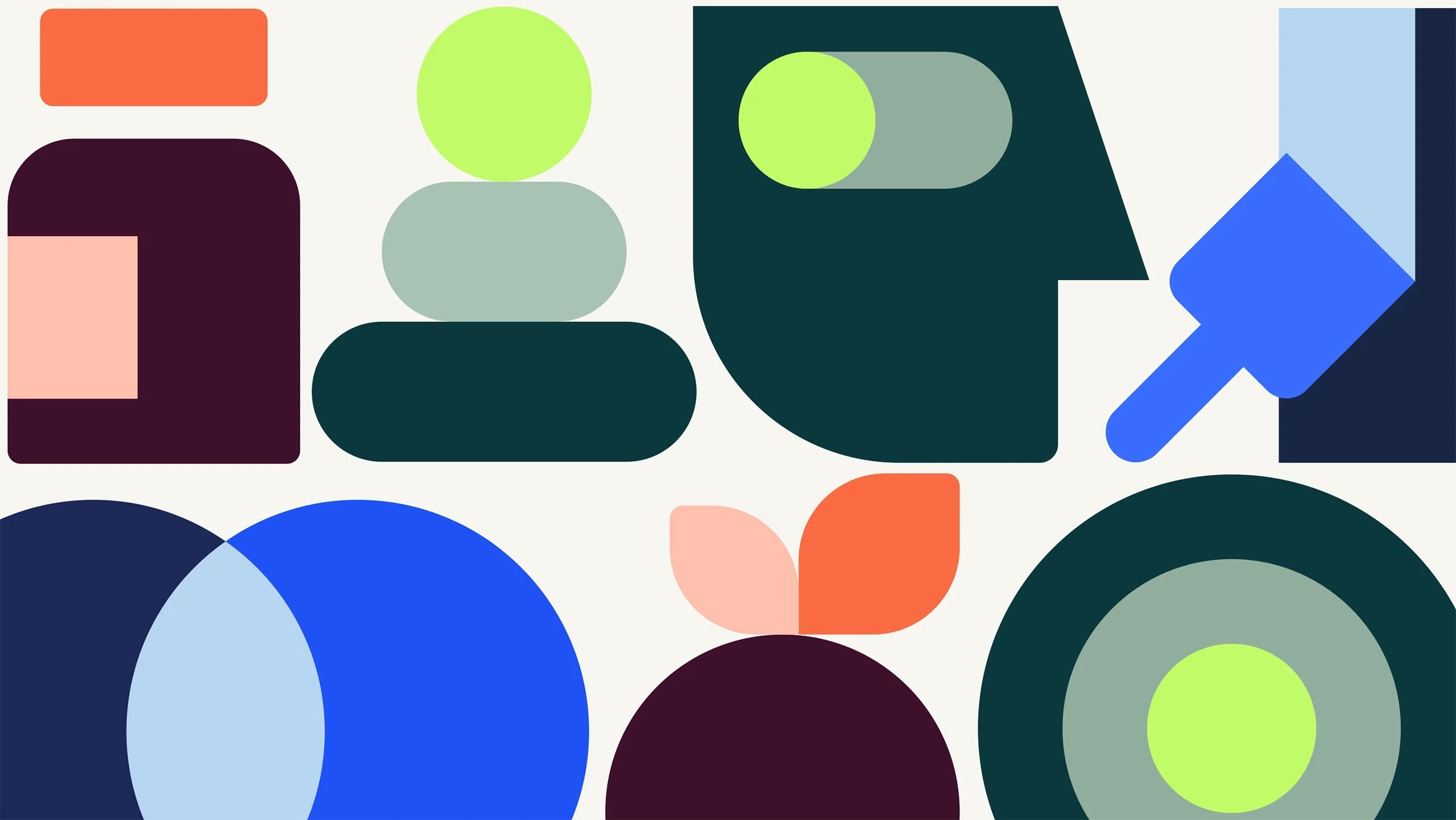
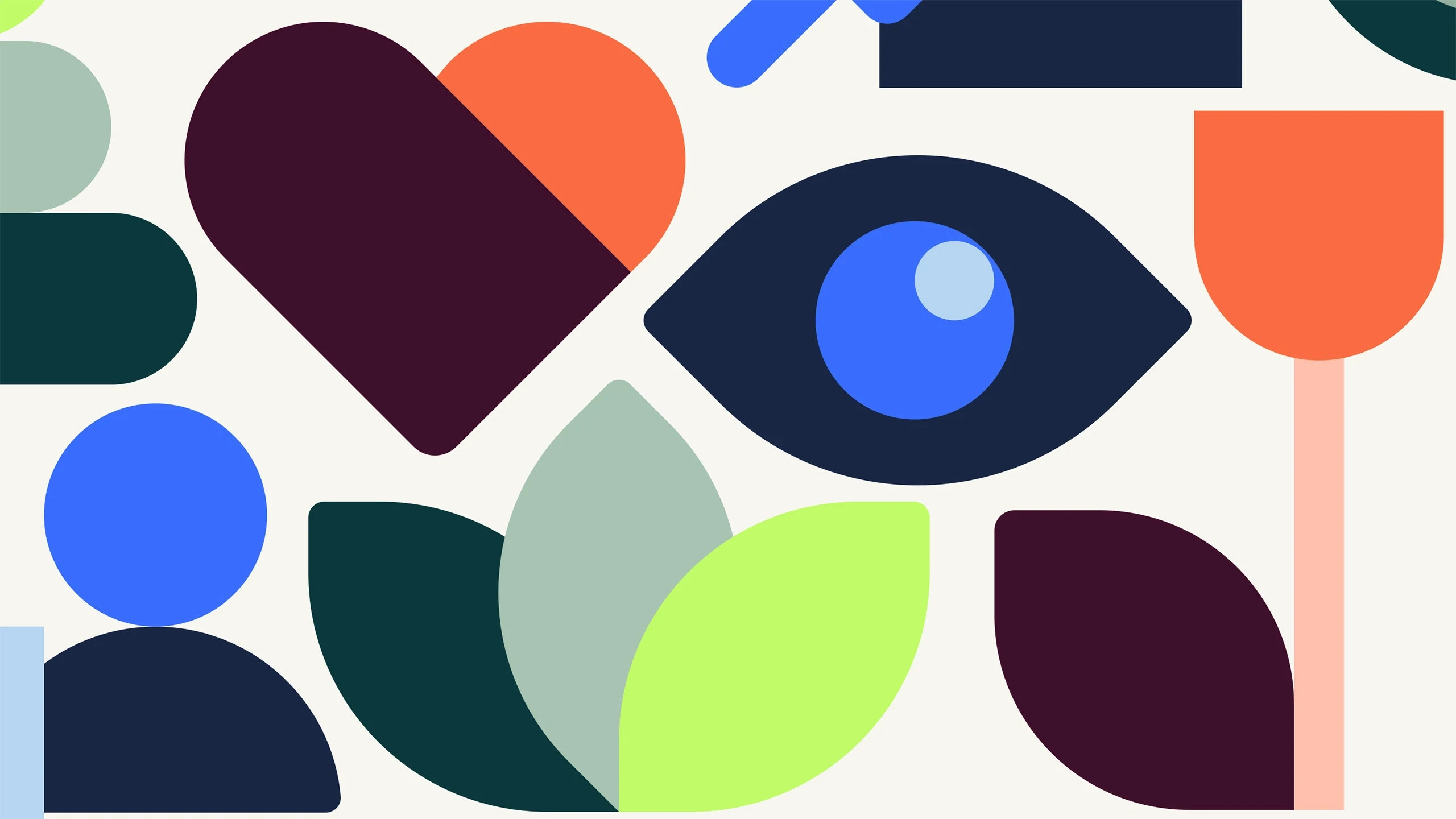
The symbol is a stylized letter V that stands for strength, empathy and wellbeing. The shape can also be interpreted as a bicep or a person with raised arms. The visual element is inspired by the symbol, but to add a more organic feeling, the circles are not perfectly geometrical. Instead they have a slightly hand drawn feeling, giving a sense of human touch to the identity.
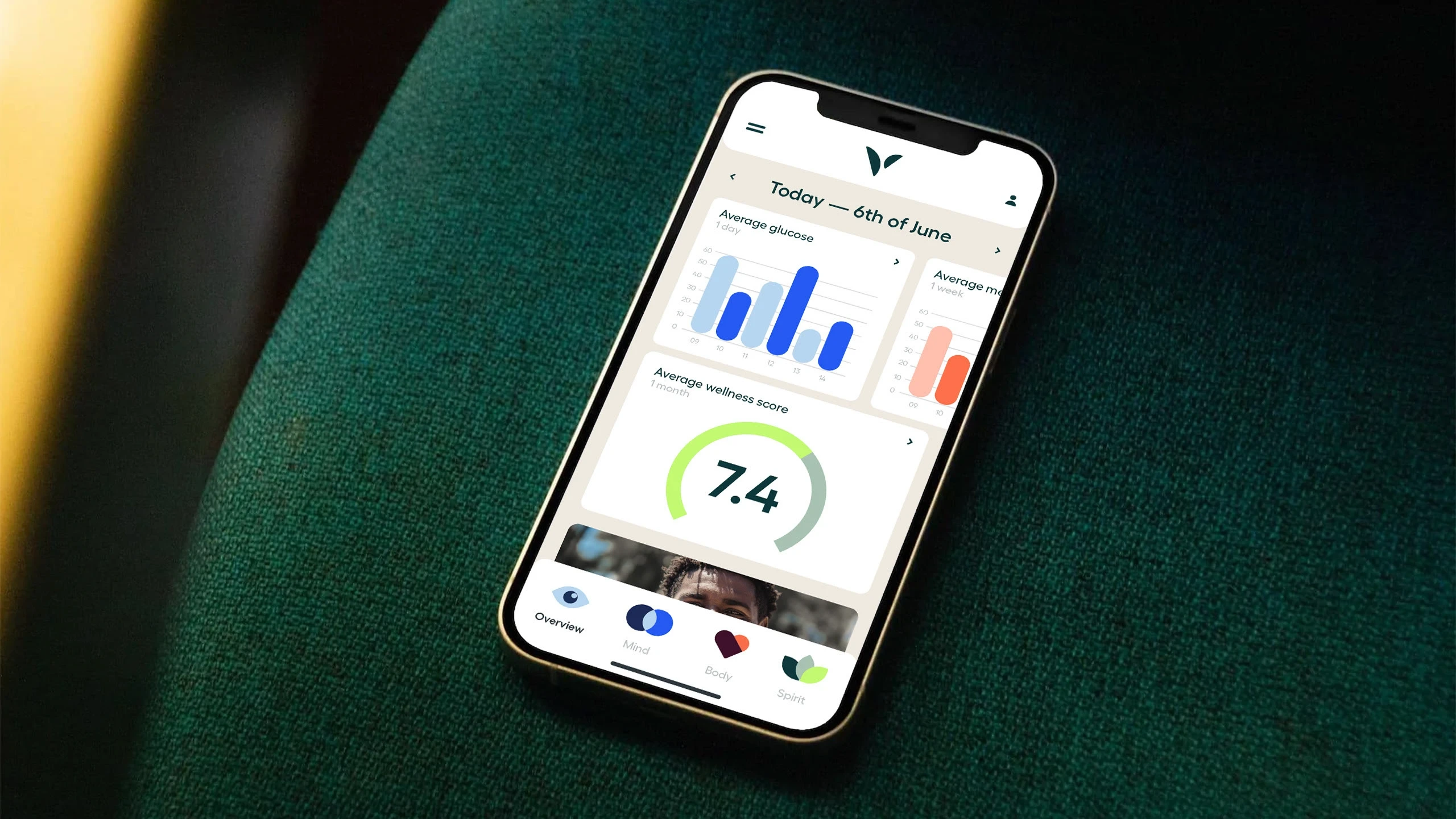
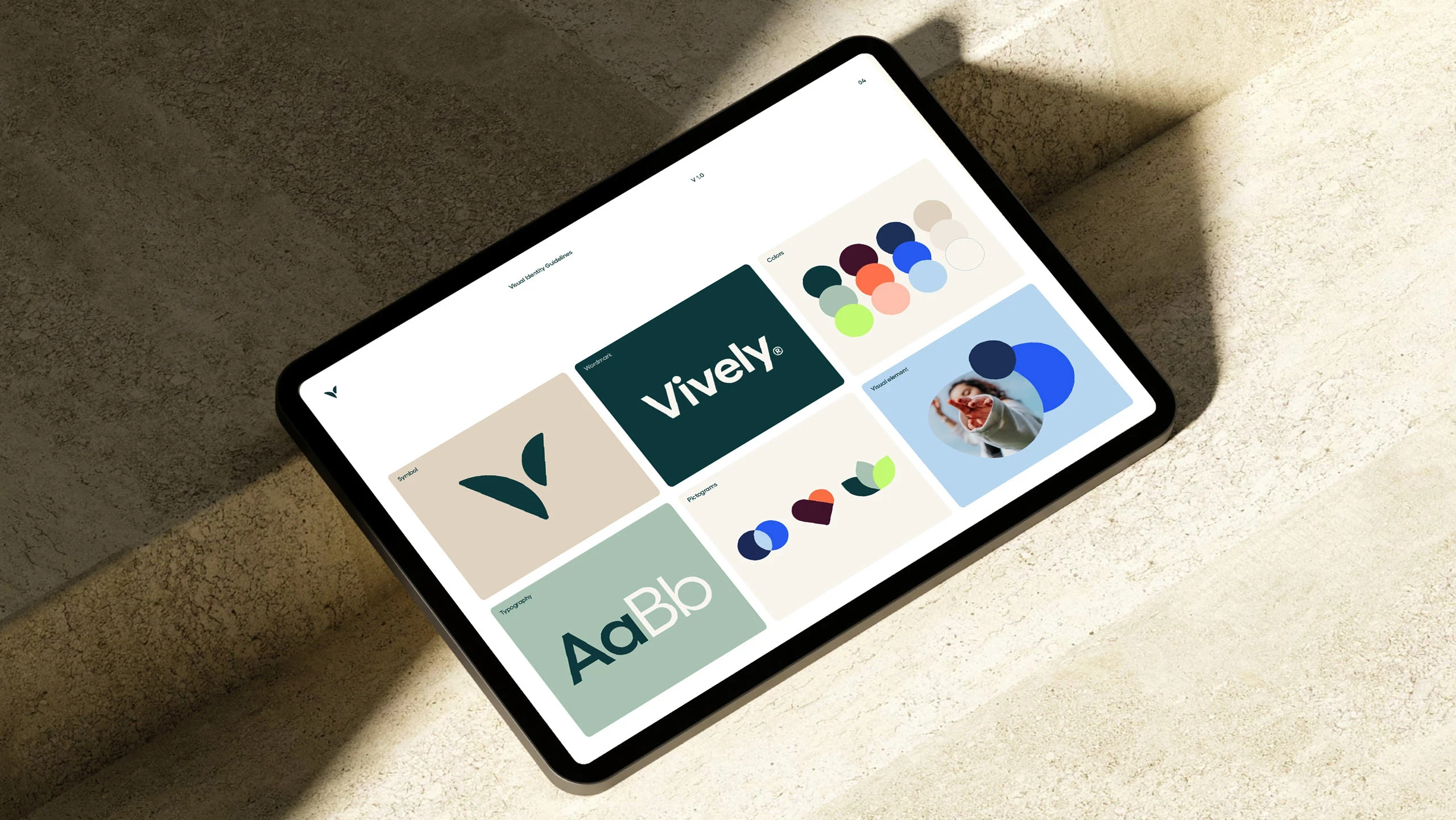
Oké Design Created the visual identity for the brand as well as some initial implementations including website, app and printed matter, before handing over to the in-house design team.
See more at vively.com.au

Like this project
Posted May 22, 2025
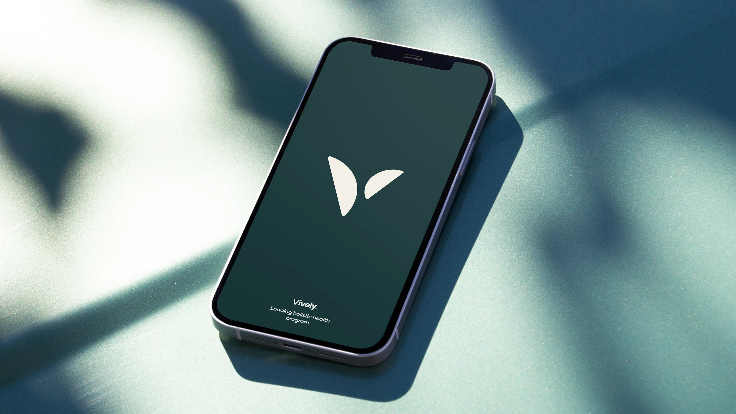
The holistic health perspective, represented by the imperfect circle, became the foundation for this visual identity for Australian health tech startup Vively.
Likes
1
Views
26
Timeline
Jan 1, 2021 - Ongoing