Omma Brand Identity Design
Dmitri Litvinov

Premium Services Provided: Week Design Sprint
The Brief
Omma is an AI-powered platform that transforms ideas into fully realized digital experiences in seconds, bridging the gap between creativity and execution for designers, developers, and non-technical users alike. The objective was to create a distinctive and memorable brand identity that feels powerful, stable, and inherently positive—capturing the speed, productivity, and creative potential at the core of the product. The challenge was to design something iconic and instantly recognizable, while avoiding generic AI tropes and instead building a refined, future-facing visual system that scales seamlessly across different mediums.
Exploration
During the week-long design sprint, I explored a wide range of logo directions focused on capturing Omma’s core themes of speed, creativity, and productivity. The exploration phase prioritized bold, simple forms that could translate into an iconic and instantly recognizable mark, while testing different metaphors around generation, flow, and transformation. I intentionally pushed both geometric and more expressive directions to understand the boundaries of the brand, refining toward solutions that felt stable and powerful without becoming heavy or overly complex. This process allowed me to identify a clear visual language that balances clarity, energy, and scalability across the system.
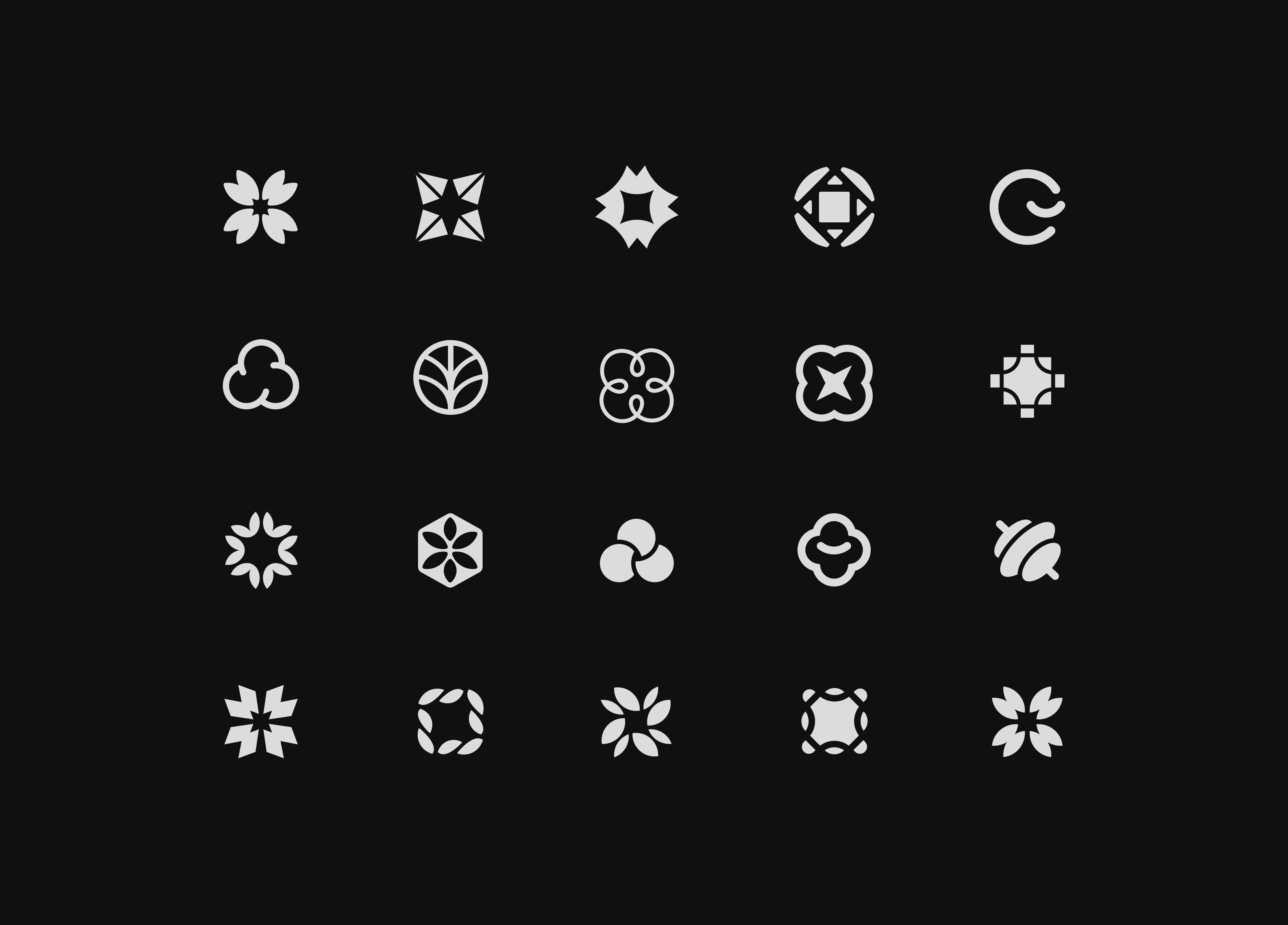
Initial exploration
Mark
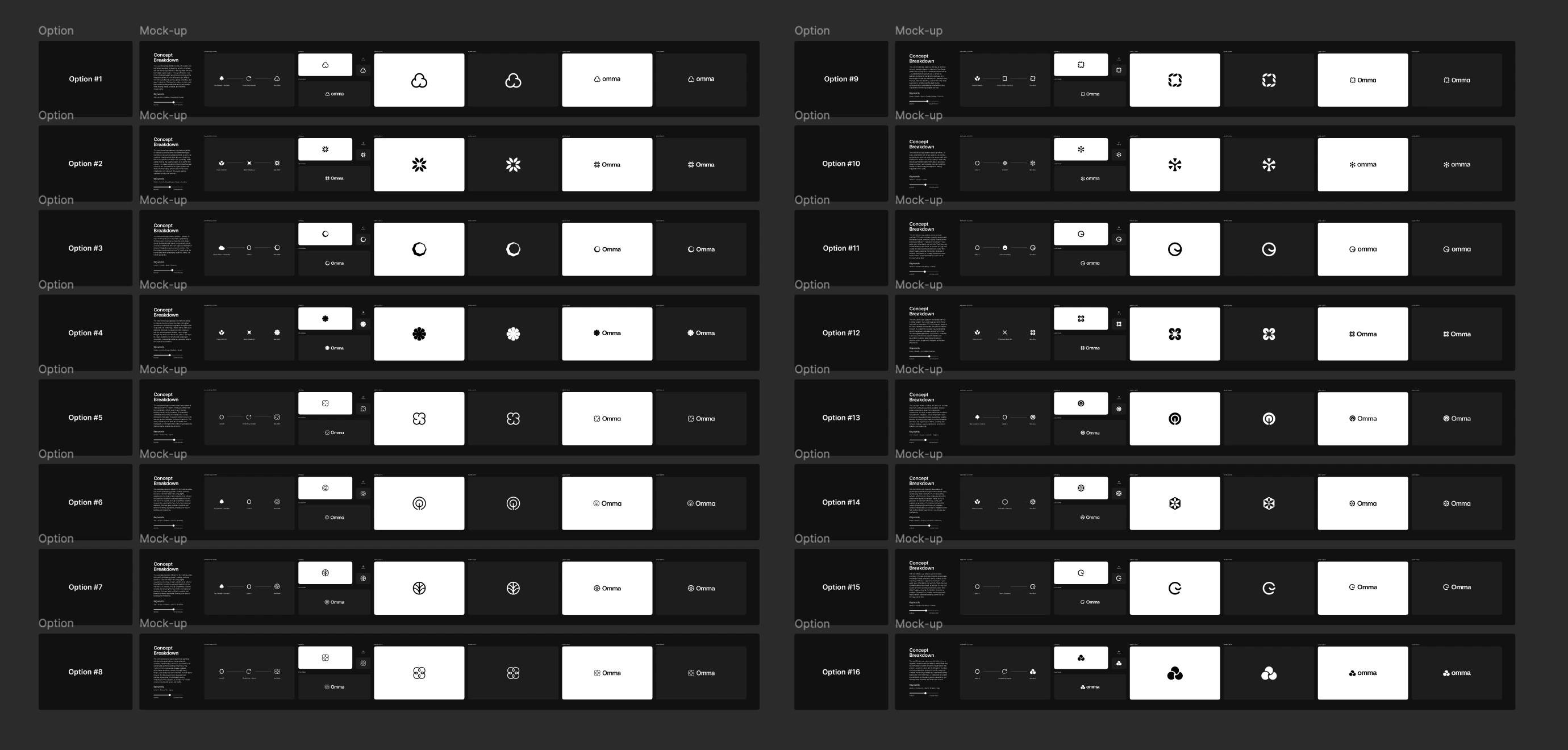
The logo mark exploration focused on translating the brief into a wide range of distinct yet intentional directions, each rooted in the core ideas of speed, creativity, and productivity. I developed numerous concepts that explored different visual metaphors—from flow and generation to structure and transformation—while keeping a consistent emphasis on simplicity and recognizability. By iterating across both geometric and more expressive forms, I was able to test how far the identity could stretch while still feeling stable, powerful, and positive. This breadth of exploration helped surface the most ownable and scalable solution, ensuring the final mark feels both iconic and deeply aligned with the product’s vision.
Top picks
Color Palette
The color palette exploration focused on establishing a flexible yet cohesive system that could scale across a wide range of applications. I explored multiple color directions—from more neutral, grounded tones to brighter, high-energy accents—to understand how different palettes could express speed, creativity, and positivity. The goal was to strike a balance between a strong, stable foundation and moments of vibrancy that bring the brand to life, without overwhelming the overall system. This range of exploration helped define a palette that feels modern, adaptable, and capable of supporting both product and brand experiences consistently.
Testing out different color palettes
Narrowing It Down
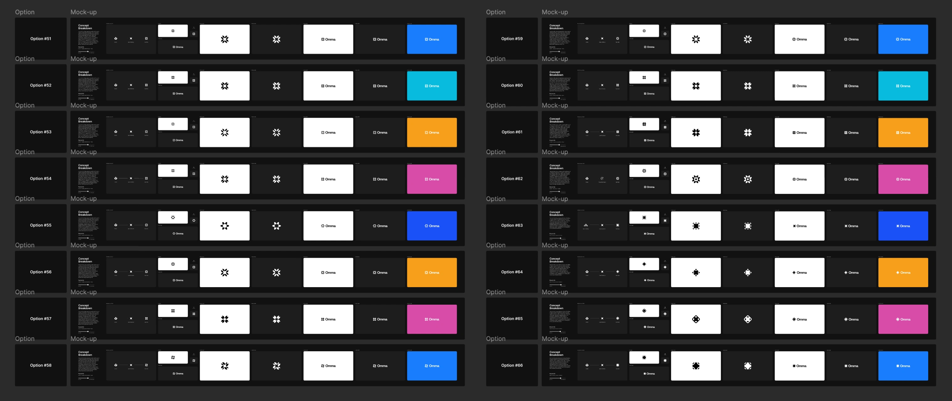
After exploring a wide range of directions, I narrowed the concepts down by evaluating each option against the core goals of the brief—clarity, memorability, and scalability. I focused on identifying the mark that felt the most balanced: simple enough to be instantly recognizable, yet distinctive enough to feel ownable and powerful. Through iterative refinement, I stripped away unnecessary complexity and strengthened the underlying geometry to ensure it would hold up across all sizes and applications. The final logo emerged as the most cohesive solution, capturing Omma’s sense of speed, creativity, and stability in a way that feels both timeless and forward-looking.
Final options
Logo Breakdown
The final logo was carefully constructed with a focus on precision, balance, and symmetry to ensure it feels both intentional and timeless. Every curve, angle, and spacing decision was meticulously refined, allowing the mark to achieve a sense of visual harmony and stability. I paid close attention to alignment, proportions, and negative space to create a form that feels clean and effortless, while still carrying subtle complexity beneath the surface. This level of detail ensures the logo holds its integrity across all sizes and applications, reinforcing its strength as a scalable and iconic mark.
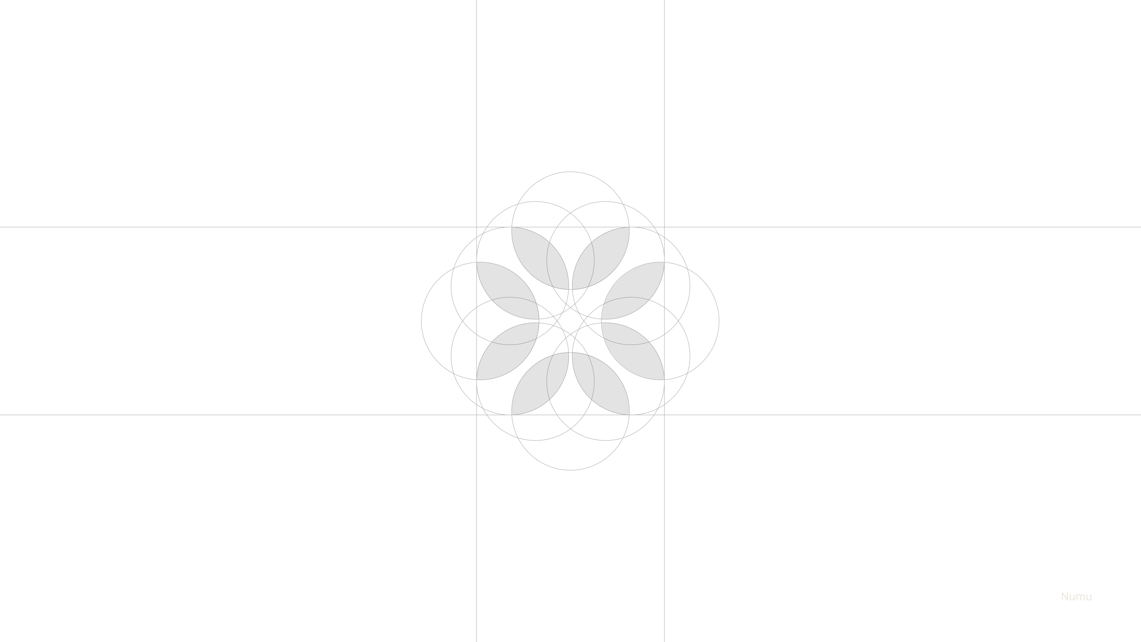
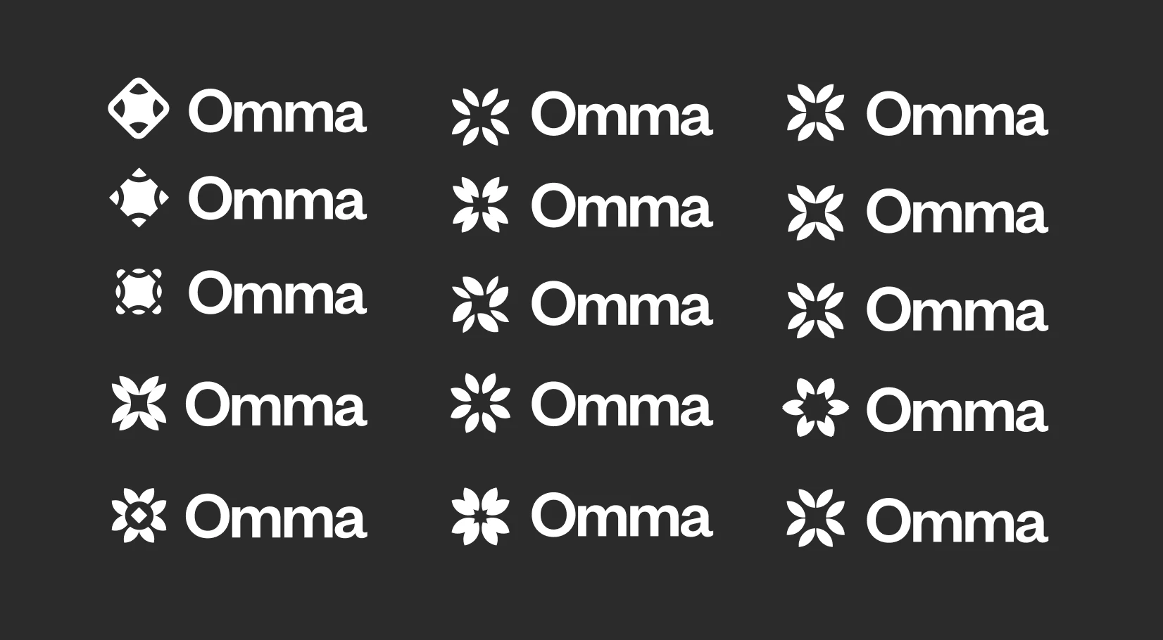
Fine details
Final Logo
The final logo brings together all aspects of the Omma brand into a single, cohesive mark that feels both intentional and distinctive. It captures the core ideas of speed, creativity, and productivity through a form that is clean, balanced, and instantly recognizable, while maintaining a sense of strength and stability. The simplicity of the design allows it to scale effortlessly across different touchpoints, from product interfaces to marketing, without losing its impact. As a result, the logo not only reflects Omma’s forward-thinking nature but also establishes a clear and ownable foundation for the brand moving forward.
Final pick
Brand Guide
The Brand Guide serves as the final deliverable of the week-long design sprint, bringing together every aspect of the Omma identity into a clear, cohesive system. It outlines all the essential details—from logo usage and construction to color, typography, and iconography—ensuring consistency across every touchpoint. Each element is documented with precision, providing a practical framework that can be easily applied and scaled as the product evolves. The result is a comprehensive and actionable guide that translates the brand into a system ready for real-world use.
Full Brand Guide
See it live here — Omma
Like this project
Posted May 5, 2026
Week design spring for Omma's new brand identity.
Likes
0
Views
92
Clients
Spline