Badge Icons
What is Rippling?
Rippling helps minimize the administrative work on the HR and IT side, which means I can spend more time on what I enjoy most: helping clients solve problems with innovative strategies.
Project Brief
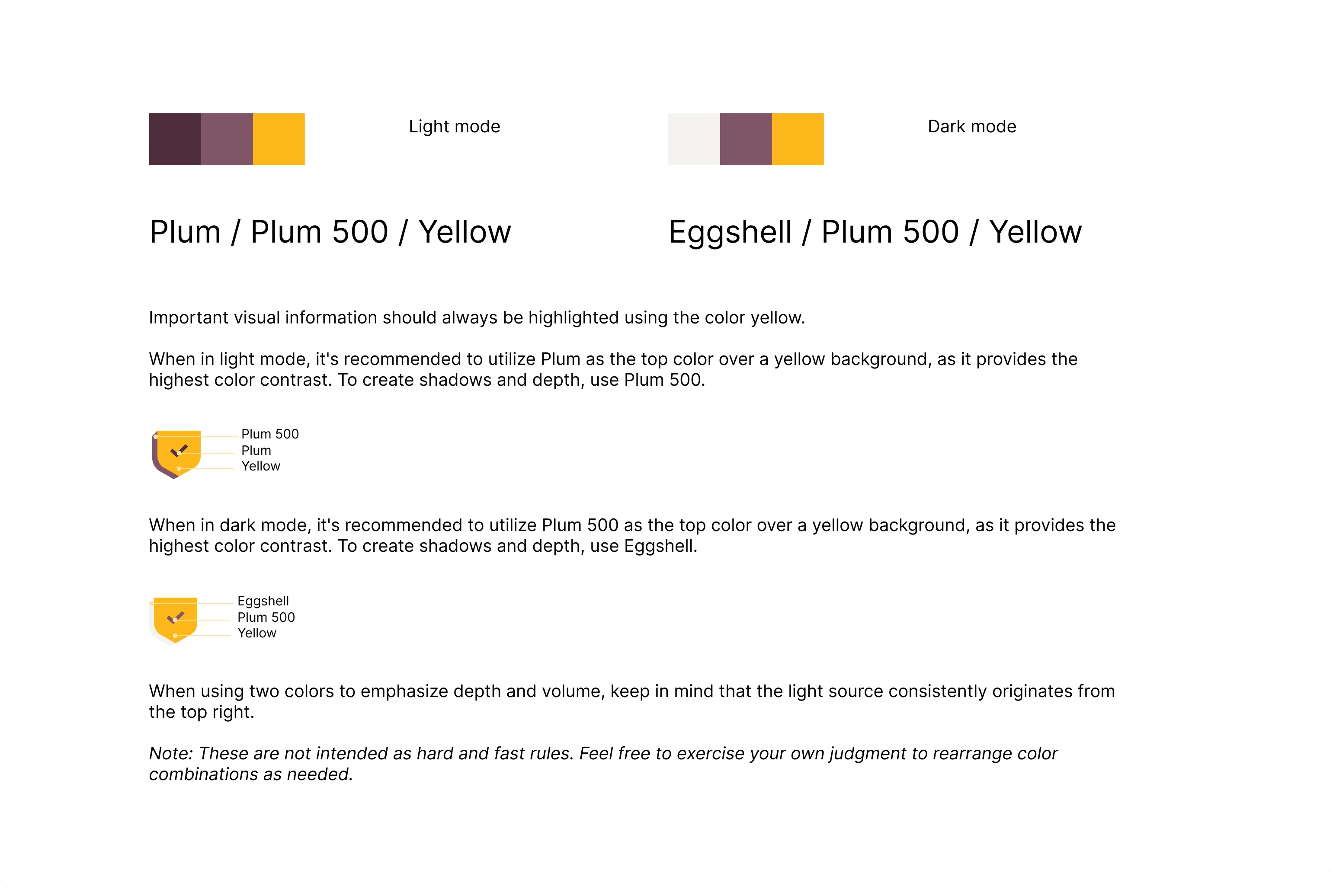
The project brief for new Rippling Badge Icons includes requirements for modern, scalable designs that represent various achievements or statuses within the platform. These icons should be visually distinct yet cohesive, aligning with Rippling's brand identity while providing clear and intuitive communication to users.
Overview of the project brief
Rippling Badge Icons includes requirements for modern, scalable designs that represent various achievements or statuses within the platform.
Dimension & Perspective
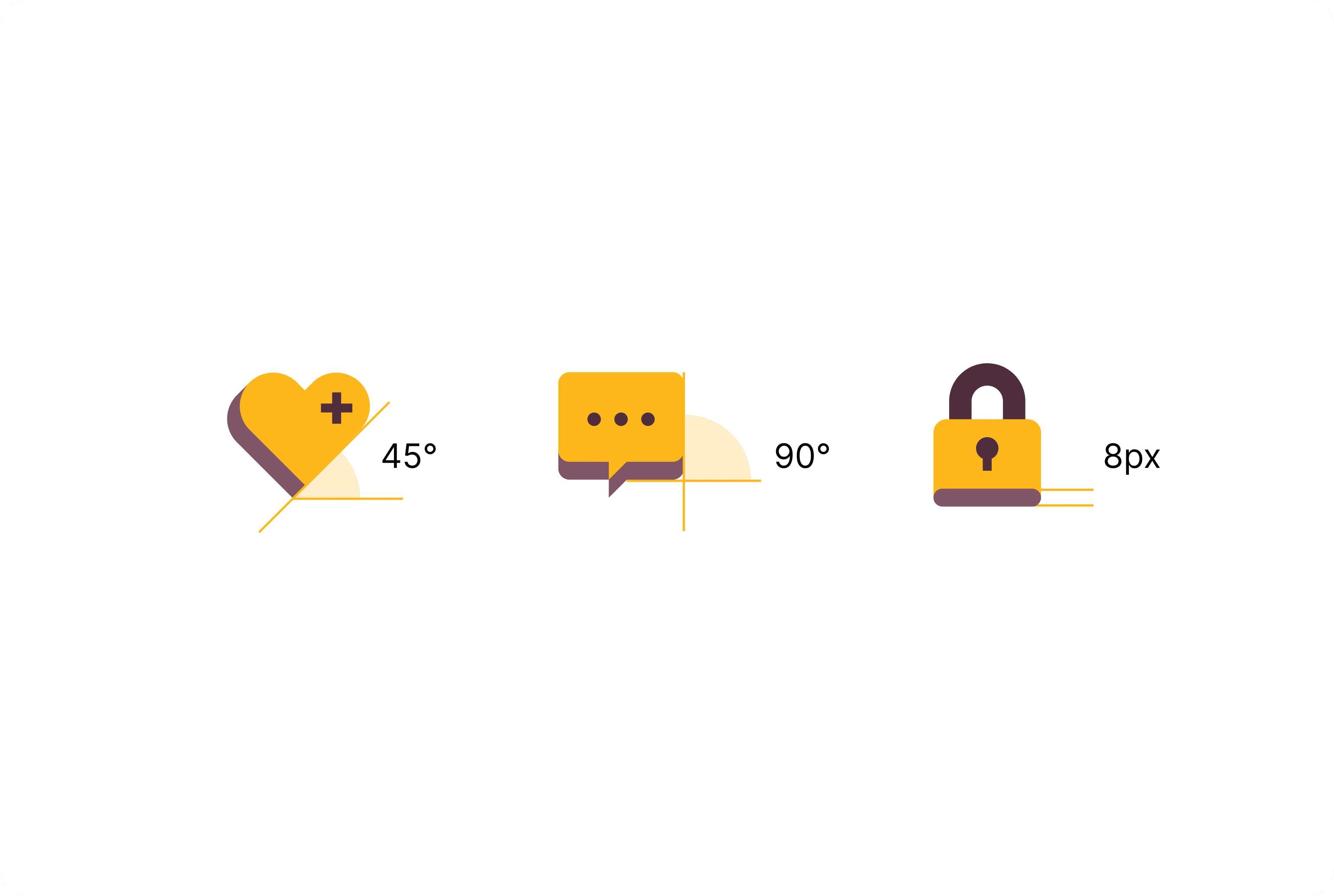
Expressive icons use forced perspective to create a sense of dimension and volume. For visual consistency, forced perspective should be applied at either a 45 or 90 degree angle and extrude 8px. When smaller shapes require forced perspective to be applied, an extrusion of 4px is recommended.
Details about the dimension and perspective of the icons
New Icons & Revisions
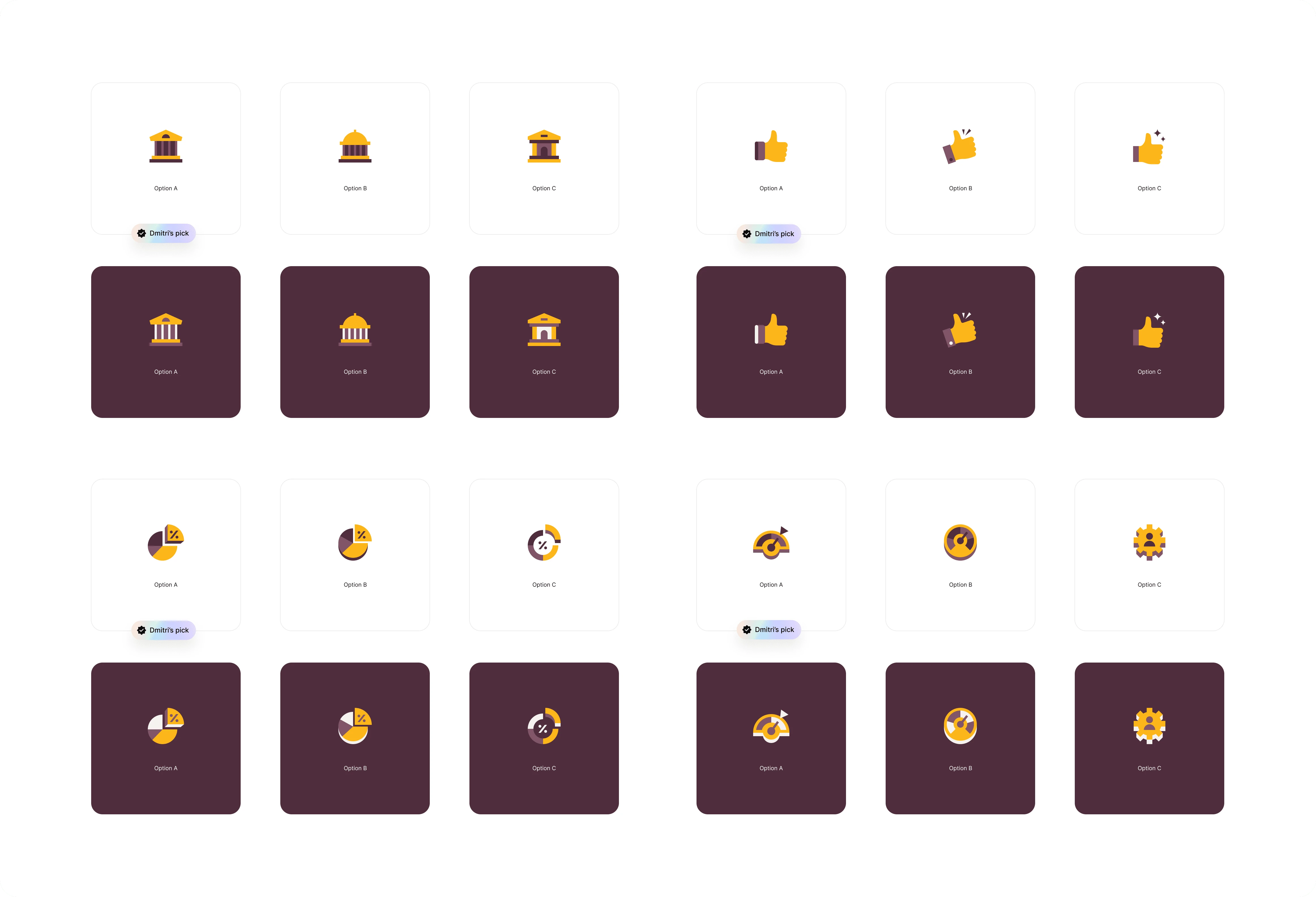
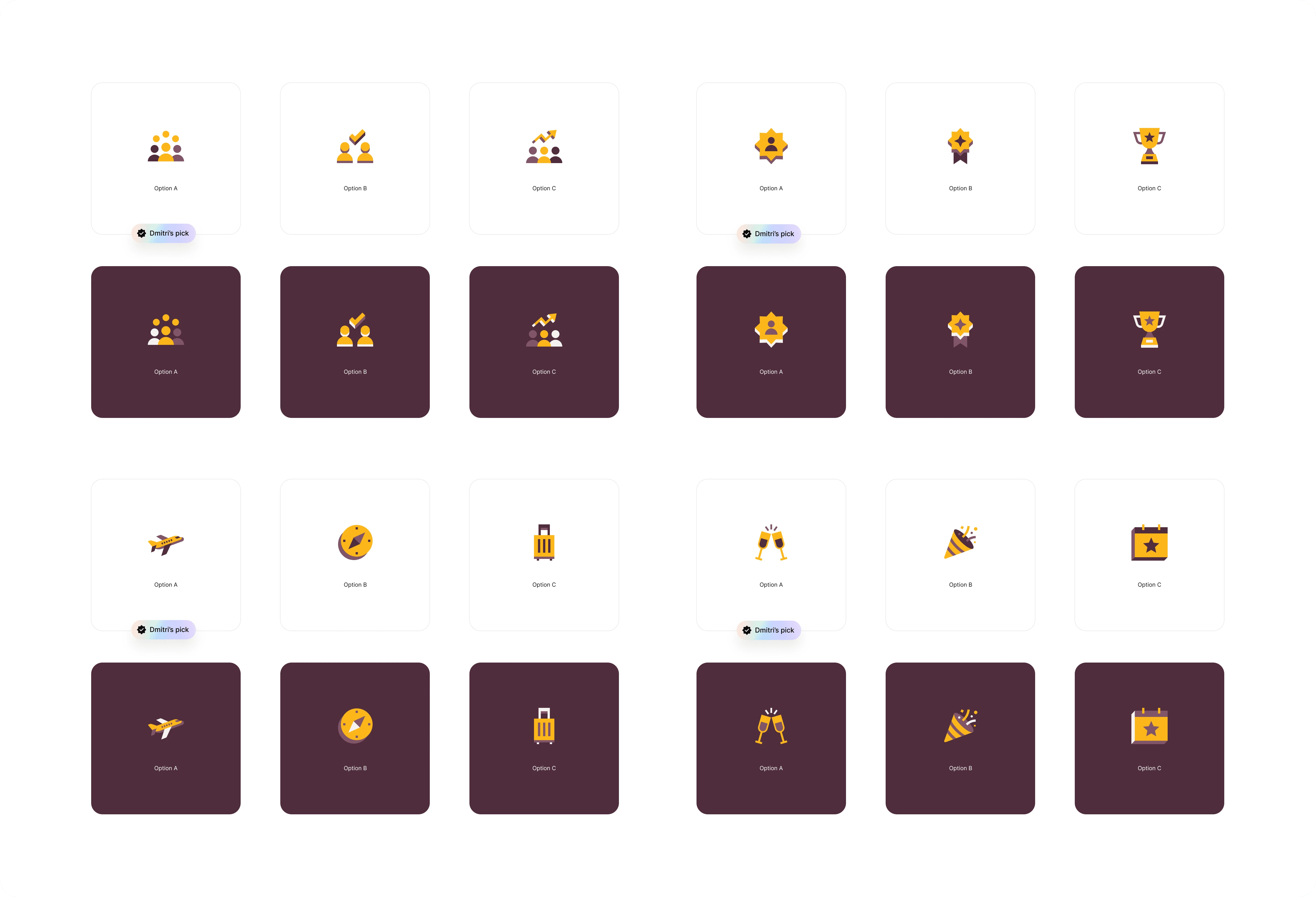
During the presentation for the new Badge Icons project at Rippling, I showcased three different versions for each icon, providing the client with a range of options to choose from. Each version was carefully crafted to align with Rippling's brand aesthetic while offering unique visual elements to suit different preferences and use cases. This approach allowed for a thorough exploration of design possibilities and ensured that the final icons would effectively communicate the desired achievements and statuses within the platform
Overview of the icon mock-ups
Each version was carefully crafted to align with Rippling's brand aesthetic while offering unique visual elements to suit different preferences and use cases.
Design Process
In the process of refining the Badge Icons for Rippling, we encountered several rejections before arriving at the final approved design. Each rejected icon provided valuable feedback and insights that guided us towards improvements. Through iterative revisions and close collaboration with the client, we fine-tuned the icons' visual elements, ensuring they aligned perfectly with Rippling's brand identity and effectively communicated the intended achievements and statuses. This iterative approach not only led to the creation of a visually compelling and cohesive set of Badge Icons but also strengthened the overall design process and client satisfaction.
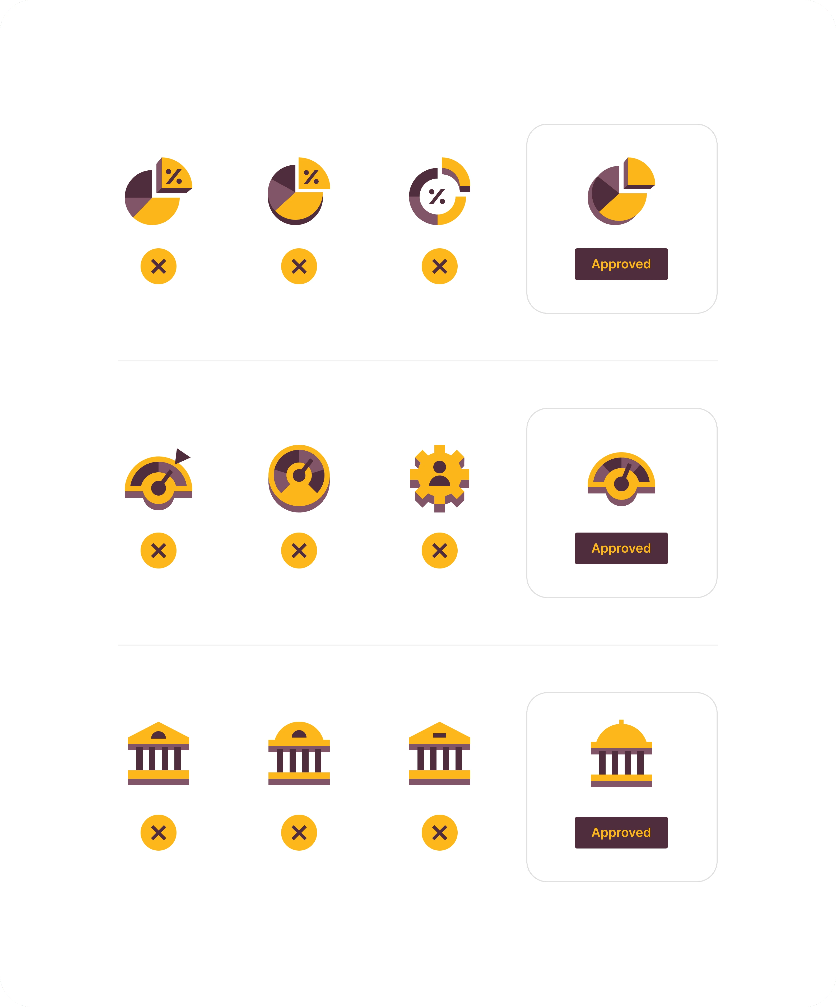
We set up a fluent approval process to narrow it down to the final icons
Through iterative revisions and close collaboration with the client, we fine-tuned the icons' visual elements, ensuring they aligned perfectly with Rippling's brand identity and effectively communicated the intended achievements and statuses.
Final Icons
I felt immensely proud of the new and final Badge Icons that I designed for Rippling. Seeing the evolution from initial concepts to the refined, approved icons was a rewarding journey. The icons not only met but exceeded the client's expectations, perfectly capturing Rippling's brand essence while enhancing user experience. Knowing that these icons would play a significant role in communicating achievements and statuses within the platform filled me with a sense of accomplishment and professional satisfaction.
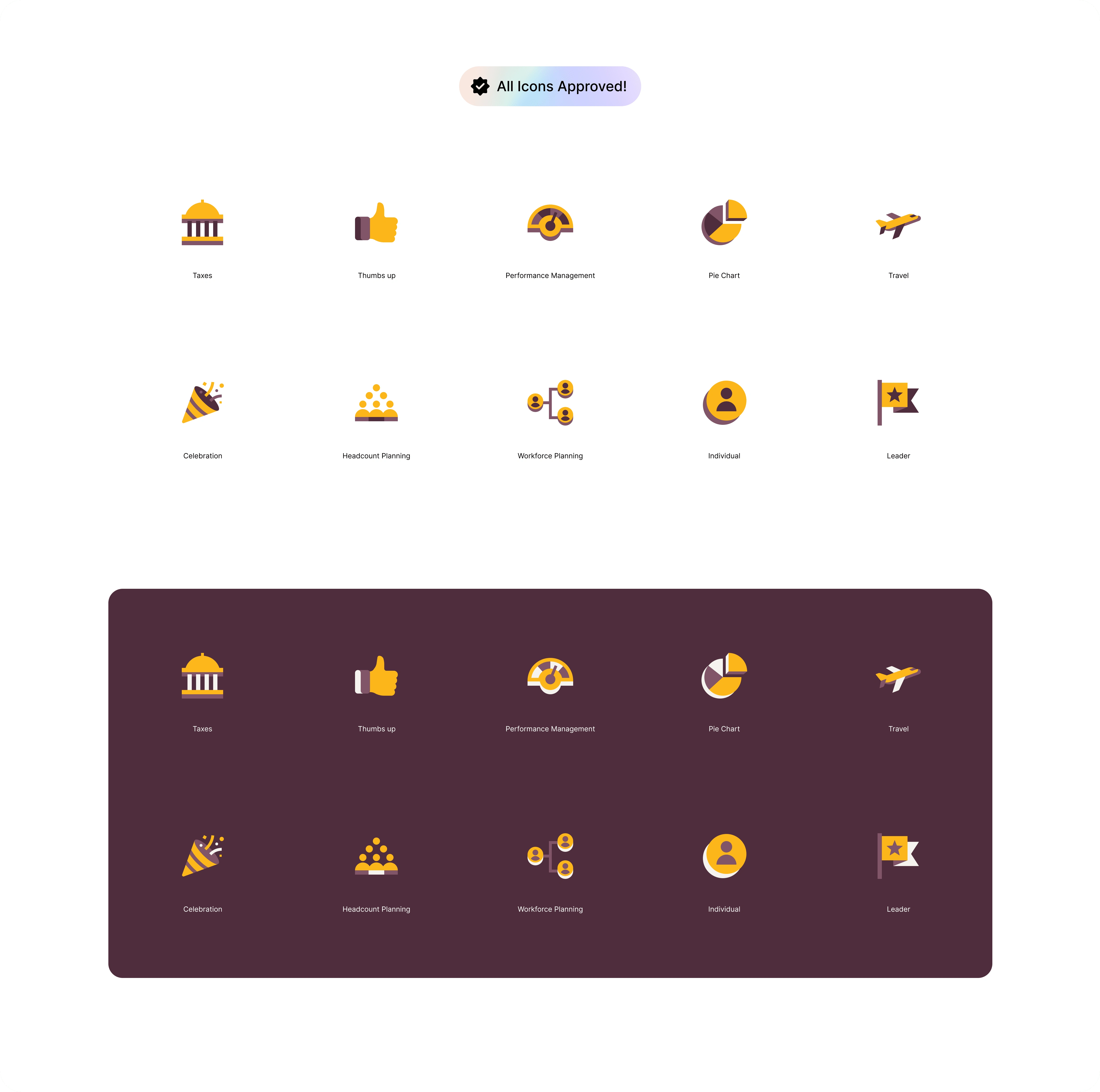
Final icon set
Conclusion
In conclusion, my efforts in redesigning the Rippling Badge Icons resulted in a significant improvement and the creation of a new, cohesive set. Through iterative design processes and collaboration with the client, we were able to refine the icons to better align with Rippling's brand identity and user experience goals. The new set of Badge Icons not only meets the functional requirements but also embodies a visually appealing and unified design language, enhancing the overall branding and usability of the Rippling platform.
Have a project in mind?
👋🏻 Contact me → hey@dmitrilitvinov.com
Like this project
Posted May 1, 2024
Designed the new custom Badge Icon set system.


