PayPal Icons
Dmitri Litvinov
Creating New PayPal Icons
In crafting the new refreshed icons for PayPal, I embarked on a design journey that aimed to modernize and elevate the brand's visual identity. The process involved a meticulous blend of contemporary design principles and a deep understanding of PayPal's ethos, resulting in a set of icons that not only reflects the brand's cutting-edge nature but also resonates with users, fostering a seamless and visually engaging experience. The refreshed icons stand as a testament to the commitment to innovation and user-centric design, enhancing the overall aesthetic of the PayPal platform.

Working with initial ideas and gridlines.
By adhering to the established color palette, the icons stand as a cohesive extension of the PayPal brand, contributing to a unified and recognizable user interface that enhances the overall brand experience.
Exploring Colors
For the new PayPal icons, I delved into an extensive color exploration process, aiming to strike the perfect balance between brand consistency and visual appeal. Leveraging a diverse palette, each color choice was meticulously considered to evoke positive user associations and enhance the overall user experience. The varied color explorations not only breathe new life into the icons but also cater to different functionalities, contributing to a vibrant and cohesive visual language that aligns seamlessly with PayPal's brand identity.

Exploring different color options.
Brand Colors
Maintaining consistent brand colors was of paramount importance in designing the new PayPal icons, ensuring a seamless integration with the established visual identity. The use of these consistent hues not only reinforces the brand recognition but also cultivates a sense of trust and familiarity among users. By adhering to the established color palette, the icons stand as a cohesive extension of the PayPal brand, contributing to a unified and recognizable user interface that enhances the overall brand experience.
Leveraging a diverse palette, each color choice was meticulously considered to evoke positive user associations and enhance the overall user experience.

Ultimately deciding to go with the main brand colors.
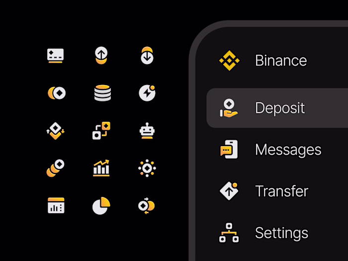
Final Result
Working on the new icon set for PayPal was an exhilarating experience, marked by the opportunity to contribute to the visual evolution of such a globally recognized brand. The creative process allowed for a seamless blend of innovation and brand integrity, resulting in a set of icons that not only reflect PayPal's cutting-edge nature but also enhance the user experience. The project was a testament to the collaboration between design principles and brand values, culminating in an icon set that stands as a visual cornerstone of PayPal's commitment to modernity and user-centric design.

Final icon set.
Have a project in mind?
👋🏻 Contact me → hey@dmitrilitvinov.com
Like this project
Posted Jan 31, 2024
Designing the new refreshed icon system.