WeightWatchers Illustrations
Dmitri Litvinov
Getting Started.
Designing small illustrations for WeightWatchers is crucial as these visual elements play a significant role in enhancing user engagement and understanding within the app. In a space where every pixel matters, these illustrations convey information succinctly, making the user experience more intuitive and enjoyable. They serve as visual cues, guiding users through their wellness journey, and contribute to the overall positive and supportive atmosphere of the WeightWatchers app.
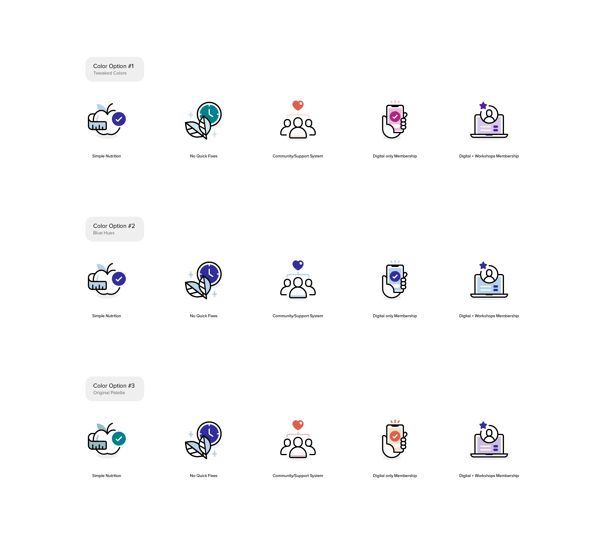
Picking the right colors.
Sketches & Ideas
Sketching out new ideas for small illustrations is essential as it serves as a rapid and iterative ideation process, allowing designers to explore creative concepts before committing to digital production. This hands-on approach fosters innovation, enabling the refinement of visual elements to effectively convey messages and evoke desired emotions. Sketching plays a pivotal role in honing the final design, ensuring that small illustrations not only serve their functional purpose but also contribute to a cohesive and aesthetically pleasing user experience.
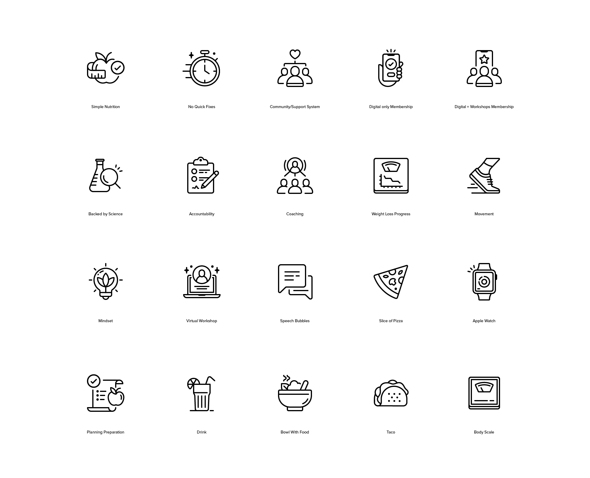
Sketching out ideas for the illustrations.
These illustrations not only modernized the user experience but also played a crucial role in conveying the evolving narrative of wellness, making the app more engaging and relatable.
Picking The Right Direction
Selecting the right direction for WeightWatchers illustrations involves a thoughtful process of aligning visual elements with the brand's values and the app's overall message. It requires careful consideration of design elements that resonate with the target audience, fostering a connection and enhancing the user's experience. Picking the right direction ensures that the illustrations not only complement the app's functionality but also contribute to a cohesive, positive, and motivating visual narrative, reinforcing the brand's commitment to wellness and healthy living.
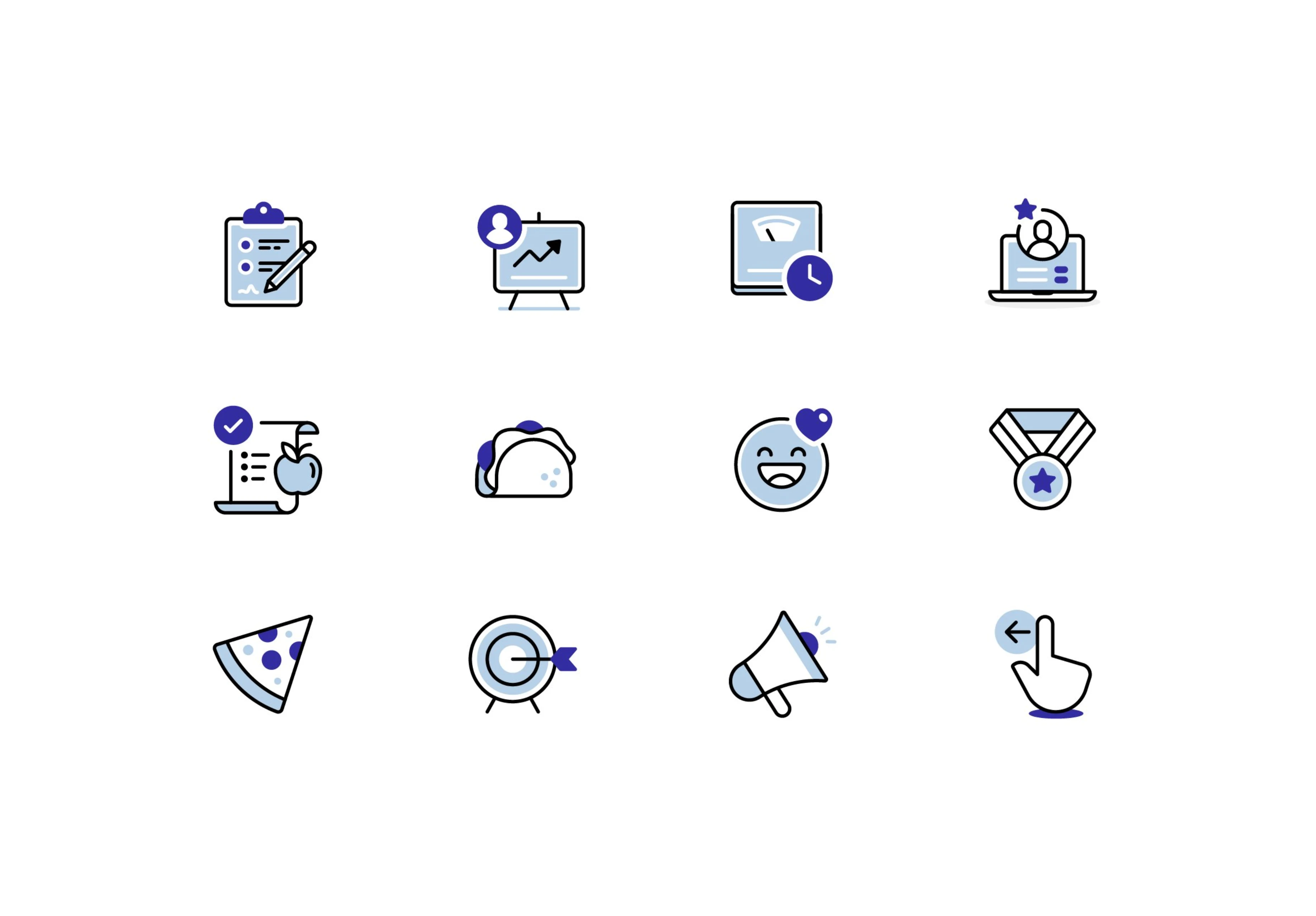
Preview of the approved direction.
New & Improved
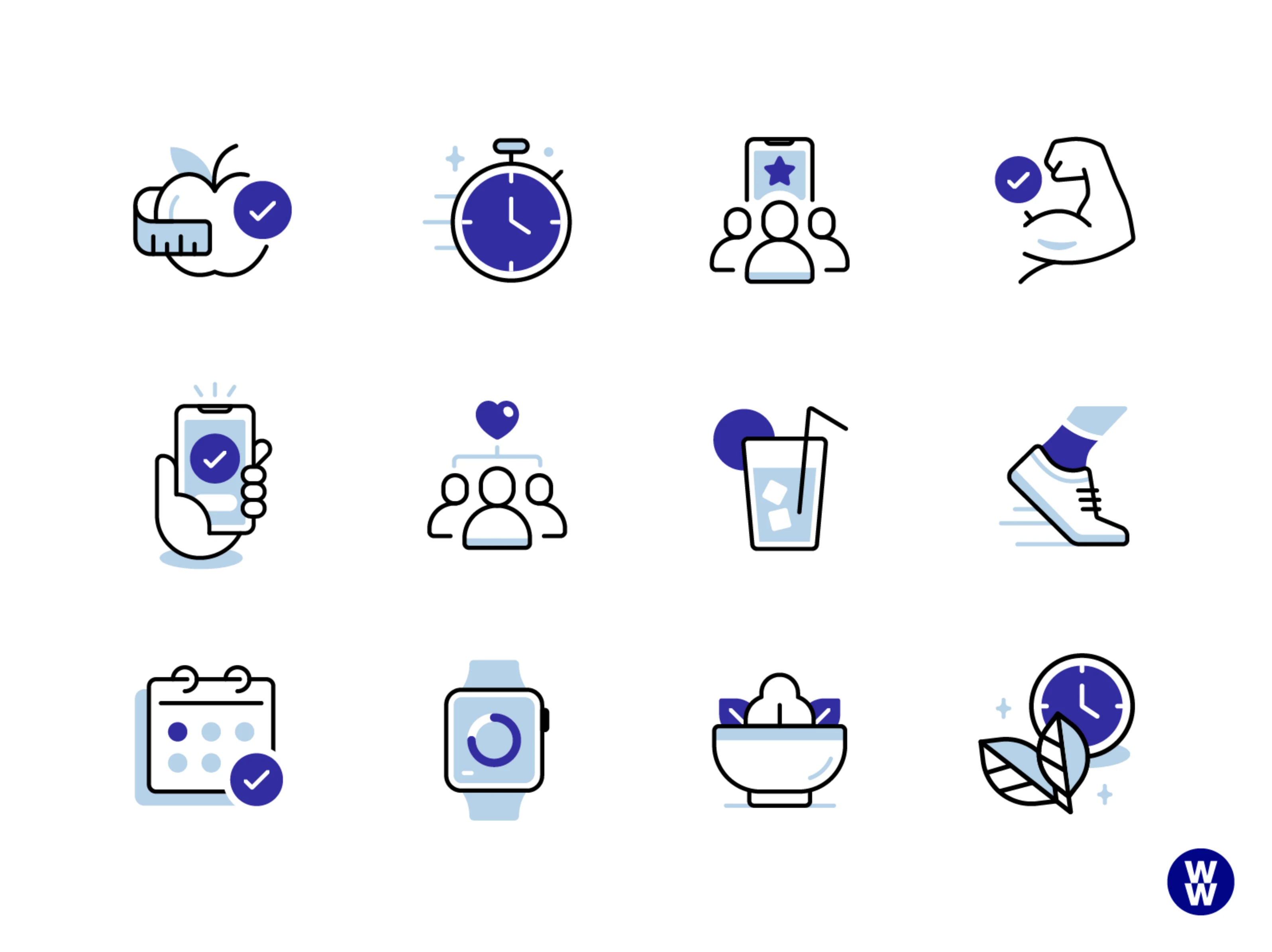
Designing the new refreshed illustration set for WeightWatchers was of paramount importance as it breathed new life into the brand's visual identity. These illustrations not only modernized the user experience but also played a crucial role in conveying the evolving narrative of wellness, making the app more engaging and relatable. The refreshed set ensured alignment with contemporary design trends, contributing to the overall appeal of WeightWatchers and reaffirming its commitment to providing a dynamic and user-friendly platform for achieving health and wellness goals.
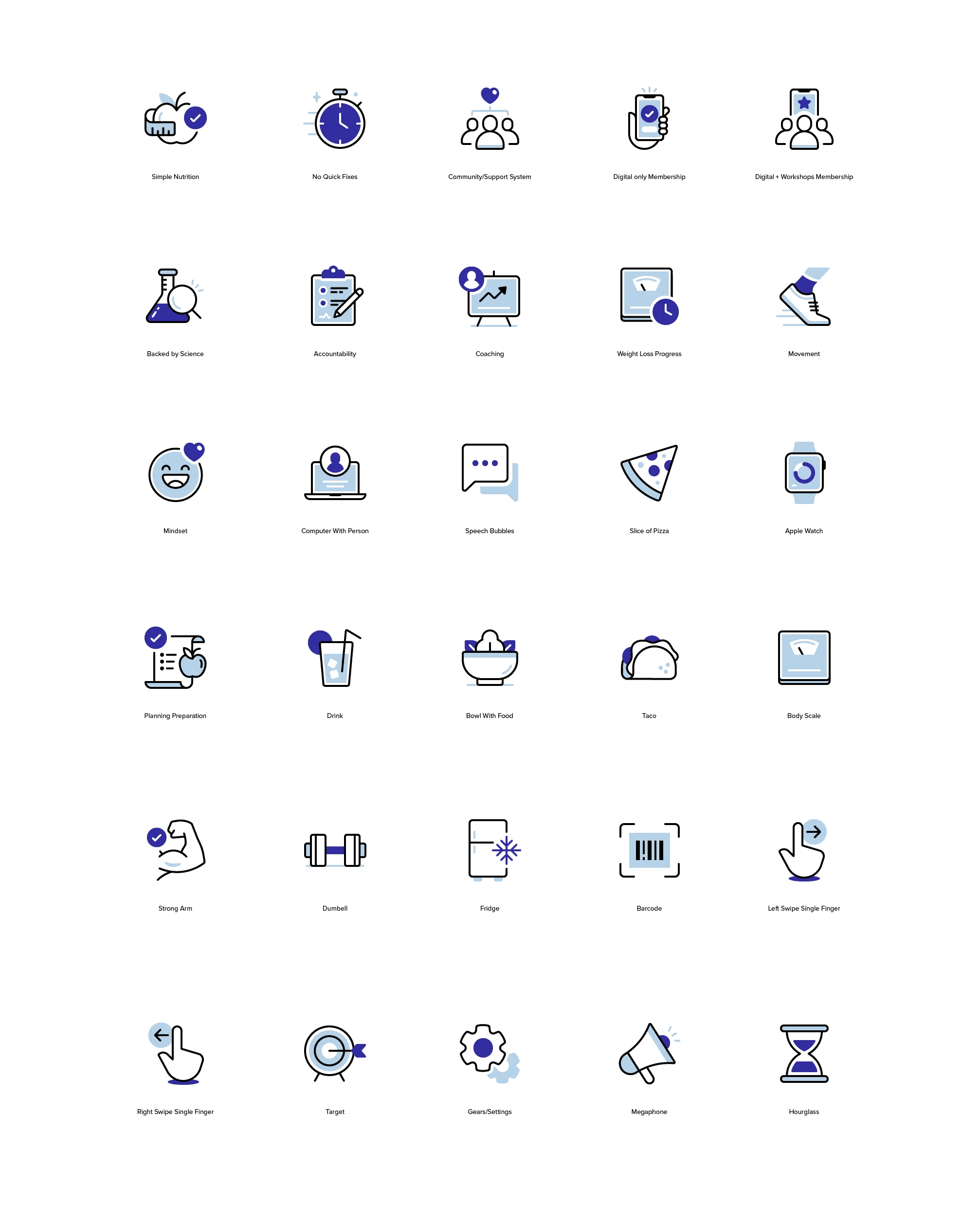
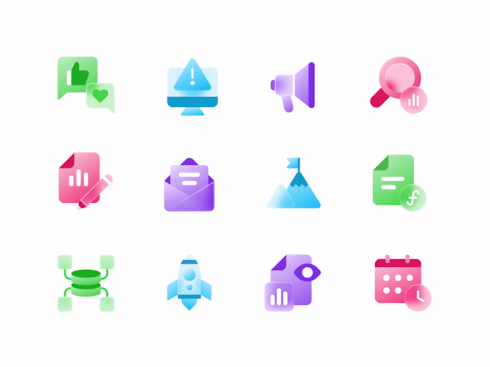
Preview of the new set.
These Illustrations serve their functional purpose but also contribute to a cohesive and aesthetically pleasing user experience.
The client's satisfaction with the illustrations for WeightWatchers was incredibly rewarding, affirming that the design choices resonated with their vision and positively impacted the user experience. The collaborative effort in crafting visuals that align with the brand's identity and messaging not only met but exceeded the client's expectations, contributing to a visually cohesive and appealing app. The happiness expressed underscores the success of the illustration project in enhancing the overall aesthetic and engagement levels within the WeightWatchers platform.
Have a project in mind?
👋🏻 Contact me → hey@dmitrilitvinov.com
Like this project
Posted Jan 30, 2024
Designing the new and improved Illustration design system.
Likes
1
Views
137
Clients
WW Weight Watchers