Superbet Icons
Dmitri Litvinov
New Look
Taking on Superbet as a new client and designing their new icons for the app and UI was crucial to not only expand my portfolio but also to contribute my design expertise to a dynamic industry leader. It presented an exciting opportunity to shape Superbet's visual identity, ensuring that their icons resonate with users, elevate the overall user experience, and reinforce Superbet's commitment to innovation and excellence in the gaming sector.
Constructing the new icon design system.
Color Palette
Utilizing Superbet's color palette for the new icons was crucial as it maintained brand consistency, reinforcing the visual identity across the app and UI. By aligning with their established colors, the icons seamlessly integrated into the overall design language, fostering immediate recognition and a cohesive user experience while upholding Superbet's brand integrity.
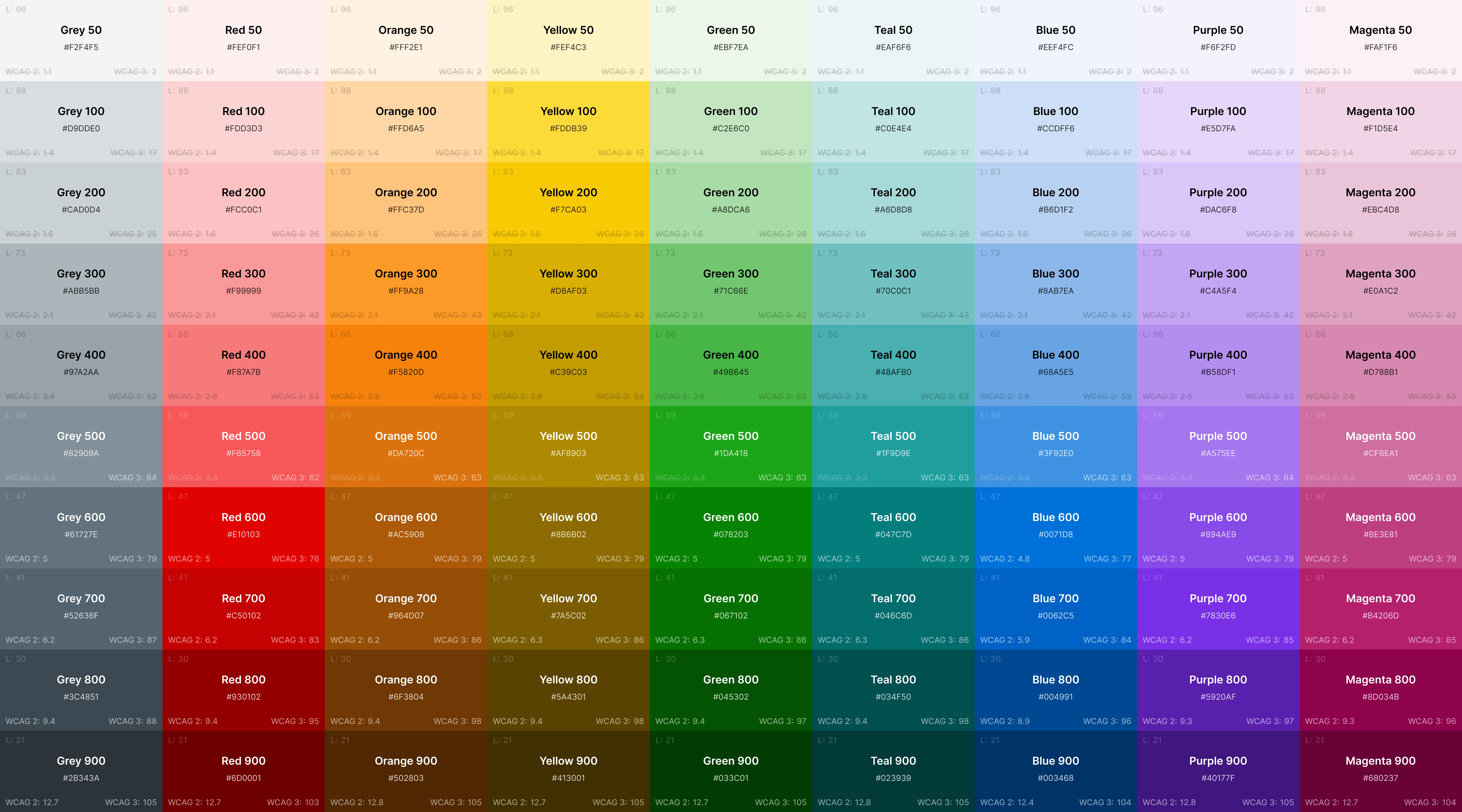
Brand colors.
It presented an exciting opportunity to shape Superbet's visual identity, ensuring that their icons resonate with users.
Details Matter
Incorporating unique details in Superbet's new icon system was vital to distinguish their visual identity in a competitive market. These distinctive elements not only set Superbet apart but also contributed to a memorable and engaging user experience, fostering a sense of innovation and modernity within their app and UI.
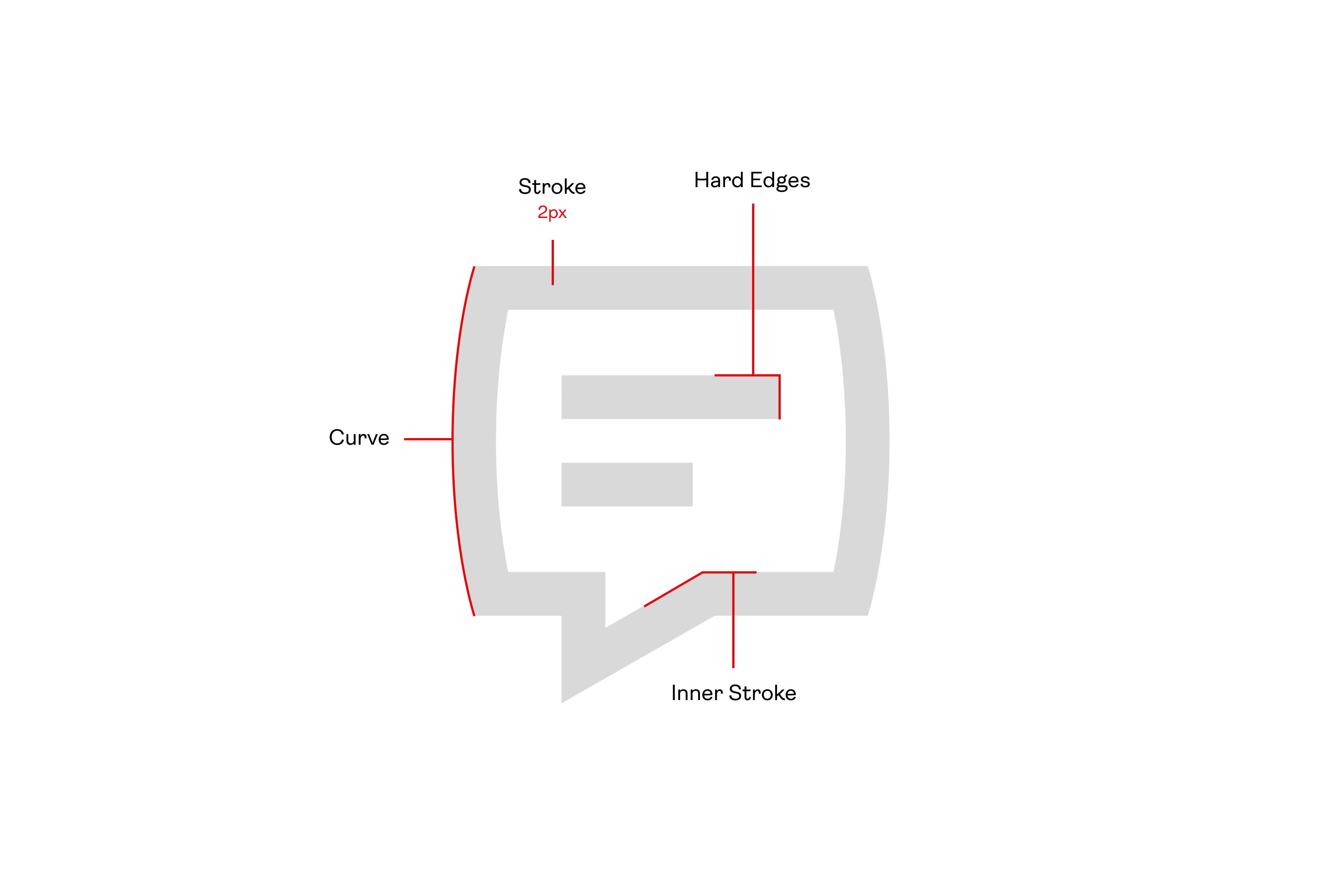
Breaking down the stylistic details for the icons.
Geometry, Size, and Structure
Having the proper geometry, size, and structure in place for the new Superbet icon set was essential to ensure a consistent and visually pleasing user interface. Adhering to standardized dimensions and design principles not only enhanced the overall aesthetic but also facilitated seamless integration, promoting clarity and usability throughout the app and UI. This meticulous approach contributed to a polished and professional appearance, aligning with Superbet's commitment to providing an optimal user experience.
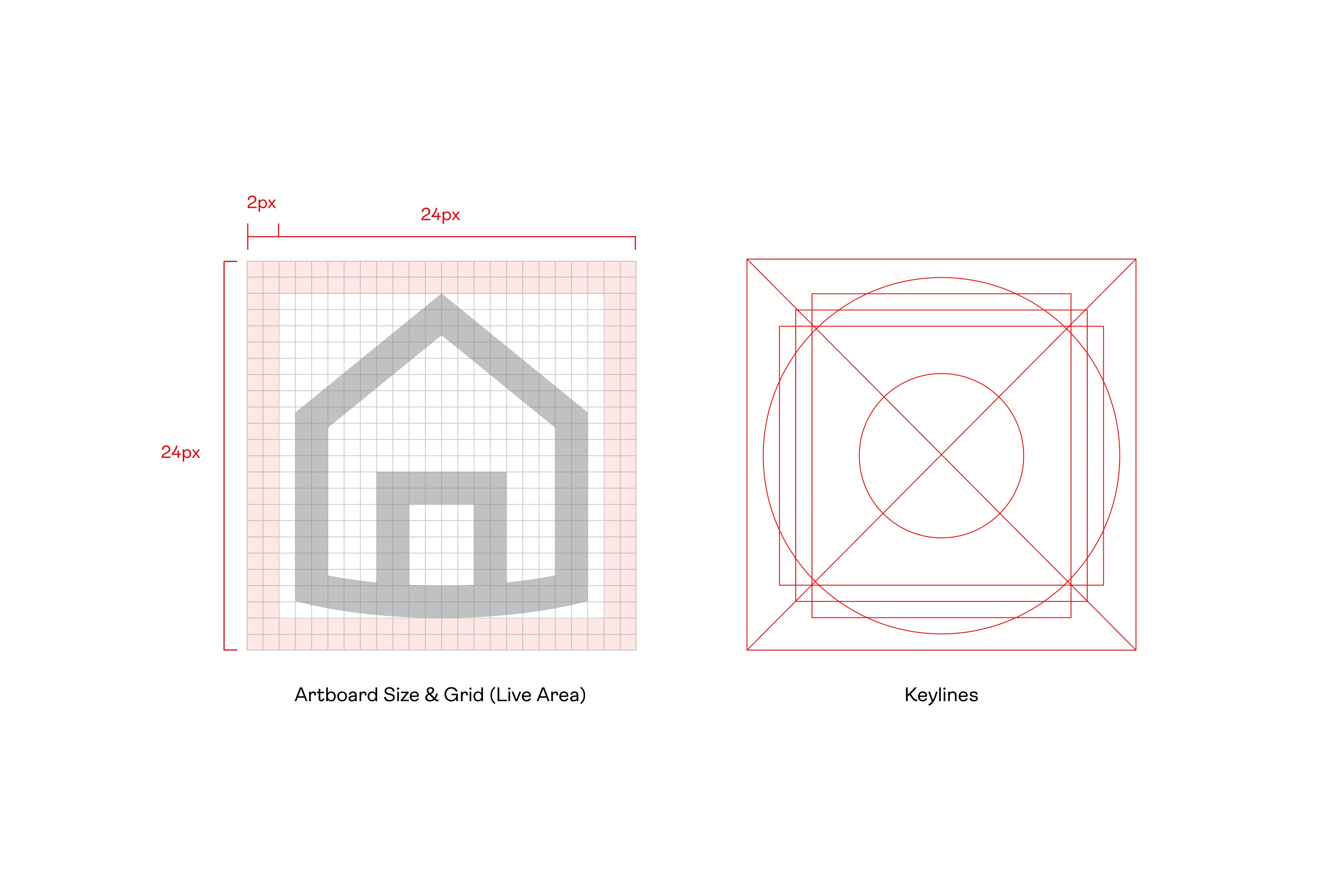
Gride and Keyline details.
Adhering to standardized dimensions and design principles not only enhanced the overall aesthetic but also facilitated seamless integration, promoting clarity and usability throughout the app and UI.
Overview
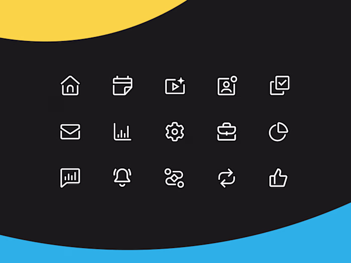
Crafting the entire cohesive set for Superbet icons involved a meticulous process of thoughtful design choices and meticulous attention to detail. Each icon was conceptualized to not only reflect the specific functionality it represented but also to seamlessly integrate into a unified visual language across the Superbet platform. The result is a comprehensive set that not only meets the functional requirements but also elevates the overall aesthetic, contributing to a cohesive and visually engaging experience for Superbet users
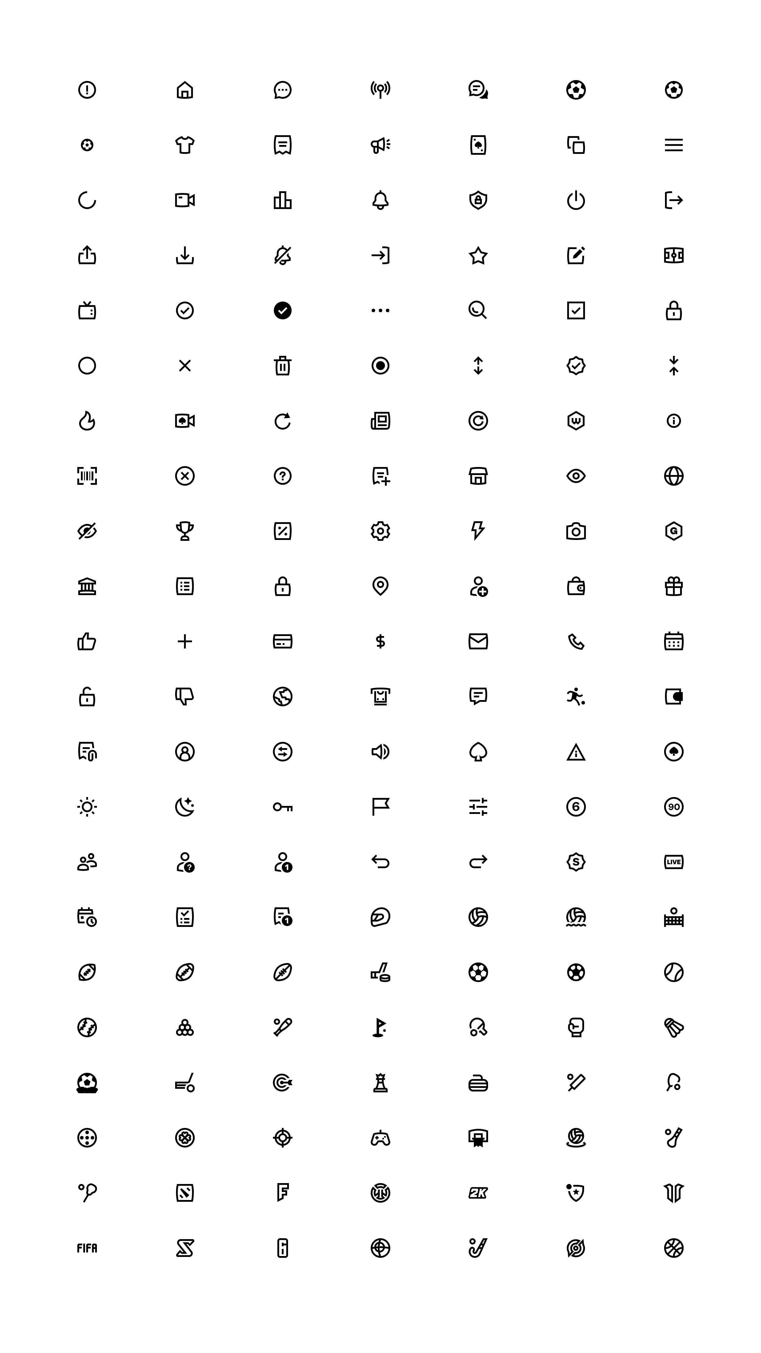
Superbet's new icon set.
Each icon was conceptualized to not only reflect the specific functionality it represented but also to seamlessly integrate into a unified visual language across the Superbet platform.
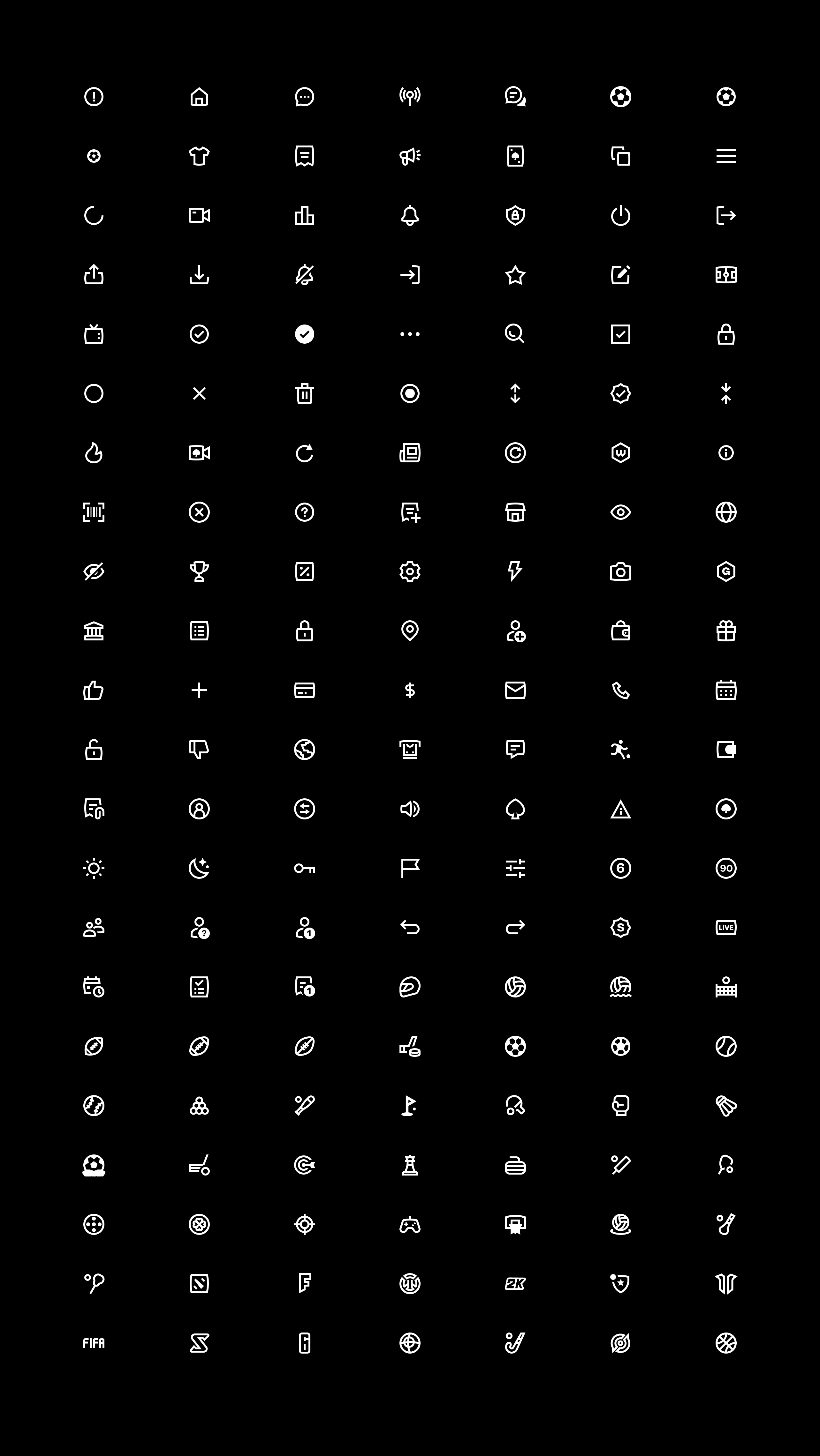
The new icon set on a dark background.
See the icons live → https://superbet.ro/
Have a project in mind?
👋🏻 Contact me → hey@dmitrilitvinov.com
Like this project
Posted Feb 5, 2024
Designing Superbet's new icon design system.
Likes
0
Views
897
Clients
Superbet