
Objective
Design a full icon set aligned with Meta's new brand, supporting uses worldwide.
Project Description
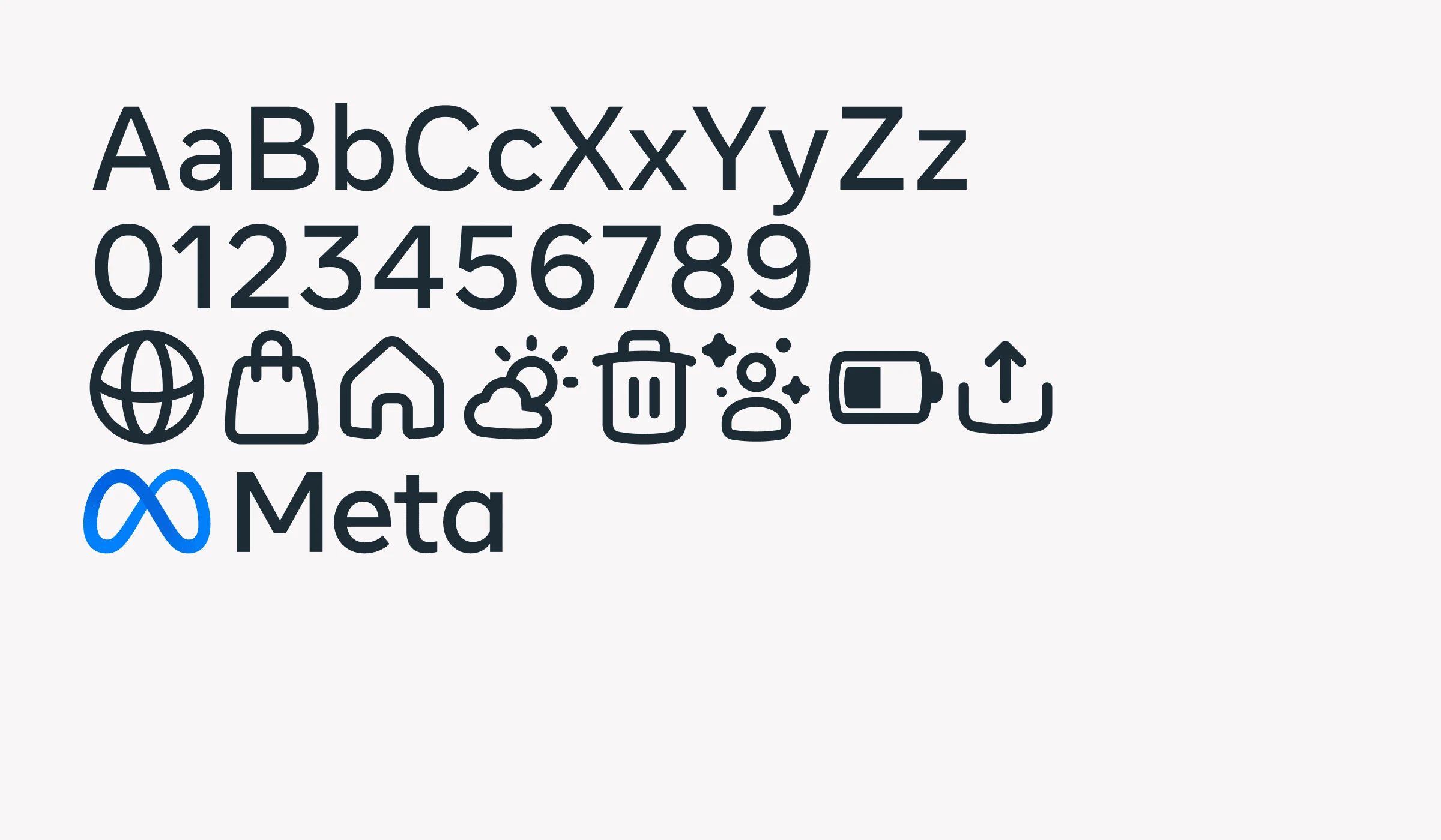
Following 'The Facebook Company's' rebrand as 'Meta’' there was a need for a unified visual system that reflected their renewed focus on human connection. An essential element of this initiative was the creation of an icon set that complemented Meta's new logo and the 'Optimistic' typeface.
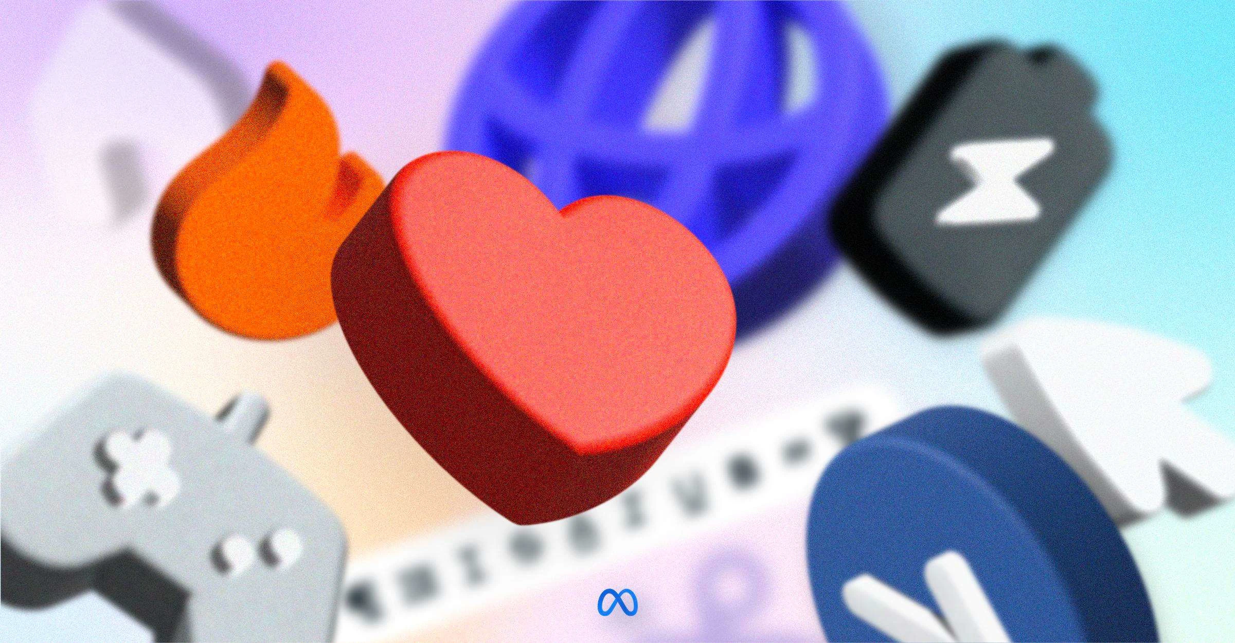
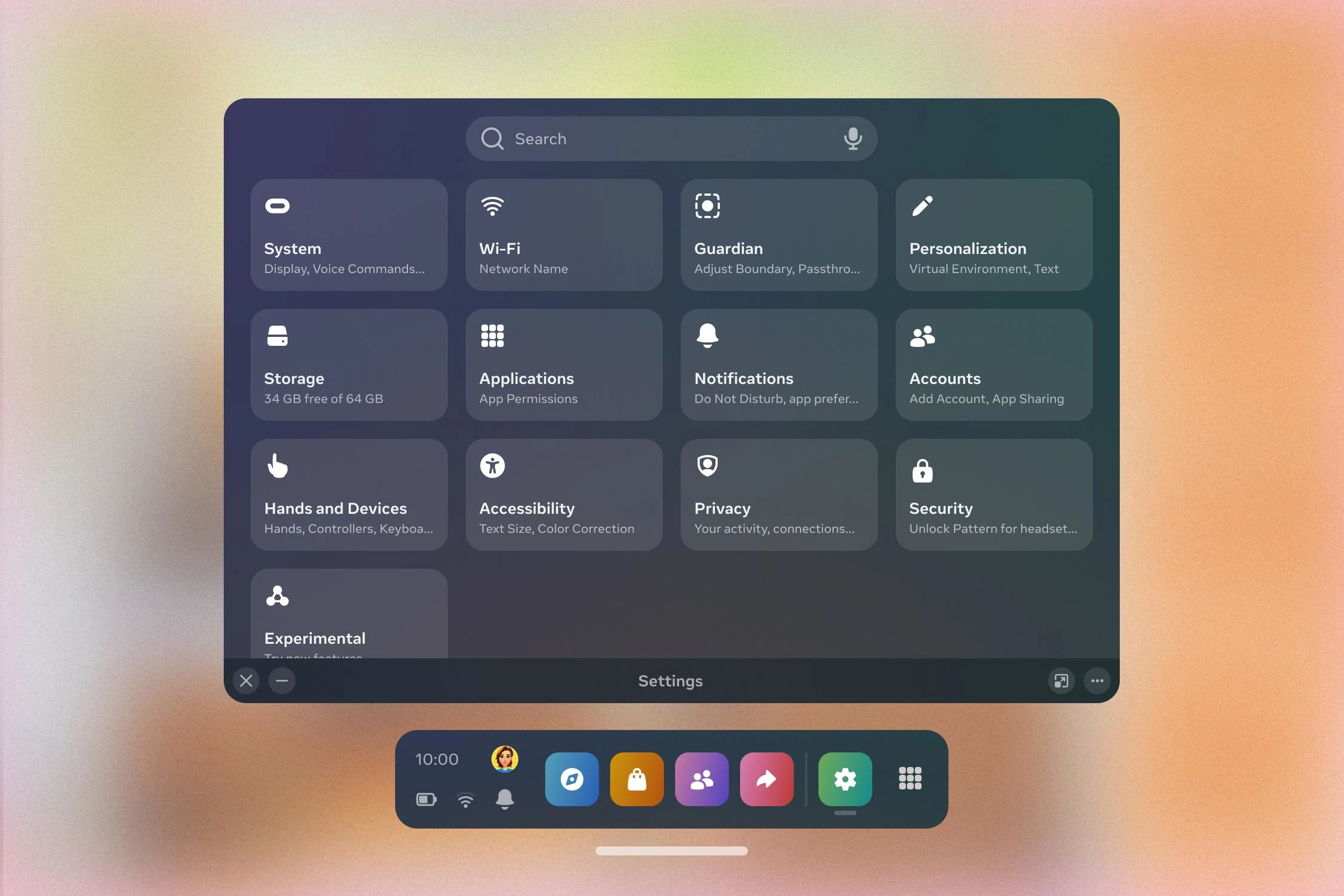
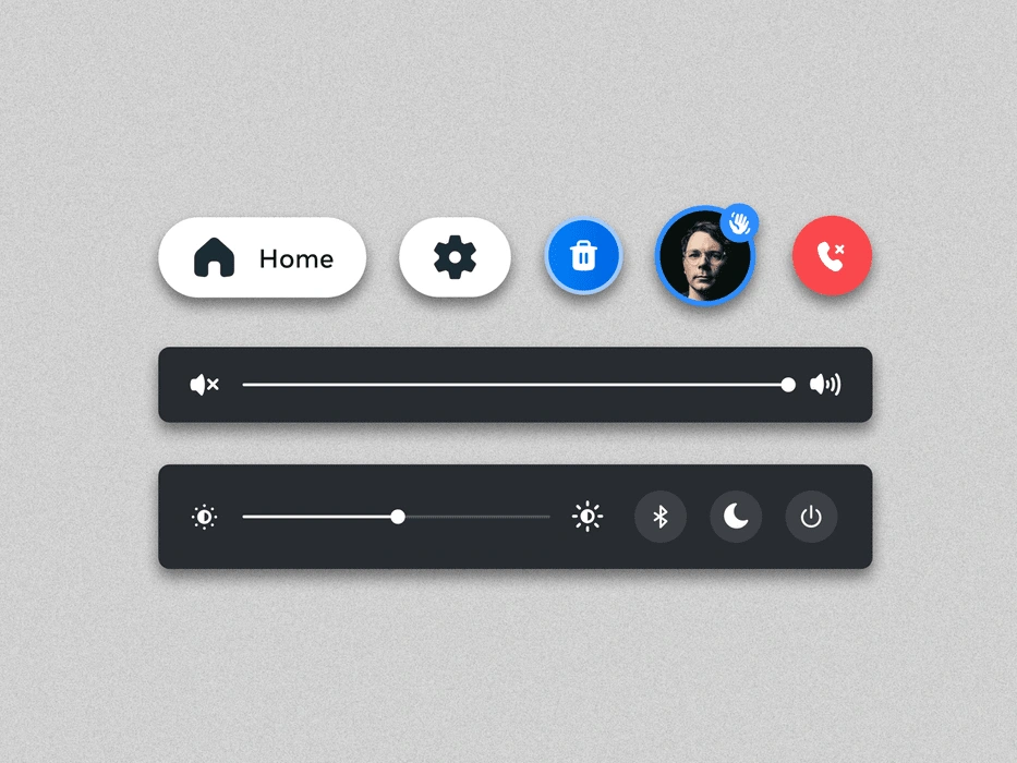
1,500 Metaphors, 3,000 Icons and counting.
Design Approach and Methodology
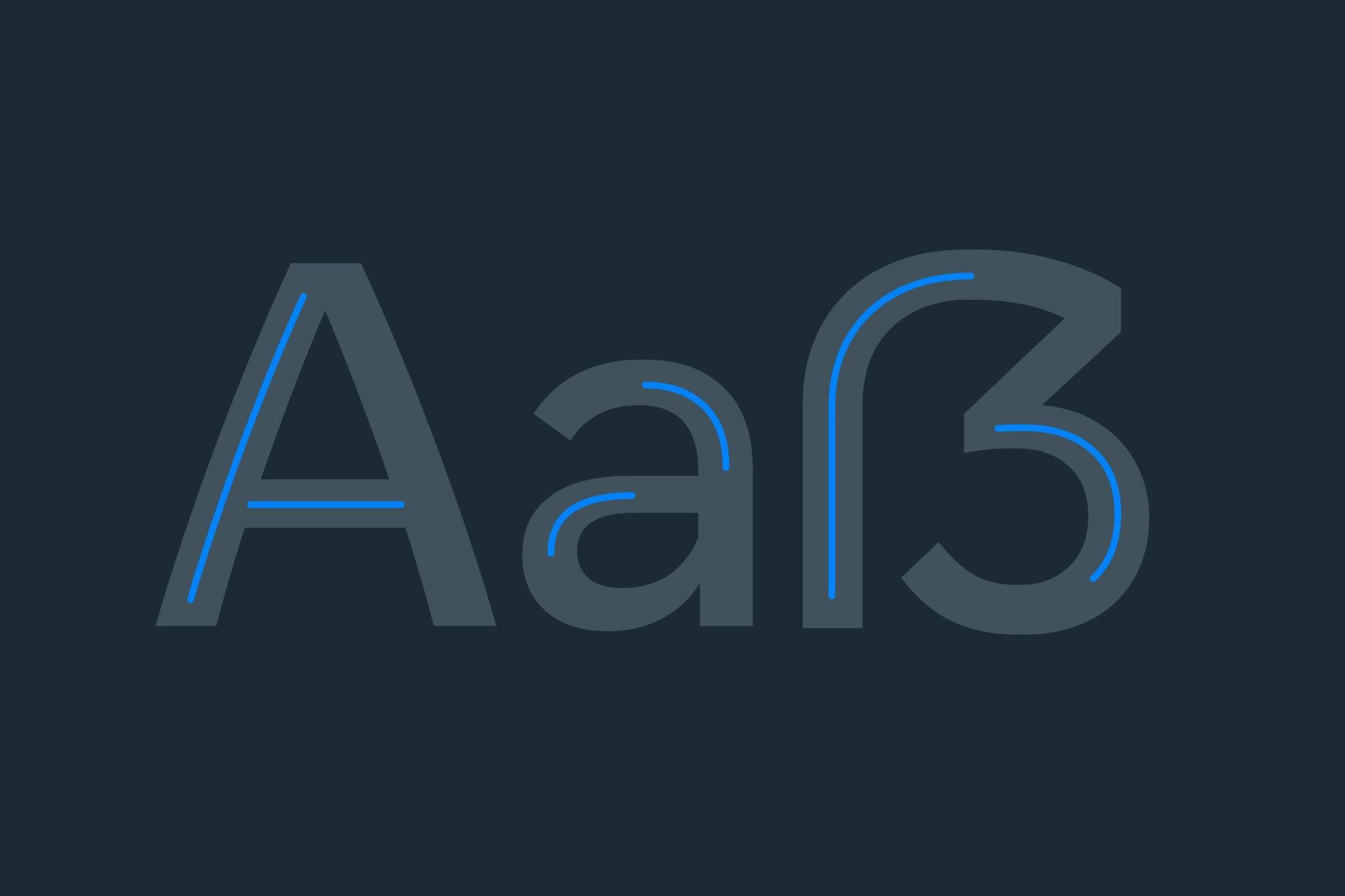
The first step involved a thorough review of Meta's new brand and their 'Optimistic' typeface. This review helped us get a clear picture of the typeface's features, which guided us in designing icons that blend smoothly with Meta's brand system.
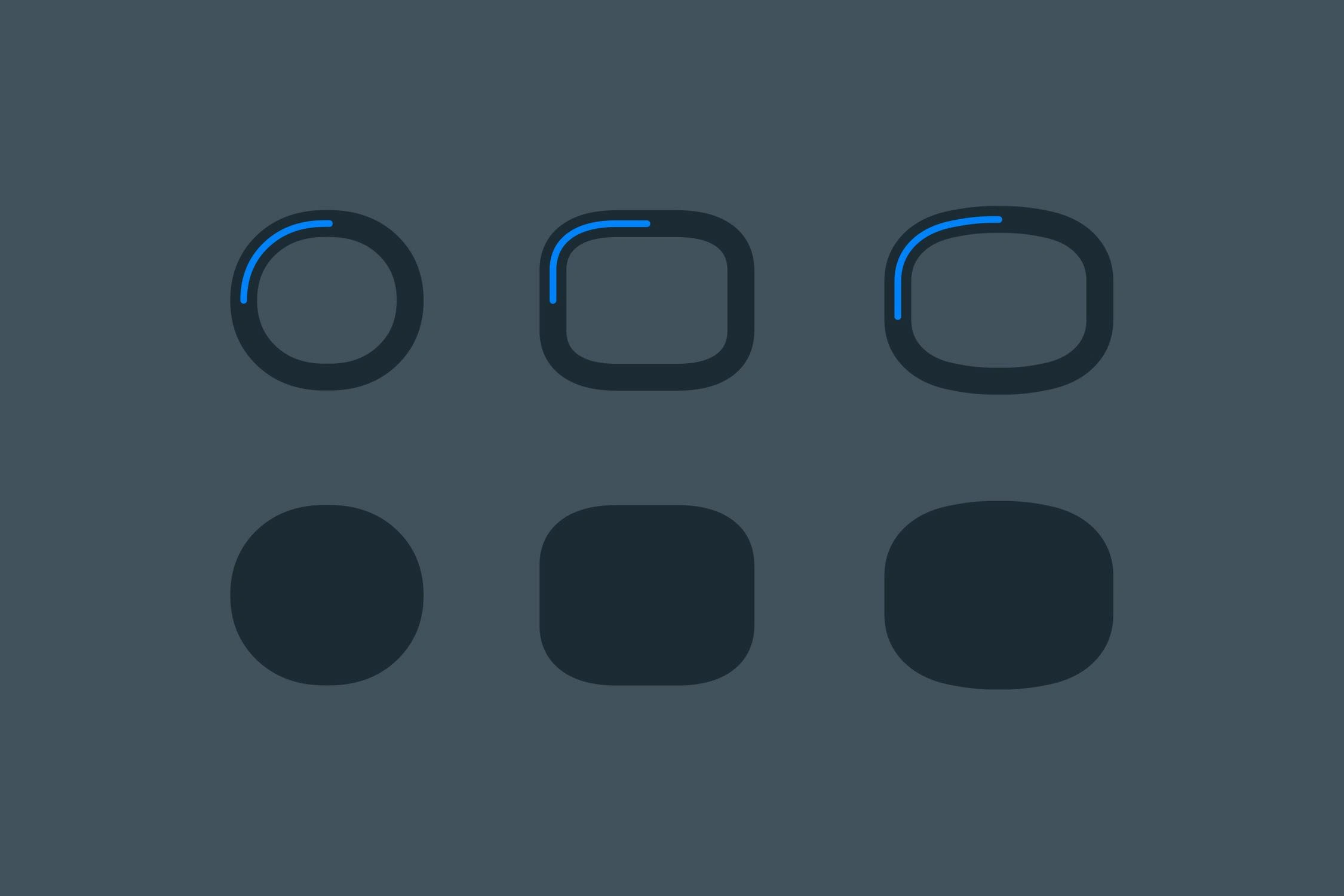
We started with basic design elements inspired by the special characteristics of the 'Optimistic' typeface. These basics were key to making icons that look consistent with both the logo and the font.

Conceptual Development
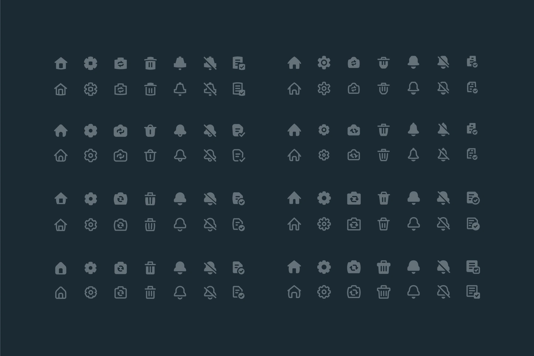
We explored various design concepts, from circular to angular, to ensure the icons not only maintained consistency with the 'Optimistic' typeface but also seamlessly integrated with the brand's overall visual identity.

Selection and Refinement
Through extensive testing and evaluating situational mockups, we found one design that worked best for Meta's brand. This design seamlessly brought together the icons, the 'Optimistic' typeface, and Meta's logo.
Standardized Drawing Procedures
We created a detailed guide on how to design the icons. This guide gives clear steps to make sure the icons are precise and capture the friendly qualities with careful design methods.
Creative Production Framework
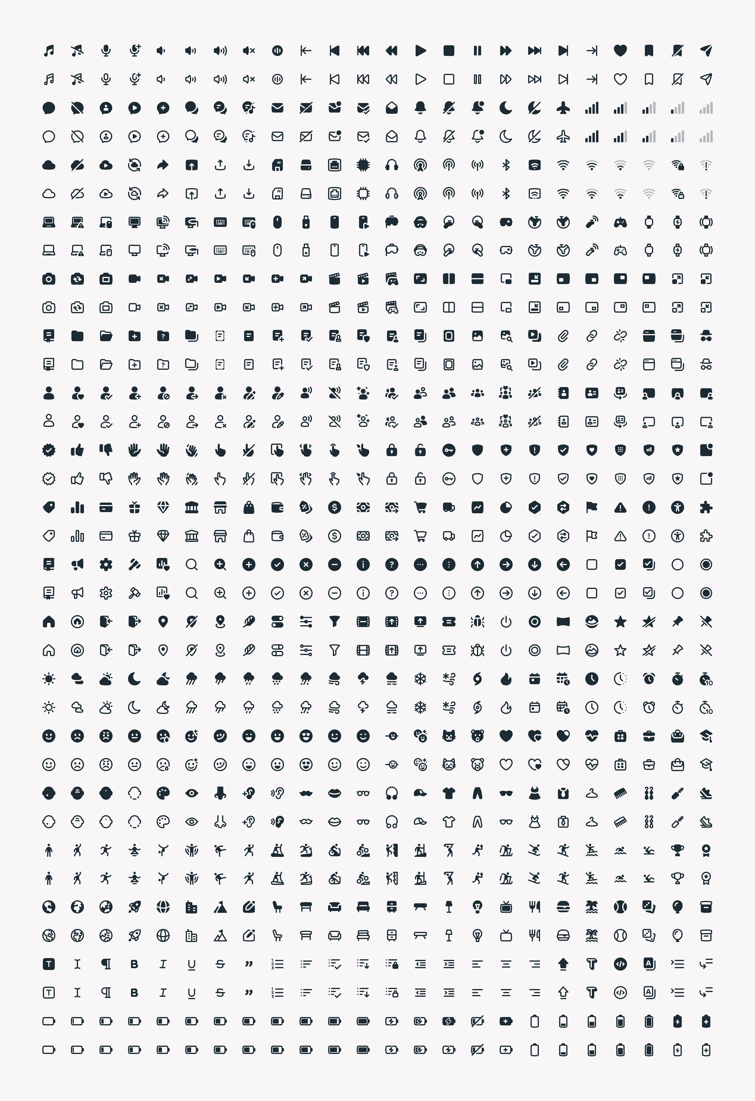
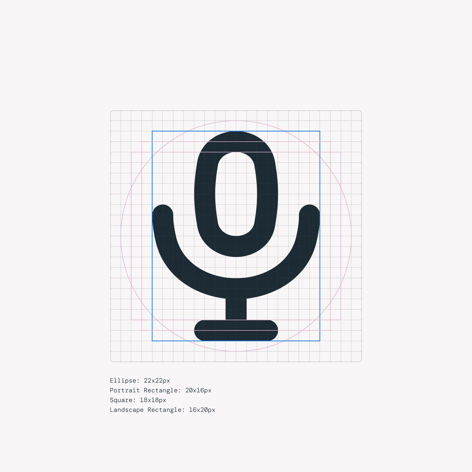
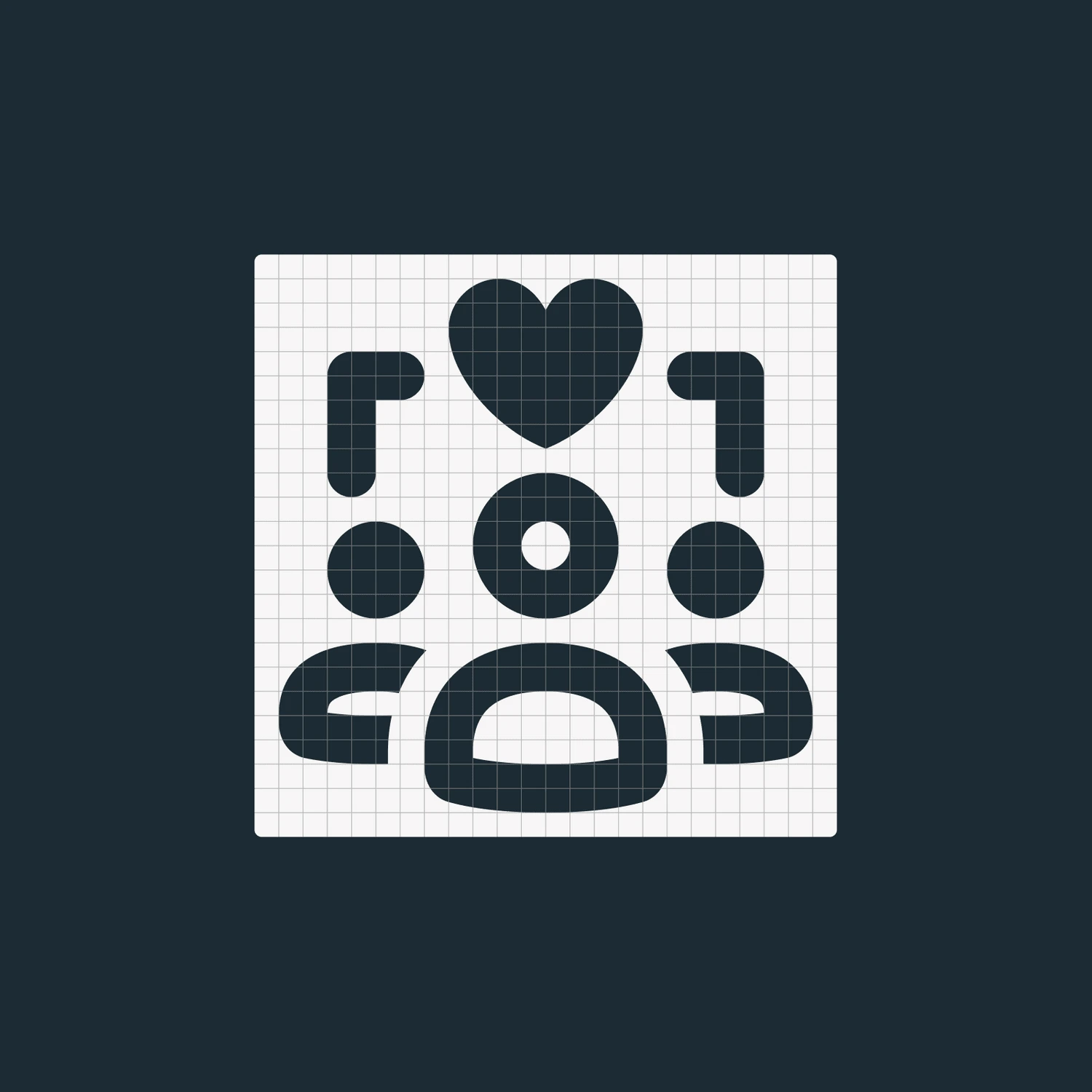
We followed a detailed plan for building the icon library, aiming for consistent design and function in various settings. This approach included designing icons in both filled and outlined styles, using a 24x24 pixel grid, and aligning them with a custom grid to keep details clear and ensure uniformity.
Systematic Approach
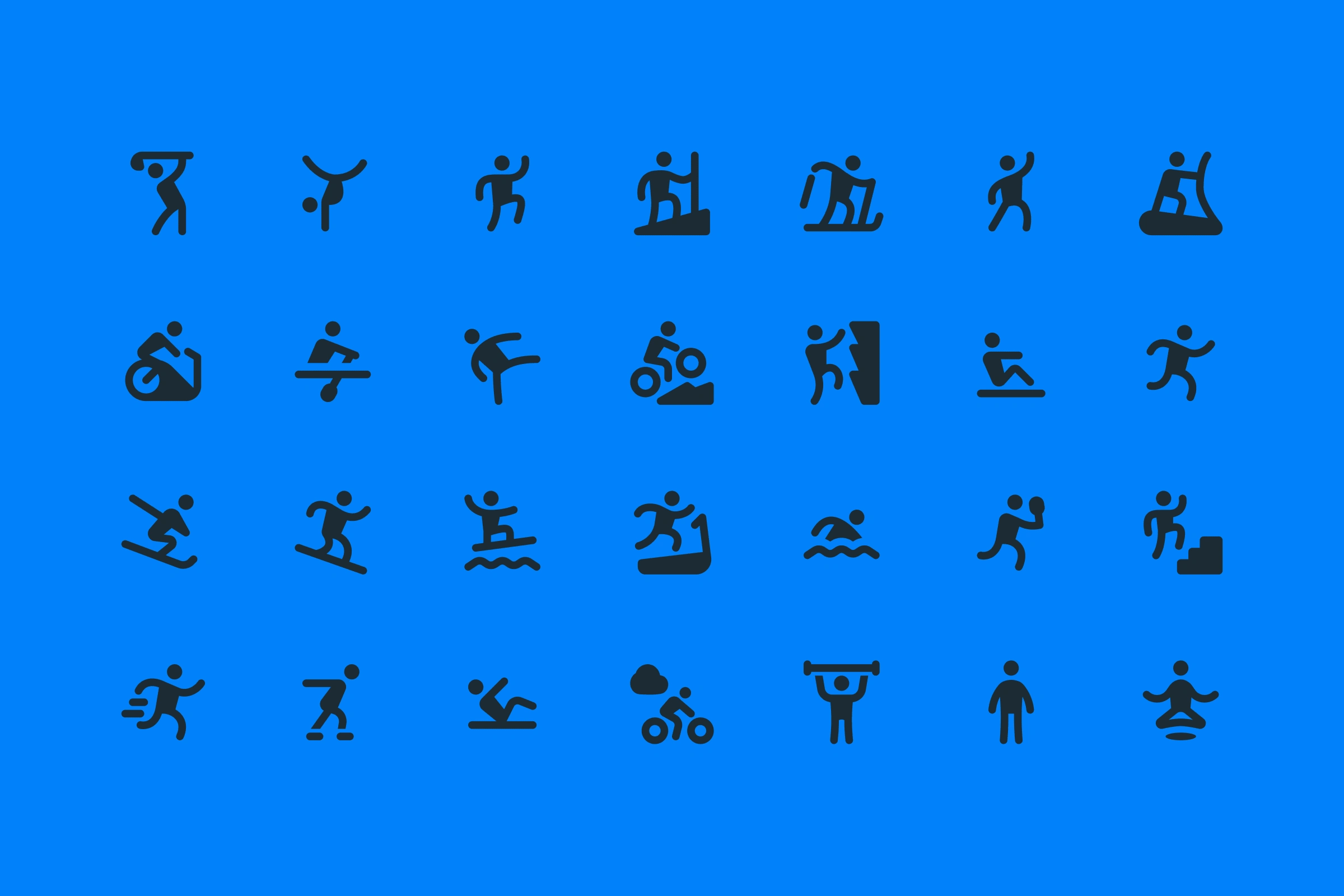
The icon library was designed to be versatile, covering a wide range of metaphors, everything from user activities and emotions to tools used for creation and editing. We followed a careful drawing process to keep the icons consistent, ensuring they work well and look the same on different platforms and user interfaces.
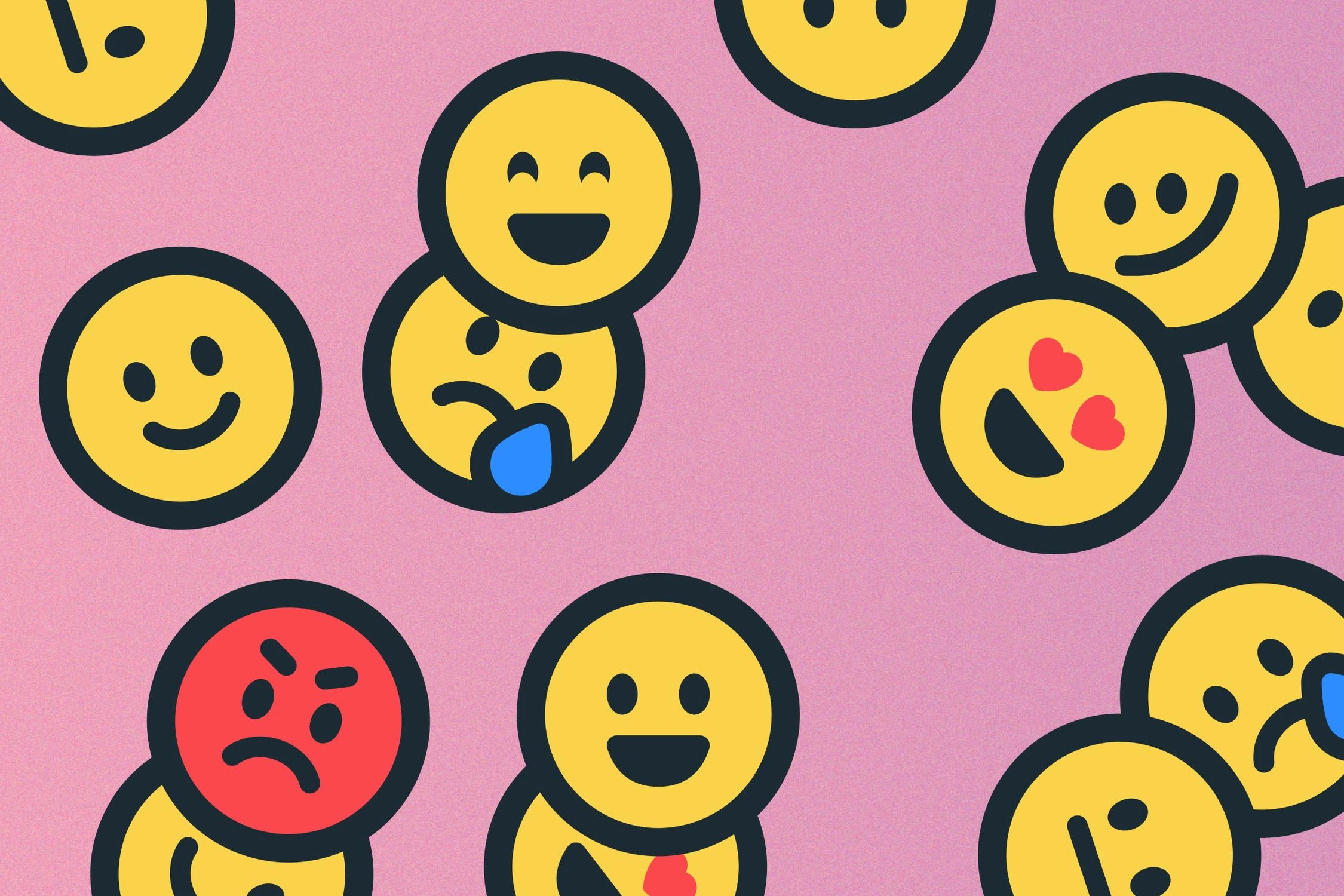
This project showcases our commitment to creating flexible design systems that seamlessly blend with a brand's changing needs, improving user experience and emphasizing the importance of design that solves problems.
Credits
Counter Brand & Type (visit website here)
Brand Strategy / Project Management — Mike Edwards
Creative Direction / Design — Michael Steven Forrest
Contributing Art Direction — Michael Cina
Design — Dmitri Litvinov
Design — Jonathan Howell
Design — John Bowles
Hero Art — Mirna Pierre
Have a project in mind?
👋🏻 Contact me → hey@dmitrilitvinov.com
51 likes · 2.6K views · Feb 14, 2025
Full icon set aligned with Meta's new brand, supporting uses worldwide.

