Stream App Brand Sprint
Dmitri Litvinov
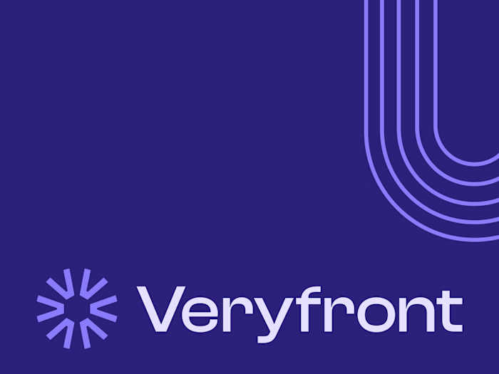
Bringing new branding to life
Premium Services Provided: Week Design Sprint
Brand Sprint
As part of a recent brand sprint for Stream, I set out to redefine the product’s entire visual and experiential identity from the ground up. The goal was to create a brand that feels modern, fluid, and adaptable across every touchpoint while staying true to Stream’s core purpose. This involved reimagining the core branding, developing a cohesive iconography system, and designing custom illustrations that add warmth and narrative depth without sacrificing clarity. Each element was crafted to work harmoniously together, giving the brand a distinctive yet approachable presence. Building on this foundation, I’m now shaping the new UI, designed to make Stream feel both intuitive and visually unified.
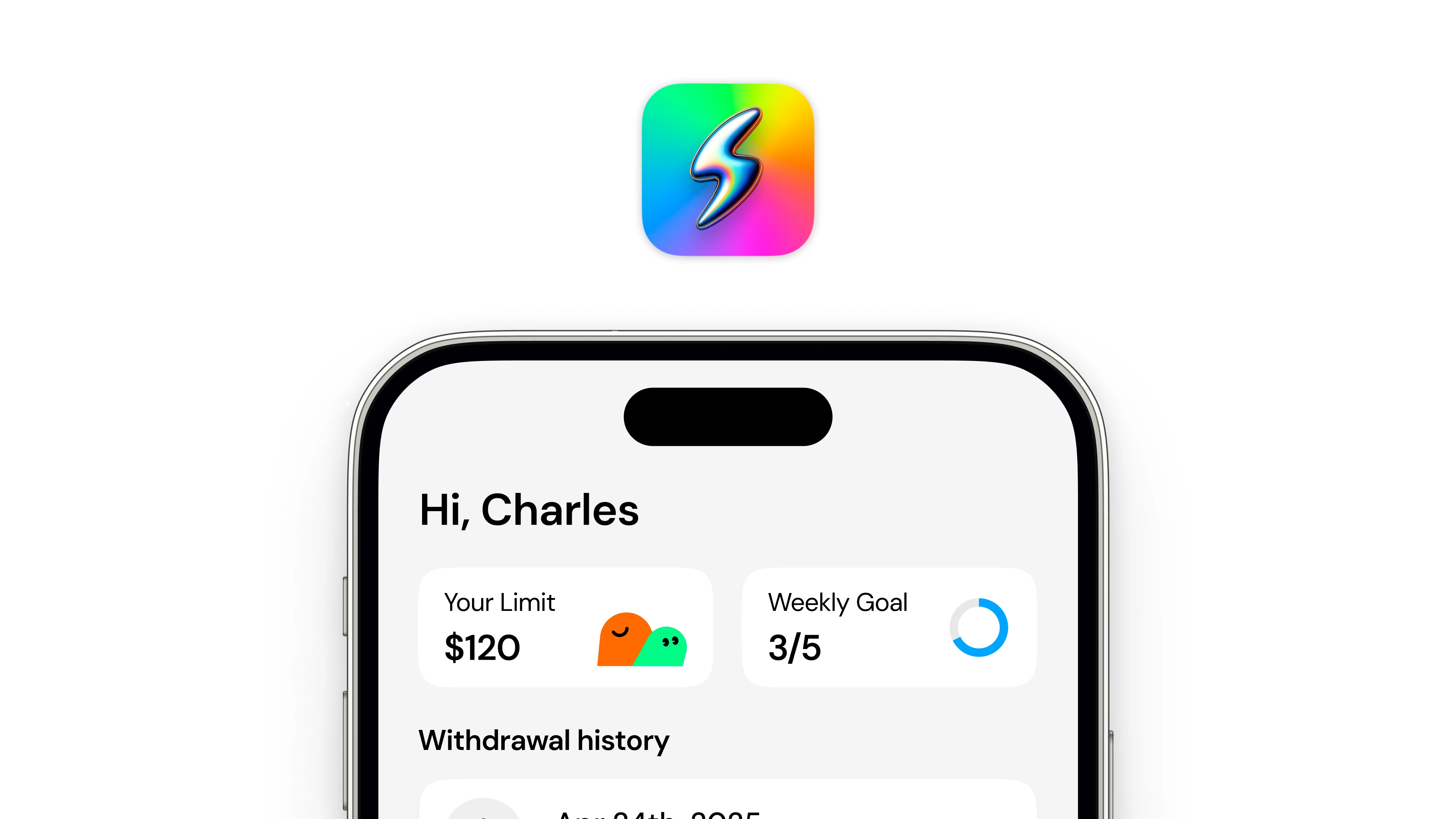
Screen preview
Sprint Goals
The goal of the sprint was to strengthen Stream’s visual foundation by refining its branding and design language. I began by auditing the existing design, identifying areas where the visuals could better reflect the product’s identity and purpose. From there, I pitched improvements and created a cohesive set of icons and illustrations that align with the new brand direction. While I wasn’t designing the app itself, my focus was on elevating the visual system and UI elements to make Stream feel more unified, consistent, and visually engaging.
Main screen preview
Details + Branding
The strength of the new Stream brand comes from the attention to detail across every visual element. Each icon, illustration, and UI component was crafted intentionally to reflect the brand’s personality and create a cohesive experience. It’s through these carefully designed assets that the brand’s identity truly comes together, feeling consistent and recognizable at every touchpoint. Most importantly, this level of detail is what allows Stream to stand out confidently in a crowded digital space.
Logo and app icon overview
Brand Assets
As part of the brand sprint, I developed a comprehensive set of brand assets that bring Stream’s identity to life. This included a bold and balanced color palette designed to convey energy, clarity, and modernity across all platforms. I also created custom icons and illustrations that align with this palette, ensuring every visual feels connected and purposeful. Together, these assets form a cohesive system that strengthens recognition and gives Stream a distinctive, polished look.
Finalizing the color palette
Illustrations
For the illustration system, I focused on creating visuals that feel friendly, expressive, and aligned with Stream’s new brand language. Each illustration was designed to support the product’s tone—balancing clarity with a sense of personality and warmth. The clean lines, consistent shapes, and use of the brand’s color palette help unify the overall visual experience. Together, these illustrations add character and storytelling to the brand, making Stream feel more human and approachable.
New illustrations to fit the brand
Overview of all the illustrations
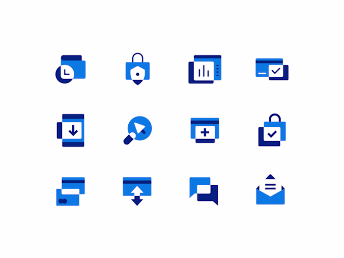
Iconography
The new iconography system was designed to bring clarity, consistency, and personality to Stream’s visual language. Each icon follows a unified grid, line weight, and proportion system, ensuring harmony across the interface and brand materials. The icons draw subtle inspiration from Stream’s logo and shapes, creating a visual rhythm that feels intentional and distinctive. This cohesive approach helps the icons not only serve a functional purpose but also reinforce the brand’s identity at every touchpoint.
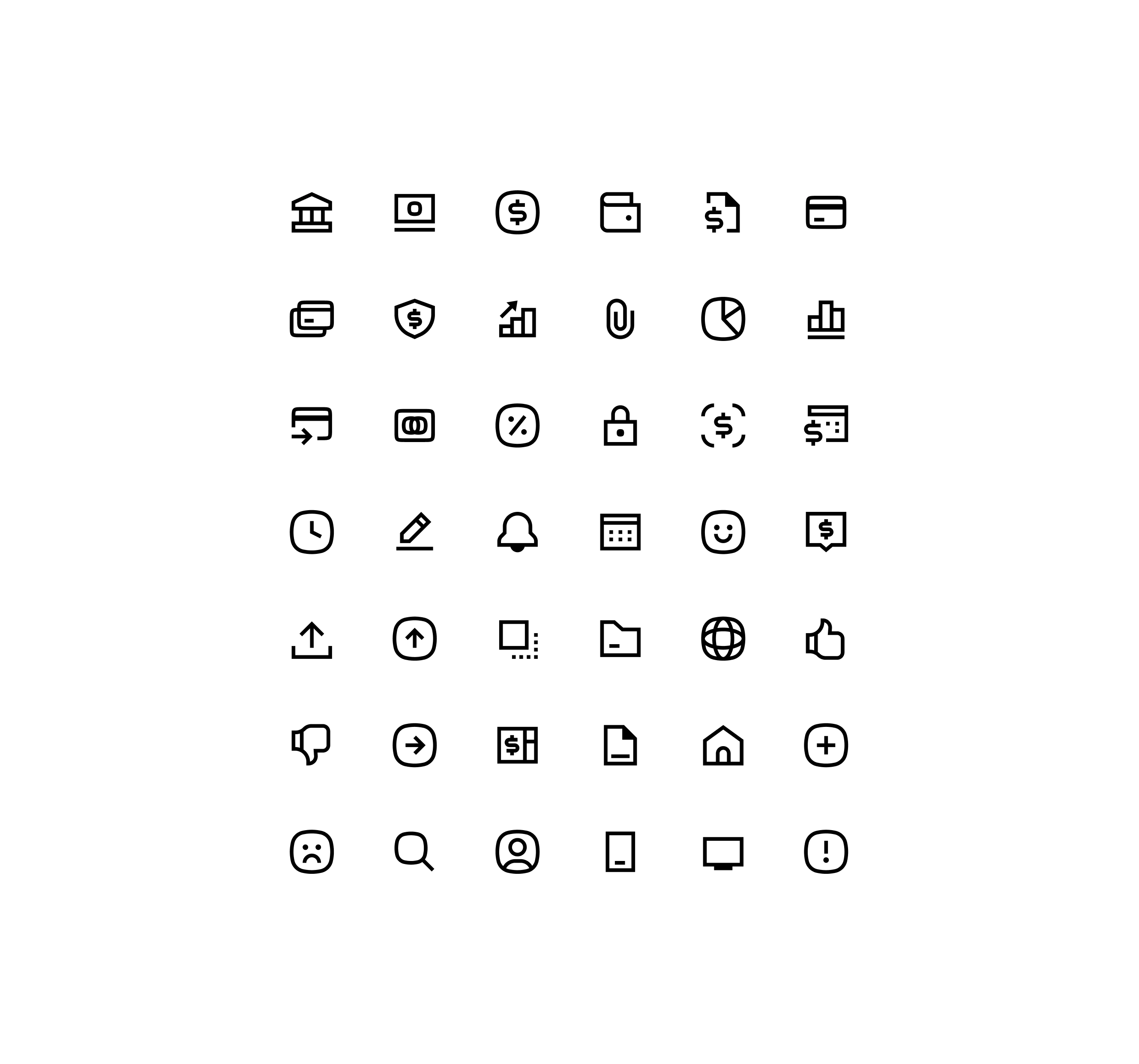
Custom icon set
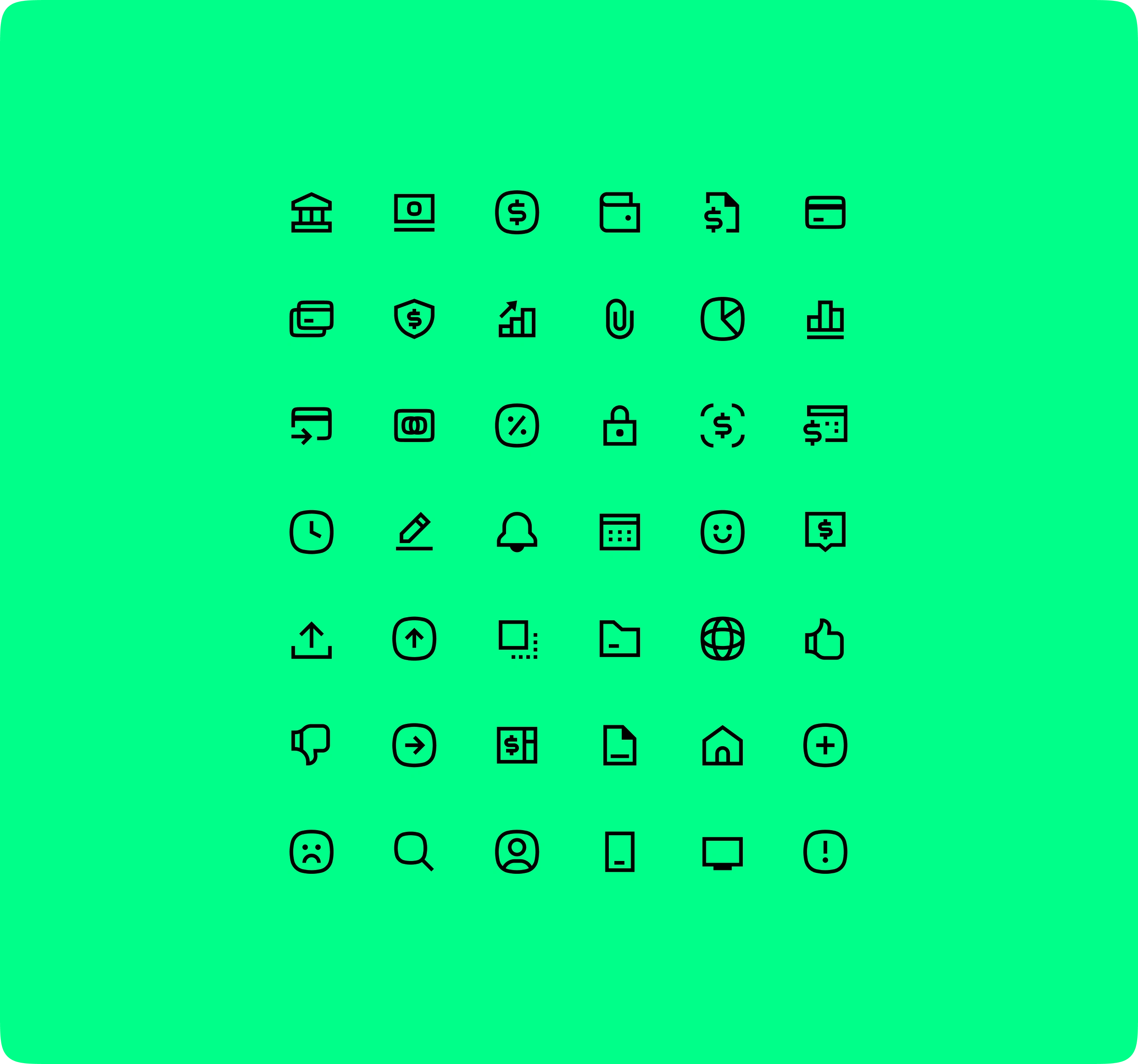
Custom icon set

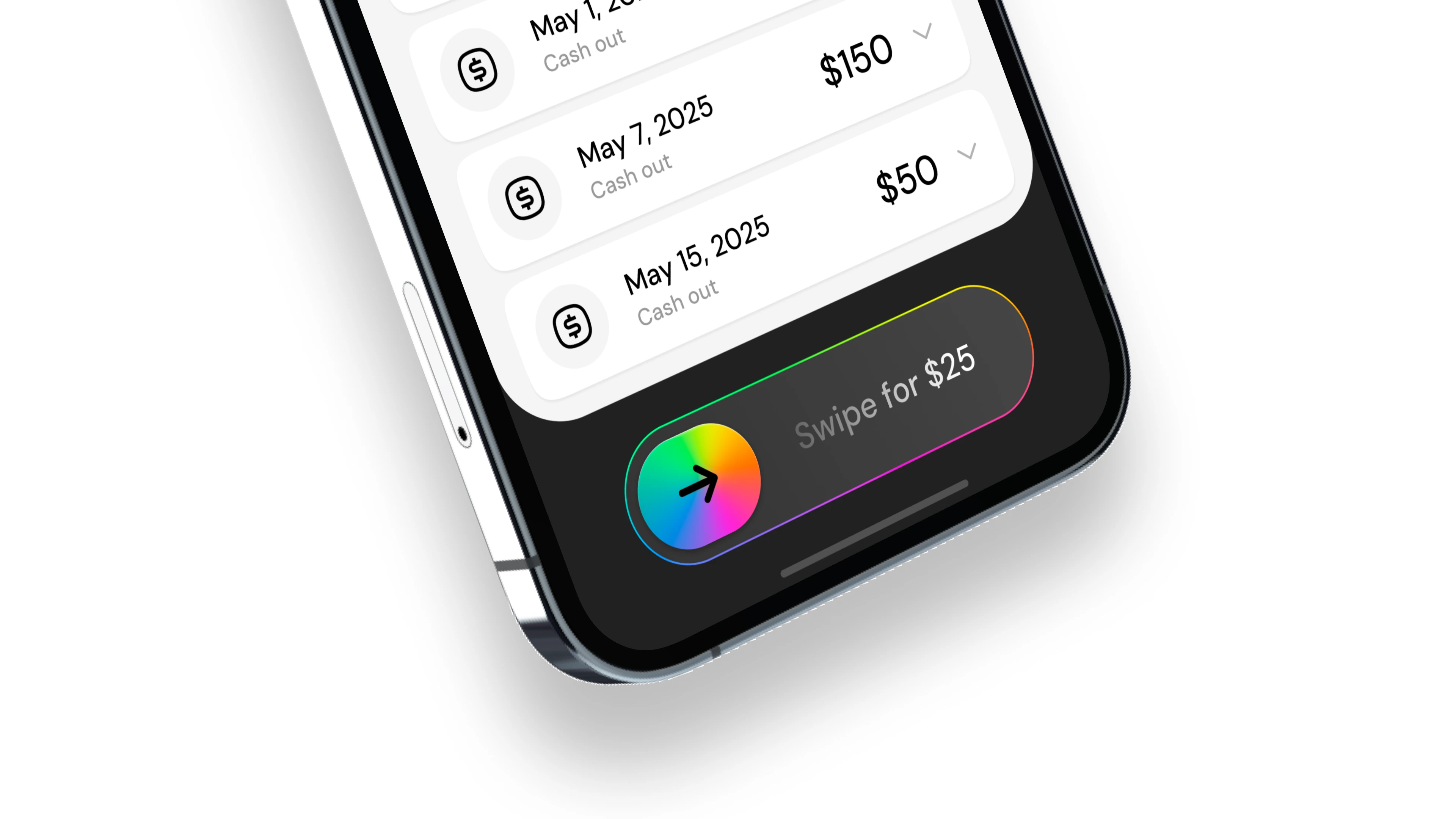
UI Screens
For the UI screens, the focus was on bringing all brand elements together into a clean, modern, and cohesive interface. I applied the new color palette, iconography, and illustration system to ensure a consistent visual flow throughout the experience. The layouts emphasize clarity and usability while maintaining a sense of personality that reflects Stream’s refreshed identity. Overall, the updated UI showcases how strong branding can elevate the product’s look and feel without redesigning its core structure.
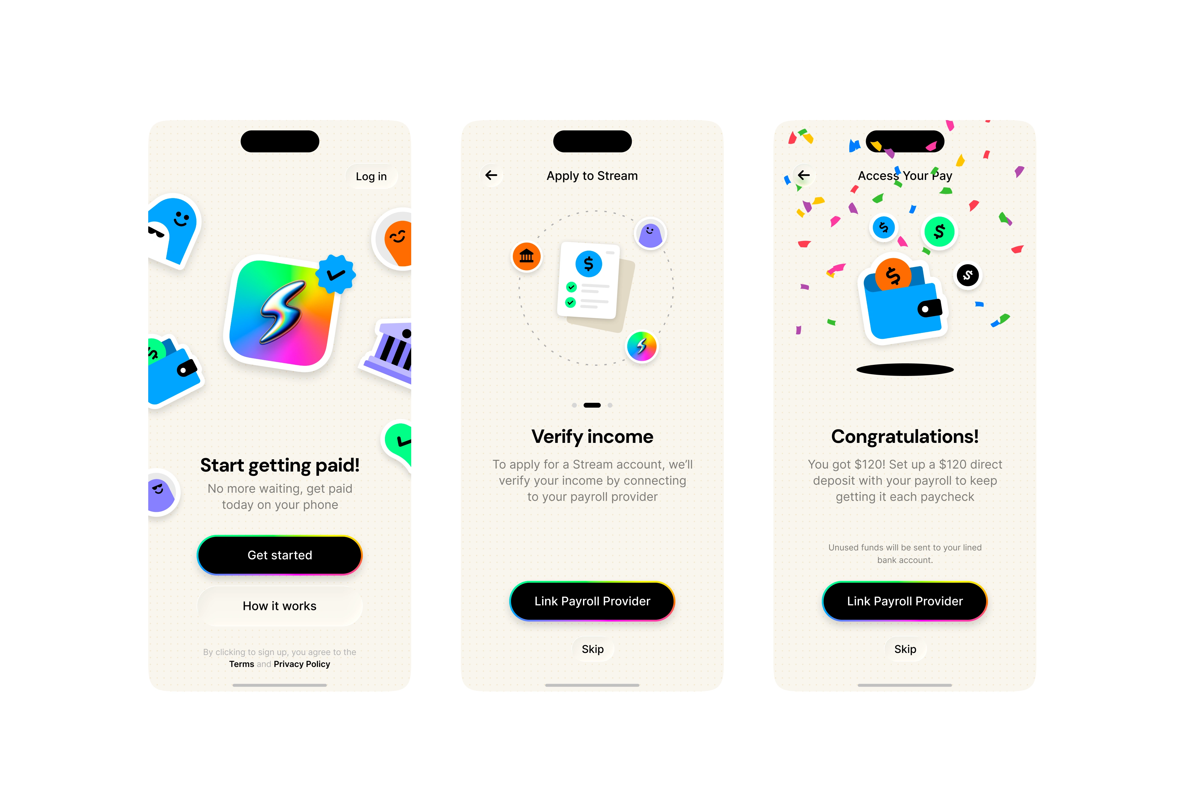
Onboarding screens
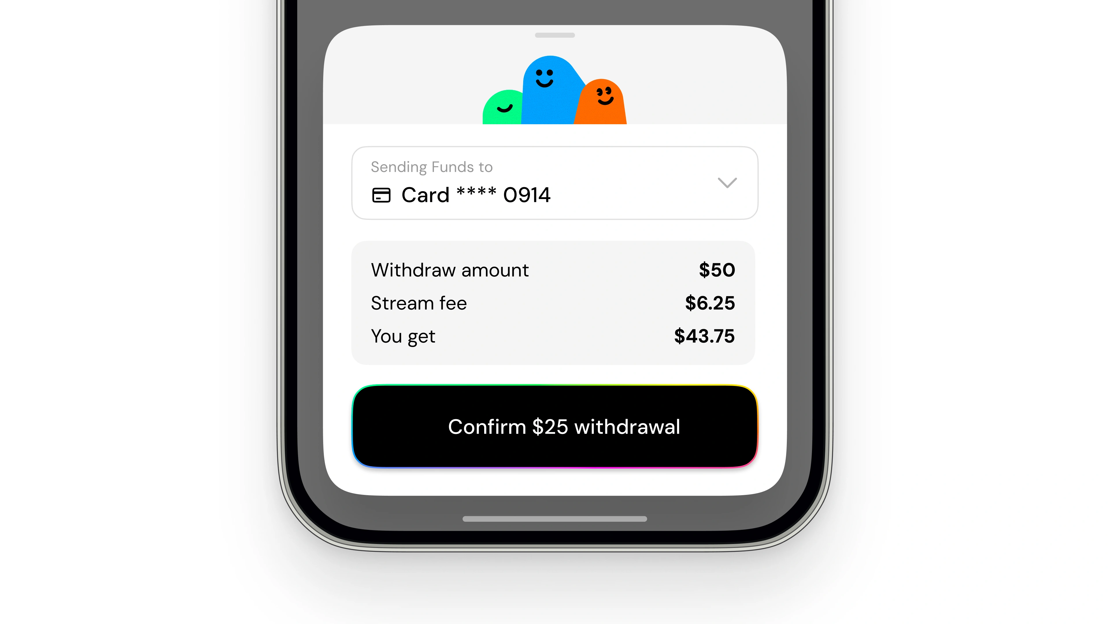
Drawer preview
App Icon + Brand Future
By creating a strong and cohesive new brand foundation, Stream is now positioned for long-term growth and consistency. Every visual element—from the color palette to the iconography and illustrations—was designed with scalability and adaptability in mind. This ensures the brand not only feels timeless today but can evolve naturally as the product and platform grow. In essence, this refreshed identity gives Stream the longevity and flexibility to stay relevant and build upon its visual language well into the future.
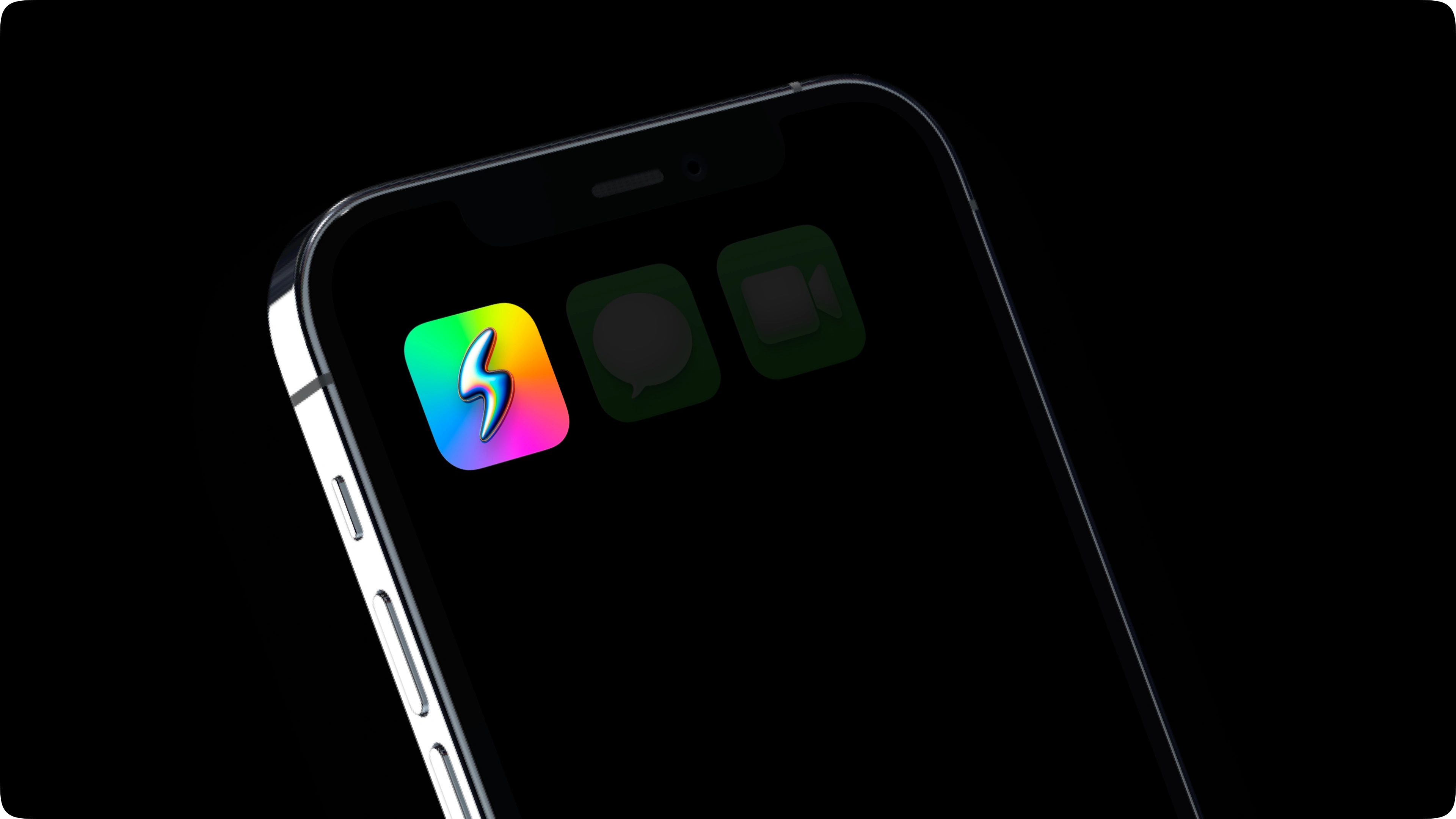
Final app icon
See it live in the App Store
Like this project
Posted Oct 29, 2025
Brand sprint and new identity + assets for Stream App
Likes
2
Views
341
Clients
Stream