Believe Brand Identity
Dmitri Litvinov

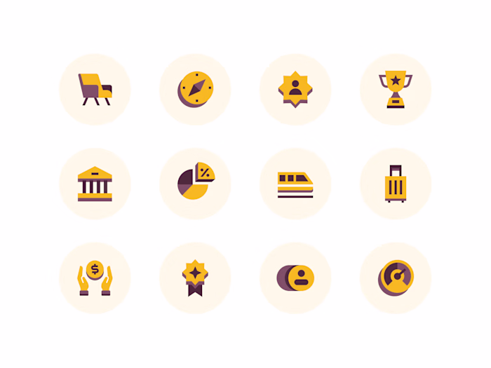
Premium Services Provided: Week Design Sprint
Your App Icon is Everything—Believe’s #30 App Store Ranking Proves It! 🚀 Designed by Me, Crafted for Success.
The Brief
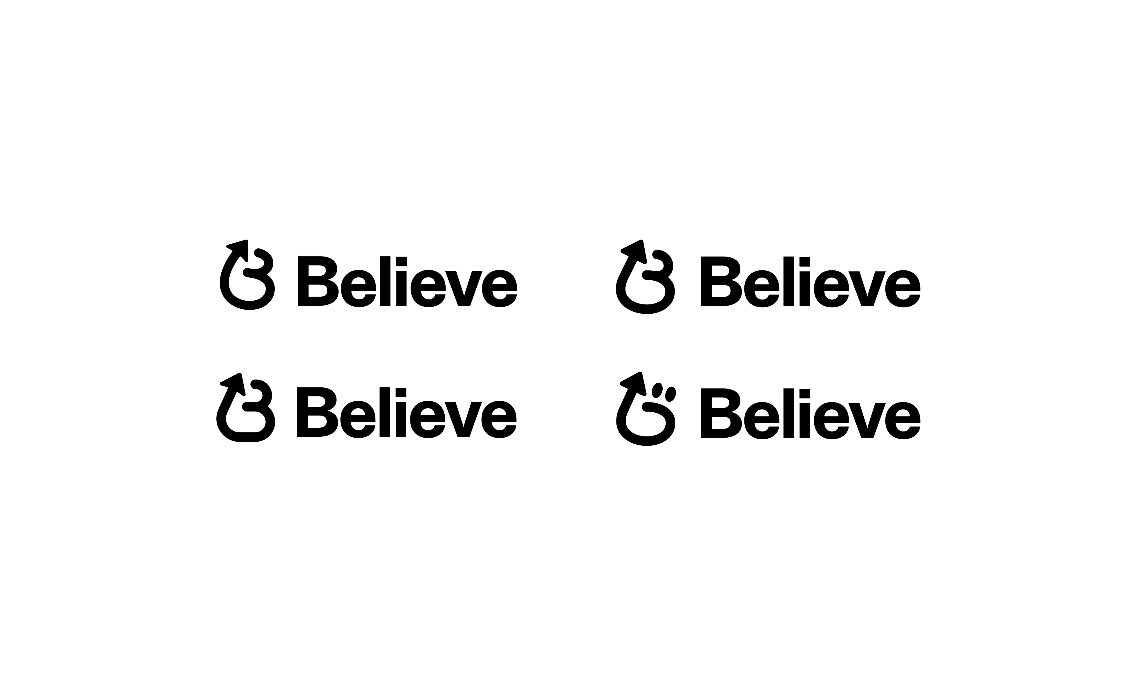
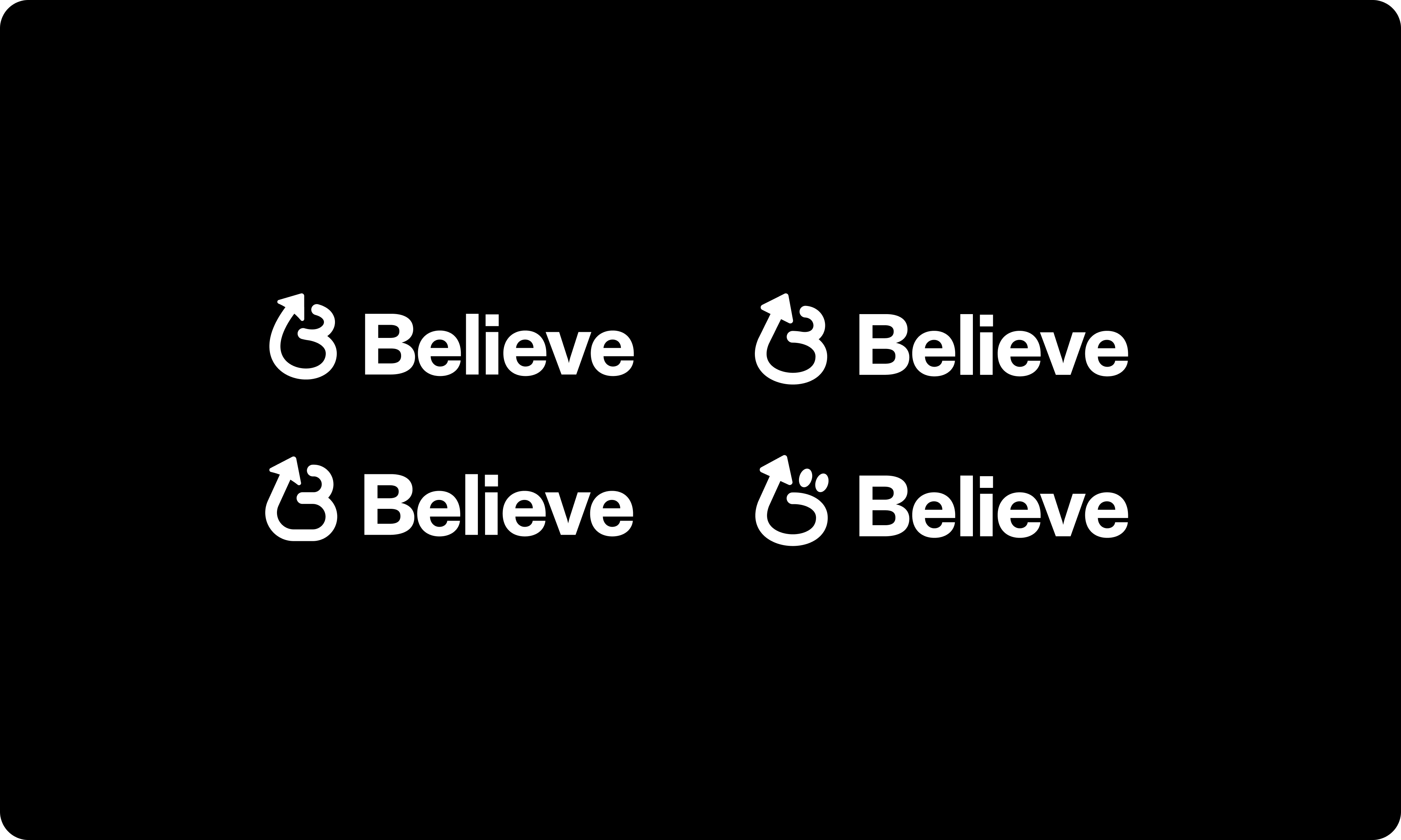
The new Believe app icon you designed is a standout blend of creativity and purpose. Featuring the letter B at its core, the design cleverly incorporates an arrow that represents movement in the market, finance, and growth. The continuous drawing gives the icon a sense of flow and balance, creating a distinct and modern character. This thoughtful composition makes the design instantly recognizable, confident, and full of forward momentum.
Exploration
During the exploration phase of designing Believe’s new brand identity, I went through a wide range of creative concepts to capture the core of what the brand stands for. I explored different representations of the letter B, experimenting with geometric, abstract, and continuous-line styles to find the right balance between confidence and optimism. I also played with motion and arrow metaphors to represent growth, progress, and the flow of the market, while keeping the overall design simple, modern, and memorable. This iterative process helped refine the brand into a cohesive identity that feels purposeful, balanced, and full of forward energy.
Initial Exploration
Mark
Arriving at the final Believe mark was a thoughtful and iterative process. I went through a bunch of different “B” options, exploring geometric, abstract, and flowing styles before nailing the right direction. Each variation was tested for its ability to express Believe’s themes of growth, optimism, and forward movement, while maintaining visual balance and simplicity. Through multiple refinements and explorations, the design evolved into a confident, cohesive symbol that captures the spirit of the brand and stands out as a distinctive and timeless mark.
Exploring "B" aligned concepts
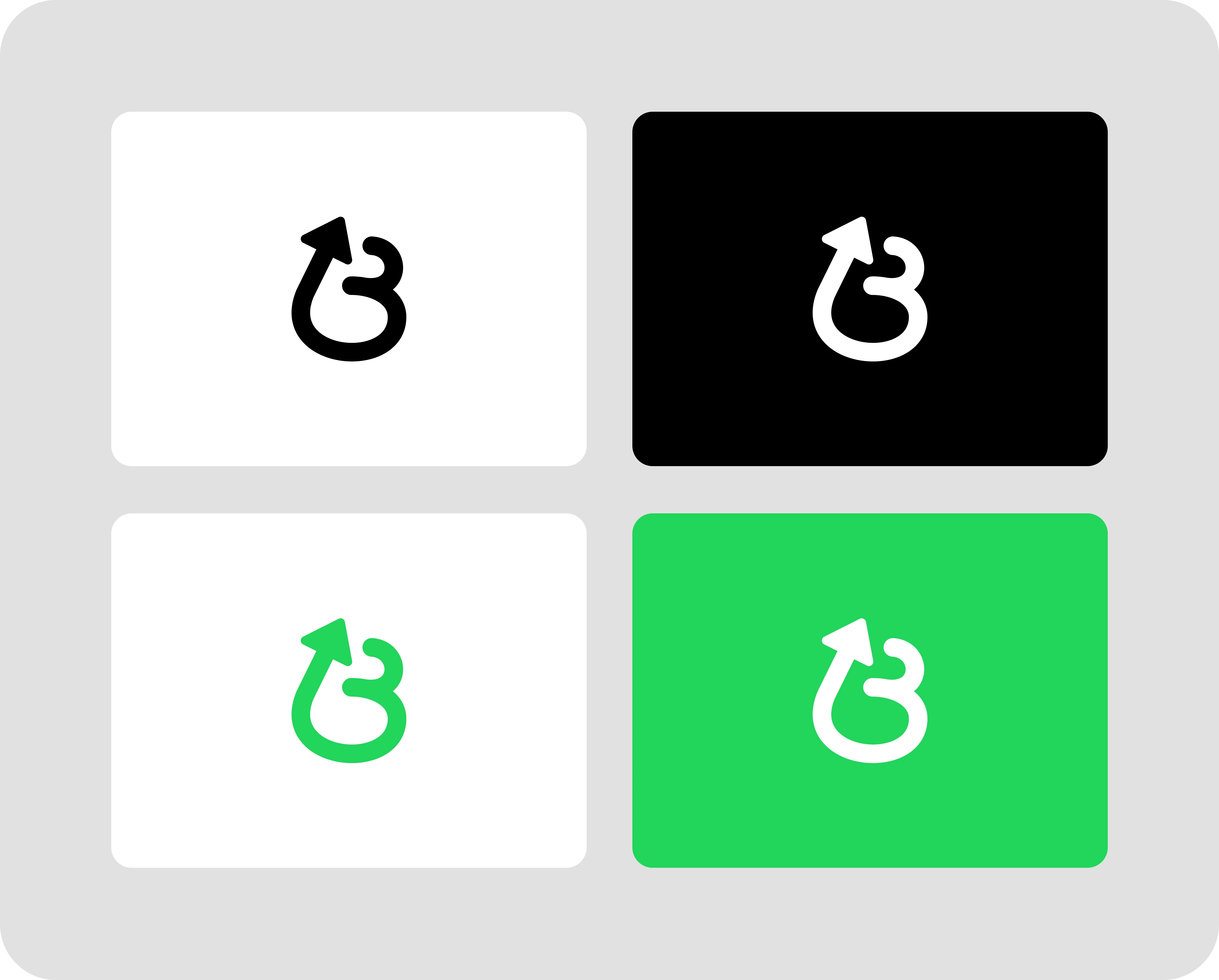
Testing on colored backgrounds
Making The Logo
Designing the logo for Believe was an exciting and exploratory process that involved going through a bunch of different full logotype concepts before finding the right direction. I experimented with a variety of styles—from minimal and geometric to expressive and fluid—each aiming to capture the spirit of confidence, growth, and optimism that defines the brand. Throughout the process, I explored ways to integrate motion and balance into the wordmark, ensuring it felt dynamic yet refined. After testing and refining multiple directions, the final design emerged as a clean, confident, and modern logotype that perfectly represents Believe’s forward-thinking identity.
Logotype exploration
Narrowing It Down
Narrowing down the Believe mark and logotype was a careful and iterative process that required refining a wide range of early explorations. I started with many different directions, experimenting with both standalone marks and full wordmarks to see which best captured Believe’s themes of growth, optimism, and balance. As the process evolved, I began eliminating options that felt too complex or off-tone, focusing instead on designs that were simple, scalable, and emotionally resonant.
Through rounds of refinement and testing, I gradually honed in on a direction where the mark and logotype complemented each other—combining movement, clarity, and confidence. The result is a cohesive, balanced identity system that feels modern, purposeful, and unmistakably Believe.
Narrowing down to final options
Dark background explorations
Final Design
The creation of the Believe mark was a journey of exploration, refinement, and precision. I started by exploring a wide range of concepts and styles, experimenting with different interpretations of the letter B, motion, and balance to capture the brand’s spirit of growth and optimism. As the process evolved, I narrowed it down to the perfect option—obsessing over every curve, angle, and proportion to ensure it felt confident, modern, and timeless. The result is a solid, cohesive brand identity for Believe that embodies purpose, clarity, and forward momentum.
Final mark
App Store & iOS
The final Believe design stands out powerfully both in the App Store and on its own, instantly capturing attention through its clean form and confident presence. Its bold yet balanced structure gives it strong visual weight, while the subtle arrow detail adds movement and meaning, symbolizing progress and growth. Unlike generic app icons that blend into the crowd, this design feels distinctive and memorable—something users can recognize at a glance. Every curve and proportion was carefully refined to make it both timeless and scalable, giving Believe a brand identity that not only stands apart from competitors but also builds instant trust and recognition with anyone who sees it.

App Icon Preview
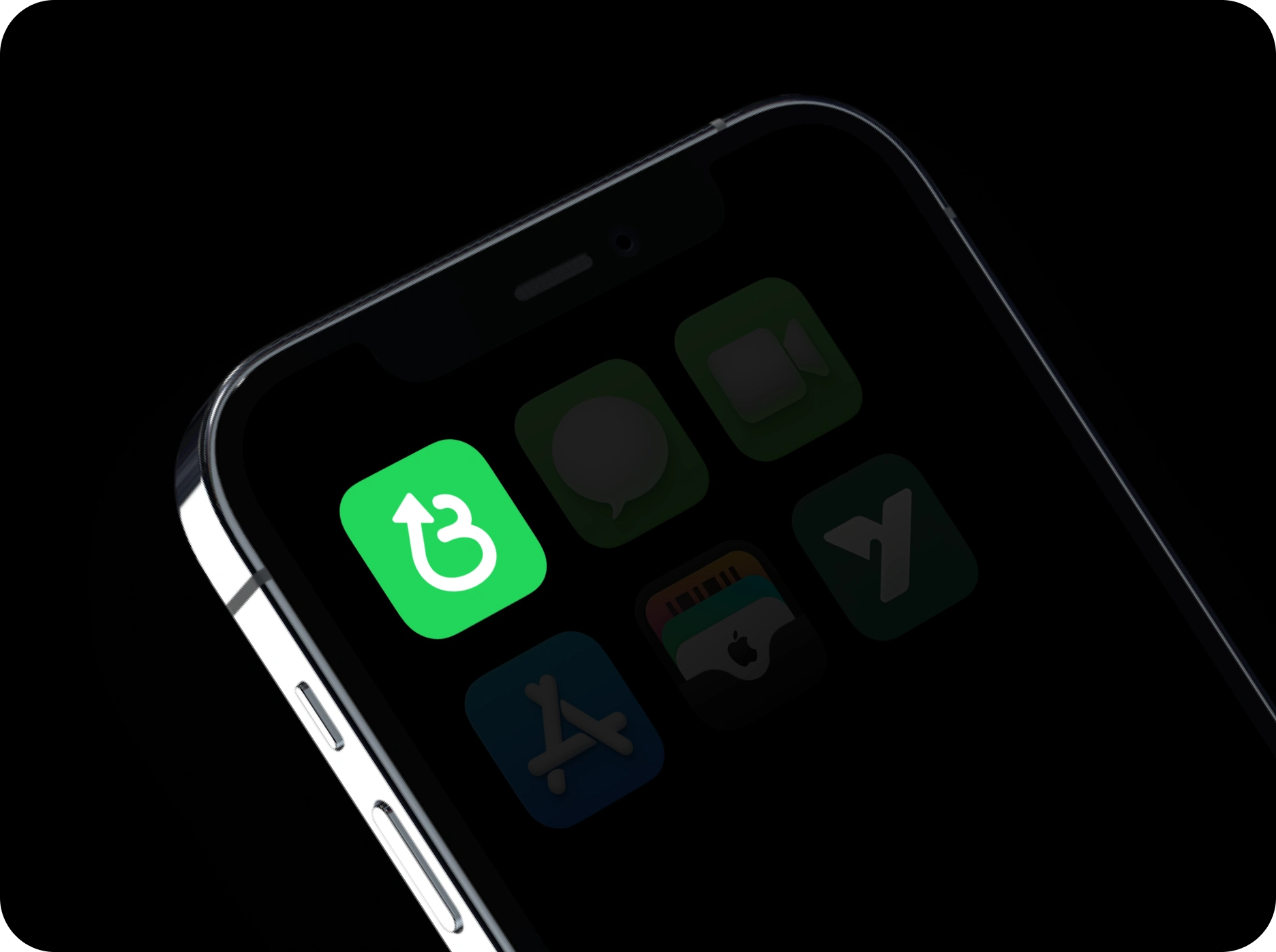
iPhone Preview
See it live in the App Store
Like this project
Posted Oct 17, 2025
I designed the new Believe brand identity with care, and its clean, uplifting energy quickly went viral, inspiring confidence and self-belief.
Likes
8
Views
592
Clients
SIMULATE