Apollo.io Icons
Dmitri Litvinov
Icons Exploration
Having an exploration phase for the new Apollo.io icons was crucial as it allowed for thorough research and ideation, ensuring that the final designs effectively communicated the brand's values and resonated with its target audience. This initial exploration facilitated the discovery of unique design directions and informed decisions about visual styles and elements, laying a solid foundation for the development of cohesive and impactful iconography. Ultimately, the exploration phase was instrumental in shaping icons that not only met the functional requirements but also aligned seamlessly with Apollo.io's identity, contributing to a visually compelling and user-friendly experience.
Exploration style direction #1.
Exploration style direction #2.
Exploration style direction #3.
This initial exploration facilitated the discovery of unique design directions and informed decisions about visual styles and elements, laying a solid foundation for the development of cohesive and impactful iconography.
UI Testing
Testing out different icon style directions in the UI before deciding on the final direction was important as it allowed for user feedback and validation of design choices. This iterative process ensured that the chosen style resonated with users, effectively communicated the intended message, and seamlessly integrated with the overall interface design. By gathering insights from real users, Apollo.io could make informed decisions and refine the iconography to create a cohesive and user-friendly experience that met the needs and preferences of its audience.
Testing out the icons in the main nav.
By aligning with user preferences and ensuring consistency with Apollo.io's identity, the approved direction represents a cohesive and visually compelling icon set that enhances the user experience and reinforces the brand's presence.

Bigger view of the new icons in the UI.
Approved Direction
After thorough exploration and user testing of various icon style directions, we finally landed on the approved direction for the Apollo.io icon set through a collaborative process. This direction was chosen based on its ability to effectively communicate the brand's values, resonate with the target audience, and seamlessly integrate with the overall interface design. By aligning with user preferences and ensuring consistency with Apollo.io's identity, the approved direction represents a cohesive and visually compelling icon set that enhances the user experience and reinforces the brand's presence.
Approved icon style direction.
Geometry & Details
It's crucial to maintain consistent geometry and adhere to proper keylines and grids for the new icons to ensure visual harmony and usability within the interface. Consistent geometry creates a cohesive visual language, while proper keylines and grids provide structure and alignment, enhancing the overall clarity and organization of the iconography. By maintaining these design principles, the new icons for Apollo.io not only maintain a polished and professional appearance but also contribute to a seamless and intuitive user experience.
Icon breakdown.
Consistent geometry creates a cohesive visual language, while proper keylines and grids provide structure and alignment, enhancing the overall clarity and organization of the iconography.
Size & Structure
Having the proper size and structure for the new icons is essential for ensuring optimal legibility and usability across various devices and screen sizes within the Apollo.io interface. Consistency in size ensures that icons are easily recognizable and accessible, while a well-defined structure provides visual clarity and alignment, facilitating intuitive navigation for users. By adhering to proper size and structure guidelines, the new icons contribute to a cohesive and user-friendly experience, enhancing usability and reinforcing Apollo.io's brand identity.
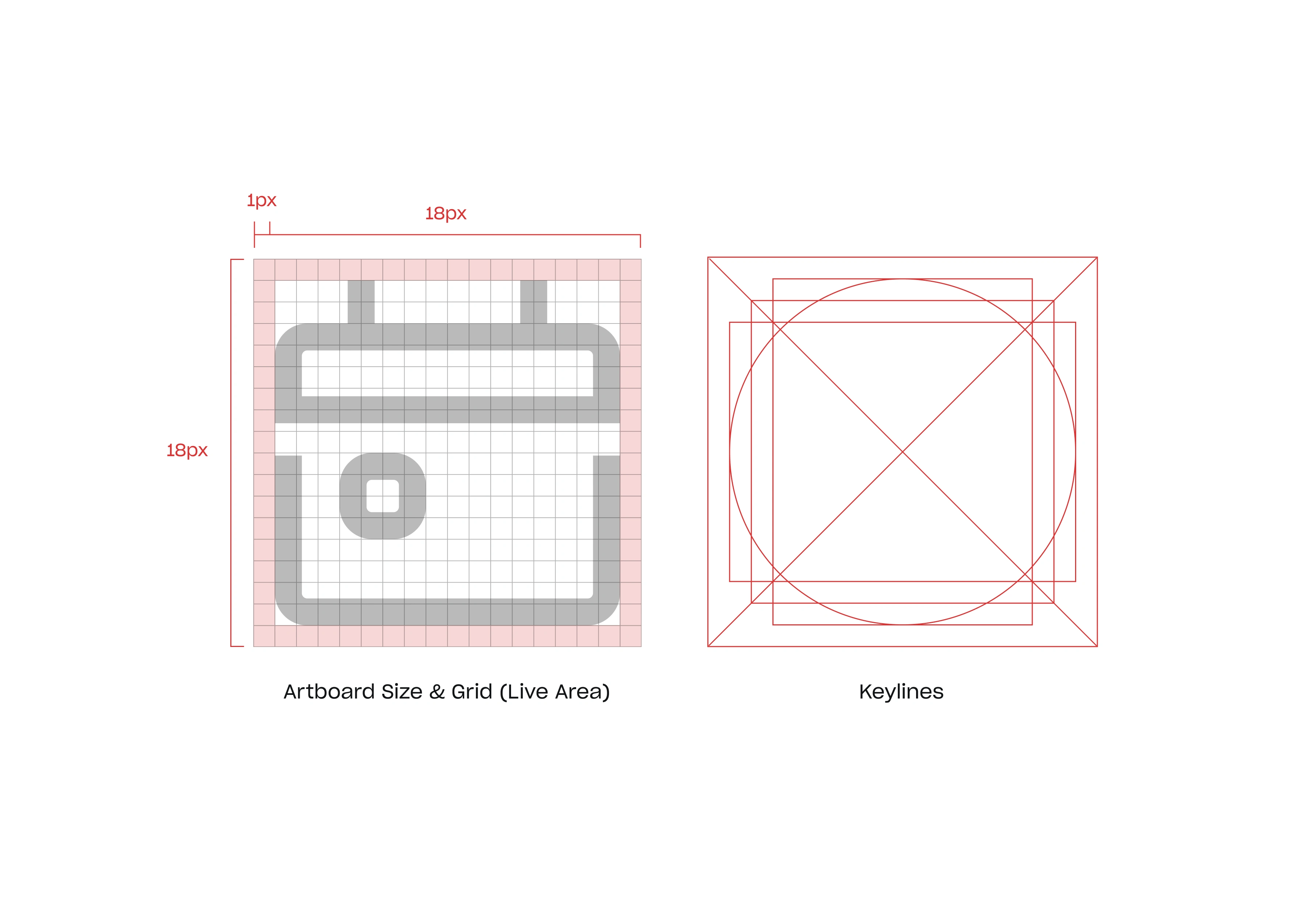
Icon grid and keylines details.
Final Result
Working with the Apollo.io team to create the new refreshed icon set was an exhilarating experience marked by collaboration, creativity, and a shared commitment to excellence. The synergy between our teams allowed for the seamless exchange of ideas and feedback, resulting in an icon set that not only met but exceeded expectations. Together, we navigated through challenges, celebrated successes, and ultimately delivered a visually stunning and cohesive iconography that enhances the user experience and strengthens Apollo.io's brand presence.
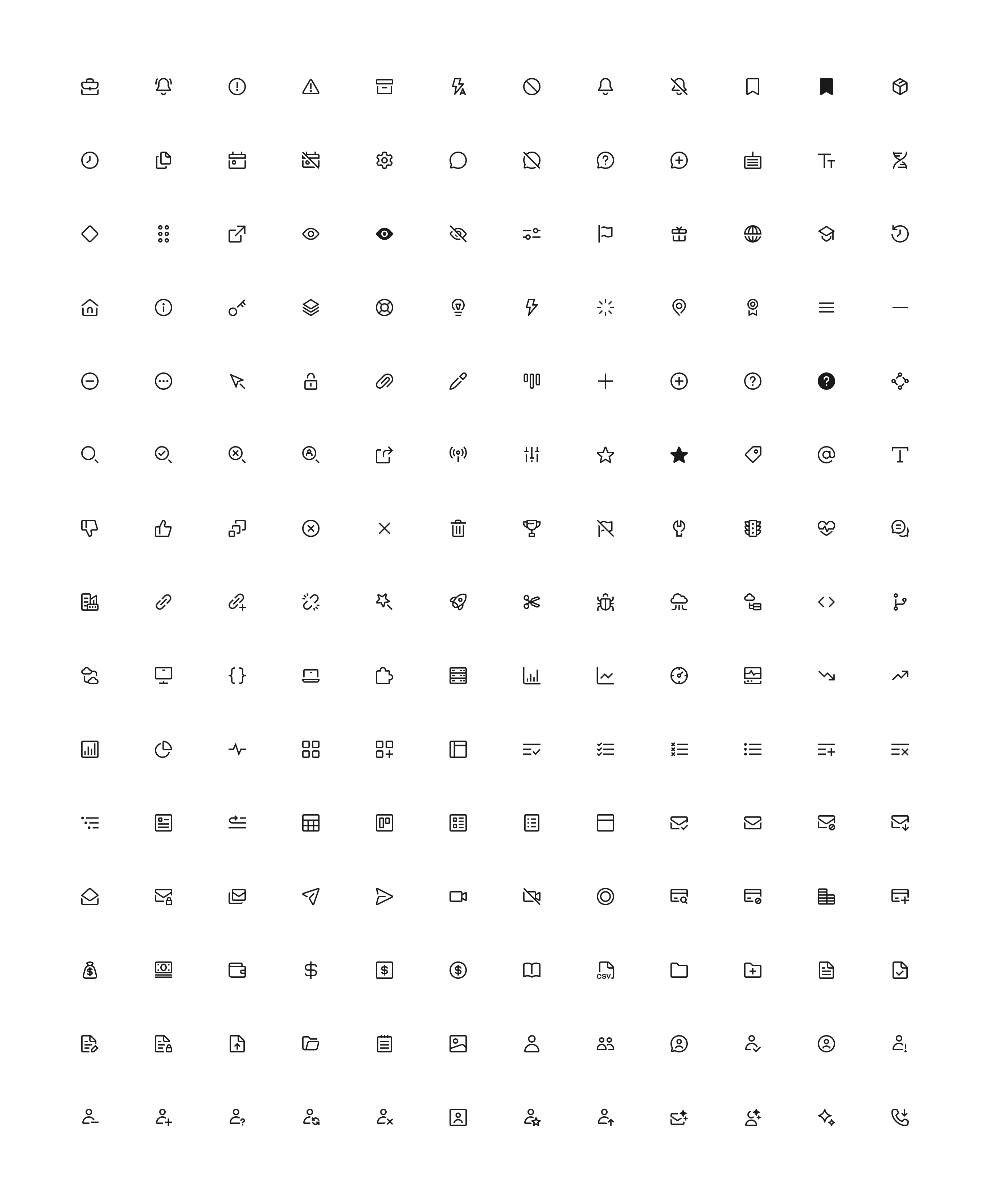
The new full icon set.
Together, we navigated through challenges, celebrated successes, and ultimately delivered a visually stunning and cohesive iconography that enhances the user experience and strengthens Apollo.io's brand presence.
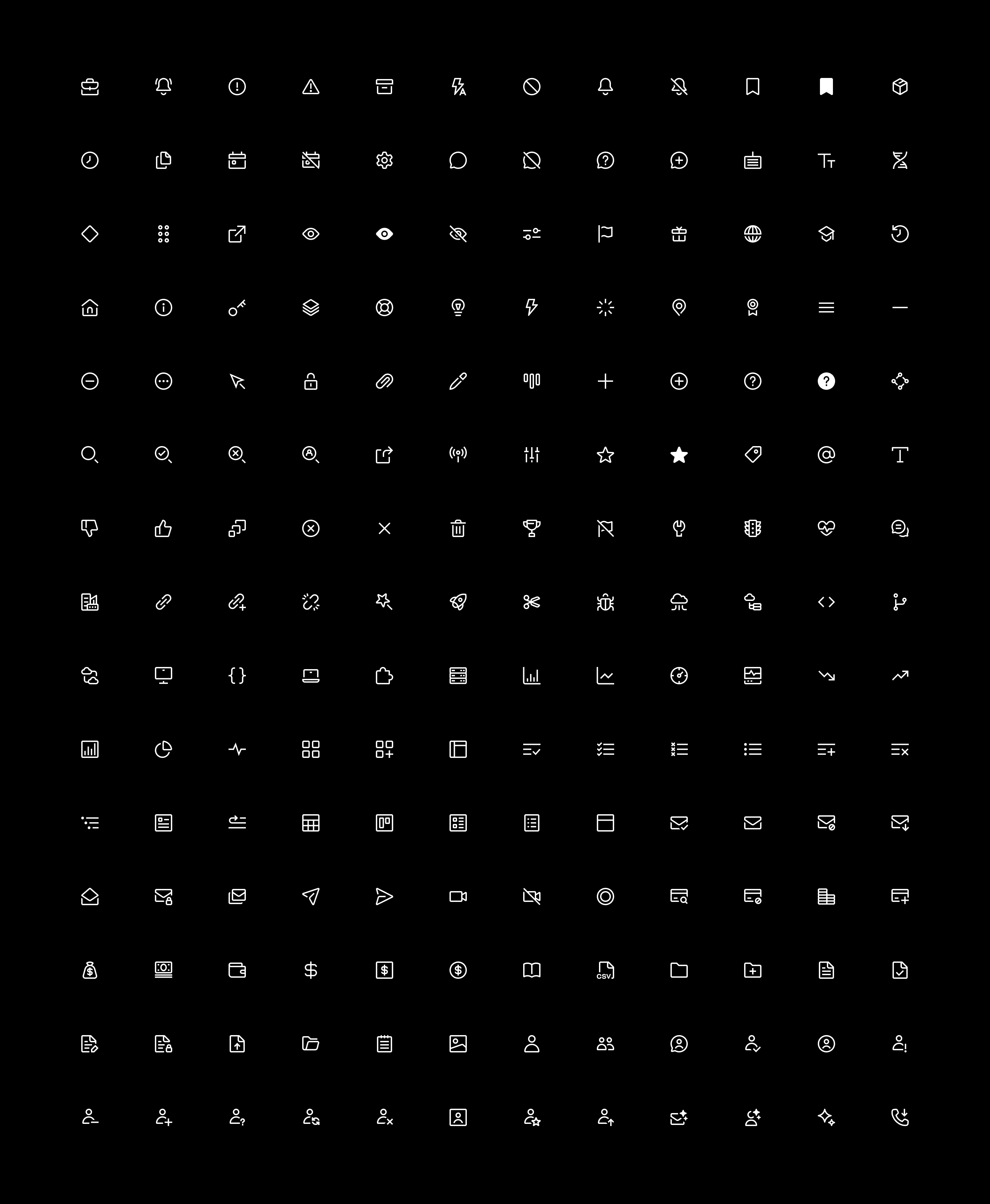
New icon set on a dark background.
Style Guide
Having an icon style guide for Apollo.io icons was crucial as it provided clear guidelines and standards for maintaining consistency and coherence across the entire icon set. This ensured that all icons adhered to the same visual language, including size, shape, color, and style, resulting in a unified and professional appearance throughout the interface. By establishing a comprehensive style guide, Apollo.io could streamline the design process, facilitate collaboration among team members, and ultimately enhance the user experience by providing a visually cohesive and intuitive interface.
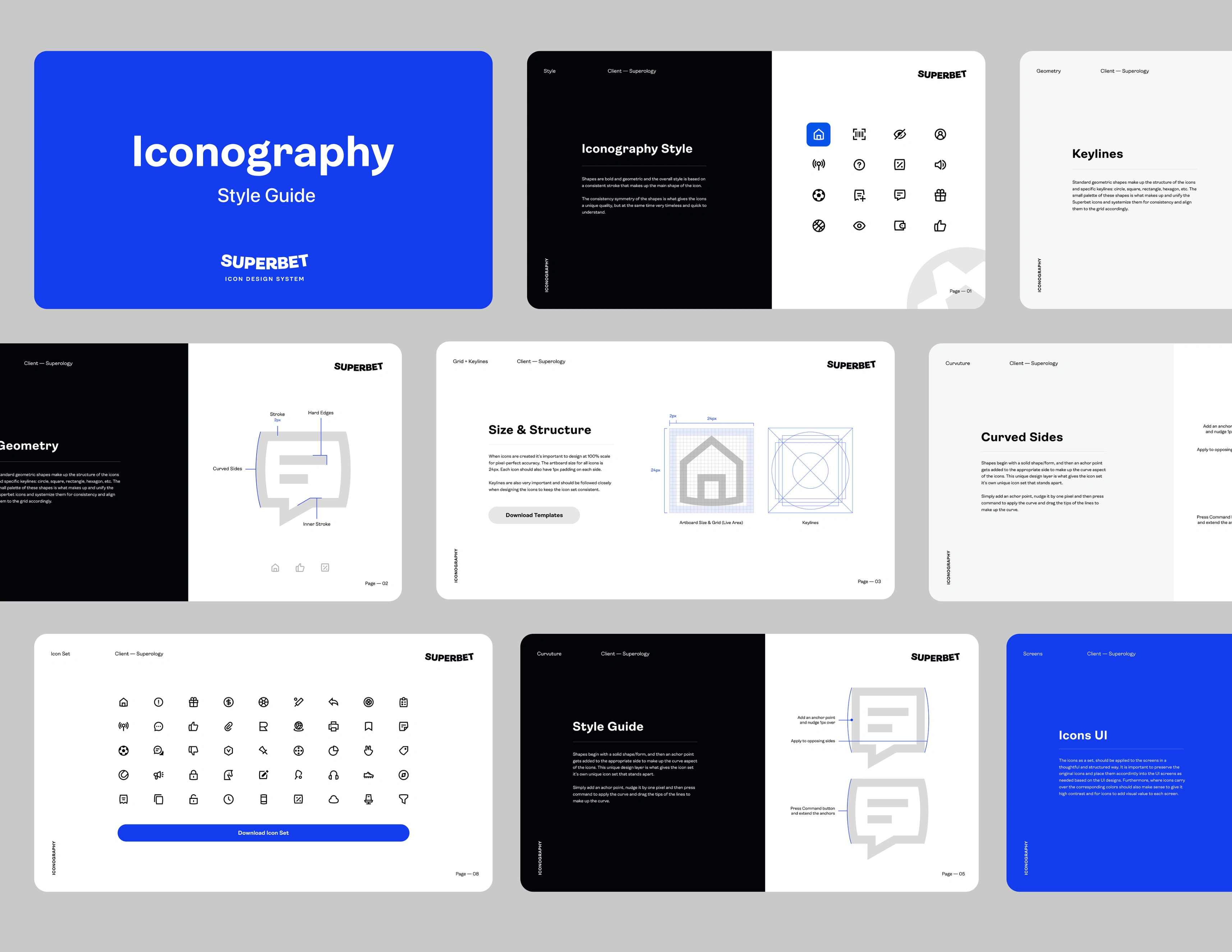
Preview of the style guide provided for the new icons.
Have a project in mind?
👋🏻 Contact me → hey@dmitrilitvinov.com
Like this project
Posted Feb 7, 2024
Designed the new updated icon design system.