Airtable Illustrations
Dmitri Litvinov
Getting Started
My approach to designing new and sleek small illustrations for Airtable revolves around a meticulous fusion of simplicity and sophistication. By distilling complex concepts into visually compelling elements, I aim to create illustrations that not only enhance user understanding but also elevate the overall aesthetic of the interface. Through a process of iterative ideation and refinement, each small illustration is crafted with a keen focus on precision, ensuring a seamless integration into Airtable's sleek and modern design language.
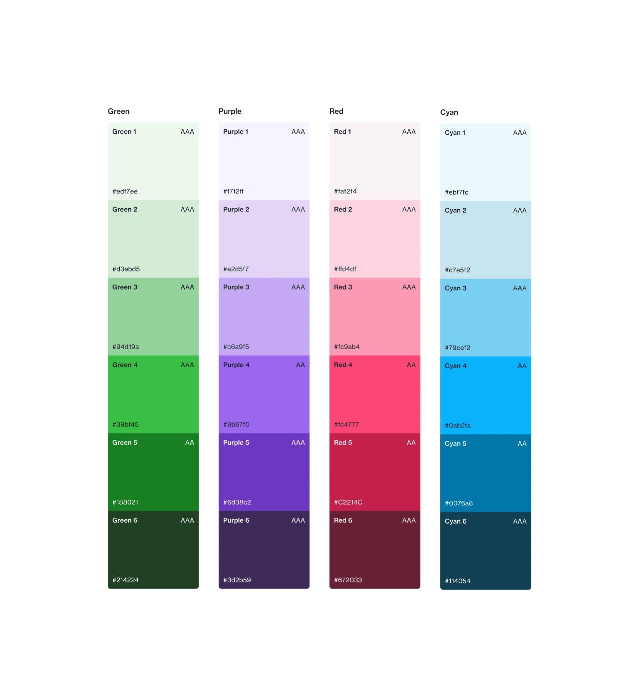
Brand colors.
This design choice not only aligns with contemporary trends but also imparts a subtle depth, elevating the overall user interface by providing a sleek and polished appearance.
Utilizing brand colors in illustrations is crucial for fostering visual consistency and reinforcing brand identity. By incorporating these colors, illustrations become a powerful extension of the brand, creating a cohesive and memorable user experience that strengthens recognition and establishes a harmonious connection between the visual elements and the brand's overall aesthetic.
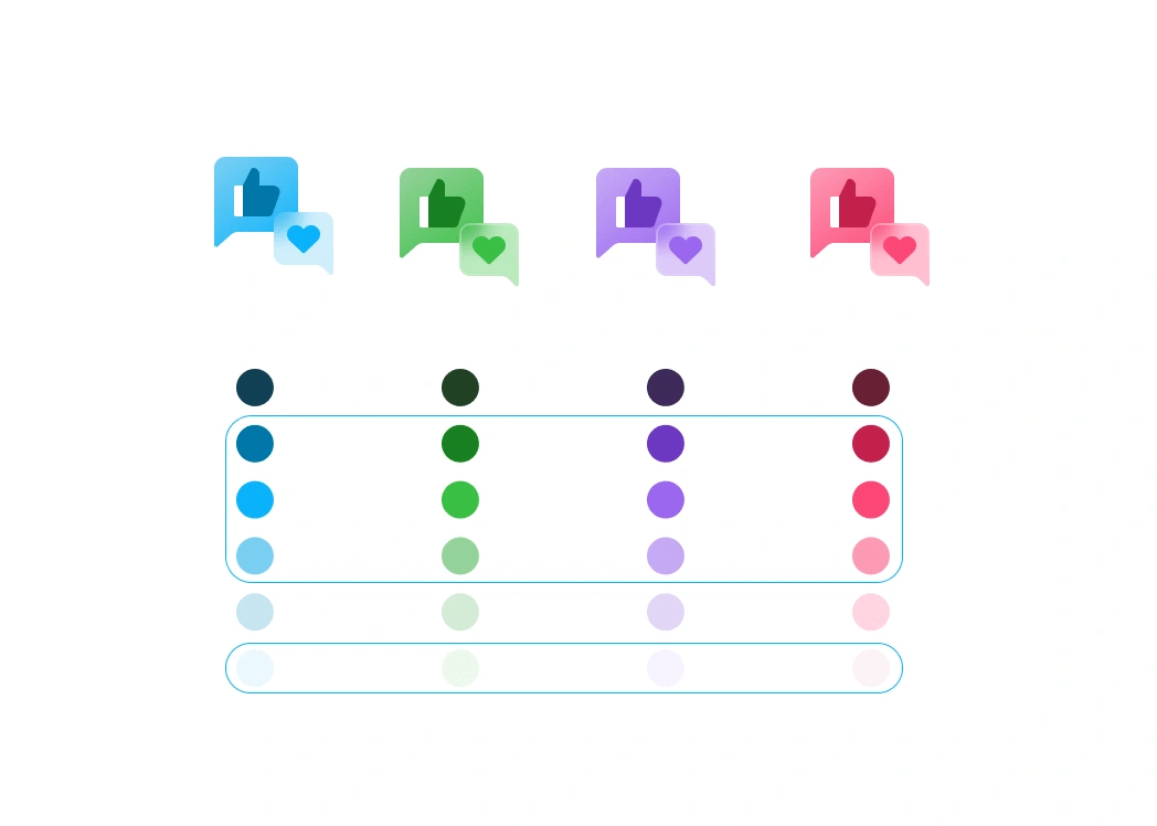
Testing out the different scalable colorways.
Through a process of iterative ideation and refinement, each small illustration is crafted with a keen focus on precision, ensuring a seamless integration into Airtable's sleek and modern design language.
Fresh Look
The "frosted" look in the new Airtable icons holds paramount importance as it adds a layer of sophistication and modernity to the visual identity. This design choice not only aligns with contemporary trends but also imparts a subtle depth, elevating the overall user interface by providing a sleek and polished appearance. The frosted look contributes to a harmonious and visually appealing design language, enhancing the user experience within the Airtable platform.

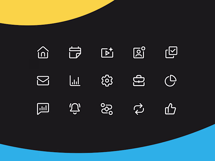
Approved set of icons on a light background.

Icons on a dark background (for flexibility).
Each unique style element, thoughtfully integrated, contributes to the overall aesthetic, creating a cohesive and memorable visual language that enhances the user experience and strengthens the brand's presence.
It's All In The Details
Incorporating sleek, frosted-looking details into icons is crucial as it introduces an elegant and contemporary aesthetic that elevates the overall visual appeal. The frosted finish imparts a subtle sophistication, adding depth and dimension to the icons. This design choice not only aligns with modern trends but also contributes to a cohesive and polished interface, enhancing the user experience and reinforcing a sense of quality and refinement within the visual elements.

Closer look at the "frosted" details.
A Cohesive Set
The importance of a fully cohesive set with unique style elements in icons cannot be overstated. It not only cultivates a visually harmonious and professional appearance but also reinforces brand identity. A consistent design language across the entire set ensures that users experience a seamless and unified interface, fostering recognition and trust. Each unique style element, thoughtfully integrated, contributes to the overall aesthetic, creating a cohesive and memorable visual language that enhances the user experience and strengthens the brand's presence.

Overview of the whole icon set.
The importance of a fully cohesive set with unique style elements in icons cannot be overstated.
Have a project in mind?
👋🏻 Contact me → hey@dmitrilitvinov.com
Like this project
Posted Jan 30, 2024
Designing the new Illustration design system.
Likes
0
Views
313
Clients
Airtable