SAE-REN: Luxury Beauty Identity & Packaging System

Mariya Vasileva


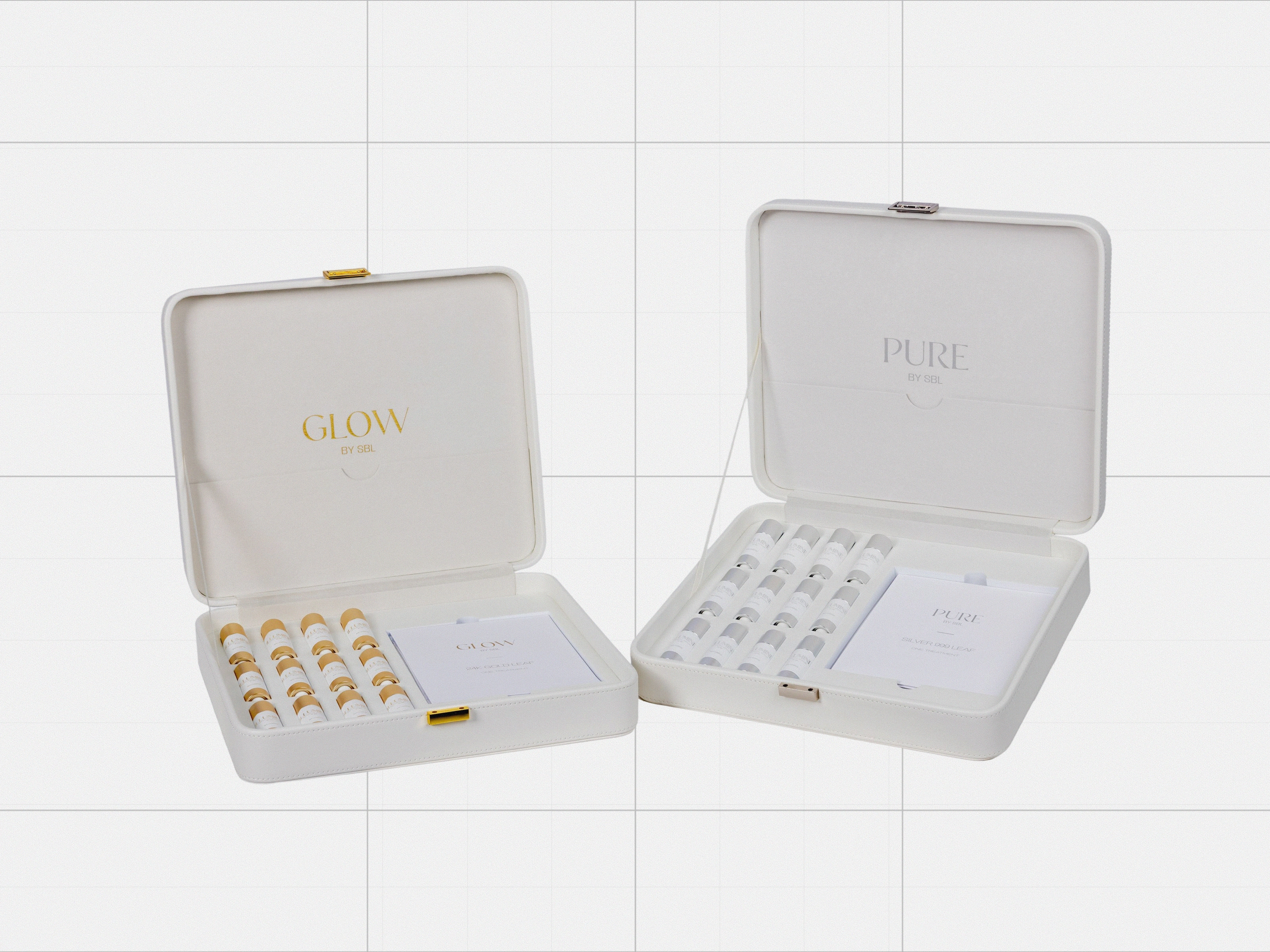
SAE-REN: Luxury Beauty Identity & Packaging System
SAE-REN needed an identity that could feel premium across beauty, wellness and retail without becoming visually fragile or dependent on one hero application.
I developed the brand identity as a flexible system, then extended it across packaging, digital touchpoints and campaign direction. The visual language balances a more expressive beauty sensibility with enough structure to work across different products and formats.
The result is not simply a logo applied everywhere. It is a recognizable system designed to hold together as the brand expands into new products, categories and physical environments.
My role: Brand strategy, brand identity, art direction, packaging direction, digital direction
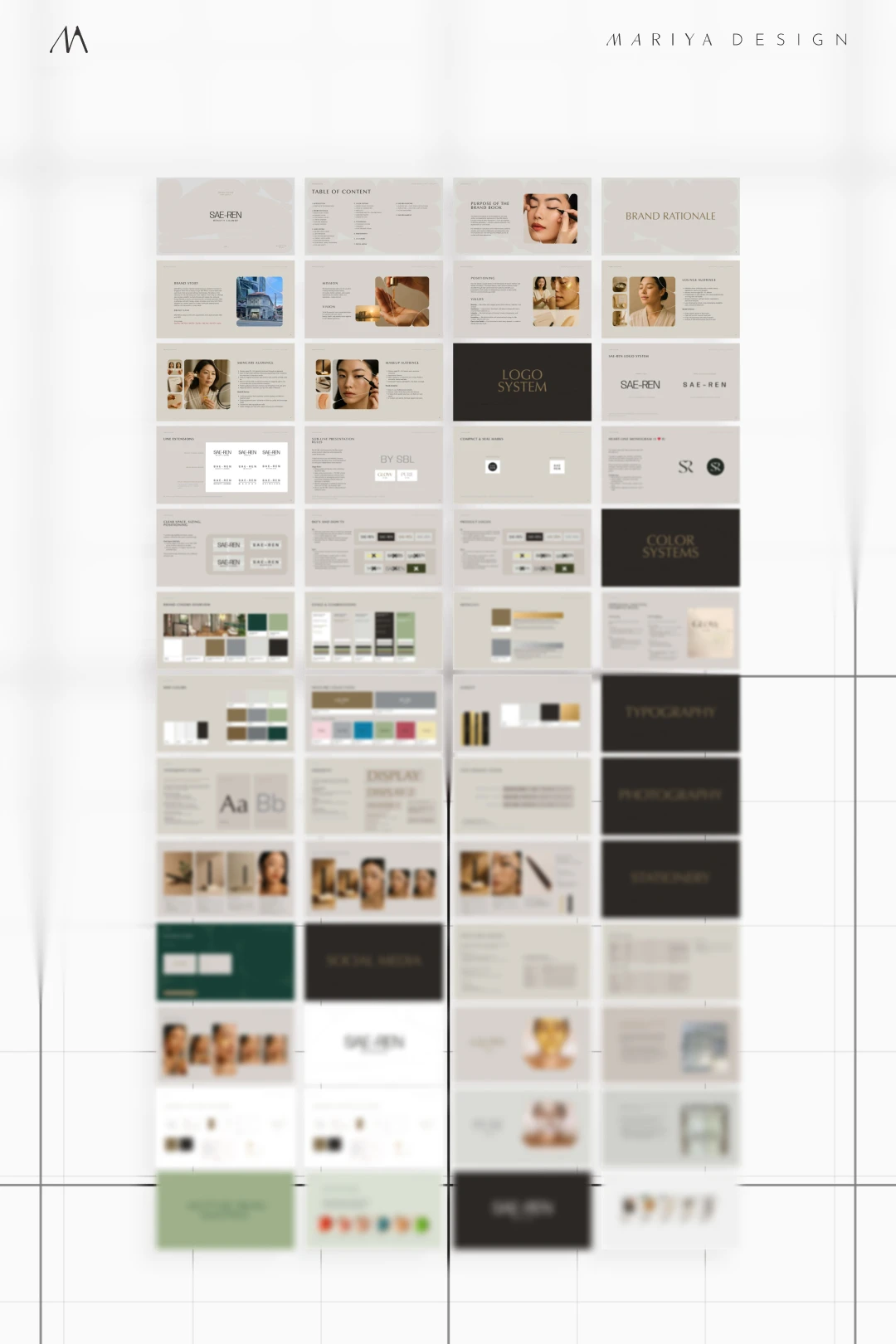
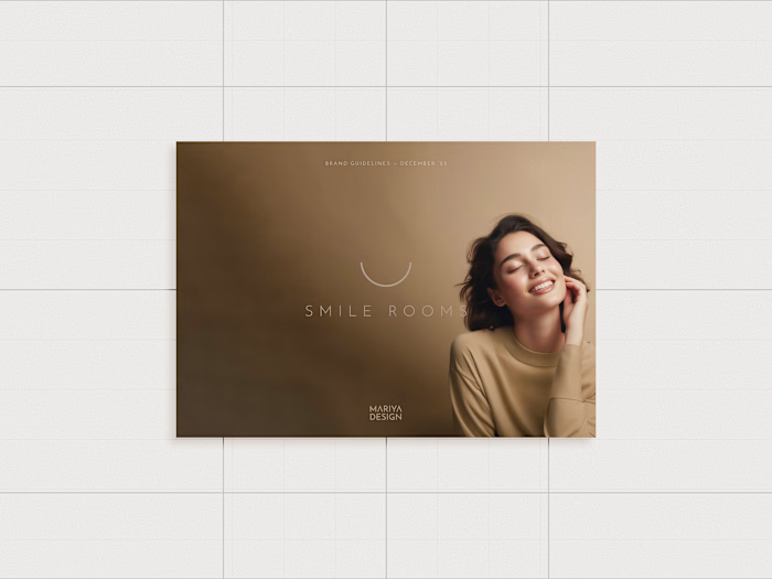
Brand guidelines: identity, color, typography, packaging and digital standards.
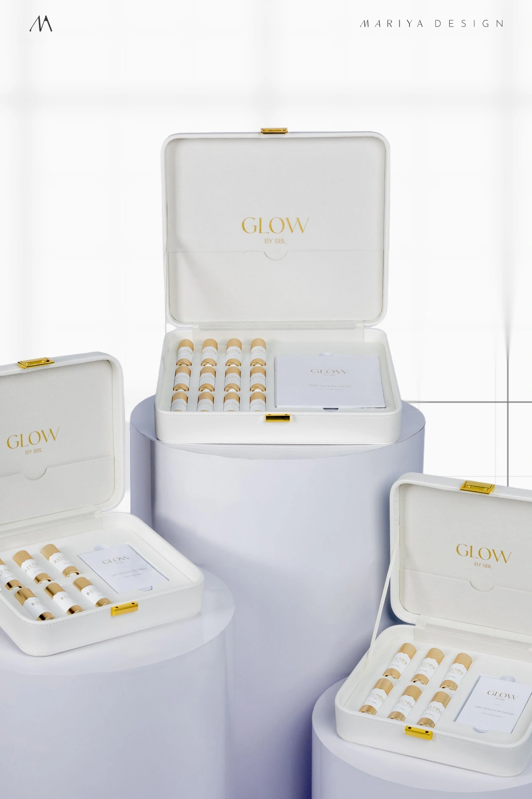
GLOW skincare kits: product hierarchy, metallic finishes and packaging architecture.
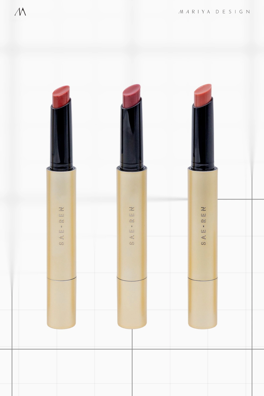
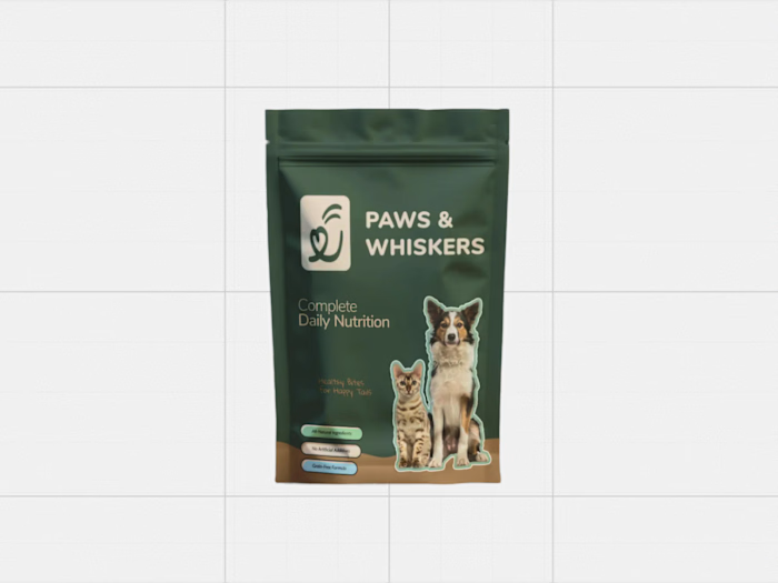
Makeup packaging: a shared identity across shade variants and product formats.
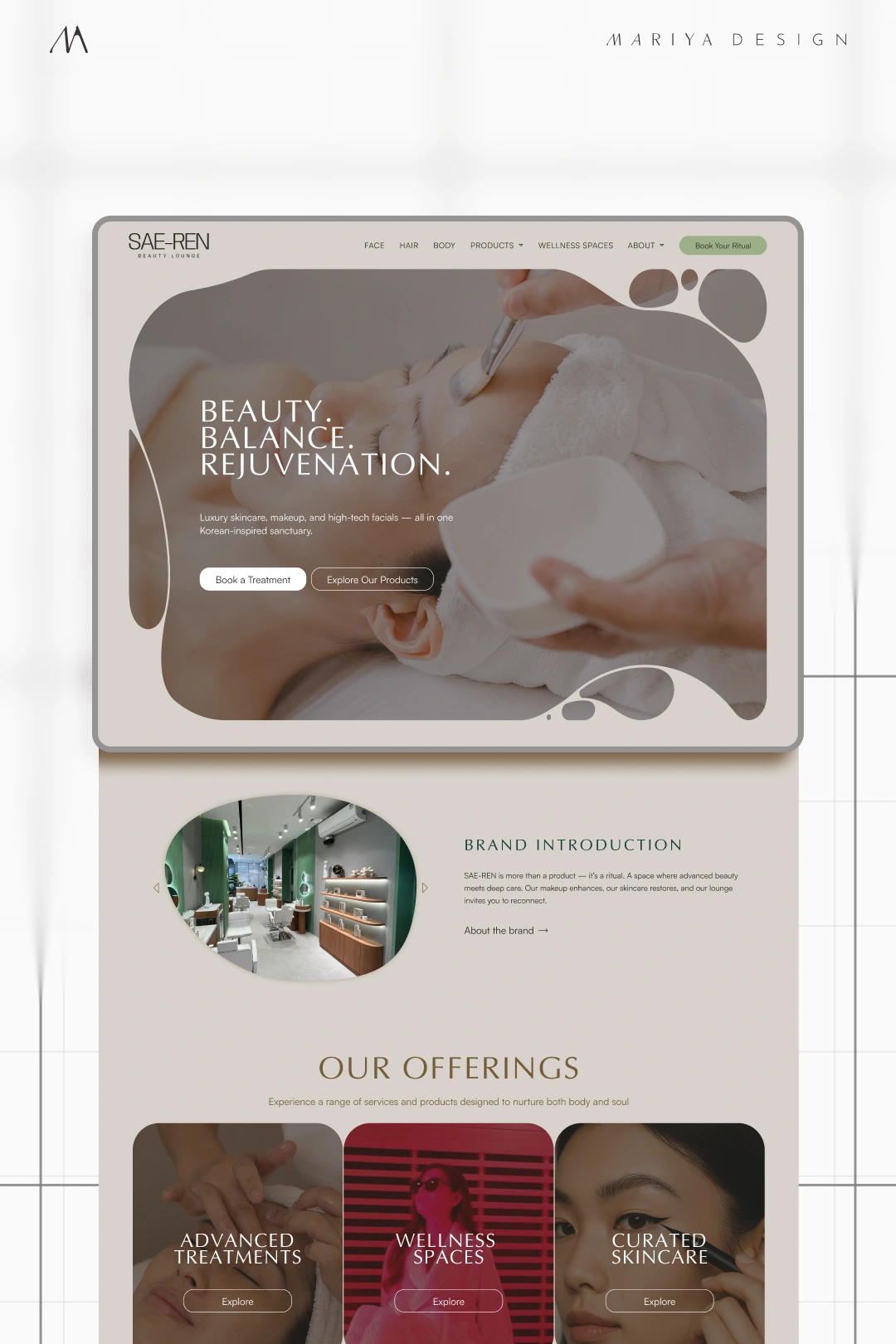
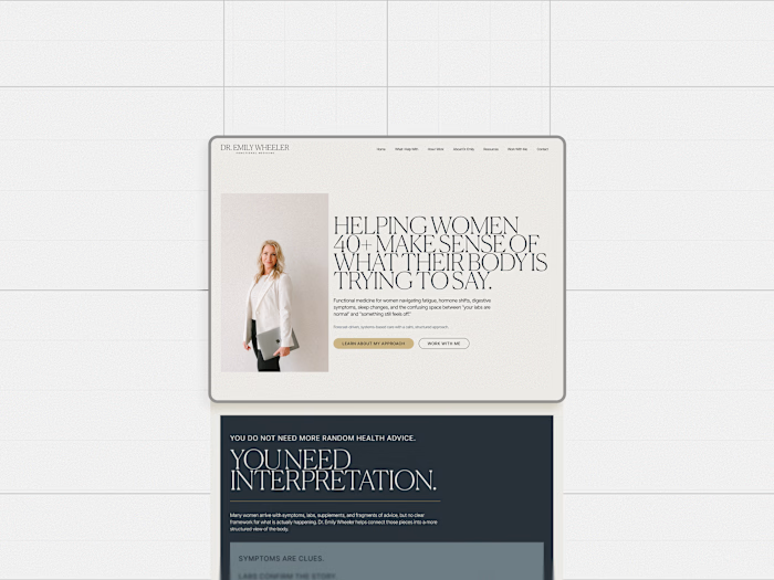
Website design direction: translating the identity into a digital experience.
Like this project
Posted Sep 14, 2026
A K-beauty identity and multi-SKU packaging system built to keep skincare, makeup, spa and digital applications recognizably SAE-REN as the brand expanded.