Paws & Whiskers: Premium Pet Wellness Brand Identity

Mariya Vasileva


Paws & Whiskers: Premium Pet Wellness Brand Identity
Paws & Whiskers was preparing to enter the U.S. pet wellness market with a premium, human-grade position. The challenge was to avoid both sides of the category cliché: overly playful pet branding on one side and cold, clinical supplement language on the other.
I developed the brand strategy and identity system around a warmer, more adult wellness position. The work included the logo system, hand-drawn iconography, typography hierarchy, a restrained green-led colour system, imagery and illustration direction, conceptual packaging architecture and a 55-page brand guideline.
Because the business was still pre-launch, the goal was not to claim retrospective sales results. The real outcome was readiness: a complete system the founders could use in investor, retail, manufacturing and launch conversations, with packaging logic already structured for future SKUs rather than requiring another redesign as the range expanded.
My role: Brand design, brand strategy and packaging design.
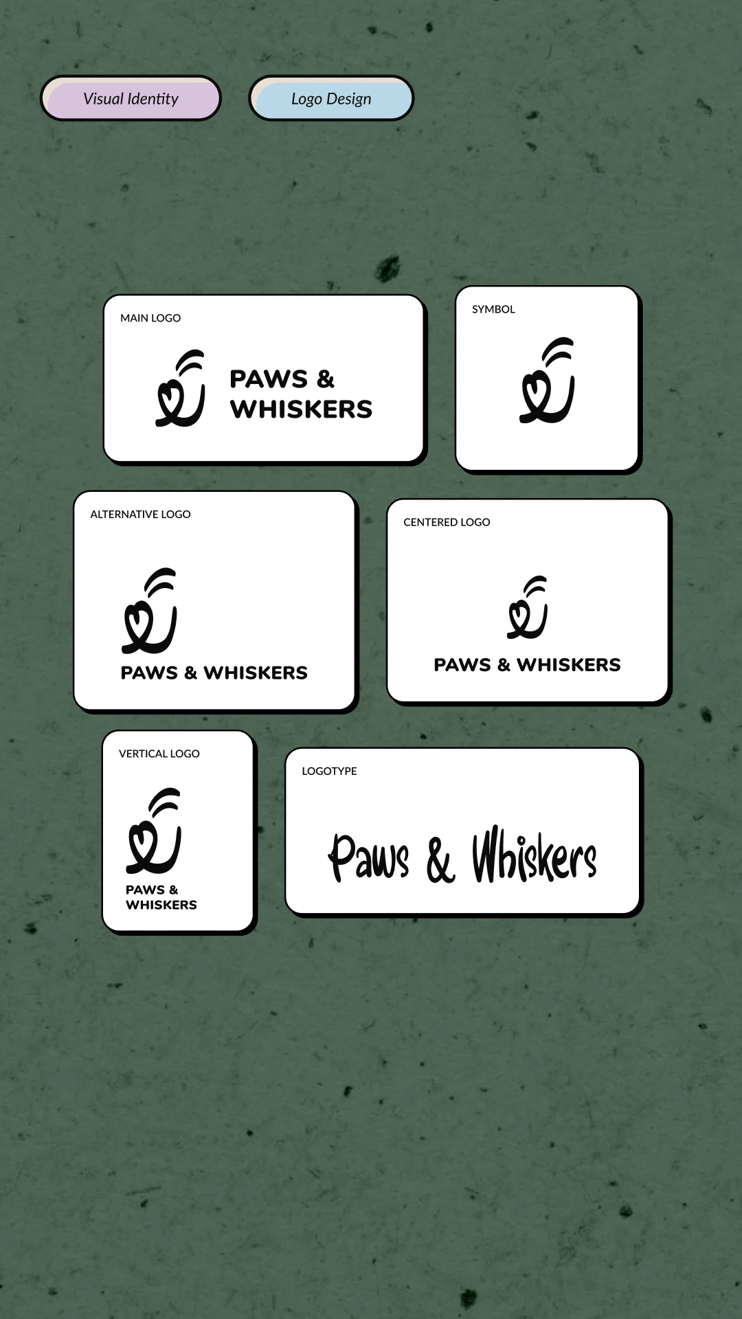
Primary logo system and alternative lockups on a light background.
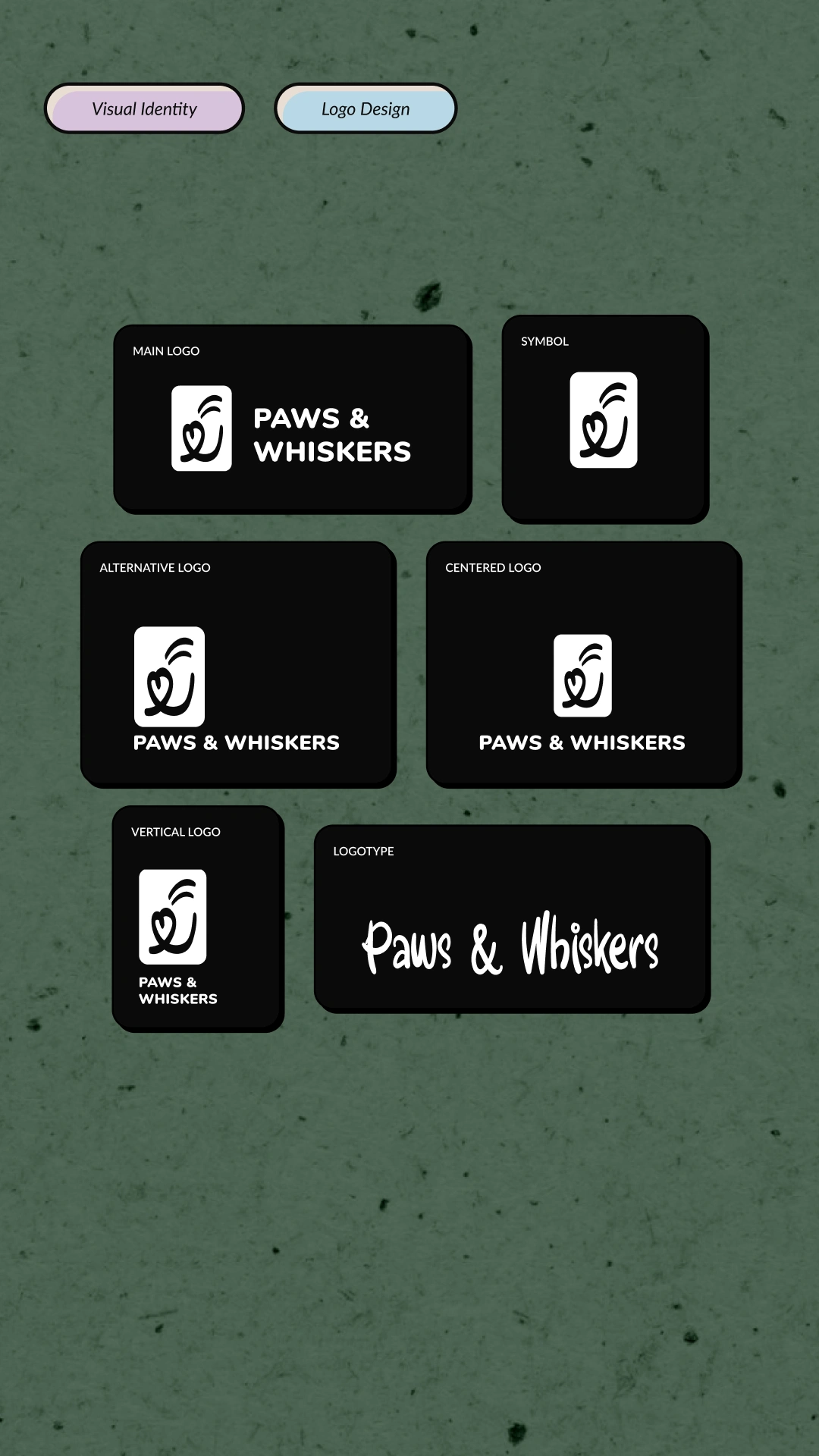
Inverse logo system and contrast applications for different usage contexts.
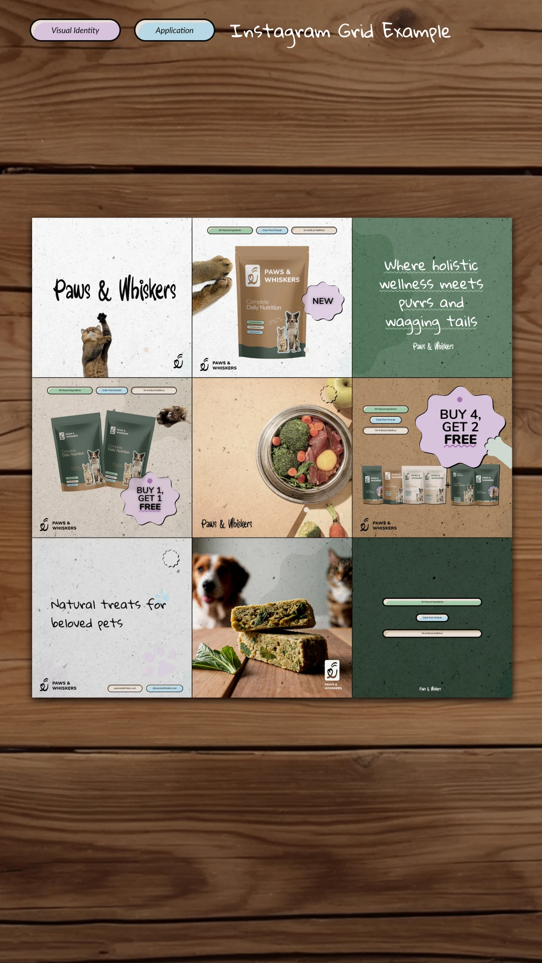
Digital application system using brand colors, packaging imagery and structured content blocks.
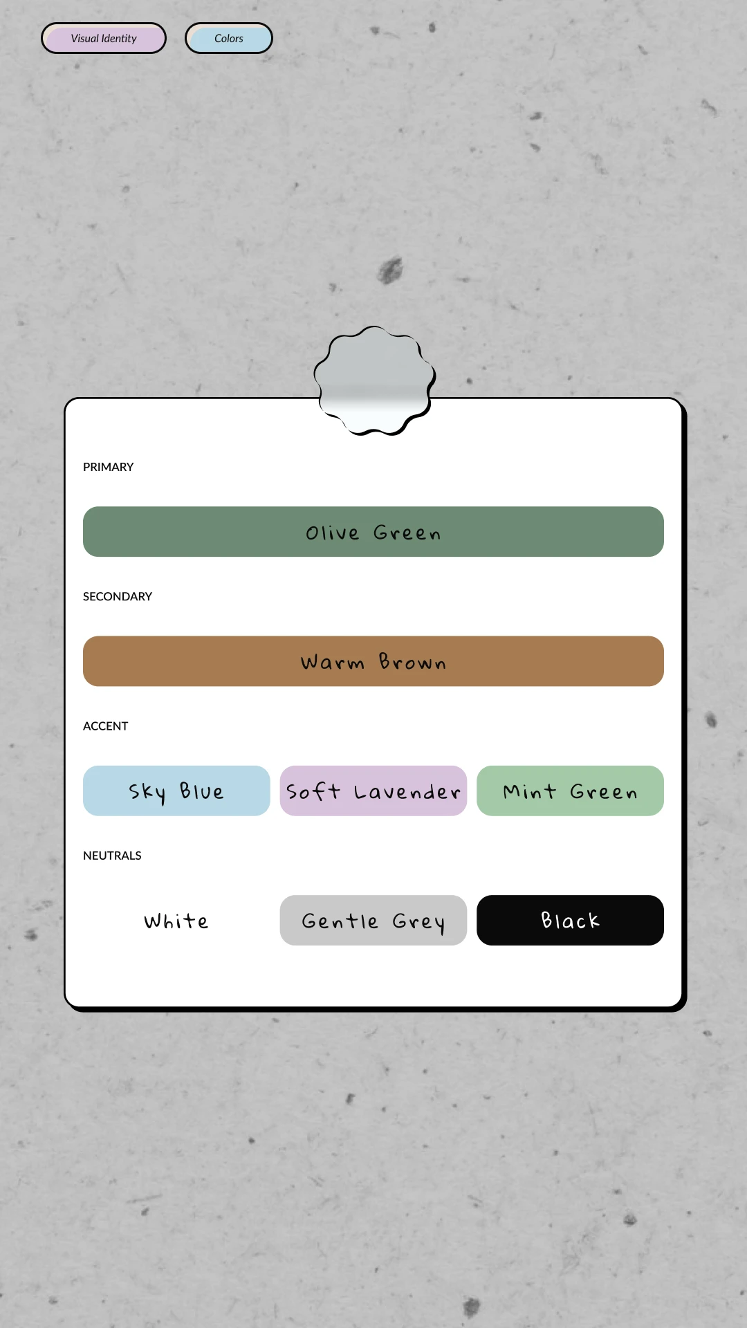
Restrained olive, warm brown and supporting accents for a premium pet wellness position.
Like this project
Posted Sep 15, 2026
A pre-launch pet wellness identity built to feel human-grade, credible and scalable across packaging, retail, manufacturing and future product expansion.