Creating a Recruiting Platform. Empowering Tech Diversity
Kyrylo Liakhovets
SummaryThe ChallengeMarket ResearchTaking a deep knowledge of the Swiss marketUX ResearchMapping Out the User ExperiencePersonasHighlighting a Point of ViewHow Might We Help QuestionsInformation ArchitectureUser ExperienceEmail: Connect, Engage, and Amplify Communication!User Verification and Onboarding EssentialsFinal DesignResults
Summary
I did research and designed a delivering of a working MVP tech solution for the Swiss market.
The Challenge
In a fast-evolving tech landscape, diversity and inclusion are essential. Our mission with the future solution was to empower underrepresented individuals in tech, connecting job seekers, companies, and associations for a diverse tech ecosystem.
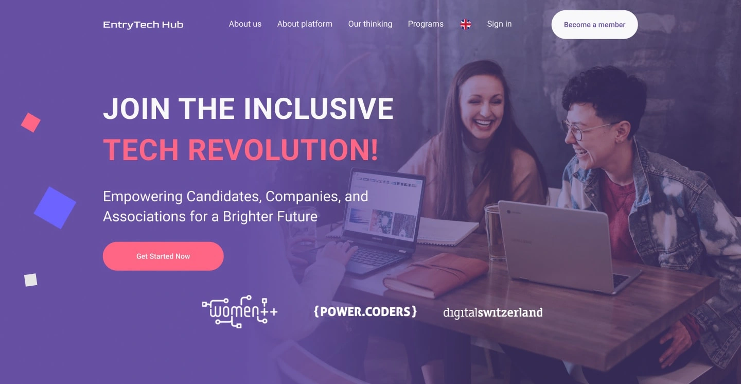
Hero section of the homepage
Market Research
Taking a deep knowledge of the Swiss market
We started the project with a trip to Zurich. We met as part of the team for the first time at the ceremony of the beginning and opening of the project. Our goal was to meet stakeholders, collect content, and obtain the most useful information for our project. We wanted to find out how the Swiss IT market differs from other markets, and what the specifics of the local recruiting process are. Especially when it comes to entry-level candidates.
UX Research
Mapping Out the User Experience
Having returned from the trip, we reviewed some of our notes and impressions. To make sure I wasn't designing something that just looked cool but didn't work well, I based the entire design on several user stories we collected in the field and from Product Owners. The starting point was that we develop this platform for 4 types of users. Some of the main user stories are below:
Candidates. This platform optimizes tech job searches with tailored profiles, a curated employer list, and equal opportunities. The user-friendly interface encourages regular updates, offering flexibility in profile visibility.
Companies. An exclusive platform that provides a curated pool of 5-10 skilled candidates for entry-level positions, allowing recruiters to easily evaluate and contact potential hires while ensuring data security and compliance with privacy regulations.
Associations. A platform that can empower underrepresented groups in the tech industry, ensuring protection for both candidates and companies by allowing only invited and serious participants. It should feature a dashboard to track impact metrics, record and assign initiatives to candidates as badges, and maintain a profile to enhance exposure for its mission and values.
Administrators. Full access to view all user information, authority to manage accounts (create, delete, deactivate, activate, block), and the ability to provide user support, including customizing centrally managed content such as drop-down lists for programming languages.
After creating the wireframes, I began defining the visual style of the dashboard and homepage. The main page was supposed to provide information about the platform, its advantages, and its objectives. The website had to be visually different from anything else on the Swiss market. And, of course, I should distance myself from platforms such as Indeed and LinkedIn.
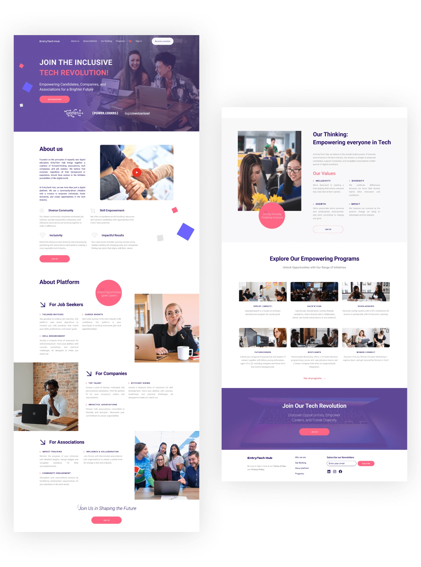
Home page
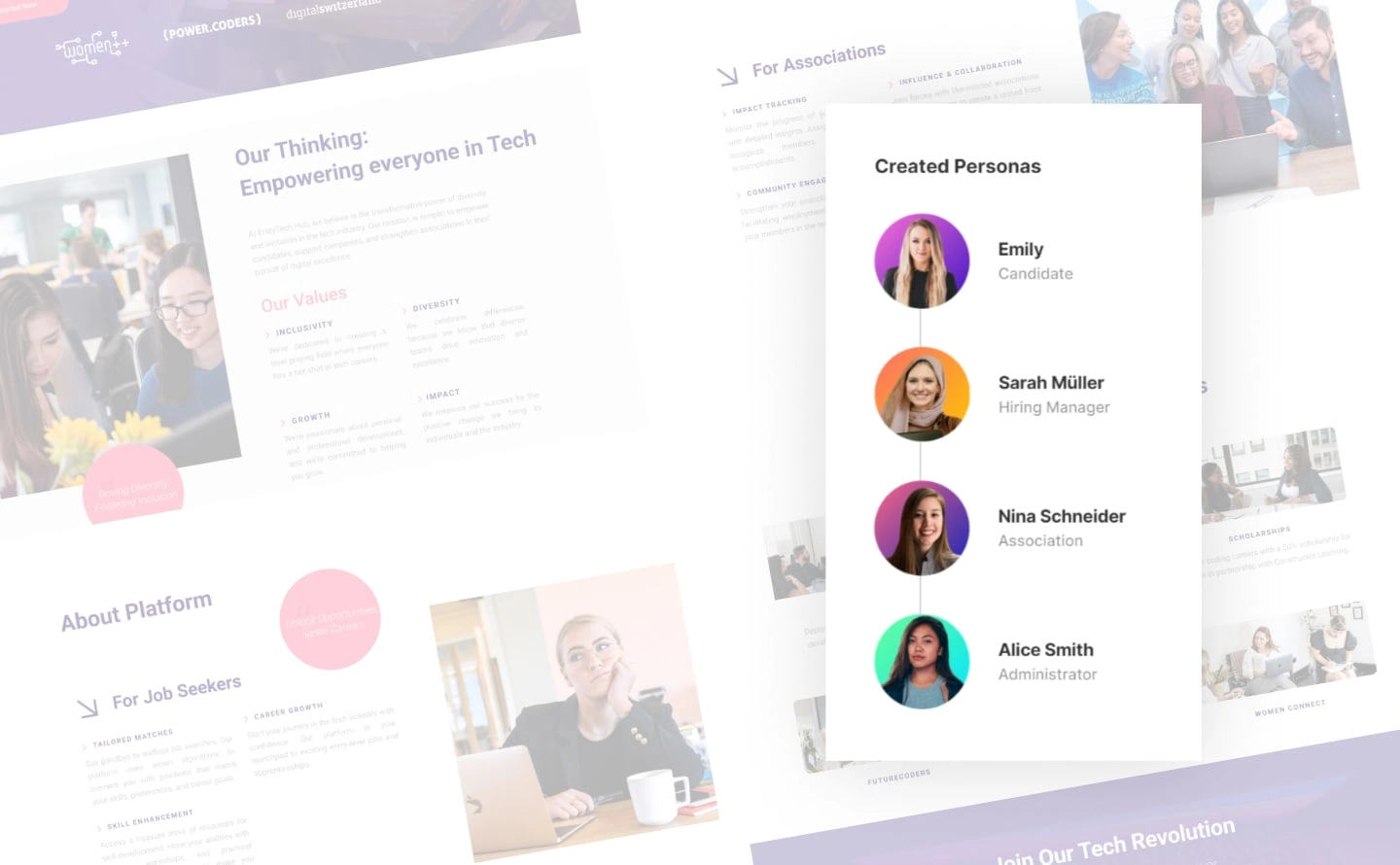
Personas
We based ourselves on the interviews we conducted, highlighting user stories and subsequently identifying problem statements. Also taking into account some of the specifics of the Swiss market, I developed our personas to better understand who we are developing our product for.
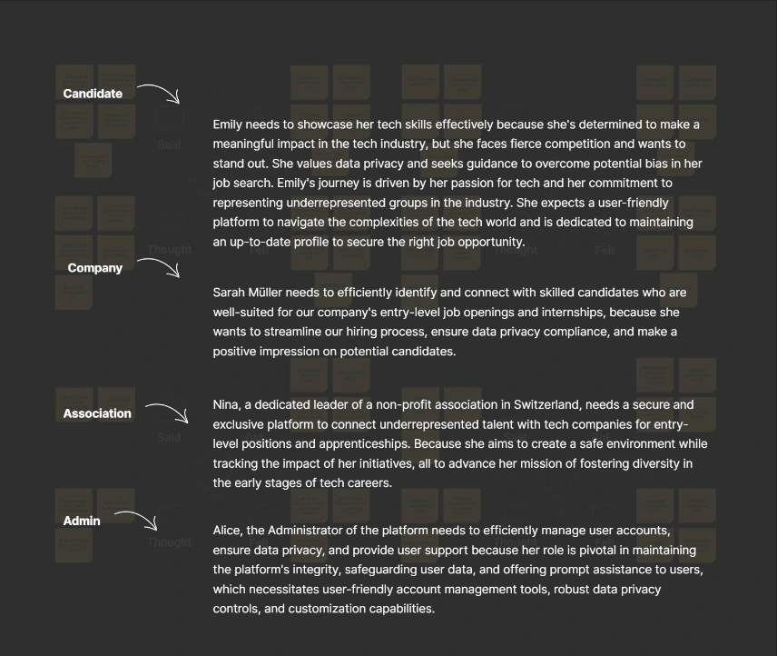
Highlighting a Point of View
After conducting interviews with target audiences, we discovered many insights that are worth considering when developing the platform. Much of the difficulty lay in the specifics of the Swiss market. After identifying the problems of each user group, we formed those pain points that needed to be solved first.
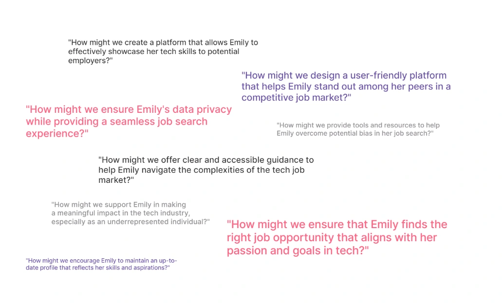
How Might We Help Questions
We asked “How might we” questions that stem from our perspective statement. They helped us discover a design challenge and inspired us to brainstorm and other ideation sessions to create a wide range of solutions.
Information Architecture
When we created the home page from the beginning, we decided what we would display on it, namely the main and general information about the platform. Then we created the information architecture of the future dashboard for each of our personas. Dashboards are different for each type of user depending on their role on the platform.
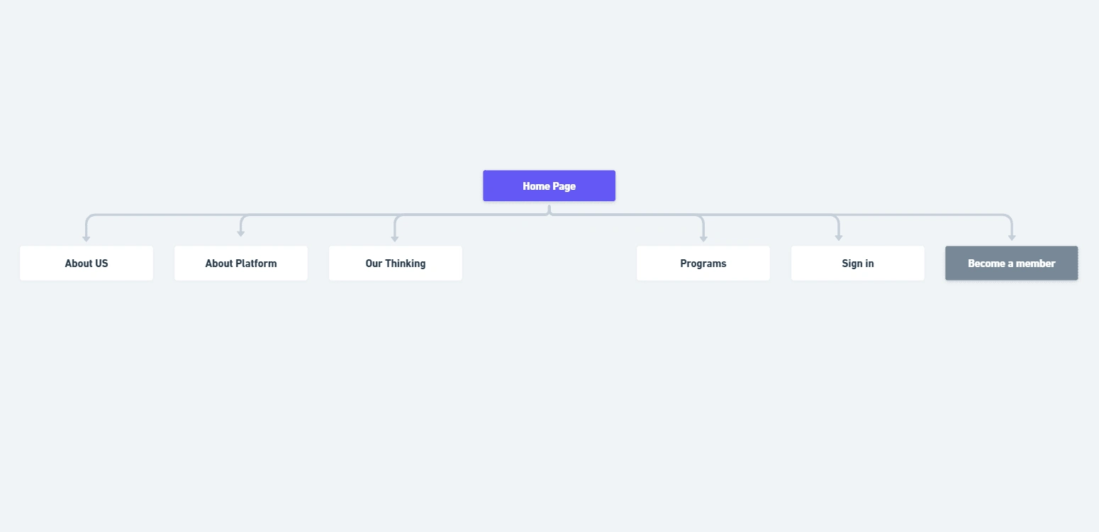
Site map
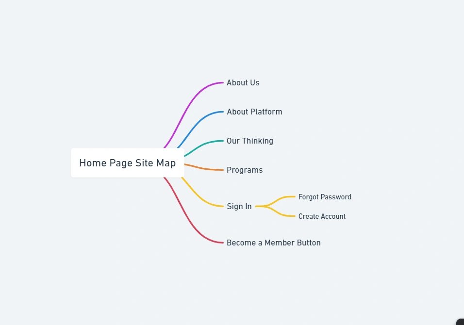
Mind map
User Experience
Email: Connect, Engage, and Amplify Communication!
To enhance user engagement and facilitate communication between stakeholders, an email system was designed and integrated. This feature streamlines updates, job notifications, and platform interactions for candidates, companies, and associations.
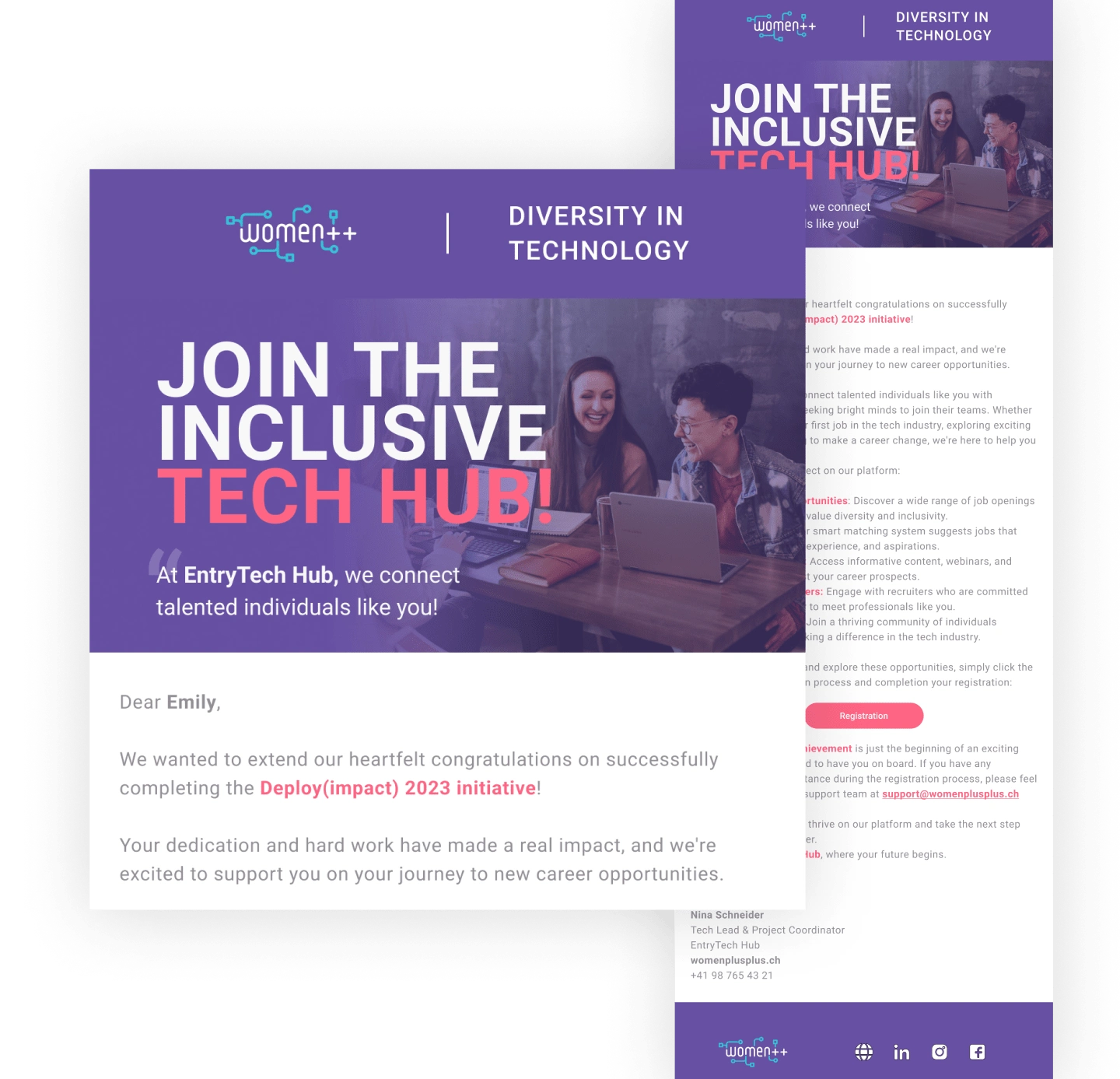
Email Design
User Verification and Onboarding Essentials
To ensure a secure and user-friendly onboarding process, reaching out to the platform began with verification pages. These pages were designed to establish a sense of trust and confidence for users from the moment they interacted with the platform.
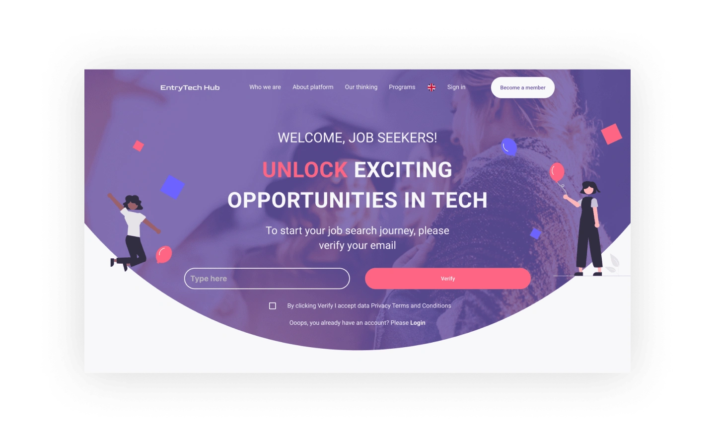
Verification page
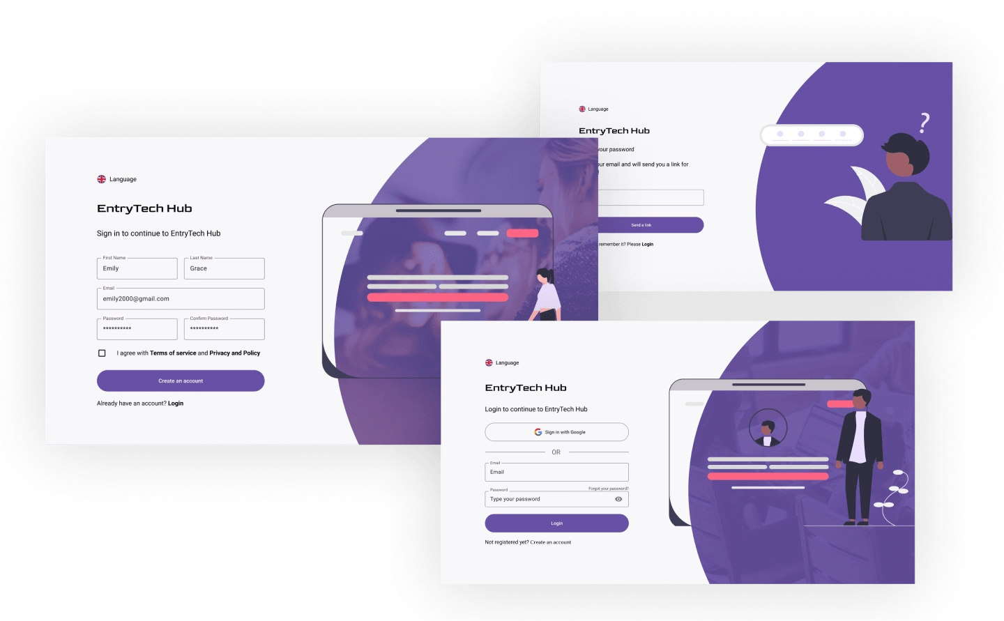
Account creation pages
Final Design
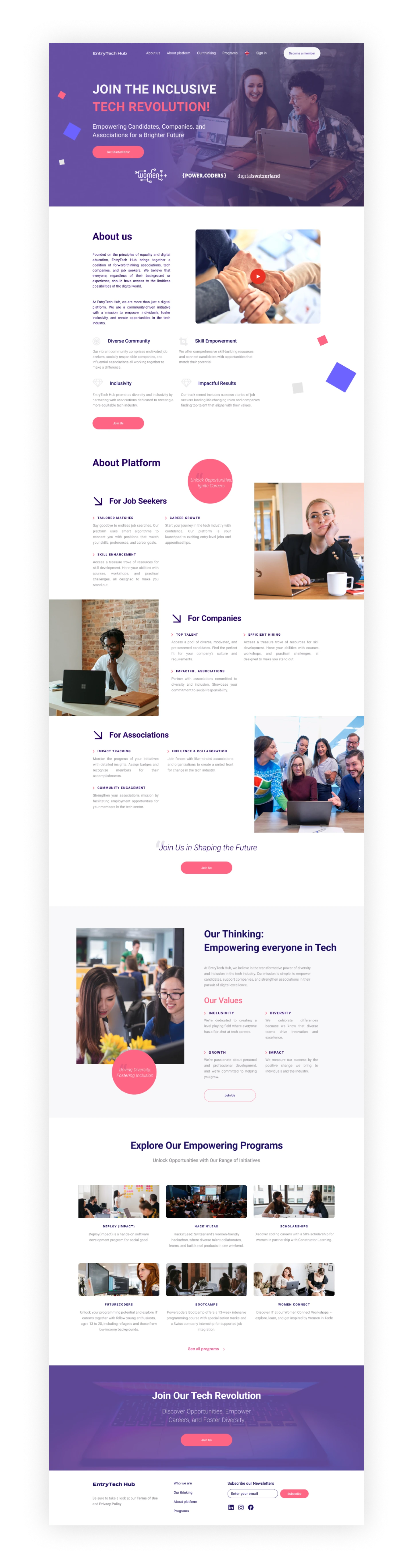
Homepage
Results
The result of the work done was the creation of a home page with all the necessary information about the platform, its advantages, and its mission. A user flow was also thought out, which was necessary to get the user onto the platform through an individual invitation via email. When developing the design and user experience, great attention was paid to account security, so additional steps were created to verify accounts. That is, it was extremely important for the inviting party to understand that exactly the person they invited through the letter would get on the platform.
Like this project
Posted Jan 15, 2024
I did research and designed a homepage, email, and registration pages of a recruiting platform as the tech solution for the Swiss market.