The Streaming Platform App Redesign
Kyrylo Liakhovets
📕Summary🔮Project background🥋The ChallengeThe Problem StatementResearch and Discovery. Understanding User Engagement Issues👨💻Design ProcessWhat is Happening?Challenges and SolutionsDesign of Information Architecture✏️Prototyping and User TestingAdventure Task FlowThe User FlowIncreasing Loyalty and User EngagementA Better Engagement🚀Launch🧙♂️Learnings
📕Summary
I led the redesign of their application to enhance the overall user experience.
🔮Project background
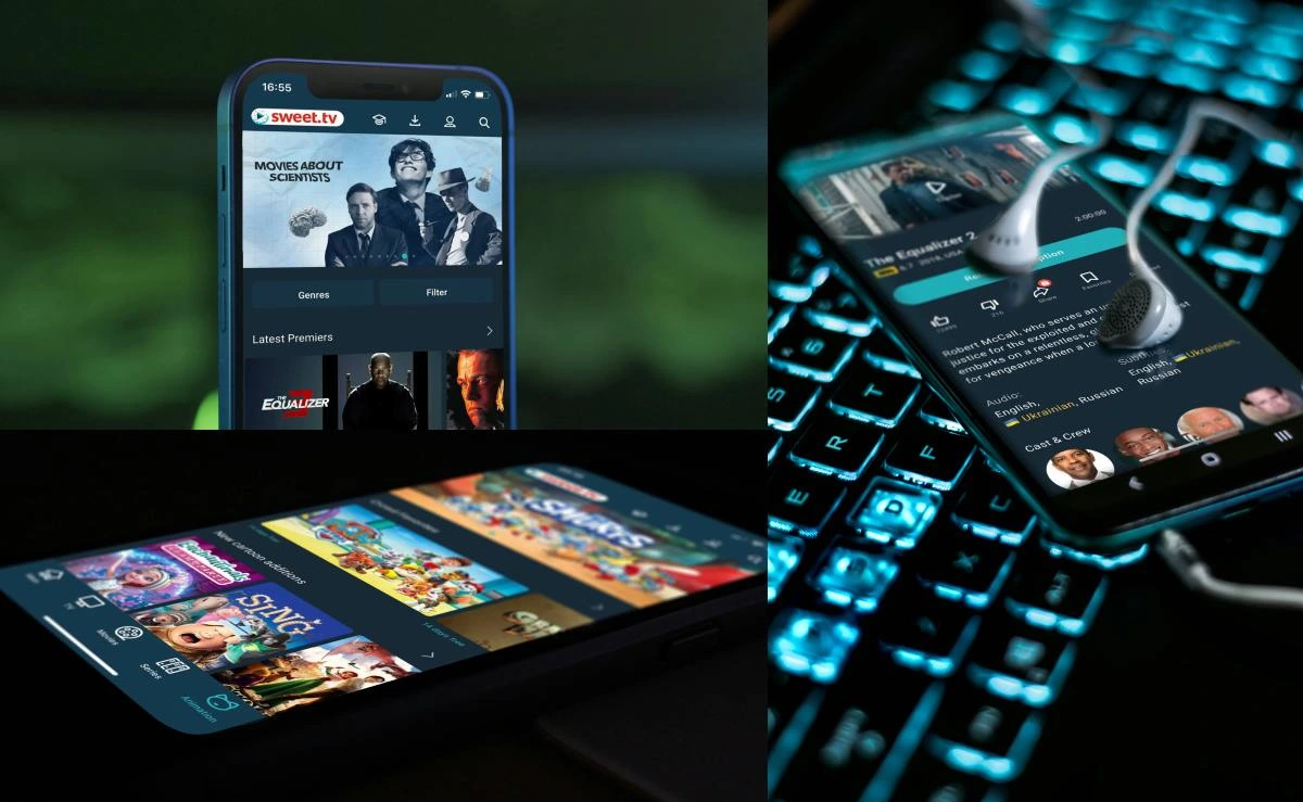
Sweet.tv is a leading Ukrainian online streaming platform, offering a vast library of movies, TV shows, and live TV channels. As a Senior UX/UI Designer, I was responsible for redesigning the application to improve the overall user experience and address several critical issues identified through user feedback and market analysis.
🥋The Challenge
One major challenge was ensuring smooth navigation while integrating a wide range of content. We addressed this by creating a more intuitive and hierarchical navigation system. Performance optimization was another challenge, tackled by working closely with developers to improve load times and responsiveness.
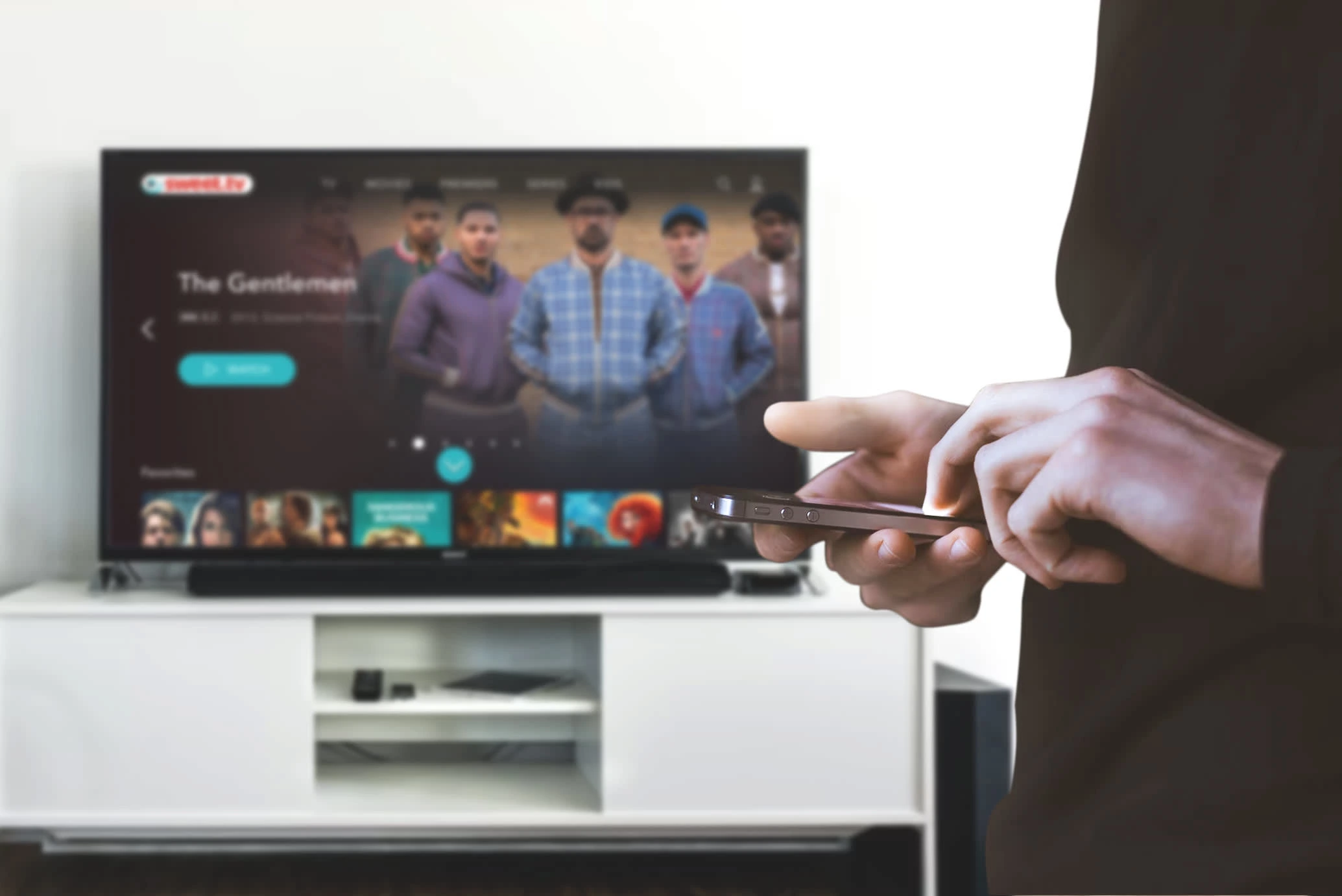
Smooth navigation across the platforms
The Problem Statement
User Engagement: Users found the existing interface cluttered and difficult to navigate, leading to low engagement and high churn rates.
Content Discovery: The application lacked efficient content discovery features, making it hard for users to find new and relevant content.
Performance: Slow load times and performance issues frustrated users and hindered their viewing experience.
Consistency: The design lacked consistency, with varying styles and elements that did not align with the brand’s identity.
Research and Discovery. Understanding User Engagement Issues
Our objective was to identify why users were disengaging from the application and pinpoint areas for improvement. The methods we used we pretty in common for this kind of task: surveys, interviews and usability testing.
For the surveys, we distributed tasks to a broad user base to gather quantitative data on user satisfaction, frequency of use, and primary reasons for disengagement.
For the interviews, we conducted in-depth interviews with a selected group of users to gain qualitative insights into their experiences and pain points.
We observed users interacting with the current application to identify specific usability issues and understand their behavior patterns.
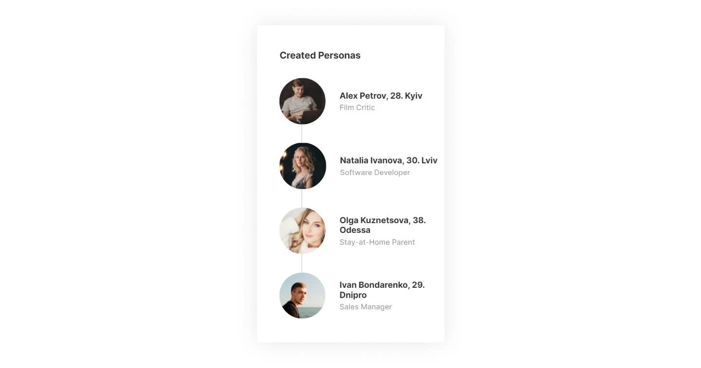
Personas
The initial launch was doing great for the whole period, but soon we faced our next problem: How do we tell our full brand story on our application? We had no clear idea who was subscribing mostly and why. We assumed we had some early explorers, tech enthusiasts, and … just movie lovers. So, they were kind of the mix but we knew that we couldn’t rely on that audience for long. We didn’t want the brand to be all about TV shows and series but about getting through the platform with joy and unprecedented flow. How do we do that?
This is where the work began. We talked with users, attended conferences, collected surveys, and refined our message until we felt like we knew who we were and who we were serving to.
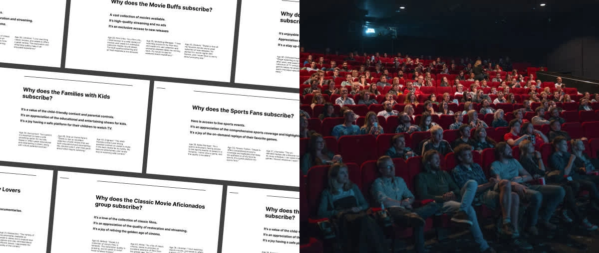
The questions are prepared for each group of user
👨💻Design Process
Having some data from the above activities, we had a better idea of our users. This helped us create personas and we started working on wireframes.
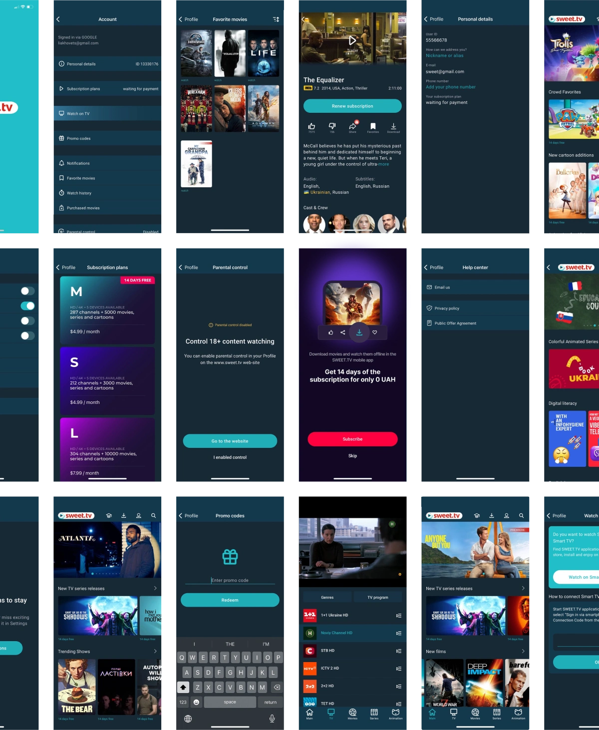
We started with low-fidelity wireframes to outline the new layout and navigation. Over several iterations, we refined our designs based on user feedback and testing results. Key features such as personalized recommendations, an improved search function, and a streamlined interface were developed to improve the user experience.
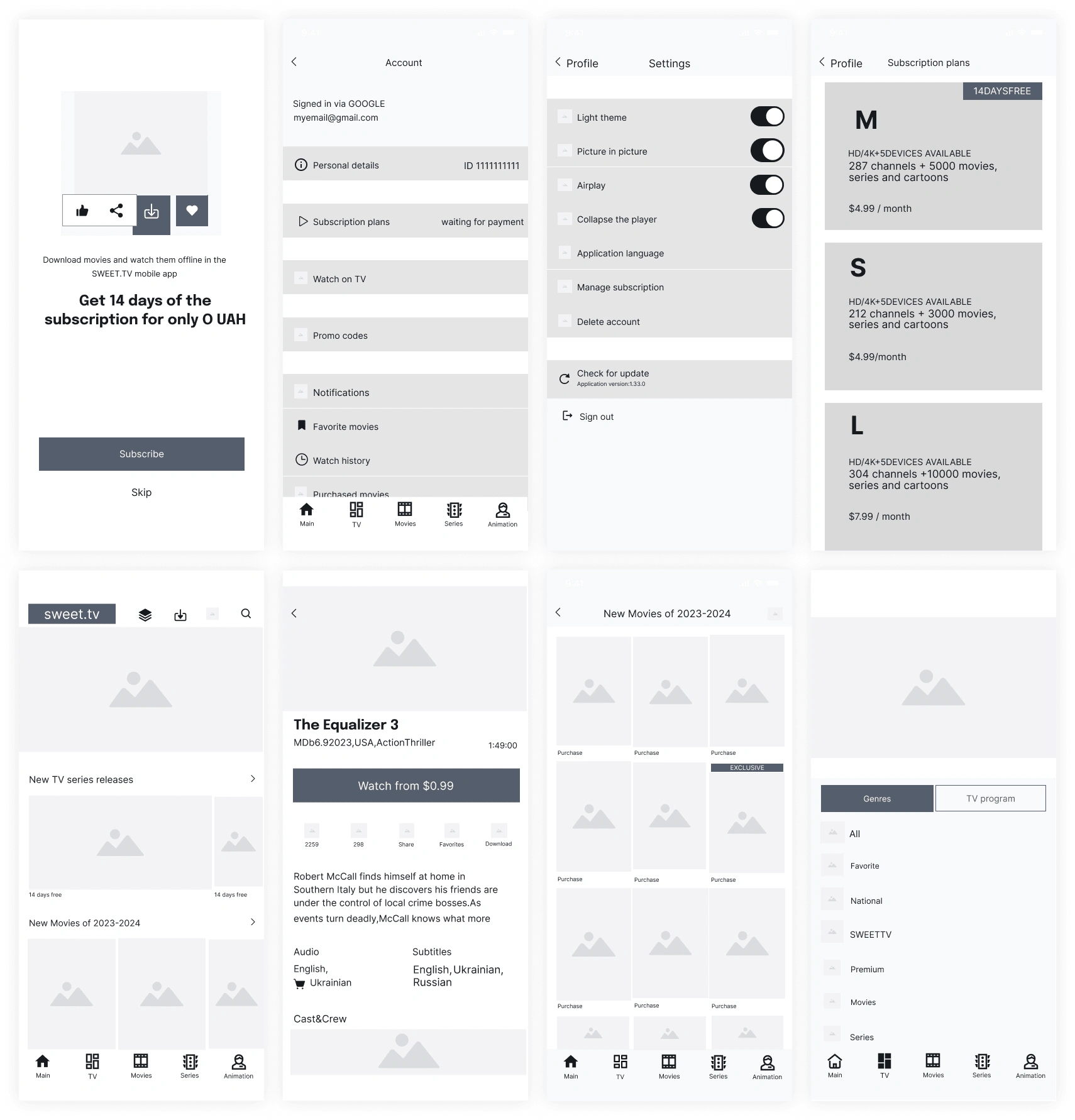
Wireframes
What is Happening?
When we collected the results of our interviews with current users of the platform and conducted user testing, we discovered points that urgently needed to be changed and put in order.
Challenges and Solutions
We faced challenges in creating an intuitive navigation system and optimizing performance. These were addressed by developing a hierarchical navigation structure and working closely with developers to improve load times and responsiveness.
Design of Information Architecture
We started with low-fidelity wireframes to outline the new layout and navigation. Over several iterations, we refined our designs based on user feedback and testing. Key features such as personalized recommendations, an improved search function, and a streamlined interface were developed to improve the user experience. We incorporated a better information architecture into the new design, taking into account user feedback and usage of the previous version of the app.
The Sweet.tv app had quite a few issues including lack of clear architecture, consistency, accessibility, basic usability issues, and user control.
These were the issues I had to deal with. There must be many issues that regular users face. Then I realized that this could be said about any app, not just Sweet.tv. So to understand it better, I had to go through the app again and ask for feedback from other users. So, let's get to the real work. The process!
✏️Prototyping and User Testing
One of the main challenges was to ensure smooth navigation while integrating a wide range of content. We solved this problem by creating a more intuitive and hierarchical navigation system. Performance optimization was another challenge that was solved by working closely with developers to improve loading times and responsiveness.
A prototype of the future app was created for subsequent user testing. We invited several candidates to ensure that the navigation through the app was truly smooth.
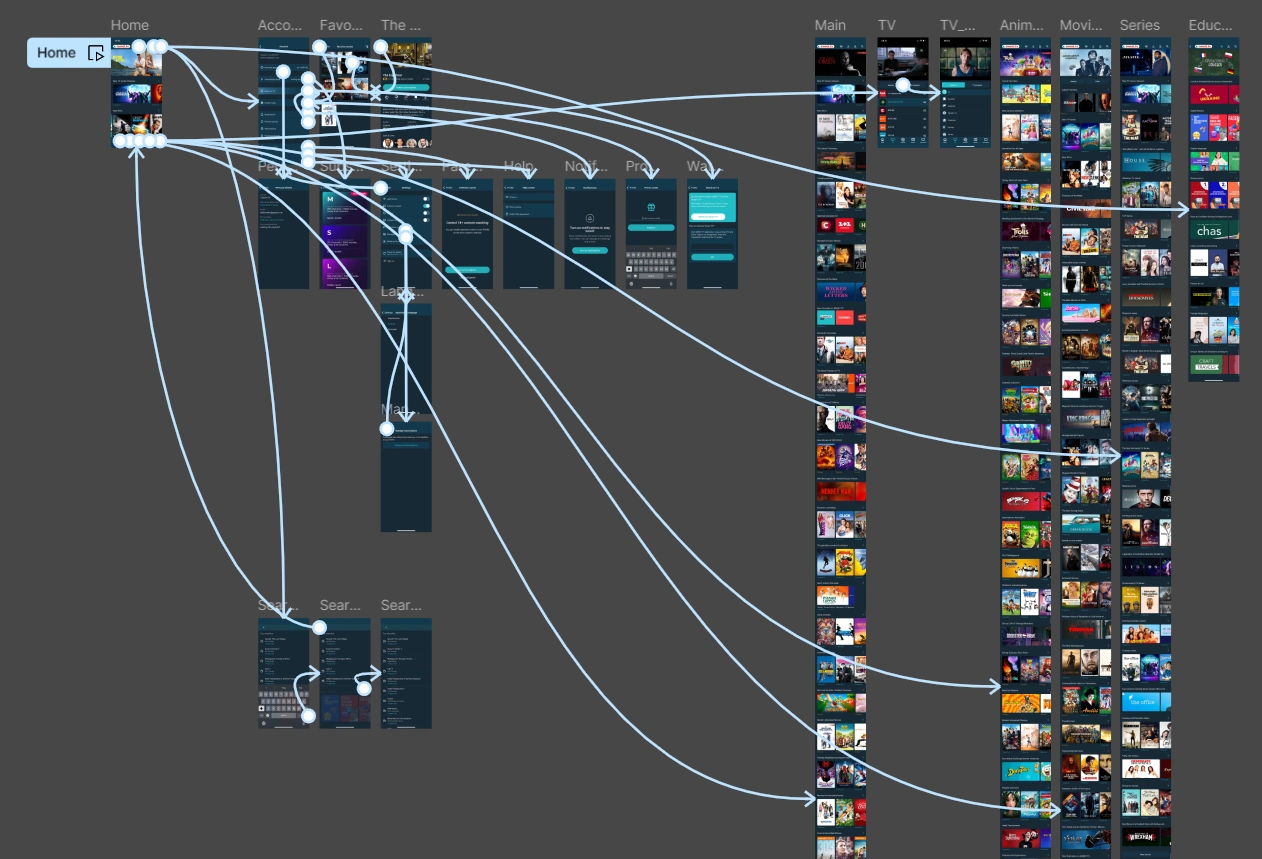
Prototyping in Figma
Adventure Task Flow
While working on updating the app's navigation, a fairly simple task flow was created, which I've created below. The diagram follows the journey of an active subscriber who is looking for a new adventure movie to watch in the evening.
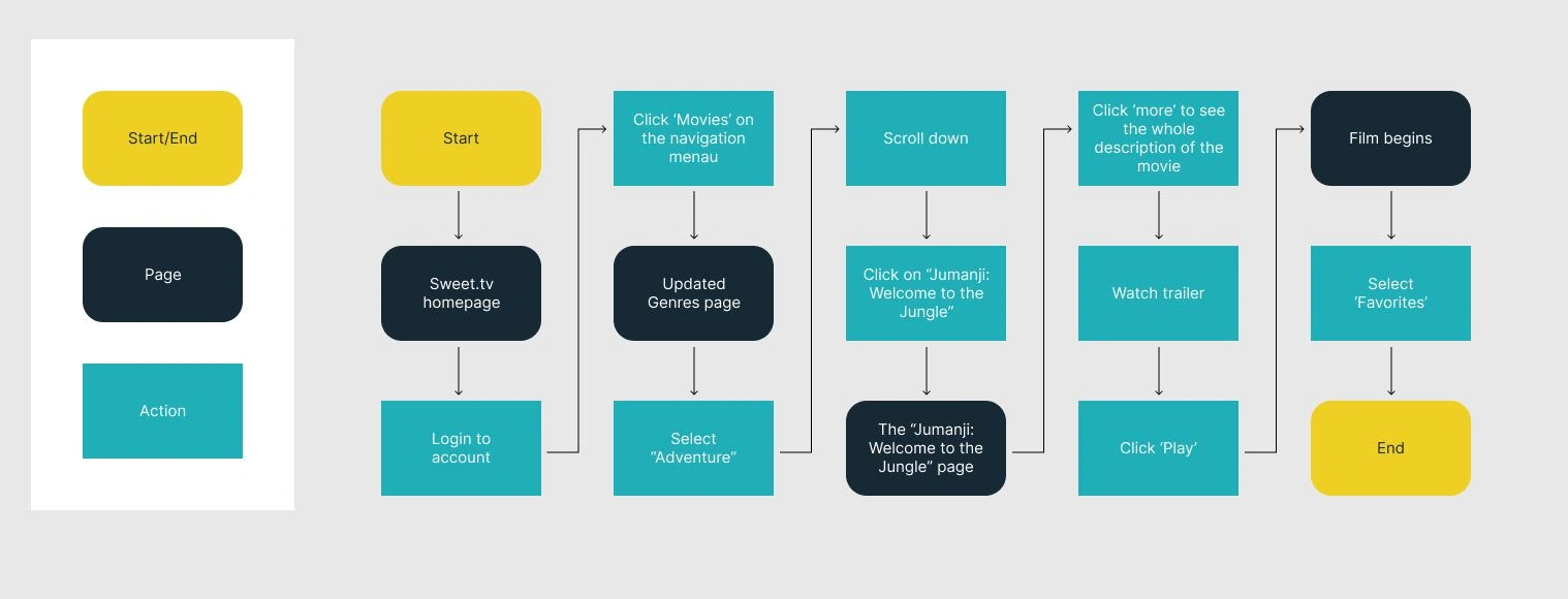
Taskflow
The User Flow
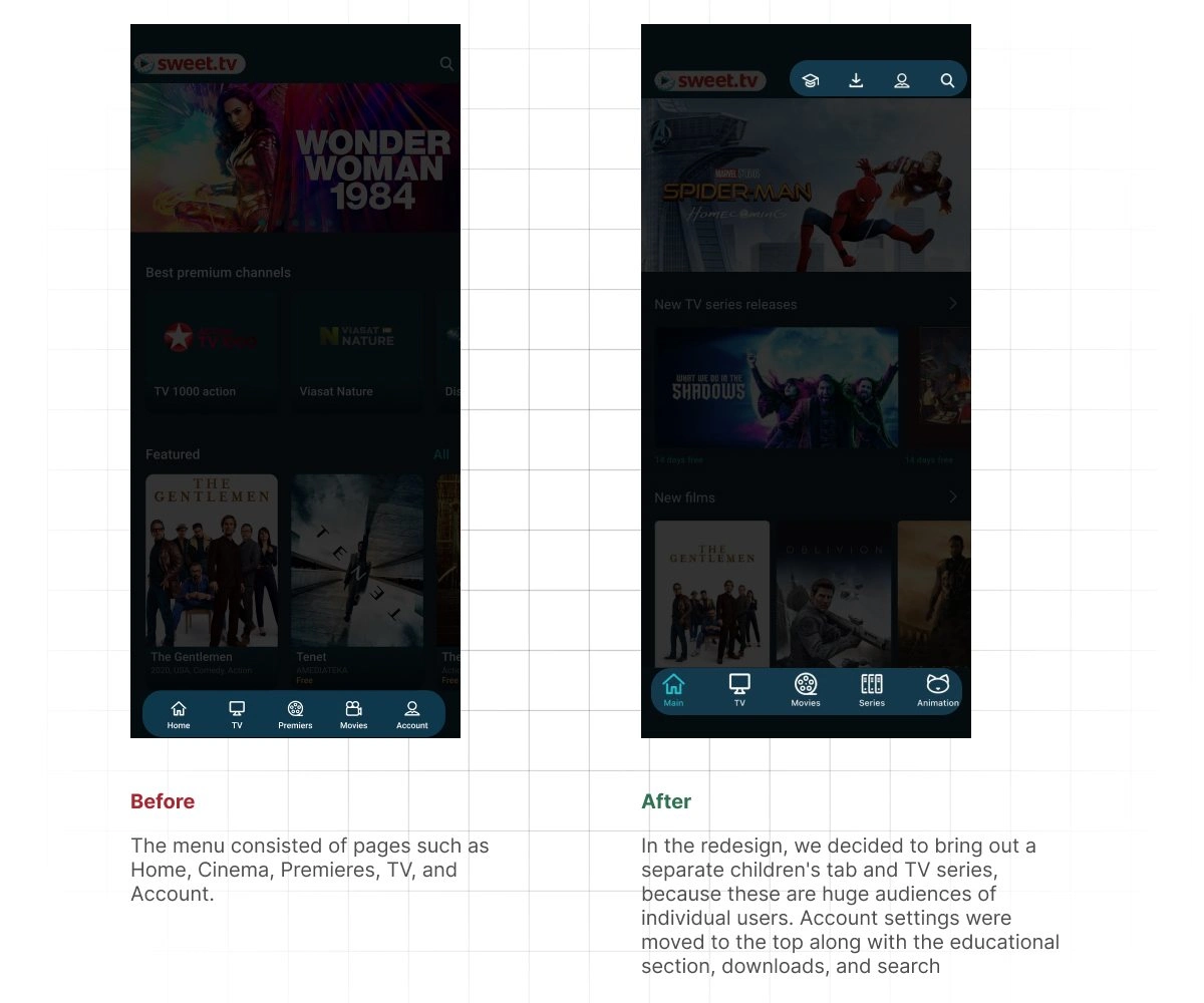
For a streaming app, it is quite obvious that the user flow will mainly come from the home page. The home page concentrates on collections or new releases of films, series, and cartoons. One way or another, the user moves from the home page. Therefore, all paths in one direction or another are concentrated around the home page. We divided navigation into main and secondary. We attributed the educational center, account settings, search engine, and downloads to the secondary one.
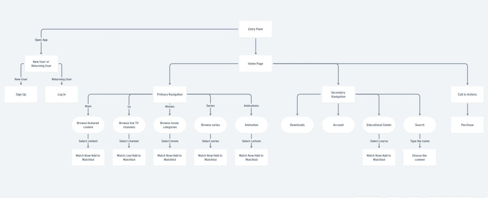
The user flow
Increasing Loyalty and User Engagement
In terms of marketing, we have worked through the entire funnel of converting a simple subscriber into a loyal customer. We have achieved this by offering personalized content recommendations, exclusive access, and family features, ensuring a smooth, high-quality streaming experience. The app also includes a rewarding loyalty program, regular updates, and responsive customer support, demonstrating continuous improvement and valuing user feedback.
A Better Engagement
The redesigned app showed significant increases in user engagement and retention. Content discovery became more efficient, with users spending more time exploring new content. Performance improvements resulted in reduced load times and a smoother browsing experience.
🚀Launch
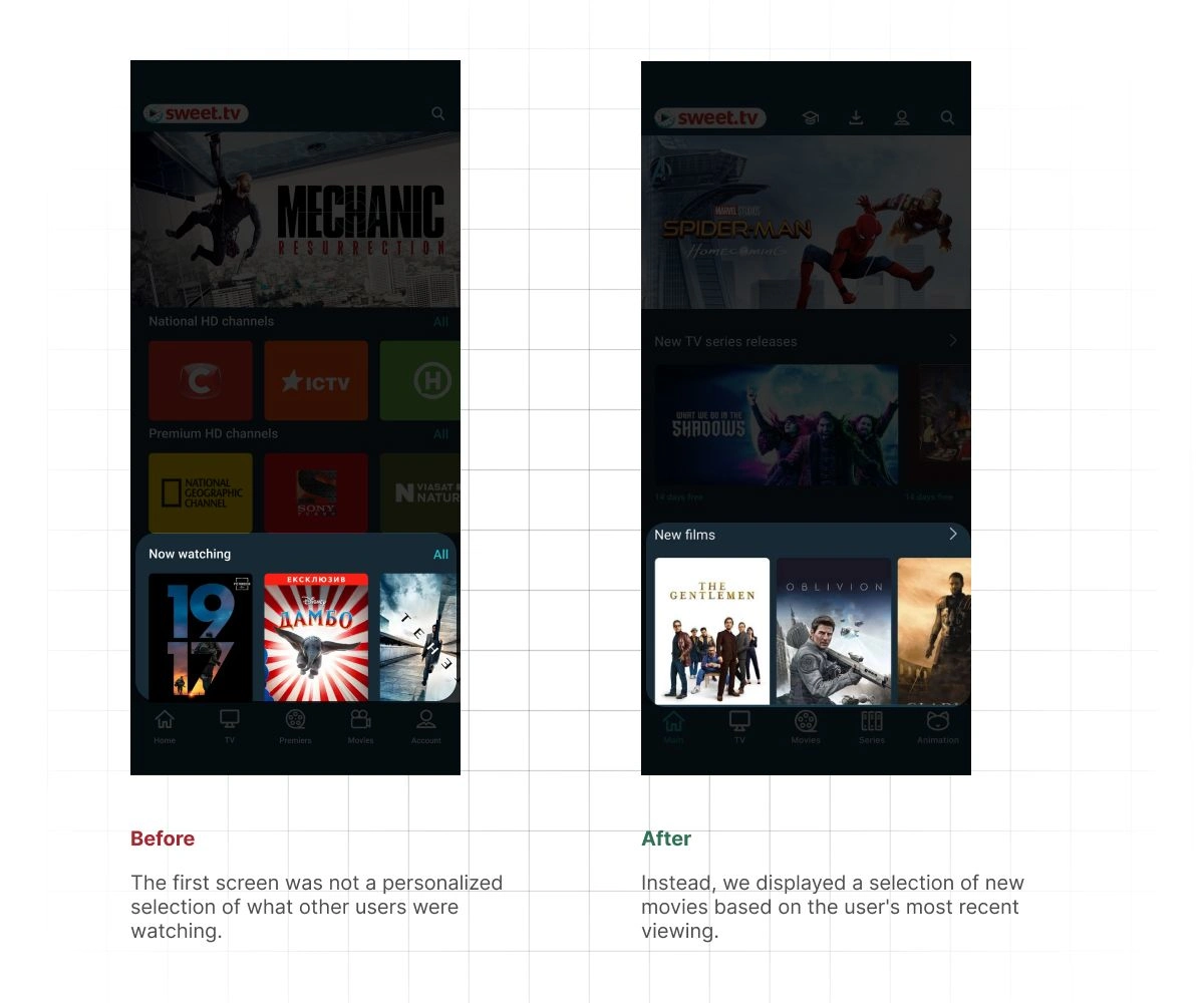
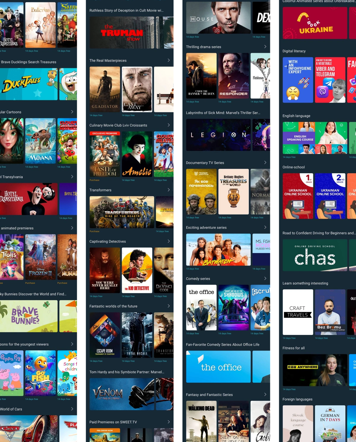
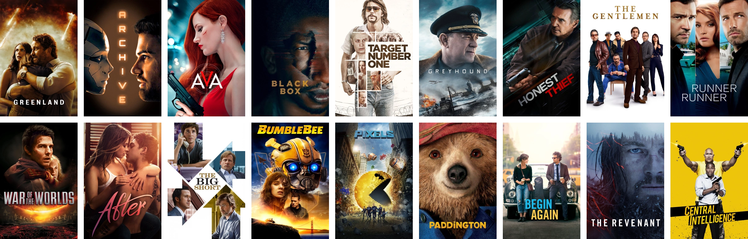
With the new app, we expected a lot of growth, on top of the traffic that the desktop and mobile websites were already bringing in. With the launch of Sweet.tv, we updated our home page, adding recommended, personalized content selections that can be downloaded or saved. We found fairly simple ways to help users navigate better and find the content that suits them best at any given time. We also implemented robust search in three languages, which improved the overall user experience for our users.
🧙♂️Learnings
The sweet.tv project demonstrates how a well-designed streaming platform can enhance the entertainment experience for users. By offering personalized content, exclusive access, and family-friendly features, sweet.tv showcases how technology can provide a seamless and engaging viewing experience. This project highlights the potential of tech to make entertainment more enjoyable and accessible for everyone.
User-Centric Design is Crucial: The success of the sweet.tv app underscored the importance of designing with the user in mind. By focusing on user needs and preferences, we were able to create a product that delivered a seamless and engaging experience.
Personalization Enhances Engagement: Implementing personalized content recommendations significantly increased user satisfaction and engagement. Tailoring content to individual preferences made the app more enjoyable and encouraged longer viewing times.
Exclusive Content Drives Loyalty: Offering exclusive content and early access to new releases proved to be a strong driver for conversions and user loyalty. This unique value proposition helped differentiate sweet.tv from competitors and kept users coming back.
Like this project
Posted Jul 13, 2024
I led the redesign process of the application to enhance the overall user experience.
Likes
0
Views
24
Clients
SWEET.TV