Website Navigation Improvement of Crypto Company
Kyrylo Liakhovets
Summary
I helped the project redesign the site navigation, and checkout process and also developed a design system.
The Challenge
Increase the percentage of converting a client into a customer at a big fall in Bitcoin to increase sales and market share. And also develop a design system to be ready to create new pages of an existing site faster.
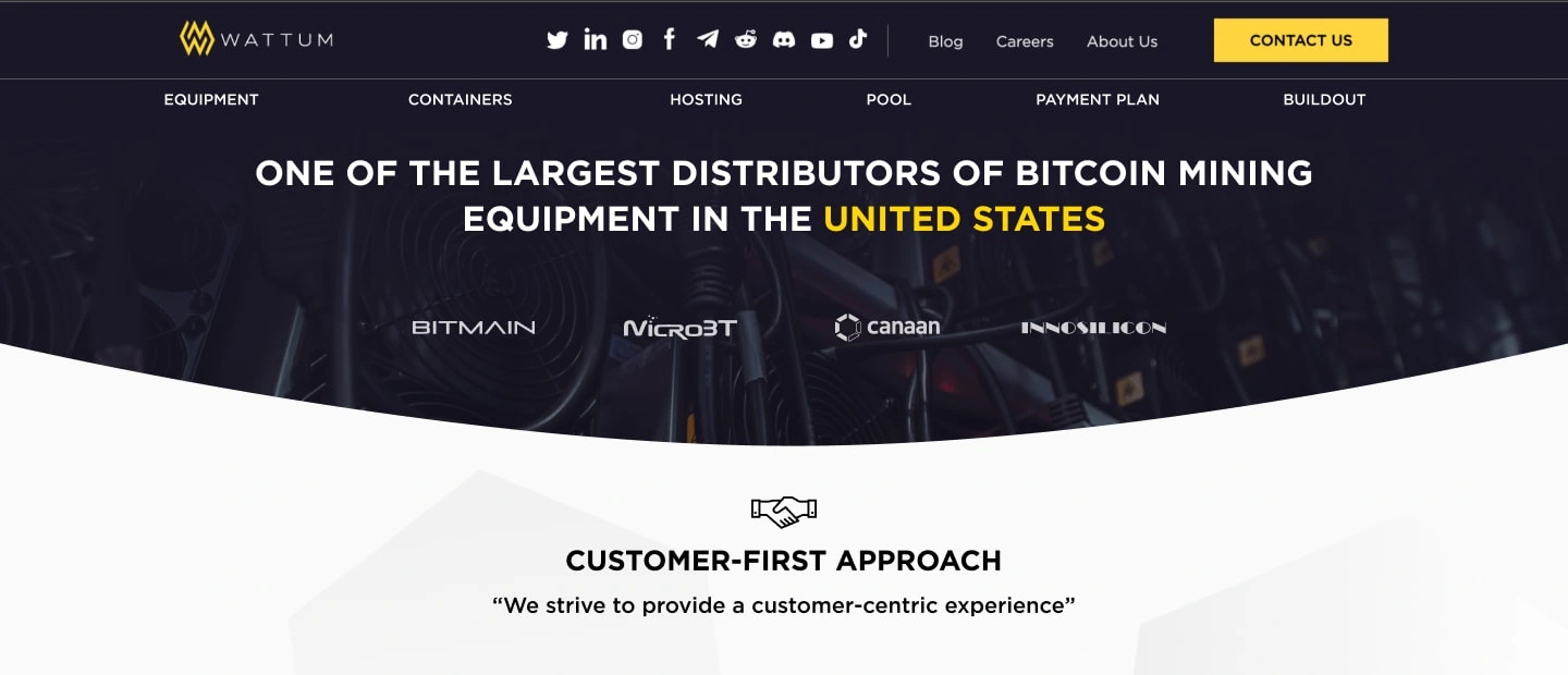
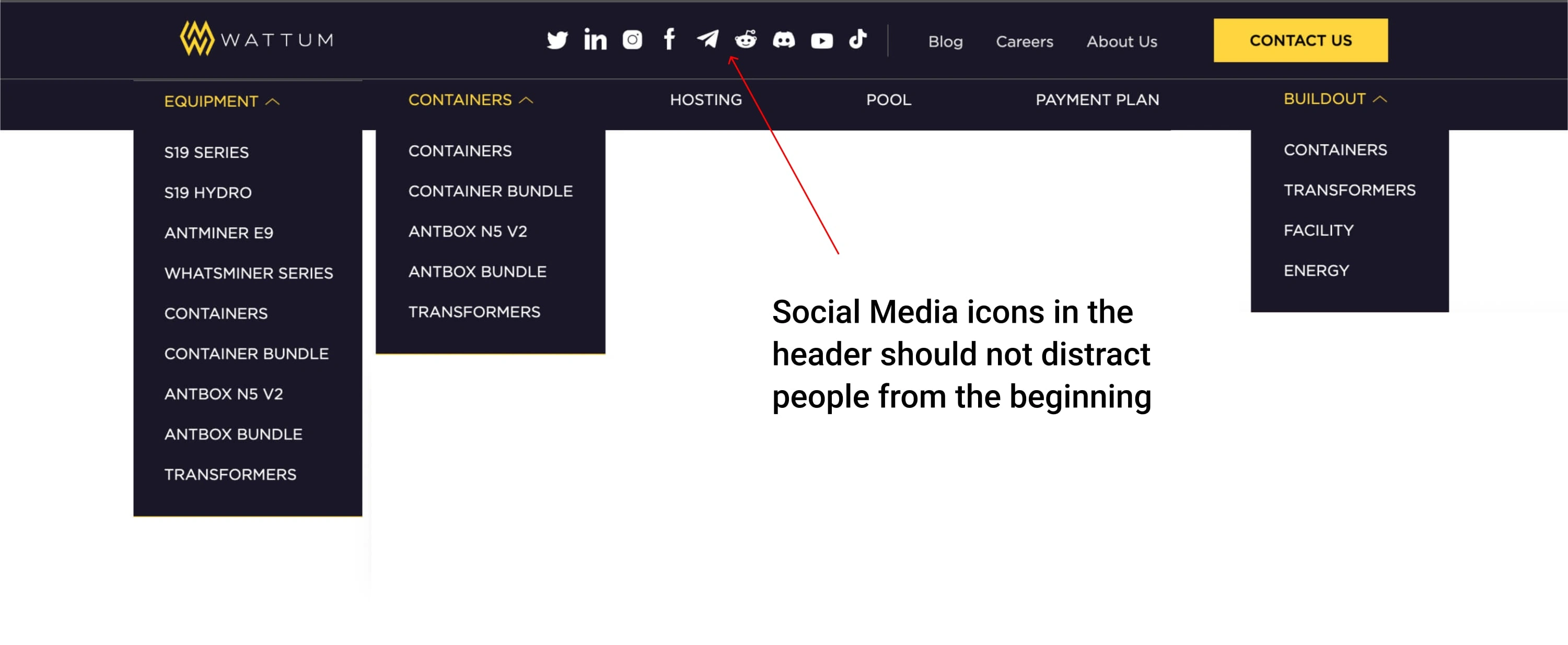
Old Version of Navigation
UX Research
Talking with Real Users
I used multiple methods to gain a deeper understanding of customer pain points and business needs, as well as evaluate user experience and satisfaction with the website. A series of surveys, interviews with stakeholders and users, and A/B usability testing were conducted.
We developed a questionnaire in Google Forms and asked interested parties to participate in the survey. A script for the upcoming series of interviews was also thought out.
We used tools to track user behavior on screen to identify the most problematic areas in the existing user flow.
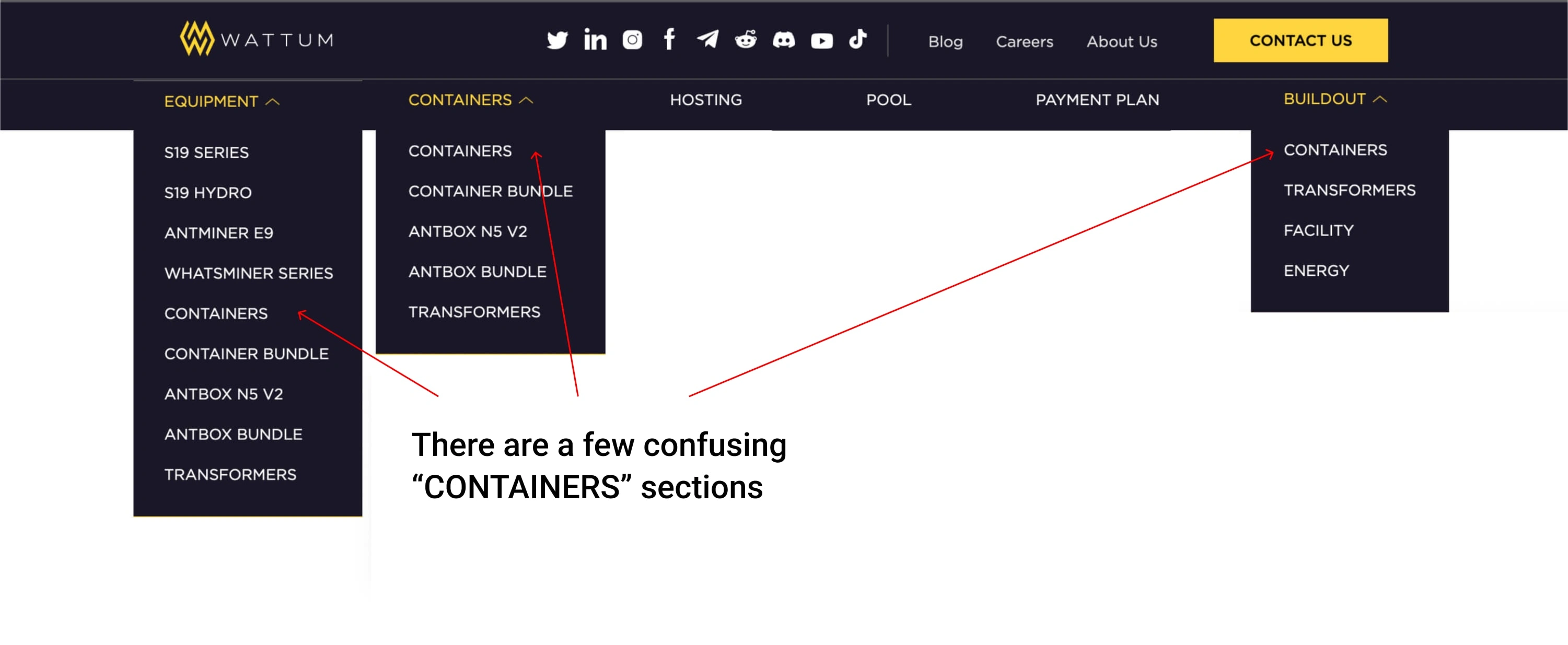
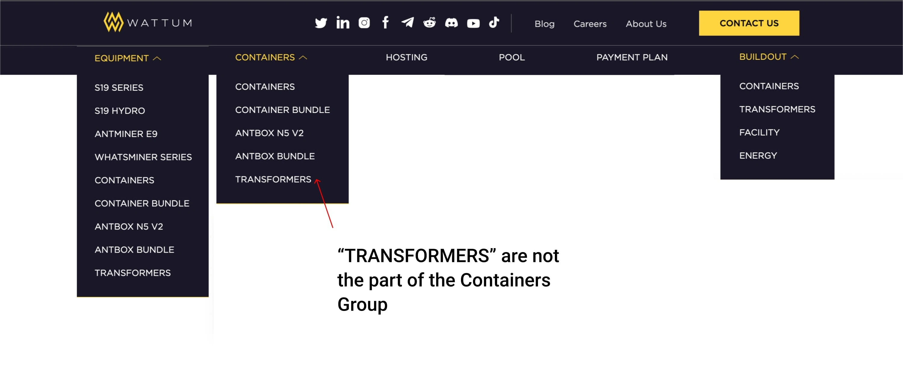
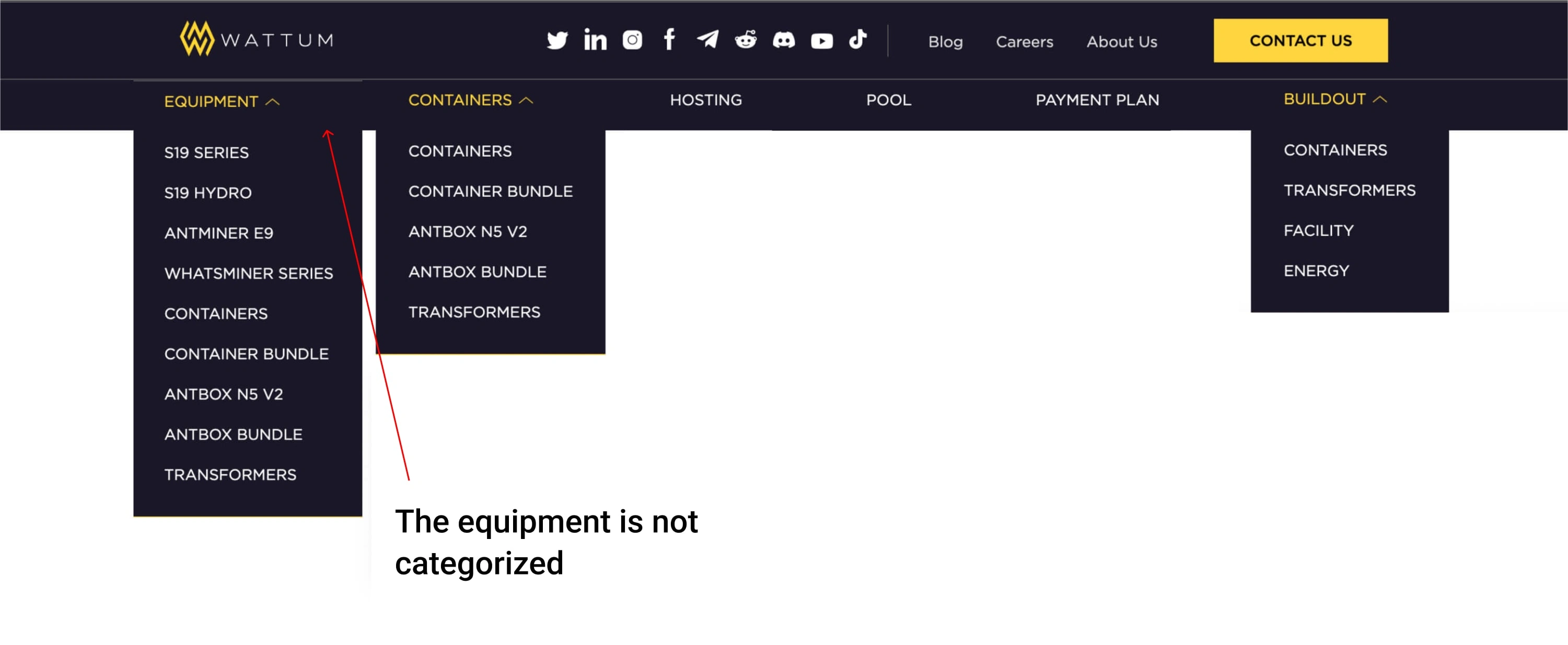
The Problem Statement of Information Architecture
In the course of the survey results, after the interviews, and after looking at records of user behavior on the site, we discovered some problems that we will work on.
The study found that site navigation was unintuitive and difficult to navigate. To figure this out, we used card sorting.
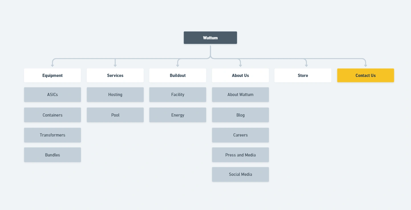
Recreating information architecture. Site Mapping
After testing and sorting the cards, we set about developing a new site map. Before implementing it, we came up with our product overhaul for financial tests using an interactive prototype in Figma.
Solution
New navigation design
After a series of tests of the new navigation, we came to the latest solution, which turned out to be the most convenient and intuitive for the user.
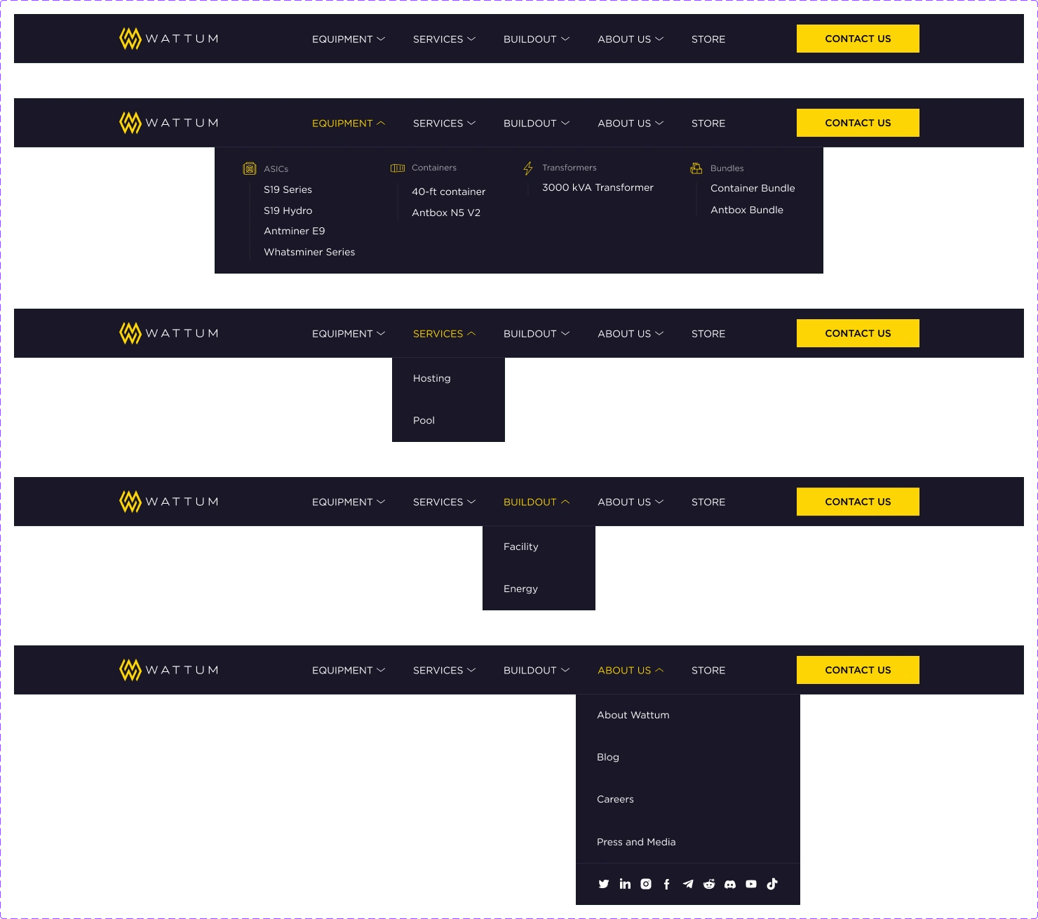
New navigation as a prototype
New Navigation
Key Takeaways
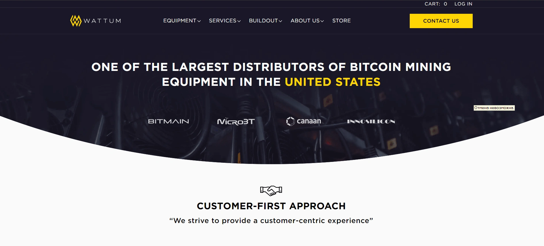
Having carried out work on the Wattum company project, I managed to achieve better results. So, by analyzing the information we collected and talking with real users of the existing website, we were able to improve the digital experience for customers.
One of the most significant results was the reworking of the current site navigation by rethinking the user flow. We created a site map for which we redesigned the navigation.
This led to an increase in orders for user consultations by 30%.
Like this project
Posted Jan 13, 2024
I helped the project redesign and implement the website navigation.