Improving Email Campaigns
Kyrylo Liakhovets
Summary
I helped the project research and redesign the email campaigns to improve the Open Rate and Click Through Rate metrics.
The challenge
The main challenge for the company was the fall of Bitcoin in the summer of 2022. We, being designers, could not influence the restoration of the market situation in any way, but we were able to improve the market performance of our email campaigns.
Usability Testing
Strategy
Newsletter for Every Client
The more the company was in the crypto movement, the more it reached clients of different levels. We determined who our emails were intended for and carefully conducted competitor research to identify best practices in the B2C and B2B segments. This way we were sure that each email was addressed to one or another client.
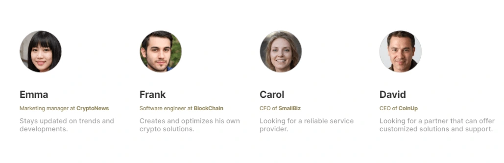
Personas
We decided that each email should have its look, aimed at a particular customer segment. After working with the marketing department, we concluded that for B2C clients we will have offers starting from one unit per order. At the same time, we created bundles and wholesale offers for B2B clients.
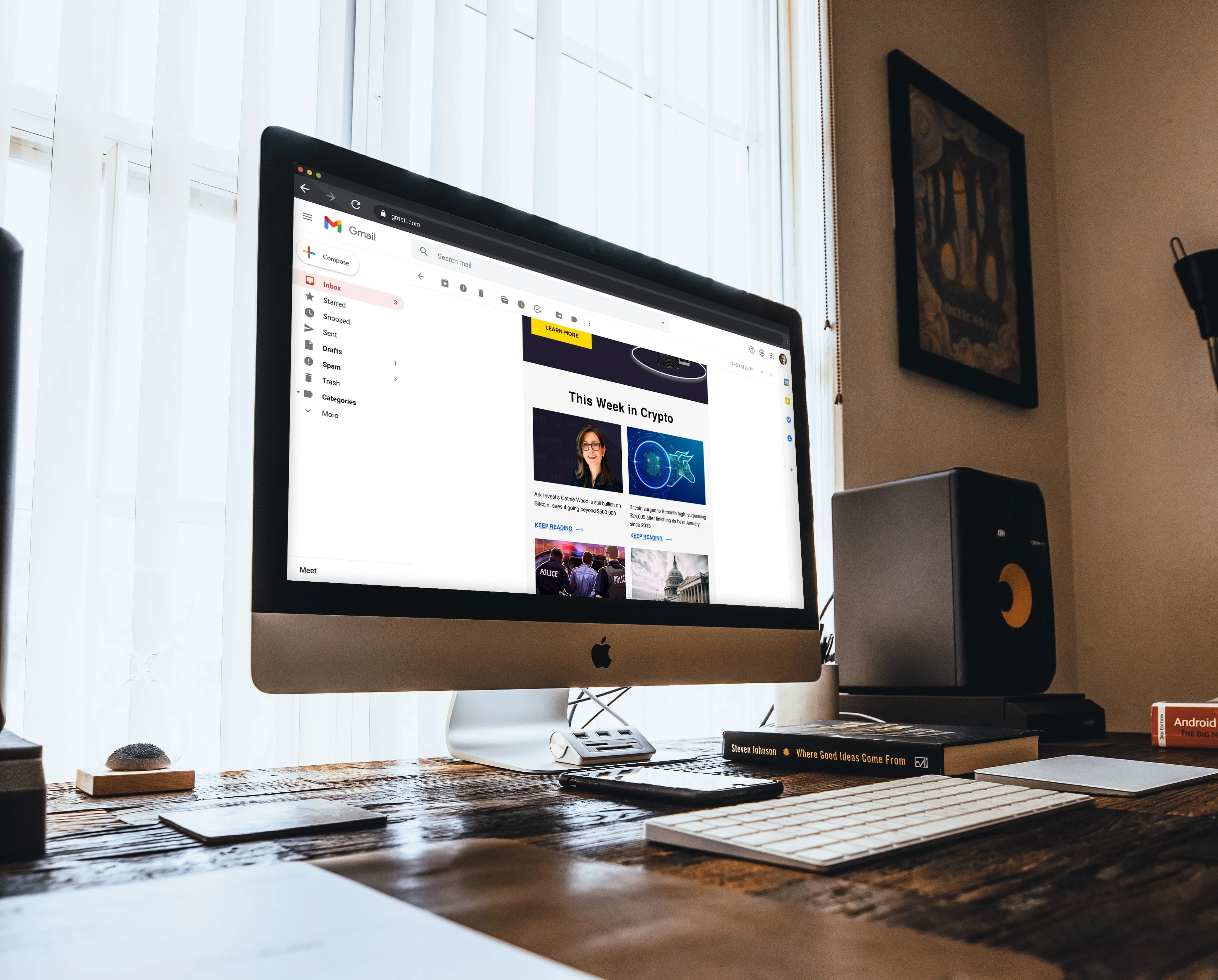
New Email design at Gmail client
UX Research. Emphasizing the problem statement.
After analyzing our user surveys, you have identified the following pain points that we focus on first:
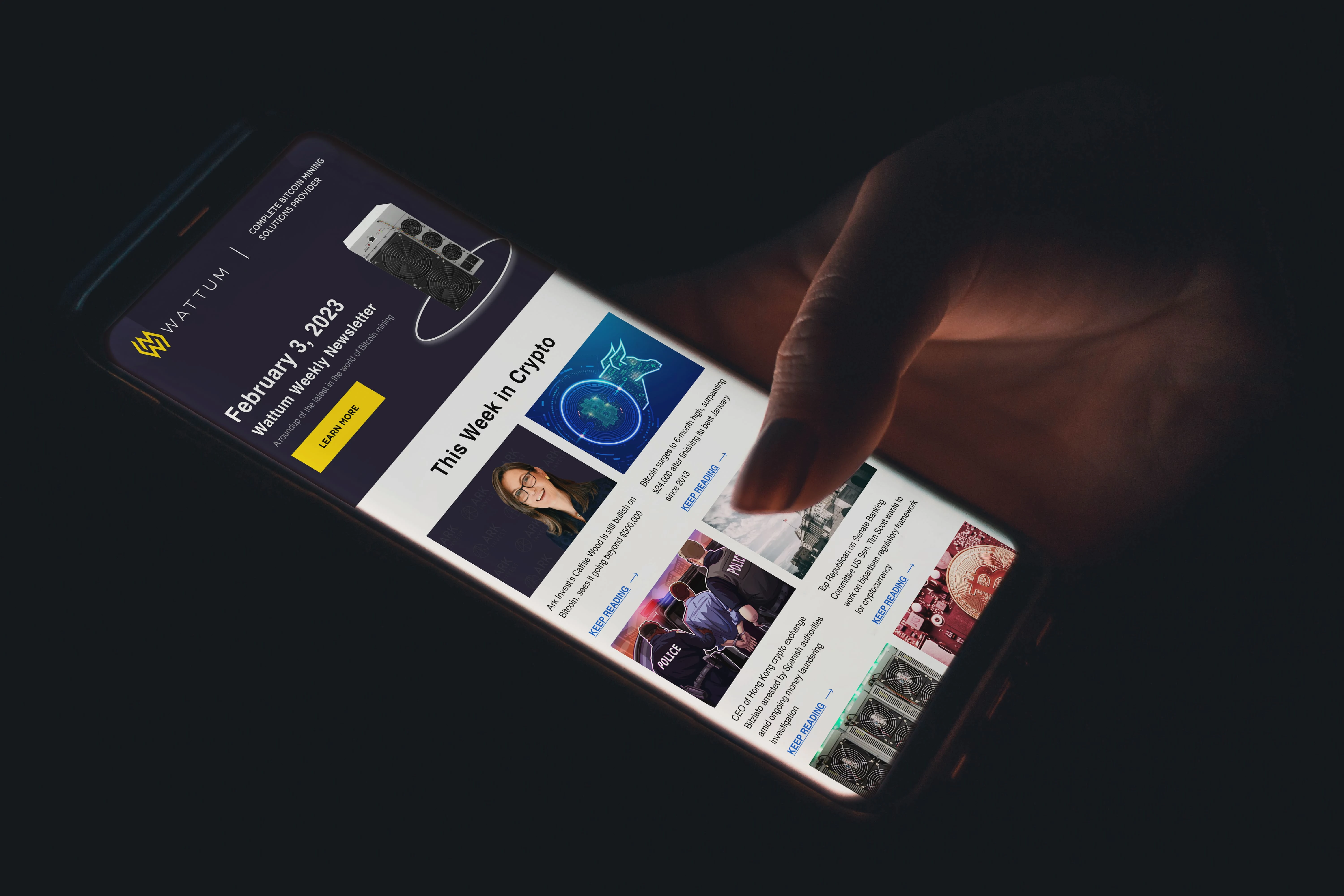
"This Week in Crypto"
Users find it difficult to interact with content that only contains links. The lack of visual content prevents users from clicking on links and reading articles fully, resulting in low engagement rates.
Solution -> Included visually appealing graphics and images showcasing the latest news and trends in the cryptocurrency world. The block was made more attractive and informative, as well as introducing links that were more visible and clickable by adding clear call-to-action buttons.
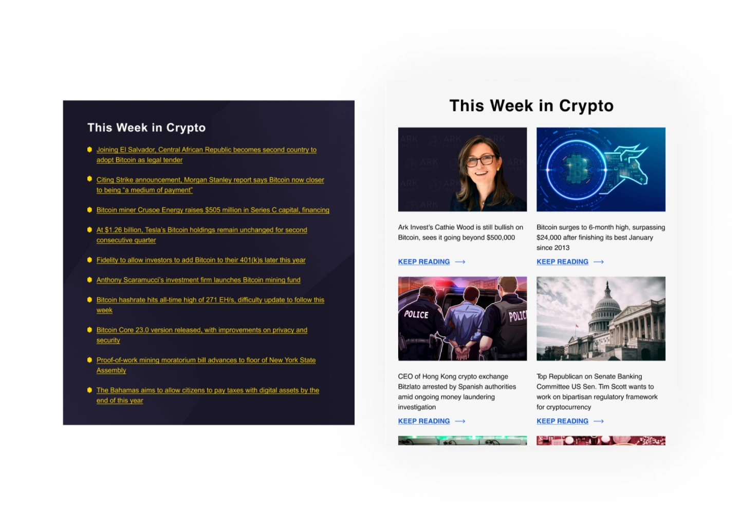
Old Design (Left) / New Design (Right)
"Recommended articles"
Long reads can be tedious and discourage readers from engaging with the content. Especially if the letter begins with it.
Solution -> Instead of featuring only one long article, we now provide two short article summaries with only their names included in the newsletter. This allows readers to quickly scan the options and choose the article they are most interested in reading. added buttons to each article summary that lead to the full article on our website.
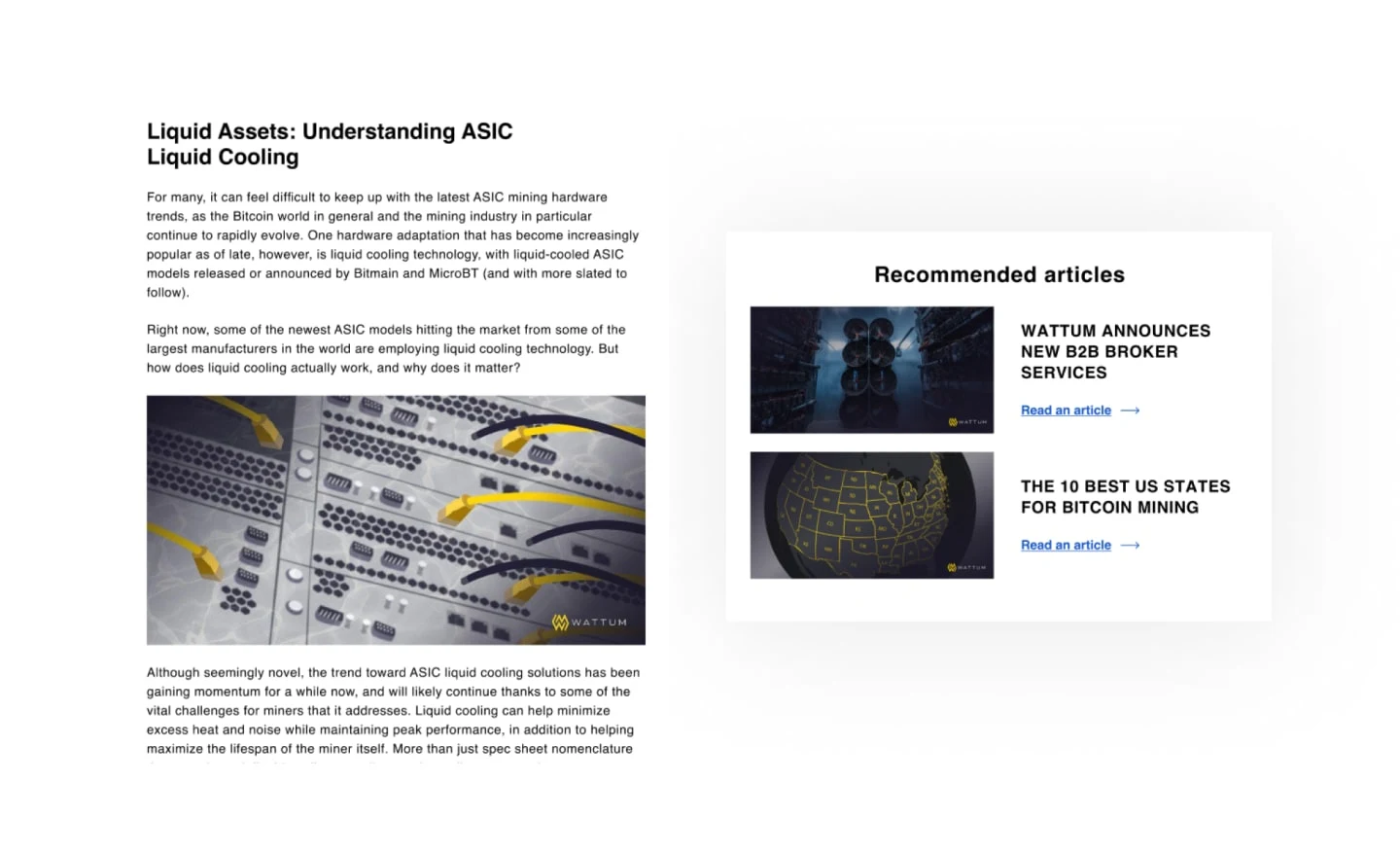
Old Design (Left) / New Design (Right)
"Latest Equipment"
A huge amount of information on product cards. It's hard to find what to focus on. Inconsistent graphic forms and visual hierarchy.
Solution -> Reducing the amount of information displayed on each card and ensuring consistent graphic design, we have made it easier for readers to quickly scan and find the information they need.
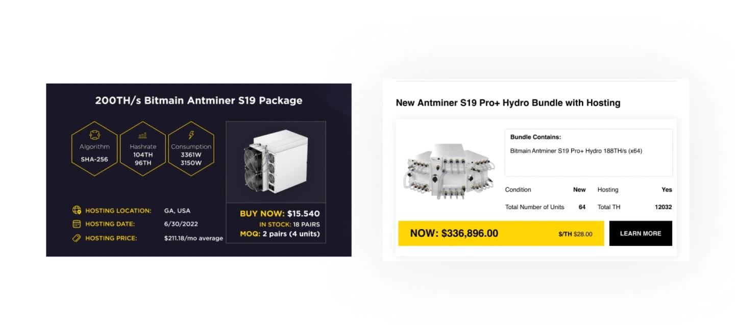
Old Design (Left) / New Design (Right)
"Call to action"
A banner with a call to action does not attract attention in any way and the user does not respond to it at all.
Solution -> Adding a visually appealing banner image that catches the reader's attention. Additionally, we have updated the design of the CTA button by using contrasting colors and bold typography to make it more prominent and increase its clickability.
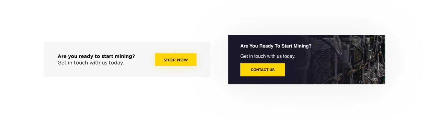
Old Design (Left) / New Design (Right)
For B2B Clients, product cards were also redesigned, and the structure of the information presentation was changed.
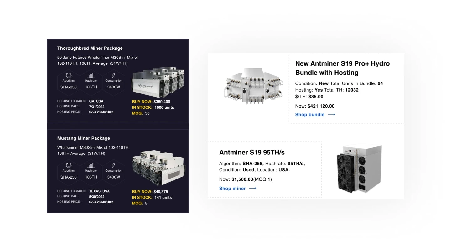
Old Design (Left) / New Design (Right)
A/B Testing
Win in the dark mode
During the research and email redesign, we discovered a problem related to dark mode. It turned out that some email elements of the branded color were not displayed correctly. That is, the output color was distorted. Instead of the signature yellow, it turned out to be some kind of brown. Which is the main corporate color. Which, of course, should be displayed correctly in all email platforms and devices. Be it Android or iOS.
Also, in the footer, where all the icon links to the company’s social networks were located, due to the dark color of the footer, it was displayed in black. That is, they were completely unreadable.
We conducted many tests and manipulations with the design and eventually found a solution. For example, the icons were made with a black outline. And thus, the color indexing took over this outline, and the icon remained white. This is what was needed to display them correctly in the email footer. I am very grateful to Sergei Zlatov for really putting a lot of effort into helping me deal with the problem that arose in Dark Mode.
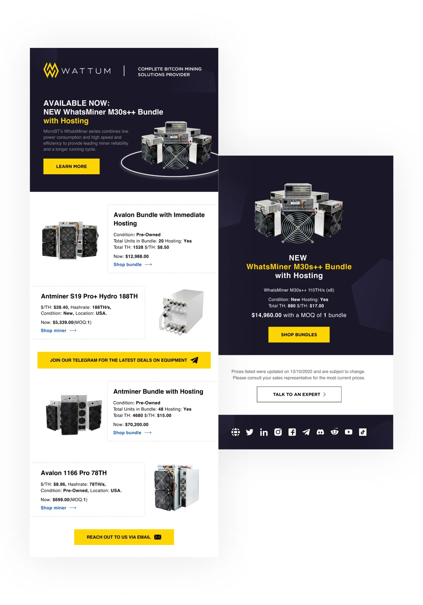
Redesign of Inventory Email
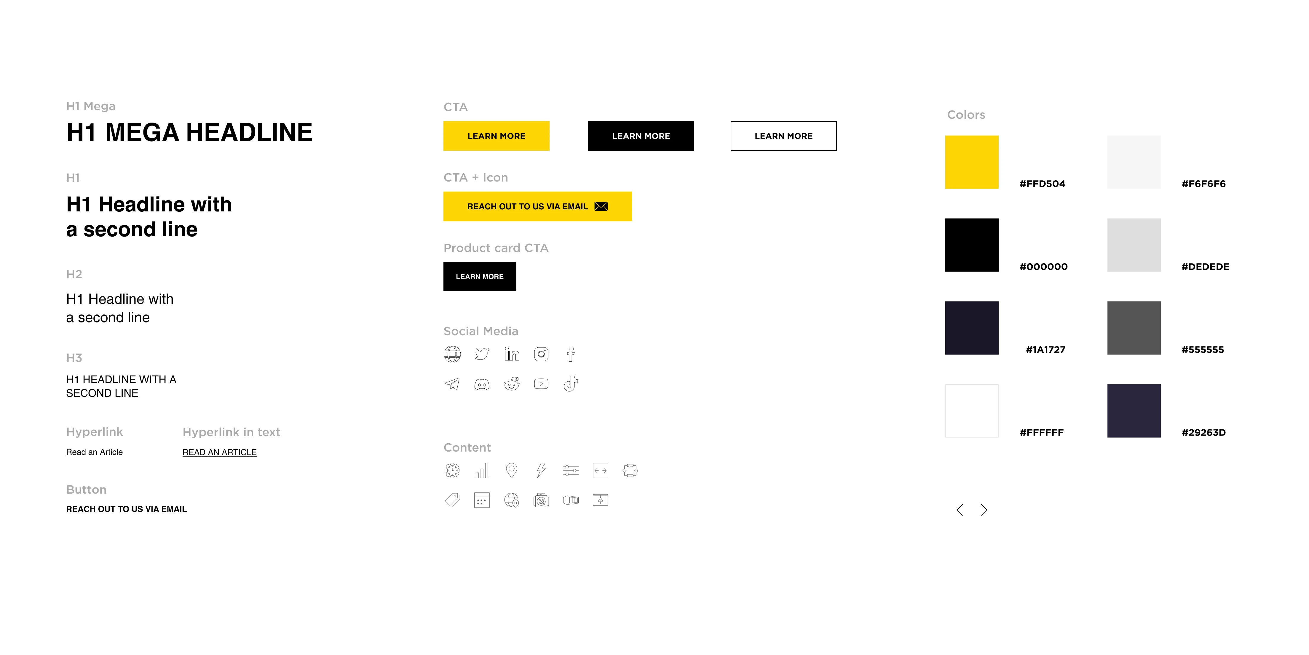
Email Guideline Was Updated
Results
Launching the email campaigns
After research, redesign, and A/B testing, we received new results in terms of open rates and click-through rates to benchmark. And this is against the backdrop of the fact that Bitcoin just went down sharply.
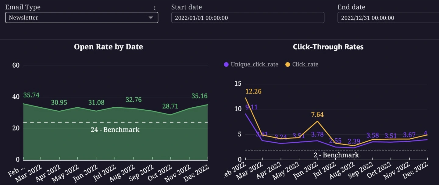
Indicators of Newsletter Email
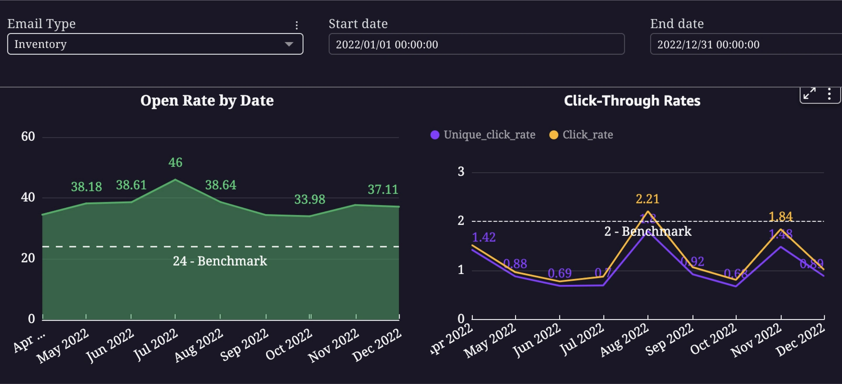
Indicators of Inventory Email
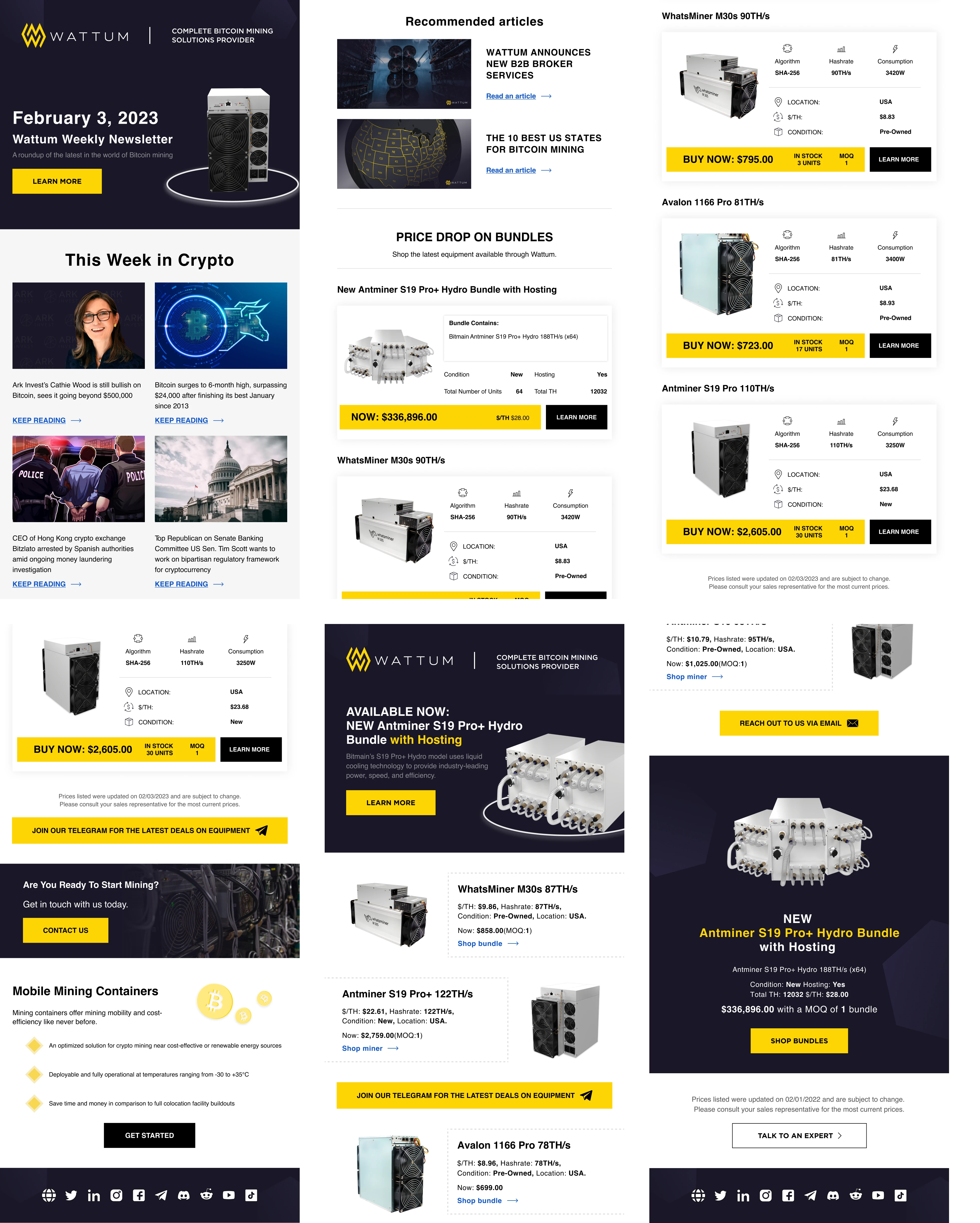
Redesigned Email Sections
Key Takeaways
Having completed work on email campaigns from Wattum, we were able to achieve better results. By analyzing the collected information along with best practices and talking to real users, we were able to improve key metrics and at the same time improve the user experience.
1. One of the significant results was the addition of more visual content to the emails, as well as a revision of the structure of the emails themselves.
2. I applied the best practice strategy from email marketing to our email campaigns and it brought results.
3. While working on the company’s emails, I created the design system, which overlapped with the design system of the website, and helped speed up the creation of new letters and emails by up to 40%.
Like this project
Posted Jan 22, 2024
I helped the project research and redesign the email campaigns to improve the Open Rate and Click Through Rate metrics.