Wugo Dating App (UI/UX Design for mobile)
Overview
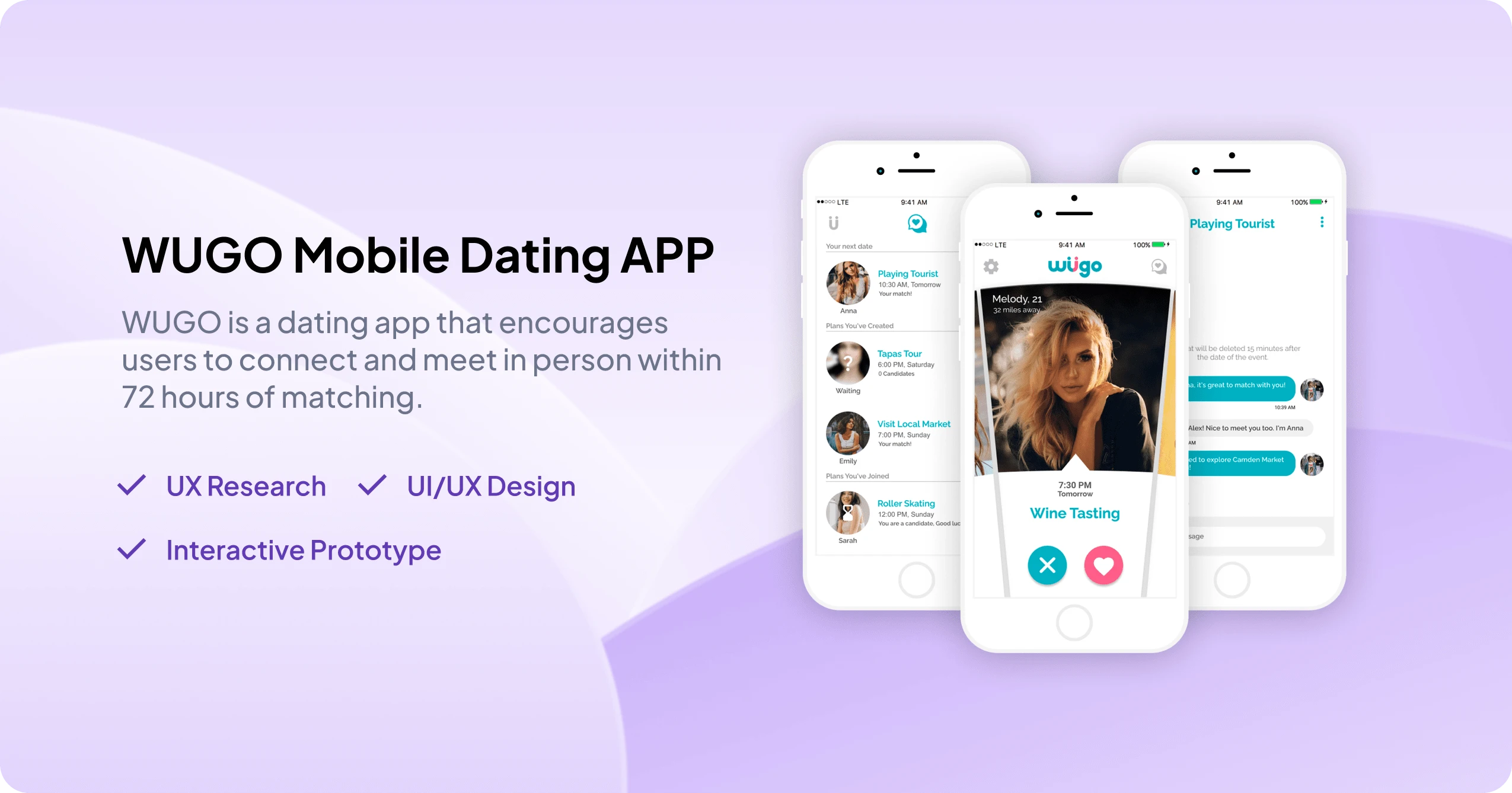
WUGO is an innovative dating app that aims to transform the online dating experience by focusing on people's interests and unique date plans. Instead of just swiping left or right based on appearances, users can now connect with others based on shared interests and the appeal of their proposed date plans. This new approach to dating not only fosters more meaningful connections but also makes the dating experience more engaging and enjoyable.
The challenge
Traditional dating apps often lead to monotonous conversations and lackluster dates, as users primarily focus on appearances when swiping left or right. These apps often fail to facilitate genuine connections and leave users feeling frustrated and unfulfilled.
How might we create a more engaging and meaningful dating experience by incorporating users' personal interests and unique date plans into the matching process?
The Solution
WUGO is a dating app that centers on users' interests and proposed date plans. By showcasing these plans on the home screen alongside users' images and names, the app encourages connections based on shared interests and the allure of the planned activities. When users express interest in someone, they are also requesting to join the person's plan at a specific time. The creator of the plan can then select a candidate to join them on the date, fostering a more intentional and engaging dating experience.
Design Process
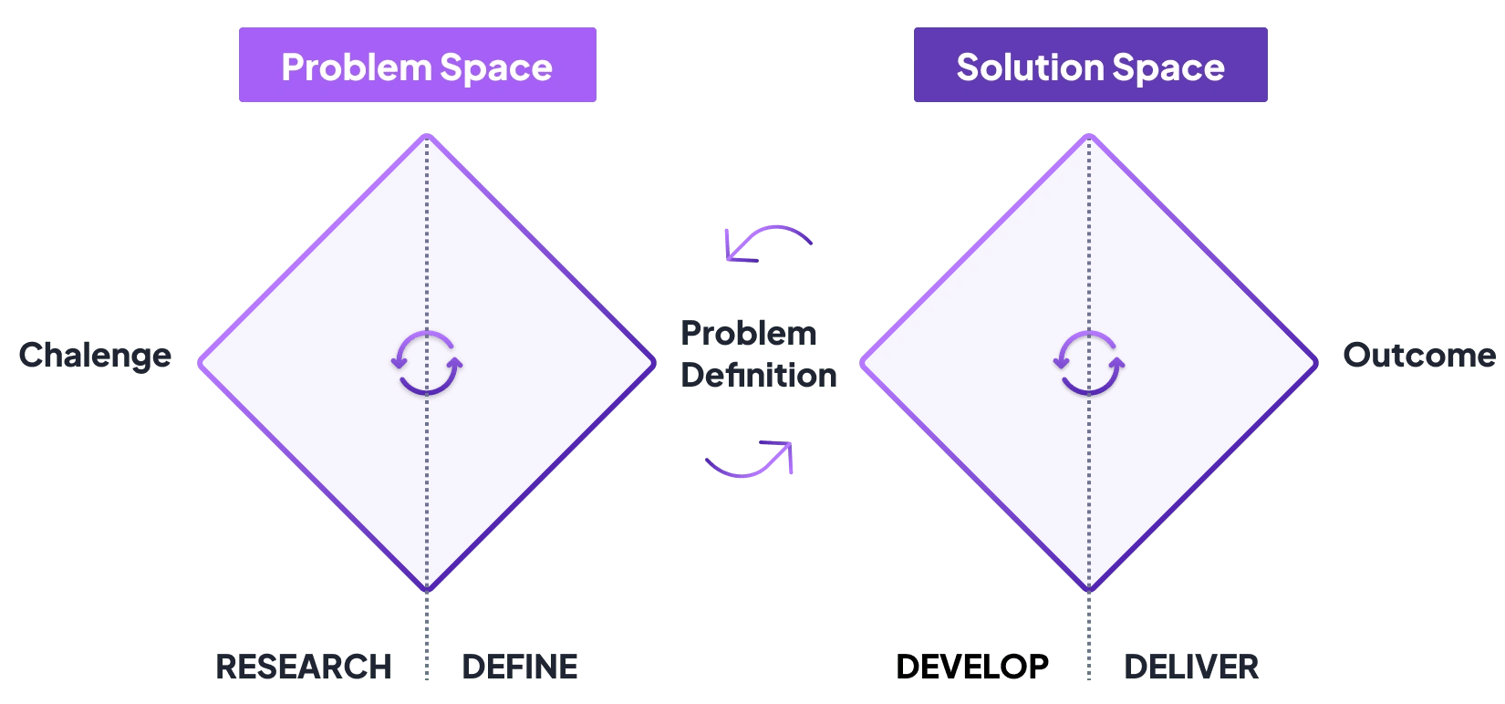
Utilizing the Double Diamond Design Thinking approach, I aim to explore the online dating environment and identify the challenges users face. By focusing on a solution that addresses these issues, I can create a more meaningful and engaging experience for our users.
01 - Discover Phase
Our research goals include understanding the current online dating landscape, identifying users’ pain points and desires, and uncovering opportunities for improvement in the dating experience.
I will conduct market research, competitive analysis, and user interviews to gather insights into users’ expectations and behaviors.
Competitive Analysis
The following competitive analysis examines the strengths, weaknesses, opportunities, and threats of the leading dating apps in the UK market in 2016: Tinder, Bumble, OkCupid, and Harmony.
This analysis aims to provide valuable insights into the competitive landscape, helping to identify gaps and shortcomings in the existing offerings.
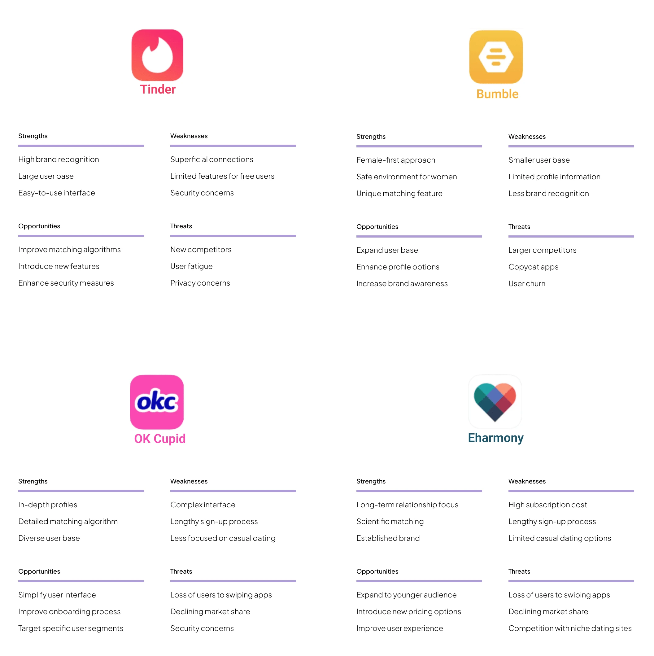
By understanding the advantages and disadvantages of each competitor, we can better position WUGO in the market and design a unique user experience that meets the evolving needs of online daters. This evaluation will serve as a crucial foundation for further UX research and design decisions, ensuring that WUGO stands out among its competitors and addresses the unmet needs of its target users.
User Research
Qualitative Research
I interviewed 10 people aged between 20 to 35, who identified as female and male Millennials, and LGBTQ. My research aimed to understand users' attitudes and behaviors towards online dating and dating apps, identify their pain points, and uncover any unmet needs.
Interview questions:
What is your name, age, occupation, and gender?
Why do you use social media and dating apps?
What online dating apps have you used before?
What do you think are the benefits of online dating?
What positive experiences have you had while using online dating apps?
What were the biggest obstacles or inefficiencies you faced while using online dating apps?
What frustrated you the most while using online dating apps?
Have you ever had any negative experiences or safety concerns while using online dating apps?
What features do you expect from a dating app?
What is most important to you in a dating app?
What's your preferred method of finding a relationship?
What are the common ways people meet potential partners, as you know?
Quantitative Research
Based on the quantitative research we conducted, we collected responses from over 60 users through an online survey. Here's a summary of the results for each question:
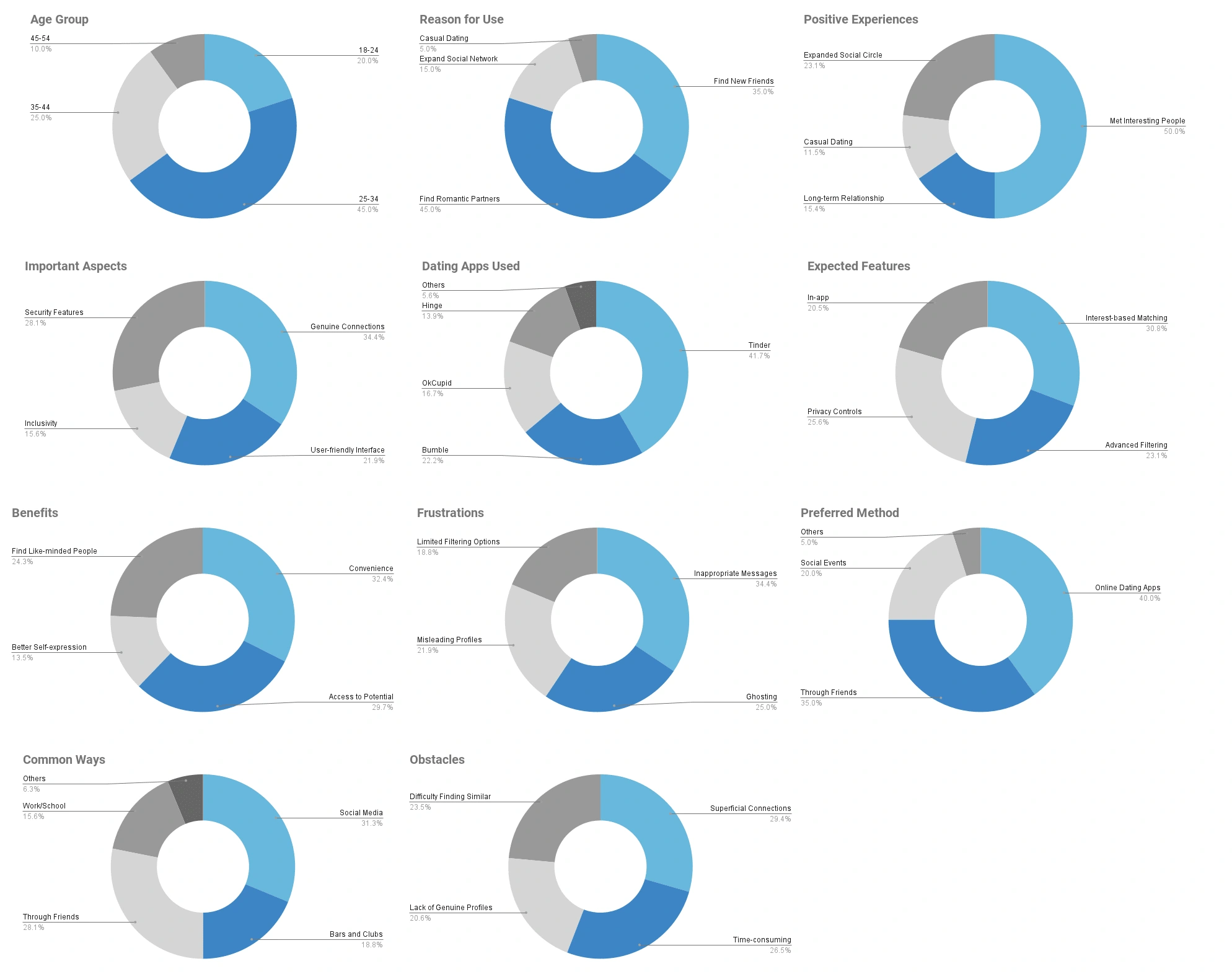
These results provide valuable insights into the users' experiences, preferences, and expectations, which can be used to inform the design and development of the WUGO dating app.
Research Findings
Users are looking for a dating app that facilitates genuine connections based on shared interests and activities rather than just swiping through profiles.
Many users feel disillusioned with the current online dating experience, as they often don't lead to real-life meetups and genuine connections.
Users want an app that provides a safe and secure environment for meeting new people and arranging dates.
Users value transparency in online dating and want apps that allow them to set expectations and intentions from the start.
Users appreciate features that allow them to filter matches based on their interests, location, and preferences.
Some users find online dating overwhelming, and they appreciate apps that simplify the process and offer guidance and tips for successful online dating.
Customer Journey Map
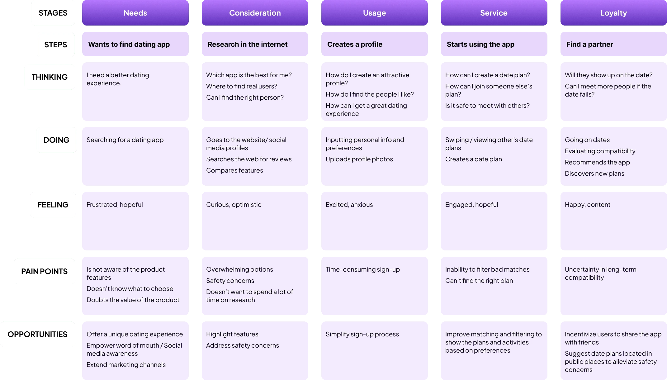
To better comprehend the user’s interaction with our service, I utilized a customer journey map. This strategic tool allowed us to visualize the path a user navigates through our app, giving us insight into their needs, pain points, and moments of satisfaction. The journey map effectively informed us where we could refine our design and improve the user experience.
02 - Define Phase
In the Define phase, we sorted through our collected research data to highlight key user problems and articulate clear problem statements. This phase allowed us to build a comprehensive understanding of our users and align our project with their actual needs, shaping our solution around real challenges users face.
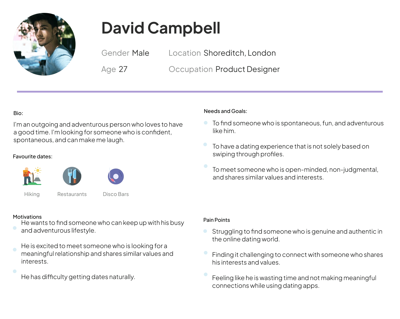
User Personas
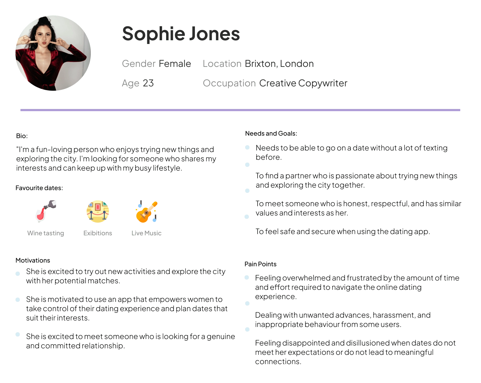
Based on the surveys and interviews conducted with several potential users, I formulated two personas:
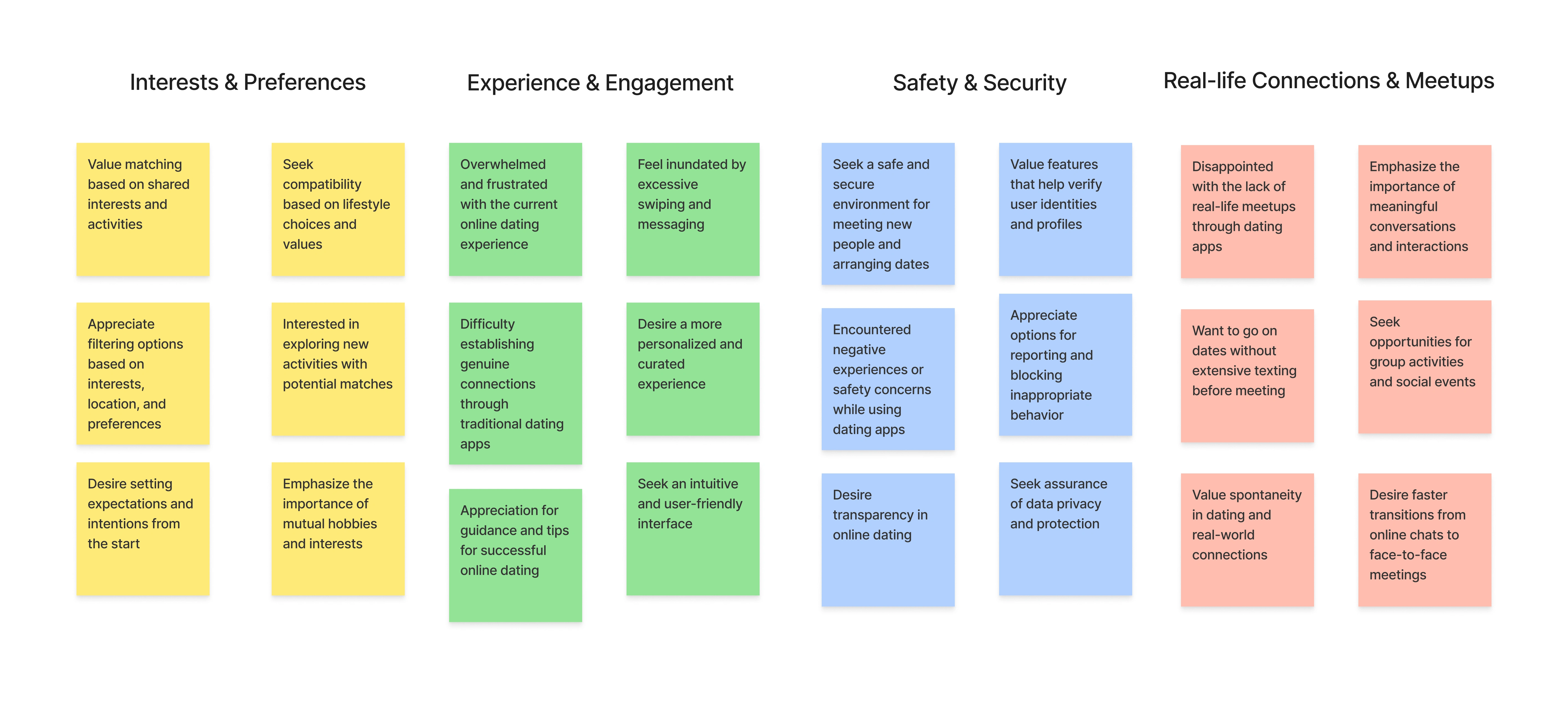
Affinity Diagram
After analyzing the user research data and organizing it into an affinity diagram, we identified four key themes that emerged from the collected information.
Problem Definition
Based on the user research information, I noticed three prevalent or interesting problems:
Users are looking for a dating app that facilitates genuine connections based on shared interests and activities, rather than just swiping through profiles.
Many users feel disillusioned with the current online dating experience, as they often don't lead to real-life meetups and genuine connections.
Users want an app that provides a safe and secure environment for meeting new people and arranging dates.
The HMW statements for each of these patterns:
How might we create a dating app that emphasizes shared interests and activities, leading to more genuine connections between users?
How might we design a dating app that encourages real-life meetups and fosters meaningful connections, preventing users from feeling disillusioned with the online dating experience?
How might we ensure that the dating app provides a safe and secure environment for users to confidently meet new people and arrange dates?
03 - Develop Phase
During the Develop phase, potential solutions were brainstormed, designed, and iteratively refined based on user feedback.
The Idea
WUGO introduces a feature called "Icebreakers" that enables users to create and showcase personalized date plans based on their interests and preferences. This feature is designed to address the identified problems and enhance the overall dating experience.
Icebreakers / Interest-based Date Plans: Users can create date plans that incorporate their interests and hobbies, allowing potential matches to connect based on shared interests and the appeal of the planned activities. The Icebreakers feature helps users move beyond the superficial aspects of traditional dating apps and fosters genuine connections between users.
Plan Requests & Real-life Meetups: When users express interest in someone, they are also requesting to join the person's Icebreaker plan at a specific time. This approach encourages real-life meetups by streamlining the process of moving from online chats to in-person dates. With a clear plan and time in place, users are more likely to follow through and meet up, creating opportunities for meaningful connections.
Safety & Security Features: WUGO prioritizes user safety by incorporating features such as profile verification, user reviews, and in-app reporting options. Users can feel confident and secure when meeting new people and arranging dates through Icebreakers. Additionally, users can opt to make their Icebreaker date plans visible only to verified profiles, ensuring a safer dating experience.
By implementing the "Icebreakers" feature, WUGO aims to address the issues identified during the research and provide a more engaging, meaningful, and secure dating experience for users.
User Flow
To ensure a smooth and intuitive user experience, I have designed three key user flows for WUGO: Selecting Your Match, Creating an Icebreaker, and Expressing interest in another user's Icebreaker.
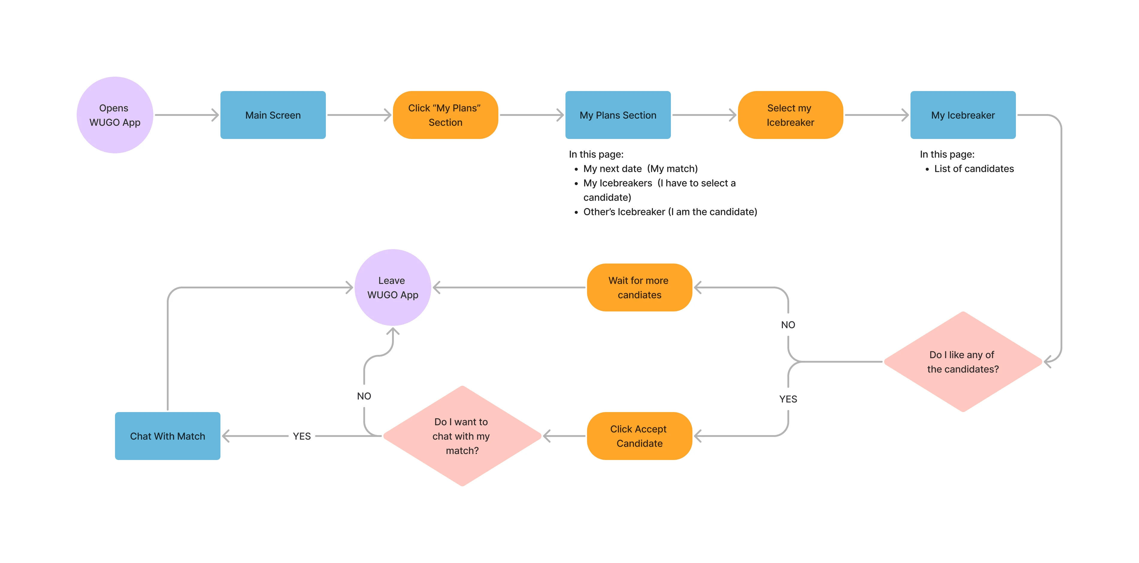
Selecting my Match
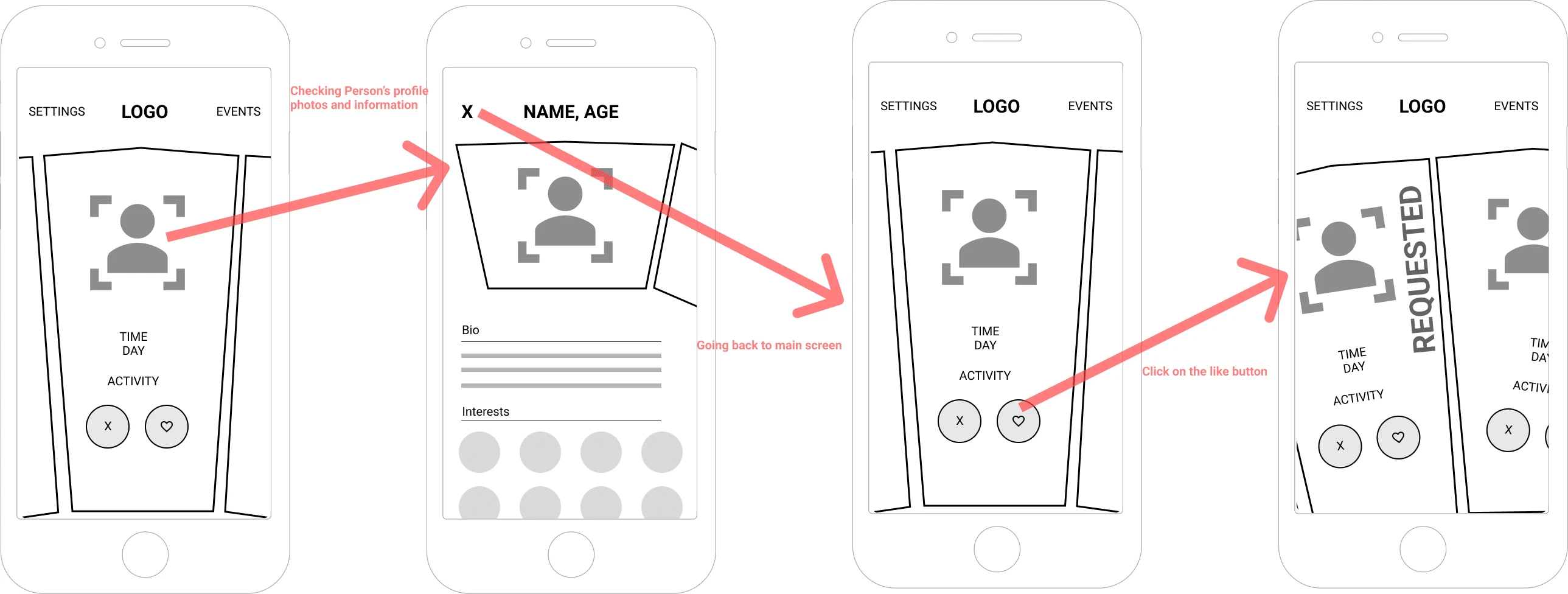
Expressing interest in another user's Icebreaker
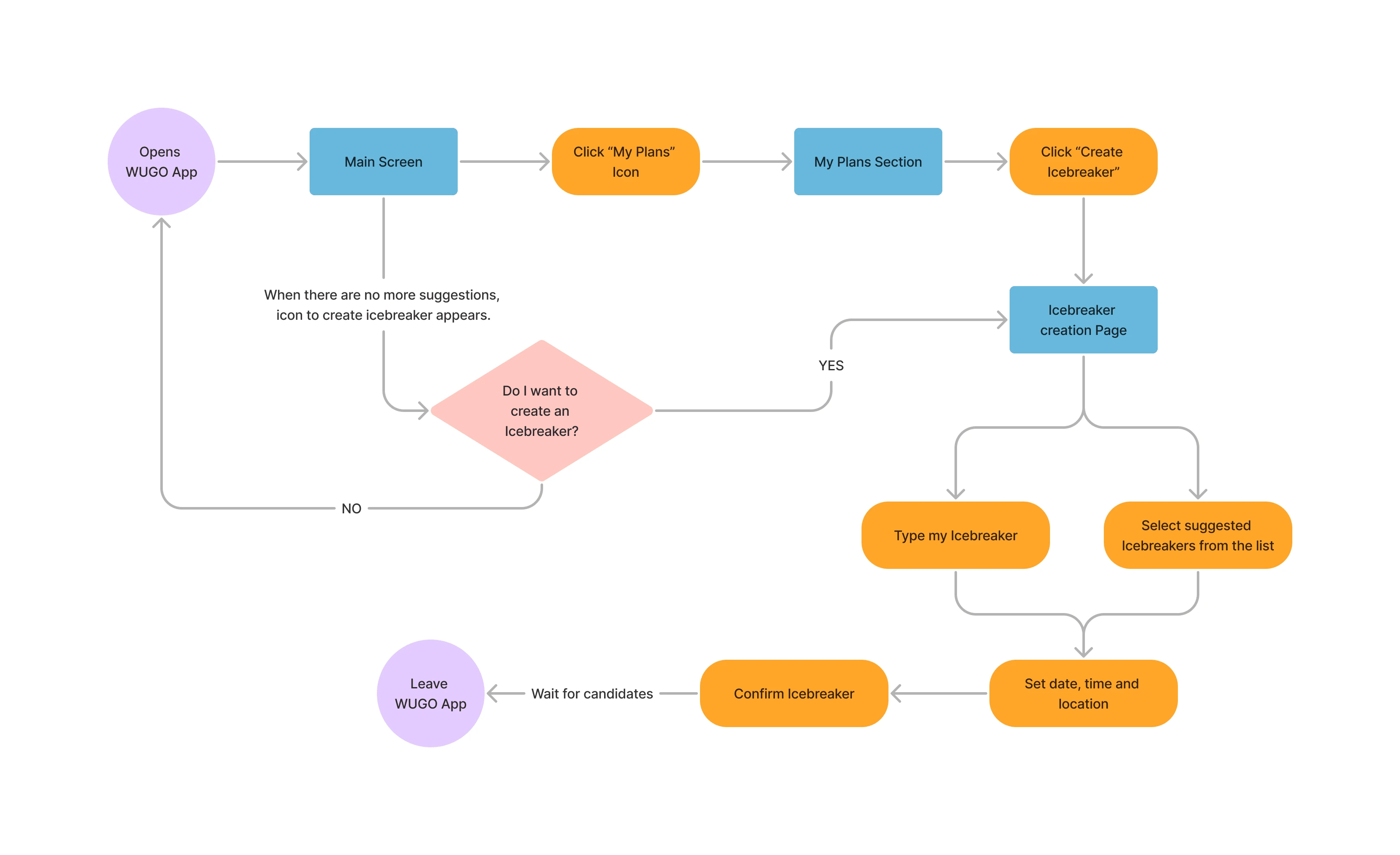
Creating an Icebreaker
These user flows are designed to create an engaging and straightforward experience for users, encouraging them to create unique Icebreakers and connect with others based on shared interests and appealing activities.
Low Fidelity Wireframes
Low-fidelity wireframes were instrumental in our project as they enabled us to blueprint our app’s basic structure and layout. By focusing on usability and functionality without the complexities of visual design, I was able to test and iterate quickly. These sketches played a pivotal role in receiving initial feedback and validated that our app’s structure and flow met the user’s needs before moving into more detailed design stages.

Expressing interest in other’s icebreaker

Selecting my date

Creating an icebreaker
04 - Deliver
The Deliver phase of the design process involves finalizing the design, testing, and releasing the product. This phase will bring the ideas and design concepts to life.
High Fidelity Mockups
In the final design stage, I refined the user interface based on user feedback and usability tests. I polished the visual design, typography, iconography, and interactions to make the user experience more intuitive and engaging. This process included creating high-fidelity mockups for all key screens and flows in the app.
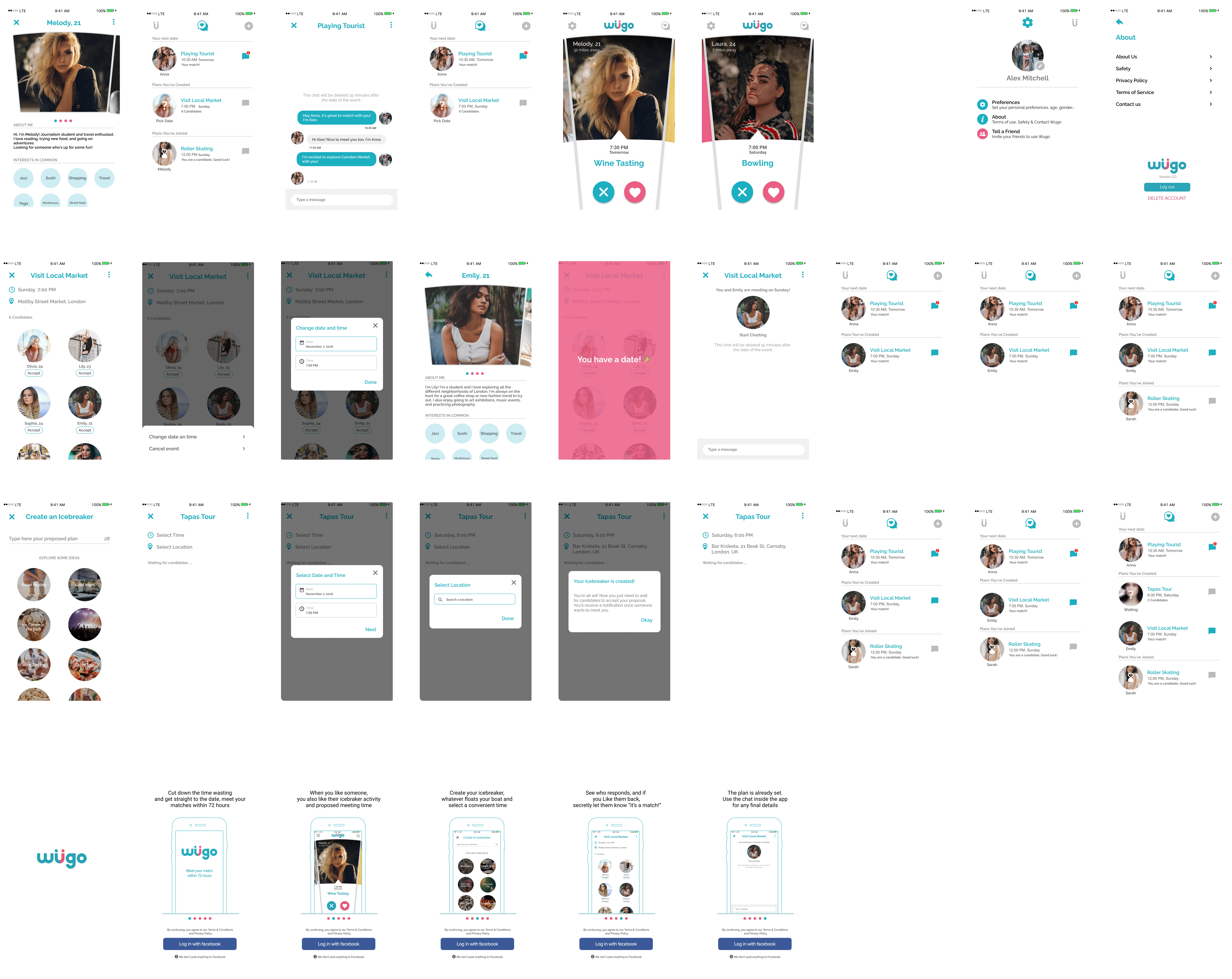
Interactive Mockup
I then turned our high-fidelity designs into an interactive prototype using Marvel.
This prototype was used for further usability testing and to demonstrate app functionality to stakeholders and the development team.
Usability Testing
The Marvel prototype was tested with three users, providing valuable feedback on usability and overall experience. The findings from the usability test were documented and rated by severity to prioritize improvements.
The most severe problems identified during testing included difficulty navigating the app, confusion regarding the Icebreaker creation process, and lack of clarity when expressing interest in another user's Icebreaker.
These issues were addressed in the next high-fidelity iteration of the design, which included improvements to navigation, clearer instructions for creating and engaging with Icebreakers, and streamlined user flows for expressing interest and selecting a date. This iterative process helped refine the design and ensure that WUGO offered a seamless and enjoyable user experience that aligned with users' needs and expectations.
Handoff to Developers
Once we were satisfied with the final design and usability testing results, I handed off the design to the development team. This process included providing all necessary design files, specifications, and assets, as well as detailed guidance on the intended interaction patterns and transitions.
Moving forward
The WUGO app's concept and design have been well-received by users. They expressed excitement about the potential to make genuine connections that lead to real-life dates and reduced time spent on fruitless online interactions. The unique Icebreaker feature was particularly well-regarded as a way to spark meaningful conversations.
Throughout the design process, the importance of user testing became increasingly evident, as it allowed us to better understand user behavior and refine the app's user experience. This project focused on creating a minimum viable product (MVP) to validate the core features and gather valuable user feedback.
The next steps for WUGO include:
Developing a seamless onboarding strategy that effectively matches users in meaningful ways.
Incorporating a gamification element to further facilitate icebreaking and make user interactions more engaging.
Encouraging users to create short video introductions to represent themselves more realistically.
Exploring opportunities for live events and other creative ways to promote real-life connections.
Additionally, future versions of the app will introduce a credit system that allows users to unlock more potential matches. This approach will not only provide a revenue stream for the app but also incentivize users to actively engage with the platform and make thoughtful choices when selecting potential dates.
In conclusion, the WUGO project has demonstrated the value of iterative design, user testing, and focusing on user needs. As we continue to refine and expand the app's features, we are confident that WUGO will become a popular and effective platform for making genuine connections in the world of online dating.
In 2018, Forbes published an article highlighting the unique approach of WUGO in the online dating landscape, giving women the power to propose the kinds of dates they want to go on within a 24-hour window. The article emphasized how WUGO was gaining popularity among female Millennials, as it provided them with a platform to choose the dates they prefer, rather than being limited by the suggestions of their matches.
This coverage in Forbes was a significant milestone for WUGO at that time, as it not only brought attention to the startup but also validated its unique approach to dating. The article's focus on the app's appeal to female Millennials further emphasized its potential for growth and success in a competitive market. The positive reception and growing user base signaled a promising future for WUGO, as it continued to develop its product and user experience.
Like this project
Posted Jun 9, 2023
Full UX Research and UI Design creating a mobile app that encourages people to meet within 72 hours.

