UI/UX Design of an Interactive 3D App for Renewable Products
Introduction
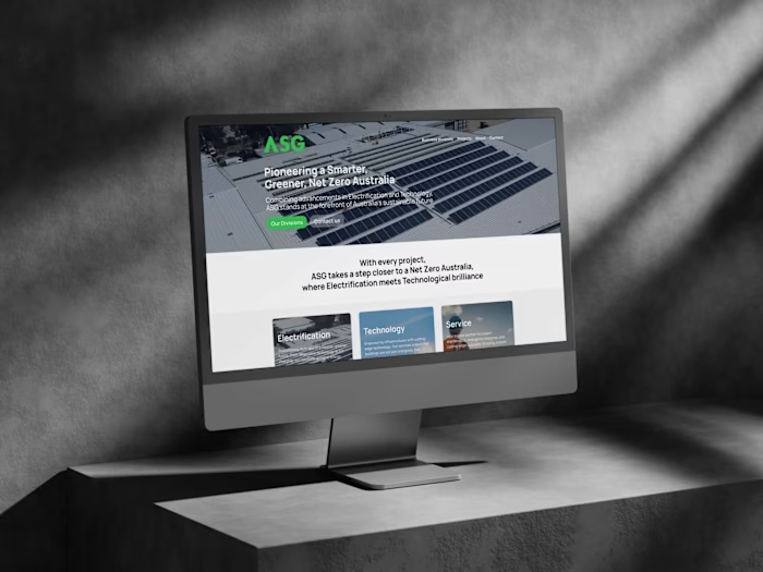
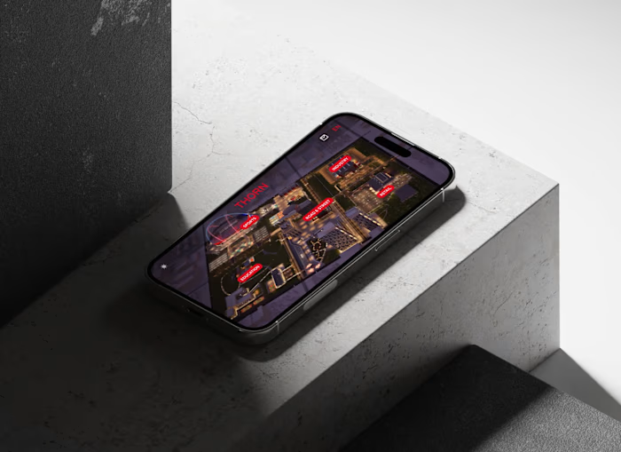
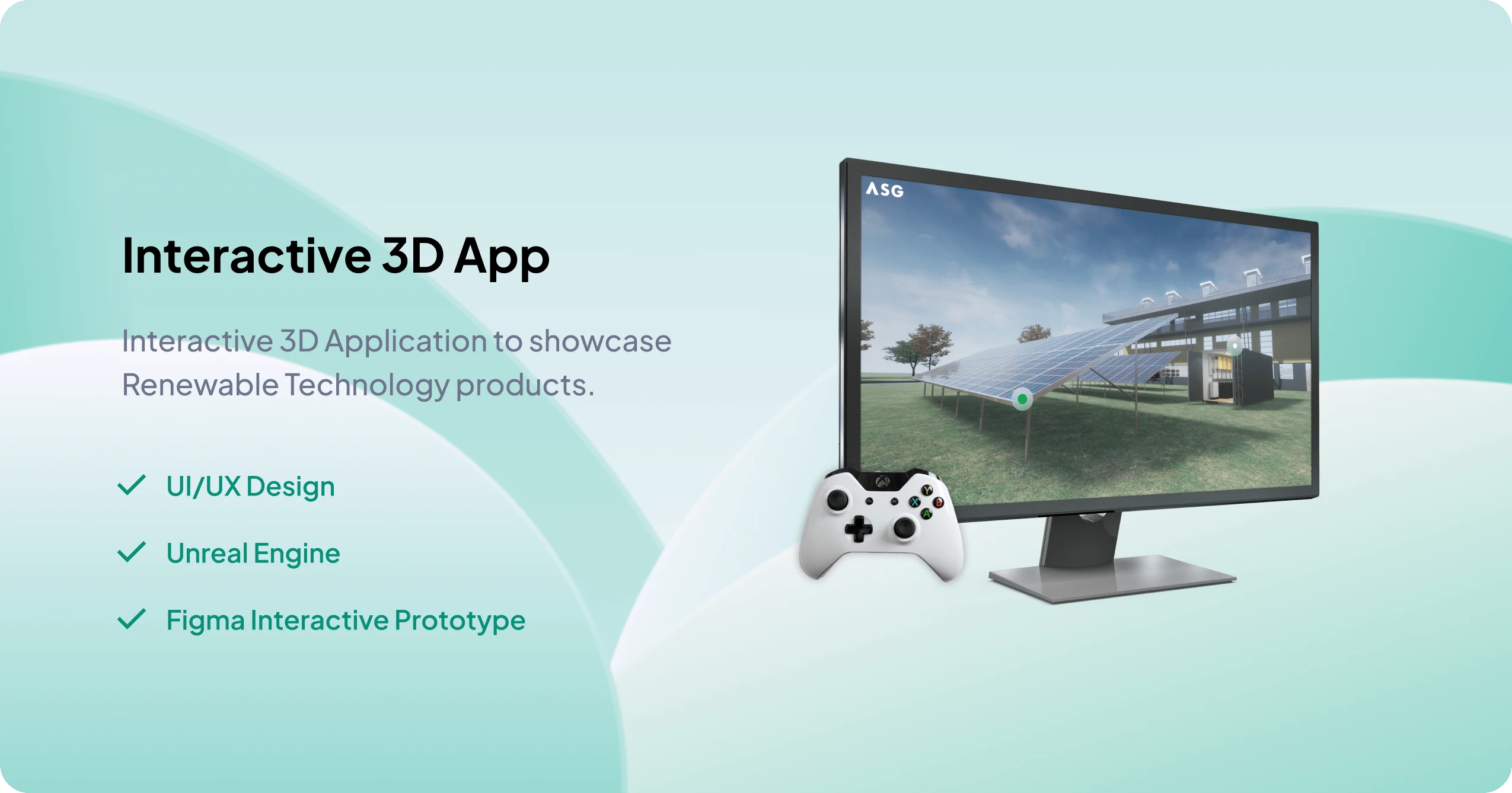
ASG, an innovative electrical contracting company specializing in renewable technology and smart building technologies, wanted to create a groundbreaking marketing tool to showcase their products – the Solar Microgrid Interactive Walkthrough.
This case study details the design process and the project’s successful implementation, focusing on the UI/UX Design process.
My Role
As the Product Manager, I was involved in all stages of product development, from conception to launch. I liaised with a talented VR artist and an Unreal Engine developer, coordinating the work and ensuring that our development aligned with the project goals and objectives.
As the UI/UX designer, my focus was on designing an intuitive user interface, ensuring a smooth user experience, and facilitating an immersive and engaging journey through the 3D environment.
Project Specifications
Client: Australian Smart Group (Canberra, Australia).
My Role: Product Manager and UI/UX Designer.
Team: Product Manager / UI/UX Designer (myself), VR artist, Unreal Engine developer.
Project Goal: To create a 3D interactive application effectively showcasing ASG’s renewable technology products.
Deliverable: An application developed using Unreal Engine 4, compatible with an Xbox controller.
Discover
The discovery phase focused on understanding the end-users, their needs, and the context within which they’d interact with ASG’s products.
We conducted several workshops with ASG and potential customers, including building managers, to gather insights into their perceptions of renewable technologies, their informational needs, and their familiarity with 3D interactive technologies.
Our key insights from these sessions included:
Prospective customers were interested in renewable technologies but often lacked the technical knowledge to fully understand the products.
Interactive 3D environments were a new and exciting concept for many potential customers. They were keen to learn more through this innovative format.
The need for readily accessible, comprehensive, yet digestible information about ASG’s products was a common theme among potential customers.
Define
Armed with the insights from the discovery phase, we defined the problem statement: How might we design a user-centric, immersive interactive 3D application that allows prospective clients to explore and understand ASG’s renewable technology products in an intuitive and engaging way?
From this problem statement, we derived our project’s key objectives:
Create a realistic and visually appealing 3D environment.
Design intuitive navigation and interaction mechanics.
Develop informational hotspots providing additional product details.
Ensure a seamless and user-friendly experience.
Create an adaptable platform for future updates and expansion.
Ideate
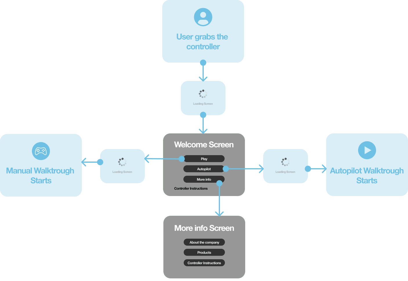
Creating an intuitive and seamless user experience was at the heart of this project. To achieve this, we adopted an iterative design process, starting with user flow creation, moving onto wireframes, and then conducting user testing with an interactive prototype.
User Flow
This was the first step of our design process where we charted the path that a user would take through the 3D environment. We considered various user scenarios, carefully plotting the sequence of steps users would likely follow as they interact with the application.
Low-Fidelity Wireframes
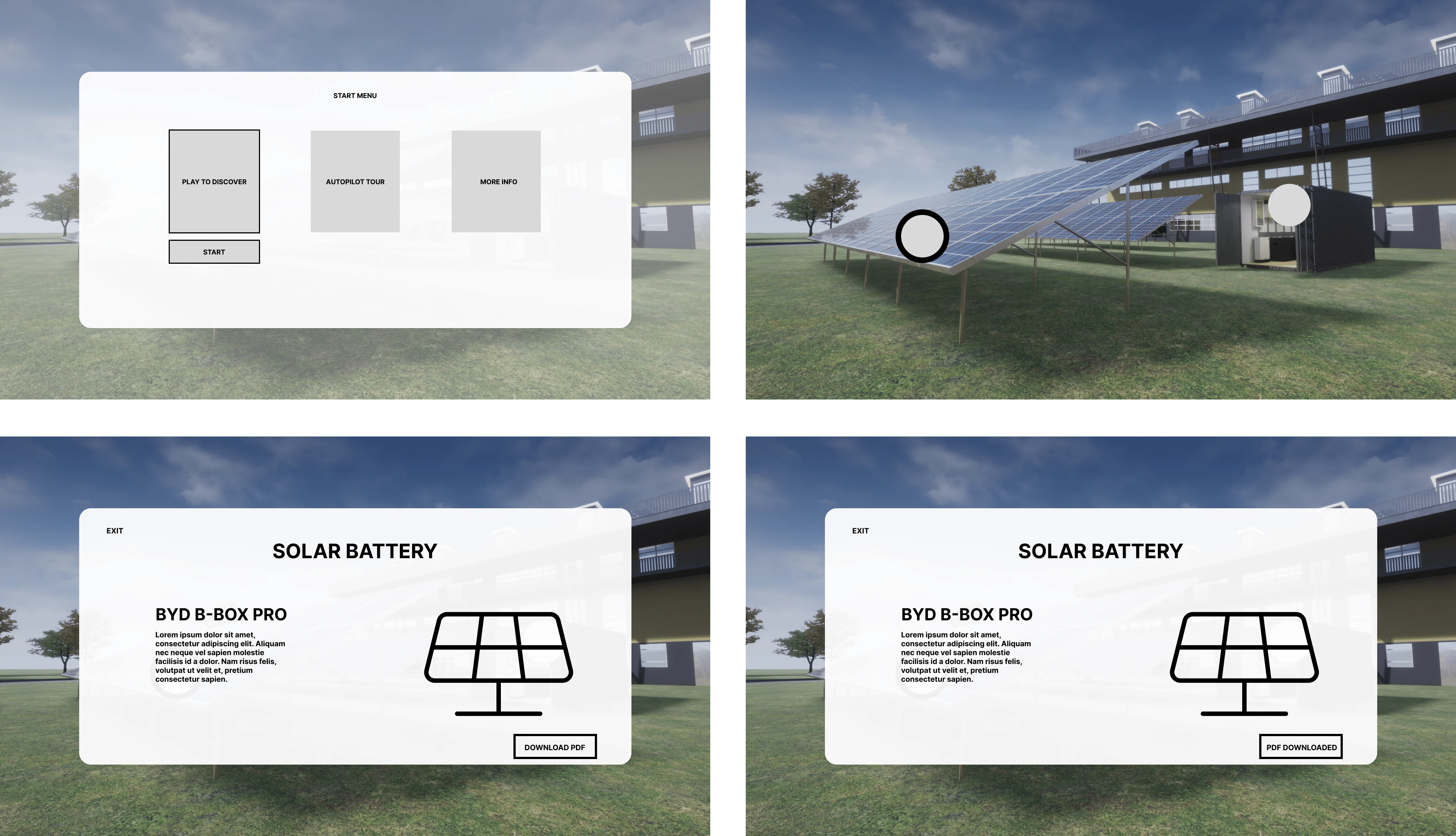
With the user flow established, we moved onto creating low-fidelity wireframes. These basic layouts helped us visualize the initial structure of the application’s interface, focusing on usability rather than visual design

Mid-Fidelity Wireframes
Once the low-fidelity wireframes were finalized, we transformed them into more detailed mid-fidelity wireframes.
I find this stage critical for user testing as it enables us to gather feedback without the substantial investment of time and resources required to build the actual 3D application. It’s faster to prototype in Figma and make changes based on user feedback, which allows us to iterate on the design quickly and effectively.
User Testing (interactive prototype)
The mid-fidelity wireframes were then converted into an interactive prototype using Figma, a tool that enabled us to simulate user interactions and gather valuable feedback.
The following example is a request for the user to “find the solar battery PDF and download it”:
User Feedback
We closely observed how users interacted with the application, paying special attention to areas where users seemed confused or faced difficulties.
Two key areas of improvement emerged from this user testing:
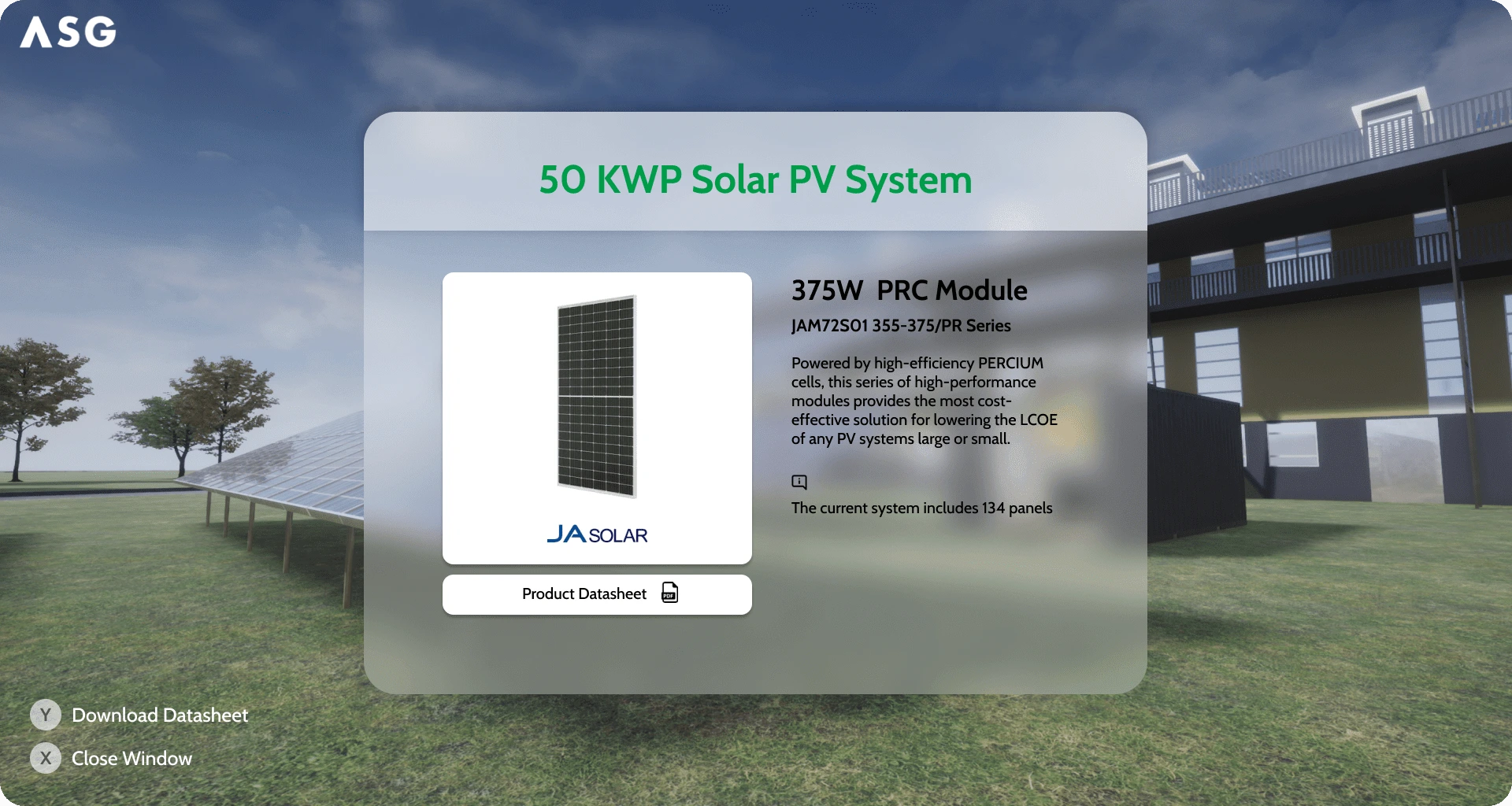
Download Product Catalogue Functionality: Users found it confusing to download the product catalogue. To resolve this, we added an icon on the product page. After the download is completed, an animation is triggered to signify the successful completion of the download.
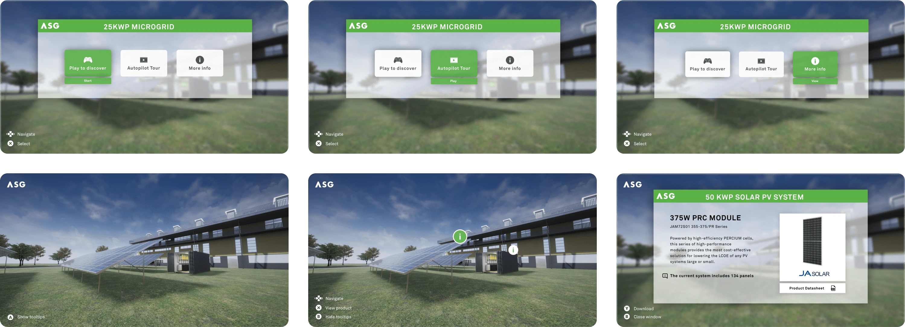
Indications for Button Usage: To help users navigate the application, we added indications at the bottom left corner of the screen. These indications dynamically display the available buttons to press at each moment, providing real-time guidance to users.
High-Fidelity Wireframes
With all user feedback incorporated and the design solidified, we progressed to the creation of high-fidelity wireframes. These wireframes represented the final design, complete with all interface elements, animations, and interactive features. At this stage, we were ready to begin developing the application.
Final Product Demo
After developing the 3D interactive application based on the final high-fidelity wireframes, the first version of the product was completed. The successful integration of key design elements and user interactions earned commendations from both the design team and management, solidifying our confidence in the product’s readiness for launch.
New Design UI
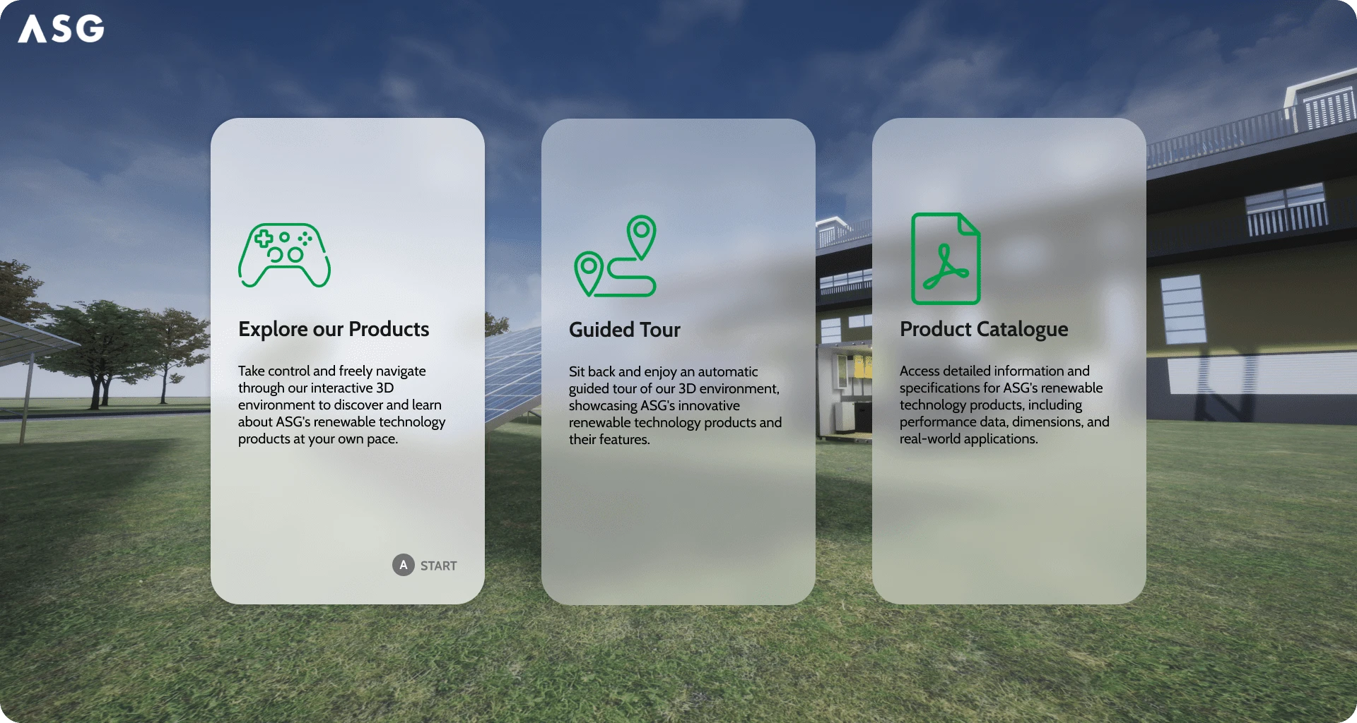
The journey doesn’t end at the launch. In response to user feedback and emerging design trends, the product UI is currently being redesigned. The aim of this redesign is to make the user interface more engaging, intuitive, and visually appealing.
Figma Interactive Prototype
Here is a Figma interactive prototype that offers a preview of the upcoming changes and our ongoing commitment to improving the user experience
Key Learnings and Takeaways
The Microgrid Interactive Walkthrough project was a unique learning opportunity that enriched my understanding of the complex intersection of interactive 3D environments and product showcases. A few key learnings from this project include:
Understanding Users’ Technical Comfort: Developing a product for a diverse user base with varying degrees of technical comfort was a challenge. We had to ensure the application was intuitive for all users, irrespective of their prior experience with 3D environments or Xbox controllers.
Balancing Realism and Functionality: Creating a realistic 3D environment that accurately represented ASG’s products while maintaining the ease of navigation and interaction required meticulous planning and precise execution.
Future Recommendations
Looking forward, there are several enhancements that could be implemented to further improve the user experience and extend the application’s capabilities:
Personalization: Offering personalized user experiences, such as customizable routes or preferred product categories, can increase user engagement.
Integration with Online Platforms: Integrating the application with ASG’s website or social media channels could offer users an option to explore the products online and share their experiences.
Analytics: Incorporating a system to collect and analyze user interactions within the environment can provide valuable insights, such as the most visited areas or most interacted products. This data can be used to drive business decisions and future enhancements.
Conclusion
The Microgrid Interactive Walkthrough project was a challenging but rewarding endeavor. It underscored the importance of a user-centered approach in designing interactive 3D applications and demonstrated the potential of such applications as a tool for product marketing and customer engagement.
Like this project
Posted Jun 9, 2023
Led the development of a 3D Interactive Application to showcase renewable technology products. Including Product Management and UI/UX Design.
Likes
0
Views
37

