Halaska™ Studio
A leading digital design partner for Tech and Web3 Businesses.
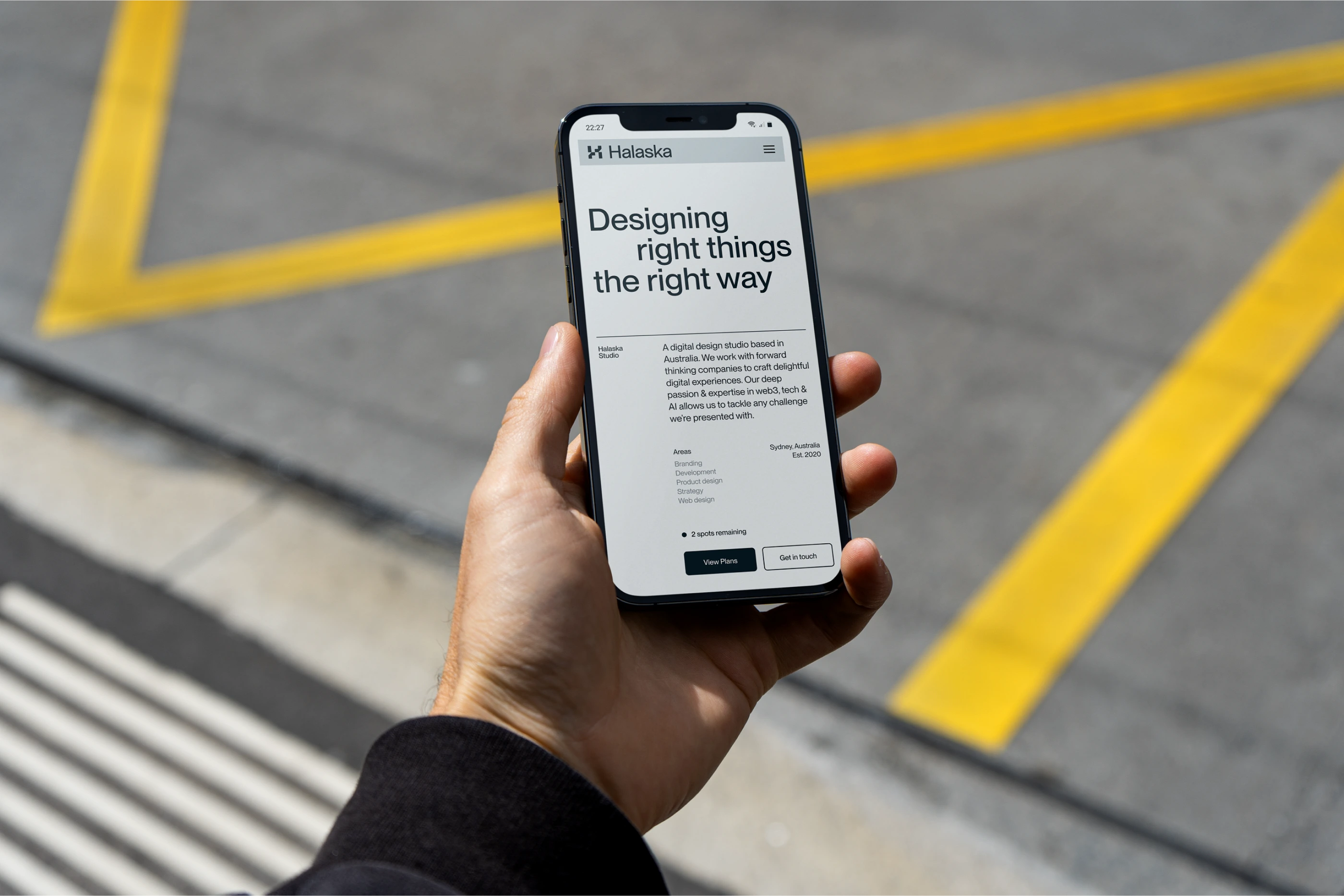
Chris — studio's founder reached me out to redesign their current identity. Tehy already had an indetity but they weren't happy with the way they looked — we don't look professional and innovative in Chris's words.
—
Project - Brand Visual Identity
Scope - Logo, Visual Identity, Brand Guidelines
Industry - Design Services
Author
Miqdam Sajid

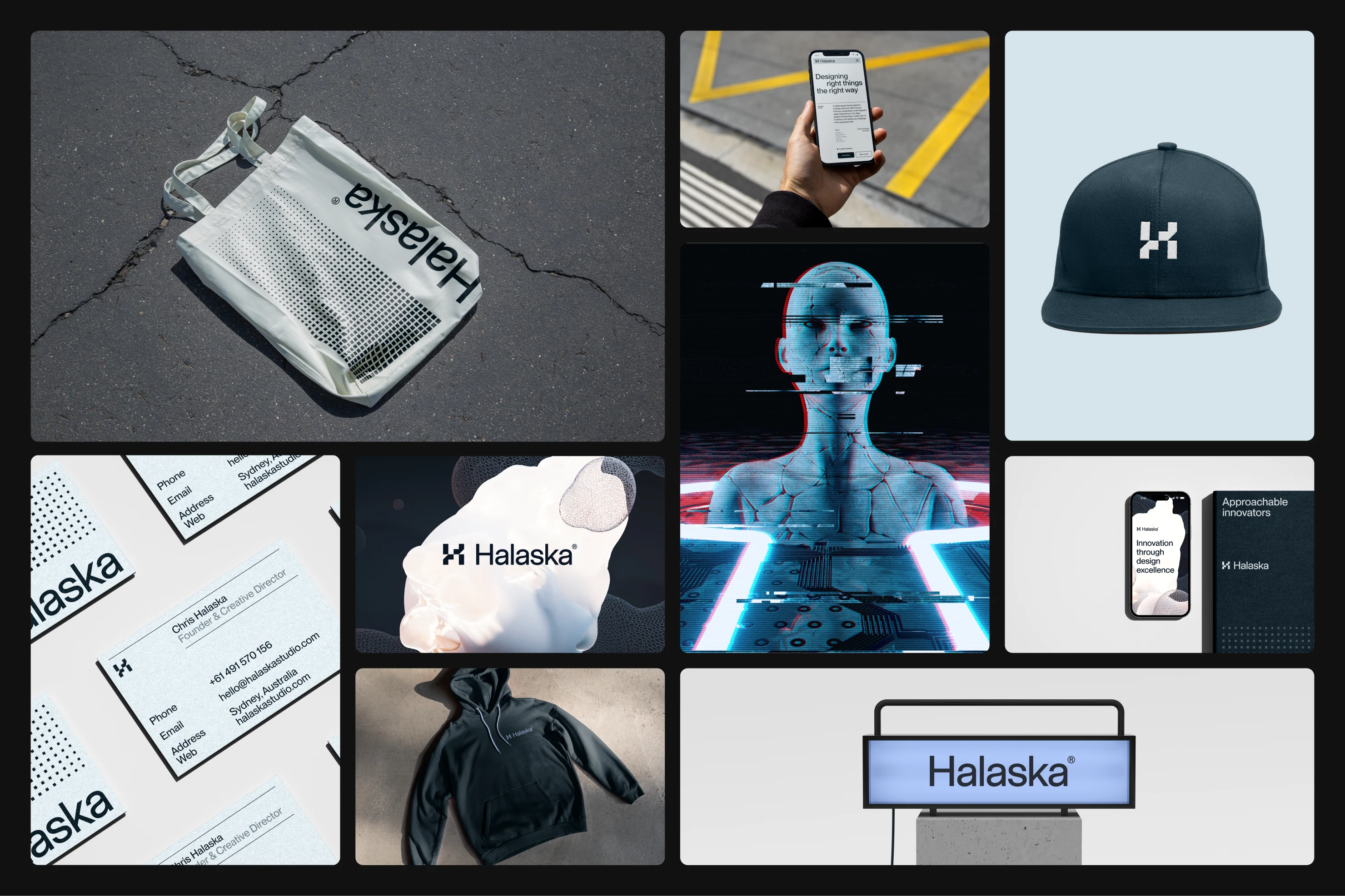
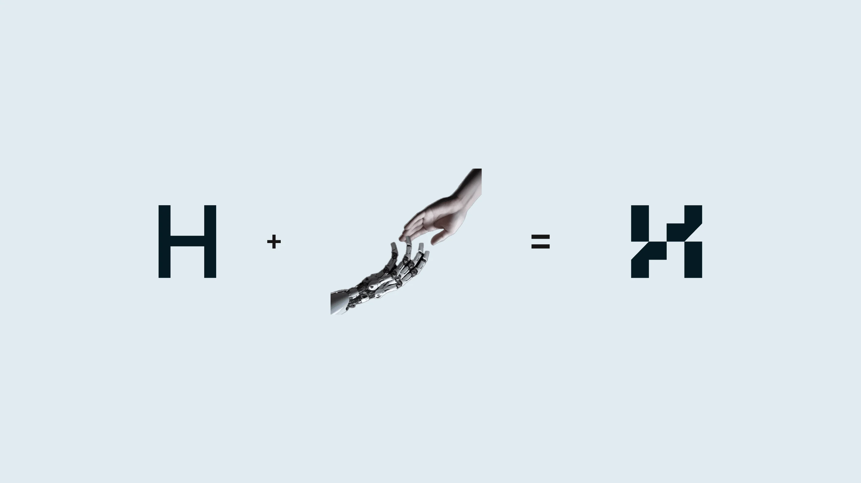
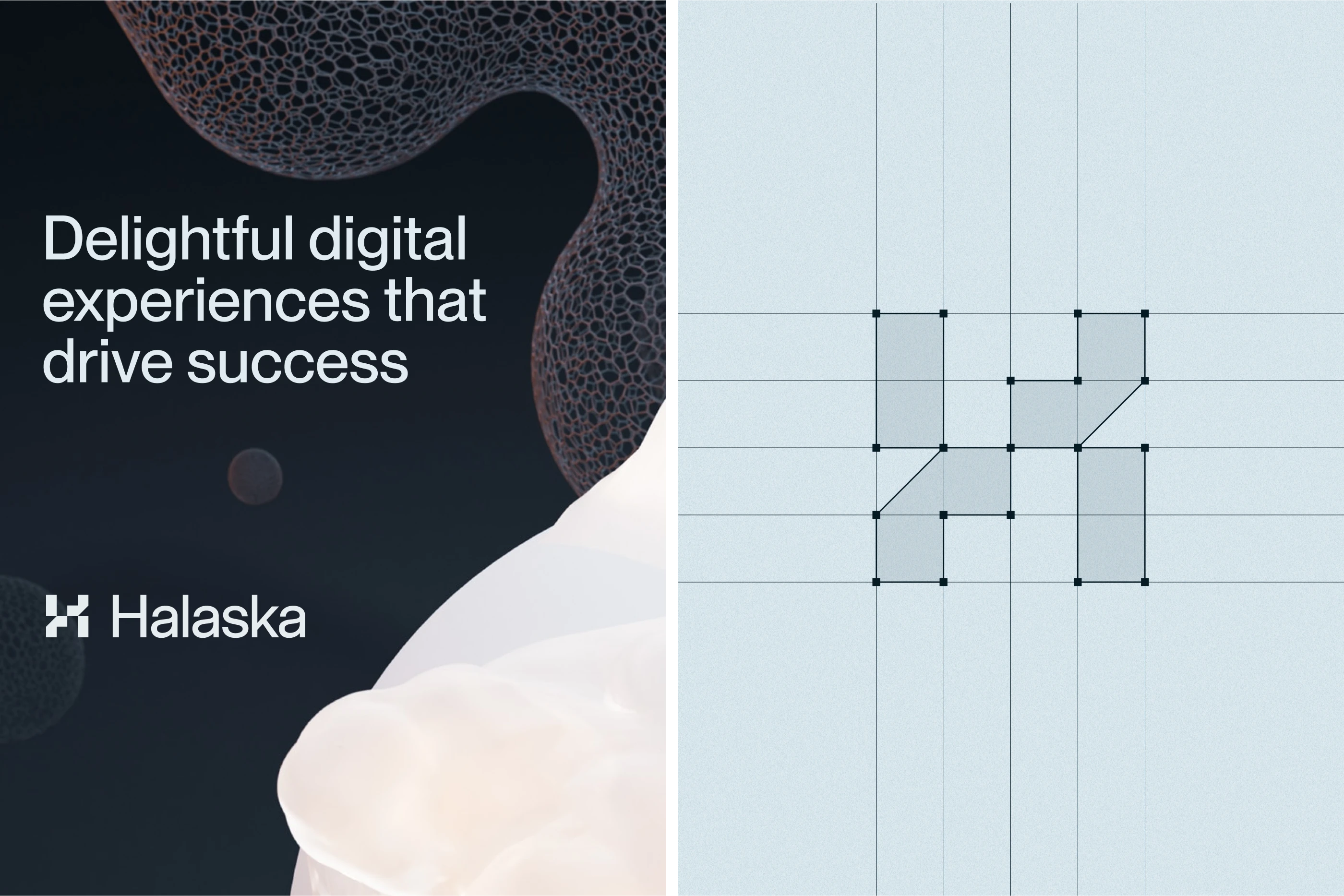
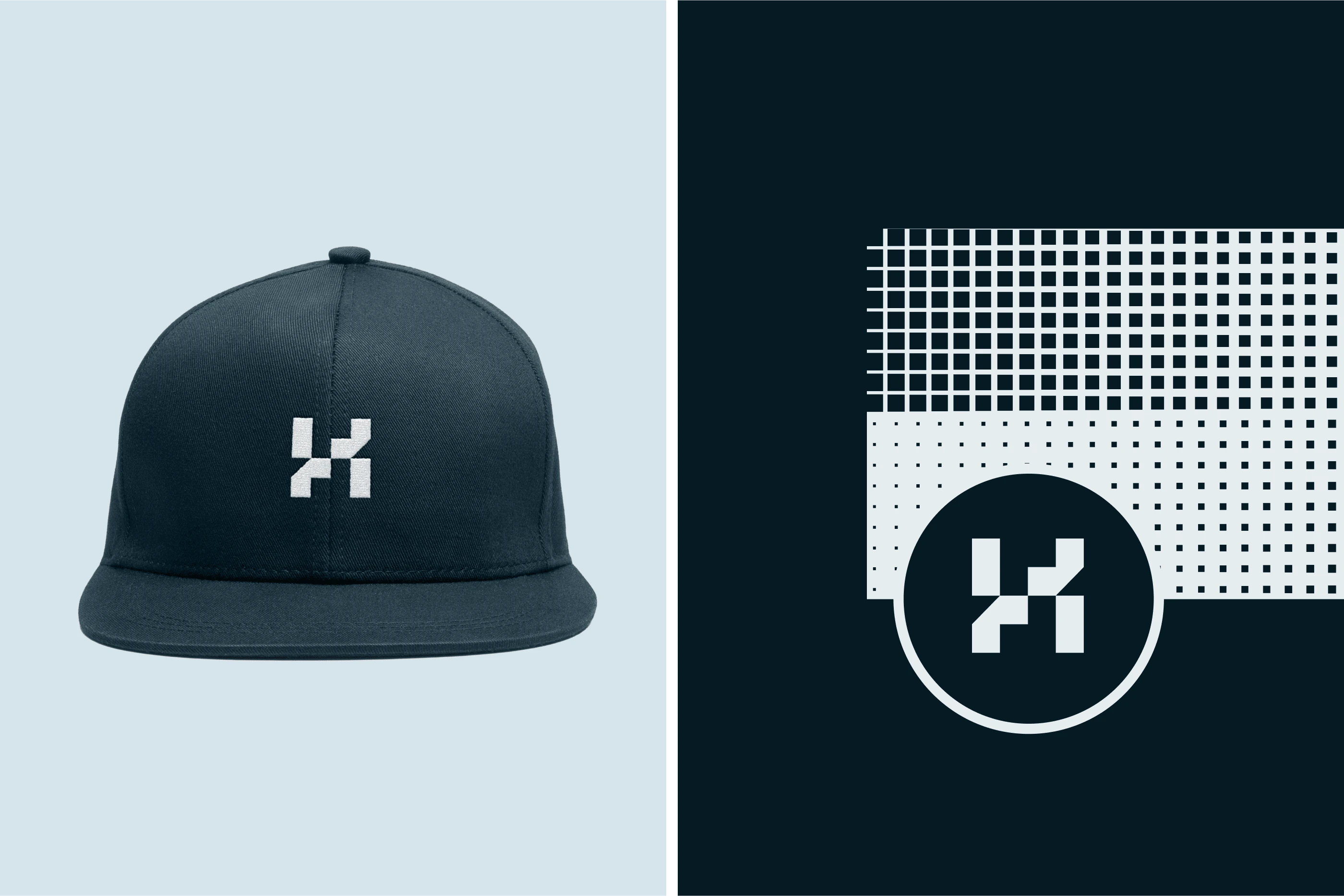
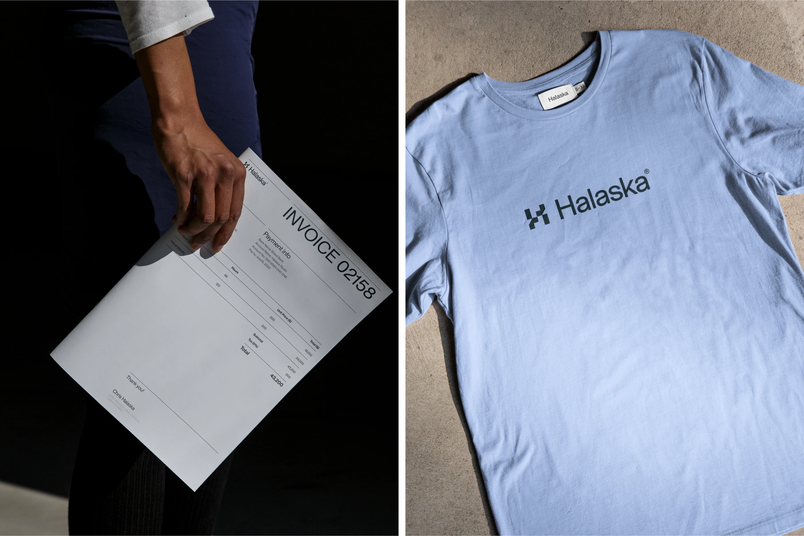
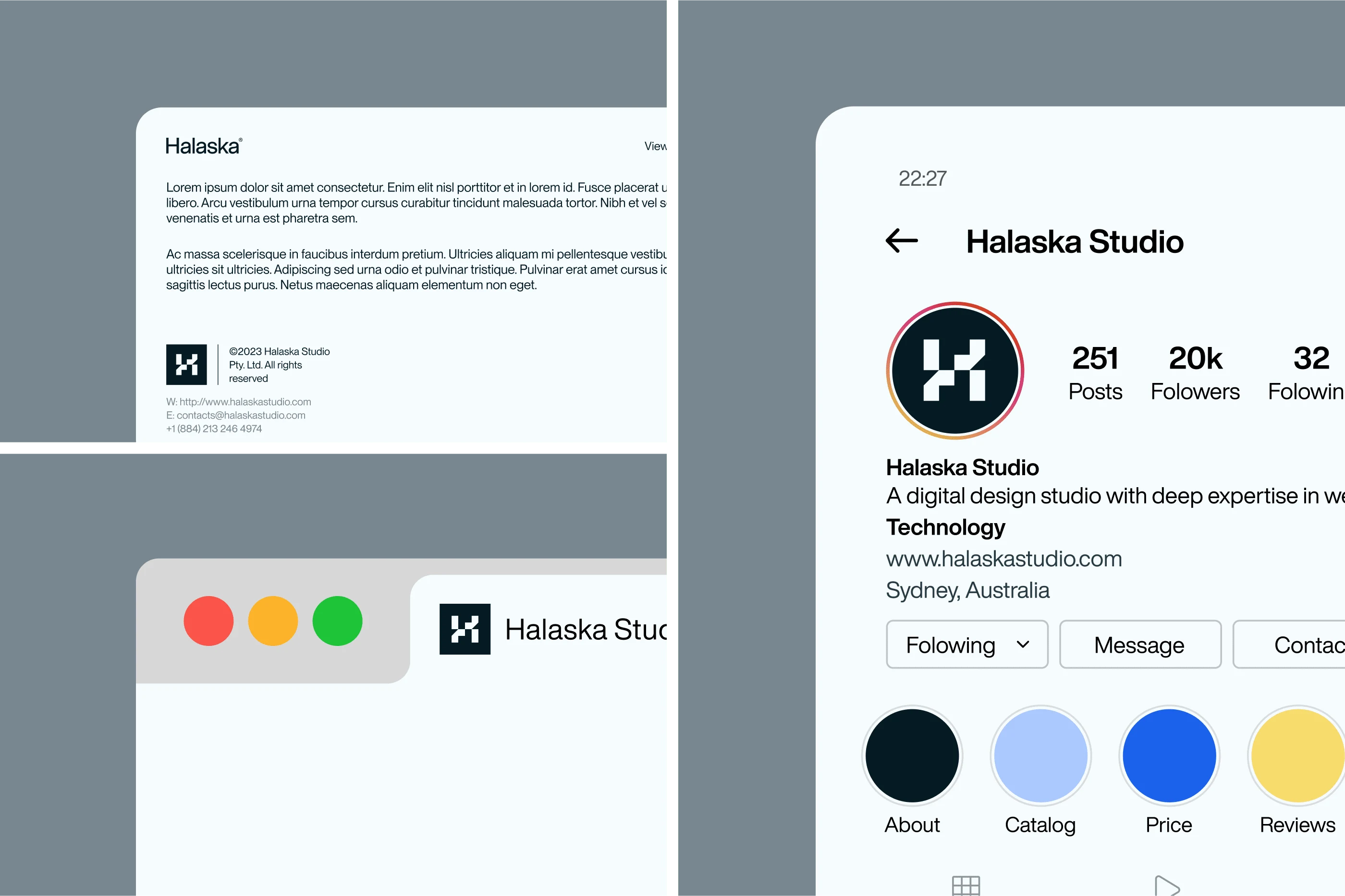
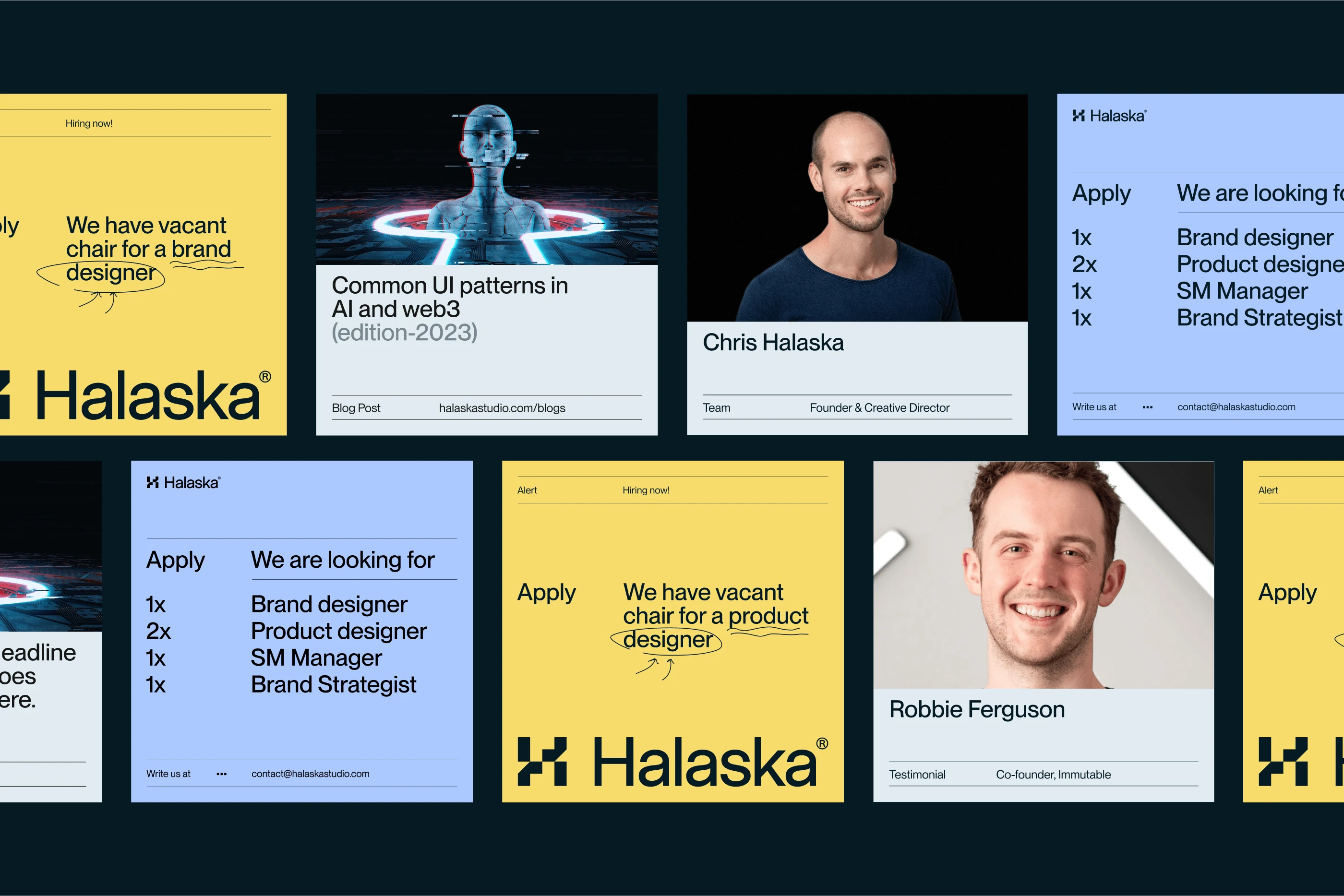
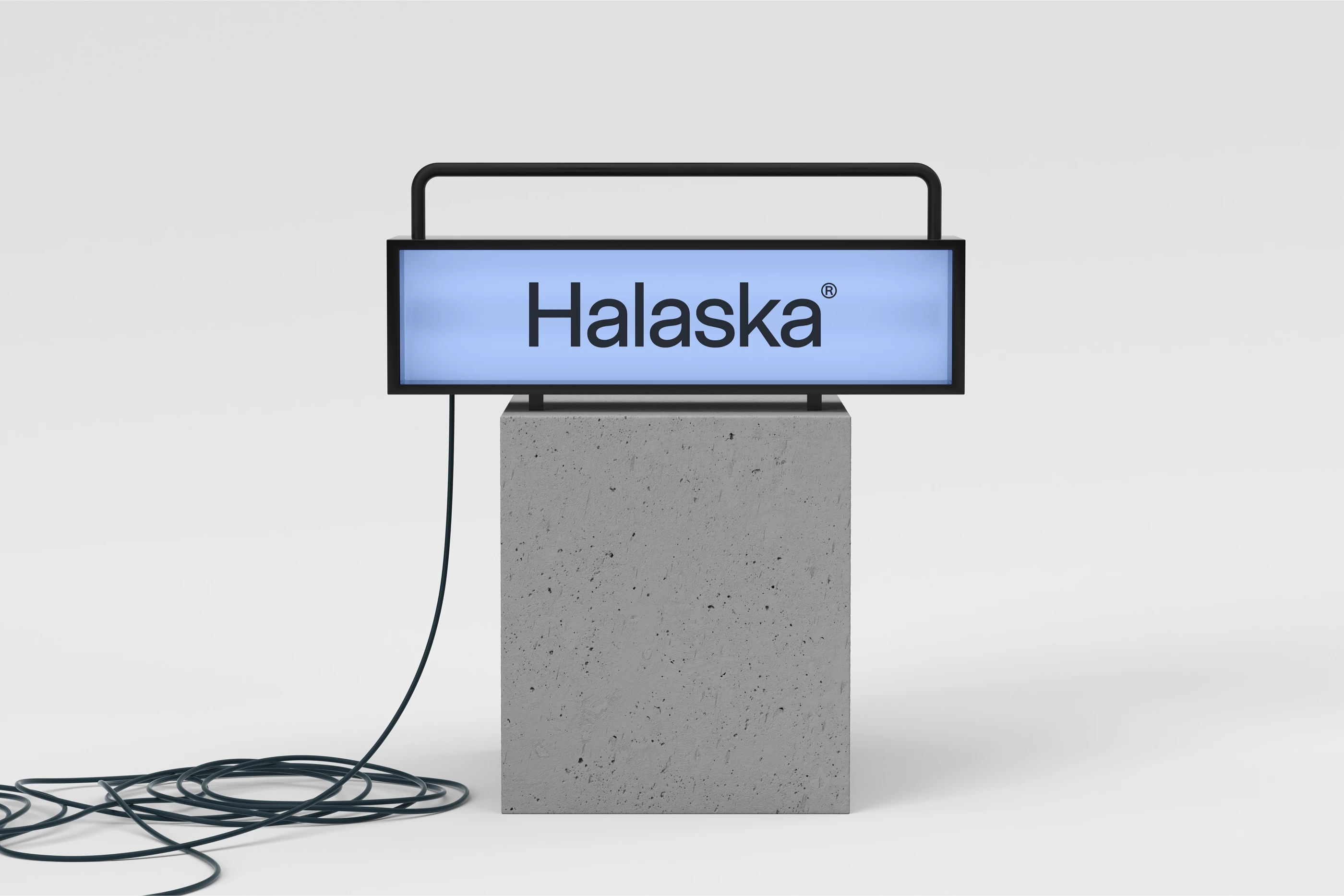
We started off by first narrowing down target audience and crafting the positioning statement based on that for internal clarity. We then worked towrads crafting a simple, timeless yet unqiue logo for the studio's face.


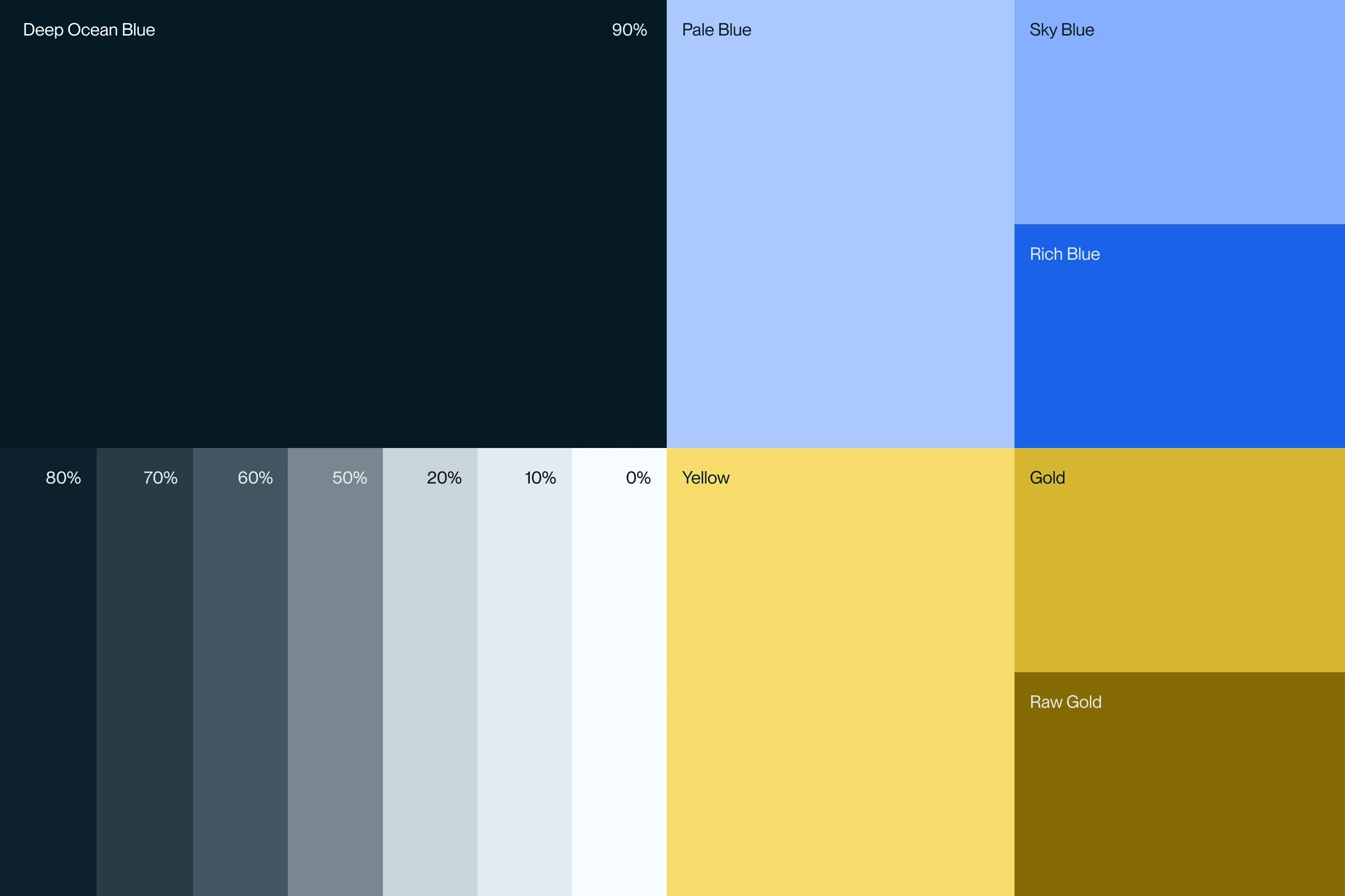
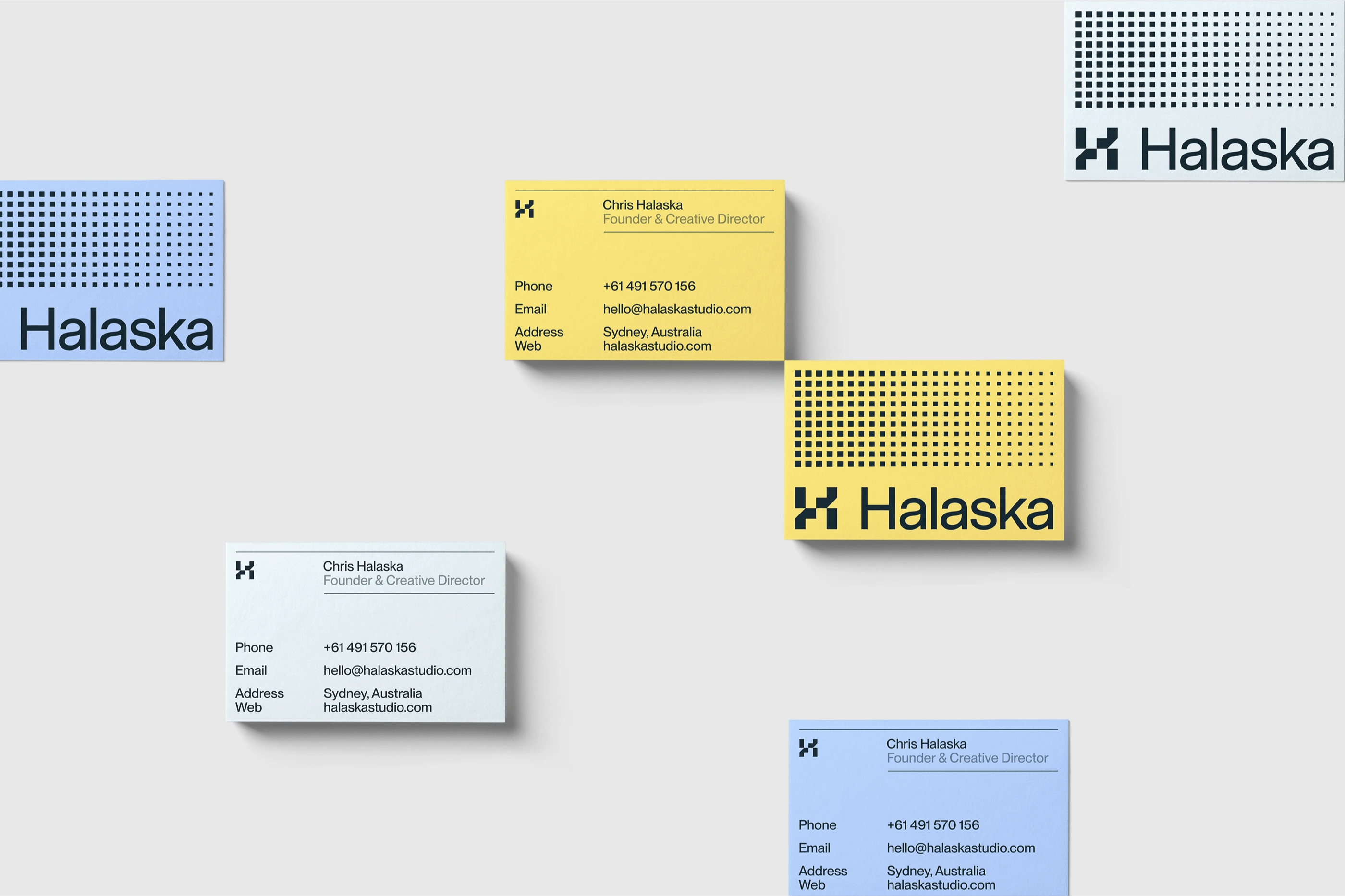
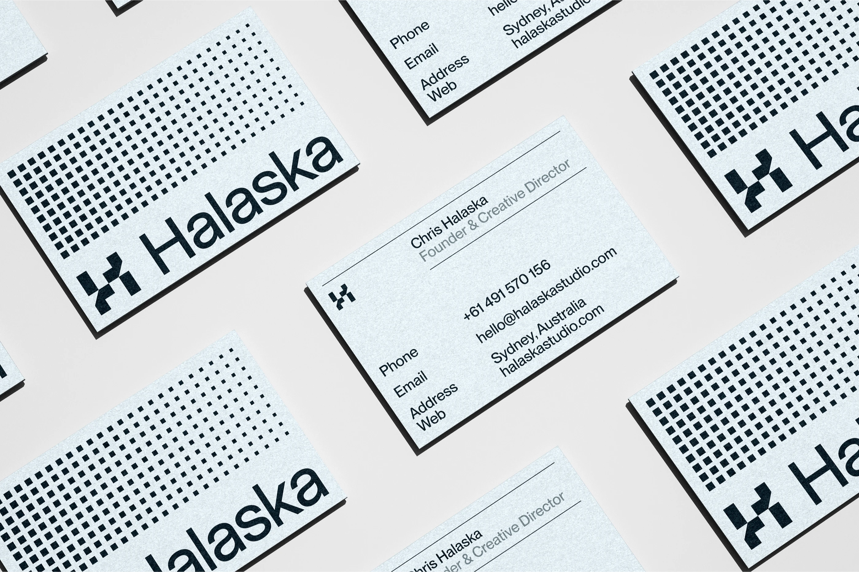
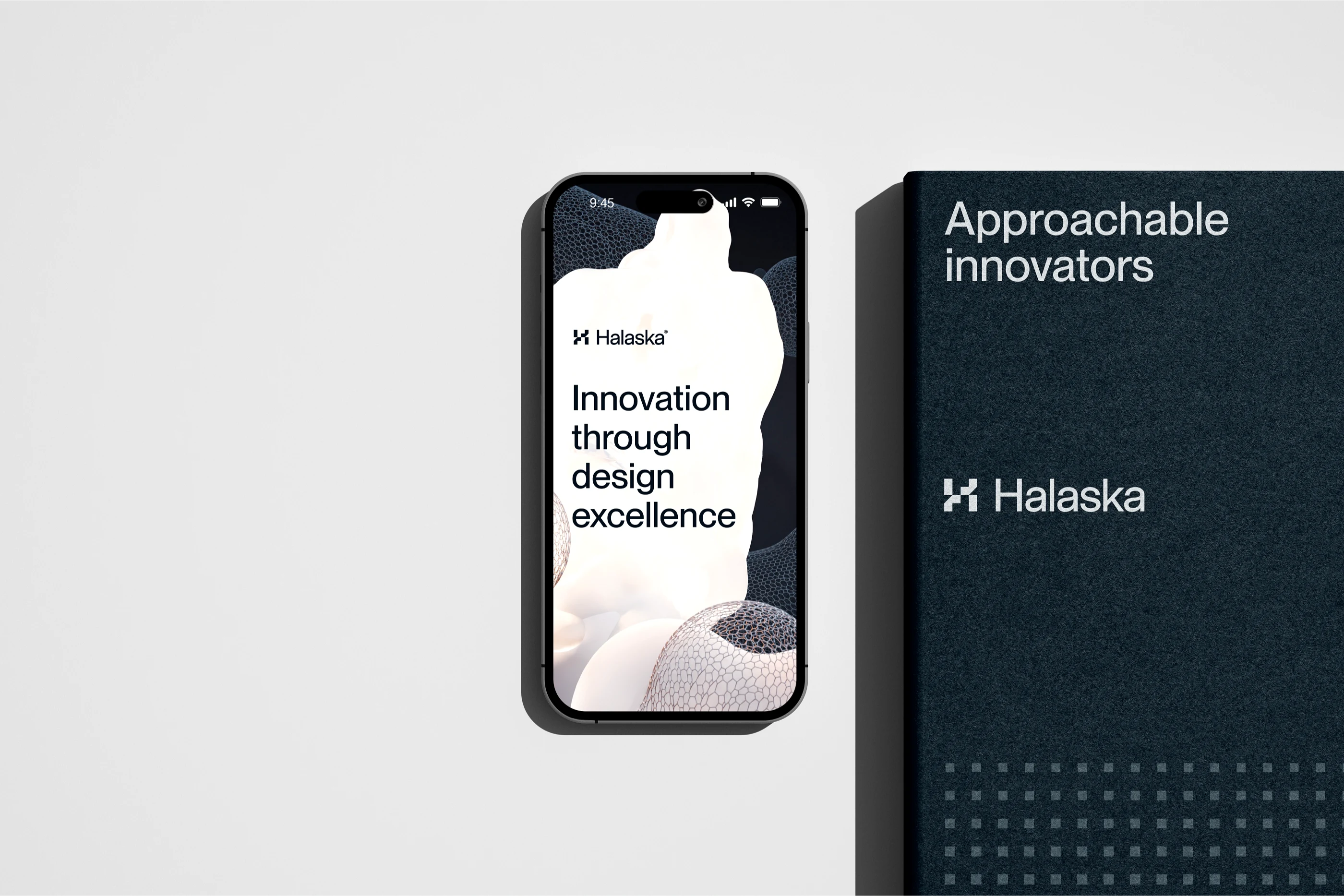
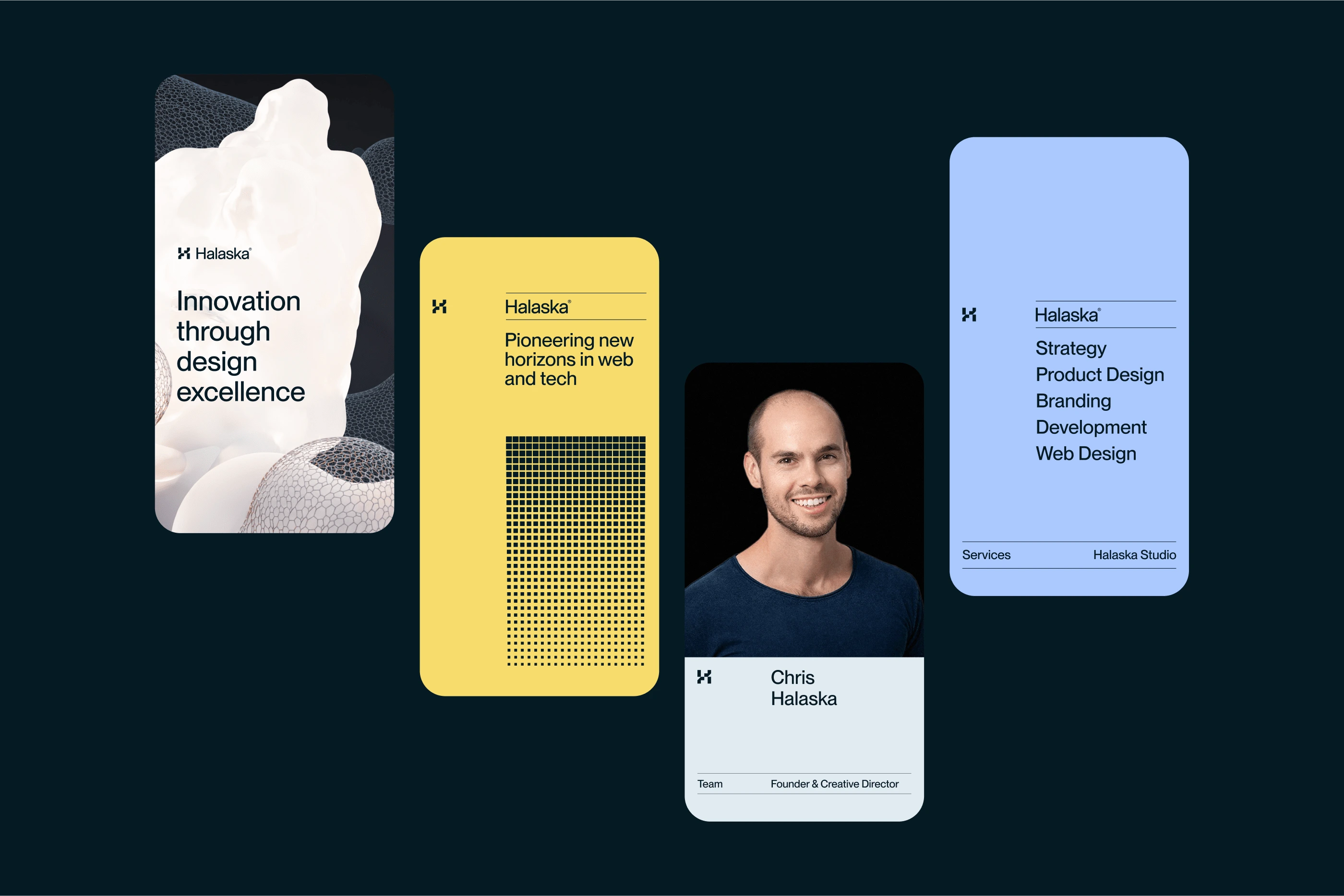
To communicate an innovative and cutting edge feeling we went for the color palette based on the ocean. For our primary dark color we went for deep sea blue paired with fresh, slightly desaturated blues and yellows to avoid visual fatigue.

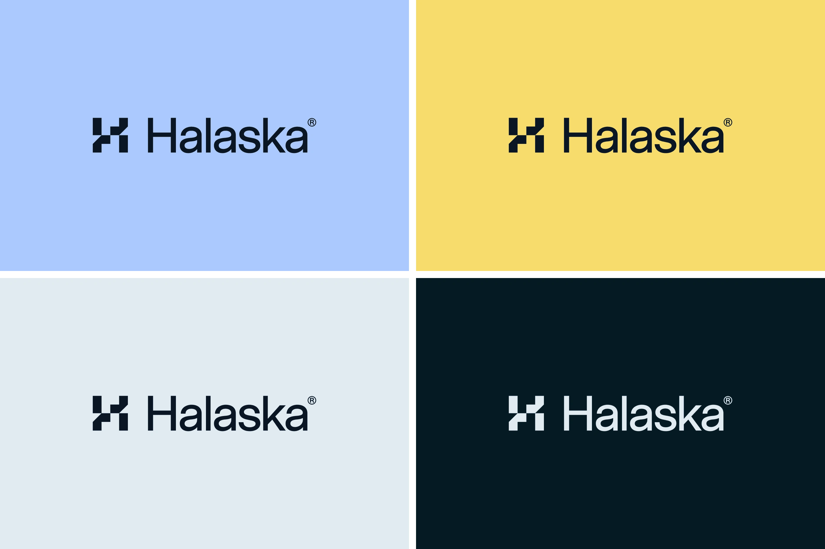
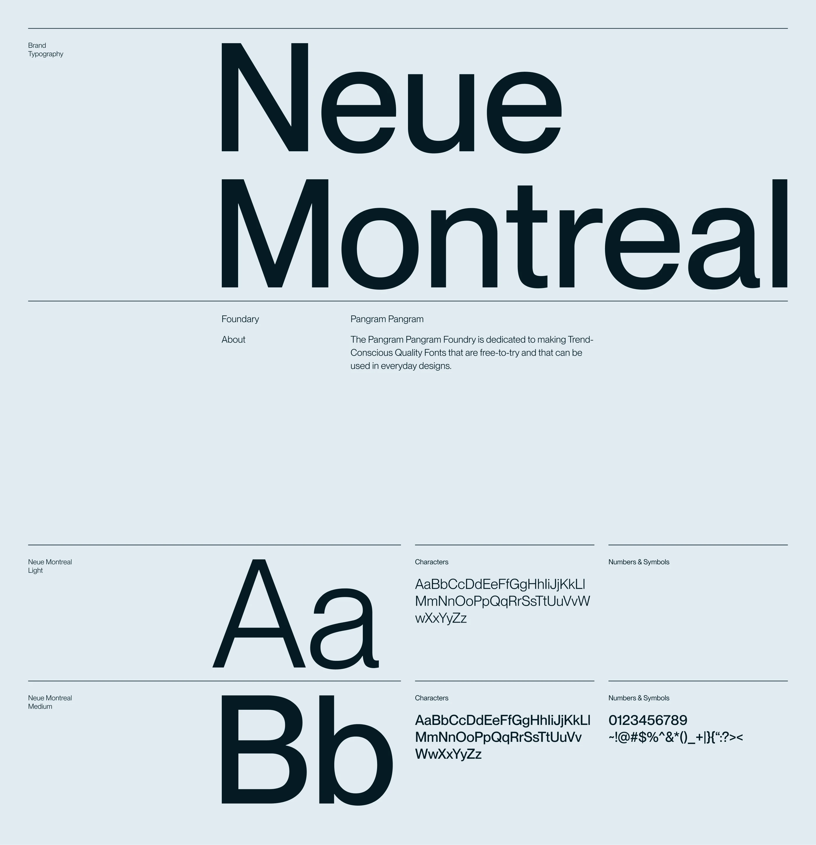
In terms of typography we wanted something that's timeless and stay relevant for decades to come. So to avoid the cliche of using outright Helevetica (which BTW we adore) we went for an equally outstanding yet fresh Neue Montreal by Pangram Pangram.


Thank You :)
Reach me out if:
You're struggling to attract the investors because your brand doesn't look professional.
You're looking for an identity that you don't have to update for decades to come
Your business is doing good and you feel it's time to look good as well
You're tired of DIYing and want a professional help
Like this project
Posted May 27, 2024
Halaska Studio is a digital design partner for web3 and AI businesses. Their moto is to do the right thing the right way, no bs involved.
Likes
8
Views
591
Clients
Halaska Studio

