Konica Minolta — Enterprise Website Redesign

Gianluca Boccia

UI Designer & Design System Owner · Figma
Status: Design delivered; website not yet published.
Making a complex offering easier to explore
Konica Minolta brings together printing technology, business solutions and services for different organizations. The design challenge was to give that breadth a clear structure while maintaining a recognizable enterprise brand.
My work covered the website interface and its design system foundations: page hierarchy, responsive layouts, navigation patterns and reusable components. This case study highlights selected screens from the delivered design work.
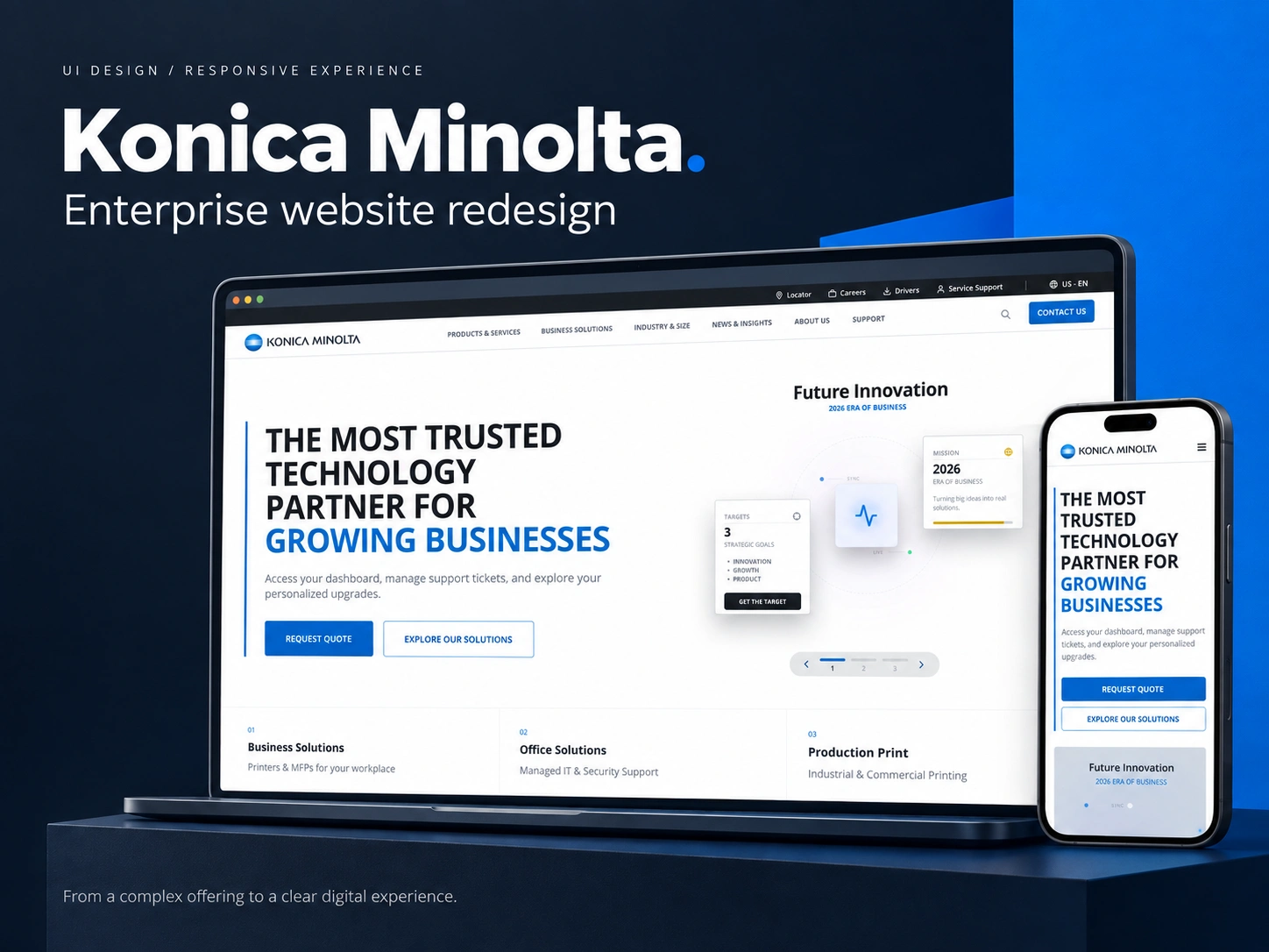
A homepage with a clear direction
The homepage brings the core proposition forward, then creates distinct entry points into services, solutions and supporting content. Strong typography, blue accents and deliberate spacing establish a consistent visual hierarchy across desktop and mobile.
The intention is to help visitors understand the offer and identify a relevant next step, while giving the business a flexible structure for presenting different types of content.
Navigation designed for breadth
The desktop mega menu groups products and services into scannable columns, with clear category headings and contextual links. On mobile, the same high-level structure becomes a focused, hierarchical drawer.
Products and services, business solutions, industries and support remain recognizable entry points across screen sizes. Utility actions such as drivers, locator and contact are kept within reach.
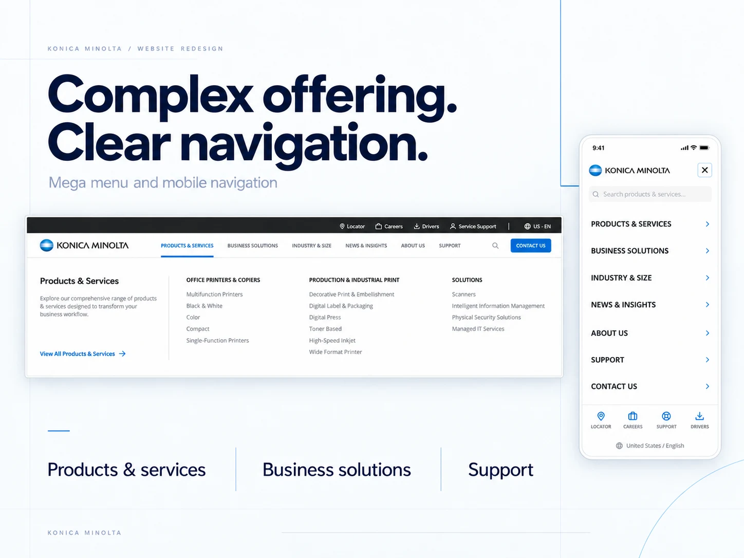
Desktop mega menu and mobile navigation — selected UI from the delivered redesign.
Support organized around tasks
The support interface begins with search and common queries, followed by three direct routes: finding a driver, booking a service call and checking ticket status.
This shifts the page structure toward what a visitor needs to do. The visual hierarchy separates these tasks clearly and gives each one a distinct entry point.
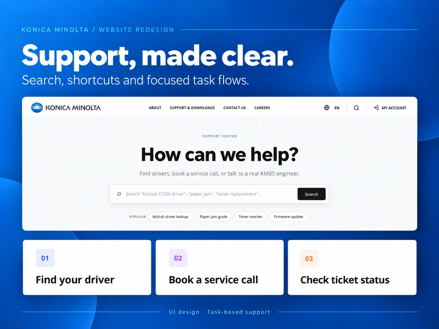
Support design — search and three focused entry points for common tasks.
Consistency through KOMI
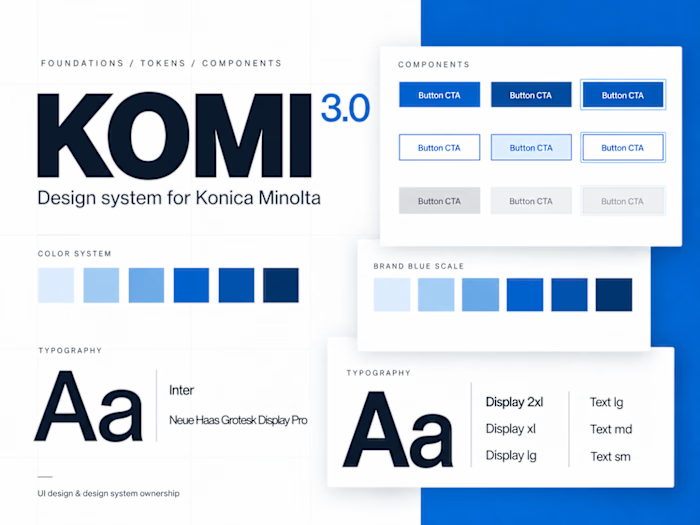
Alongside the website UI, I owned the evolution of KOMI, the design system supporting the work. Building on an existing base library, I created and extended variables, tokens and components for the project’s needs.
That work connected individual page decisions to reusable foundations, making typography, colors, spacing and interface patterns easier to maintain consistently.
Delivered design
The delivered Figma work includes desktop and mobile layouts, navigation variants, page designs and supporting components. The website has not yet been published, so this case study focuses on the design deliverables rather than post-launch performance.
Need a clearer enterprise website or a design system that supports it? Let’s talk about your project.
Like this project
Posted Sep 22, 2026
Enterprise website UI, responsive navigation and task-focused support, backed by KOMI design system ownership. Design delivered; not yet live.
Likes
0
Views
8
Clients
Konica Minolta