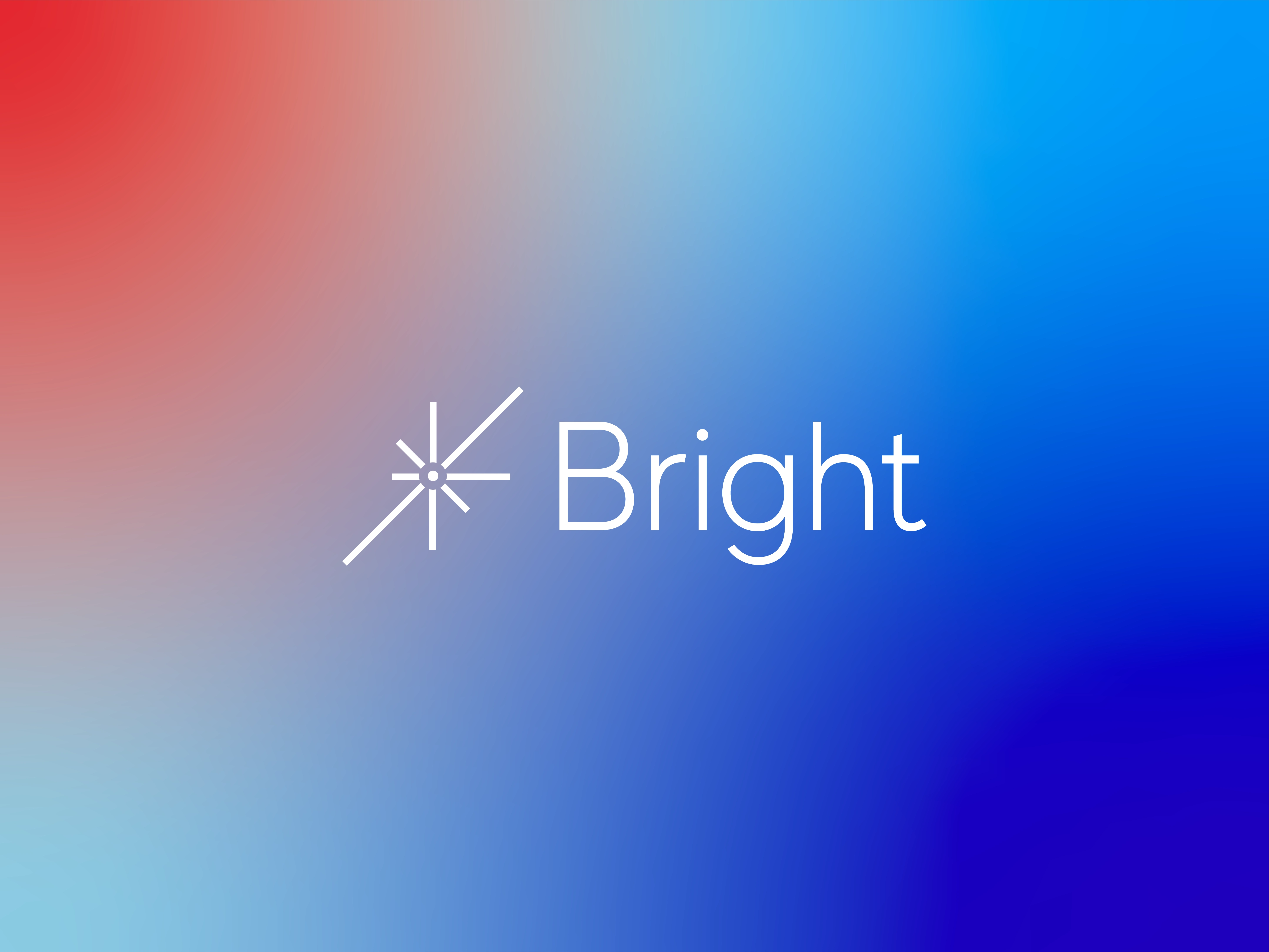
Brand Identity Design for Bright Logistics
Austyn McFadden
Overview:
Bright Logistics is a veteran-owned transportation company built on precision, discipline, and trust. In an industry crowded with noise and complexity, the goal was restraint. We focused on clarity over excess, designing a brand that reflects operational excellence and quiet confidence. Anchored by the simple, memorable name “Bright,” the identity emphasizes reliability, adaptability, and respect for process, mirroring the company’s commitment to safety, timeliness, and enduring partnerships.
A minimal symbol inspired by first light. Radiating lines reference sunrise, clarity, and forward motion.
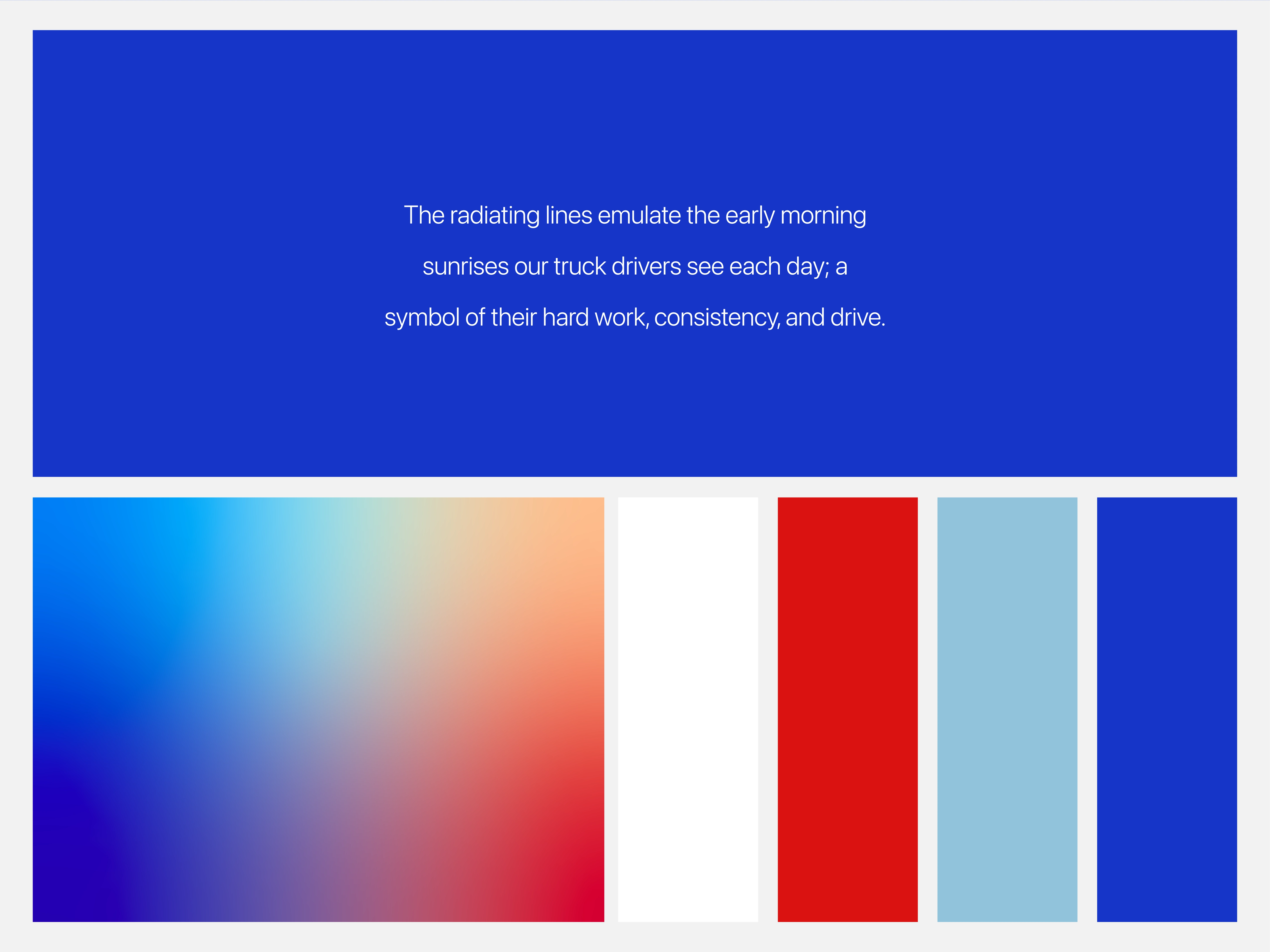
A restrained palette drawn from early mornings on the road, balancing calm blues with moments of warmth.
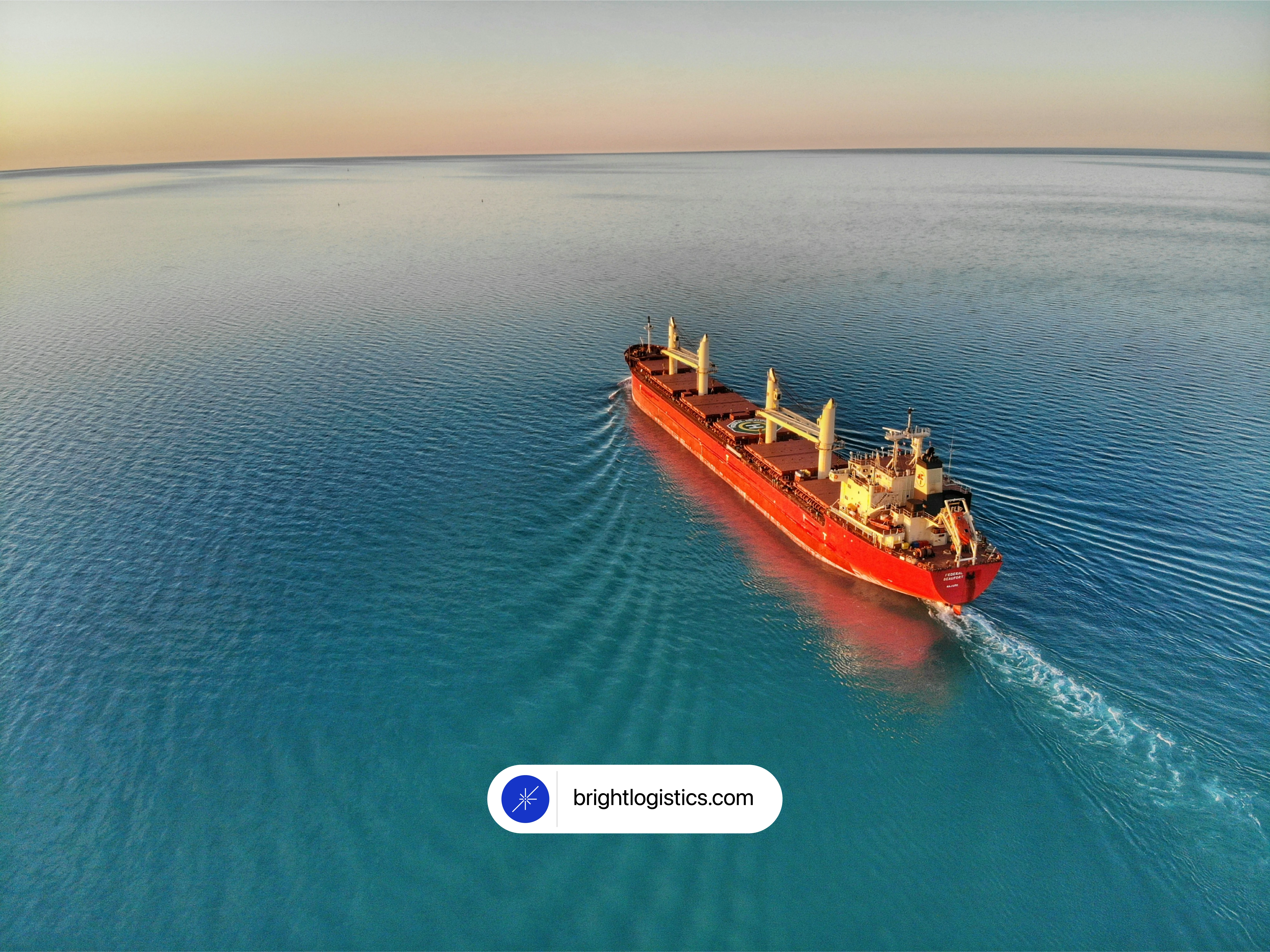
The brand in motion. Bright lives where work happens, across land and sea.
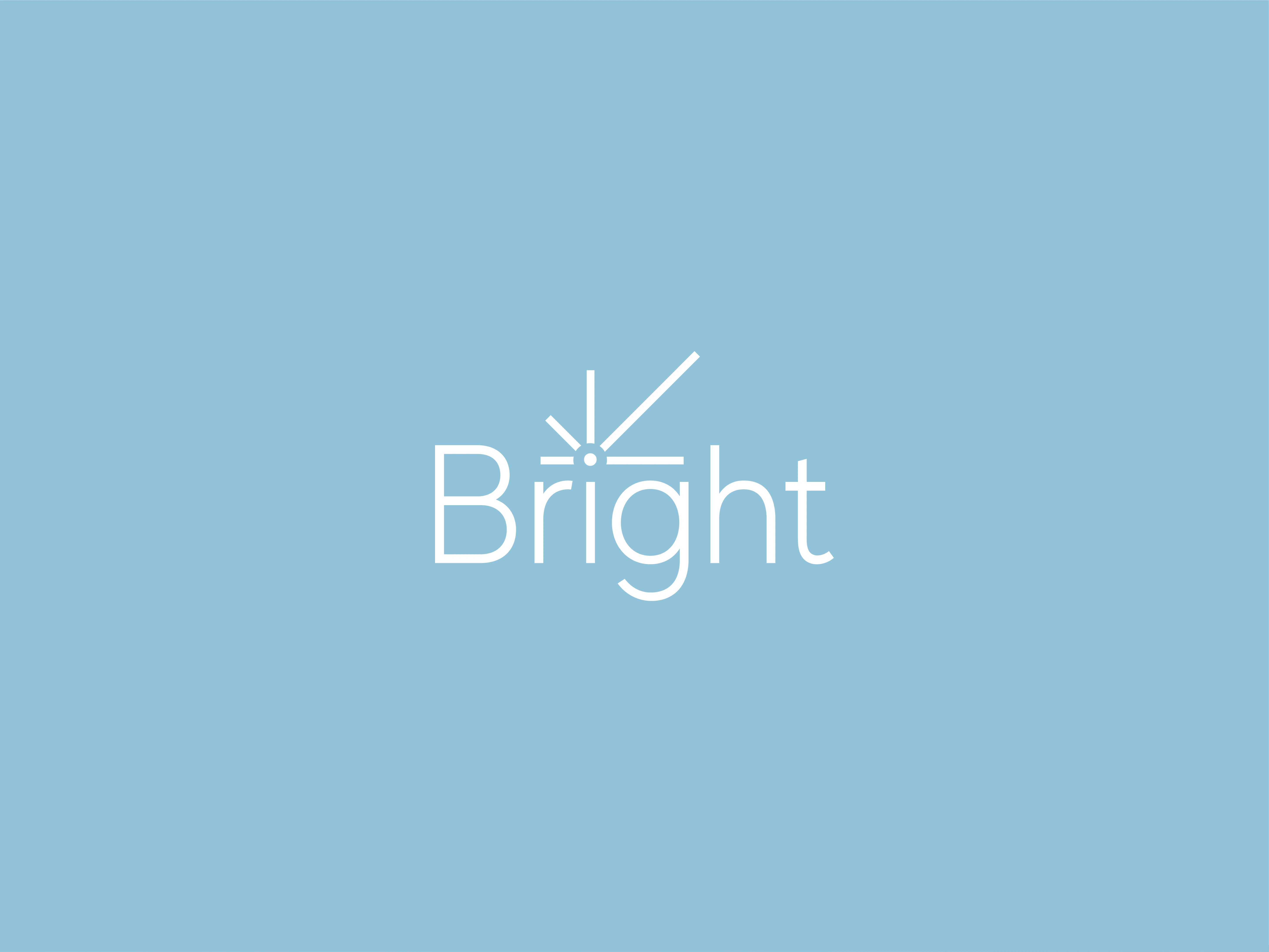
Simple typography paired with the mark to emphasize legibility, confidence, and recall.

“Every Morning Deserves a Bright Start.” A visual expression of consistency and quiet momentum.

The symbol distilled for digital use, designed to remain recognizable at any scale.
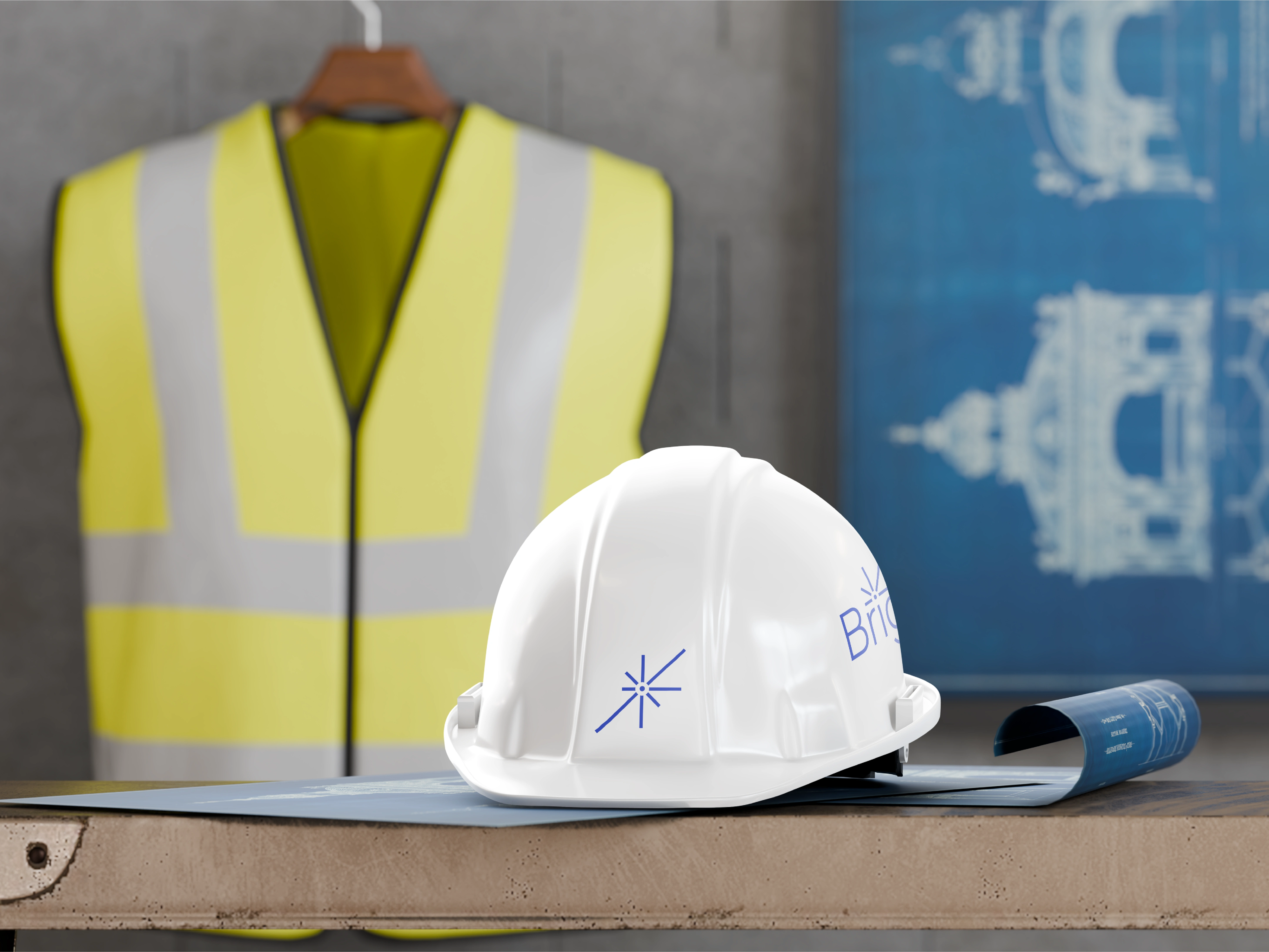
Safety gear and on-site materials reflect the same clarity and discipline as the core identity.
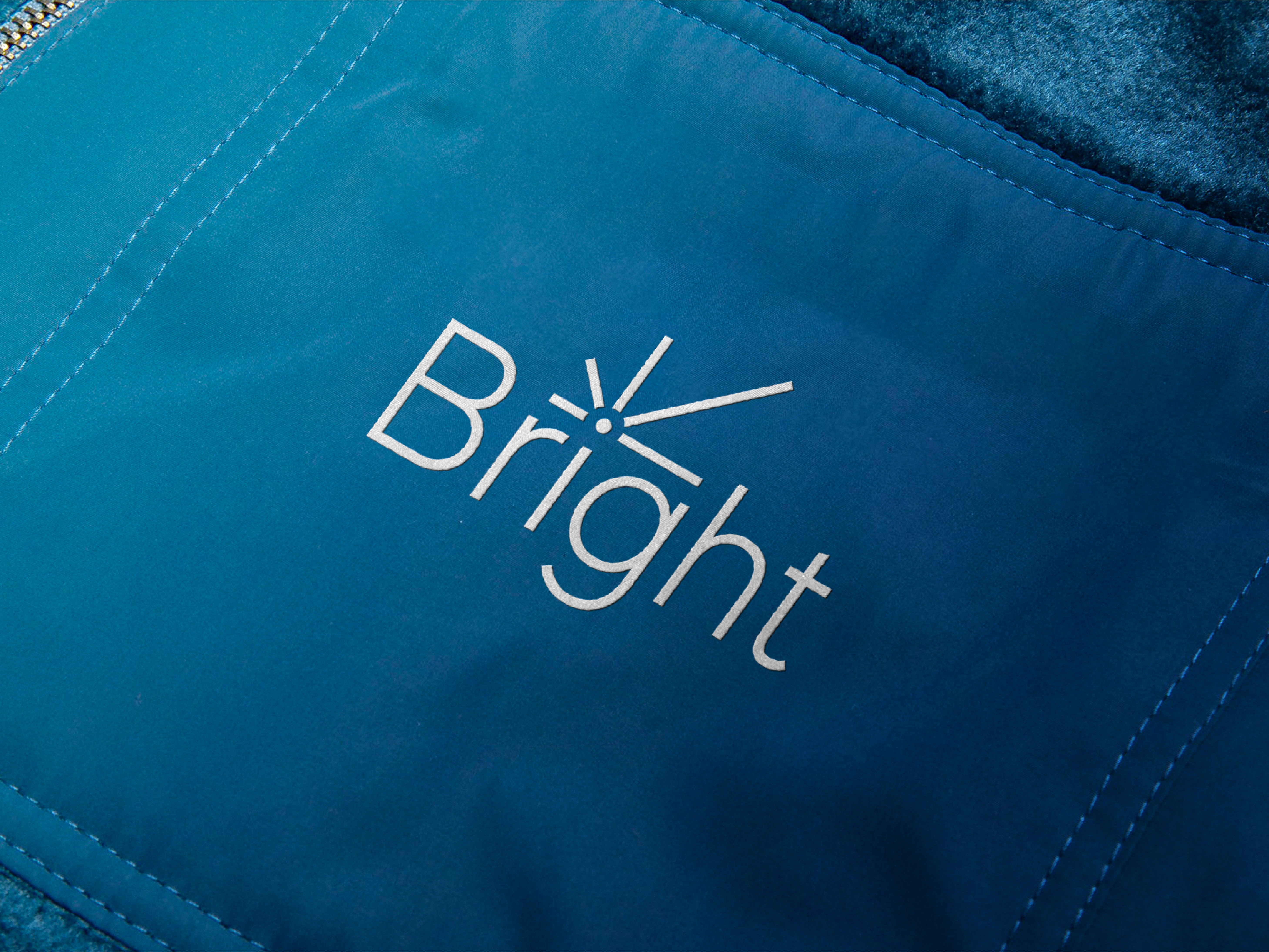
Embroidery and texture showcase how the brand holds up in real-world use.
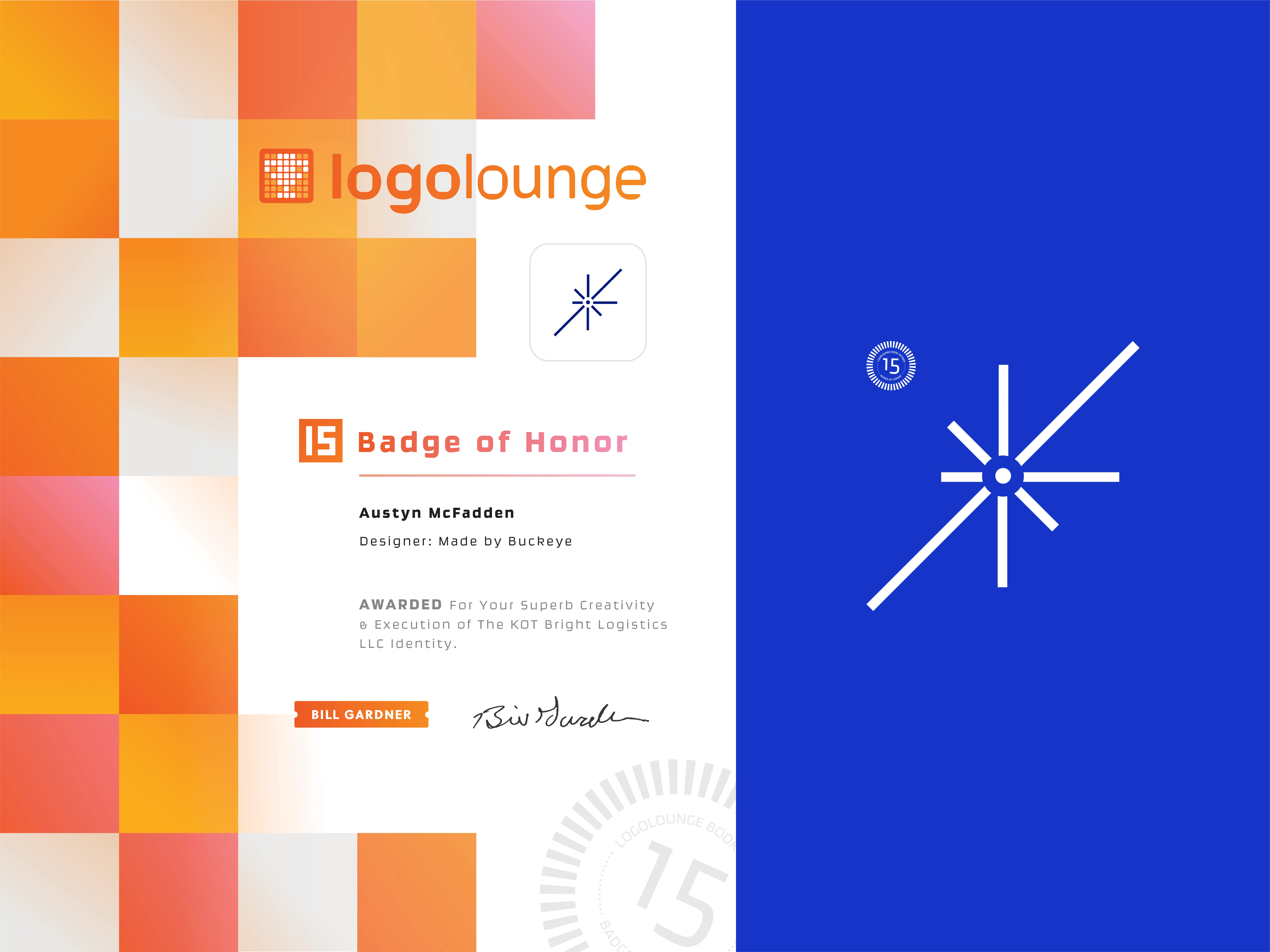
Awarded for creative execution and identity design for KOT Bright Logistics.
Like this project
Posted Jan 12, 2026
A restrained, sunrise-inspired identity for a veteran-owned logistics company, built around clarity, consistency, and forward momentum.
Likes
1
Views
9
Timeline
Jan 1, 2024 - Mar 1, 2024
Clients
Bright Logistics