Brand Identity and Packaging Design for Maneo Skincare
Austyn McFadden
Maneo came to us looking for a brand and packaging system that felt both clinical and approachable, something that could communicate science-backed skincare without feeling cold or overly medicinal. Designed for urban and suburban consumers seeking solutions for acne, aging, and hydration, the identity needed to balance credibility with simplicity.
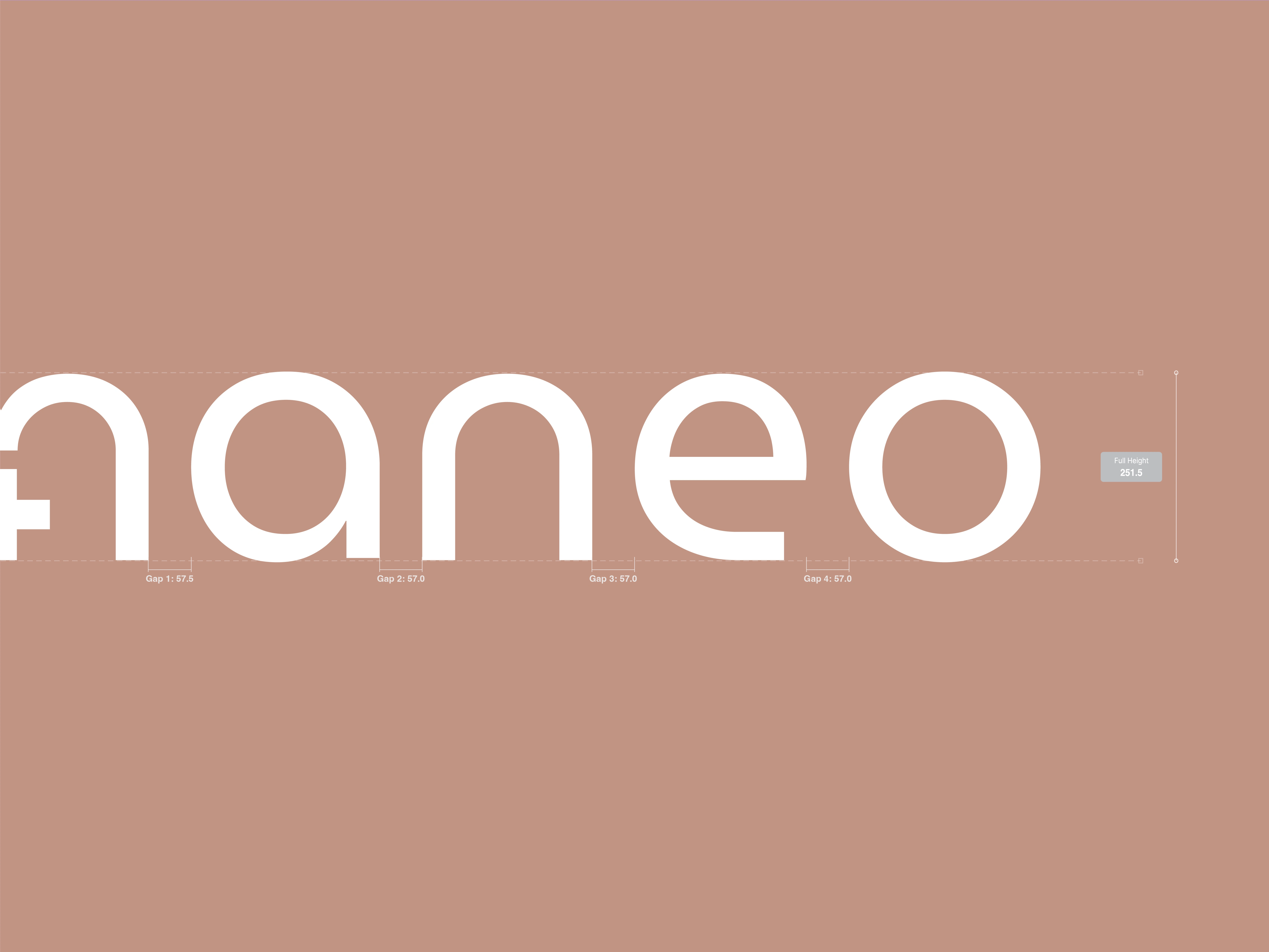
We built the brand around a refined, minimalist aesthetic. The logomark began with a modified lowercase “m” from Museo Moderno, subtly reshaped to incorporate a plus symbol in its center.
This small detail nods to the scientific foundation of the products while keeping the mark clean, modern, and approachable. Integrated directly into the maneo wordmark, it creates a unified system that adapts seamlessly across packaging and digital touchpoints.

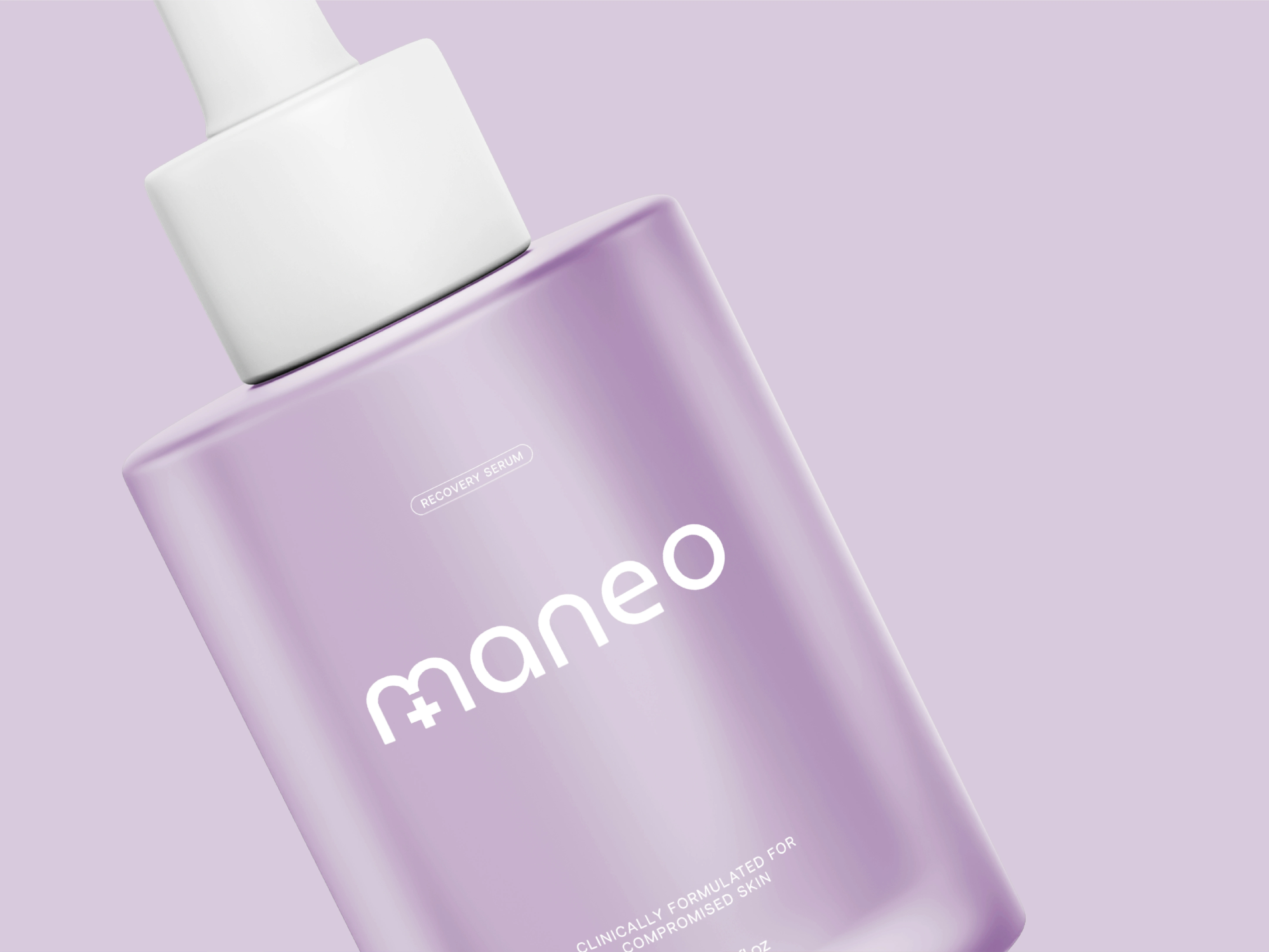
The packaging continues this balance of science and simplicity. Clean white bottles are paired with halftone graphic elements that symbolize gradual improvement, reflecting the realistic, progressive nature of skincare results.
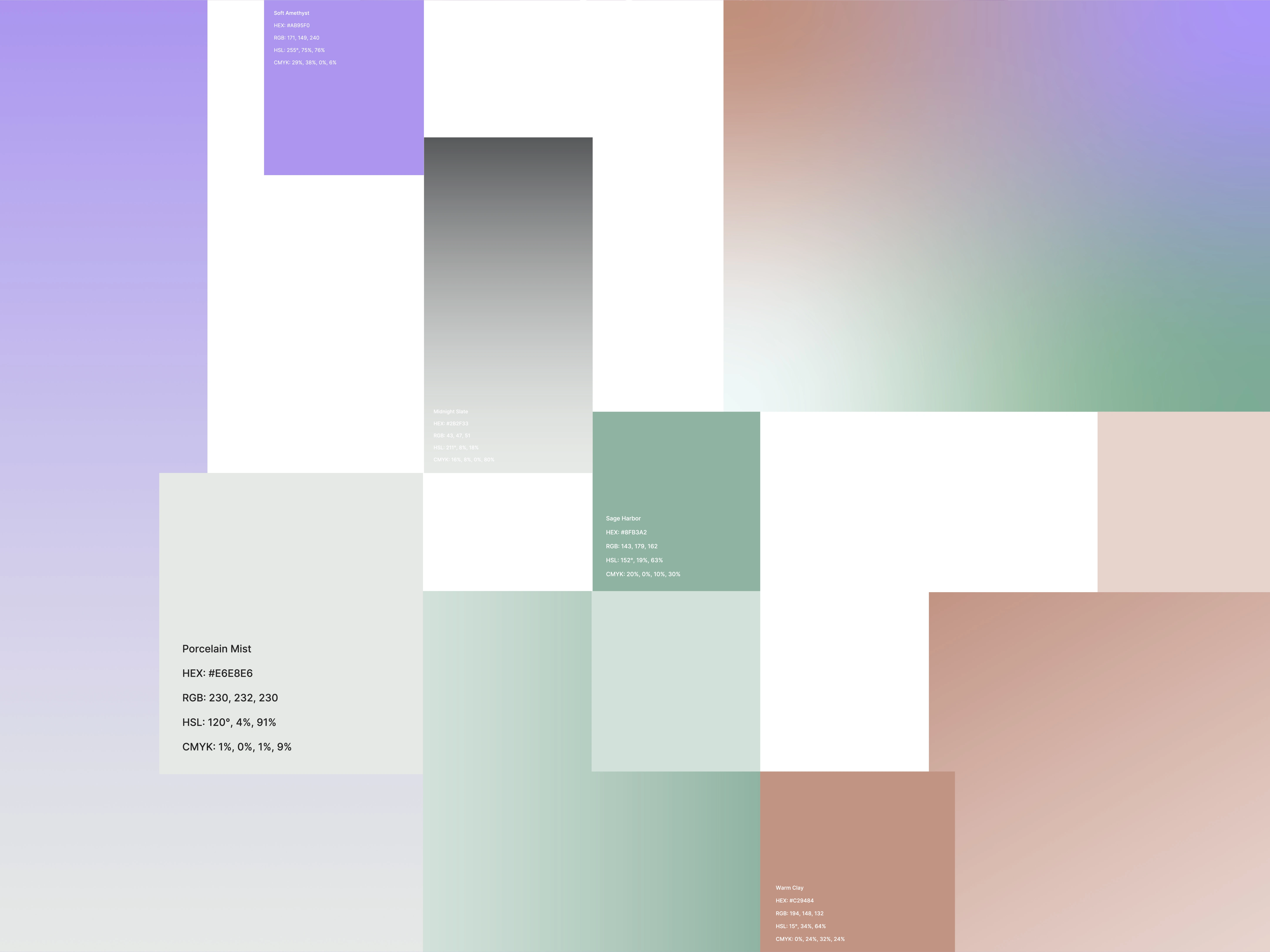
Color plays a key role in distinguishing each product line while maintaining cohesion across the range: mint green for acne treatment, soft lavender for aging solutions, and cool blue for hydration. Together, these subtle shifts in tone create clear differentiation without disrupting the overall minimal identity.
The final system positions Maneo as modern, trustworthy, and quietly confident.
By combining clinical cues with approachable design choices, the brand stands out in a crowded skincare market while resonating with a broad audience across genders.

Like this project
Posted Feb 13, 2026
Designed a scientific yet approachable brand identity and packaging for Maneo, blending clinical credibility with modern design and product clarity.
Likes
1
Views
7
Clients
Maneo