How I Organize My Work in Figma: 5 Best Practices I Use

Anna Podrez


How I Organize My Work in Figma
This case study is a step-by-step look at how I work in Figma: project structure, libraries, file organization, prototyping and developer handoff. It shows how I use auto layout, variables, components and statuses in daily work, so your team always knows where things are and what state they’re in.
1. Project & file setup
Every engagement starts with a clean project structure. I create the project in your Figma workspace, so ownership and admin rights always stay on your side.
Inside the project, work is split into separate files so nothing gets mixed up: product design, the component library, marketing assets and an archive for anything retired. Every file gets a cover with its name and purpose, so you can see from the file grid how the whole project is organized, without opening anything.
The structure scales with the project. A small MVP may start with just two files (design and library), while a larger product grows into separate files per platform or product area.
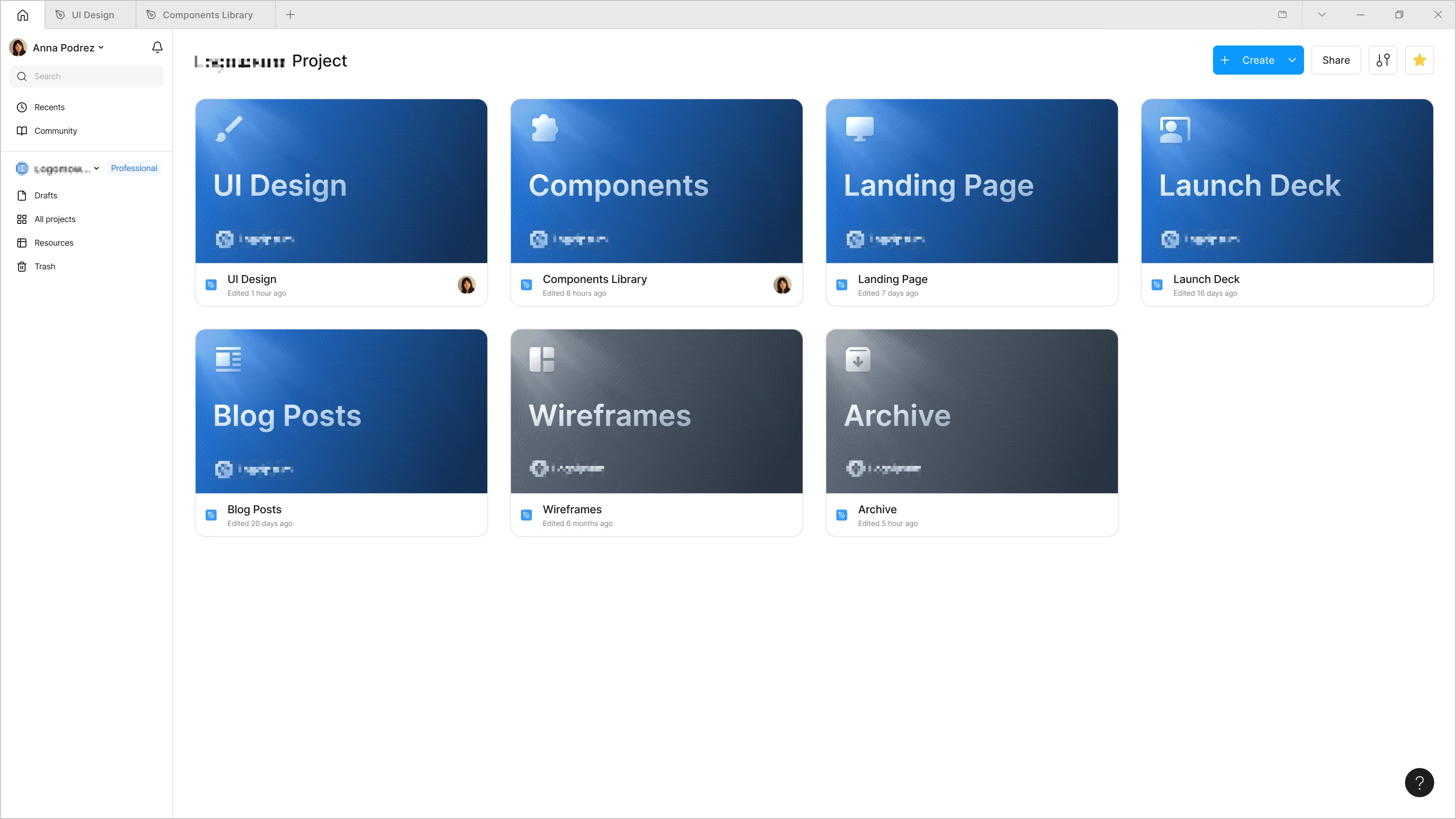
The project view: one file per purpose; covers make each file recognizable at a glance.
2. Component library
The component library lives in its own file, separate from the screens. This is deliberate. It keeps design files light and fast, makes the library reusable across projects, and, most importantly, enables sync. Every design file is connected to the same library, so when I update a component once, the change reaches every screen that uses it.
Two ways to start a library
Option A: ready-made library. I start from a proven UI kit and adapt it to your brand: colors, typography and overall visual style. The fastest way to a working product. Best for MVPs, tight timelines and standard patterns.
Option B: custom library. I design the system from scratch around your brand and product logic, with every component made for your use cases. Best for strong brands, complex products, and long-term work.
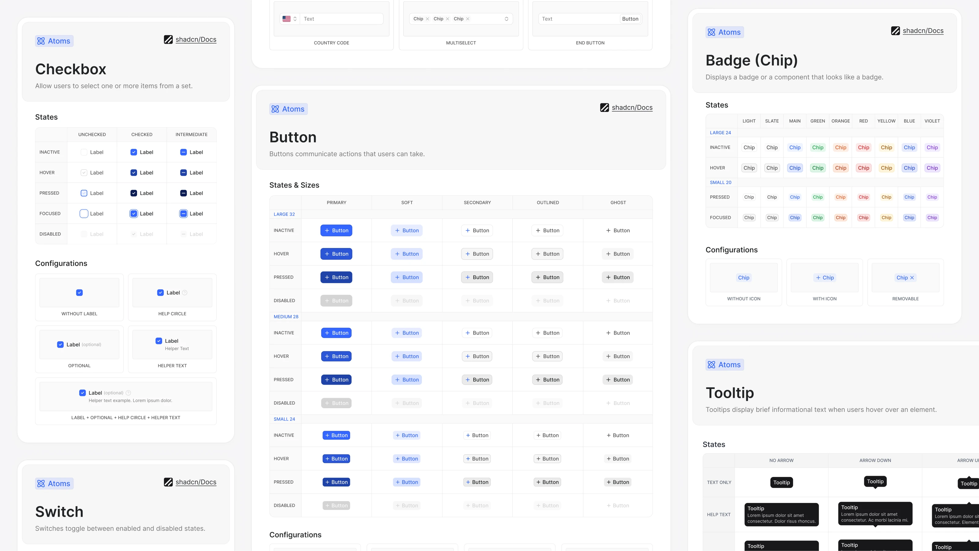
Inside the library: component sheets with every state, size and configuration.
What the library is built from
• Variables: colors, spacing and corner radius values live as tokens (including light/dark themes), paired with a full type scale applied consistently on every screen.
• Text styles: a full type scale (headings, body, captions) applied consistently on every screen.
• Reusable components: buttons, inputs, cards and navigation are defined once with variants & slots, so every state is covered and inner content can be swapped without detaching from the library.
• Auto layout: every component is responsive, so when content changes, the layout adapts without manual fixes.
Variables
No value is ever typed by hand, because each fill, text style, gap and corner radius references a token. That is what makes a finished screen switchable: light and dark are two modes of the same set, so the whole theme, or just the accent color, changes in one click
A finished screen with no hard-coded values: theme and accent colors switch in one click.
That table is the single source of truth for the whole product, and variable names match the code's design tokens 1:1, giving design and development a shared language. Because every screen pulls from the same place, values can't drift apart from screen to screen: change a token once and everything using it updates.
The variable table: every token in the product, and the structure behind it.
Reusable components
Every recurring element (buttons, inputs, cards, navigation) lives in the library as a component. A component is defined once, with variants for every state and size, and used across screens as instances that stay connected to the source. When a component changes, every instance in every file picks up the update.
One edit to the main card component instantly updates every instance of it across the file.
Auto layout & responsive design
Every component and screen is built with auto layout, Figma's equivalent of how developers actually build UI. When text gets longer or an element is added, the card resizes itself: nothing overlaps and nothing needs manual realignment.
*Example 1: narrowing the card. Without auto layout the content breaks out of the frame.*
Auto layout also speeds up work on mobile versions. With properly configured auto layout, a row of cards reflows onto the next line by itself and spacing holds at any frame width.
*Example 2 - the same auto layout rules turn the desktop layout into the mobile one.*
3. Organizing work in a file
In any project I work on, the page list reads like a table of contents. Three conventions make that work:
Page names. Each major part of the product gets its own page, usually mirroring the product’s sidebar or navigation.
Flow organization. Each flow is its own named section, with screens laid out left-to-right in the order the user goes through them, and edge cases in rows below.
Per-screen labels & statuses. Every screen carries its own name and a status badge above it, so the state of a whole flow is readable at a glance.
Inside a file: pages mirror the product’s navigation; each flow is a section with statuses per screen.
4. Prototyping
I test flows before they’re built. Screens are wired into clickable prototypes right in the design file, so stakeholders click through a flow instead of imagining it, and usability issues surface before a line of code is written.
*Figma prototype: screens wired into a clickable flow, right in the file.*
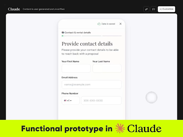
For complex logic I build a working prototype in code with Claude, connected to the same component library, so it runs on the same tokens and components. It serves as a realistic build for user testing, and can become a head start for the real frontend.
More on this in my case study: How I Use AI in UX/UI Design: 7 Real Workflows.
5. Developer handoff
A handed-off file should answer questions, not create them. Before anything is marked ready:
• Layers get clean, semantic names. No “Frame 427”.
• All sizes, padding and gaps come from the spacing scale, so the Inspect panel shows real, systematic values.
• Colors and themes are variables that map 1:1 to code tokens (light/dark included).
• Annotations next to the screen explain edge cases, states and logic wherever behavior isn't obvious from the design itself.
• Only screens marked Ready for Dev go into development, so there’s no guessing what’s final.
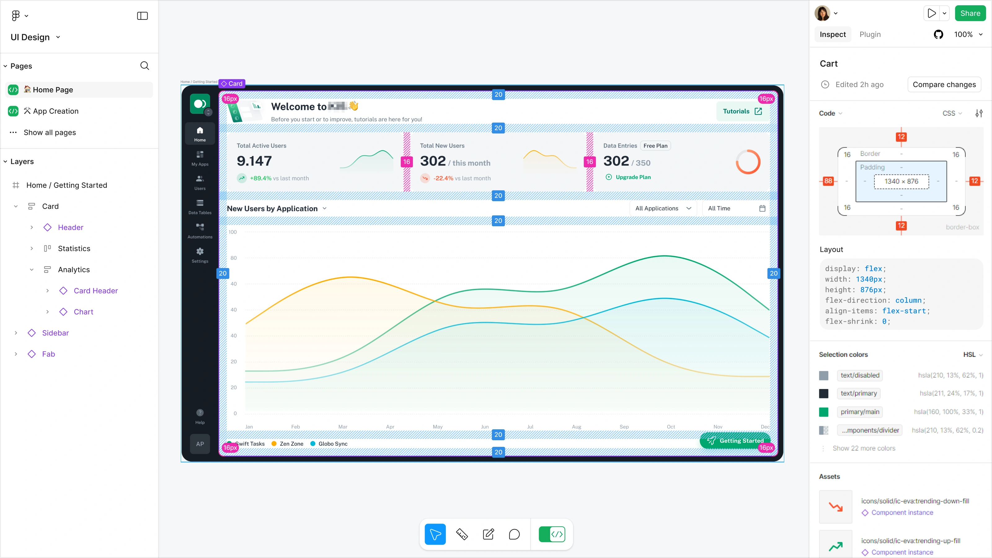
Development-ready design in Figma
Additionally, I added an AI audit to my handoff step as soon as Figma shipped it, and it earned its place fast. It is a second pair of eyes on what is easy to miss after hours in the same file: layer names, resizing behavior, a style or variable that slipped through in one or two places, leftover hidden layers, placeholder copy. None of it is dramatic on its own, but taken together it is the difference between a file that reads clearly and one that needs a call.
Summary
You own the files and always see the real project state. One component library keeps every screen consistent and speeds up new ones. Statuses make progress visible without meetings, flows are tested as prototypes before development, and developers receive clean, annotated, token-based files.
👉 Have a project in mind?
I can provide a FREE UX/UI audit of your project and estimate the timeline and budget based on that.
📩 Just send me a quick message and I’ll provide an initial consultation.
Thank you for reading 🤘
Like this project
Posted Sep 29, 2026
This case study is a step-by-step look at how I work in Figma: project structure, libraries, file organization, prototyping and developer handoff.
Likes
3
Views
24