Fleet Management Platform Design using Ant Design React UI
Anna Podrez
Verified
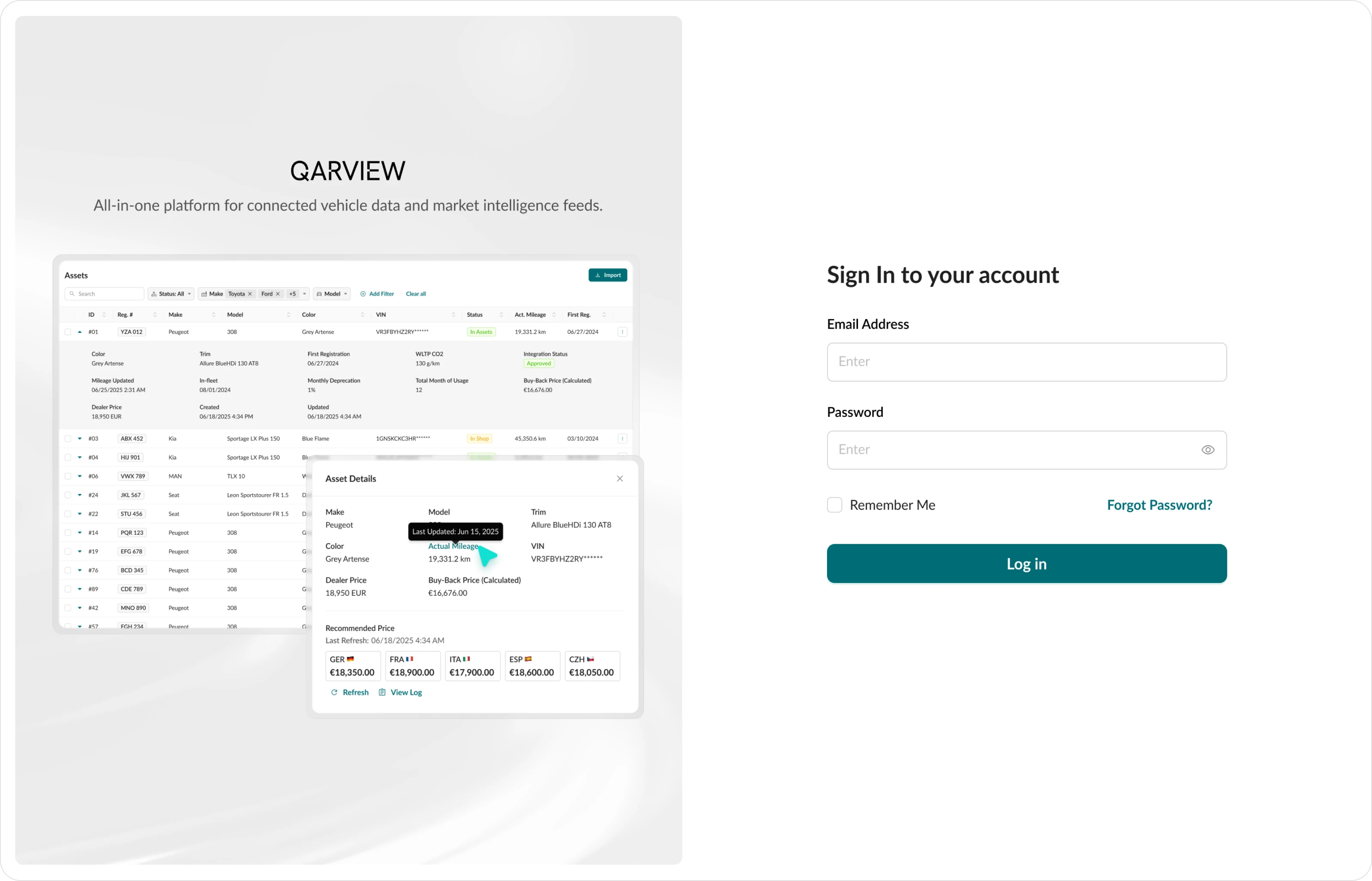
QarView is a SaaS platform for fleet asset management where fleet owners can track the full lifecycle of a vehicle in real time — from in-fleet and operations to de-fleet and remarketing .
Industry: Automotive, SaaS Web Application, B2B, Data analytics
Project Type: Product Design
Timeline: 3 Months
Contribution: Research, Design Review, UX, UI, Design Library
🤔 Problems:
1. The demo version had overloaded logic and confusing navigation, which reduced work efficiency. Even basic actions, such as adding vehicles or creating orders, caused difficulties for users.
2. The product did not have a well-designed filtering system, so managers spent a lot of time searching for information. Also, working with data was difficult because of poorly designed tables with long horizontal scrolling and no ability to quickly sort assets by needed parameters.
3. Platform sections existed separately and did not provide logical transitions. The system did not give hints about next steps and did not connect data between sections.
🎯 Tasks:
1. Create a unified filtering pattern for the whole interface. Think through different filter options and make them clear, so users can see active parameters even when there are many of them.
2. Improve interaction with tables.
3. Improve flows so the system becomes more connected and intuitive.
4. Follow Ant Design library guidelines to speed up development and reduce costs. Custom solutions are allowed only when standard components are not enough for good UX.
Onboarding
Before starting the project, the client provided user flows as diagrams, role descriptions, and user stories for each section of the platform. This made it much easier to understand the task and reduced the time needed for estimation.
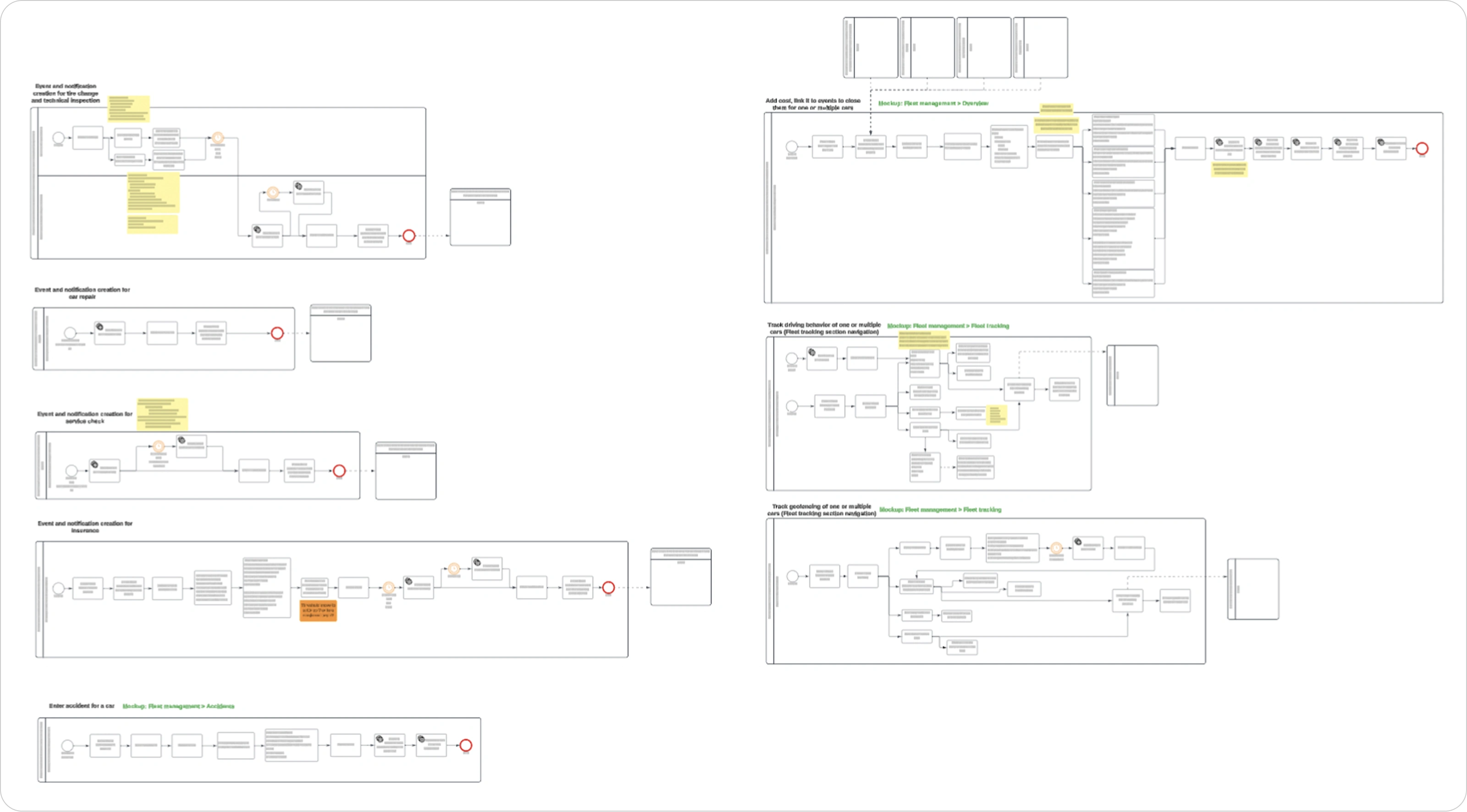
Based on this information, an estimate and project roadmap were created:
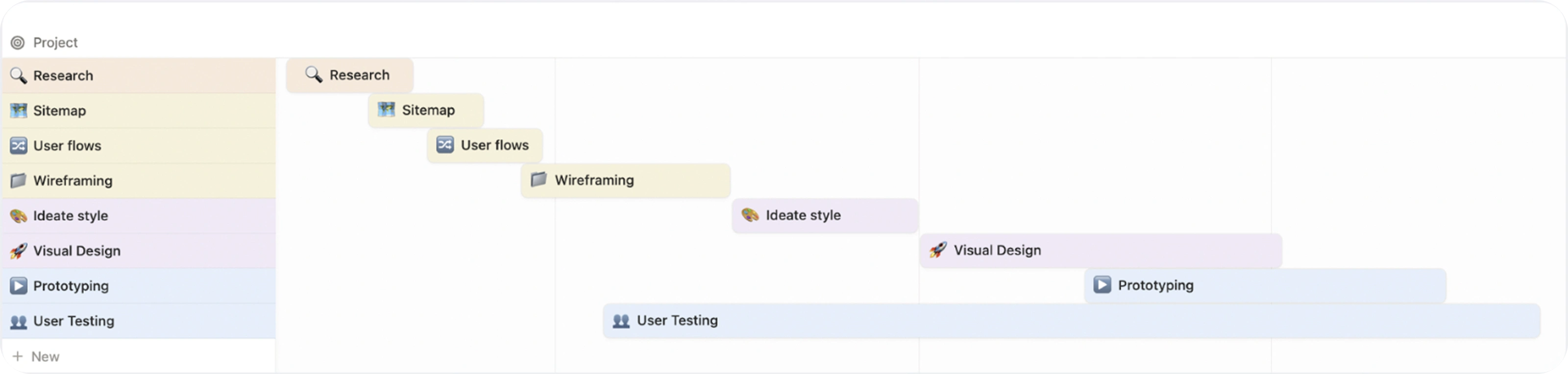
Research
After understanding product requirements and details, it was necessary to set it all up before starting the design part. This included creating a sitemap, doing a design review, and analyzing how competitor platforms work.
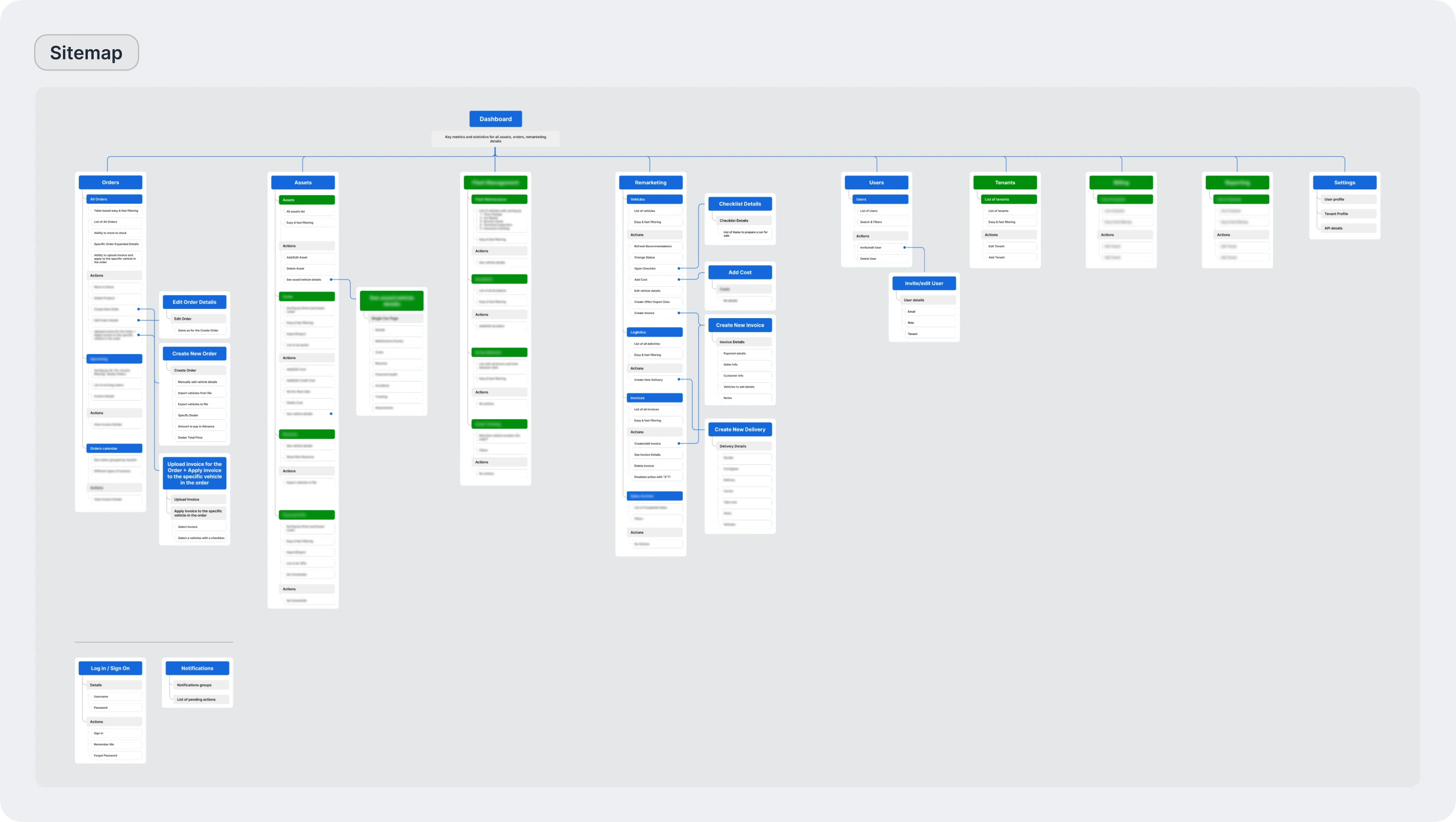
Sitemap
To clearly show connections between sections and confirm the functionality of the current iteration, a sitemap was created. It shows the product structure and helps design logical navigation and define content for each section.
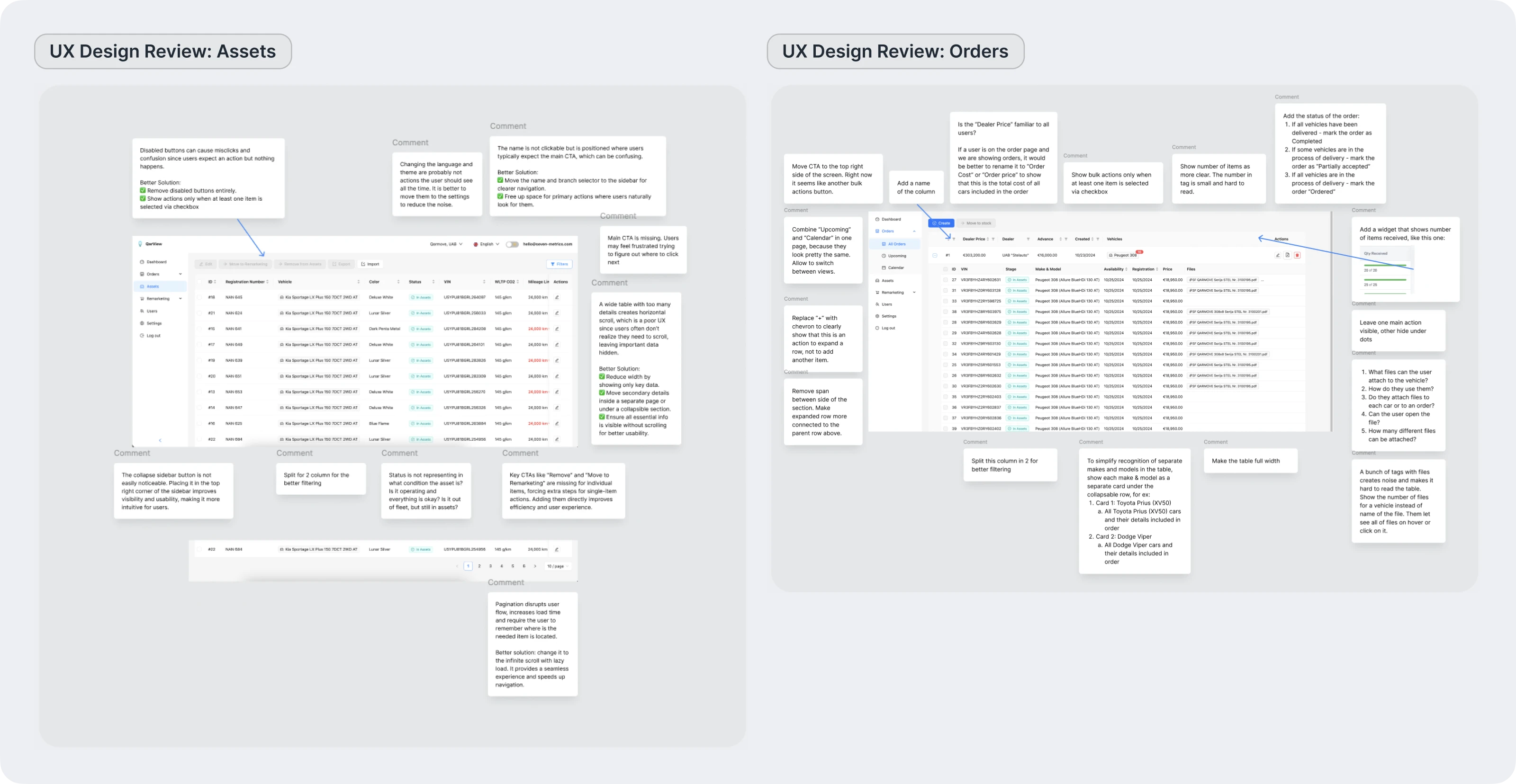
Design review
Next, a design review of the main sections of the demo version was done. This helped find critical UX issues and define ways to improve them.
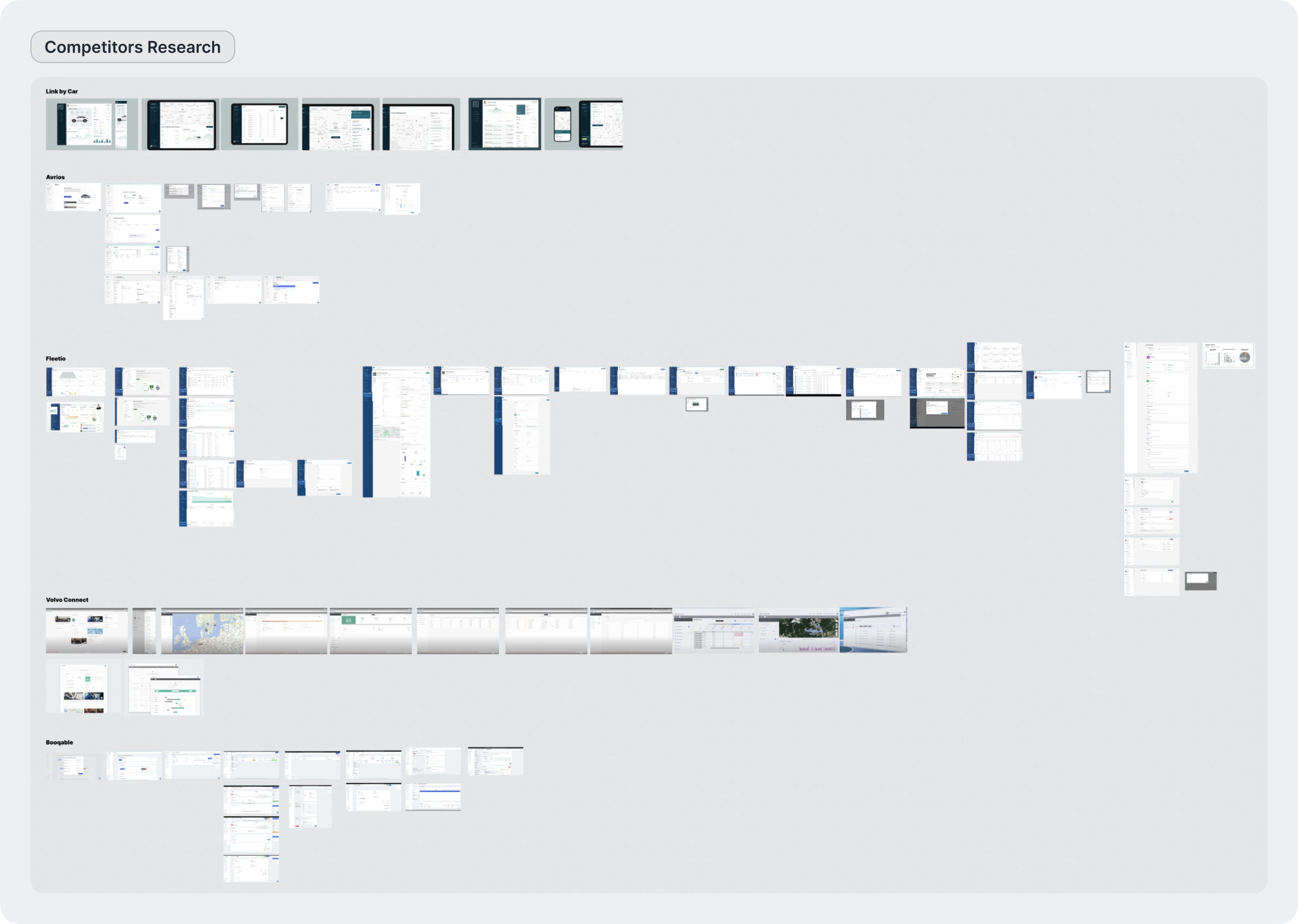
Competitors Research
Competitor analysis helped to see common solutions used in the automotive industry. It also helped find functional mistakes and choose the best approaches to use in the fleet management platform.
Defining Design Concept
The process started with creating several UI options to agree on the overall visual direction with the client and build a base for further work.
The main goal was to create a workspace where managers can spend many hours working with tables and data.
Key UX and UI decisions:
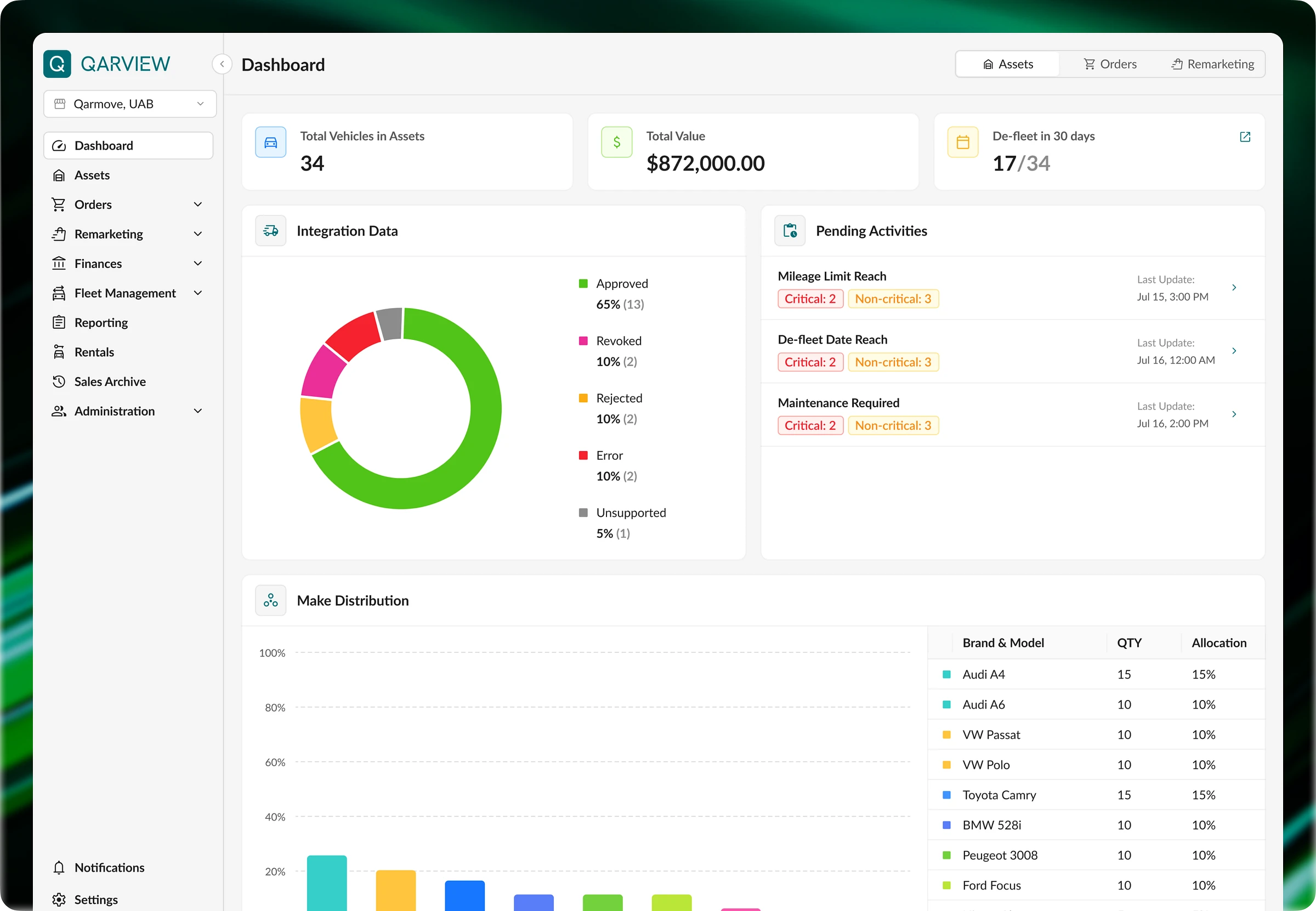
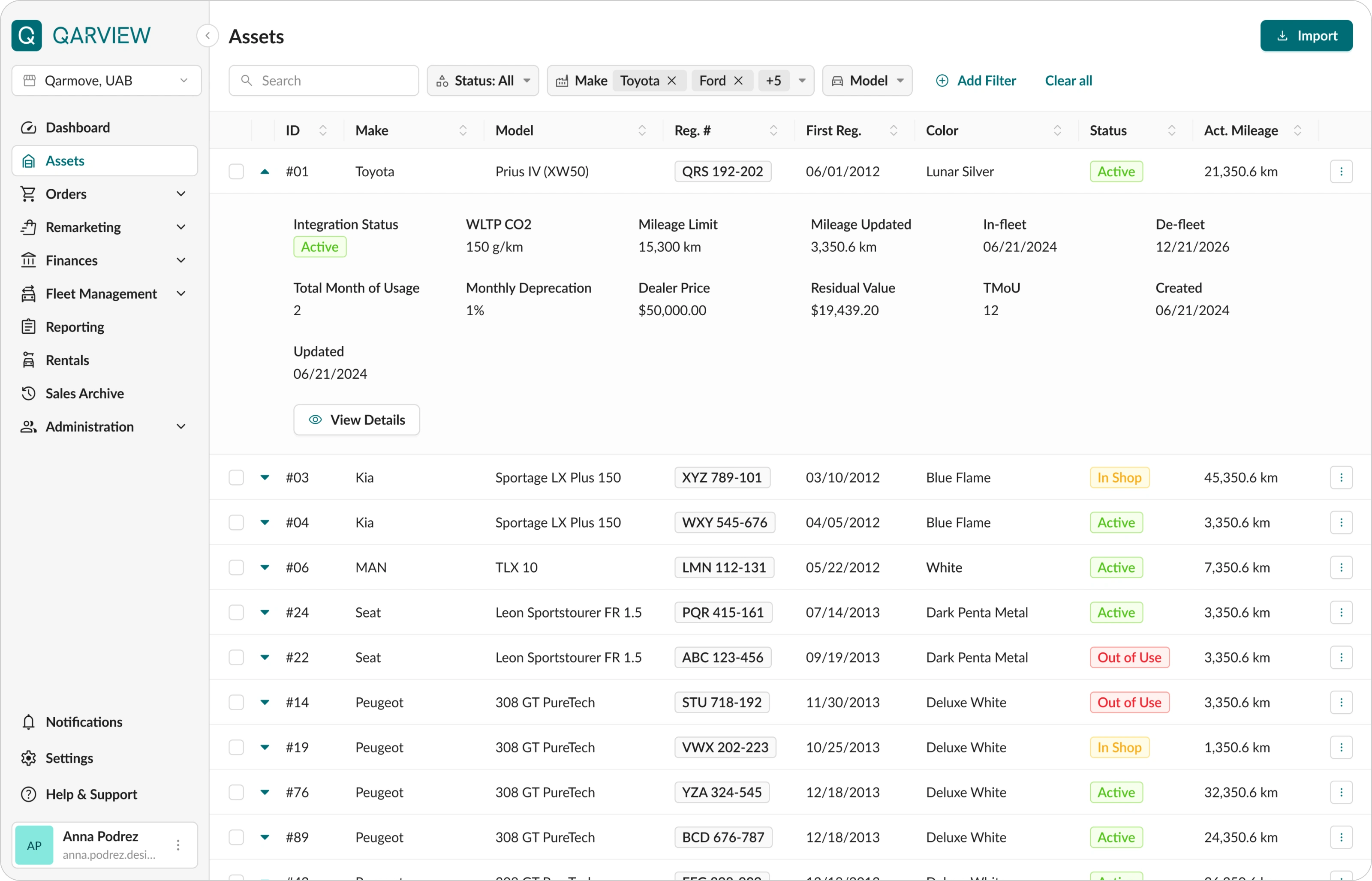
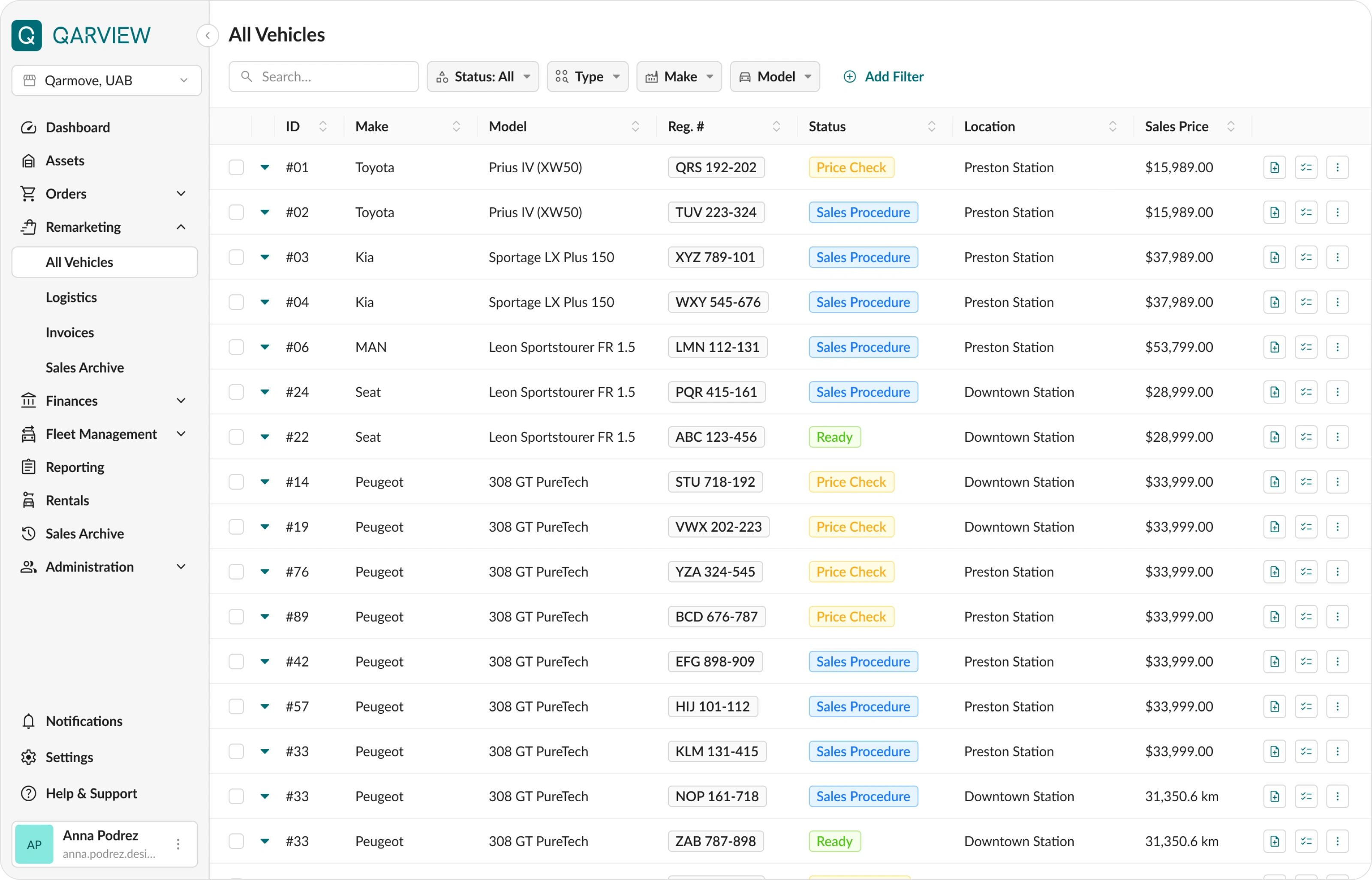
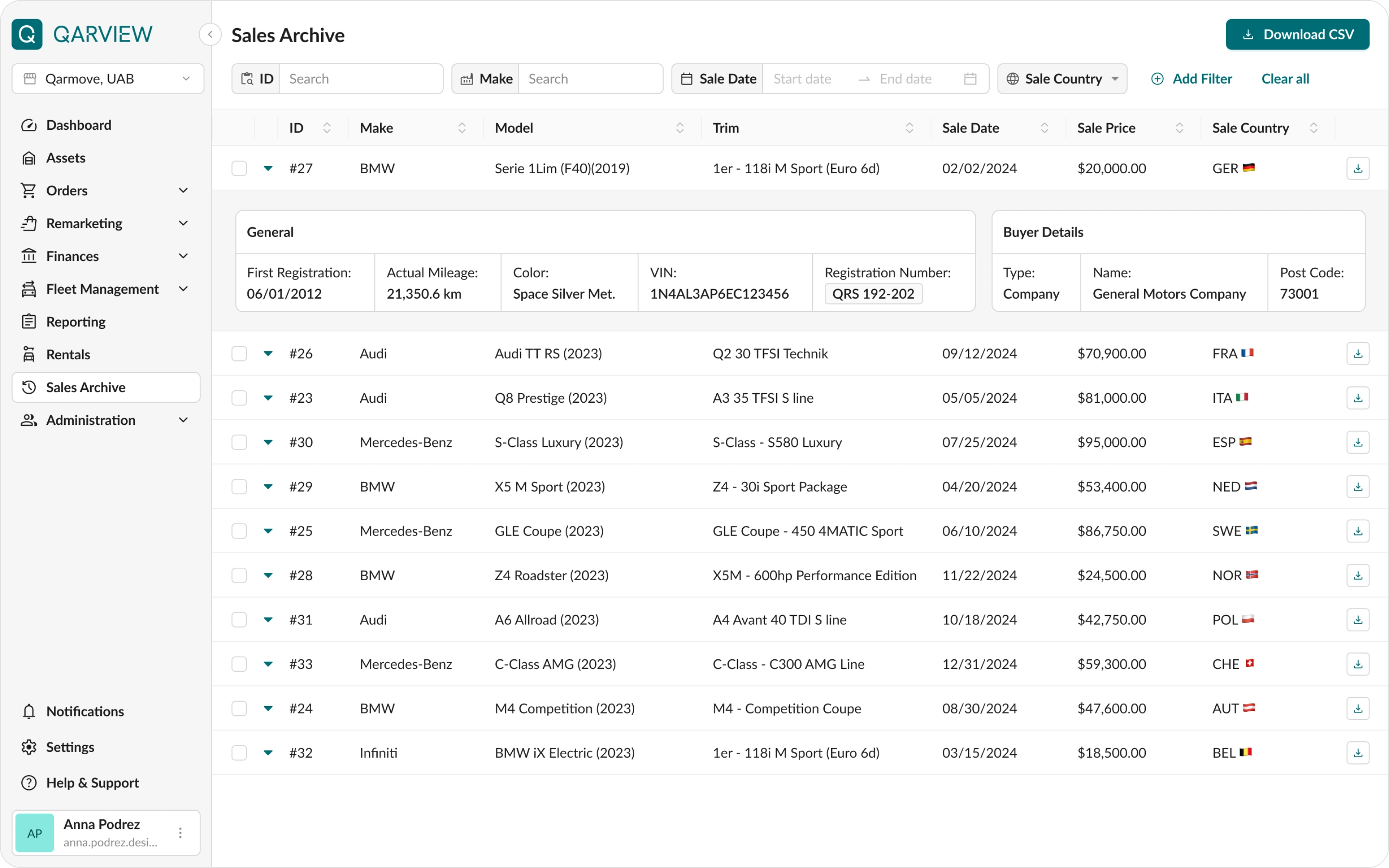
• Research shows that many users do not notice horizontal scroll or do not know how to use it. To fit all data on one screen, instead of scrolling right, expandable rows were used. The most important parameters were placed in the main row. Secondary information was hidden inside expandable blocks. This made it easier to scan the list.
• The filter panel was moved from a modal window to the page header. The most used parameters are visible at glance, and others can be added with an “Add filter” button. Now applied filters are always visible and do not require extra actions to check.
• Column settings were added for flexibility. Different employees can choose the data they need for their work.
• The registration number was often hard to notice, so it was placed inside a separate frame similar to a real license plate. This made it much more visible.
• Several versions were tested, including a version with a bright sidebar, to find the right visual balance. In the end, neutral colors were chosen to reduce visual overload and help users focus on data.
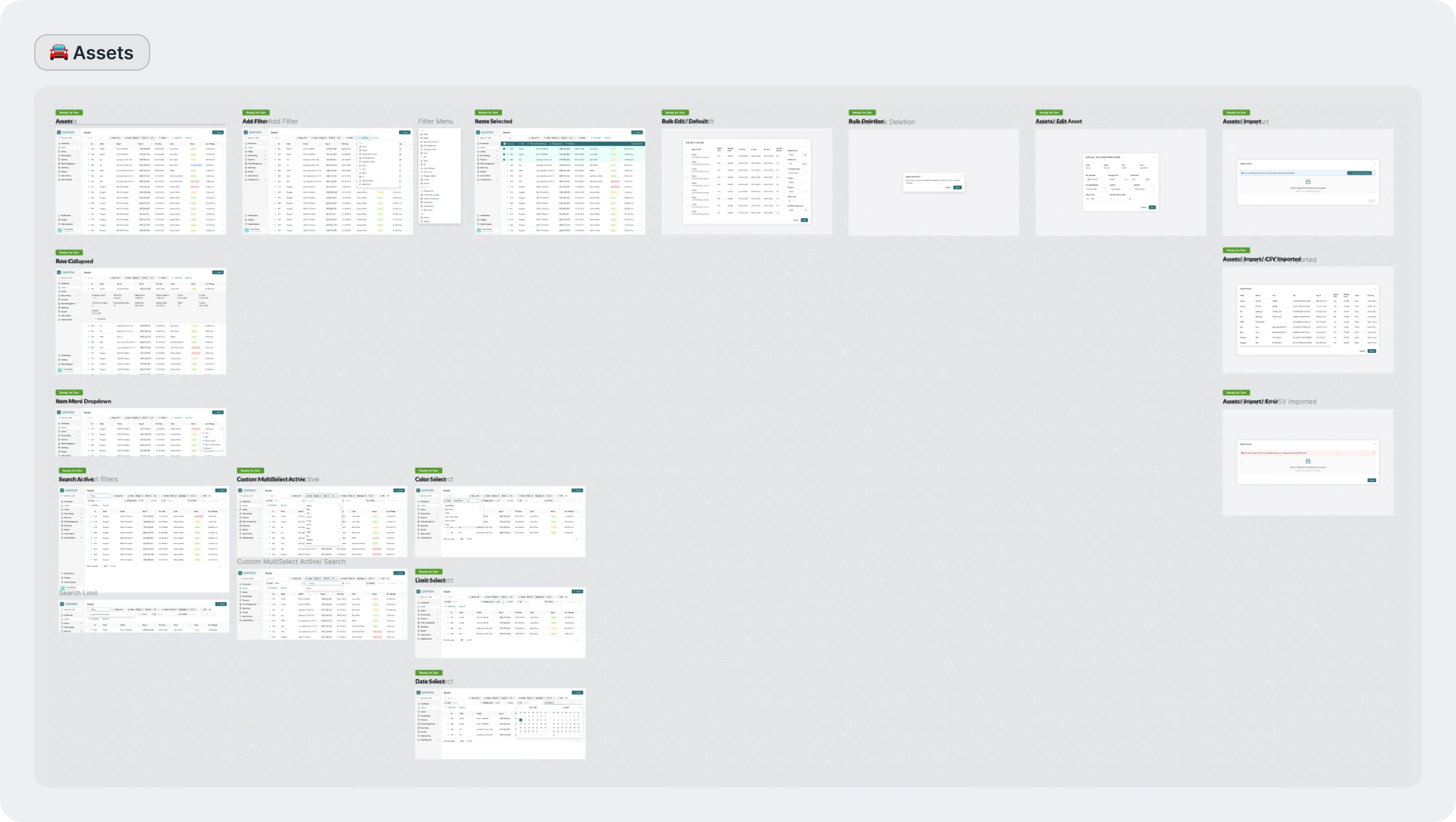
After the main style was approved, secondary screens, modals, and other details were delivered.
Crafting the platform
Then the work continued on other sections of the platform.
The main goal was to improve existing functionality within the new style and add new features.
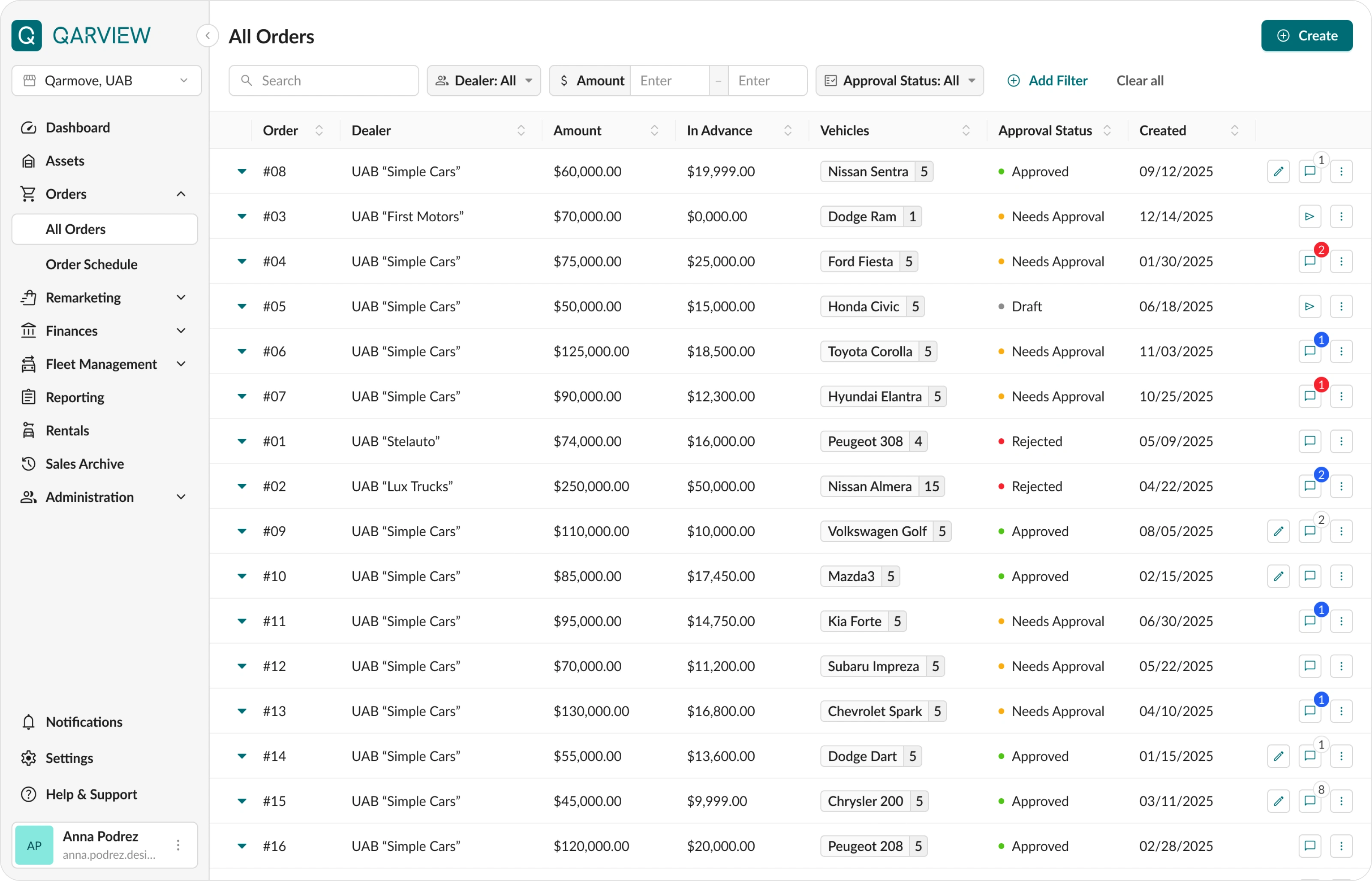
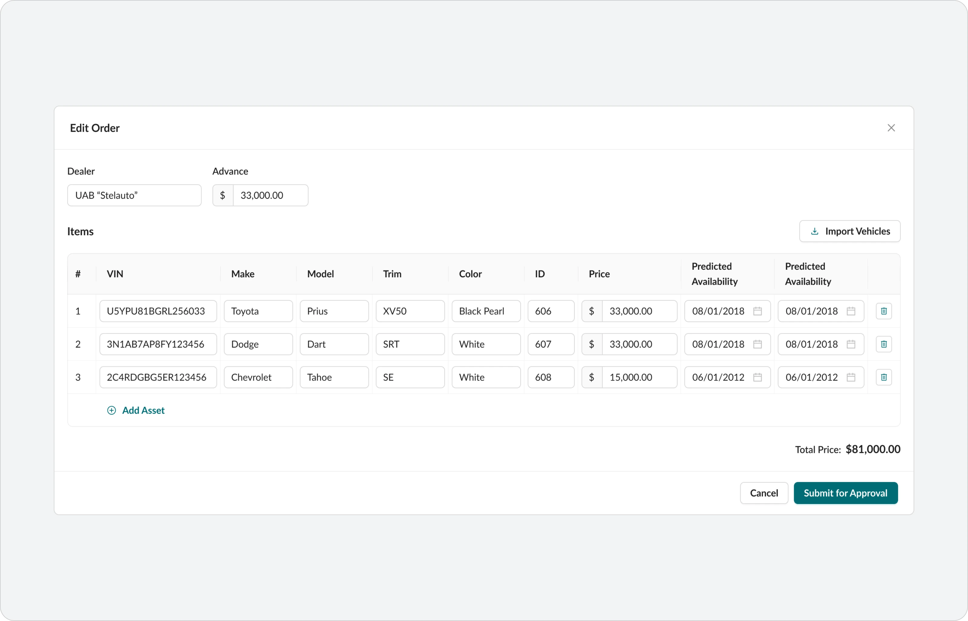
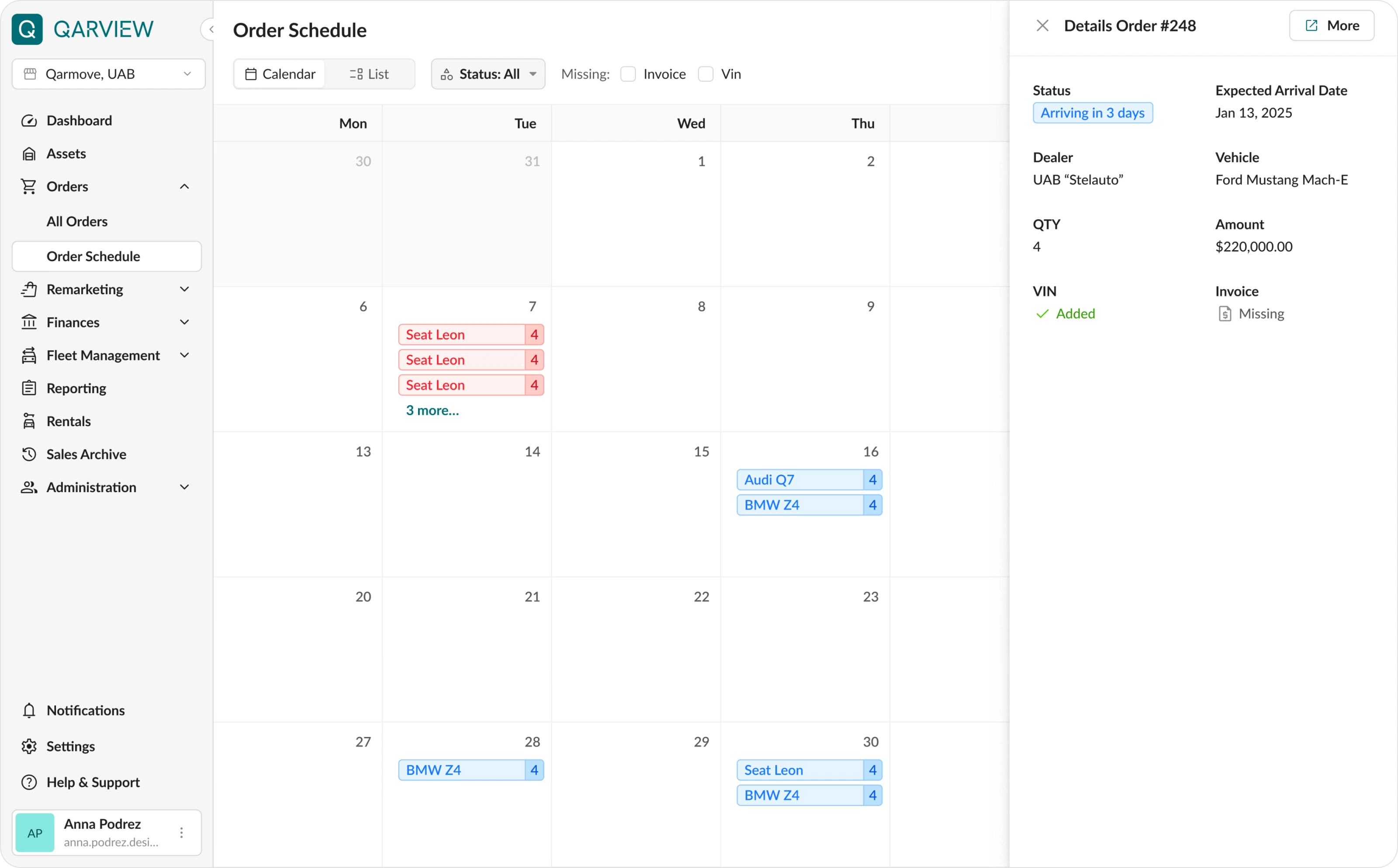
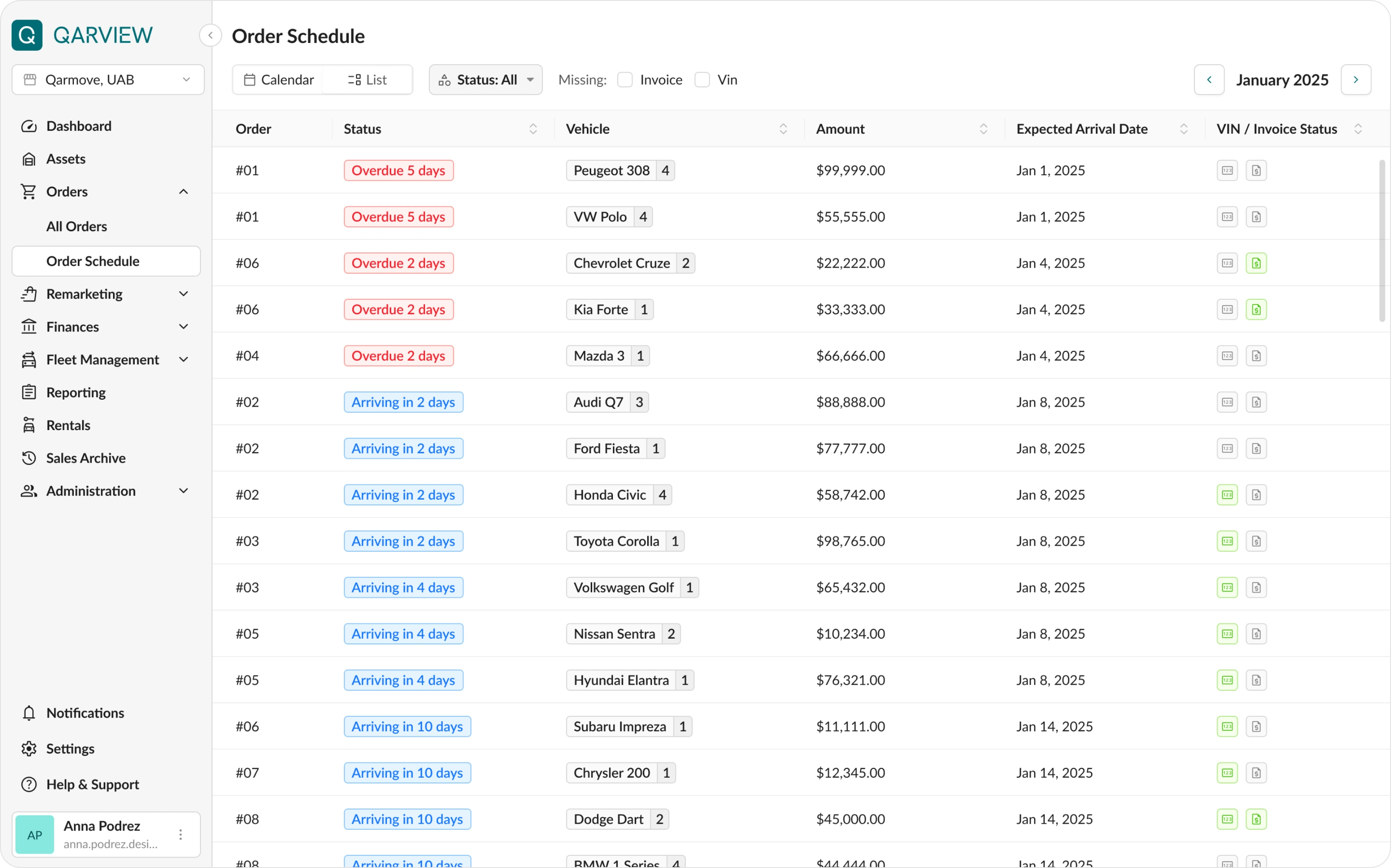
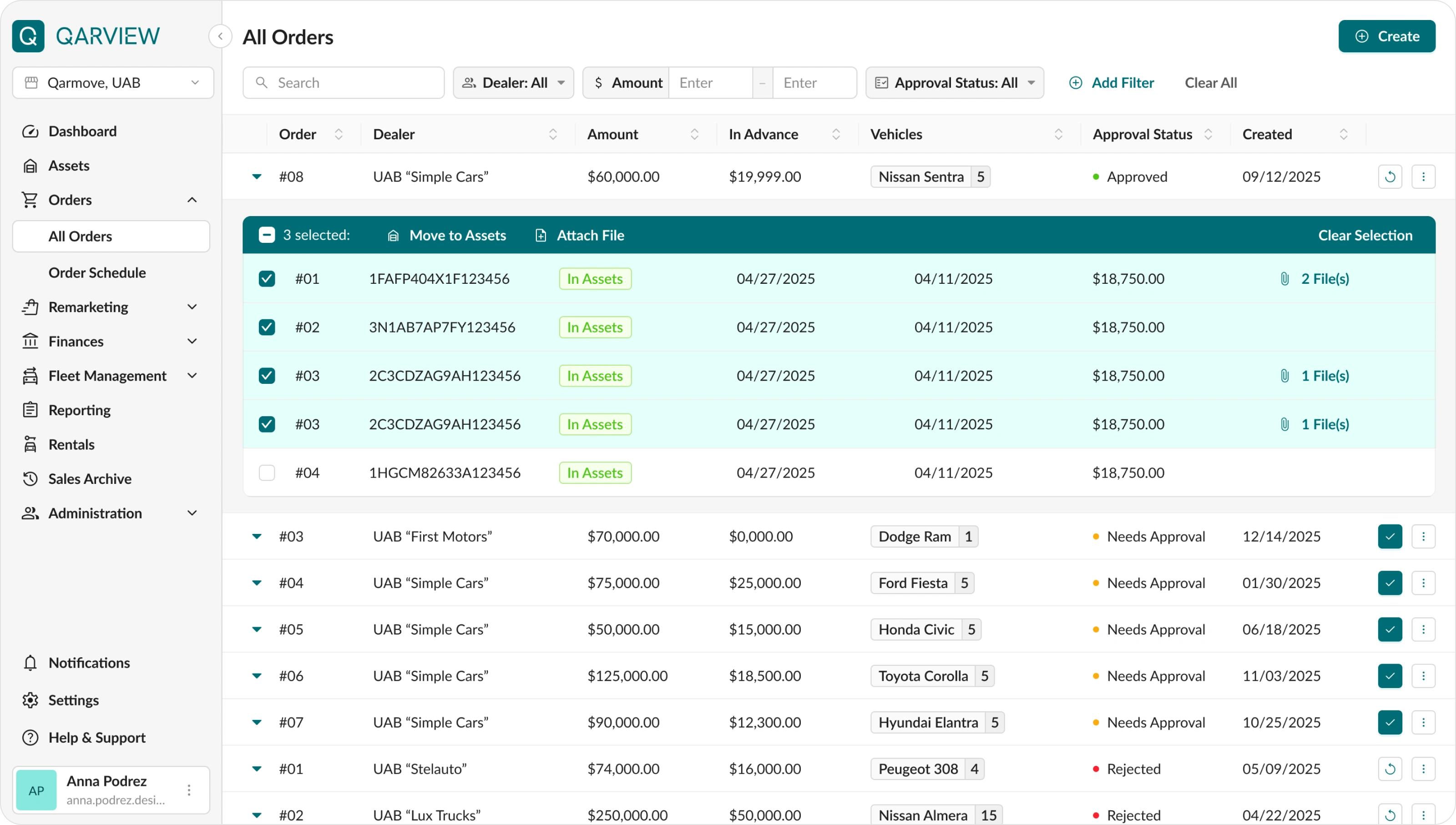
Orders
In this section, managers track the purchase of new vehicles, delivery stages, and order statuses.
The table was redesigned based on solutions used in the Assets section.
The approval and rejection flow for super admins was designed in detail. Since purchases are related to finances, they always require approval from management. The process includes several approval steps, and users can also leave comments and suggest changes before final approval.
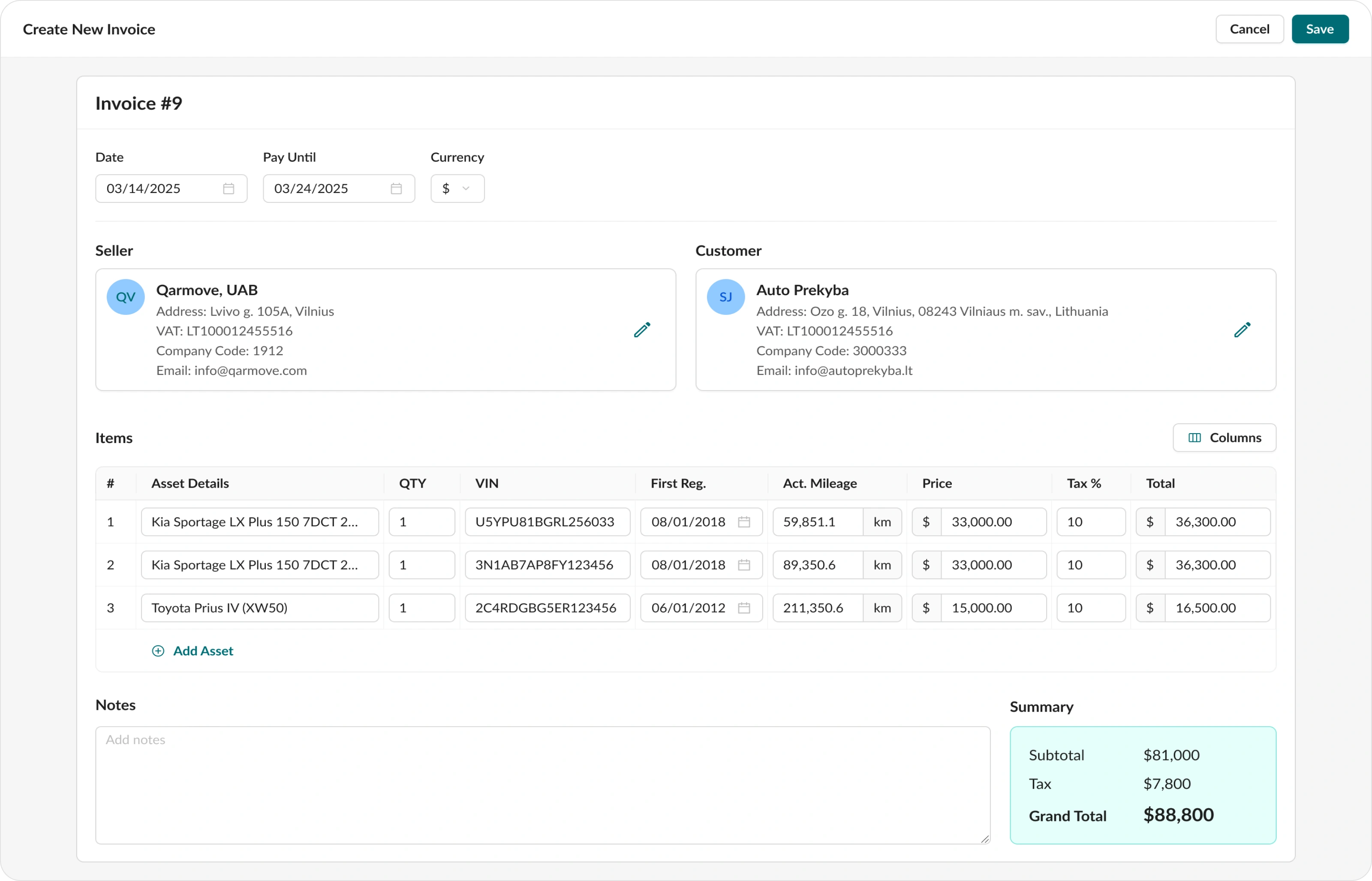
Remarketing
This section is used for selling vehicles that reached the end of their lifecycle.
Vehicles come here from the Assets section, and dashboard notifications inform managers when it is time to prepare for a deal.
Key features:
• Invoice builder that allows selecting vehicles, adding buyer data and prices, and sending the final invoice for signing. Managers can now do everything in one platform without using external services.
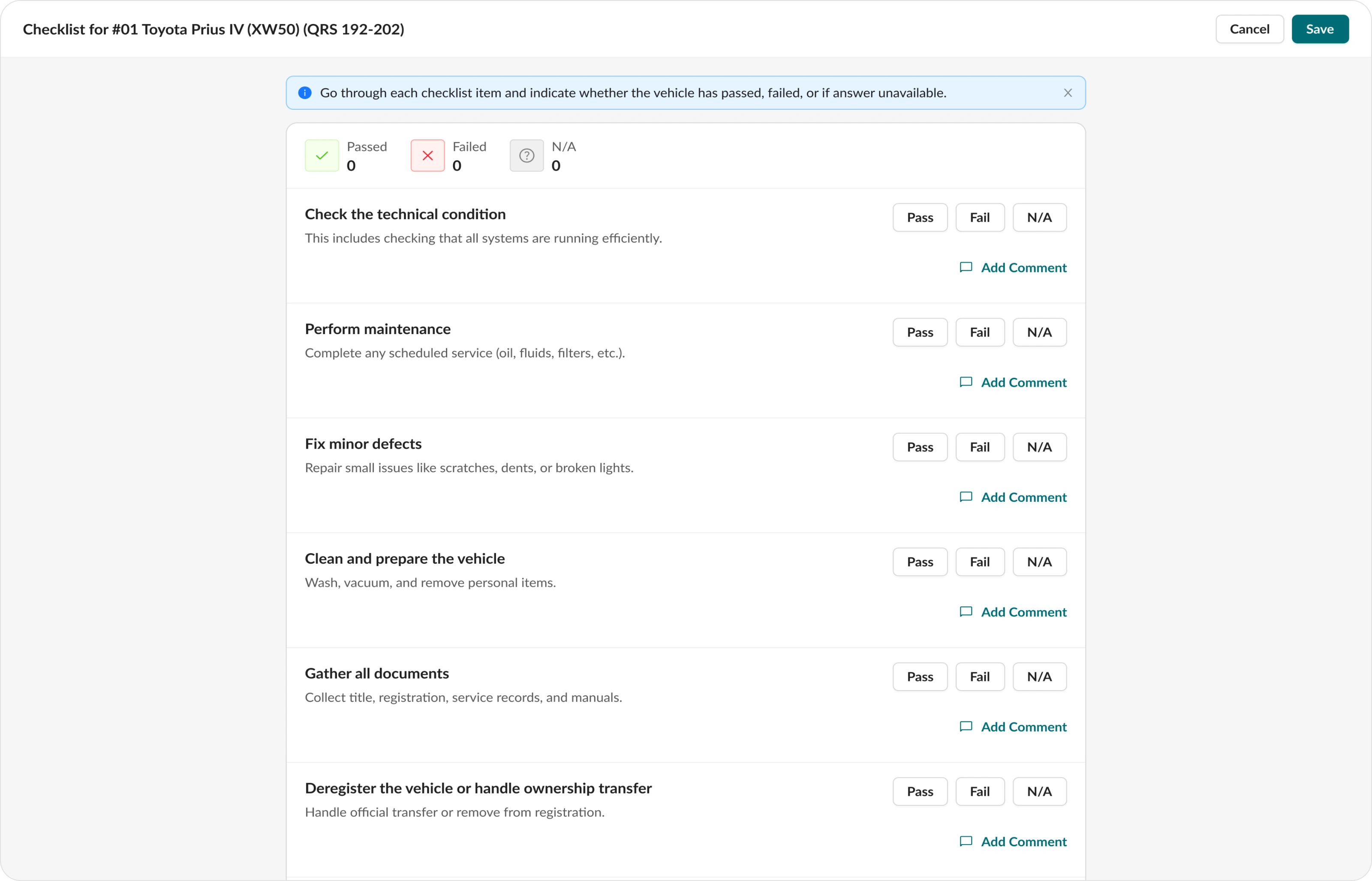
• Online checklist for vehicle preparation before sale. A technician marks completed steps, and the manager can see the status in real time.
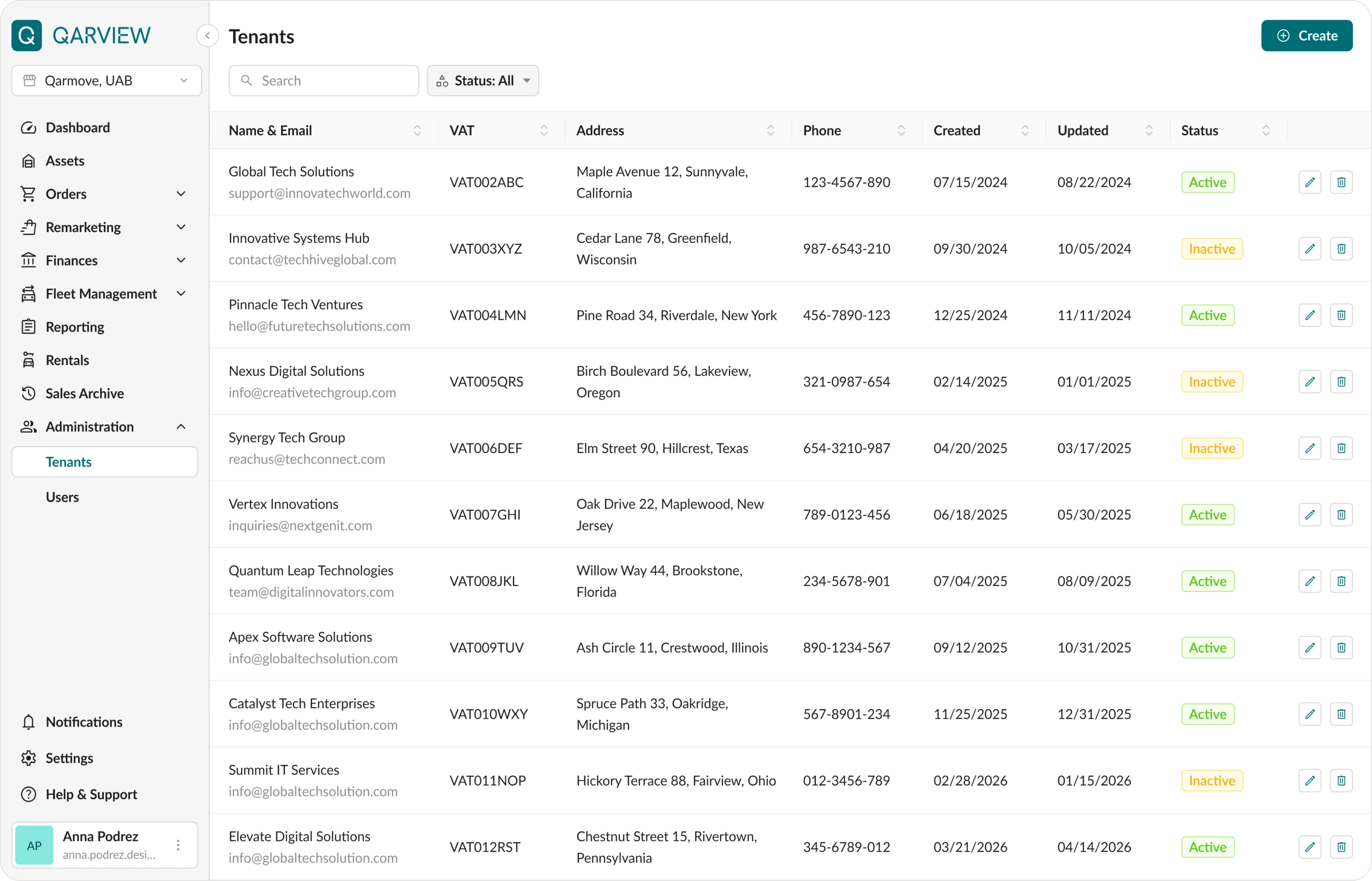
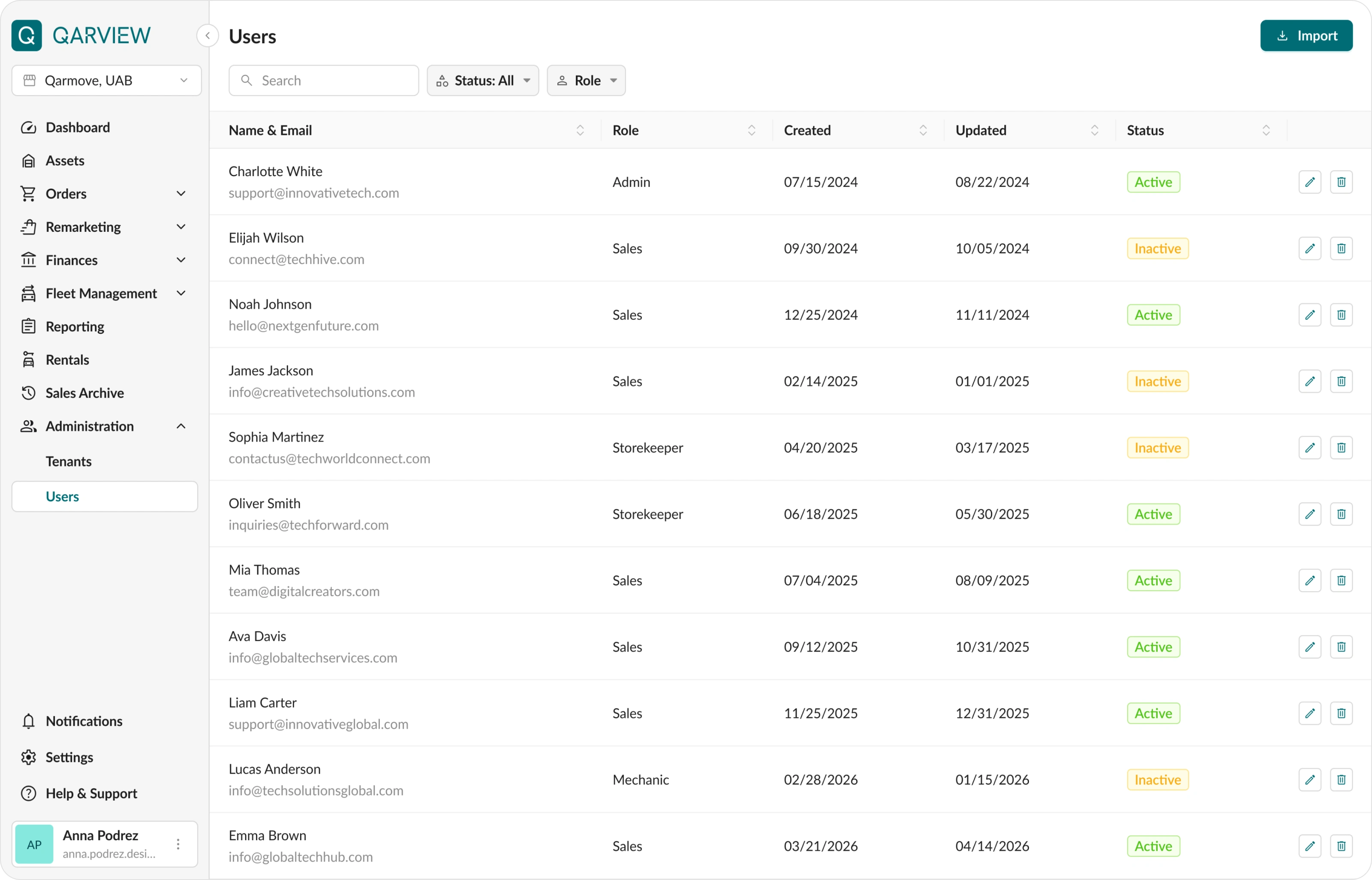
Tenants and users management
This section is used to manage employee access and their data.
If the company has multiple divisions, Qarview allows managing them from one centralized interface.
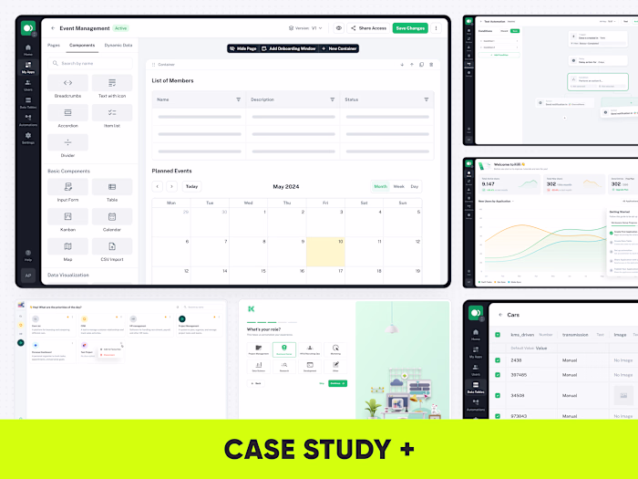
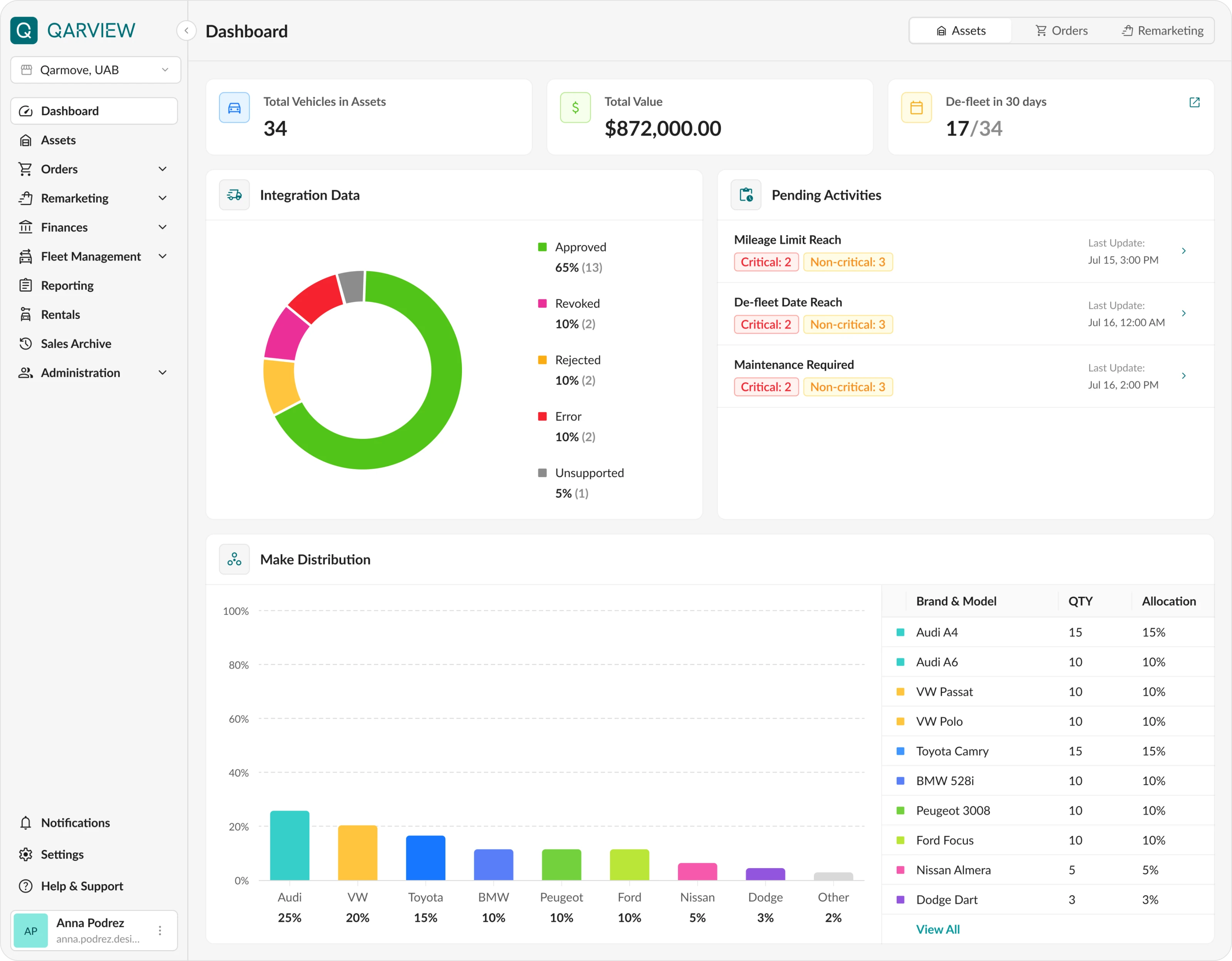
Dashboard
An interactive dashboard for tracking company performance, latest financial data, and notifications about required maintenance or resale.
Other pages of the platform
Below are some additional screens that were also redesigned during this iteration of the Qarview project
System States
System states were designed for all sections: loading screens, empty states, error messages, etc. This made the interface more predictable for users and saved time for developers.
Work with Ant Design UI Library and Development Aligning
The interface was built following Ant Design guidelines.
The main technical goal was to reuse default components as much as possible to speed up development and MVP launch.
Details
1. Standard variables from the library were used. New variables were created only in rare cases and after agreement with the technical team. This reduced the number of custom elements.
2. Colors and typography were updated through variables after the style was approved. A JSON file was prepared using the official Ant Design builder, allowing developers to quickly apply global styles and start development in parallel.
3. All components were named and structured according to Ant Design documentation. This made communication with developers easier and avoided mistakes when translating design into code.
Summary
• The redesign took around 2 months.
• The main result was a significant simplification of working with fleet data and the ability to track metrics in real time.
• Thanks to improved table structure and navigation, the interface became more intuitive and increased manager efficiency.
• The platform is now easy to scale using Ant Design components.
• The project was delivered on time, according to the initial estimate and approved stages.
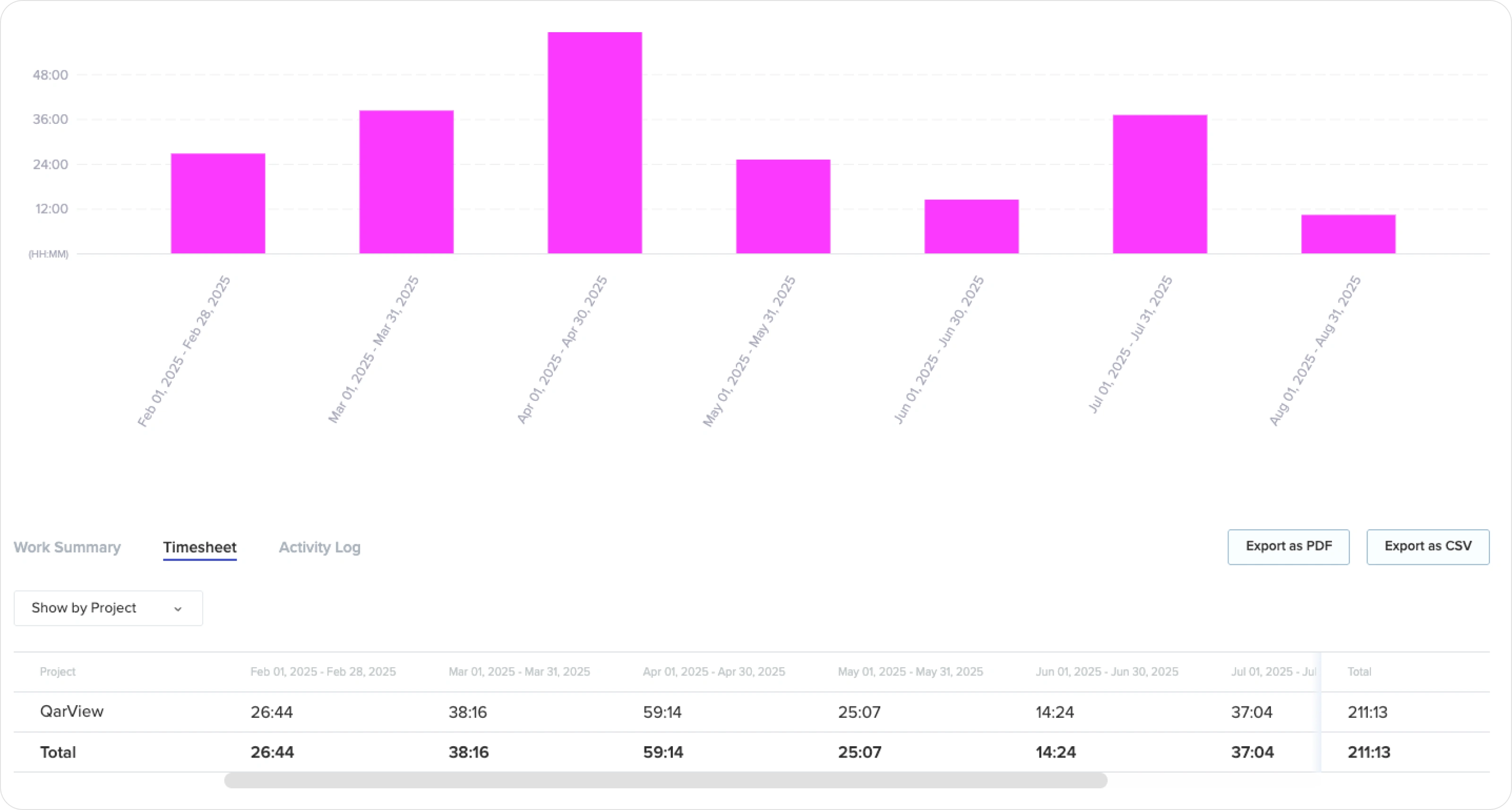
• Toptal Tracker was used to track progress and working hours.
Result
Our partnership continued. We have now reached 300+ hours of collaboration, continuously improving the platform with new features and optimizations.
👉 Have a project in mind?
Send me a quick message and I’ll provide a free consultation with an estimated timeline and budget. 📩
Like this project
Posted Jun 17, 2026
Redesigned Qarview's SaaS fleet management dashboard for better UX/UI, enhancing data tracking and user efficiency.
Likes
1
Views
6
Timeline
Jan 15, 2026 - Ongoing
Clients
QarView