Conversion-Focused HealthTech Landing Page Design
Anna Podrez
Verified
How I Designed a Conversion-Focused HealthTech Landing Page with Minimal Initial Information
This case study shows how I designed a landing page for a complex HealthTech weight loss program with almost no initial materials. I approached it as a full UX and product challenge: researching, defining structure, drafting content, and designing all user flows and interactions. The goal was to turn a complicated medical process into a clear, trustworthy, and conversion-focused experience. AI tools were used for both research and generating custom visual assets, saving significant time and budget. This project demonstrates a proactive, product-oriented approach to design, focused on real user and business outcomes.
📄 Context
Client: Symliphy — a U.S.-based HealthTech platform that provides users with fast access to medical treatment.
After launching the main version of the Symliphy platform, the client returned with a new request: to design a landing page for their new product — a Weight Loss Program.
The goal was to present a fairly complex medical process — including ordering laboratory tests and purchasing prescription medications from different manufacturers — in a simple, transparent, and trustworthy user interface.
One of the main challenges of this project was the lack of initial materials. At the start, I had very limited information beyond competitor websites. There was no prepared content, no images, no predefined page structure, and no low-fidelity draft from the client.
🔎 Onboarding and Research 🧩
Based on the client’s initial preferences, I started by asking clarifying questions to better understand what they wanted to communicate on this page.
Once I had gathered a bit more context, I conducted market and competitor research and explored how similar weight-loss programs are structured and delivered. I also used AI tools to better understand typical program flows and the medical processes behind them.
Using these insights, I created a low-fidelity wireframe that outlined the core structure of the landing page.
📐Wireframing
After completing the research phase, I proposed my vision for how this page could work.
I independently designed the entire page structure, including the logical sections, the sequence of blocks, headlines, descriptions, and supporting text. The goal was to keep each block short and easy to understand while placing them in a logical order.
This structure was designed from the perspective of someone who knows nothing about the product. I included the type of information that I personally would want to see if I were discovering such a service for the first time.
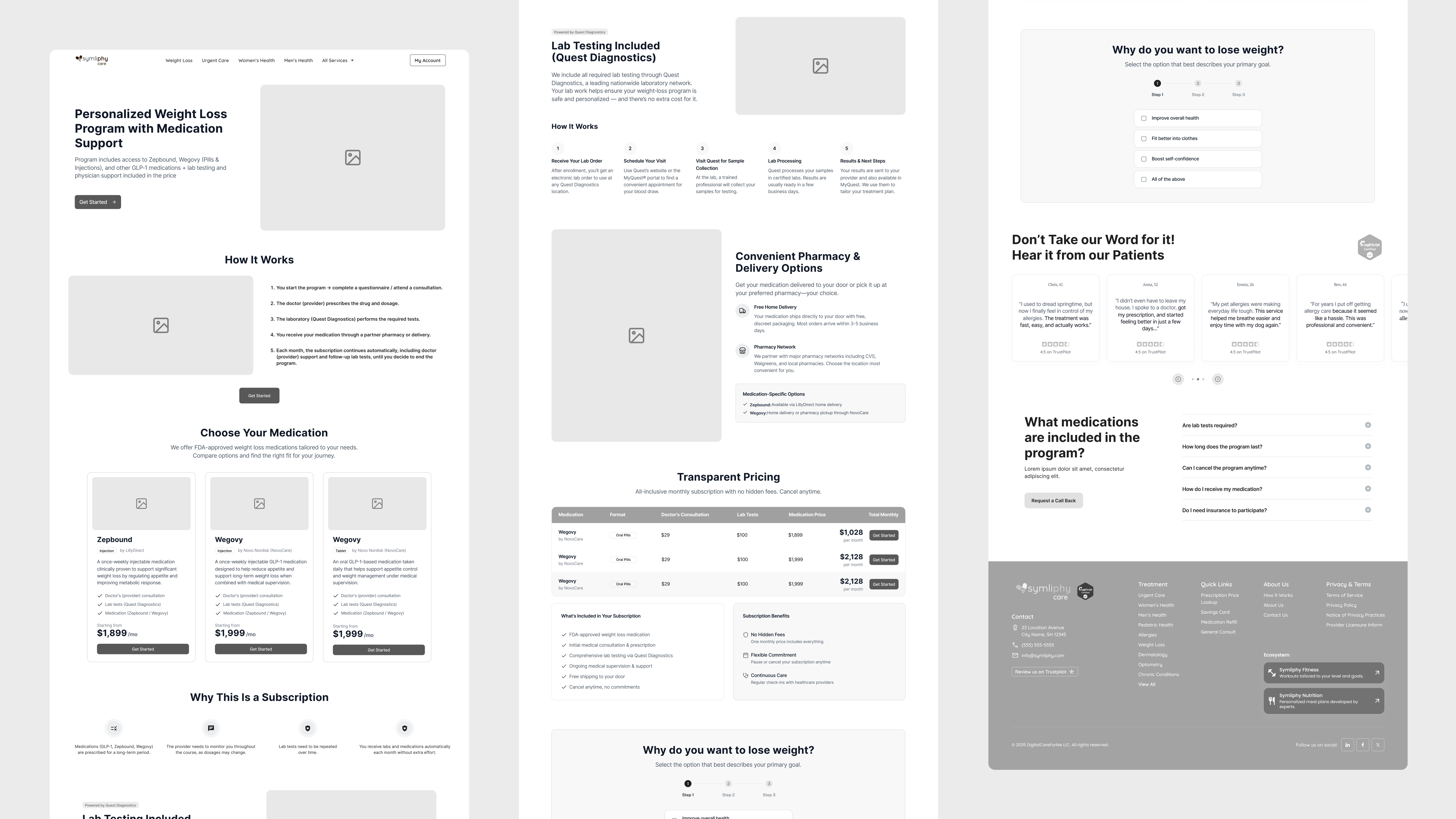
After presenting this structure to the client, we discussed it together and made several adjustments based on their feedback.
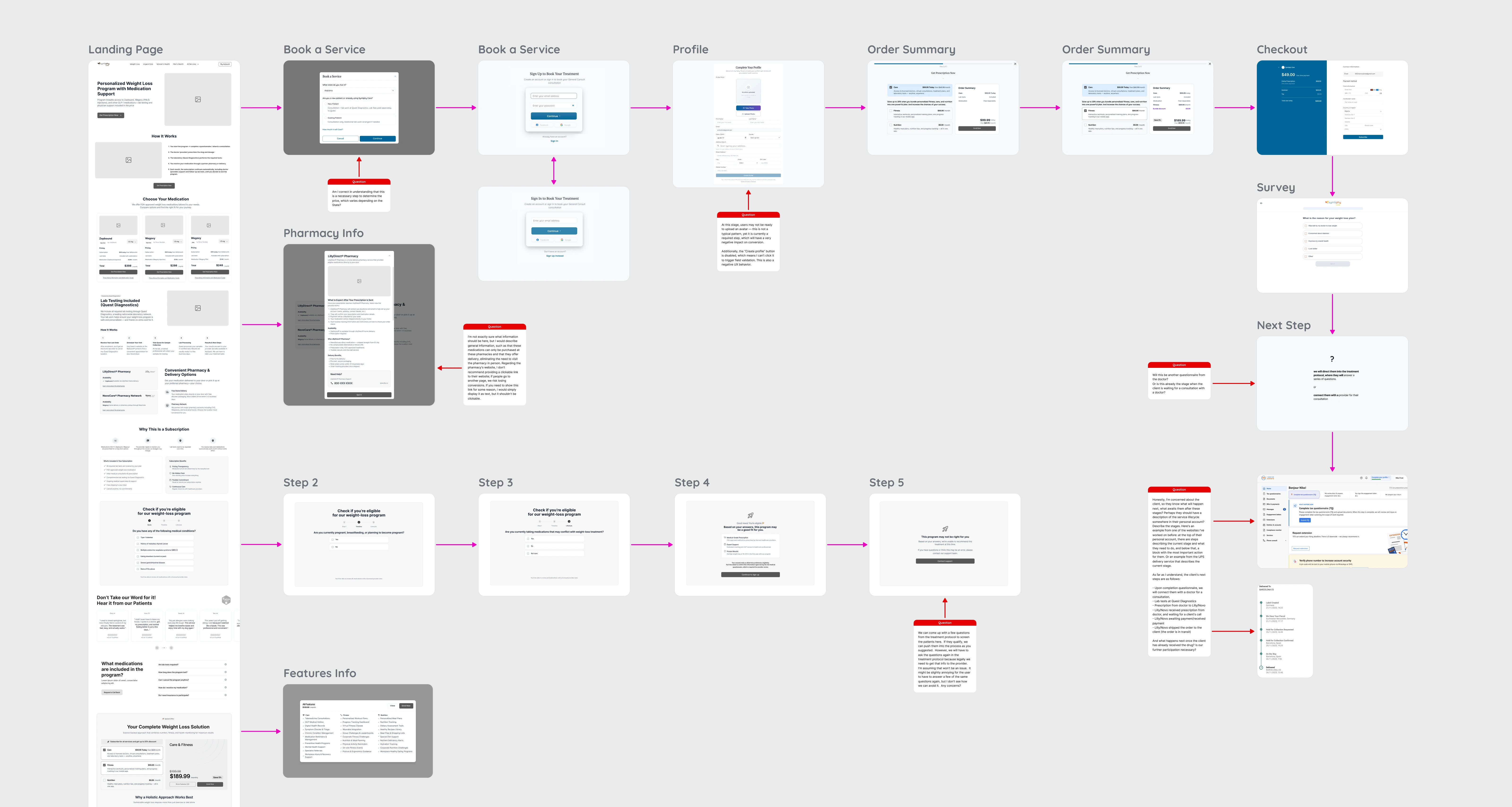
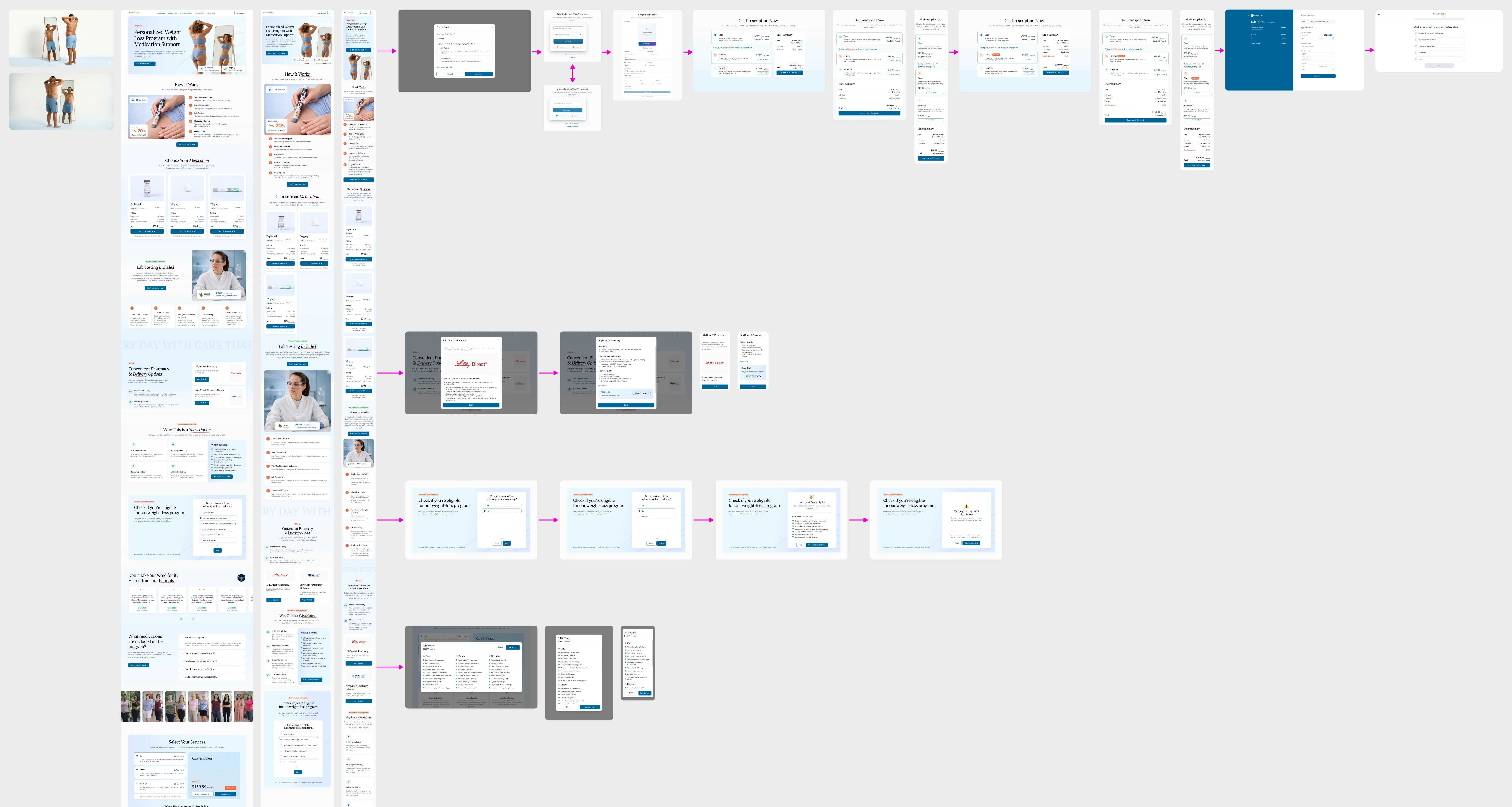
🎛️ Interaction Design and Hidden States
Once the page structure and logical sections were approved, I worked on all additional interface elements that appear after user interaction. This included various pop-ups, contact forms, and the purchase flow.
Both clients and designers often focus only on the visual design of the main page and estimate design time based on that. However, developers frequently encounter problems later when key interaction states are missing from the design.
For this reason, during the design phase it is important to ask a series of questions:
What happens when the user clicks this button?
What happens next?
And what happens after that? I design the full interaction chain — from the first click to the final feedback or error state of the form — so that developers have everything they need to implement the product correctly.
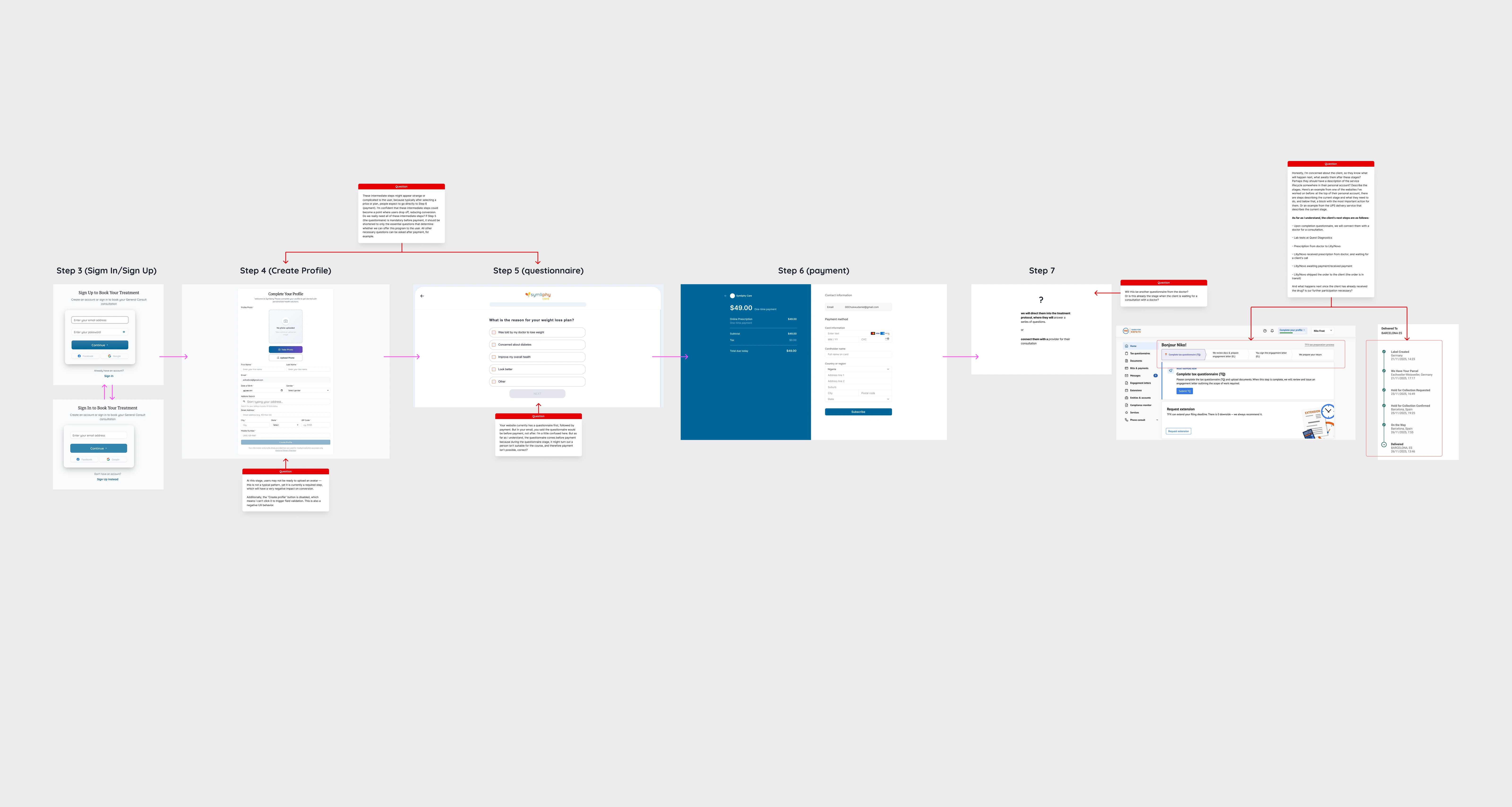
💬 Design Communication in Figma
I usually leave my comments and questions directly visible in the layout, instead of relying heavily on the standard Figma comment system.
The reason is simple: comments in Figma require opening the comment panel, hovering over markers, and clicking them to see the content. For many clients this is not always convenient.
Instead, I prefer to place short explanatory notes directly on the canvas. This allows the client to immediately see the reasoning behind specific decisions and reply right next to the design element.
I try to accompany most design decisions with short explanations so the client understands why the interface is designed this way.
🎨 UI Design and AI Image Generation
After the page structure was approved, I moved on to the UI design phase.
Since the visual style had already been defined earlier during the design of the main Symliphy platform, I reused the established design system and visual language.
The main challenge during this stage was the lack of visual assets from the client. There were no product images or lifestyle photography available.
To solve this, I created a small moodboard of references, developed several visual ideas, and prepared detailed prompts for AI image generation tools. Using these tools, I generated a set of custom images from scratch.
These images included fictional models as well as product imagery created from publicly available references. The result was a set of high-quality visuals that would normally require 4-8 hours of searching on stock photo platforms, plus additional licensing costs.
Creating such images through a traditional process — organizing a photoshoot or producing custom photography — would require significantly more time and budget.
An additional advantage of image generation was the ability to precisely control the details. For example:
the swimsuit color matches the brand colors of the product
the model has a neutral, relatable appearance
the composition clearly communicates the program’s idea
Instead of using generic images of people with excess weight, we created a more conceptual hero image: a woman looking at herself in the mirror and seeing the future version of herself with the desired result.
Another benefit of AI tools was the ability to control the direction of the model’s gaze, guiding user attention toward the main call-to-action on the page.
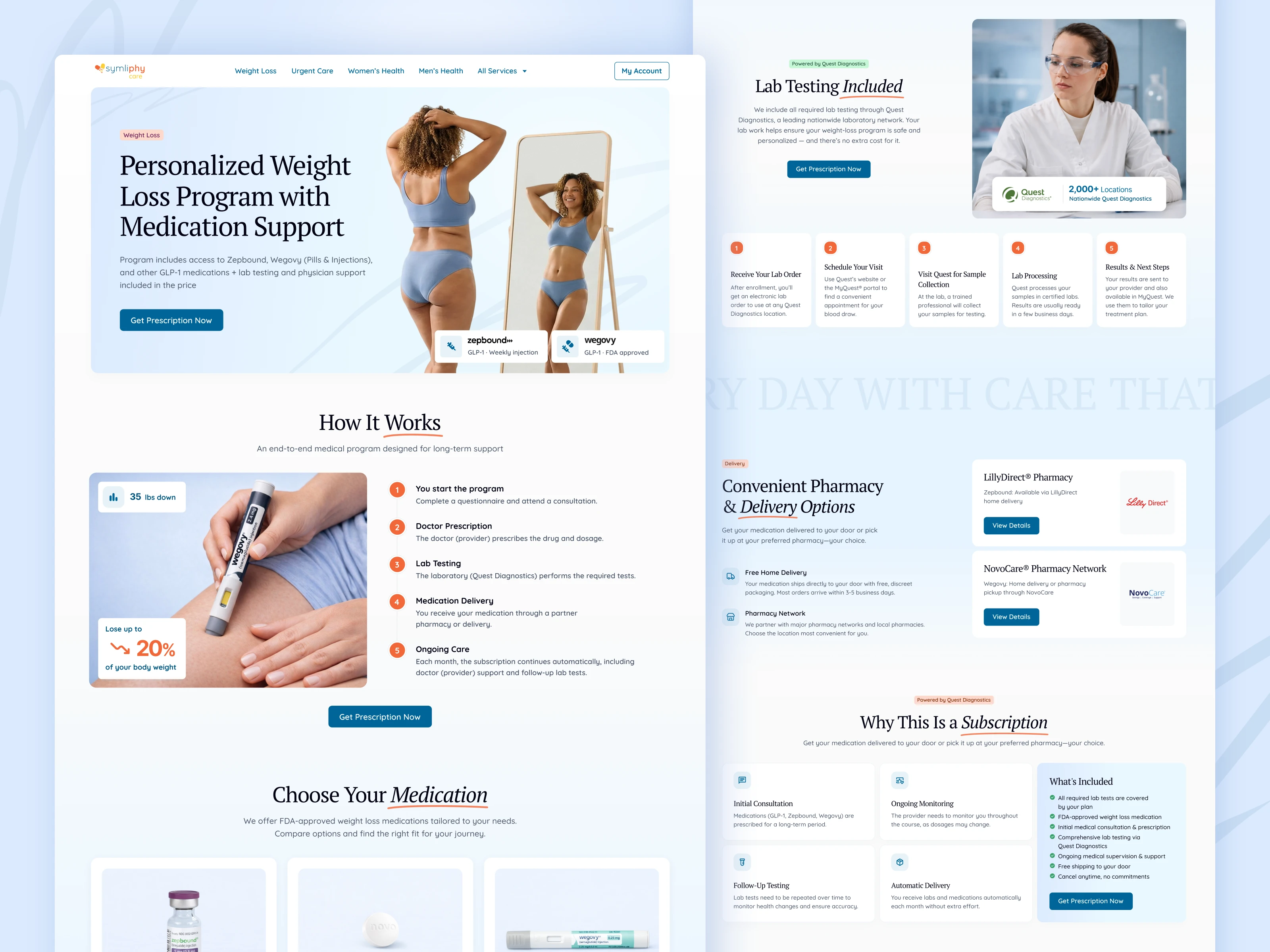
✅ Final Page
Below is the final result of the landing page design.
📊 Additional Work
As part of this project, I also designed:
responsive versions for mobile devices
the order and purchase flow
a pricing or offer page
partner pop-up windows
a marketing capture form designed as a small commitment step that encourages users to begin the process and then leave their contact information to avoid losing their progress
⏱️ Scope of Work
In total, the work described above took 40 hours (5 working days) — from the initial idea and research stage to fully prepared design files ready for development.
Since the visual style had already been defined earlier, I did not need to spend additional time on creating a new design language.
The client is satisfied with the result. In the future, we plan to measure conversion performance and gather feedback from real users. I hope to share insights later about how effective this design was in terms of conversion.
📬 Closing
Follow my social media to see more design work and case studies — you may find ideas useful for your own projects.
If you have an idea for a product or need help designing a complex web application, feel free to contact me. I will review your request and provide a project estimate.
Thank you for reading🙏
Like this project
Posted Mar 19, 2026
How I Designed a Conversion-Focused HealthTech Landing Page with Minimal Initial Information
Likes
3
Views
53
Timeline
Feb 10, 2026 - Ongoing
Clients
Symliphy Health