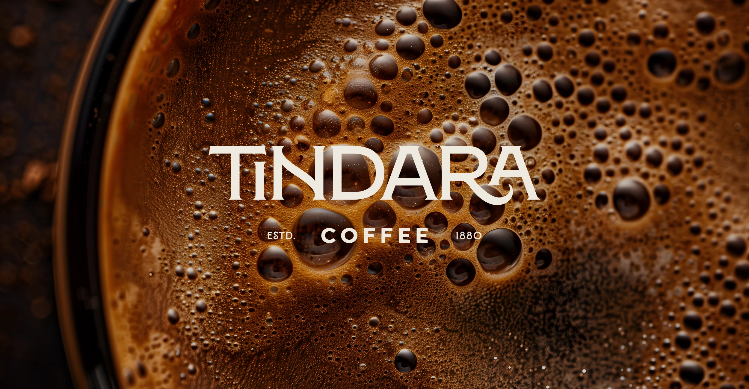
TINDARA - Coffee Brand Identity & Packaging Design

Roberto De Simone


The brief
The aim was to create a coffee brand identity rooted in Tindari, Sicily, with a contemporary feel and a clear connection to its local heritage.
The identity needed to work across coffee packaging and café materials, bringing the same character to a bag of coffee, a takeaway cup, and the wider café experience.
The solution
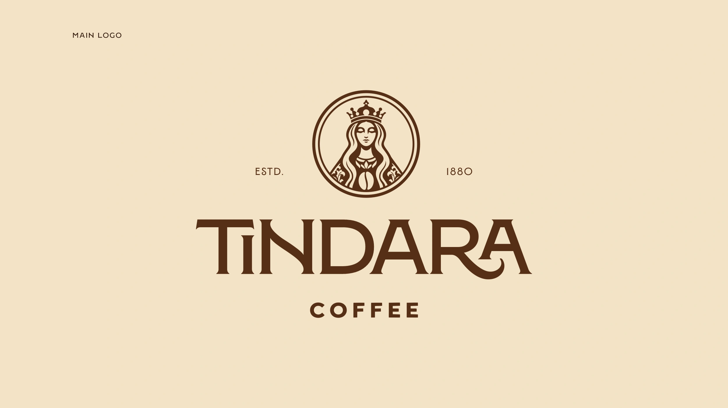
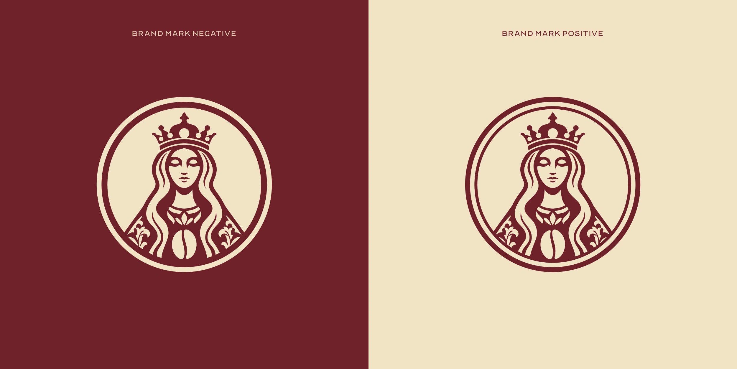
I built the identity around a symbol inspired by the Madonna di Tindari, giving the brand a meaningful connection to its name and place of origin.
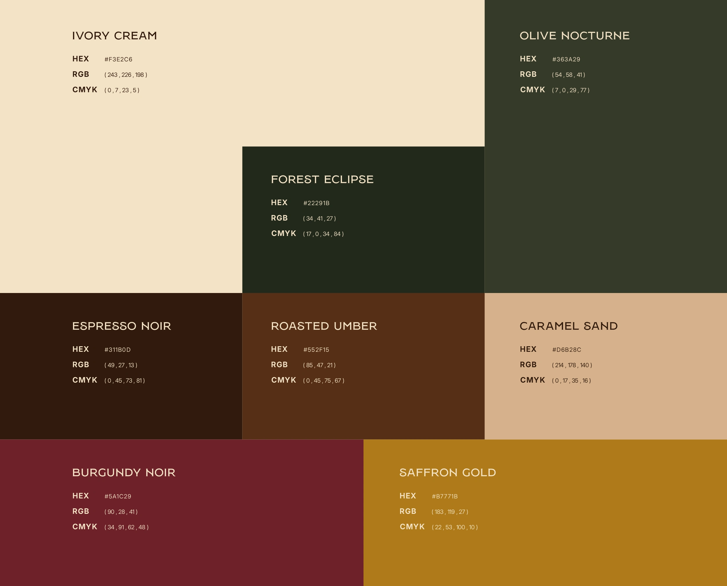
The palette brings together mustard yellow, deep green, and burgundy, balanced with warm cream. Across the coffee range, these colors distinguish the products while the consistent logo placement and typography keep them connected.
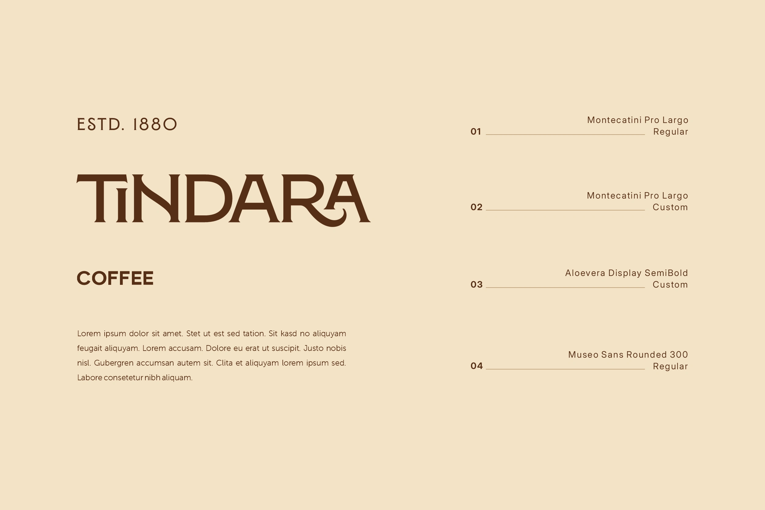
The identity extends to cups, carriers, bags, and stationery. Each application uses the same core elements, with enough flexibility to suit its format.
For the presentation, the art direction focuses on the everyday coffee ritual. Natural light, tactile surfaces, and close-up details bring warmth to the project and show how the identity fits into a café setting.
The result
A cohesive coffee brand identity with a distinct Sicilian character. The packaging and café materials feel part of the same family, balancing local references with a clear, contemporary design.
THE COLOR PALETTE
The color palette takes inspiration from the warmth of Sicily, the richness of roasted coffee, and the natural tones of the Mediterranean landscape.
Rather than relying on conventional coffee branding colors alone, the identity introduces a more expressive combination of earthy neutrals, deep greens, burgundy, and warm golden accents.
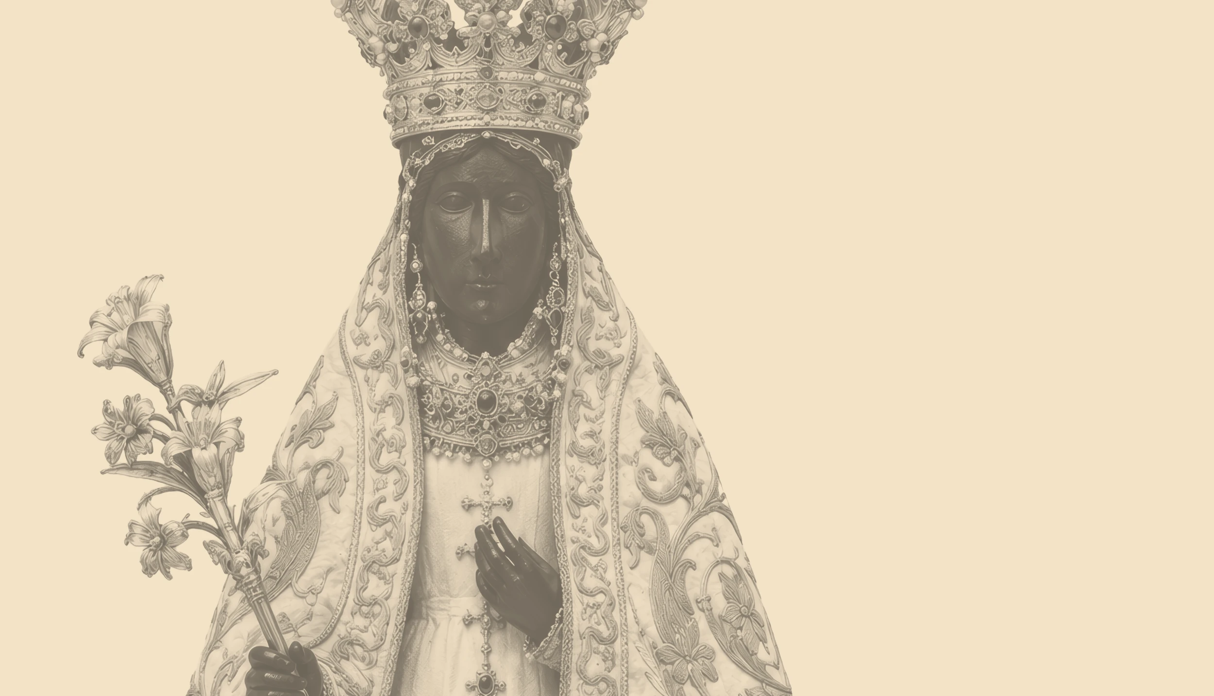
TINDARA Coffee Brand Identity & Packaging: Madonna di Tindari inspo
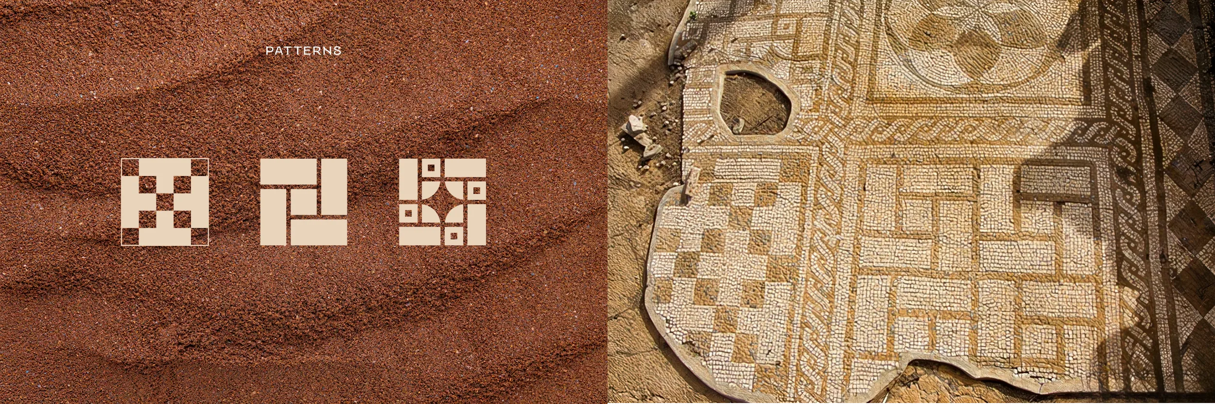
TINDARA Coffee Brand Identity & Packaging: Sicillian patterns
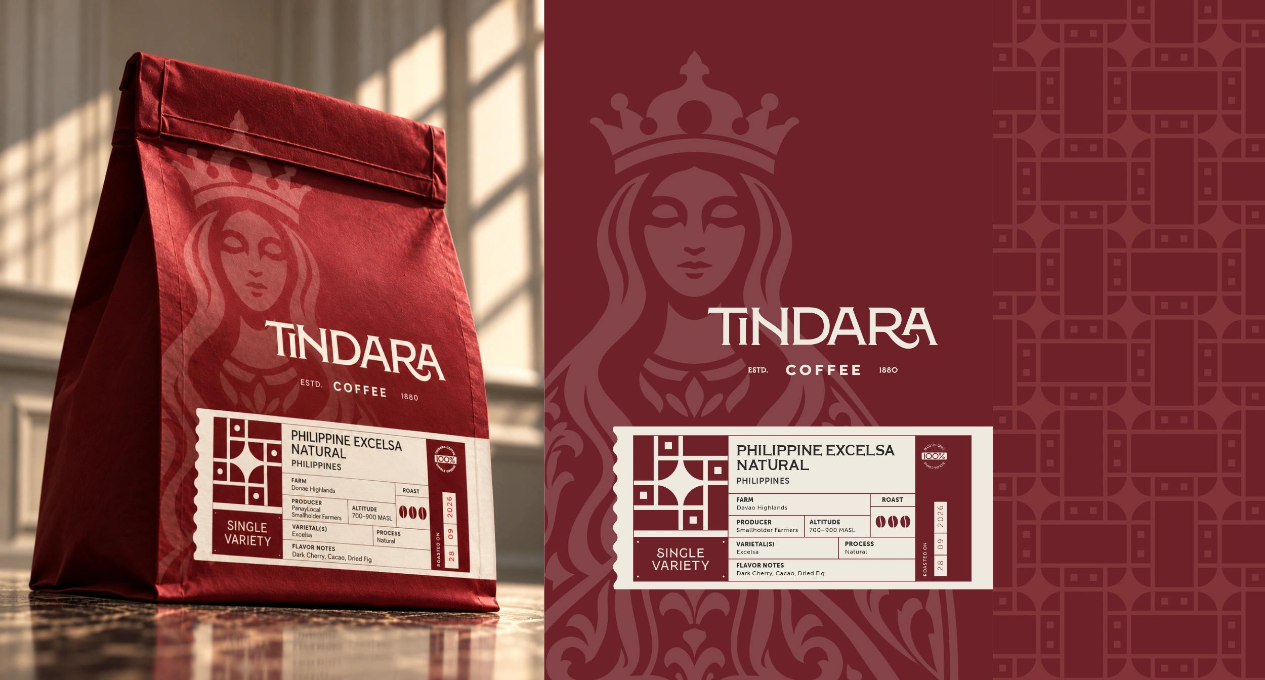
TINDARA Coffee Brand Identity & Packaging: coffee packaging design details
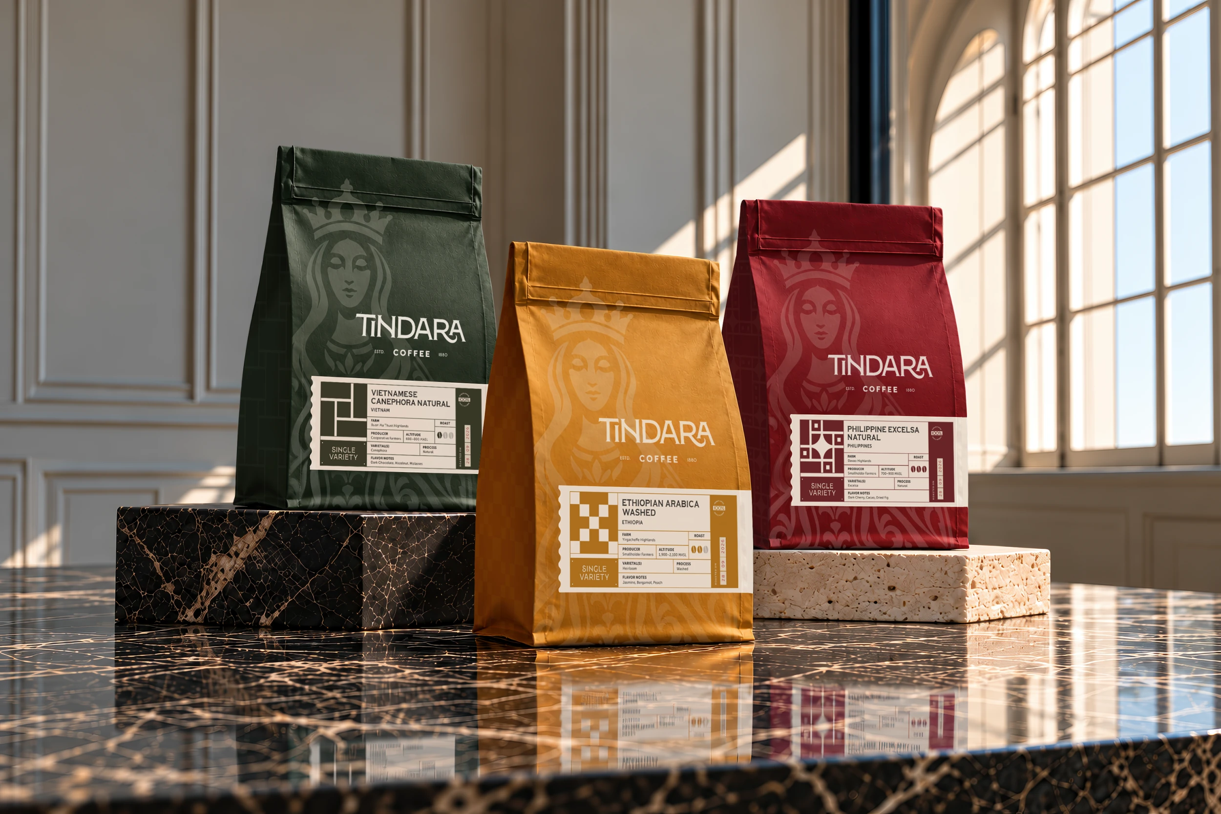
TINDARA Coffee Brand Identity & Packaging: full coffee packaging design collection
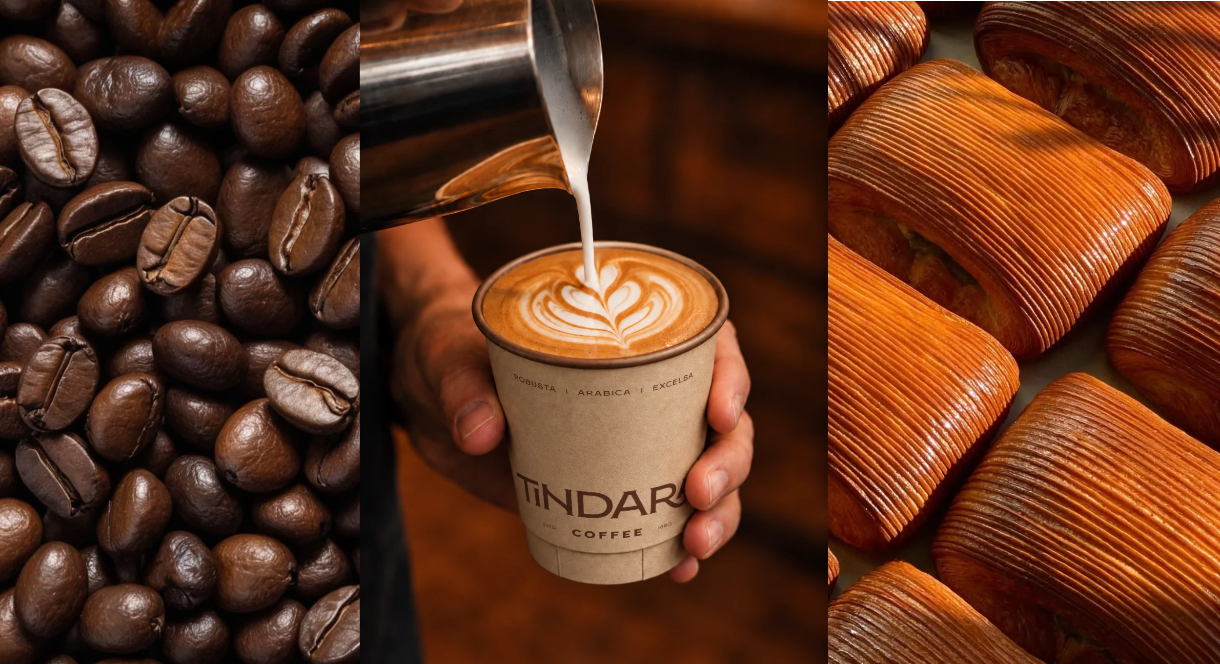

TINDARA Coffee Brand Identity & Packaging: paper bag and cups
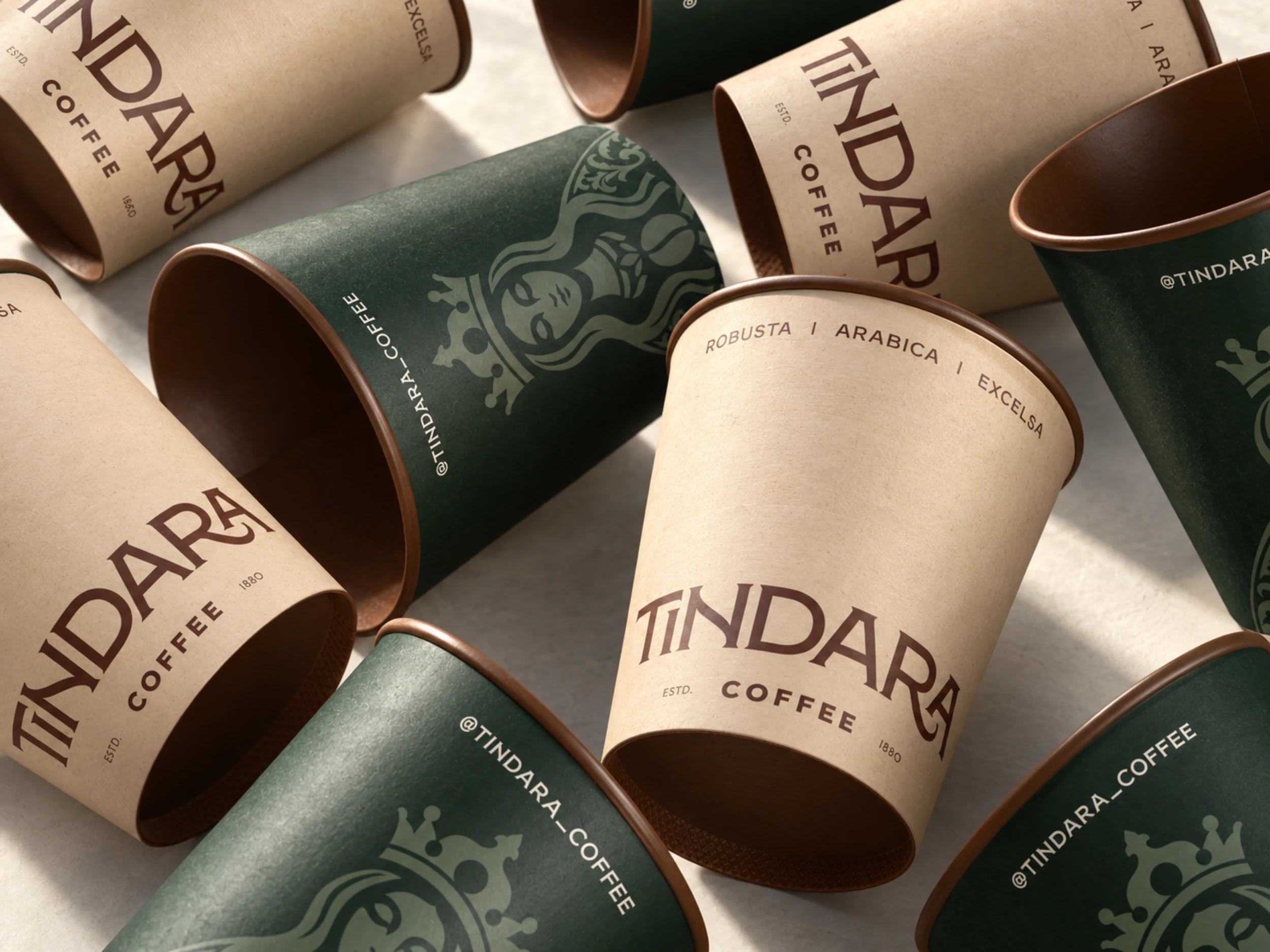
TINDARA Coffee Brand Identity & Packaging: coffee cup design
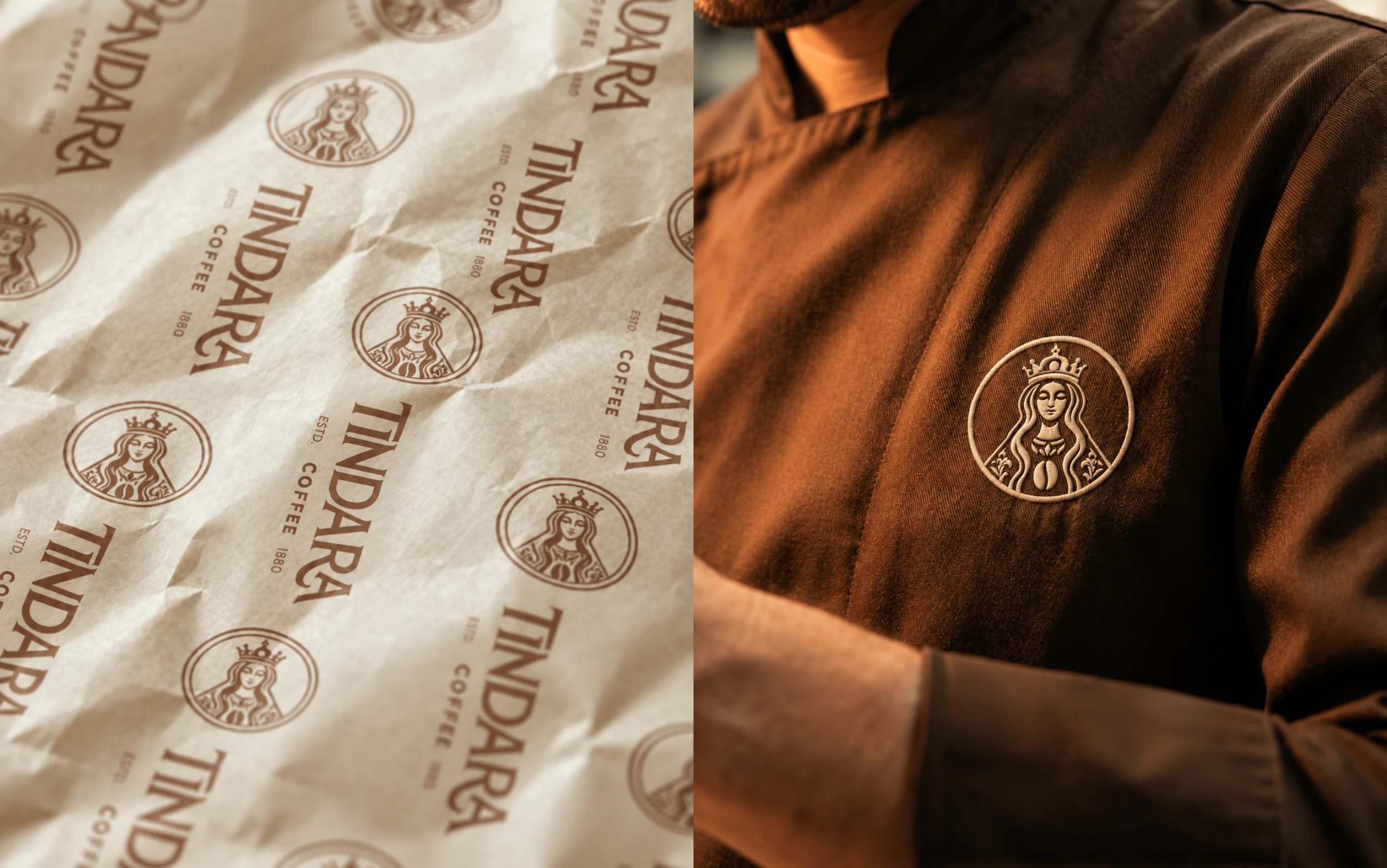
TINDARA Coffee Brand Identity & Packaging: wrapping paper and uniforms
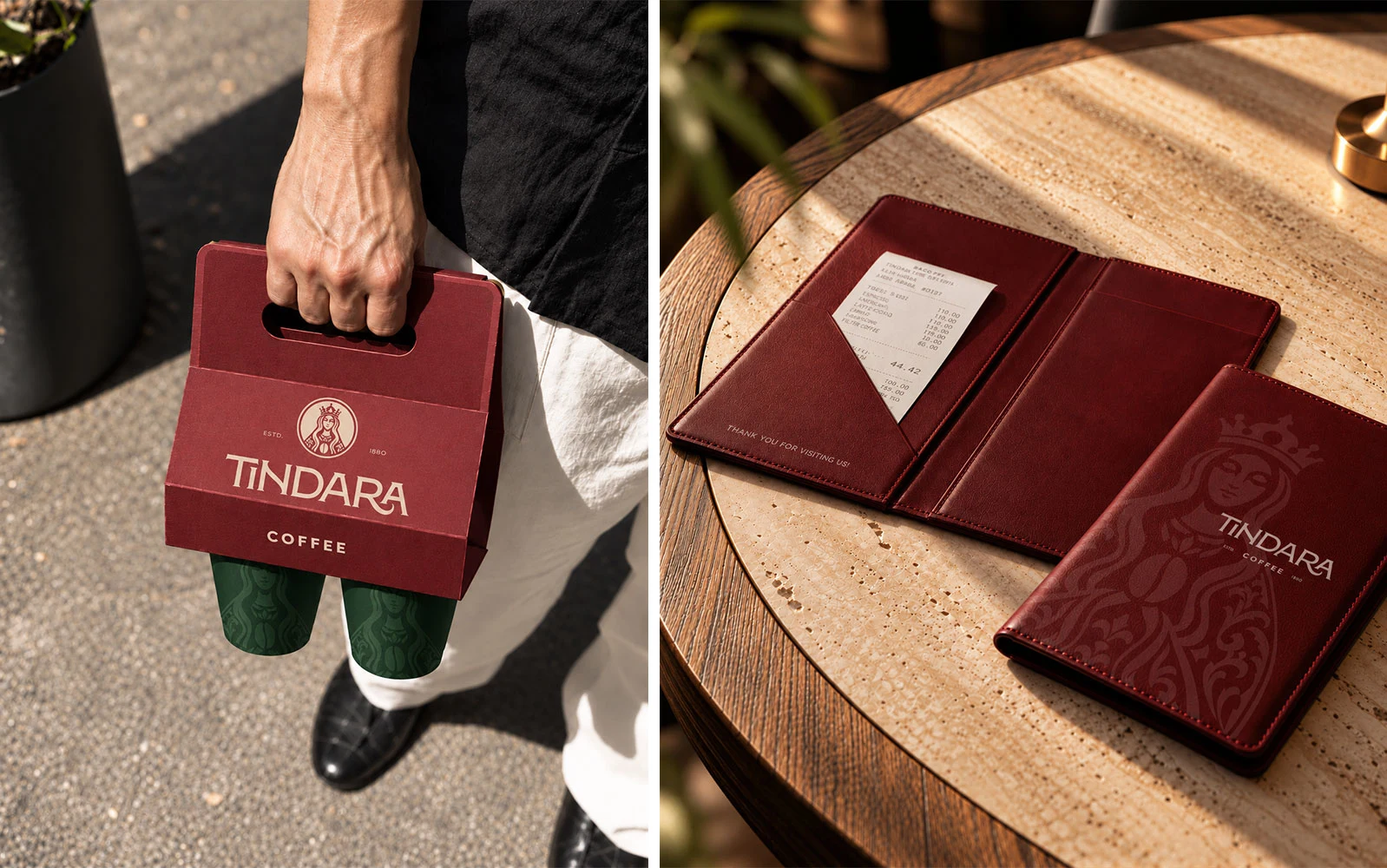
TINDARA Coffee Brand Identity & Packaging: coffee holder and check holder
Let’s work together
Creating a coffee brand or giving an existing one a new direction? I’d love to help with your brand identity and packaging.
Like this project
Posted Oct 28, 2026
Coffee brand identity and packaging design for Tindara, inspired by Sicilian heritage and brought together through rich colors and an illustrated mark.