Ambrosia - Bodycare Brand Identity & Packaging Design

Roberto De Simone


The brief
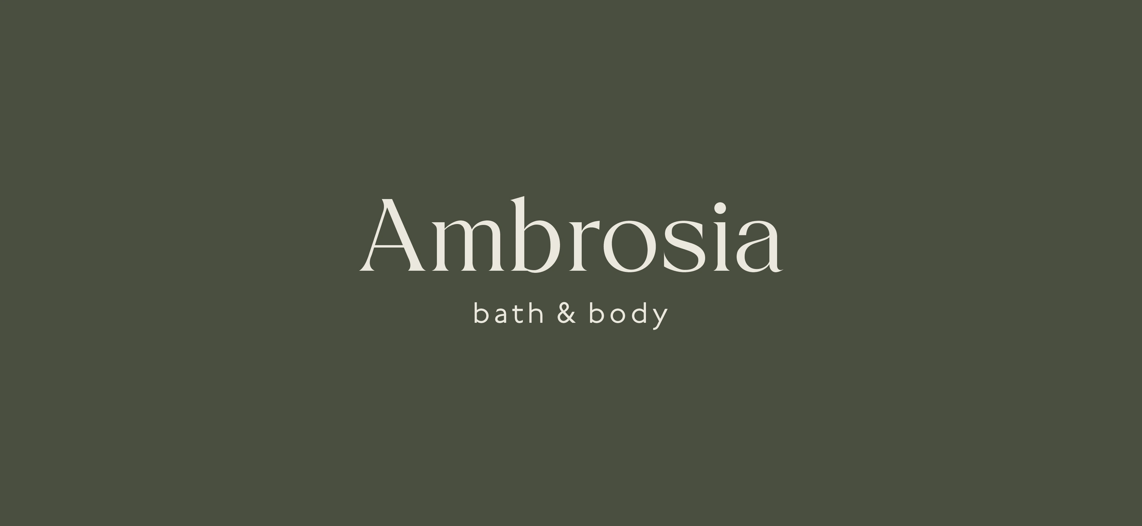
Ambrosia is a conceptual bodycare brand inspired by botanical science and the idea of turning everyday skincare into a considered ritual.
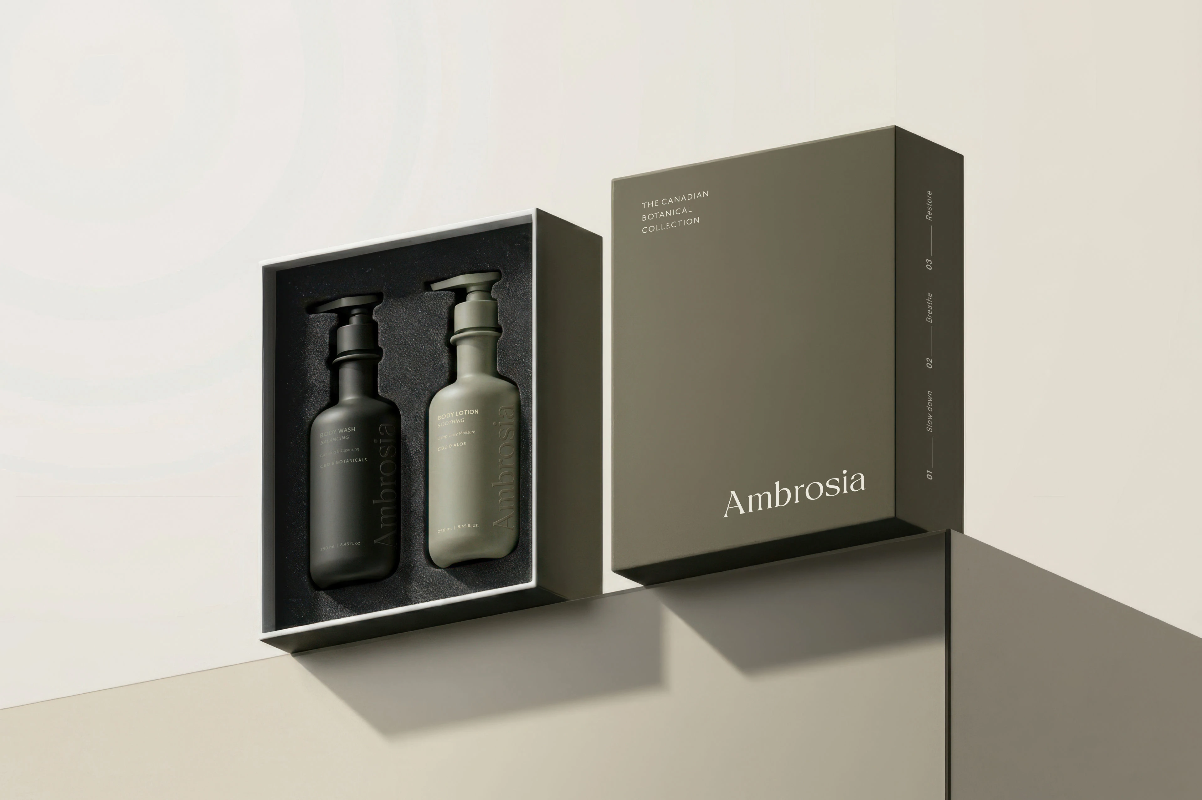
The brief was to develop a premium brand identity and packaging system for a collection of cannabinoid-based bodycare products. It needed to communicate quality, make different products easy to navigate, and feel consistent across glass, aluminum, and paper packaging.
The solution
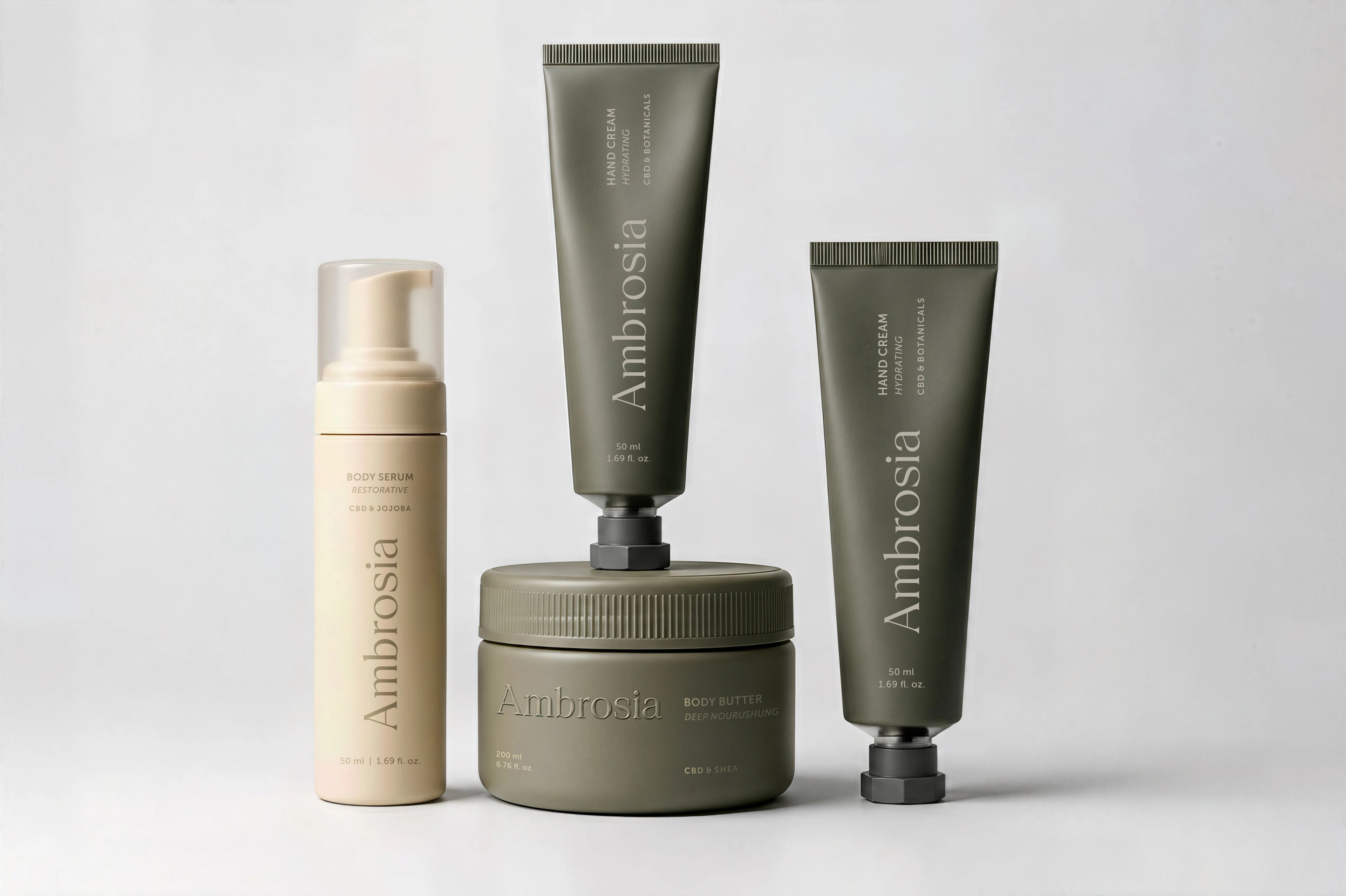
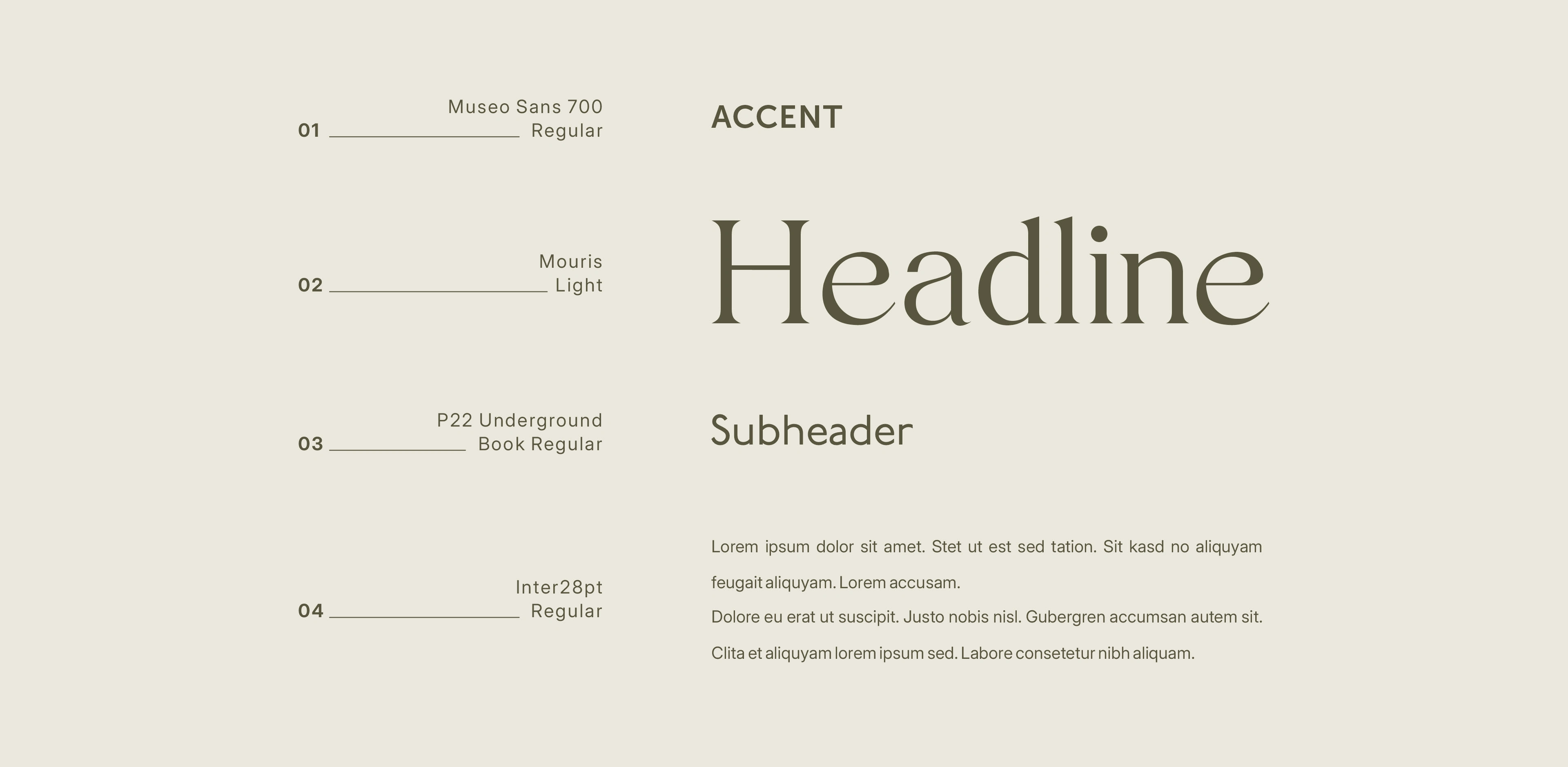
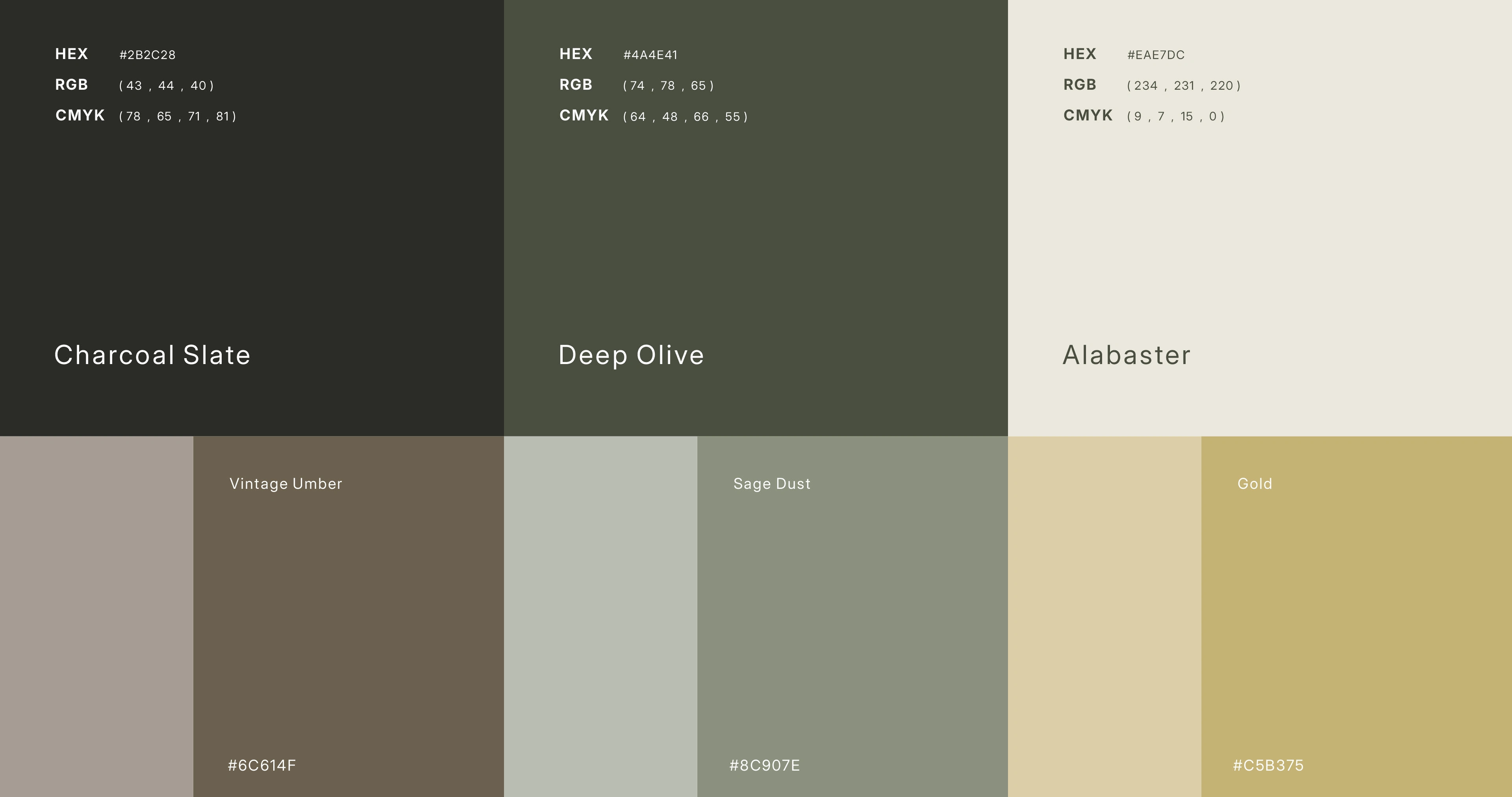
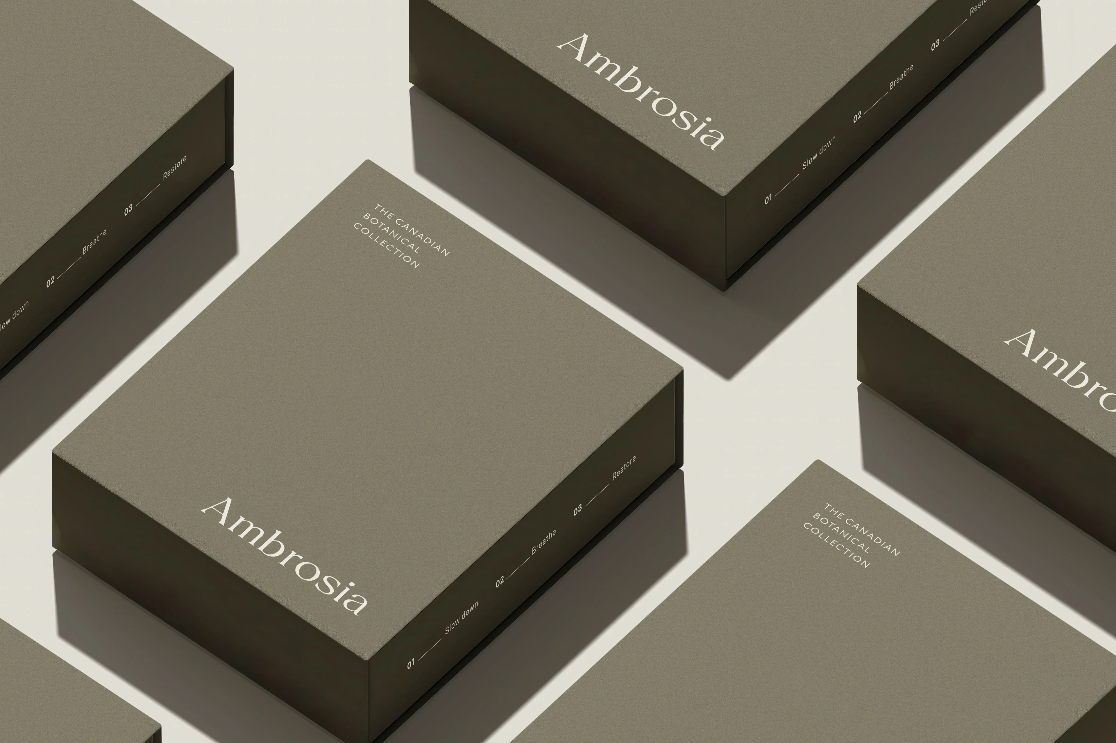
I developed the logo, typography, color palette, and packaging as one connected system. The visual direction is minimal, with careful attention to spacing, proportion, and the way information is presented.
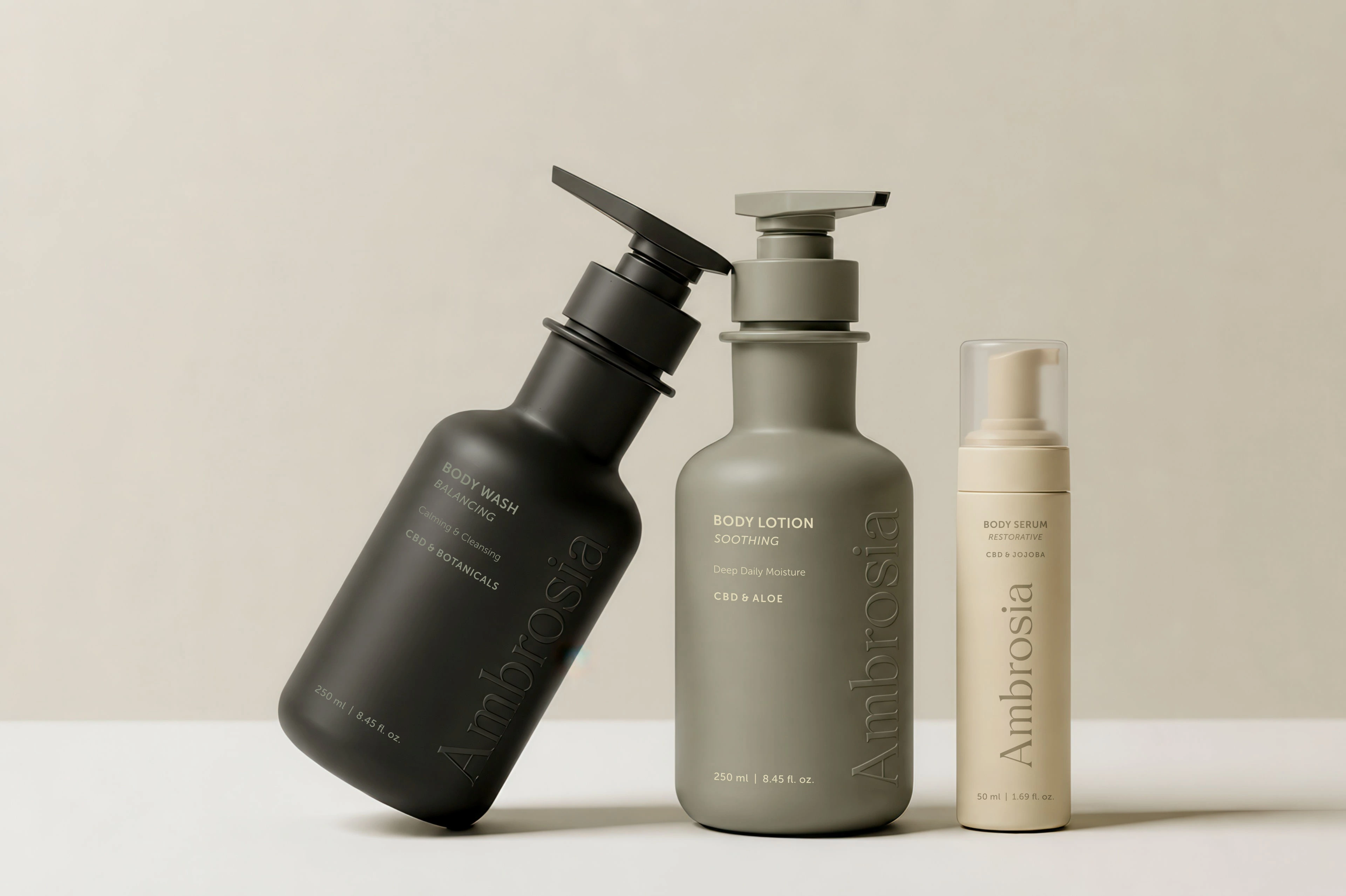
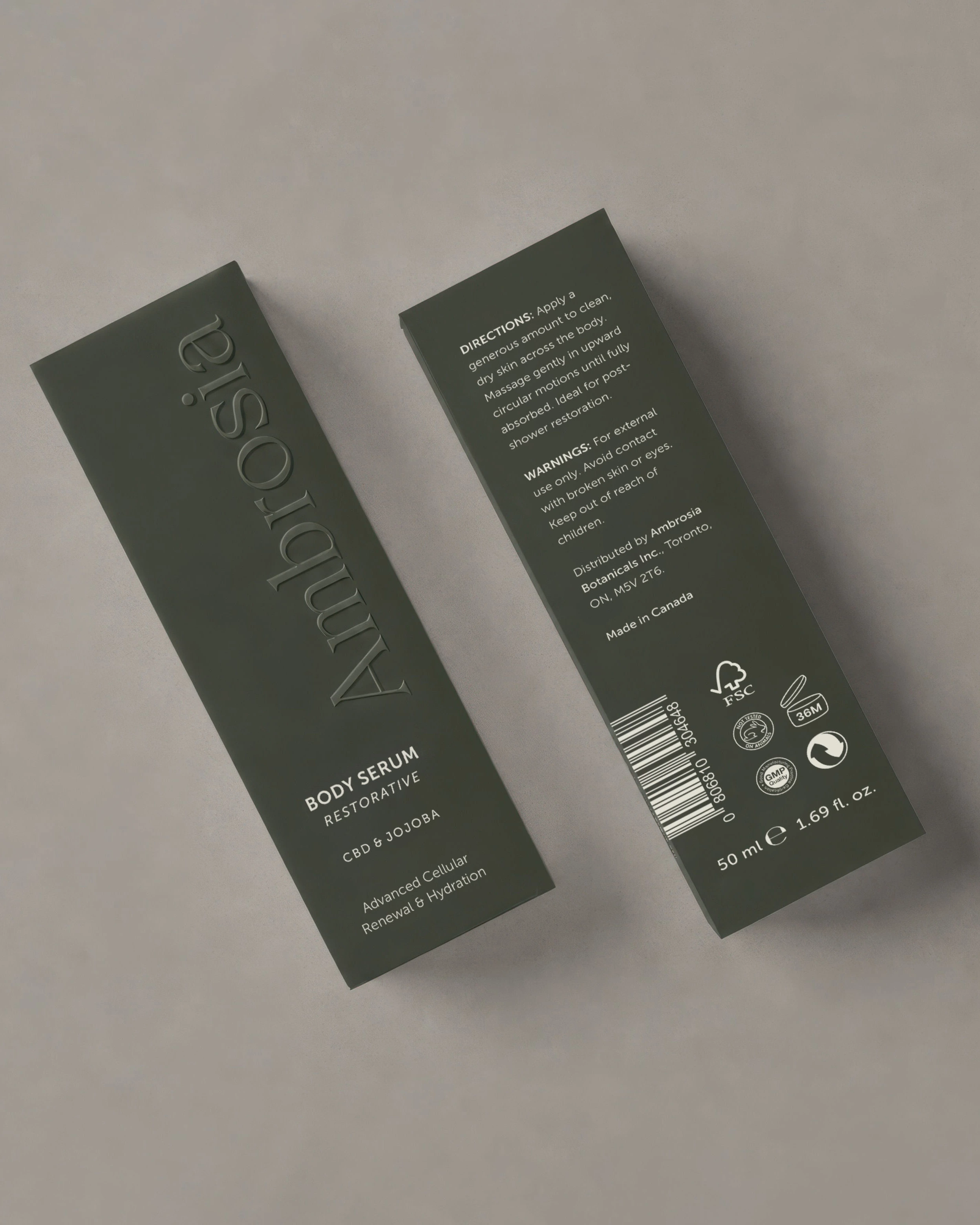
Across the range, a shared label structure brings consistency to different packaging shapes and sizes. Product names and supporting details have a clear hierarchy, helping distinguish each formula while keeping the brand recognizable.
The material contrasts became part of the identity: dark matte glass, raw aluminum, and soft-touch paper give the collection a tactile quality. The art direction carries that same restrained approach into the product imagery.
The result
A complete brand identity and packaging concept that brings a varied bodycare collection together. Each format has its own presence, while the typography, layout, and visual direction make the range feel like one brand.
The project explores how a few carefully considered design choices can create a premium experience across packaging and branded applications.

Developing a beauty or wellness brand?
Let’s talk about your brand identity and packaging.
Like this project
Posted Oct 5, 2026
Luxury bodycare brand identity and cosmetic packaging design for Ambrosia, a concept combining minimal typography, tactile materials, and botanical inspiration.