KÖÖK – Vegetable Soup Brand Identity & Packaging Design by Roberto De SimoneKÖÖK – Vegetable Soup Brand Identity & Packaging Design by Roberto De Simone

KÖÖK – Vegetable Soup Brand Identity & Packaging Design

Roberto De Simone

Roberto De Simone

KÖÖK is a Portland, Oregon-based food producer specialising in premium vegetable soups made with carefully selected ingredients and straightforward recipes. The brand was created for consumers looking for convenient, comforting meals without sacrificing ingredient quality, visual appeal or a sense of authenticity.
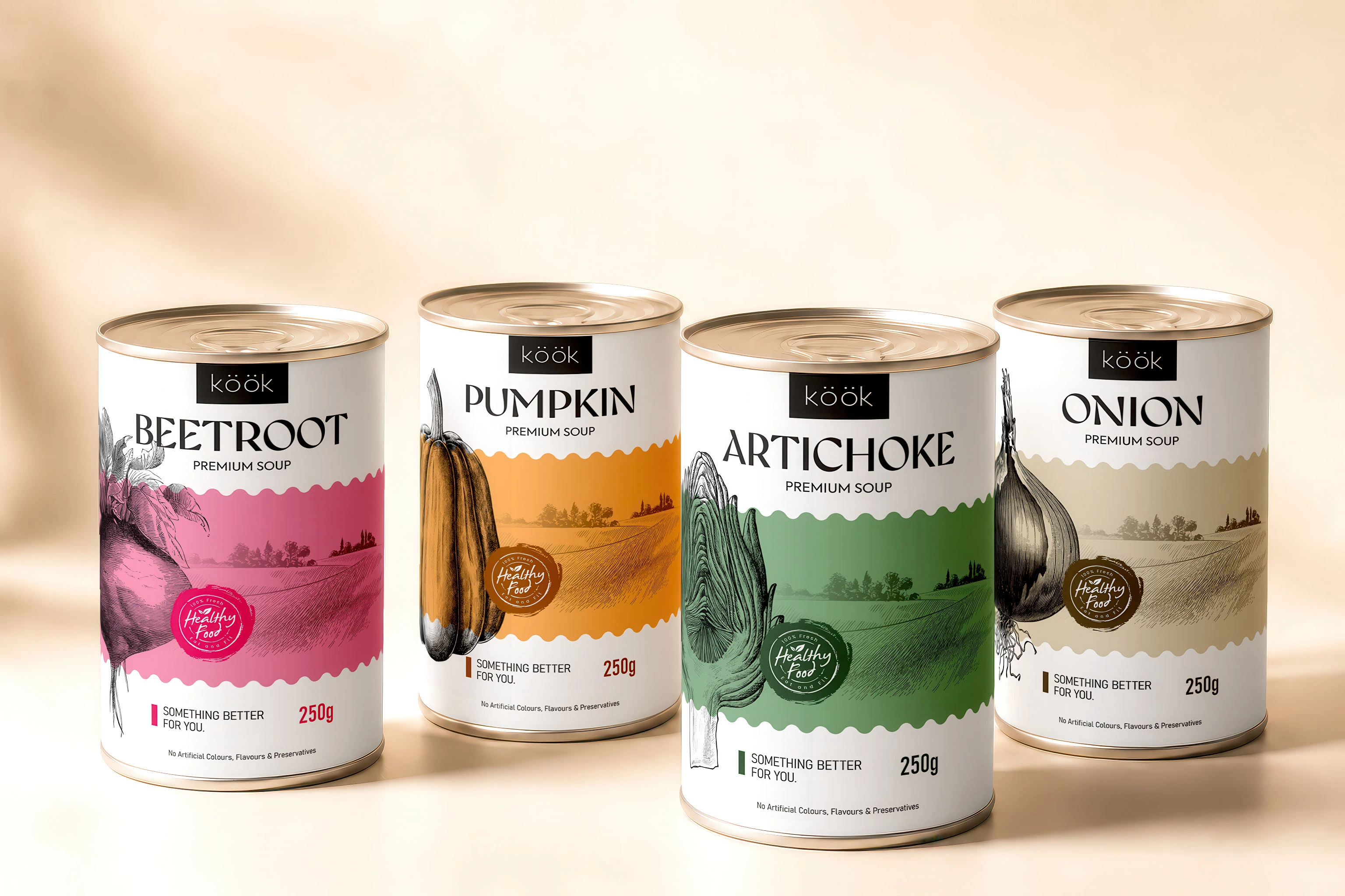
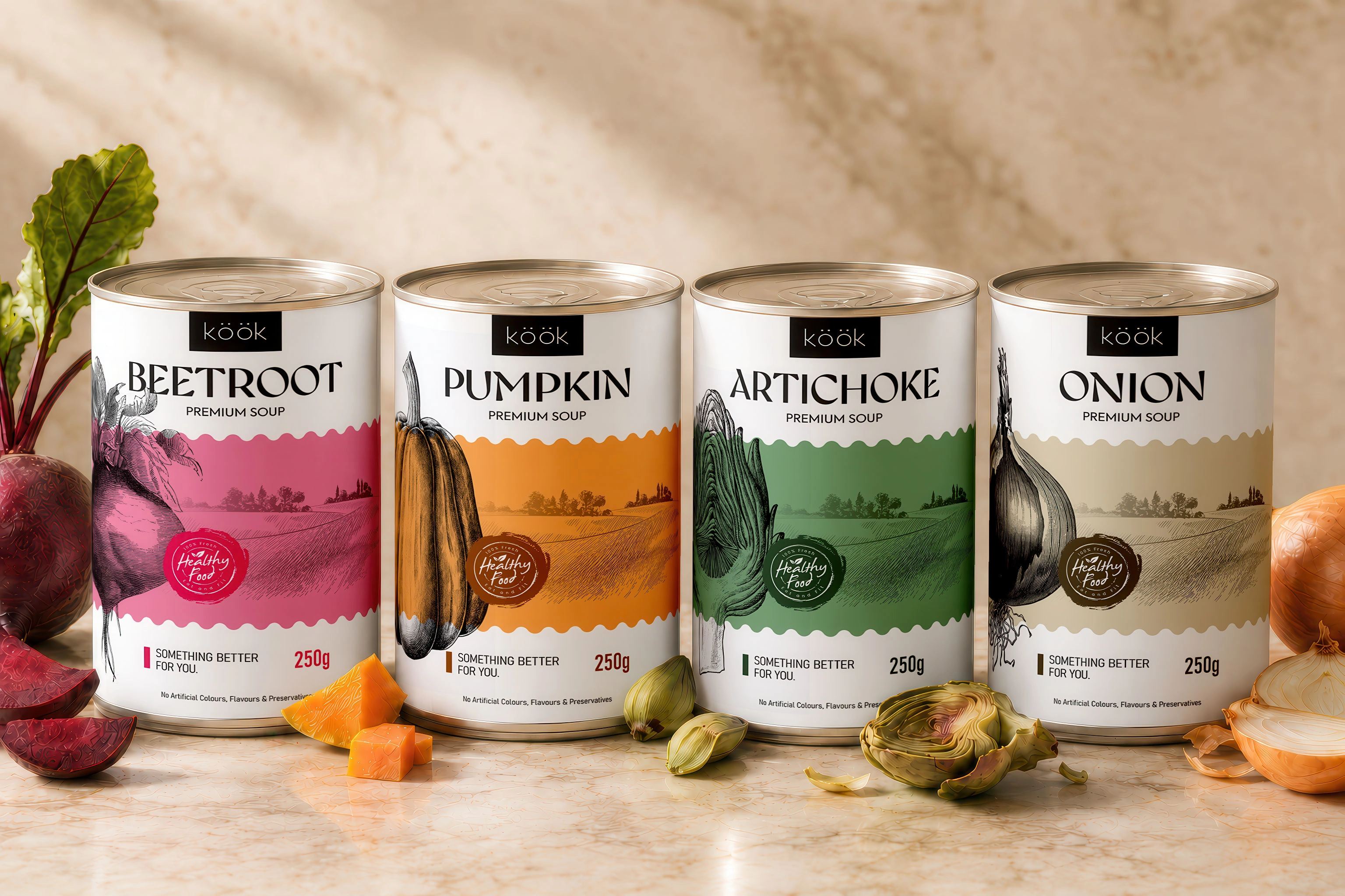
The objective was to develop a distinctive food brand identity and packaging system capable of bringing together four different soup varieties: Onion, Artichoke, Pumpkin and Beetroot, while giving each flavour its own recognisable character. 
The resulting design balances a contemporary American food-brand aesthetic with the warmth and craftsmanship traditionally associated with homemade soup.
Creative Direction, Brand Identity & Packaging Design: Roberto De Simone Studio: Korvin Brand Studio
Packaging concept
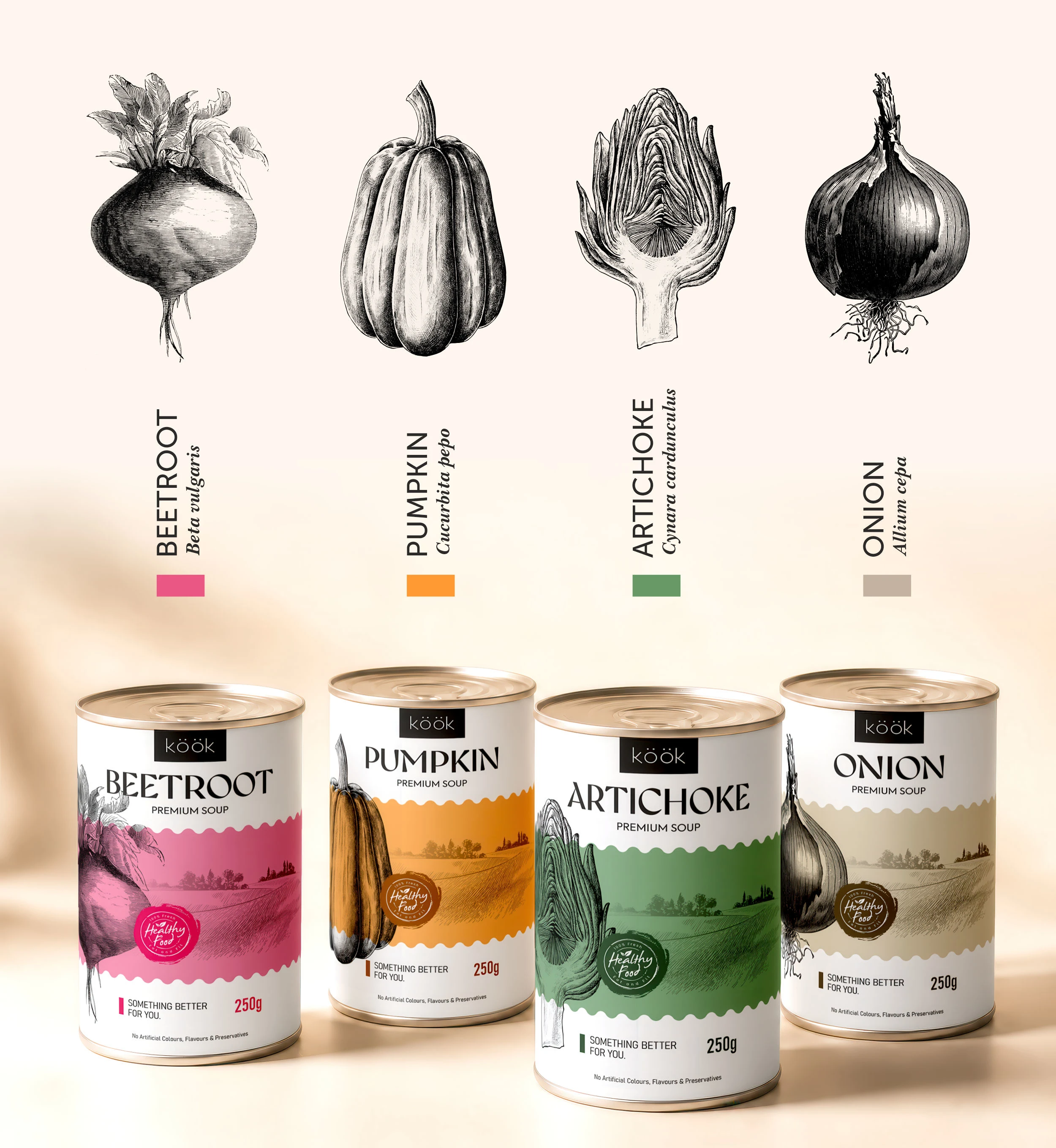
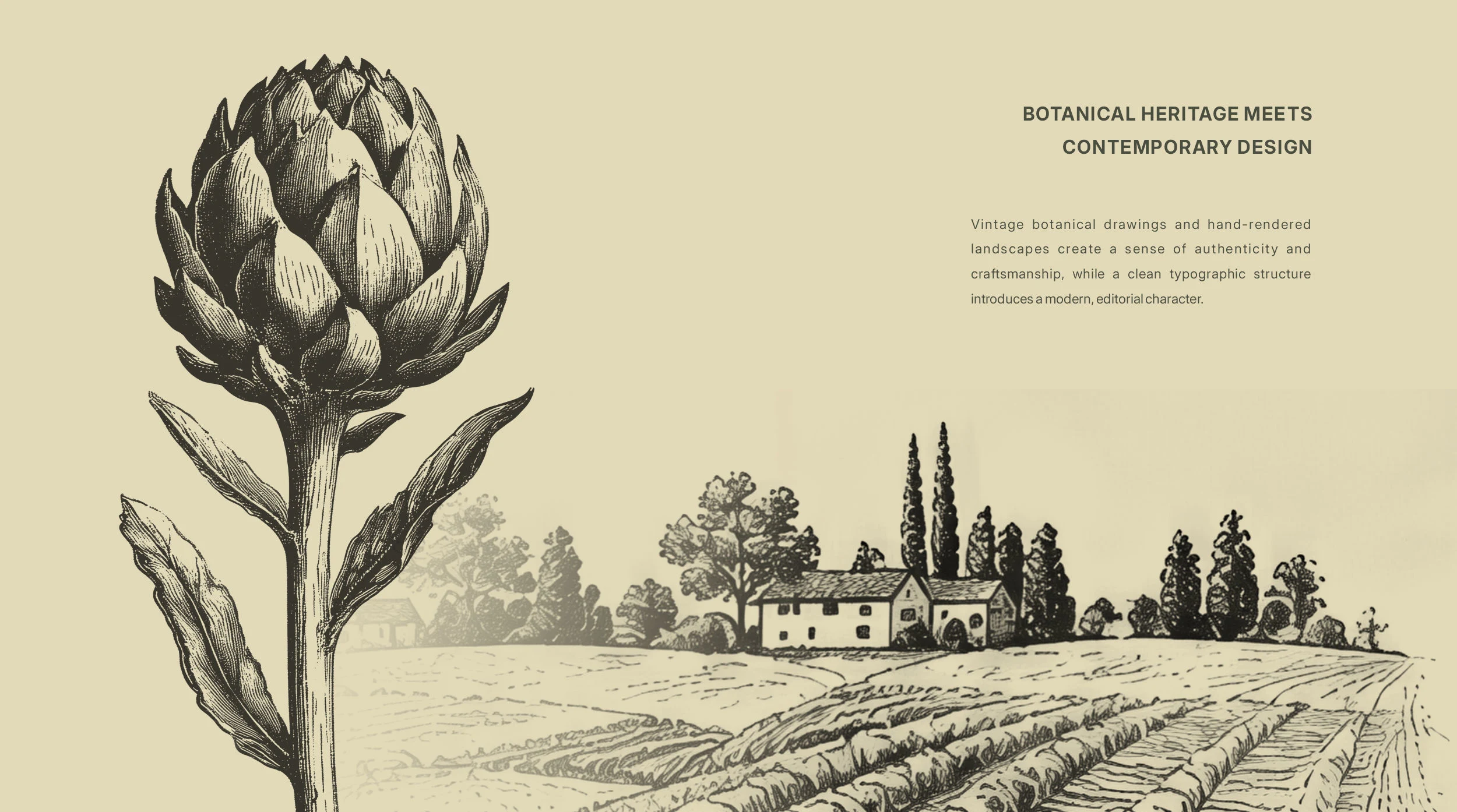
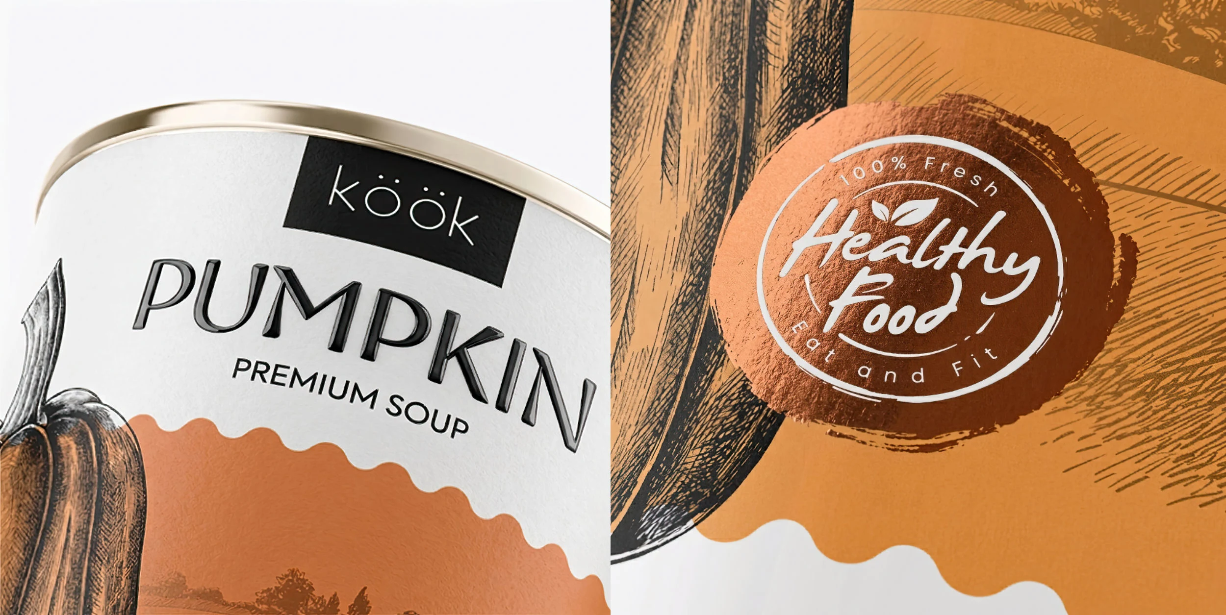
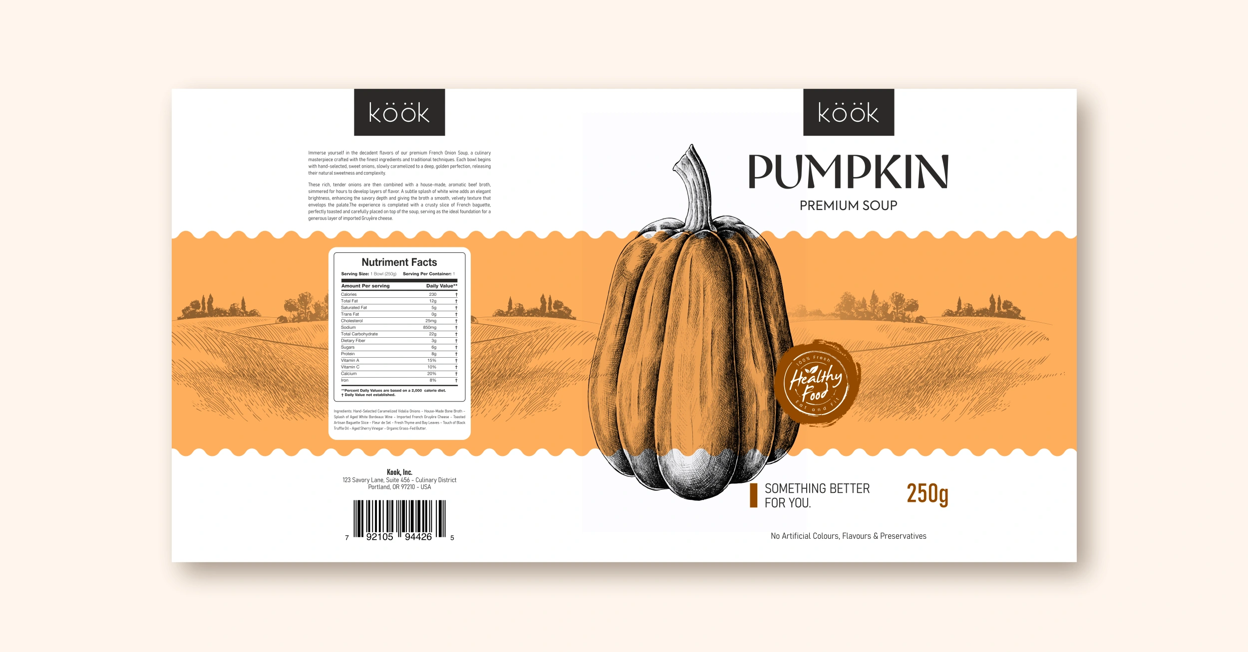
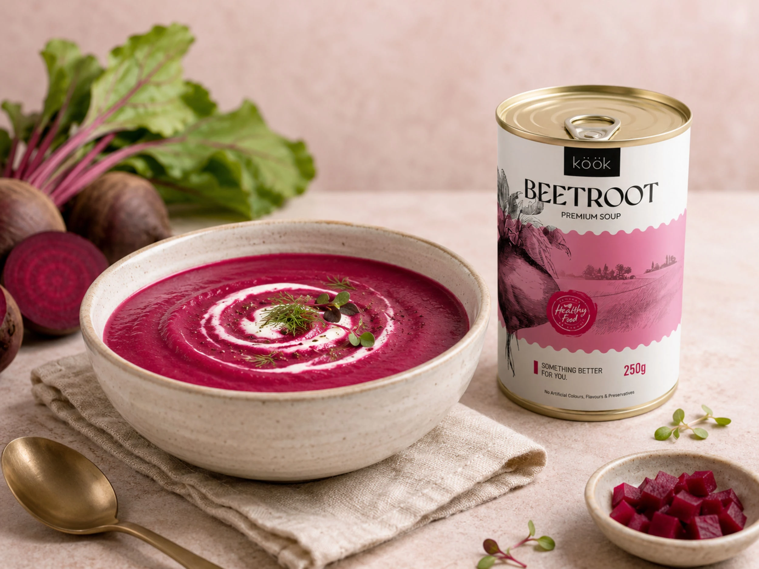
The packaging concept is built around the idea of presenting each vegetable as the central ingredient and visual protagonist of the recipe. Instead of relying on conventional food photography across the entire label, the design uses detailed, hand-drawn botanical illustrations to communicate natural ingredients, craftsmanship and a closer connection to the origins of the food.
Each illustration was developed specifically for its corresponding flavour and placed within a consistent label architecture. This creates a cohesive vegetable soup packaging design system while allowing the individual products to remain easy to distinguish on the shelf.
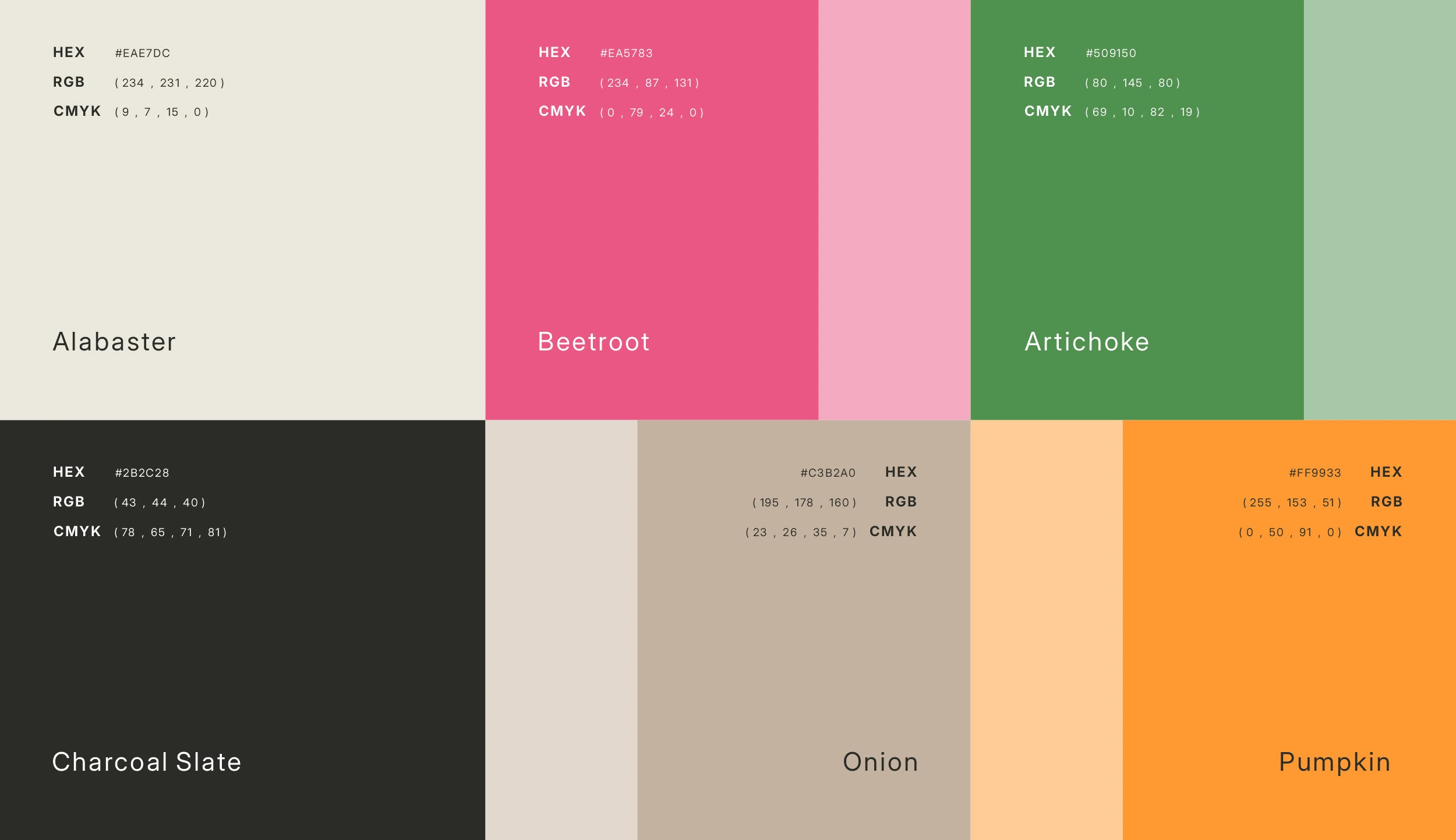
A dedicated colour palette identifies every recipe:
- warm neutral tones for Onion;
- fresh botanical green for Artichoke;
- rich golden yellow for Pumpkin;
- deep magenta and earthy pink for Beetroot.
These colours extend beyond the label and become an essential part of the wider brand language, creating a collection that feels varied yet unmistakably connected.
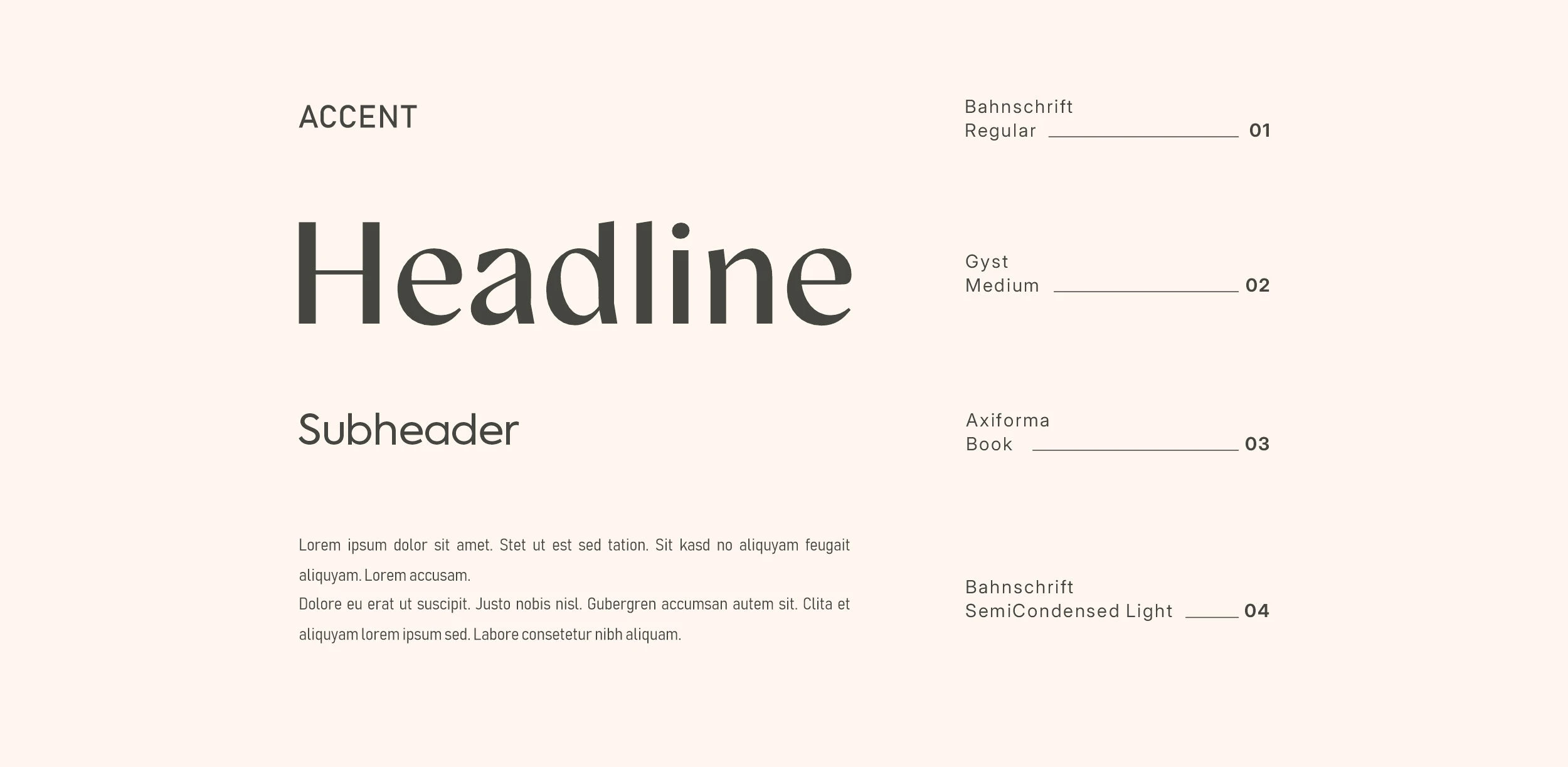
The restrained typography and generous use of white space give the cans a clean, modern appearance, while the engraved-style illustrations introduce texture, character and an artisanal quality. This contrast was designed to reflect KÖK’s positioning: a premium yet approachable Portland food brand combining contemporary convenience with the familiarity of traditionally prepared soup.
Thank you for exploring the KÖÖK project.
For brand identity, packaging design and creative direction enquiries, visit:
KORVIN BRAND STUDIO korvinbrandstudio.com
Follow our latest projects and behind-the-scenes work on Instagram: @korvinbrandstudio
Like this project

Posted Sep 3, 2026

Brand identity and packaging design for KÖÖK, a Portland, Oregon-based producer of premium vegetable soups.