Freeletics App Visual Refresh
Iñigo Hernández
Freeletics Visual Refresh
Context
Over years of iteration, Freeletics’ app had accumulated inconsistent patterns and outdated visuals. The experience felt fragmented, creating usability friction and diluting the brand.
Problems
Inconsistent typography, colors, and spacing made the app feel cluttered and hard to navigate.
Visual language didn’t match Freeletics’ evolving brand, reducing trust and appeal.
UI lacked clarity and polish compared to competitors, impacting perceived quality.
Goal
Lead a visual refresh to modernize the product, improve usability, and align the app with Freeletics’ updated brand — without disrupting existing user habits.
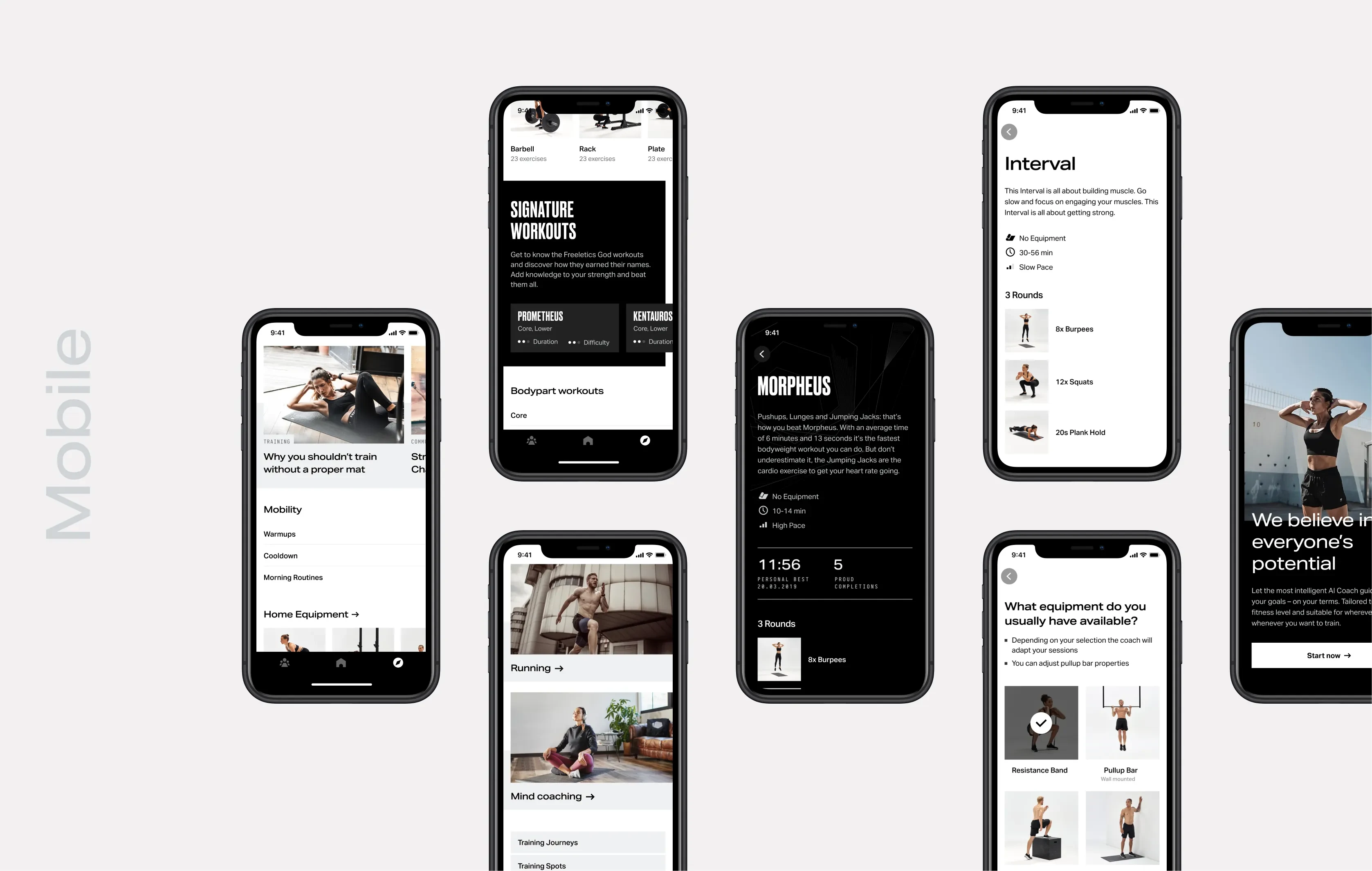
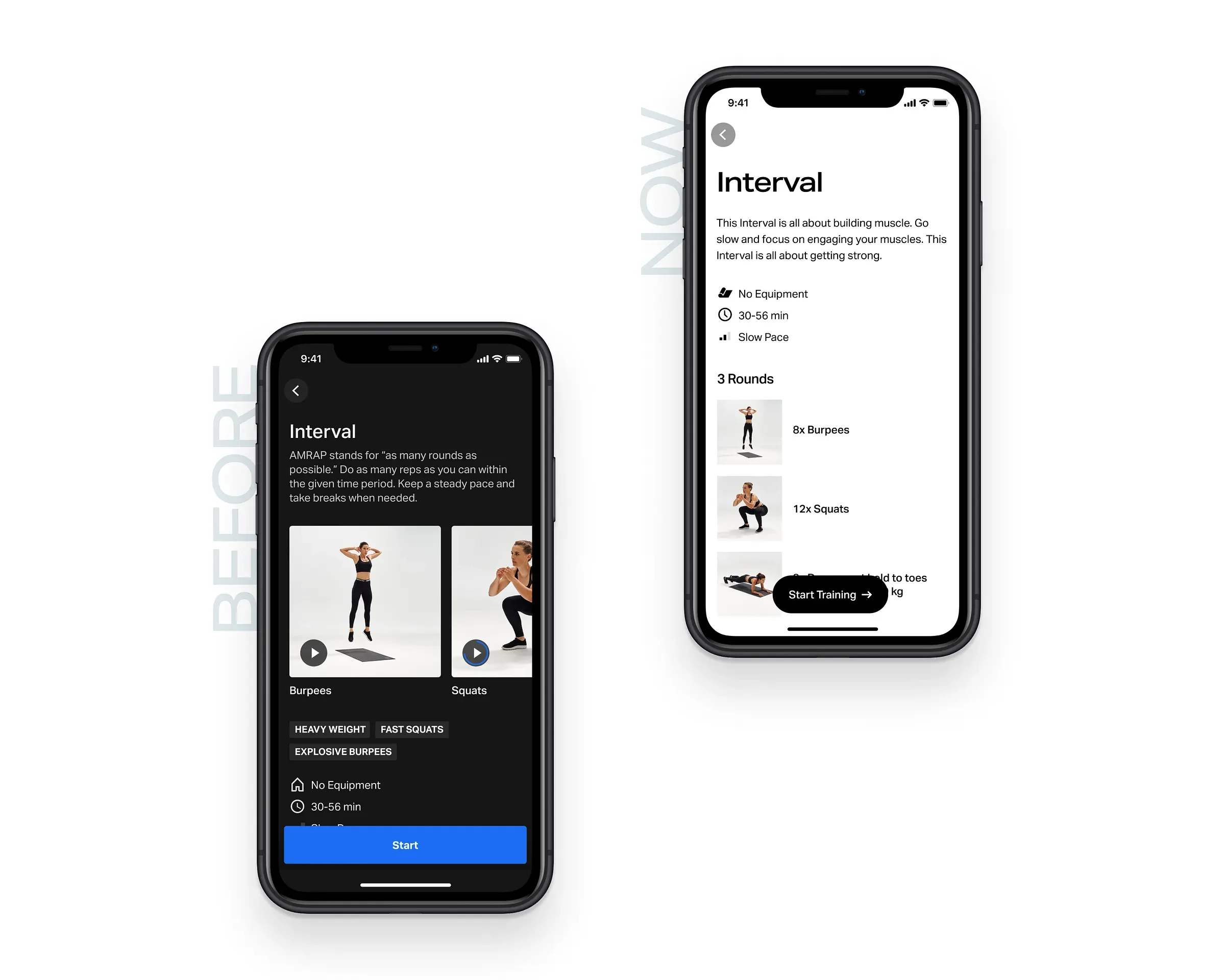
Training Journey details
Training overview
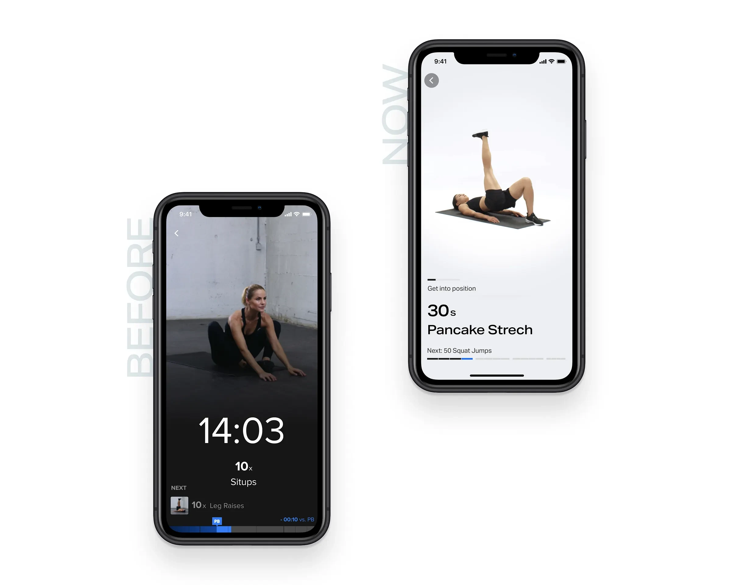
Workout experience
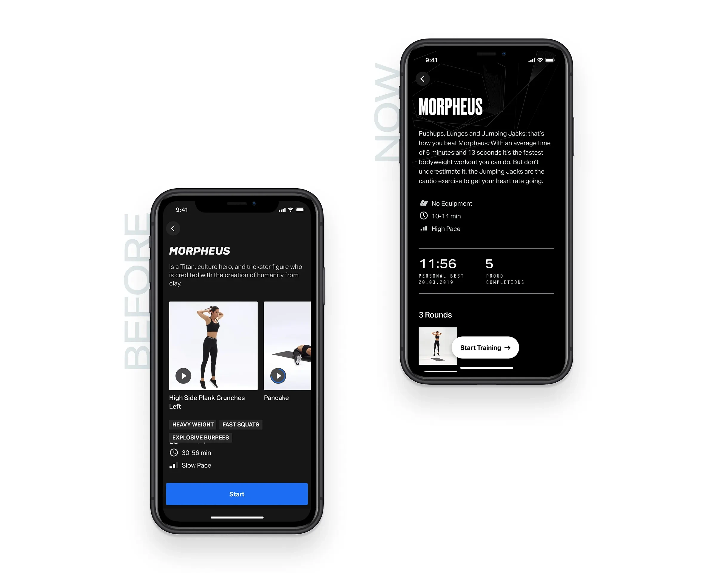
Branded training overview
Actions
Audited design language to identify inconsistencies in typography, colors, spacing, and components.
Created a visual design system aligned with the refreshed Freeletics brand.
Partnered with engineers to implement scalable UI components across iOS and Android.
Balanced “refresh” vs. “redesign” — modernizing while keeping functionality intact.
Challenges
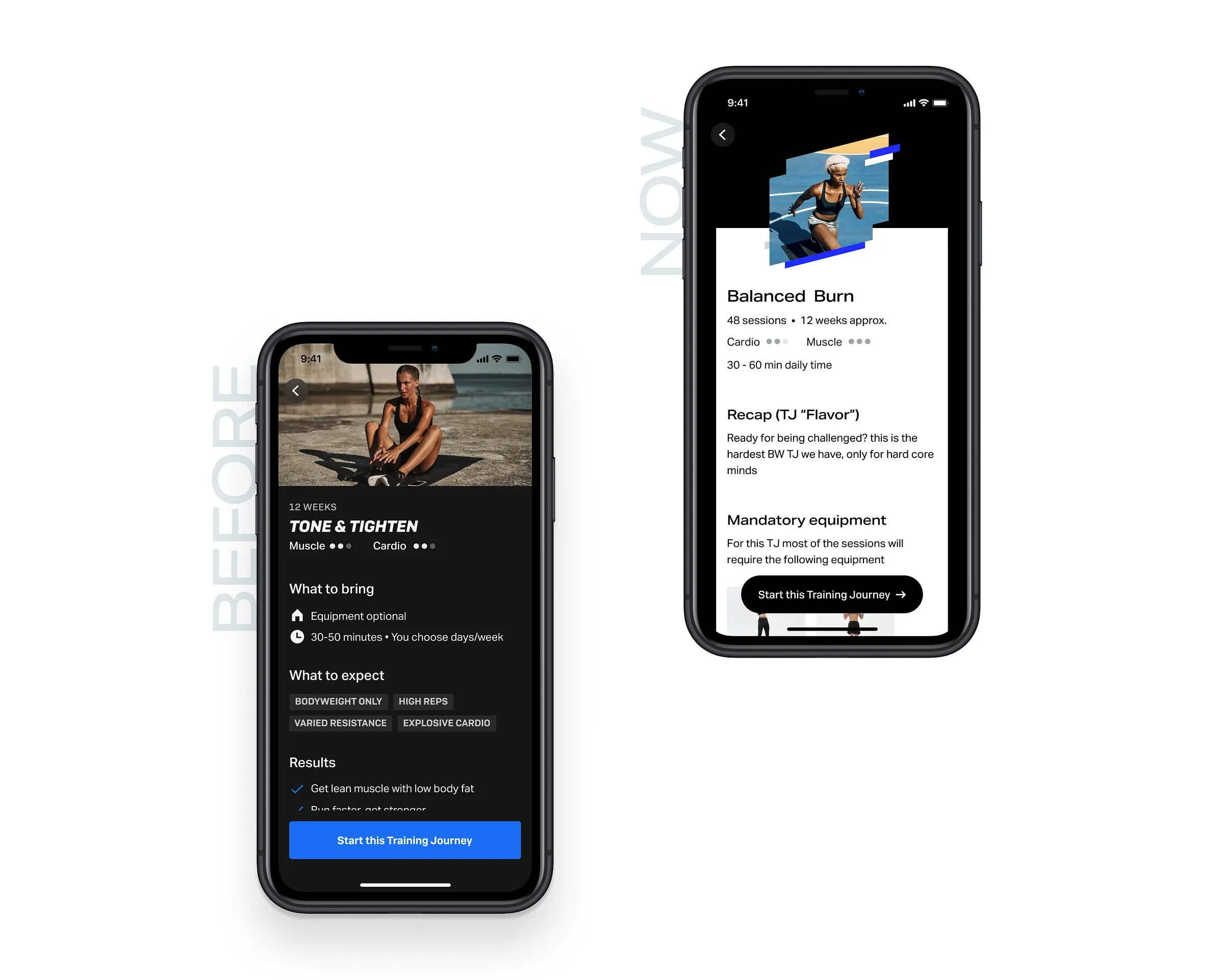
The hardest part was finding the sweet spot between continuity and change: too drastic a redesign risked alienating users, too subtle left problems unsolved. Incremental updates across key flows proved most effective.
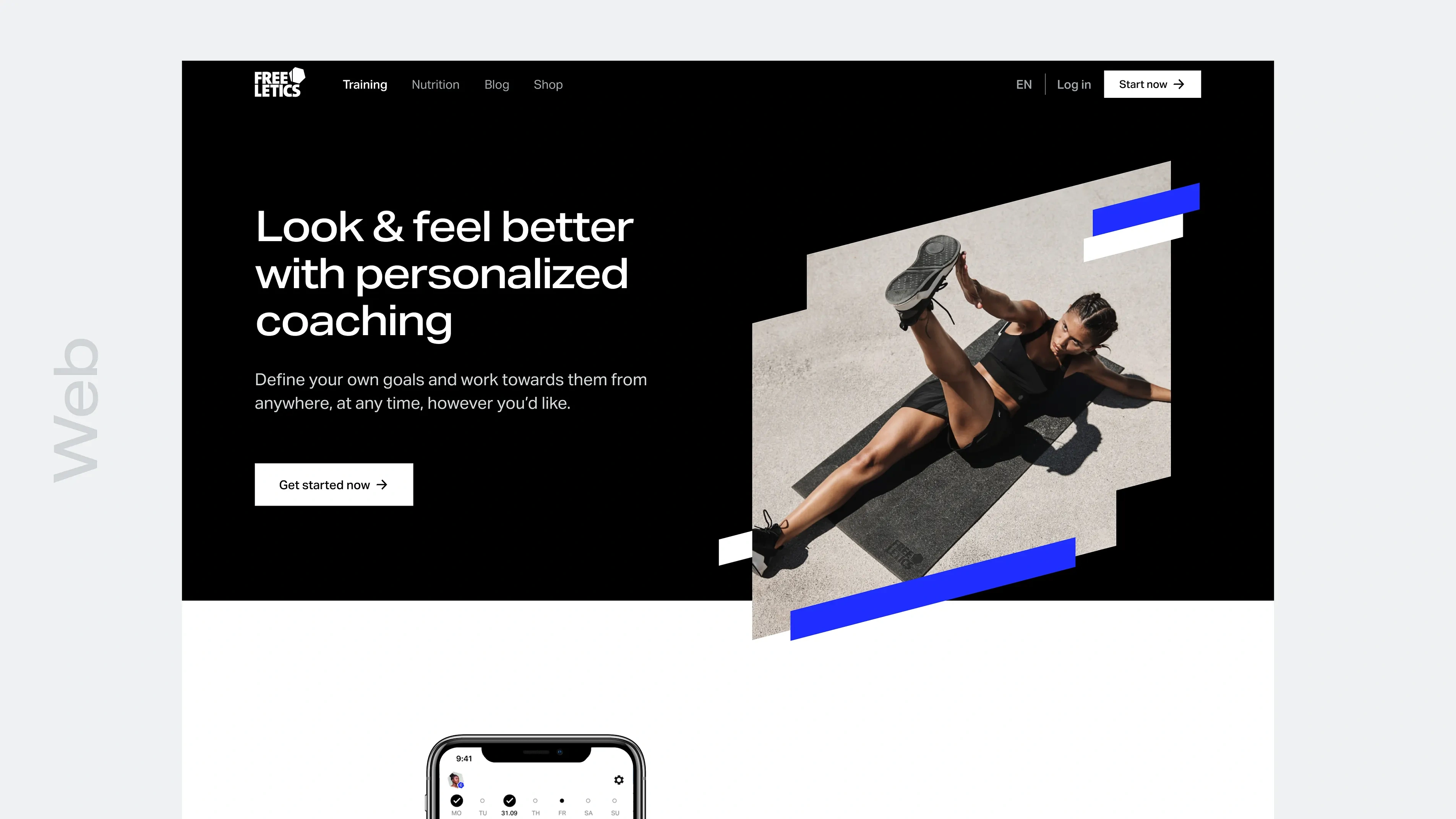
Website
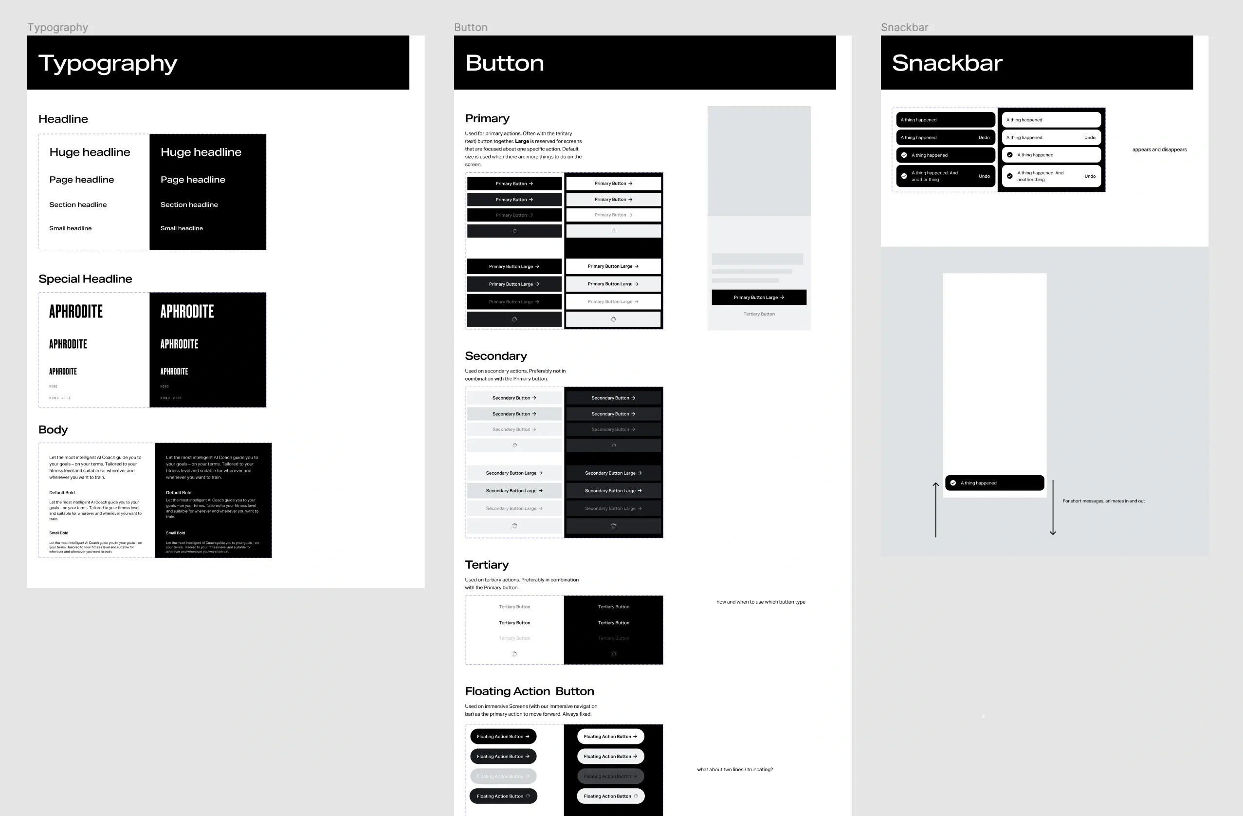
Components
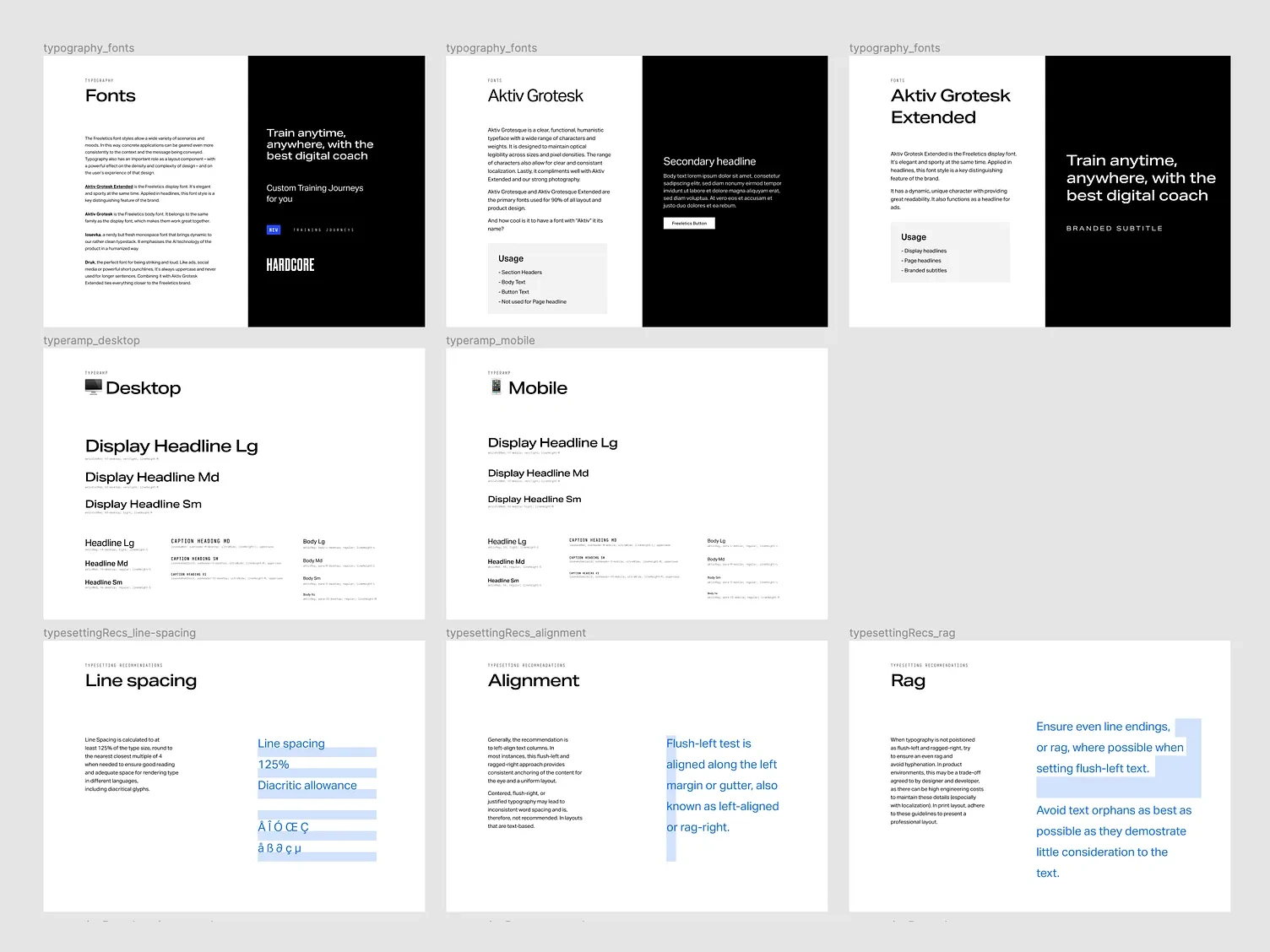
Styles
Results
Rolled out a refreshed app UI that users recognized but found more modern and trustworthy.
Reduced visual inconsistencies across screens and platforms.
Established a foundation that improved design velocity and implementation quality.
Learnings
Reduced design and engineering debt by strengthening the design system.
A refresh can drive efficiency and brand value even without new features.
Cross-platform parity requires closer design-engineering collaboration.
Like this project
Posted Oct 28, 2025
Led a visual refresh of the Freeletics app. Cleaner UI, stronger brand, faster-to-scan screens. Result: a modern look that makes workouts feel sharp.
Likes
1
Views
10
Clients
Freeletics