StudyPal: The Essential Educational App For Students
Hamud Dawud
📚 For my Masters Degree project, I created StudyPal an immersive educational app for secondary school students, featuring a user-friendly interface and engaging learning features."
Overview 🔎
As my Masters Degree major project, I developed StudyPal, an innovative educational UI app designed to support and aid students in their learning journey. My objective was to create a user-friendly platform that enhances the student experience, prioritising usability and functionality. After compiling research, I identified a gap where some competitor apps lacked creativity and aesthetics, so I aimed to make these areas strong points of StudyPal.
Problem 🔬
The central problem I tackled was the current practice in many schools, where students are required to pay a subscription fee for the use of iPads or tablets for tasks ranging from school trip payments to homework assignments and receiving updates on holidays or teacher training. Unfortunately, the existing apps for these purposes often featured basic and unattractive user interfaces, causing difficulties for both parents and students in navigation.
Solution ✅
StudyPal serves as a solution to address these challenges. It was developed to provide a remedy to the issue of subscription fees for educational tablets and their UI/ UX not matching the cost, offering a user-friendly and aesthetically pleasing interface that greatly improves usability. By doing so, StudyPal aims to make the subscription fee a worthwhile investment for parents while enabling students to seamlessly navigate the app. Ultimately, StudyPal is positioned to revolutionise the way students engage with their educational tasks, offering an enhanced and enjoyable experience that allows them to concentrate on their studies and educational activities.
Research 📚
Primary Research
The main section that covered my primary research was to analyse the UI design and user experience that a Firefly user currently has access to; topics such as aesthetics and pros and cons were discussed. Additionally, other areas of primary research were conducted via a questionnaire that gained feedback and results from the opinions of parents that have children that use educational apps for school, these responses were given at a local secondary schools parents evening.
Secondary Research
The secondary research focused on assessing the effectiveness of educational apps for children, parents, and teachers through user reviews. It also examined key features and functionalities, considering factors like usability, engagement, educational value, and howits aligned with the schools curriculum. Perspectives from children, parents, and teachers were included, and metrics like user satisfaction, academic performance, and behavioral changes were used for evaluation. Comparative analysis identified trends, providing valuable insights into the best-performing apps across different educational sections.
Here's a link to my Figma file that contains all my research!👇🏽
Research Preview 📚
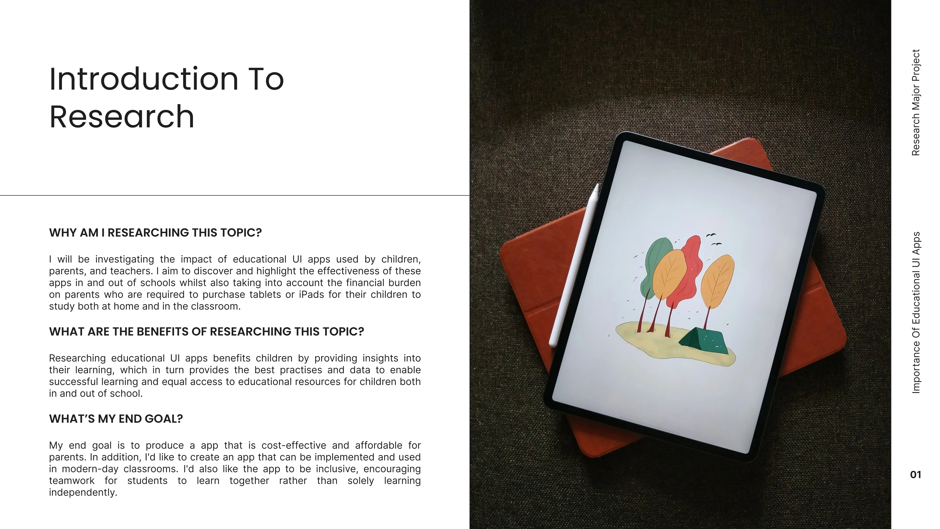
This slide explains why I picked this project and what I aim to achieve with it.
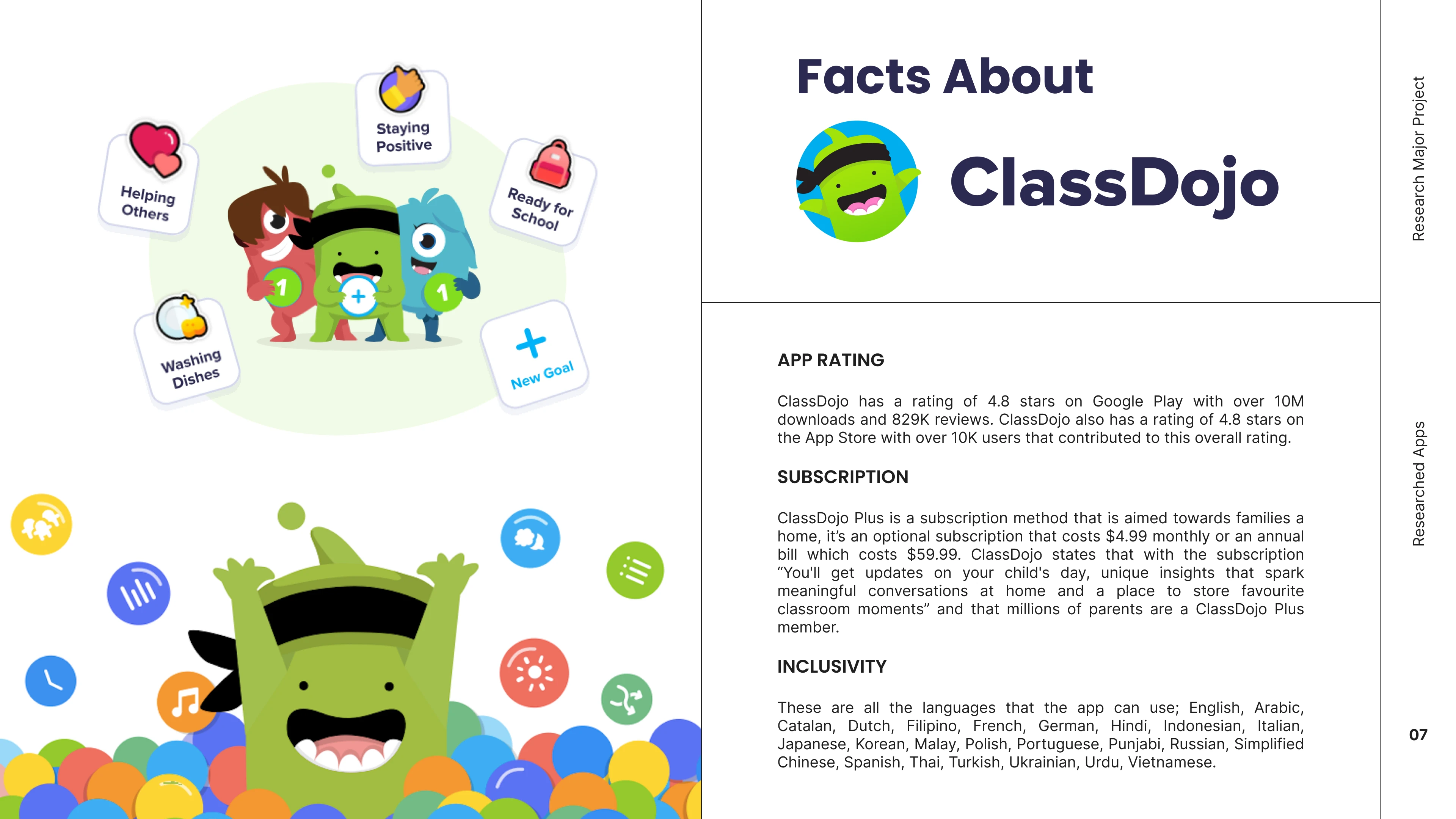
Here's a preview slide that provides a brief introduction to the success of an existing app.
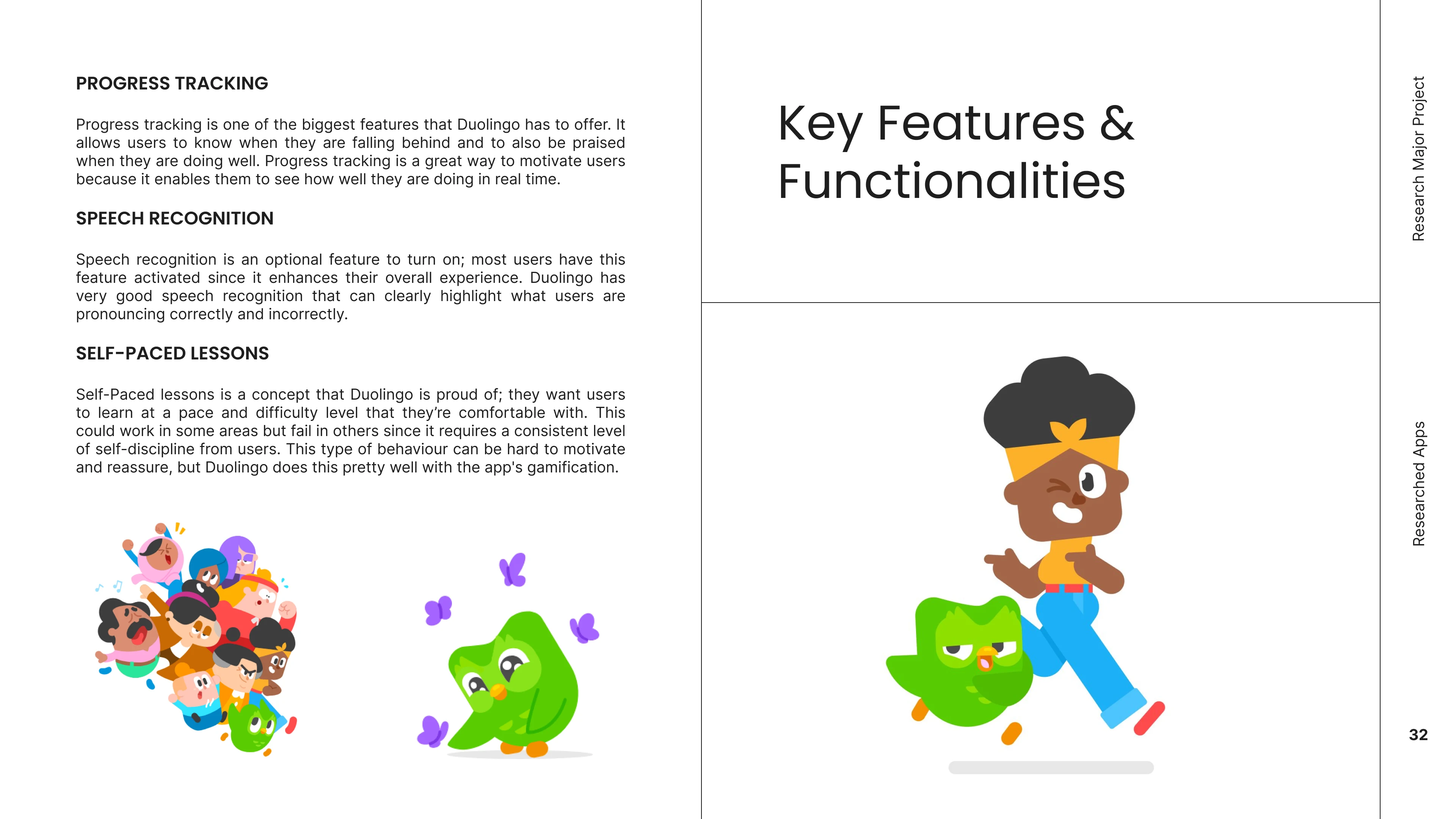
This slide showcases the key features & functionalities that stood out to me
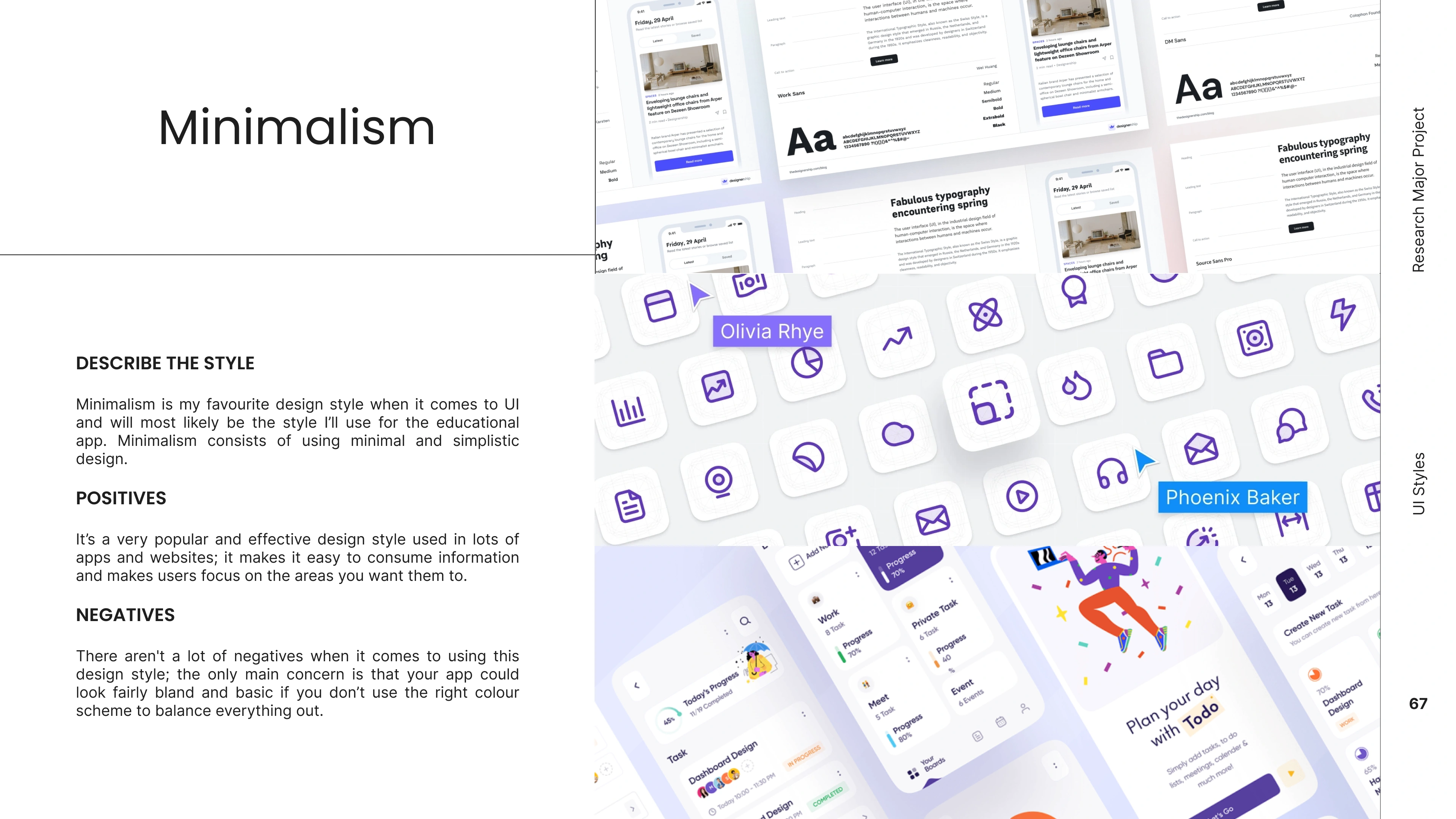
This last slide displays one of the many design styles I researched before settling on the final one.
Inspiration 💡
Mood Boarding
In the inspiration stage, I developed a mood board to draw ideas from existing educational apps that offer a minimalistic and user-friendly system. This involved curating a selection of design elements, colour schemes, typography styles, and visual representations from these educational apps.
Ideation 💡
Wireframe Sketches
After researching educational UI designs and apps, I proceeded to the next phase of the project. which was to begin sketching wireframes. These wireframes provided a structured visual representation of the app's layout and functionality, allowing me to design a clear and practical blueprint of the user interface. This step ensured that I had a clear vision of how the final design would be structured and how users would interact with it.
Low-Fidelity
Following the process of sketching wireframes, I transitioned to designing low-fidelity digital designs. The low-fidelity designs helped by creating a quick understanding of the app's layout and functionality. This approach ensured a clearer understanding for all users and testers off the app.
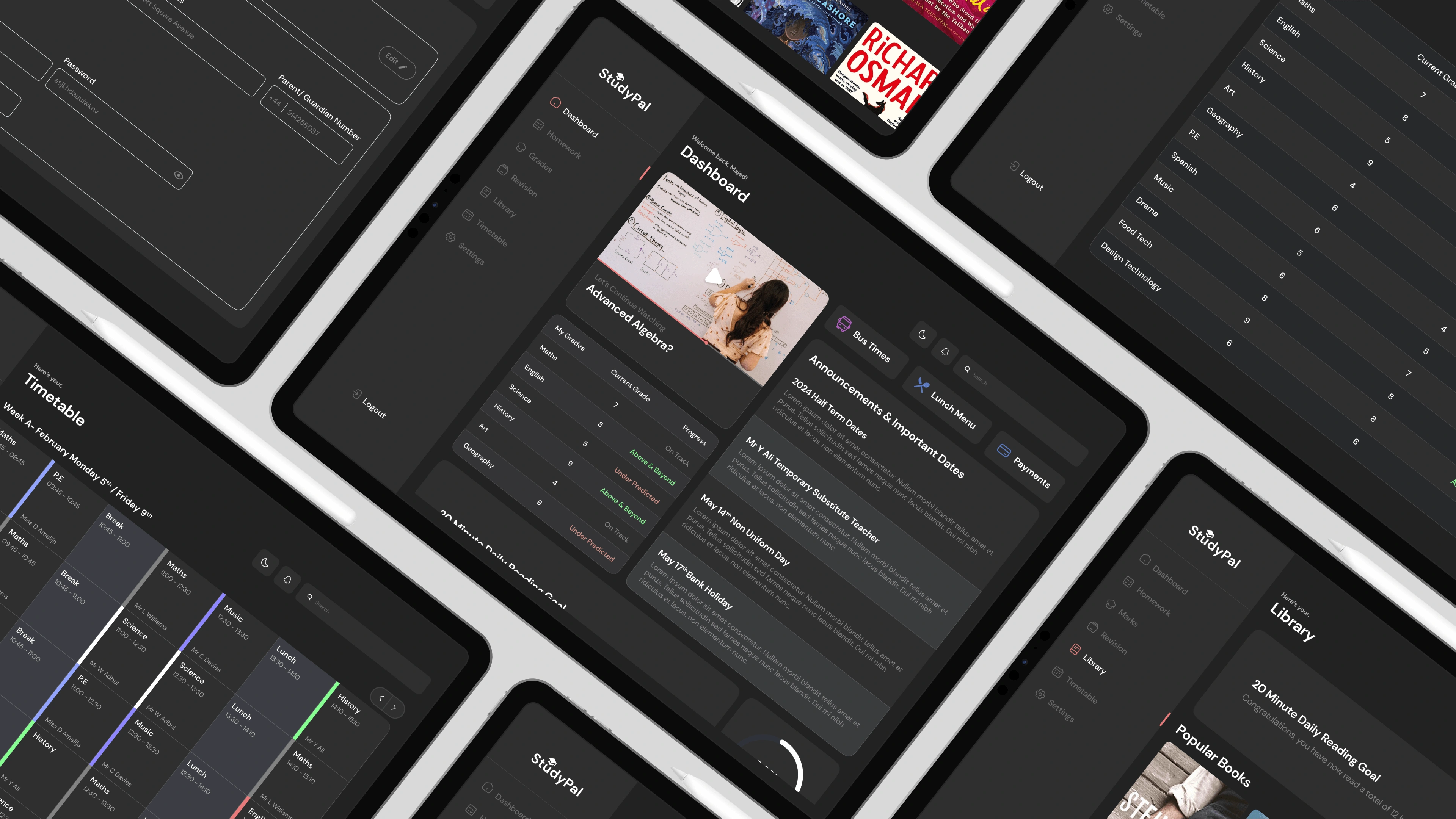
Final
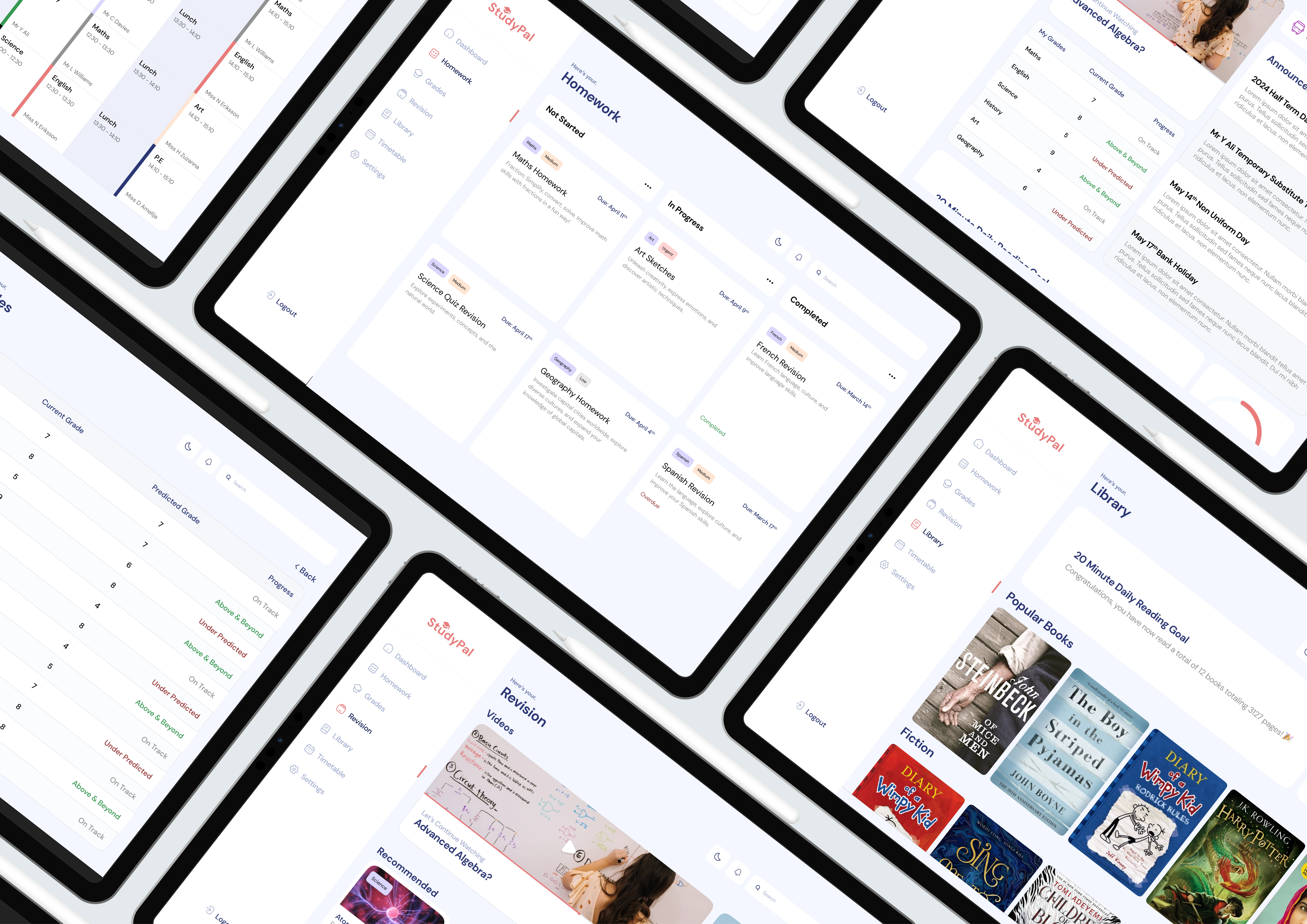
Lastly, I moved on to create the final version of the UI design. During this phase, I worked on perfecting the visual aspects by adding branding elements, colours, fonts, and detailed user interface components. These high-fidelity designs showcase the fully polished and finished user interface that users will see and use.
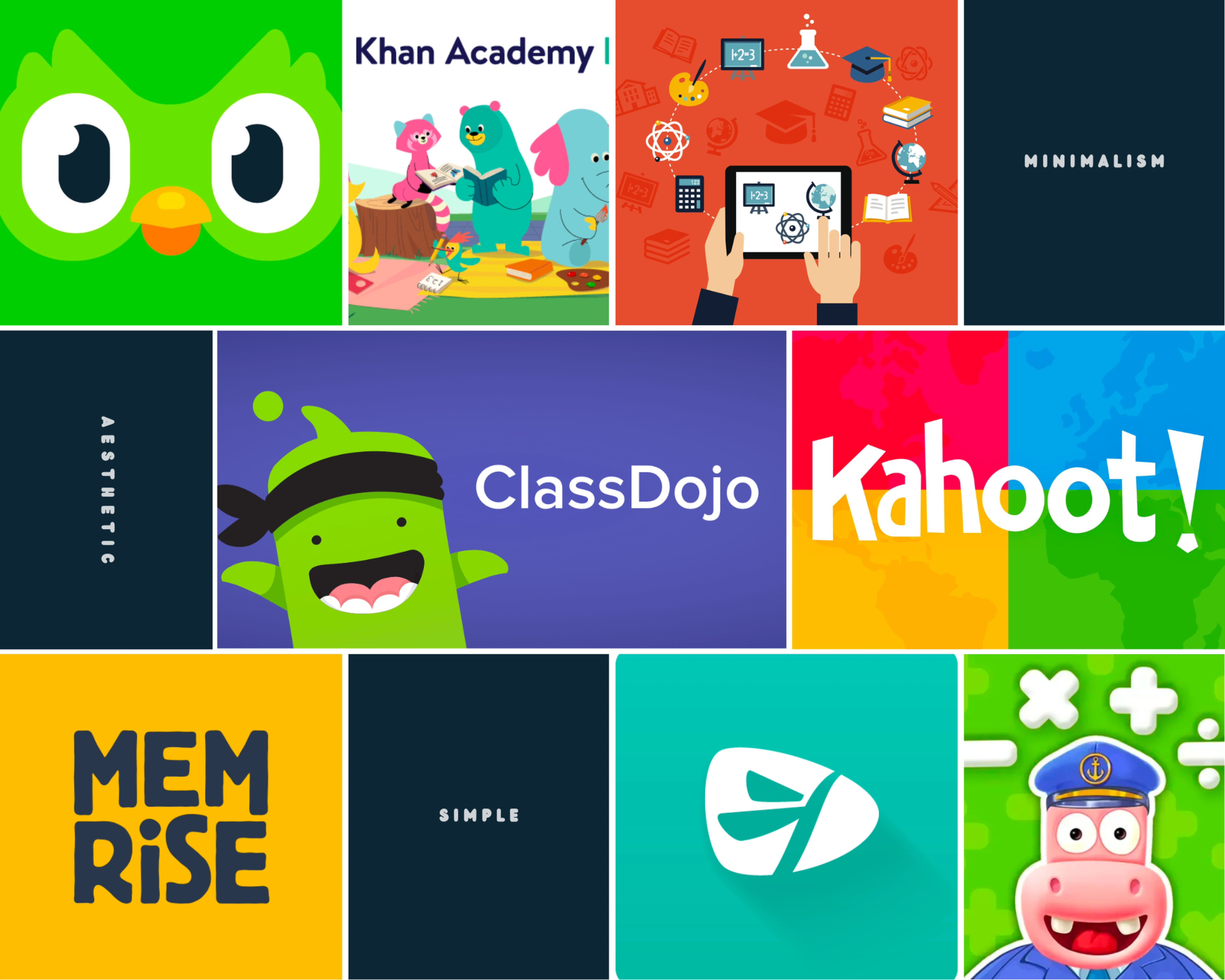
This mood board contains images of educational apps that I gained inspiration from in terms of features and functionalities.
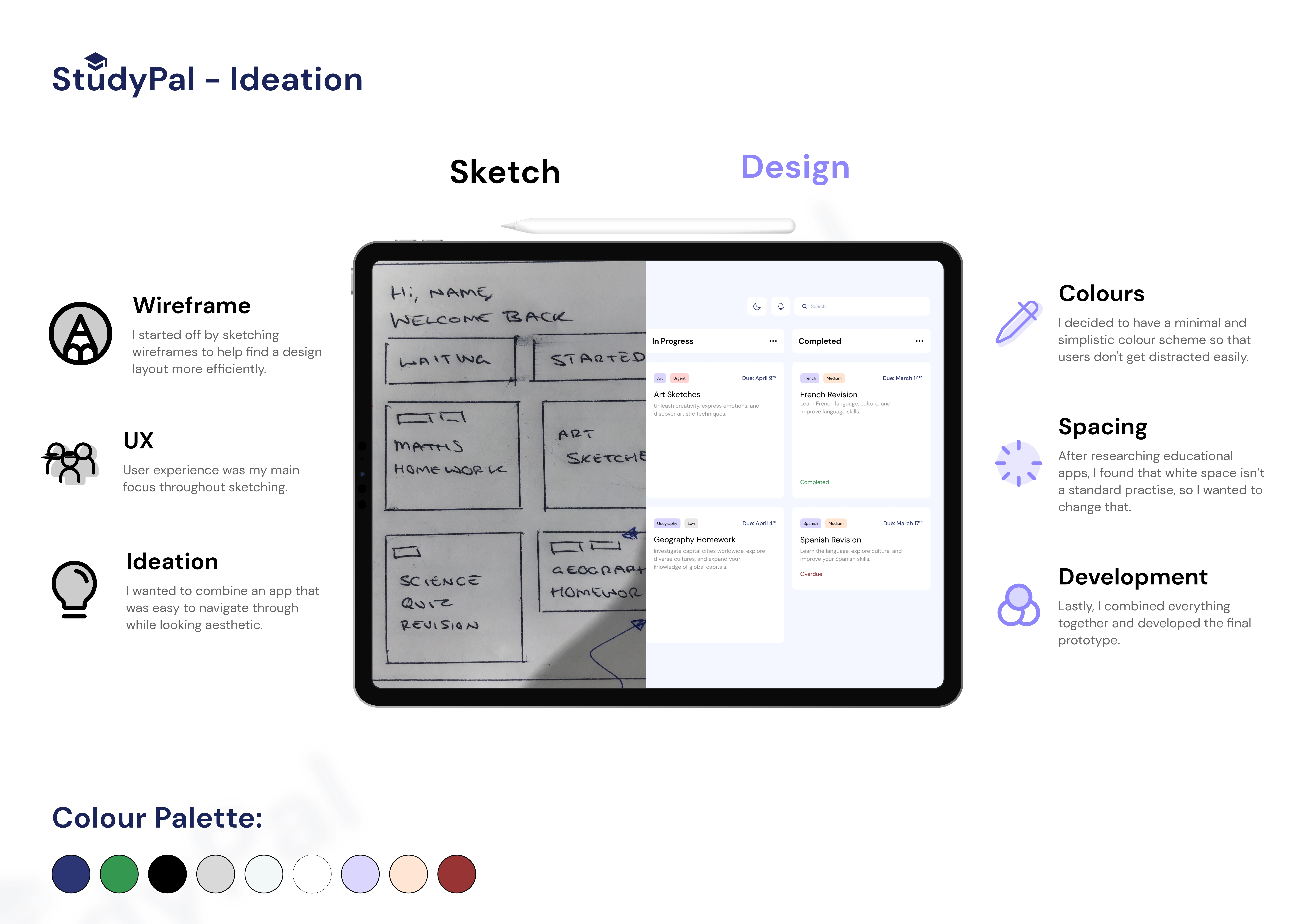
Here, I showcase my design process, starting from an initial sketch and leading to a final design.
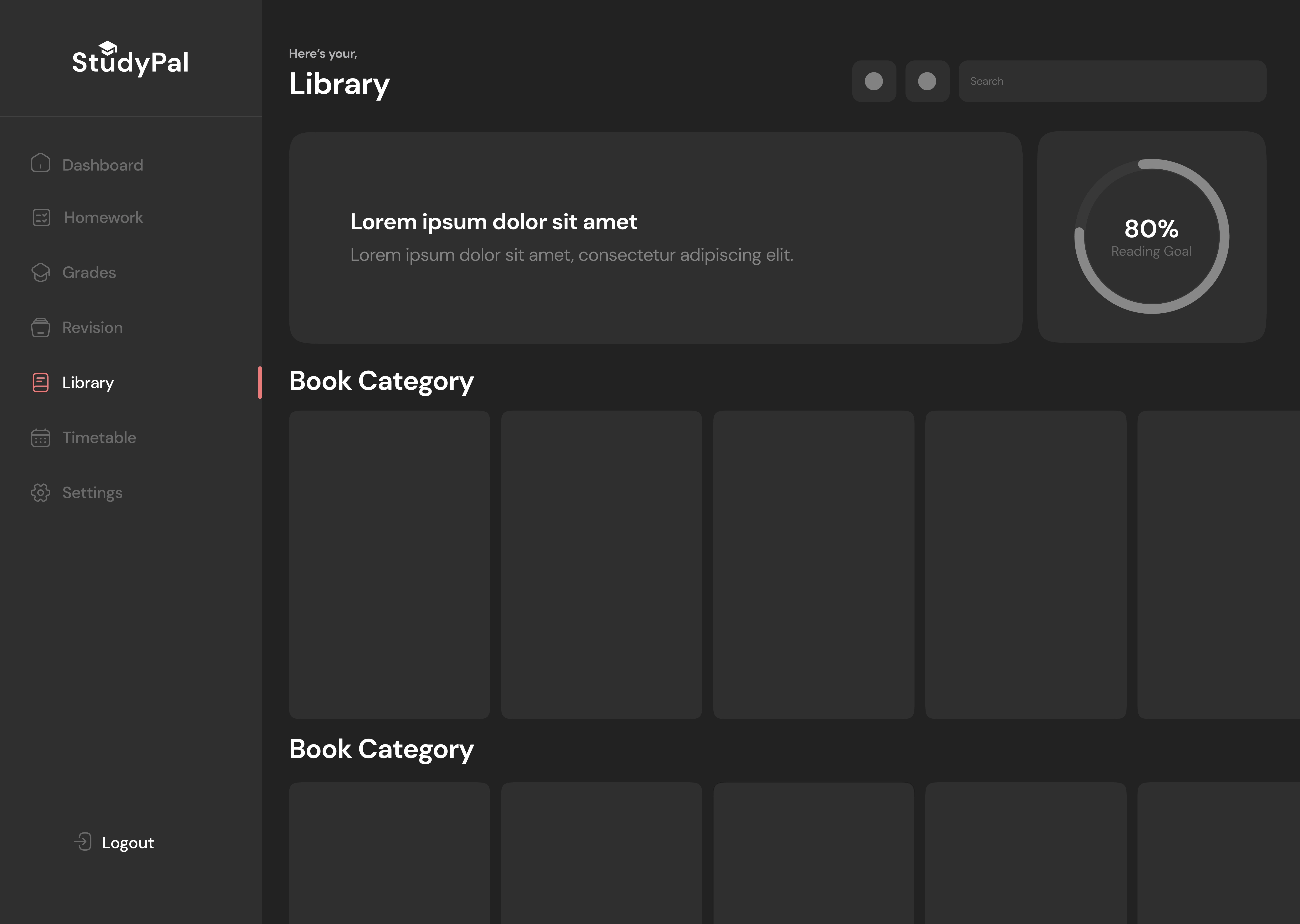
Regarding low-fidelity wireframes, I prefer to keep them as straightforward and understandable as I can. I also strive for a minimal use of text and colours in order to emphasise user interaction.
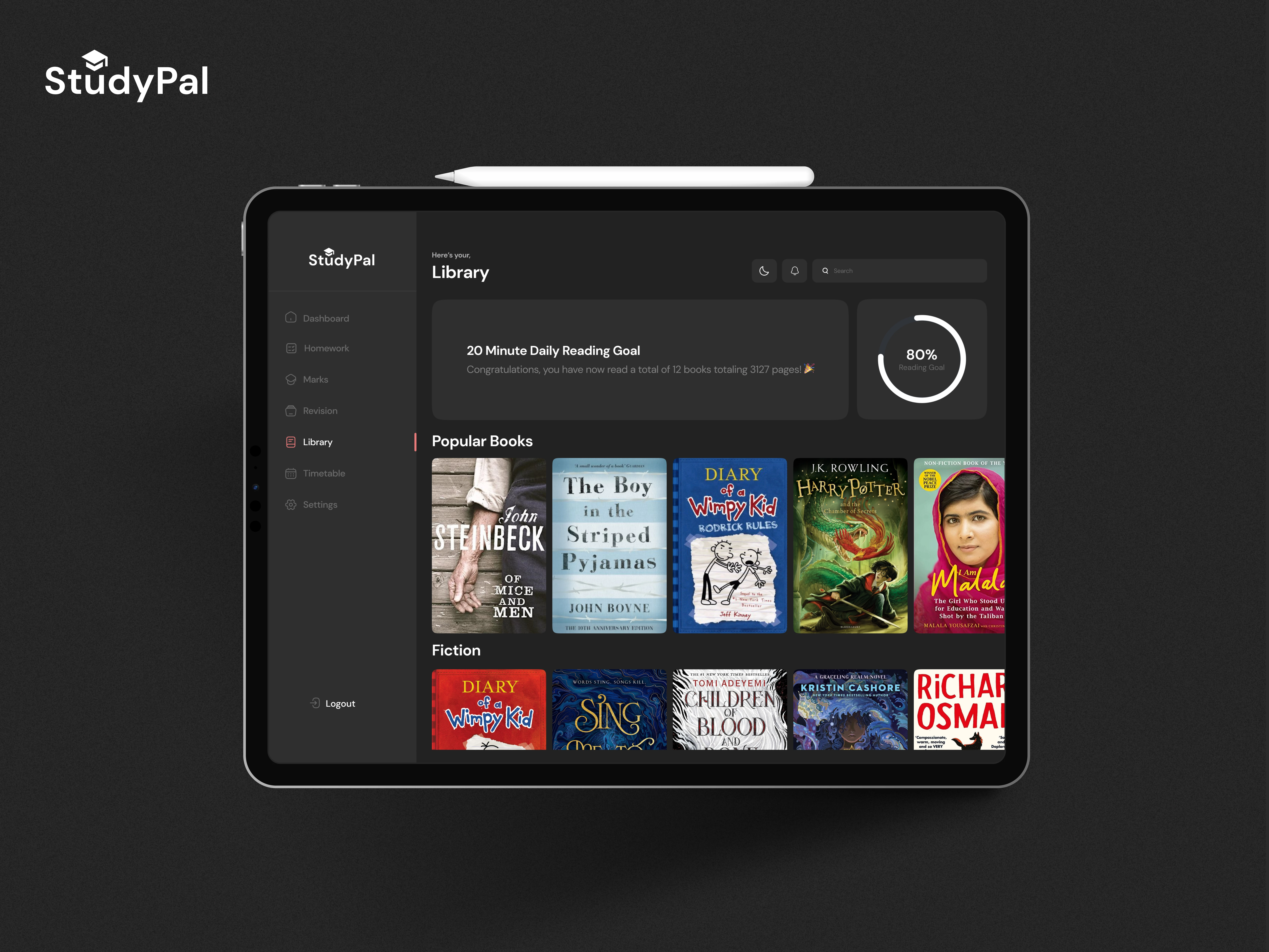
This is the final design version of what I was discussing earlier. Now, it's filled with colour and information while still maintaining the same simple user interaction.
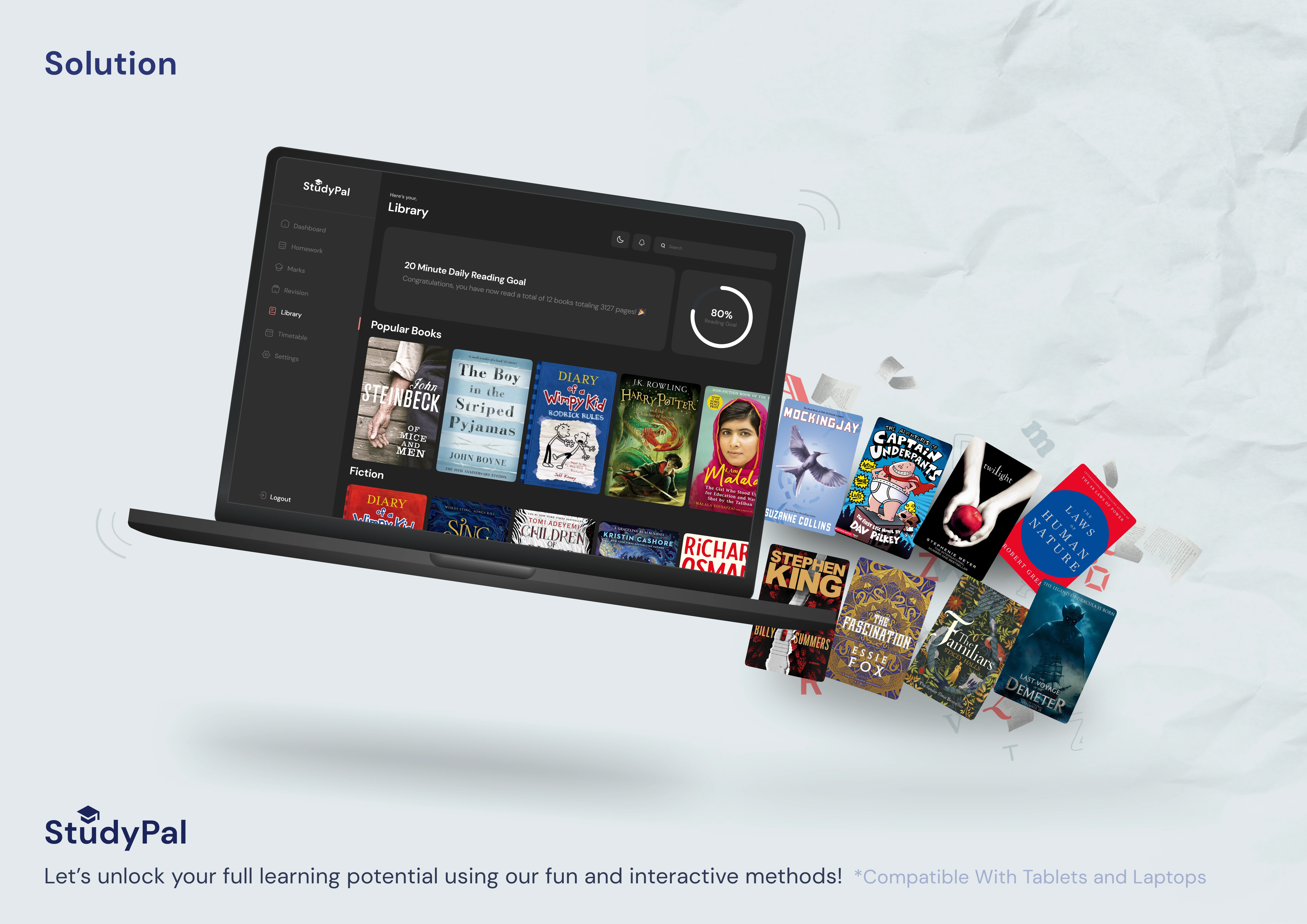
Here is an advertising poster I created to promote one of the app's features.
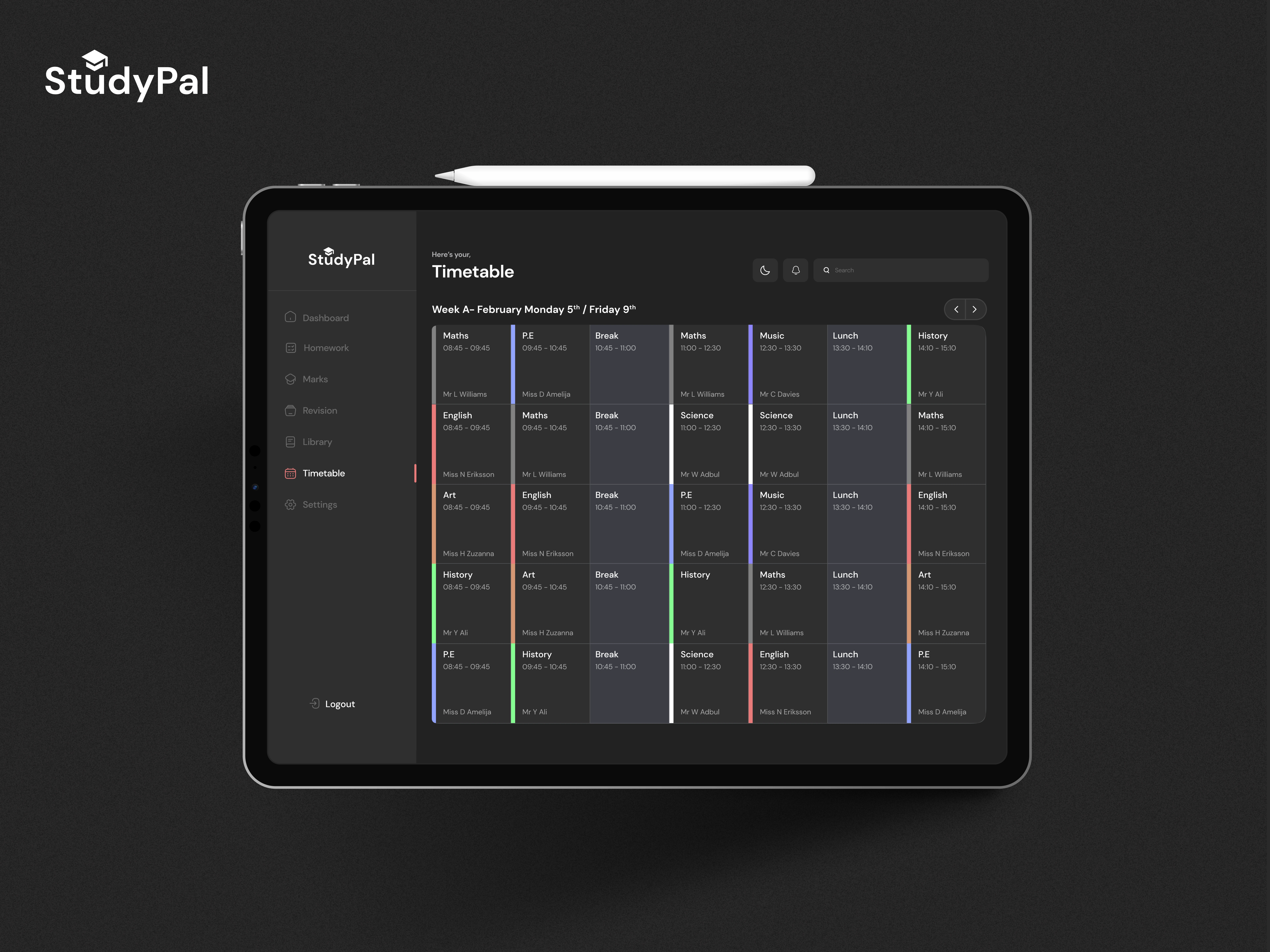
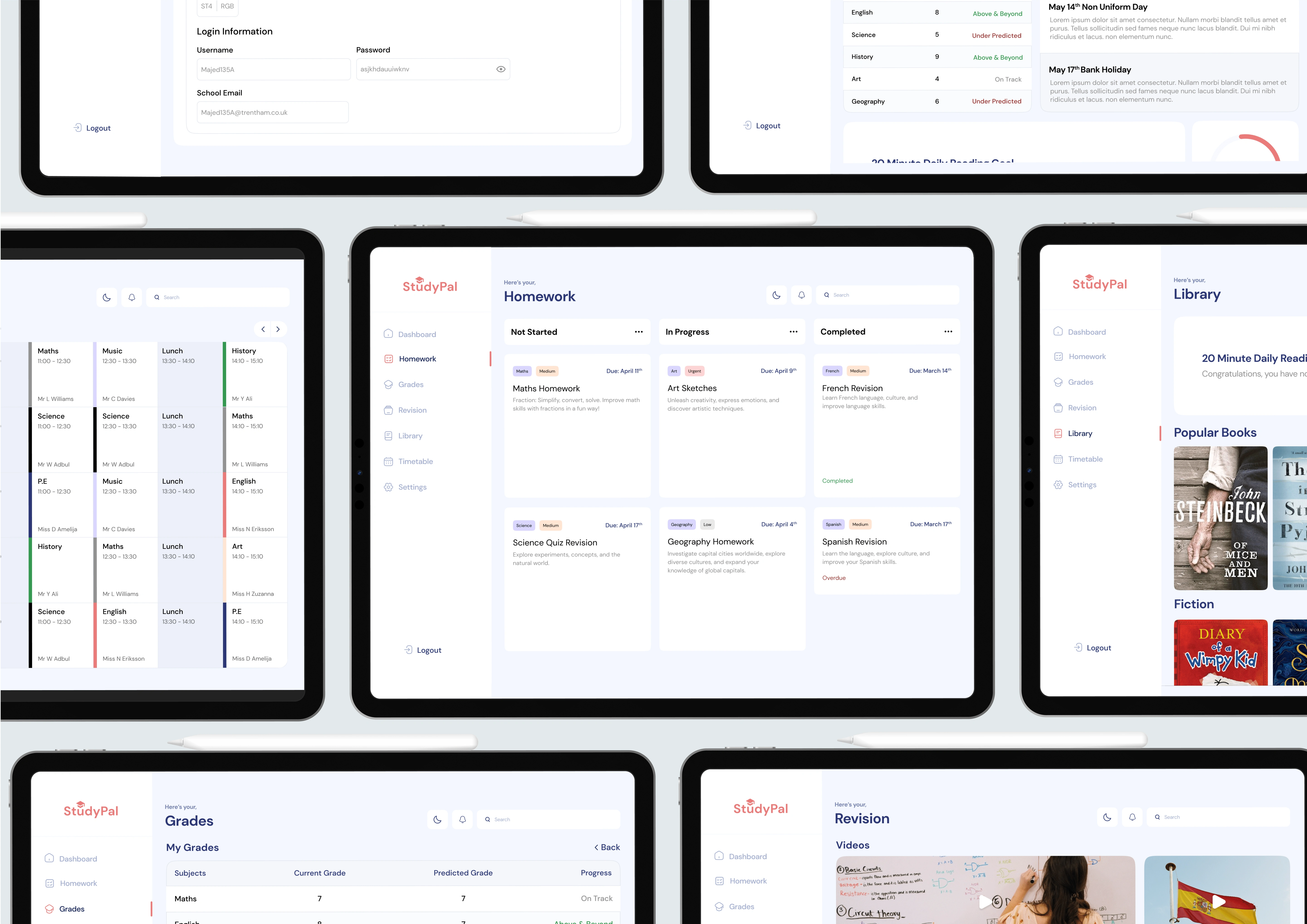
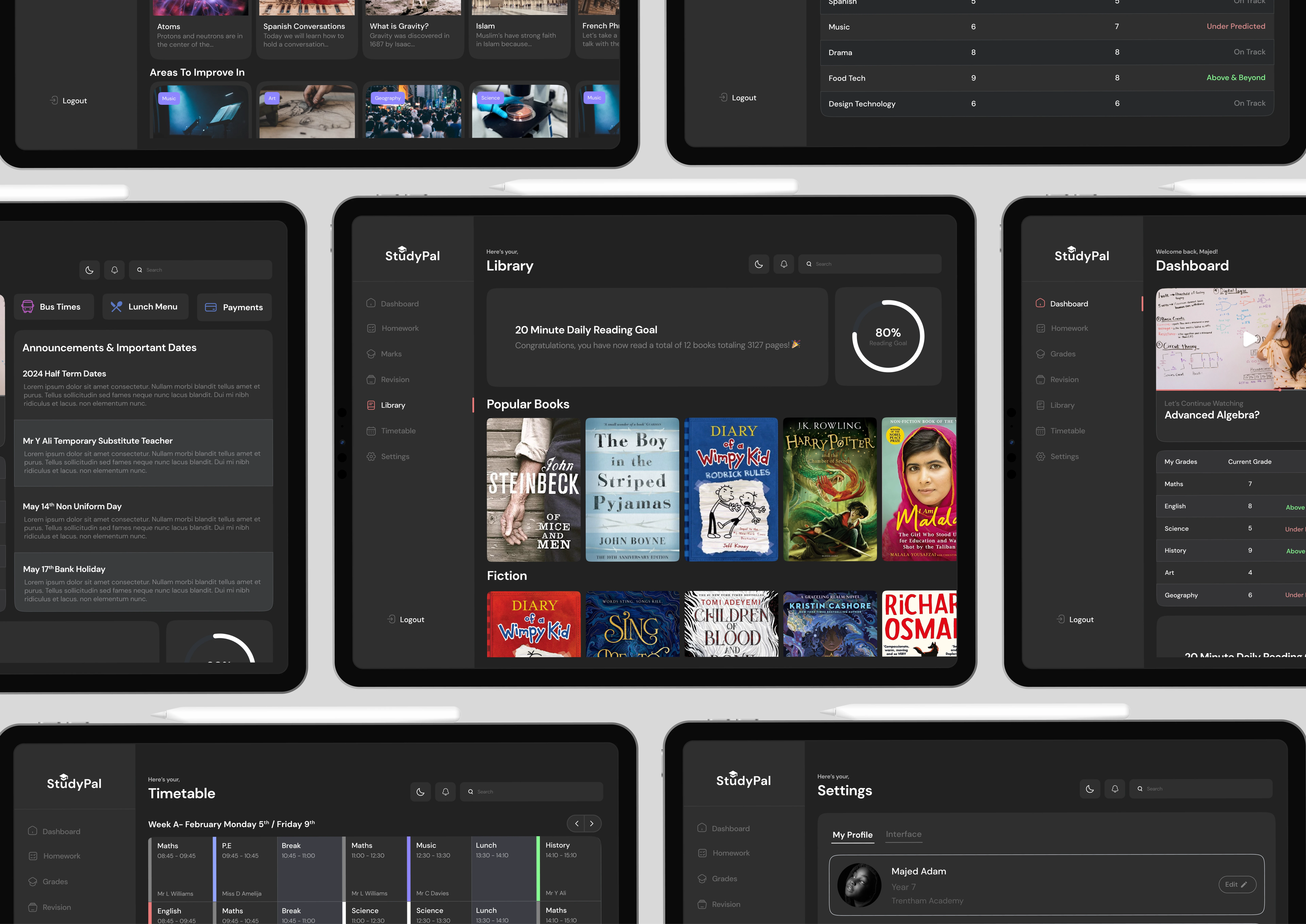
This is a screen that users will frequently use - it's a timetable showing their lessons and lunchtimes. I used a specific colour scheme to make it easier for users to quickly locate the information they need.
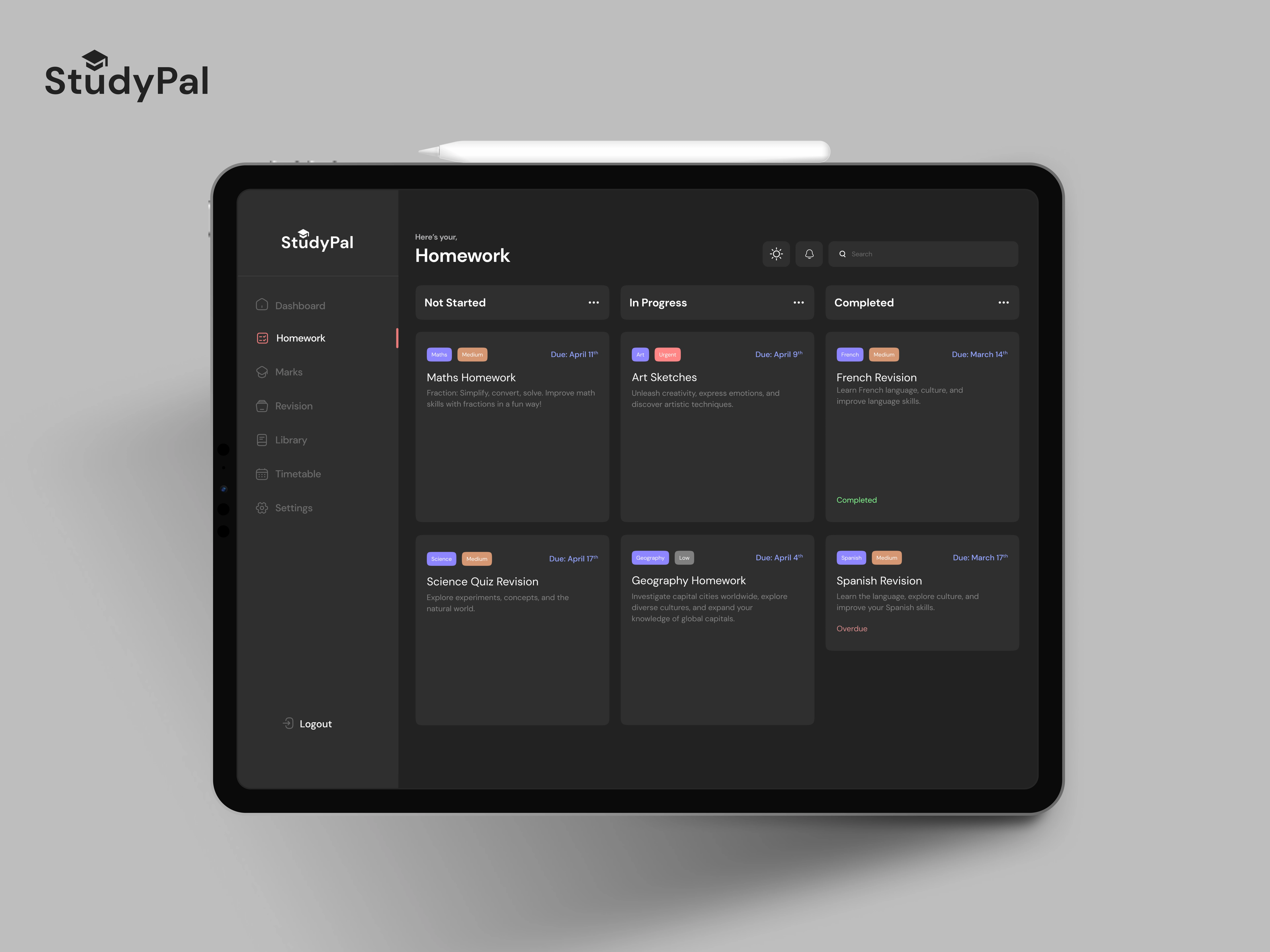
Here's another screen users will interact with often; it's a homework management screen that displays different tasks with priority levels indicated by colours. This colour coded system helps users quickly identify the difficulty level of each task.
Like this project
Posted Oct 6, 2023
StudyPal, an immersive educational app for secondary students, with a user-friendly interface and engaging learning tools for my Master's project.
Likes
0
Views
17